A strong brand doesn’t need to shout.
It needs to stand with purpose.
For this Spartan logo design concept, I focused on creating a symbol that communicates:
→ Strength
→ Discipline
→ Courage
→ Leadership
The visual direction is bold, sharp, and minimal—designed to feel powerful without becoming overly complex.
A Spartan is more than a warrior.
It represents resilience, strategy, and the mindset to keep moving forward.
That idea became the foundation of this logo concept.
Strong identity.
Clear symbolism.
Memorable design.
What do you see first in this logo—the helmet or the warrior?
#LogoDesign #LogoDesigner #BrandIdentity #Branding #GraphicDesign #LogoConcept
1
2
34
R+R is a modern monogram logo concept built from two “R” letters, creating a bold, balanced, and memorable visual identity.
The clean geometry and refined structure make it versatile for branding, fashion, creative studios, and modern businesses.
#LogoDesign (https://www.pinterest.com/search/pins/?q=LogoDesign) #MonogramLogo (https://www.pinterest.com/search/pins/?q=MonogramLogo) #LetterLogo (https://www.pinterest.com/search/pins/?q=LetterLogo) #BrandIdentity (https://www.pinterest.com/search/pins/?q=BrandIdentity) #LogoInspiration (https://www.pinterest.com/search/pins/?q=LogoInspiration) #GraphicDesign (https://www.pinterest.com/search/pins/?q=GraphicDesign) #BrandingDesign (https://www.pinterest.com/search/pins/?q=BrandingDesign) #MinimalLogo (https://www.pinterest.com/search/pins/?q=MinimalLogo) #ModernLogo (https://www.pinterest.com/search/pins/?q=ModernLogo) #CreativeLogo (https://www.pinterest.com/search/pins/?q=CreativeLogo) #VisualIdentity (https://www.pinterest.com/search/pins/?q=VisualIdentity) #LogoDesigner (https://www.pinterest.com/search/pins/?q=LogoDesigner)
1
54
Two letters. One bold identity.
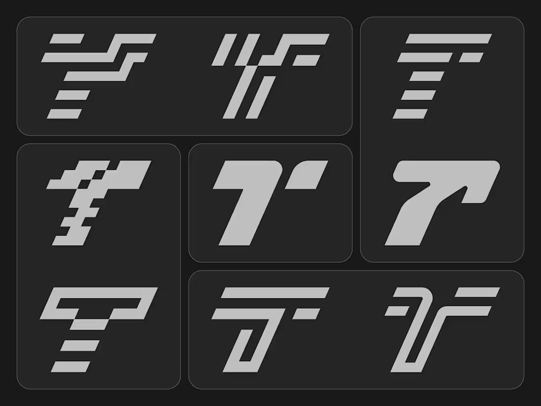
A T+T monogram logo concept built around simplicity, balance, and connection.
By merging two T’s into one distinctive symbol, the mark creates a clean and memorable visual identity. Minimal form.
Maximum recognition. What do you see first—two T’s or one symbol?
#LogoDesign (https://www.pinterest.com/search/pins/?q=LogoDesign) #MonogramLogo (https://www.pinterest.com/search/pins/?q=MonogramLogo) #Lettermark (https://www.pinterest.com/search/pins/?q=Lettermark) #BrandIdentity (https://www.pinterest.com/search/pins/?q=BrandIdentity) #Branding (https://www.pinterest.com/search/pins/?q=Branding) #LogoDesigner (https://www.pinterest.com/search/pins/?q=LogoDesigner)
1
60
“Cravina” is a modern, geometric wordmark built on a precise grid system with rounded corners that balance tech and warmth. Designed through careful vector refinement, it ensures harmony and readability. The challenge was creating a unique yet legible identity—solved by custom letter tweaks and consistent stroke rhythm. The result is a clean, futuristic logo adaptable across digital and print platforms.