
ely uí design
Email Marketing Design, UI/UX designs in Figma


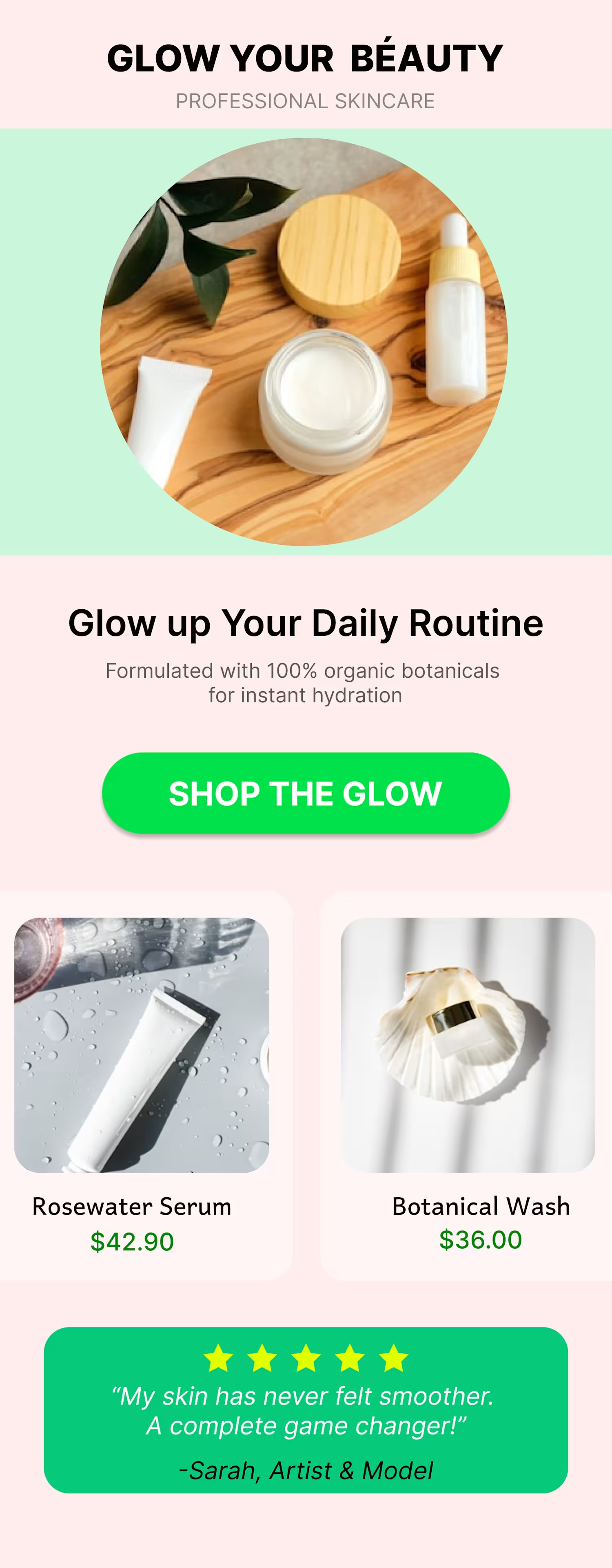
Skincare Email Marketing Campaign 🙌
— 🌿 GLOW YOUR BEAUTY CAMPAIGN 🌿
A clean, modern email marketing concept designed for a premium skincare brand.
The goal of this project was to create a visually engaging product-focused email that introduces the "Glow Repair Serum Series" and guides the audience toward a clear purchase action.
𝗗𝗲𝘀𝗶𝗴𝗻 𝗙𝗼𝗰𝘂𝘀
🌿 Product-focused visual hierarchy
🌿 Premium and minimal skincare aesthetic
🌿 Clean typography and generous whitespace
🌿 Strong product presentation
🌿 Clear and prominent CTA placement
🌿 Designed with email readability and conversion in mind
𝗞𝗲𝘆 𝗖𝗧𝗔
SHOP THE GLOW NOW button
The layout is structured to naturally guide the viewer from product discovery to product benefits and, finally, toward the purchase CTA.
𝗧𝗼𝗼𝗹𝘀
🌿 Figma
This project was created as a visual email marketing concept to showcase how thoughtful design can turn a product introduction into a clear and engaging customer journey.
Encouraging customers to take the next step toward purchase.
0
201
𝓣𝓲𝓽𝓵𝓮
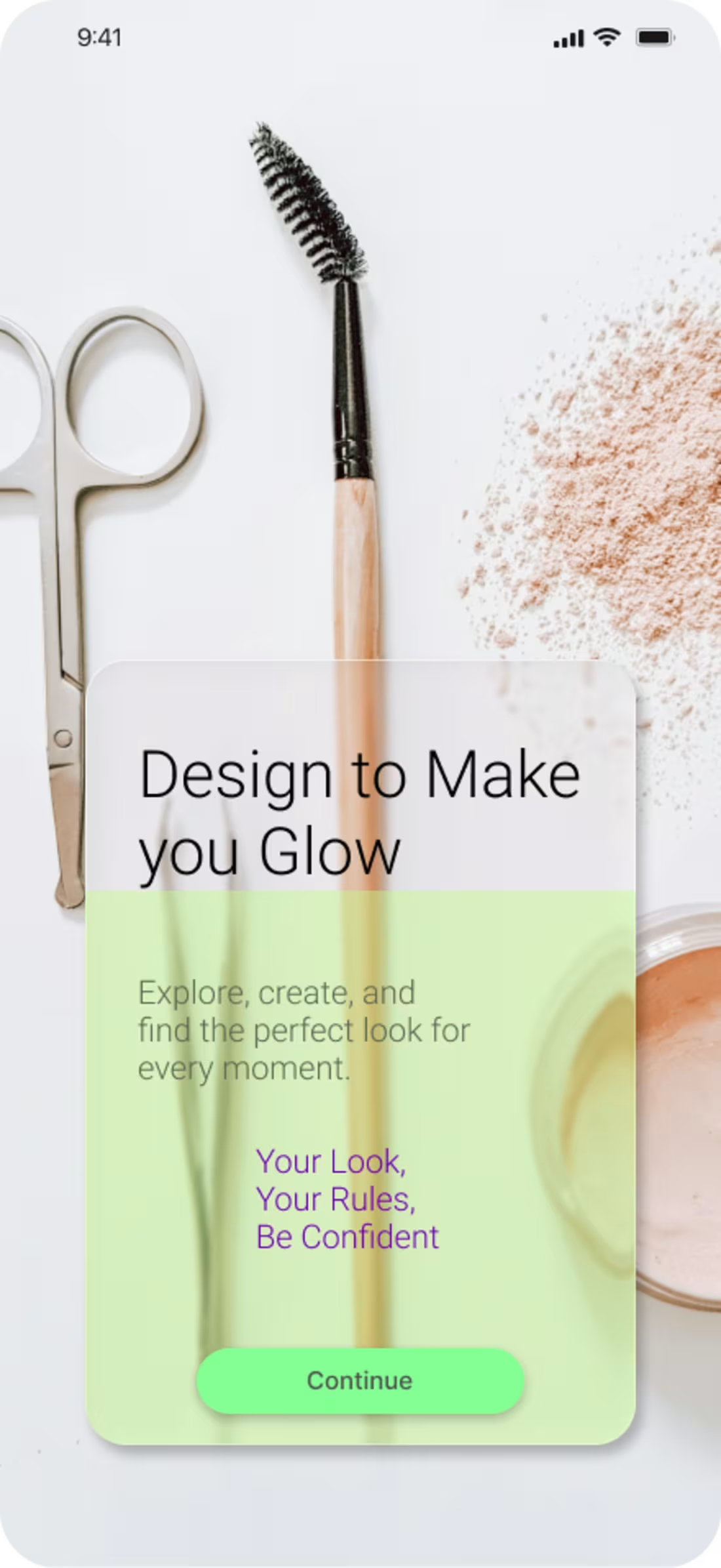
A simple and modern home screen concept for a beauty and makeup app, designed to make discovering makeup inspiration feel easy, visual, and enjoyable.
𝗗𝗲𝘀𝗶𝗴𝗻 𝗚𝗼𝗮𝗹
The goal was to create a clean first impression while giving users a clear starting point to explore makeup looks and beauty content.
𝐃𝐞𝐬𝐢𝐠𝐧 𝐀𝐩𝐩𝐫𝐨𝐚𝐜𝐡
I focused on creating a visually balanced layout with clear hierarchy, soft colors, and strong visual elements that fit the beauty and cosmetics space.
The home screen is designed to help users quickly understand the app and discover content without feeling overwhelmed.
✓ Clean and minimal visual hierarchy
✓ Easy-to-scan sections
✓ Beauty-focused color palette
✓Clear CTA button
✓ Modern mobile-first UI
✓ Consistent typography and spacing
#figma #uidesign #uxdesign #makeup
0
247
𝑪𝒂𝒔𝒆 𝑺𝒕𝒖𝒅𝒚
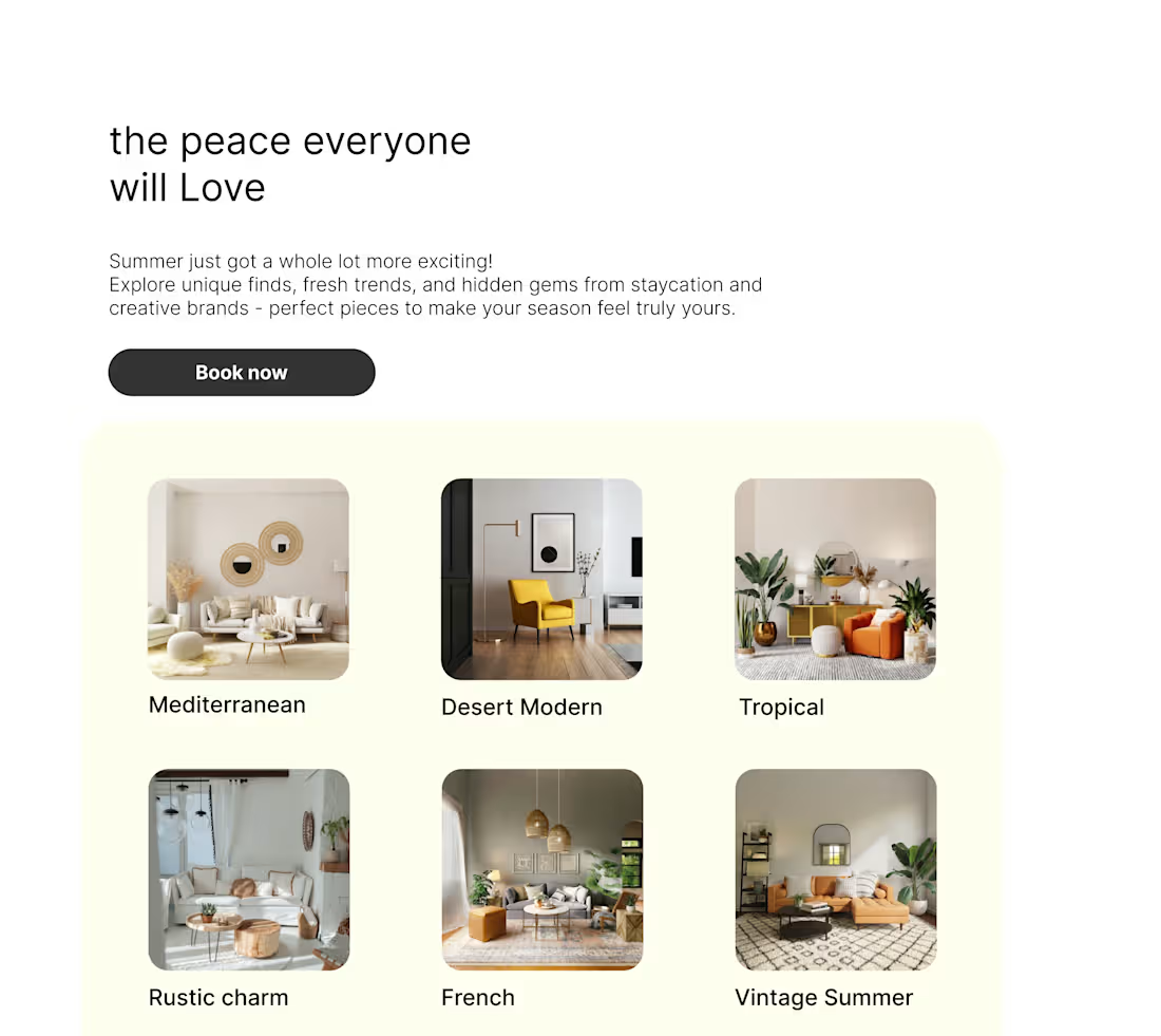
A simple, modern landing page blending rustic charm with a fresh, contemporary feel — designed for personal brands and businesses.
This concept combines warm, natural elements with clean layouts and modern typography to create a welcoming yet professional digital presence.
𝑫𝒆𝒔𝒊𝒈𝒏 𝑫𝒊𝒓𝒆𝒄𝒕𝒊𝒐𝒏
Warm & Natural — earthy tones and organic details create a relaxed atmosphere.
Modern & Minimal — clean layouts and balanced spacing keep the experience fresh and uncluttered.
Authentic & Personal — subtle rustic touches add character and make the brand feel more approachable.
Clear & Functional — straightforward navigation and strong visual hierarchy guide visitors naturally through the page.
𝑪𝒐𝒏𝒄𝒆𝒑𝒕
The goal was to create a landing page that feels personal, inviting, and timeless without becoming overly decorative.
It can work across different types of personal brands and businesses while still leaving room for each brand's own personality to shine.
1
404
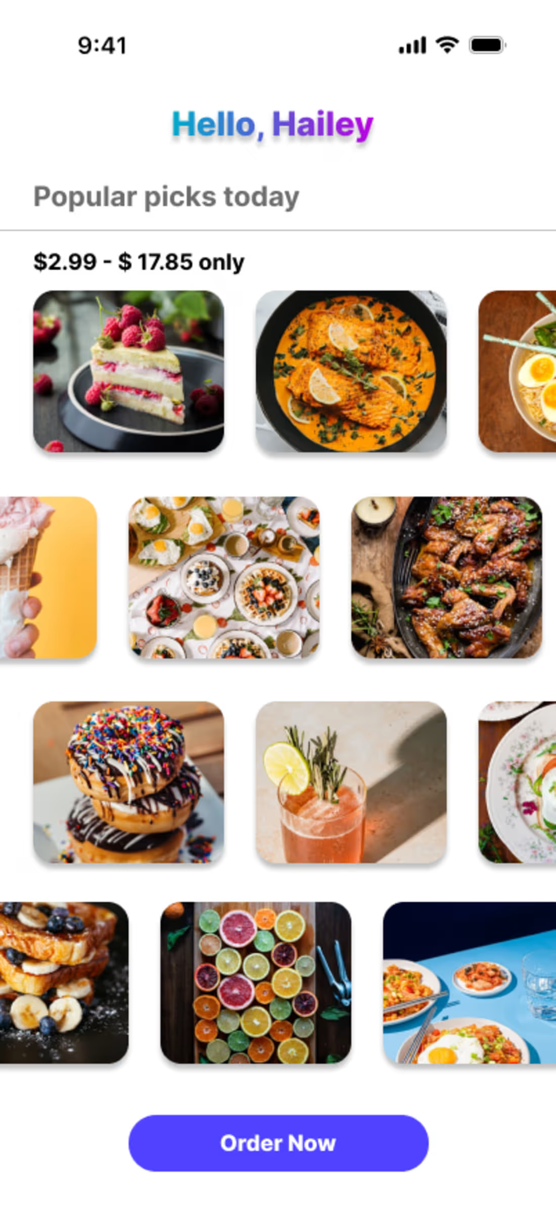
A food ordering app designed to give customers a more intuitive and engaging way to browse food and drinks. Instead of the traditional static layout, users can scroll horizontally to explore and select items, creating a smoother and more enjoyable ordering experience.
The goal is to enhance the overall user experience while exploring whether this scrolling-based purchasing feature can increase customer engagement and, ultimately, drive more restaurant sales. At the end of the month, the development team will analyze the feature’s performance and its impact on conversions and sales.
#figma #ui #ux
1
532