
Quasar Signal
Buyer Psychology & Conversion Storytelling for DTC Brands


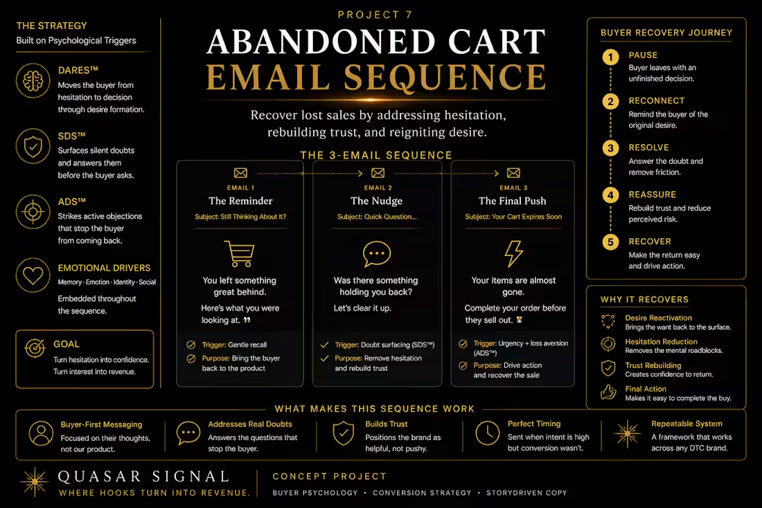
➡️DTC Abandoned Cart Email Sequence: Turning Buyer Hesitation into Purchase Confidence
➡️A buyer psychology email copywriting sample for ecommerce abandoned cart flows, retention marketing, and conversion recovery.
➡️Project Type: Concept Portfolio Project, DTC Email Copywriting, Ecommerce Conversion Strategy, Abandoned Cart Flow
➡️Services: Email Copywriting, Abandoned Cart Sequence, Retention Messaging, Buyer Psychology, Conversion Storytelling
➡️Methods: ADS™ Active Doubt Strike, SDS™ Silent Doubt Surfacing, DARES™ Desire Formation, Buyer Hesitation Mapping, Email Funnel Strategy
➡️Project Note: This is a self-initiated concept project created to demonstrate QUASAR Signal’s abandoned cart email copywriting and buyer psychology process. It does not represent a live client campaign or claim performance results.
➡️The Brief
Imagine a premium DTC sleepwear brand selling a soft, elevated lounge set for women who want their evenings to feel calmer, more comfortable, and more intentional.
The product is visually strong.
The fabric feels premium.
The PDP creates desire.
The buyer adds the product to cart.
Then they leave.
Most brands treat this moment like forgetfulness.
They send:
“Your cart is waiting.”
“Still interested?”
“Complete your purchase.”
“Here’s 10% off.”
But many buyers do not abandon the cart because they forgot.
They abandon because the decision still feels unfinished.
The goal of this abandoned cart sequence was to write emails that do more than remind the buyer.
The goal was to help the buyer move through hesitation, rebuild desire, justify the purchase, and feel confident enough to choose.
➡️The Core Conversion Problem
An abandoned cart is not always a dead sale.
Sometimes it is a paused decision.
The buyer may still want the product.
But something inside the purchase did not feel complete.
They may be thinking:
“Do I really need this?”
“Is it worth the price?”
“Should I wait for a sale?”
“Will the fabric actually feel premium?”
“What if the fit is wrong?”
“Am I buying this emotionally?”
Those doubts are not always loud.
But they are strong enough to stop action.
This is why abandoned cart email copy should not only create urgency.
It should understand the hesitation behind the pause.
➡️The Strategic Shift
From Cart Reminder to Decision Recovery
Instead of writing the sequence around the cart, this flow is written around the buyer’s state of mind.
The product is already interesting.
The buyer already moved close to action.
Now the copy has to answer:
What made them pause?
What did they want when they added it to cart?
What doubt interrupted the decision?
What proof or reassurance would help them feel safe?
What emotional reason can reconnect them to the product?
The sequence is built to move the buyer from:
Paused interest → renewed desire → practical confidence → final choice
➡️Frameworks Applied
This project uses three QUASAR Signal systems.
1️⃣SDS™ — Silent Doubt Surfacing
SDS™ is used in the first emails to reflect the buyer’s quieter hesitation.
The tone is calm, premium, and non-pushy.
Instead of saying:
“You forgot your cart.”
The copy speaks to the real emotional reason behind the product:
“You were looking for comfort for a reason.”
SDS™ helps the brand feel understanding instead of desperate.
2️⃣DARES™ — Desire Formation
DARES™ structures the sequence across the full decision journey:
Discovery → Attraction → Resonance → Evaluation → Selection
The buyer has already discovered the product and felt attraction.
The abandoned cart flow rebuilds:
Resonance — Why this product fits the buyer’s life
Evaluation — Why the product is worth trusting
Selection — Why now feels like a natural time to choose
3️⃣ADS™ — Active Doubt Strike
ADS™ is used later in the sequence when the buyer may be rationalizing delay.
The tone becomes sharper without feeling cheap or aggressive.
It surfaces the excuse:
“I’ll think about it later.”
Then reframes the cost:
“Later often means continuing the same evening routine you were trying to improve.”
ADS™ creates movement when the buyer is stuck in passive delay.
➡️Target Buyer
This sequence is written for buyers who want comfort, softness, and calm, but may hesitate around premium pricing.
They are not just buying sleepwear.
They are buying:
A better evening ritual
A softer transition out of the day
A more elevated version of rest
A product that makes home feel more considered
Permission to invest in comfort without feeling guilty
The emotional purchase driver is not only style.
It is recovery.
➡️Sequence Overview
Email 1 — Soft Reminder
Timing: 1–2 hours after cart abandonment
Framework: SDS™
Goal: Reflect the buyer’s original desire without pressure
Email 2 — Desire Rebuild
Timing: 12–24 hours after abandonment
Framework: DARES™
Goal: Reconnect the product to identity, ritual, and emotional outcome
Email 3 — Active Doubt
Timing: 24–36 hours after abandonment
Framework: ADS™
Goal: Challenge passive delay and make waiting feel less neutral
Email 4 — Trust & Reassurance
Timing: 48 hours after abandonment
Framework: DARES™ + SDS™
Goal: Resolve fit, fabric, quality, shipping, and return concerns
Email 5 — Final Choice
Timing: 72 hours after abandonment
Framework: Selection stage of DARES™
Goal: Create a calm final nudge without sounding desperate
➡️Email 1: The Soft Reminder
Subject Line Options
Still thinking about softer evenings?
Your cart was holding something softer.
You left comfort waiting.
Preview Text
A quiet reminder about the lounge set you were considering.
Email Body
You were looking at this set for a reason.
Maybe it was the fabric.
Maybe it was the fit.
Maybe it was the idea of ending the day in something that feels softer than the day itself.
Your lounge set is still in your cart.
No pressure.
Just a small reminder in case you were still thinking about making your evenings feel a little more considered.
CTA: Return to Your Cart
➡️Why Email 1 Works
Most abandoned cart emails make the buyer feel chased.
This one makes the buyer feel understood.
It does not assume they forgot.
It assumes they paused.
That difference matters because premium buyers often resist aggressive sales language.
The copy quietly reconnects the product to the emotional reason they were interested in the first place.
➡️Email 2: The Desire Rebuild
Subject Line Options
Rest should feel like something you enter.
The evening version of you deserves better.
Not just sleepwear. A softer signal.
Preview Text
For the moment your day finally lets go of you.
Email Body
There is a moment in the evening when the day is technically over, but your body has not fully caught up yet.
The laptop closes.
The lights feel softer.
The room gets quieter.
And you start looking for something that helps you feel like you are finally allowed to slow down.
That is the role this lounge set was designed to play.
Not loud.
Not overdone.
Not trying to turn rest into another performance.
Just soft, elevated comfort that makes the transition from day to night feel more intentional.
Because what you wear at home still shapes how you feel inside it.
CTA: Choose Your Set
➡️Why Email 2 Works
This email rebuilds desire through scenario and identity.
It does not talk about the product first.
It places the buyer inside the evening moment where the product becomes relevant.
The lounge set becomes more than clothing.
It becomes part of a daily transition from pressure to recovery.
Email 3: The Active Doubt Email
Subject Line Options
“Later” usually means the same routine.
If you were waiting for a sign, this is softer than one.
Comfort does not upgrade itself.
Preview Text
The routine you keep tolerating will probably be there tomorrow too.
Email Body
It is easy to leave something in the cart and call it thinking.
But sometimes “I’ll decide later” just means returning to the same small discomfort you were already trying to replace.
The old, oversized tee.
The stretched-out set.
The fabric that feels fine, but never really good.
The evening routine that works but does not feel cared for.
You do not need a dramatic reason to choose something softer.
Sometimes the reason is simple:
You are allowed to make the part of the day no one sees feel better too.
Your lounge set is still waiting.
CTA: Upgrade Your Evening
➡️Why Email 3 Works
This is where ADS™ enters.
The email surfaces the buyer’s delay and makes the status quo feel less neutral.
It does not shame the buyer.
It simply makes the hidden cost of waiting visible.
The copy turns procrastination into a choice:
Keep the same evening routine or upgrade the part of the day that should help you recover.
➡️Email 4: Trust & Reassurance
Subject Line Options
A few details before you decide.
About the fabric, fit, and feel.
Still deciding? Start here.
Preview Text
Everything you may want to know before choosing your set.
Email Body
If you are still deciding, that makes sense.
Premium comfort should feel worth it before it reaches your drawer.
Here are the details that matter:
Fabric feel
Soft against the skin, breathable enough for slow evenings, and designed to feel elevated without feeling delicate.
Fit
Relaxed without looking shapeless.
Made for movement, lounging, and settling into the evening without feeling restricted.
Care
Easy to wash, easy to wear, and built for regular use — not just special weekends.
Choosing your size
Check the fit guide before ordering. If you are between sizes, choose the fit that matches how you like to lounge: closer and cleaner, or softer and more relaxed.
Returns
If the fit is not right, you can exchange or return it within the return window.
The goal is simple:
Comfort that feels considered before you buy — and even better when it arrives.
CTA: Review Your Set
➡️Why Email 4 Works
This email supports the Evaluation stage.
By this point, the buyer may still want the product but need practical confidence.
The email answers the likely decision questions:
Will it feel good?
Will it fit?
Will it be easy to care for?
What if I choose wrong?
This turns uncertainty into clarity.
➡️Email 5: The Final Choice
Subject Line Options
Last call for your softer evening.
Your cart closes soon.
Still want this set?
Preview Text
A final reminder before your selected set leaves your cart.
Email Body
Your selected lounge set is still in your cart, but it will not be held much longer.
A small note before it goes:
This is not about needing more clothes.
It is about choosing the pieces that make the quiet parts of your day feel better.
The ones you reach for after long hours.
The ones that make home feel softer.
The ones that remind your body the day is allowed to end.
If that is what you were looking for, your set is ready.
CTA: Complete Your Order
➡️Why Email 5 Works
The final email creates urgency without cheapening the brand.
It does not rely only on discounting.
It reminds the buyer what they were really choosing:
A softer evening.
A better transition.
A more intentional version of rest.
The CTA feels natural because the desire and reassurance have already been rebuilt.
➡️Flow Logic
Email 1
Reflect the pause.
Email 2
Rebuild emotional desire.
Email 3
Challenge passive delay.
Email 4
Resolve practical concerns.
Email 5
Create a calm final decision point.
This sequence does not treat abandoned cart recovery as one repeated reminder.
It treats it as a buyer psychology progression.
➡️Optional SMS Adaptations
SMS 1
Still thinking about your lounge set? It is waiting in your cart if you want to return to it. No pressure — just softer evenings.
SMS 2
Your cart is still open. Choose the set designed to make the end of the day feel calmer, softer, and more considered.
SMS 3
Final reminder: your selected lounge set will not stay in cart much longer. Complete your order when you are ready.
➡️PDP Microcopy Adaptations
Cart Reminder Line
You chose this for a softer reason.
Checkout Reassurance
Easy returns if the fit is not right.
Size Guide Prompt
Choose the fit that matches how you like to unwind.
Shipping Microcopy
Ships quickly, so your next slow evening feels closer.
➡️What This Project Demonstrates
This concept project shows how QUASAR Signal writes abandoned cart email sequences around buyer psychology, not generic reminders.
The work starts by asking:
“What made the buyer add this to cart?”
“What doubt made them leave?”
“What desire needs to be rebuilt?”
“What practical reassurance is missing?”
“What tone protects the brand while still moving the buyer forward?”
Then the copy turns those answers into a complete email flow that supports desire, trust, confidence, and action.
➡️Client Takeaway
Abandoned cart email copy should not only remind the buyer that something was left behind.
It should help complete the decision.
The strongest abandoned cart flows understand that buyers do not always need a discount.
Sometimes they need:
The desire reactivated
The hesitation named
The risk reduced
The value clarified
The next step made easier
QUASAR Signal uses buyer psychology to turn abandoned cart emails into conversion recovery systems that feel human, brand-safe, and strategically built around the real reason buyers pause.
Because the cart is not always abandoned.
Sometimes the decision is simply unfinished.
QUASAR Signal
Buyer Psychology & Conversion Storytelling for DTC Brands.
Where hooks turn into revenue.
0
65
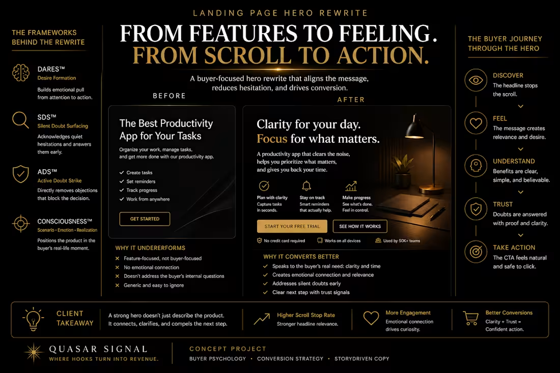
➡️DTC Landing Page Hero Rewrite: Turning First Impressions into Buyer Clarity
➡️A conversion-focused landing page copywriting sample for ecommerce brands, paid traffic, and campaign pages.
➡️Project Type: Concept Portfolio Project, DTC Landing Page Copywriting, Ecommerce CRO, Buyer Psychology
➡️Services: Landing Page Copywriting, Hero Section Rewrite, Messaging Strategy, Paid Traffic Message Match
➡️Methods: DARES™ Desire Formation, SDS™ Silent Doubt Surfacing, Consciousness Framework™, Hook Psychology, Conversion Storytelling
➡️Project Note: This is a self-initiated concept project created to demonstrate QUASAR Signal’s landing page messaging and conversion strategy process. It does not represent a live client campaign or claim performance results.
➡️The Brief
Imagine a DTC wellness brand selling a premium desk lamp designed for people who work, study, and create at night.
The product has strong features:
Adjustable brightness
Warm and cool light modes
Minimal desk-friendly design
Eye-comfort lighting
Touch controls
Long-lasting LED build
The original landing page hero explains the product clearly.
But it does not create enough emotional relevance.
The buyer understands what the lamp does.
They do not yet feel why it matters.
The challenge was to rewrite the hero section so the product feels less like a desk accessory and more like a better work environment.
➡️The Original Hero
Before
Premium LED Desk Lamp for Work and Study
Adjustable brightness, multiple light modes, and a modern design built for productive workspaces.
CTA: Shop Now
➡️Why the Original Hero Struggles
The original hero is clear, but generic.
It tells the buyer:
What the product is
What features it includes
Where it can be used
But it does not answer the more important emotional question:
Why should this matter inside my daily life?
The copy starts with the lamp.
The stronger opportunity is to start with the buyer’s environment, frustration, and desired state.
➡️The Conversion Gap
Most landing page heroes fail because they introduce the product before creating buyer recognition.
The buyer does not only need to know:
“This is a desk lamp.”
They need to feel:
“This solves the exact kind of work environment problem I keep tolerating.”
A stronger hero should help the buyer recognize:
The moment they struggle with focus
The environment that drains them
The emotional cost of poor lighting
The better version of their workspace
Why this product belongs in that shift
➡️Frameworks Applied
This project uses three QUASAR Signal systems.
💡DARES™ — Desire Formation
DARES™ shaped the hero journey:
Discovery → Attraction → Resonance → Evaluation → Selection
The hero must earn attention, create emotional pull, help the buyer see themselves in the scenario, give enough proof to believe, and make the CTA feel natural.
💡SDS™ — Silent Doubt Surfacing
SDS™ helped identify quiet doubts:
“Do I really need a better lamp?”
“Is this just another desk accessory?”
“Will this actually improve my workspace?”
“Is it worth paying more for lighting?”
The rewrite does not pressure the buyer.
It makes the daily problem feel visible.
💡Consciousness Framework™ — Scenario, Emotion, Realization
The hero uses:
Scenario: Working late at a desk
Emotion: Drained focus, visual fatigue, low-energy environment
Realization: The workspace is shaping how work feels
➡️The Strategic Shift
From Product Feature to Work Environment
Instead of saying:
“Premium LED Desk Lamp for Work and Study”
The rewrite asks:
“What does the buyer feel when their workspace works against them?”
➡️The strategy:
Buyer Moment: Late-night work or study
Emotional Tension: The desk feels harsh, dull, or draining
Desired Feeling: Clearer focus and calmer energy
Product Role: A light environment that supports the work instead of fighting it
➡️Rewritten Landing Page Hero
After
Your desk should help you focus — not drain you before the work is done.
Late nights, long study sessions, and deep work feel different when your lighting supports your eyes, your mood, and your attention.
A minimal LED desk lamp with adjustable warmth and brightness, built to turn your workspace into a calmer place to think.
CTA: Build a Better Workspace
Secondary CTA: See the Lighting Modes
➡️Why the Rewrite Works
1. It Begins with Buyer Recognition
The first line does not begin with the product.
It begins with a frustration:
The workspace is draining the buyer before the work is finished.
That creates immediate relevance.
2. It Gives the Product an Emotional Role
The lamp is not positioned as a desk accessory.
It becomes part of the buyer’s focus environment.
That makes the product feel more valuable.
3. It Connects Features to Felt Outcomes
Adjustable warmth and brightness are not just technical features.
They are connected to:
Eye comfort
Mood
Attention
Calm
Deep work
4. It Makes the CTA Feel More Meaningful
“Shop Now” is functional.
“Build a Better Workspace” connects the action to the buyer’s desired outcome.
➡️Hero Variations
Variation 01 — Focus-Led
Better light for the work that needs your full attention.
Adjustable warmth and brightness help create a calmer desk environment for late nights, long study sessions, and focused work.
CTA: Upgrade Your Desk
➡️Variation 02 — Emotional Recognition
When your desk feels draining, focus gets harder than it needs to be.
Create a workspace that feels calmer, clearer, and easier to stay with — powered by adjustable lighting designed around how you actually work.
CTA: Create Your Focus Space
➡️Variation 03 — Premium Minimal
Light that makes your workspace feel considered.
A minimal LED desk lamp with adjustable warmth and brightness for workspaces that need focus, calm, and visual comfort.
CTA: Explore the Lamp
➡️Variation 04 — Student / Study Angle
Study sessions feel different when your space is built for focus.
Adjustable lighting helps reduce visual strain and create a calmer desk environment for long nights, revision blocks, and deep concentration.
CTA: Build Your Study Setup
➡️Variation 05 — Remote Work Angle
Make your workspace feel less like survival mode.
A minimal desk lamp designed to bring calmer lighting, better focus, and a more considered feel to your everyday work setup.
CTA: Upgrade Your Workspace
➡️Above-the-Fold Structure
Recommended Layout
Headline: Buyer-recognition statement
Sub headline: Emotional outcome + product mechanism
Visual: Lamp in a real workspace context
Primary CTA: Outcome-based action
Secondary CTA: Product-learning action
Trust Microcopy: Free shipping, 30-day returns, adjustable light modes
Mini Proof Row: Eye comfort, warm/cool modes, touch control, minimal design
➡️Paid Traffic Message Match
If the ad hook says:
“Your workspace might be draining your focus.”
The landing page hero should continue that same thought:
“Your desk should help you focus — not drain you before the work is done.”
This creates stronger message match between ad and page.
The buyer does not feel like they clicked into a disconnected product page.
They feel like the page is continuing the conversation that made them click.
➡️PDP Adaptation
Product Page Hero
Build a calmer desk around the work that matters.
Adjustable warmth, brightness, and a minimal profile help create a more comfortable workspace for long sessions, late nights, and focused thinking.
CTA: Choose Your Lamp
➡️Paid Social Hook Adaptations
Hook 01
Your desk might be making focus harder than it needs to be.
Hook 02
If your workspace feels harsh, cluttered, or draining, start with the light.
Hook 03
Better lighting will not do the work for you. But it can make the work feel easier to stay with.
Hook 04
Your focus setup starts before you open the laptop.
Hook 05
A calmer workspace starts with better light.
➡️What This Project Demonstrates
This concept project shows how QUASAR Signal rewrites landing page hero copy through buyer psychology, not just prettier wording.
The work starts by asking:
“What is the buyer tolerating?”
“What moment makes the product feel necessary?”
“What emotional state does the product improve?”
“What doubt might make the buyer delay?”
“What action feels natural after the message?”
Then the copy turns those answers into a stronger hero, CTA system, ad-to-page message match, PDP adaptation, and paid social hooks.
➡️Client Takeaway
A landing page hero is not just the top of a page.
It is the first psychological checkpoint after a buyer clicks.
If the hero only describes the product, the buyer may understand it without feeling moved.
A stronger hero makes the buyer recognize the problem, feel the value of solving it, and understand why the product belongs in that shift.
That is the difference between a landing page that explains and a landing page that converts.
QUASAR Signal
Buyer Psychology & Conversion Storytelling for DTC Brands.
Where hooks turn into revenue.
0
55
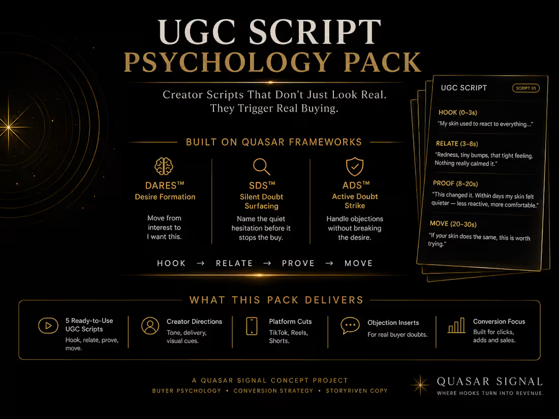
➡️DTC UGC Script Psychology Pack: Paid Social Hooks That Move Buyers
➡️A buyer psychology scriptwriting sample for UGC ads, paid social creatives, and ecommerce conversion storytelling.
➡️Project Type: Concept Portfolio Project, DTC UGC Scriptwriting, Paid Social Ad Copy, Buyer Psychology, Creative Strategy
➡️Services: UGC Scriptwriting, Hook Development, Paid Social Ad Copy, Product Messaging, Conversion Storytelling
➡️Methods: DARES™ Desire Formation, SDS™ Silent Doubt Surfacing, Consciousness Framework™, Hook Psychology, Buyer Hesitation Mapping
➡️Project Note: This is a self-initiated concept project created to demonstrate QUASAR Signal’s UGC and paid social creative strategy process. It does not represent a live client campaign or claim performance results.
➡️The Brief
Imagine a DTC brand selling a premium everyday travel backpack.
The product is well-designed.
It has useful features:
Laptop compartment
Water-resistant material
Hidden pockets
Lightweight build
Minimal premium design
Travel-friendly storage
But the original messaging sounds like every other backpack ad.
It focuses on what the product has.
Not what the buyer feels when their day is messy, rushed, or poorly organized.
The challenge was to turn feature-led product messaging into UGC scripts and paid social hooks that feel human, natural, and conversion-focused.
The goal was not to make the product sound louder.
The goal was to make the buyer recognize the problem instantly.
➡️The Core Conversion Problem
Most UGC ads fail because they sound like a product pitch wearing a creator’s face.
They open with:
“This backpack has multiple compartments.”
“This is the best bag for travel.”
“You need this if you carry a laptop.”
The information may be true.
But it does not create enough emotional recognition.
The buyer does not stop because the bag has pockets.
They stop because they recognize a moment:
Their charger is lost again.
Their laptop is squeezed between clothes.
Their bag looks messy in a meeting.
Their airport tray becomes chaos.
Their everyday carry makes them feel disorganized.
That is where the real hook lives.
The product feature is not the starting point.
The buyer’s lived friction is.
➡️The Strategic Shift
From Product Features to Buyer Moments
Instead of beginning with the backpack, the scripts begin with the buyer’s daily reality.
➡️The strategy was built around four psychological moves:
1. Recognition
Make the buyer see a familiar problem.
2. Tension
Show why that problem creates daily friction.
3. Reframe
Position the product as a simple improvement to that moment.
4. Relief
Make the buyer feel more organized, composed, and ready.
This changes the internal buyer dialogue from:
“What does this bag have?”
to:
“This is exactly the kind of everyday chaos I want to stop dealing with.”
➡️Frameworks Applied
This project uses three QUASAR Signal systems.
1️⃣DARES™ — Desire Formation
DARES™ shaped the movement from attention to action:
Discovery → Attraction → Resonance → Evaluation → Selection
Discovery earns attention through a relatable scenario.
Attraction creates interest by showing a better daily experience.
Resonance helps the buyer see themselves as more organized, prepared, and composed.
Evaluation gives proof through features, use cases, and product logic.
Selection makes the next step feel simple.
2️⃣SDS™ — Silent Doubt Surfacing
SDS™ was used to surface the quiet hesitation buyers may have around premium everyday carry products:
“Do I really need another backpack?”
“Will this actually fit my routine?”
“Is this worth paying more for?”
“Will it look good enough for work and travel?”
The scripts avoid aggressive pressure.
They create calm recognition and practical reassurance.
3️⃣Consciousness Framework™ — Scenario, Emotion, Realization
This framework shaped the creator-style storytelling.
Each script follows:
Scenario: A familiar everyday moment
Emotion: Frustration, rushed energy, or low-level chaos
Realization: The product is not just a bag — it is a way to move through the day with more control
➡️Target Buyer
This UGC script pack is built for buyers who want to feel more organized without looking overly technical or bulky.
They may be:
Young professionals
Students
Remote workers
Frequent travelers
Digital creators
Commuters
Minimal lifestyle buyers
People who carry tech every day
They are not just buying storage.
They are buying a calmer version of their day.
➡️Hook Strategy
Hook 01 — Daily Friction
If your bag turns into a black hole every time you leave the house, this is for you.
Why it works:
It starts with a familiar frustration instead of a product claim.
Hook 02 — Identity Shift
I did not realize how messy my day felt until I stopped carrying a messy bag.
Why it works:
It turns organization into identity and self-awareness.
Hook 03 — Travel Pain
Airport security feels ten times worse when your bag was never built for travel.
Why it works:
It places the buyer inside a high-friction moment.
Hook 04 — Premium Positioning
Some bags carry your things. This one makes you look like you have your life together.
Why it works:
It connects function with social perception.
Hook 05 — Short Paid Social Hook
Your everyday carry should not feel like everyday chaos.
Why it works:
It is simple, memorable, and emotionally clear.
➡️UGC Script 01: The “Black Hole Bag” Script
Use Case
Paid social ad, TikTok creative, Instagram Reels, problem-aware audience.
Opening Hook
“If your bag somehow eats your charger, keys, lip balm, and headphones every single day, you probably need this.”
Script Body
“I used to think I just needed to be more organized.
But honestly, my bag was the problem.
Everything was technically inside it, but nothing was easy to find.
My laptop was squeezed next to random cables.
My charger always ended up at the bottom.
And every time I needed something quickly, I had to empty half the bag.
This backpack changed that because everything actually has a place.
Laptop here.
Charger here.
Small essentials here.
The outside still looks clean and minimal, but inside it is built for how you actually move through the day.”
CTA
“If your current bag makes every day feel more chaotic than it needs to, this is the upgrade.”
➡️Why Script 01 Works
The script does not begin by saying:
“This backpack has compartments.”
It begins with the buyer’s lived frustration.
The compartments become meaningful because the buyer already understands the problem.
The product is positioned as relief from small daily chaos.
➡️UGC Script 02: The “Work to Travel” Script
Use Case
Retargeting ad, creator demonstration, travel-focused campaign, landing page video.
Opening Hook
“This is the first backpack I have used that does not feel like I need one bag for work and another one for travel.”
Script Body
“I wanted something that looked clean enough for everyday work but still made sense when I had to travel.
Most backpacks lean too far one way.
They look professional but barely hold anything.
Or they hold everything but look bulky.
This one sit right in the middle.
It fits my laptop, charger, notebook, headphones, and travel basics without turning into a huge bag.
The hidden pockets are useful when I am moving through airports.
The laptop section feels secure.
And the design still looks minimal enough to carry into a meeting.
That is what I like most.
It does not feel like a travel bag pretending to be professional.
It feels like one bag that actually understands both parts of my life.”
CTA
“If your day moves between work, travel, and everything in between, this is worth checking out.”
➡️Why Script 02 Works
This script positions the backpack around a lifestyle tension:
Professional enough for work.
Functional enough for travel.
That makes the product feel relevant to buyers who do not want multiple bags for different versions of their life.
UGC Script 03: The “Quiet Premium” Script
Use Case
Premium brand ad, founder-led storytelling, organic creator video, high-consideration buyer.
Opening Hook
“I do not like bags that look like they are trying too hard.”
Script Body
“I wanted something simple, but not boring.
Clean, but still useful.
Premium, but not loud.
That is what stood out about this backpack.
It does not scream for attention.
It just looks considered.
The shape is minimal.
The material feels durable.
The pockets are hidden in the right places.
And when I carry it, it does not make my outfit look more casual or messy.
It actually makes everything feel a bit more put together.
That is the difference for me.
It is not just about carrying more.
It is about carrying what I need without looking like my whole day is spilling out of my bag.”
CTA
“If you want an everyday backpack that feels organized, minimal, and quietly premium, this is the one I would look at.”
➡️Why Script 03 Works
This script is built around identity and taste.
The buyer is not only asking:
“Can it hold my things?”
They are asking:
“Does this match how I want to present myself?”
The product becomes part of the buyer’s self-image.
➡️Paid Social Caption Adaptations
Caption 01 — Problem-Aware
Your bag should not make your day harder.
A place for your laptop.
A place for your charger.
A place for the things you always lose at the bottom.
Built for everyday movement without everyday chaos.
Upgrade your carry.
Caption 02 — Lifestyle Positioning
For workdays that become travel days.
For coffee shops, airport gates, meetings, and everything in between.
A minimal everyday backpack designed to keep your essentials organized without making your carry look bulky.
Carry the day cleaner.
Caption 03 — Premium Identity
Not every backpack needs to look technical.
Some just need to feel considered.
Minimal outside.
Structured inside.
Quietly premium everywhere it matters.
Choose the backpack that keeps up without standing out too loudly.
➡️PDP Messaging Adaptation
Hero Copy
Your everyday carry, without the everyday chaos.
A minimal, travel-ready backpack designed to keep your laptop, essentials, and daily tools organized without adding bulk to your look.
CTA: Upgrade Your Carry
➡️Product Section
Built around the way your day actually moves.
Work mornings.
Coffee shop afternoons.
Airport lines.
Late commutes.
This backpack keeps your essentials easy to access, protected, and organized — so you spend less time searching and more time moving.
➡️Trust Section
Clean outside. Structured inside.
The design stays minimal from the outside while giving every essential a dedicated place inside.
Laptop compartment.
Hidden pockets.
Travel-friendly storage.
Water-resistant material.
Lightweight structure.
Everything you need, without the visual noise.
➡️How This Works Across the Funnel
Top of Funnel
Use short, relatable hooks to create recognition:
“If your bag turns into a black hole…”
“Your everyday carry should not feel like everyday chaos.”
The goal is to stop the scroll through a familiar frustration.
Middle of Funnel
Use creator demonstrations and lifestyle scripts to show how the backpack fits into real routines.
The goal is to build resonance and make the product feel personally useful.
Bottom of Funnel
Use PDP messaging, comparison sections, product proof, material details, and reassurance.
The goal is to help the buyer justify the premium price and feel confident choosing the product.
➡️What This Project Demonstrates
This concept project shows how QUASAR Signal builds UGC scripts and paid social messaging from buyer psychology, not just product features.
The work starts by asking:
“What moment does the buyer recognize?”
“What frustration are they already living with?”
“What version of themselves does the product help them move toward?”
“What doubt might stop them from buying?”
“What does the product need to prove before the buyer feels ready?”
Then the copy turns those answers into hooks, scripts, captions, PDP messaging, and conversion-focused creative angles.
➡️Client Takeaway
Strong UGC does not sound like a product demo.
It sounds like the buyer’s life finally being described clearly.
The creator should not just explain the product.
They should make the buyer think:
“That is exactly why I need this.”
That is the difference between feature-led content and buyer-centered conversion storytelling.
QUASAR Signal helps DTC brands turn product features into hooks, scripts, ad angles, and product messaging that feel human while still moving buyers toward action.
➡️QUASAR Signal
Buyer Psychology & Conversion Storytelling for DTC Brands.
Where hooks turn into revenue.
1
105
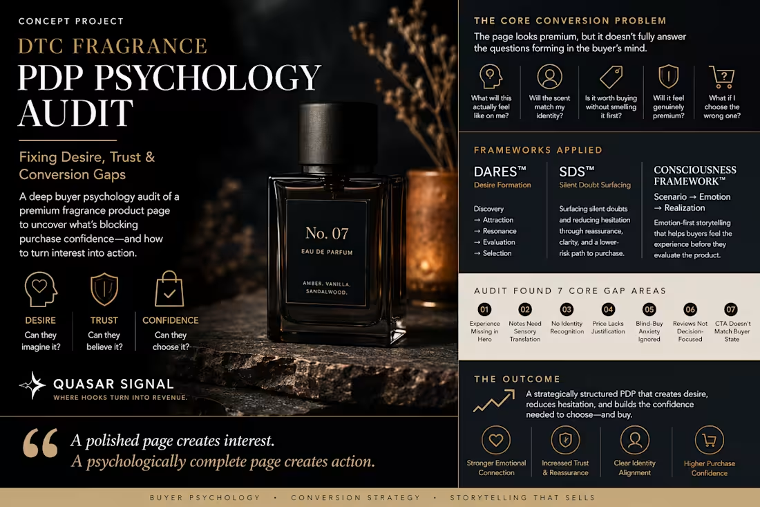
➡️DTC Fragrance PDP Psychology Audit: Fixing Desire, Trust & Conversion Gaps
💡A buyer psychology and conversion rate optimization audit for premium ecommerce product pages.
➡️Project Type: Concept Portfolio Project, DTC Ecommerce CRO, PDP Copywriting, Buyer Psychology Audit
➡️Services: Product Page Audit, Landing Page Copywriting, Conversion Strategy, Product Messaging
➡️Methods: DARES™ Desire Formation, SDS™ Silent Doubt Surfacing, Consciousness Framework™, Buyer Hesitation Mapping, Trust Diagnosis, Conversion Storytelling
➡️Project Note: This is a self-initiated concept project created to demonstrate QUASAR Signal’s strategic audit process. It does not represent a live client engagement or claim campaign performance results.
➡️The Brief
Imagine a premium DTC fragrance brand selling a warm, evening-focused eau de parfum.
The product page looks polished.
The bottle photography feels expensive.
The fragrance notes are listed clearly.
The page explains what the product contains.
But it does not fully answer the questions forming inside the buyer’s mind:
“What will this actually feel like on me?”
“Will the scent match my identity?”
“Is it worth buying without smelling it first?”
“Will it feel genuinely premium?”
“What if I choose the wrong fragrance?”
The goal of this PDP psychology audit was to identify where desire, trust, clarity, and purchase confidence break before the buyer reaches the Add to Cart button.
➡️The Core Conversion Problem
Premium product pages often look desirable without making the purchase feel safe.
That creates a gap between:
“I like this.”
and:
“I am ready to buy this.”
For fragrance, that gap is especially important because the buyer cannot smell the product through the screen.
They are being asked to purchase a sensory experience they cannot directly test.
That means the product detail page must do more than list fragrance notes and display attractive photography.
It must help the buyer:
Imagine the scent
Recognize the mood
See themselves wearing it
Understand when it fits
Trust the product quality
Reduce the risk of choosing incorrectly
The page cannot replace the physical fragrance experience.
But it can make the imagined experience vivid and the decision feel safer.
➡️Audit Overview
The product page was reviewed across four psychological conversion layers.
➡️1. Desire
Does the page create an emotional and sensory reason to want the fragrance?
➡️2. Identity
Can the buyer recognize who the fragrance is for and what wearing it says about them?
➡️3. Trust
Does the page provide enough specificity, proof, and reassurance to support the premium positioning?
➡️4. Decision Confidence
Does the page reduce uncertainty around scent profile, occasion, product fit, sampling, shipping, and returns?
➡️Frameworks Applied
This PDP psychology audit combines three QUASAR Signal systems.
💡DARES™ — Desire Formation
DARES™ structures the buyer journey through:
Discovery → Attraction → Resonance → Evaluation → Selection
It shaped the overall product page flow.
Discovery helps the fragrance earn attention.
Attraction translates the scent into an emotionally desirable experience.
Resonance helps the buyer see the fragrance as part of their identity.
Evaluation provides the logic, proof, and reassurance needed to justify the purchase.
Selection makes the final decision feel clear and low-friction.
DARES™ ensures the page does not jump directly from product introduction to purchase.
It moves the buyer progressively from noticing the fragrance to confidently choosing it.
💡SDS™ — Silent Doubt Surfacing
SDS™ was used to identify and resolve the quiet doubts that appear during a premium fragrance purchase:
“What if the scent does not suit me?”
“What if it is too sweet or overpowering?”
“What if I regret buying the full bottle?”
“What if the product feels different from how it looks online?”
Instead of using pressure, SDS™ reflects the buyer’s uncertainty and offers emotional clarity.
It informed:
The sensory fragrance description
The discovery-size option
The blind-buy reassurance
The review structure
The lower-risk path to purchase
The calm, premium tone of the copy
💡Consciousness Framework™ — Scenario, Emotion, Realization
The Consciousness Framework™ shaped the emotional storytelling throughout the PDP.
Instead of beginning with fragrance notes alone, the copy places the buyer inside recognizable moments:
Longer dinners.
Dimly lit rooms.
Quiet conversations.
The version of themselves that feels composed without trying to attract attention.
The progression becomes:
Scenario: A specific evening moment
Emotion: Quiet confidence and intimacy
Realization: This fragrance fits how I want to feel and be remembered
➡️Strategic Roles
DARES™ built the buyer journey.
SDS™ reduced the hesitation.
The Consciousness Framework™ shaped the emotional experience.
➡️Finding 01: The Hero Describes the Product, Not the Experience
Existing Direction
No. 07 Eau de Parfum
Amber. Vanilla. Sandalwood.
A sophisticated evening fragrance made for unforgettable moments.
The Problem
The copy sounds polished, but it is emotionally interchangeable.
Many premium fragrances can claim to be sophisticated.
Many can promise unforgettable moments.
The buyer still does not know:
What kind of evening this fragrance belongs to
What emotional impression it creates
Whether it feels soft, bold, intimate, mysterious, or formal
Whether it matches the version of themselves they want to express
The hero introduces the fragrance without first creating a world the buyer wants to enter.
💡Psychological Gap
The product is visible.
The identity is not.
➡️Recommended Hero Rewrite
A fragrance that stays close — and gets remembered.
Warm amber, soft vanilla, and grounded sandalwood create an intimate evening scent designed to be noticed without entering the room before you do.
For dinners that become longer conversations, dimly lit rooms, and the version of you that never needs to compete for attention.
CTA: Discover No. 07
💡Why This Works
The rewrite turns abstract sophistication into a specific emotional tone.
It gives the fragrance a clear social role:
Quiet presence instead of loud attention.
The buyer can now understand not only how the fragrance may smell, but how wearing it may feel.
➡️Finding 02: The Fragrance Notes Require Too Much Interpretation
Existing Direction
Fragrance Notes
Top: Bergamot
Heart: Vanilla and Amber
Base: Sandalwood and Musk
The Problem
A fragrance enthusiast may understand this note structure.
A less experienced buyer may not.
They can read every ingredient and still be unable to imagine the scent.
The copy provides technical clarity without sensory clarity.
Psychological Gap
The page tells the buyer what is inside the fragrance.
It does not explain what those notes become together.
➡️Recommended Rewrite
How it develops on the skin
The opening
A clean touch of bergamot gives the first spray a subtle brightness.
As it settles
Vanilla and amber soften the scent into something warm, smooth, and intimate rather than overly sweet.
What remains
Sandalwood and musk stay close to the skin, creating a grounded finish that feels calm, confident, and quietly sensual.
💡Why This Works
The buyer can now imagine the fragrance as a progression rather than a list.
The technical information remains.
But it is translated into a sensory experience.
➡️Finding 03: The Page Does Not Help the Buyer Self-Identify
The Problem
The page explains the product but does not clearly communicate who the fragrance belongs to.
Without identity cues, the buyer has to perform the positioning work themselves.
They are left wondering:
“Is this actually my kind of fragrance?”
💡Psychological Gap
The fragrance has a personality.
The buyer has not been invited to recognize themselves in it.
➡️Recommended Section
No. 07 is for you if...
You prefer presence over performance.
You want warmth without heavy sweetness.
You like fragrances that draw people closer rather than announce themselves from across the room.
You want an evening scent that feels refined, intimate, and easy to wear.
💡Why This Works
This section transforms product suitability into identity recognition.
The buyer is no longer only evaluating fragrance notes.
They are evaluating personal alignment:
“Does this sound like me?”
This is the Resonance stage of DARES™ — where the product starts becoming personally meaningful.
➡️Finding 04: The Premium Price Is Presented Without Enough Justification
The Problem
A premium price increases the buyer’s need for proof.
Beautiful packaging may create perceived value.
But it does not fully explain:
Why the formulation is different
How concentrated the fragrance is
How the scent develops
What kind of wear experience to expect
Why the product deserves its premium positioning
Without enough justification, the buyer may admire the fragrance while delaying the purchase.
💡Psychological Gap
Desire has been created.
Permission to spend has not.
➡️Recommended Value Section
Why it wears differently
No. 07 is designed as an eau de parfum with a concentrated fragrance profile that develops gradually rather than disappearing after the opening.
Each layer serves a specific role:
Bergamot creates lift.
Amber and vanilla build warmth.
Sandalwood and musk create the lasting impression.
The result is not a fragrance that reveals everything in the first five minutes.
It becomes more personal as it settles.
💡Why This Works
The price is supported through formulation logic and experience.
The buyer receives a clearer reason to believe that the product offers more than attractive packaging.
This supports the Evaluation stage of DARES™.
➡️Finding 05: Blind-Buy Anxiety Is Not Addressed
The Problem
The largest hesitation may not be the price.
It may be the fear of buying the wrong fragrance without smelling it first.
If the page ignores that fear, the buyer carries it all the way to checkout.
Common internal doubts include:
“What if it is too sweet?”
“What if it is overpowering?”
“What if it smells different on me?”
“What if I regret buying the full bottle?”
💡Psychological Gap
The brand is asking for commitment without acknowledging the risk.
➡️Recommended Reassurance Section
Unsure about choosing a fragrance online?
No. 07 is warm, woody, and softly sweet.
It is not designed to be sharp, heavily floral, or aggressively projecting.
For a lower-risk first experience, begin with the discovery size before committing to the full bottle.
Your discovery-size purchase can be credited toward a full-size order within 30 days.
💡Why This Works
The copy does not pretend the uncertainty does not exist.
It names the hesitation and gives the buyer a safer next step.
This is SDS™ in action.
The brand earns trust by acknowledging the private doubt instead of pushing past it.
➡️Finding 06: Reviews Are Present but Not Strategically Organized
The Problem
Generic five-star reviews provide social proof.
But they may not answer the buyer’s most important questions.
A review saying “I love it” is emotionally positive but strategically weak.
The most useful fragrance reviews clarify:
Perceived sweetness
Strength and projection
Longevity
Wear occasion
Compliments
Scent family
Whether the buyer would purchase again
💡Psychological Gap
The page has praise.
It lacks decision-supporting proof.
➡️Recommended Review Filters
Allow buyers to explore reviews by:
Scent profile
Warm, woody, sweet, fresh
Wear occasion
Daily, evening, date night, special occasion
Projection
Close to skin, moderate, noticeable
Buyer experience
First fragrance, fragrance collector, gift purchase
Recommended Review Prompt
When requesting a review, ask:
How would you describe the scent?
When do you wear it?
How strong does it feel?
How did it develop over time?
Would you purchase it again?
💡Why This Works
The reviews become part of the decision architecture.
They do not merely prove that people liked the fragrance.
They help the next buyer predict whether they will like it too.
➡️Finding 07: The CTA Does Not Reflect the Buyer’s State
Existing CTA
Add to Cart
💡The Problem
The CTA is functional but emotionally disconnected from the positioning.
For a familiar or low-risk product, that may be enough.
For a premium sensory purchase, the buyer may need a softer progression.
➡️Recommended CTA System
Primary CTA
Choose Your Size
Secondary CTA
Try the Discovery Size
Supporting Microcopy
Complimentary shipping on full-size orders.
Discovery-size credit available toward the full bottle.
Secure checkout and straightforward returns.
💡Why This Works
The decision is broken into manageable steps.
The buyer does not feel forced into an all-or-nothing commitment.
This supports the Selection stage of DARES™ while reducing silent hesitation through SDS™.
➡️Recommended PDP Structure
1. Experience-Led Hero
Create the emotional world before explaining the product.
2. Sensory Fragrance Journey
Translate technical notes into an experience the buyer can imagine.
3. Identity Recognition
Help the buyer understand who the fragrance is for.
4. Product Proof
Explain concentration, formulation, wear, and quality.
5. Occasion and Styling Context
Show where the fragrance fits inside the buyer’s life.
6. Blind-Buy Reassurance
Address uncertainty and provide a lower-risk path.
7. Decision-Supporting Reviews
Organize social proof around real buyer questions.
8. Clear Purchase Options
Make size, sampling, shipping, and returns easy to understand.
9. Final Emotional CTA
Reconnect the decision to the identity and feeling introduced at the top.
➡️Final Closing Section
Quiet enough to feel personal. Distinct enough to be remembered.
No. 07 was created for the moments that do not need an audience to matter.
Choose the full bottle or begin with the discovery size.
Primary CTA: Choose Your Size
Secondary CTA: Try No. 07 First
💡Before vs. After
➡️Before
The page presents:
Attractive bottle photography
A polished product name
A list of fragrance notes
General luxury language
A standard Add to Cart button
➡️After
The page creates:
A distinct emotional world
Clear sensory imagination
Buyer identity recognition
Premium price justification
Blind-buy reassurance
Decision-supporting social proof
A lower-risk path to purchase
The redesign does not simply add more copy.
It gives every section a psychological job.
➡️Funnel Applications
Top of Funnel
Use the emotional world and identity positioning in:
Paid social ads
Meta creative
UGC openings
Fragrance storytelling hooks
Founder-led content
The goal is to create Discovery and Attraction.
➡️Middle of Funnel
Use sensory storytelling, occasion-based messaging, and identity recognition in:
Landing pages
Advertorials
Email campaigns
Product education
Retargeting ads
The goal is to build Resonance.
➡️Bottom of Funnel
Use product proof, review filters, sampling options, reassurance, and clear CTAs in:
Product detail pages
Comparison sections
FAQ sections
Checkout-adjacent copy
Final decision messaging
The goal is to support Evaluation and Selection.
➡️What This Project Demonstrates👇
This concept project shows how QUASAR Signal audits a DTC product page beyond surface-level design.
The focus is not only:
“Is the page attractive?”
The deeper questions are:
“Does the buyer understand the product?”
“Can they imagine the experience?”
“Do they see themselves in it?”
“Do they trust the premium positioning?”
“Has the page addressed the reason they may delay?”
“Does the next step feel safe?”
A strong PDP does not only display the product.
It moves the buyer from curiosity to desire, from desire to confidence, and from confidence to action.
➡️Client Takeaway
A polished product page can still leave the buyer psychologically unsupported.
More traffic cannot fix a message that creates interest without confidence.
The role of conversion-focused PDP copy is to close the gaps between:
Seeing and imagining.
Wanting and trusting.
Considering and choosing.
QUASAR Signal identifies those gaps and turns them into clearer product positioning, stronger landing page copy, sharper reassurance, and a more natural path to purchase.
Because the strongest product pages do not just make the product look valuable.
They help the buyer feel confident enough to choose it.
QUASAR Signal
Buyer Psychology & Conversion Storytelling for DTC Brands.
Where hooks turn into revenue.
0
58