

QART | Art Gallery & Design Studio
1
4
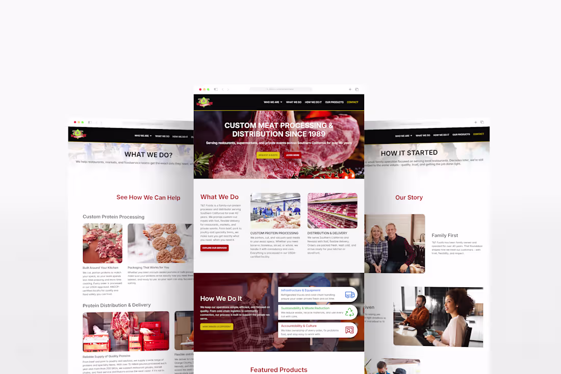
T&T Foods, Inc is a family owned USDA certified meat processor and distributor in Vernon, California, with 40 plus years serving supermarkets, restaurants, and private clients across the West Coast. The redesign introduced a clean, responsive layout with streamlined navigation, clearer storytelling around legacy and operations, and focused sections for services, products, and contact. Product forward visuals and strategic calls to action now guide visitors toward inquiries and quotes, turning the site into a modern, conversion ready hub for B2B and customer outreach.
Check out the full work: T&T Foods, Inc | QART (https://qart.gallery/studio/ttfoods)
1
245
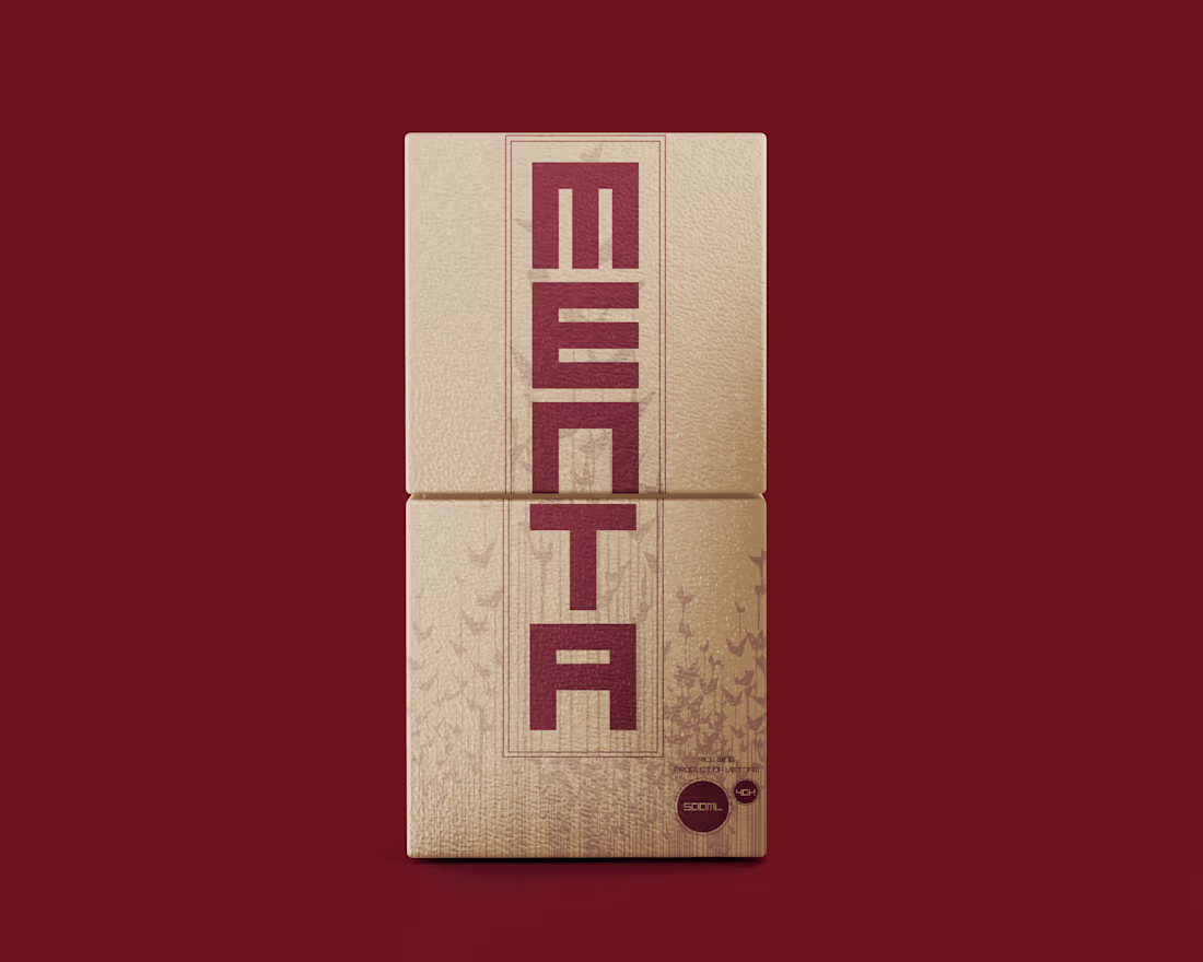
The design of Menta blends elements of heritage and modern minimalism, capturing a balance between tradition and functionality. With a carefully selected palette, the brand communicates earthy warmth and natural simplicity. The typography takes inspiration from the Vietnamese Nom script, reinterpreted with clean geometric lines that align with contemporary aesthetics. Packaging choices, from vertical layouts to bottle forms, emphasize craftsmanship and purpose, reflecting a product deeply rooted in natural heritage while being adaptable to modern markets. Every design decision contributes to the brand narrative - minimalism grounded in tradition, where each product serves as both a symbol of heritage and a modern lifestyle essential.
Check out the full work: MENTA | QART (https://qart.gallery/studio/menta)
1
14
360
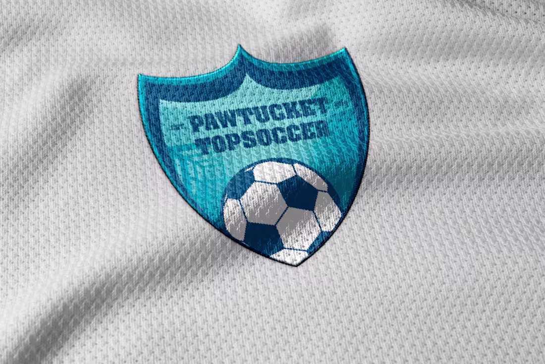
Pawtucket TOPSoccer’s new logo reflects who they are - bold, inclusive, and rooted in community. The refreshed design captures the energy of its players, the pride of its city, and the program’s commitment to accessible soccer for all. With a clean, modern shield and a dynamic soccer ball at its core, the identity stands for connection, movement, and belonging.
Check out the full work: Pawtucket TOPSoccer | QART (https://qart.gallery/studio/topsoccer)
14
360
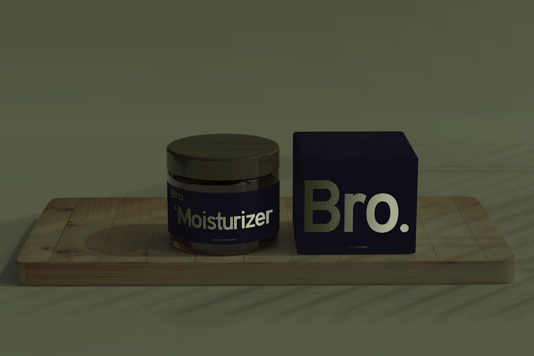
Bro. started with a focus on sun protection, evolving from BroSPF into a brand that embraces the full spectrum of men’s skincare. The design speaks to simplicity and boldness, with clean lines, functional layouts, and a color palette rooted in deep tones for timeless appeal. Every element reflects precision - from the typography that ensures clarity and recognition, to the packaging designed for effortless use. Bro. is more than a skincare brand; it’s a seamless blend of form and function, where each product is introduced with purpose, beginning with sun care as the gateway to a complete skincare journey.
Check out the full work: Bro.SPF | QART (https://qart.gallery/studio/bro)
2
25
443
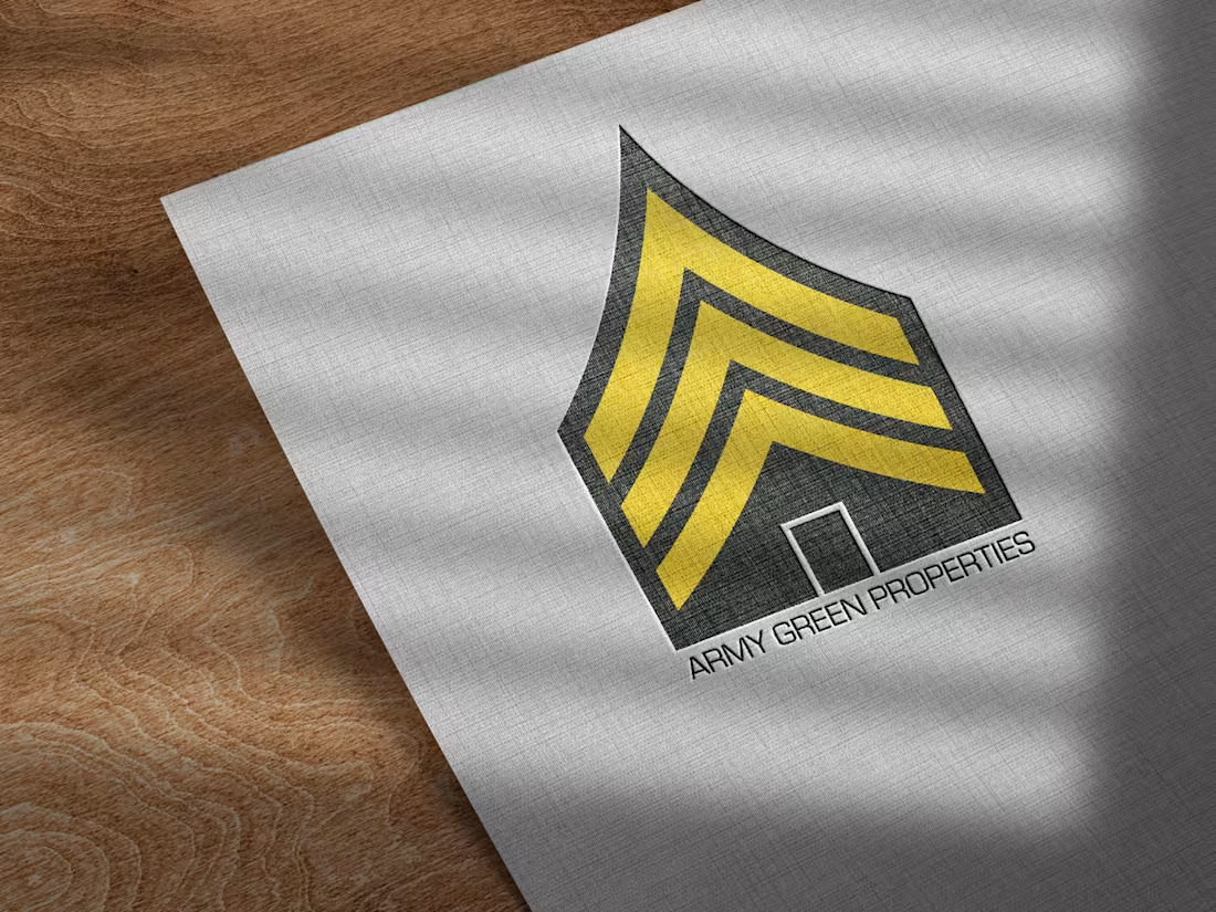
Army Green Properties is inspired by its military owner's resilience and commitment to community. The brand's visual identity emphasizes strength, simplicity, and trust, aligning with the discipline of the U.S. Army. This project goes beyond real estate, focusing on building communities rooted in strength and integrity.
Check out the full work: Army Green Properties | QART (https://qart.gallery/studio/army-green-properties)
2
283