
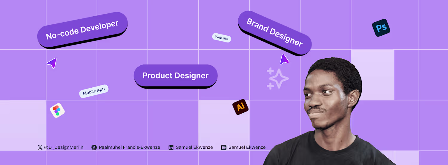
Samuel Ekwenze
Top-tier Figma Designer Expert | Web and Mobile Designer
Profile in progress
Samuel is building their profile!
𝗗𝗮𝘆 𝟯𝟭 𝗼𝗳 𝗿𝗲-𝗹𝗲𝗮𝗿𝗻𝗶𝗻𝗴 𝗳𝗿𝗮𝗺𝗲𝗿 𝘂𝗻𝘁𝗶𝗹 𝗶 𝗴𝗲𝘁 𝗺𝘆 𝗳𝗶𝗿𝘀𝘁 𝗴𝗶𝗴
Today I recreated a smooth scroll slider animation inspired by a Cycloto tutorial.
Over the last 31 days I explored:
• Scroll interactions
• 3D effects
• Micro-interactions
• Reusable components
• Advanced motion design
This challenge pushed me to consistently build, experiment, and improve my workflow in Framer.
Looking forward to applying these interaction patterns to real client projects.
0
30
𝐃𝐚𝐲 𝟑𝟎 𝐨𝐟 𝐫𝐞-𝐥𝐞𝐚𝐫𝐧𝐢𝐧𝐠 𝐟𝐫𝐚𝐦𝐞𝐫 𝐮𝐧𝐭𝐢𝐥 𝐢 𝐠𝐞𝐭 𝐦𝐲 𝐟𝐢𝐫𝐬𝐭 𝐠𝐢𝐠
Today I created a smooth horizontal scroll slider interaction to present content in a more engaging way.
This pattern helps:
• Highlight featured content
• Improve storytelling on long pages
• Add a premium interactive feel
Exploring how motion and layout can work together to create better web experiences.
0
40
𝗗𝗮𝘆 𝟮𝟵 𝗼𝗳 𝗿𝗲-𝗹𝗲𝗮𝗿𝗻𝗶𝗻𝗴 𝗳𝗿𝗮𝗺𝗲𝗿 𝘂𝗻𝘁𝗶𝗹 𝗶 𝗴𝗲𝘁 𝗺𝘆 𝗳𝗶𝗿𝘀𝘁 𝗴𝗶𝗴
Today I created a mouse hover background reveal interaction to make sections more interactive and engaging.
This type of interaction helps:
• Improve visual feedback
• Encourage user exploration
• Create a more immersive browsing experience
Subtle motion and interaction like this can significantly elevate a website’s perceived quality.
Still refining my motion design workflow.
0
39
𝗗𝗮𝘆 𝟮𝟴 𝗼𝗳 𝗿𝗲-𝗹𝗲𝗮𝗿𝗻𝗶𝗻𝗴 𝗳𝗿𝗮𝗺𝗲𝗿 𝘂𝗻𝘁𝗶𝗹 𝗶 𝗴𝗲𝘁 𝗺𝘆 𝗳𝗶𝗿𝘀𝘁 𝗴𝗶𝗴
Today I recreated the Apple-inspired liquid glass effect using the Workshop plugin.
This style helps:
• Create depth through transparency
• Add a modern, premium visual layer
• Enhance UI hierarchy when used correctly
But it requires strong control to avoid visual clutter.
Still refining how I apply advanced UI effects in real-world projects.
0
55
𝗗𝗮𝘆 𝟮𝟳 𝗼𝗳 𝗿𝗲-𝗹𝗲𝗮𝗿𝗻𝗶𝗻𝗴 𝗳𝗿𝗮𝗺𝗲𝗿 𝘂𝗻𝘁𝗶𝗹 𝗶 𝗴𝗲𝘁 𝗺𝘆 𝗳𝗶𝗿𝘀𝘁 𝗴𝗶𝗴
Today I used the Workshop plugin to create a reusable image slider component.
This approach helps:
• Speed up development
• Maintain design consistency
• Build scalable systems for client projects
Moving beyond one-off designs into component-driven workflows is key for delivering high-quality, efficient web experiences.
Still refining my process.
0
33
𝐃𝐚𝐲 𝟐𝟔 𝐨𝐟 𝐫𝐞-𝐥𝐞𝐚𝐫𝐧𝐢𝐧𝐠 𝐟𝐫𝐚𝐦𝐞𝐫 𝐮𝐧𝐭𝐢𝐥 𝐢 𝐠𝐞𝐭 𝐦𝐲 𝐟𝐢𝐫𝐬𝐭 𝐠𝐢𝐠
Today I created a smooth image scroll animation to improve visual flow and user experience.
This helps:
• Create seamless transitions
• Improve content engagement
• Add a refined, premium feel
Subtle motion like this is what elevates a website from basic to high-quality interactive design.
Still refining my motion workflow for real-world projects.
0
28
𝗗𝗮𝘆 𝟮𝟱 𝗼𝗳 𝗿𝗲-𝗹𝗲𝗮𝗿𝗻𝗶𝗻𝗴 𝗳𝗿𝗮𝗺𝗲𝗿 𝘂𝗻𝘁𝗶𝗹 𝗶 𝗴𝗲𝘁 𝗺𝘆 𝗳𝗶𝗿𝘀𝘁 𝗴𝗶𝗴
Today I created a hover image gallery effect using variants to make content more interactive and dynamic.
This approach helps:
• Improve user engagement
• Create smooth state transitions
• Build scalable interaction systems
Using variants properly turns simple components into flexible, high-quality UI systems.
Still refining my workflow for building better interactive experiences.
0
28
𝐃𝐚𝐲 𝟐𝟒 𝐨𝐟 𝐫𝐞𝐥𝐞𝐚𝐫𝐧𝐢𝐧𝐠 𝐟𝐫𝐚𝐦𝐞𝐫 𝐮𝐧𝐭𝐢𝐥 𝐢 𝐠𝐞𝐭 𝐦𝐲 𝐟𝐢𝐫𝐬𝐭 𝐠𝐢𝐠
Today I created a 3D rotation carousel animation to present content in a more engaging and interactive way.
This approach helps:
• Add depth and visual interest
• Improve content exploration
• Create a more modern, premium feel
When done right, it turns a basic carousel into a strong interactive component.
Still refining how I use motion to enhance real-world web experiences.
0
20
Today I worked on a modern 3D hover tilt interaction to enhance user engagement and visual feedback.
This kind of micro-interaction helps:
• Improve interactivity
• Add depth to UI elements
• Create a more premium feel
When used properly, it elevates simple components into high-quality interactive experiences.
Still refining motion and interaction for real-world projects.
0
26
𝗗𝗮𝘆 𝟮𝟭 𝗼𝗳 𝗿𝗲-𝗹𝗲𝗮𝗿𝗻𝗶𝗻𝗴 𝗳𝗿𝗮𝗺𝗲𝗿 𝘂𝗻𝘁𝗶𝗹 𝗶 𝗴𝗲𝘁 𝗺𝘆 𝗳𝗶𝗿𝘀𝘁 𝗴𝗶𝗴
Today I worked on a 3D parallax scroll animation to create more depth and engagement in web layouts.
This technique helps:
• Add visual hierarchy
• Guide user attention
• Create a more immersive experience
Used properly, it elevates a website from basic to premium interactive design.
Continuing to refine motion and interaction for real-world client projects.
0
29
𝗗𝗮𝘆 𝟮𝟬 𝗼𝗳 𝗿𝗲-𝗹𝗲𝗮𝗿𝗻𝗶𝗻𝗴 𝗳𝗿𝗮𝗺𝗲𝗿 𝘂𝗻𝘁𝗶𝗹 𝗶 𝗴𝗲𝘁 𝗺𝘆 𝗳𝗶𝗿𝘀𝘁 𝗴𝗶𝗴
Today I worked on a 3D rotating text cube animation, focusing on scroll transform, depth, and perspective.
This kind of interaction adds:
• Visual depth
• Stronger engagement
• A more modern, premium feel
But it only works when it’s intentional and performance-conscious.
Continuing to refine how I use motion to create high-quality, interactive web experiences for real-world projects.
0
57
𝐃𝐚𝐲 𝟏𝟗 𝐨𝐟 𝐫𝐞-𝐥𝐞𝐚𝐫𝐧𝐢𝐧𝐠 𝐟𝐫𝐚𝐦𝐞𝐫 𝐮𝐧𝐭𝐢𝐥 𝐢 𝐠𝐞𝐭 𝐦𝐲 𝐟𝐢𝐫𝐬𝐭 𝐠𝐢𝐠
Today I explored sticky scroll animations using scroll transform to create more controlled and engaging layouts.
This approach helps:
• Guide user attention
• Improve content flow
• Add depth without clutter
For client projects, these details make the difference between a basic site and a premium interactive experience.
Still refining my motion workflow to build better, more engaging websites.
0
30
𝐃𝐚𝐲 𝟏𝟖 𝐨𝐟 𝐫𝐞-𝐥𝐞𝐚𝐫𝐧𝐢𝐧𝐠 𝐟𝐫𝐚𝐦𝐞𝐫
Today I worked on a text cycle animation using the looping method. I created a smooth text transition that loops through key messages without breaking the flow of the page.
What I’m learning is this:
You don’t always need complex visuals to grab attention. Sometimes, well-timed text motion does the job better.
It keeps the interface dynamic.
It communicates more in less space.
It guides the user without overwhelming them.
This is the kind of detail that makes a website feel intentional and alive.
Still building. Still refining.
1
62
𝗗𝗮𝘆 𝟭𝟳 𝗼𝗳 𝗿𝗲-𝗹𝗲𝗮𝗿𝗻𝗶𝗻𝗴 𝗳𝗿𝗮𝗺𝗲𝗿 𝘂𝗻𝘁𝗶𝗹 𝗶 𝗴𝗲𝘁 𝗺𝘆 𝗳𝗶𝗿𝘀𝘁 𝗴𝗶𝗴
Today I built a hover image slider animation. As you hover, images slide smoothly, creating a more interactive and engaging way to explore content.
Still building. Still refining.
2
4
134
𝗗𝗮𝘆 𝟭𝟲 𝗼𝗳 𝗿𝗲-𝗹𝗲𝗮𝗿𝗻𝗶𝗻𝗴 𝗳𝗿𝗮𝗺𝗲𝗿 𝘂𝗻𝘁𝗶𝗹 𝗶 𝗴𝗲𝘁 𝗺𝘆 𝗳𝗶𝗿𝘀𝘁 𝗴𝗶𝗴
Today I took a slightly different turn.
Instead of regular animations, I experimented with scroll-based image and text reveal using variants.
As the user scrolls, the content gradually reveals itself, creating a more interactive storytelling experience.
What I’m discovering is that scroll interactions can do more than decorate a page. They can control pacing. They decide when the user sees information and how the story unfolds.
Little by little, this challenge is helping me think less like someone designing static pages and more like someone designing experiences.
Still building. Still experimenting.
0
33
𝗗𝗮𝘆 𝟭𝟱 𝗼𝗳 𝗿𝗲-𝗹𝗲𝗮𝗿𝗻𝗶𝗻𝗴 𝗳𝗿𝗮𝗺𝗲𝗿 𝘂𝗻𝘁𝗶𝗹 𝗶 𝗴𝗲𝘁 𝗺𝘆 𝗳𝗶𝗿𝘀𝘁 𝗴𝗶𝗴
Today I built a hover preview image animation.
When you hover on an element, a preview image smoothly appears.
Simple interaction… but it makes the website feel alive.
Small details like this are what turn a normal website into a premium experience.
Still building every day.
Design → Build → Improve.
1
53
𝐃𝐚𝐲 𝟏𝟒 𝐨𝐟 𝐫𝐞-𝐥𝐞𝐚𝐫𝐧𝐢𝐧𝐠 𝐟𝐫𝐚𝐦𝐞𝐫
Today I experimented with a horizontal smooth scroll animation.
The goal was to make content move naturally as users navigate across sections, instead of feeling abrupt or static.
What I learned:
• Smooth horizontal movement helps guide attention
• Transitions make the interface feel more fluid
• Small motion details improve the overall experience
Animations are not just for aesthetics. They help users understand where they are and where they are going.
Still learning.
Still refining.
1
37
𝗗𝗮𝘆 𝟭𝟯 𝗼𝗳 𝗿𝗲-𝗹𝗲𝗮𝗿𝗻𝗶𝗻𝗴 𝗳𝗿𝗮𝗺𝗲𝗿 𝘂𝗻𝘁𝗶𝗹 𝗶 𝗴𝗲𝘁 𝗺𝘆 𝗳𝗶𝗿𝘀𝘁 𝗴𝗶𝗴
In order to get more grounded in framer, I focused on optimization for different screens. A website might look perfect on desktop, but the real test is how it behaves on tablet and mobile.
So today was about refining:
• Breakpoints
• Spacing adjustments
• Section behavior across screens
• Text readability on smaller devices
• Keeping animations smooth across layouts
Because great websites aren’t just designed for one screen. They’re designed for every screen.
Still building. Still improving.
1
37
𝗗𝗮𝘆 𝟭𝟮 𝗼𝗳 𝗿𝗲-𝗹𝗲𝗮𝗿𝗻𝗶𝗻𝗴 𝗳𝗿𝗮𝗺𝗲𝗿 𝘂𝗻𝘁𝗶𝗹 𝗶 𝗴𝗲𝘁 𝗺𝘆 𝗳𝗶𝗿𝘀𝘁 𝗴𝗶𝗴
Still exploring scroll animations today.
I focused on refining how elements appear and move as users scroll through the page making the transitions feel smoother and more natural.
One thing I’m realizing is that good scroll animation isn’t about doing too much. It’s about timing, subtlety, and guiding attention.
The goal is simple: Make the experience feel smooth without the user even noticing the effort behind it.
Still building. Still refining.
1
39
𝐃𝐚𝐲 𝟏𝟏 𝐨𝐟 𝐫𝐞-𝐥𝐞𝐚𝐫𝐧𝐢𝐧𝐠 𝐟𝐫𝐚𝐦𝐞𝐫 𝐮𝐧𝐭𝐢𝐥 𝐢 𝐠𝐞𝐭 𝐦𝐲 𝐟𝐢𝐫𝐬𝐭 𝐠𝐢𝐠
Today’s focus was scroll animations.
I experimented with how elements appear and move as users scroll through a page, making the experience feel smoother and more engaging.
What I’m learning is that scroll animations shouldn’t just look cool. They should guide attention and support the story of the page.
Little by little, these details are helping me understand how to make websites feel more alive and premium.
Still building. Still learning.
0
67
𝐃𝐚𝐲 𝟏𝟎 𝐨𝐟 𝐫𝐞-𝐥𝐞𝐚𝐫𝐧𝐢𝐧𝐠 𝐟𝐫𝐚𝐦𝐞𝐫 𝐮𝐧𝐭𝐢𝐥 𝐢 𝐠𝐞𝐭 𝐦𝐲 𝐟𝐢𝐫𝐬𝐭 𝐠𝐢𝐠
Still deep in the world of micro-interactions.
Today I built a checkbox animation, a small interaction, but one that makes a big difference in how an interface feels.
Instead of a static check, I added motion so the action feels responsive and satisfying.
When a user clicks something, the interface should respond in a way that feels alive.
Still learning. Still refining the details.
0
31
𝗗𝗮𝘆 𝟵 𝗼𝗳 𝗿𝗲-𝗹𝗲𝗮𝗿𝗻𝗶𝗻𝗴 𝗳𝗿𝗮𝗺𝗲𝗿 𝘂𝗻𝘁𝗶𝗹 𝗶 𝗴𝗲𝘁 𝗺𝘆 𝗳𝗶𝗿𝘀𝘁 𝗴𝗶𝗴
Today I focused on icon animations and experimented with creating a signature animation using the pen tool.
It’s one of those small details that can instantly make a website feel more personal and premium.
This challenge keeps teaching me that the difference between a normal website and a great one often comes down to motion and tiny interactions.
Still building. Still learning.
0
50
𝗗𝗮𝘆 𝟴 𝗼𝗳 𝗿𝗲-𝗹𝗲𝗮𝗿𝗻𝗶𝗻𝗴 𝗳𝗿𝗮𝗺𝗲𝗿 𝘂𝗻𝘁𝗶𝗹 𝗶 𝗴𝗲𝘁 𝗺𝘆 𝗳𝗶𝗿𝘀𝘁 𝗴𝗶𝗴
Happy Sunday!
Today I focused on icon animation.
I animated a progress stepper from start to finish and recorded the whole process.
What looked like a small element actually took a lot of thinking:
How the icon transitions
How the progress flows
How the motion feels natural
These tiny details are what make interfaces feel alive and premium.
Still building. Still learning.
0
49
𝐃𝐚𝐲 𝟕 𝐨𝐟 𝐫𝐞-𝐥𝐞𝐚𝐫𝐧𝐢𝐧𝐠 𝐟𝐫𝐚𝐦𝐞𝐫 𝐮𝐧𝐭𝐢𝐥 𝐢 𝐠𝐞𝐭 𝐦𝐲 𝐟𝐢𝐫𝐬𝐭 𝐠𝐢𝐠
I’ve been learning how to properly design landing pages the past few days. Today I focused on micro-interactions and animations to give the site a more premium feel.
Small things like hover effects, smooth entrances, and subtle motion.
Turns out the difference between an average site and a premium one… is usually the little details.
Still building. Still learning.
#BuildInPublic (https://x.com/hashtag/BuildInPublic?src=hashtag_click) #Framer (https://x.com/hashtag/Framer?src=hashtag_click) #NoCode (https://x.com/hashtag/NoCode?src=hashtag_click) #WebDesign (https://x.com/hashtag/WebDesign?src=hashtag_click)
0
52
𝗗𝗮𝘆 𝟲 𝗼𝗳 𝗿𝗲-𝗹𝗲𝗮𝗿𝗻𝗶𝗻𝗴 𝗳𝗿𝗮𝗺𝗲𝗿 𝘂𝗻𝘁𝗶𝗹 𝗶 𝗴𝗲𝘁 𝗺𝘆 𝗳𝗶𝗿𝘀𝘁 𝗴𝗶𝗴
Continuation from yesterday’s build.
Day 5 was about laying the foundation - Navbar, hero section, and the first subsection.
Today was about expansion and structure.
I focused on building out more subsections, pushing deeper into advanced CMS integration, and working with layout templates to make the system scalable. Then I wrapped it up by structuring the footer to tie the entire page together.
What looked like “just adding sections” was actually deeper work:
• Making subsections reusable
• Structuring CMS collections properly
• Ensuring layouts stay responsive
• Keeping animations consistent across sections
Day 6 done. The goal isn’t perfection. The goal is compounding skill, one build at a time.
2
65
𝗗𝗮𝘆 𝟓 𝗼𝗳 𝗹𝗲𝗮𝗿𝗻𝗶𝗻𝗴 𝗳𝗿𝗮𝗺𝗲𝗿 𝘂𝗻𝘁𝗶𝗹 𝗶 𝗴𝗲𝘁 𝗺𝘆 𝗳𝗶𝗿𝘀𝘁 𝗴𝗶𝗴
Today wasn’t about skill. It was about resolve. I tested myself by building completely from scratch a framer template from Framer Marketplace. No YouTube, No step-by-step walkthrough, because if I’m serious about building Framer templates from scratch, I can’t always rely on someone else’s thinking.
This is a 2-part series.
Part 1: • Navbar • Hero section •
First subsection I used component templates strategically for the header (thinking systems, not just visuals). Then layered in effects like ticker and slideshow.
Part 1 done.
Part 2, we add the other subsections, and footer.
1
57
𝗗𝗮𝘆 𝟰 𝗼𝗳 𝗿𝗲-𝗹𝗲𝗮𝗿𝗻𝗶𝗻𝗴 𝗳𝗿𝗮𝗺𝗲𝗿
Today, I still continued with my framer journey by starting from a blank canvas. Followed along the tutorial on YT. The focus was on building an animated, fully responsive website from scratch, making sure:
• Breakpoints actually made sense
• Sections flowed naturally
• Animations felt purposeful
• Layout held up across devices
• Nothing broke under resize
Starting from a blank canvas exposes your real understanding. Every day I build, I feel my thinking getting sharper.
Less guessing.
More intention.
More control.
If you can design it and build it, you think differently.
Day 4 complete.
We’re not stopping.
2
3
232
𝐃𝐚𝐲 𝟑 𝐨𝐟 𝐫𝐞-𝐥𝐞𝐚𝐫𝐧𝐢𝐧𝐠 𝐅𝐫𝐚𝐦𝐞𝐫
Today, I built a high-level animated hero section.
Not just something that “moves” but something that feels intentional.
I used effects components from Framer University and pushed them further:
• Layered entrance animations
• Staggered text reveals
• Subtle parallax movement
• Smooth easing curves
• Scroll-triggered transitions
Day 3 done. We keep building till i land my first framer gig!
1
67
𝐃𝐚𝐲 𝟐 𝐨𝐟 𝐫𝐞-𝐥𝐞𝐚𝐫𝐧𝐢𝐧𝐠 𝐅𝐫𝐚𝐦𝐞𝐫
Today wasn’t about colors.
It wasn’t about fancy hero sections.
It was about structure.
Setting up proper breakpoints.
Defining clean sections.
Thinking responsive before thinking beautiful.
Because here’s what most designers won’t admit:
If your structure is weak, your design will collapse under pressure.
2
116
I’m starting a Framer building challenge.
Not for clout.
Not for content.
But to stretch myself.
So for the next few weeks, I’m building consistently in Framer.
No-code isn’t a trend anymore.
It’s becoming part of a designer’s lifestyle.
The ability to:
• Design the idea
• Prototype the interaction
• Publish the live site
• Iterate instantly
𝘏𝘦𝘳𝘦'𝘴 𝘵𝘰 𝘋𝘢𝘺 1 𝘰𝘧 𝘳𝘦𝘭𝘦𝘢𝘳𝘯𝘪𝘯𝘨 𝘧𝘳𝘢𝘮𝘦𝘳.
I dived deep into the basics, styling, components, Z index, responsiveness and animations. This was a playful design to re-boost my knowledge in designing from scratch without using templates.
2
71
I vibecoded an AI smart scheduler that can help accounting firms consultants schedule task and make it easy for people to see their task, used Figma and Figma make to ship from design to code. The future is AI
#AIcapcutchallenge #maxearnings #aidesignflows #aivideos
2
120
I created an "how it works" section container for a US based immigration company website, and animated it on Jitter, this bringing the design to live. Subtle entrance. Soft easing.
No overdesign, just smooth storytelling through motion. Kindly share your feedback. Thanks.
2
101
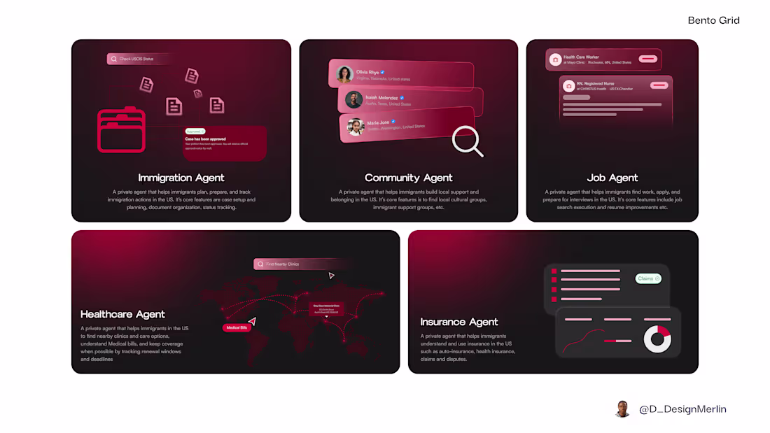
Designed a bento grid for AI based start-up that deals with AI Agents to help navigate your journey as an immigrant in the United States.
Actively seeking gigs and open for collaboration. 🔥
4
3
285
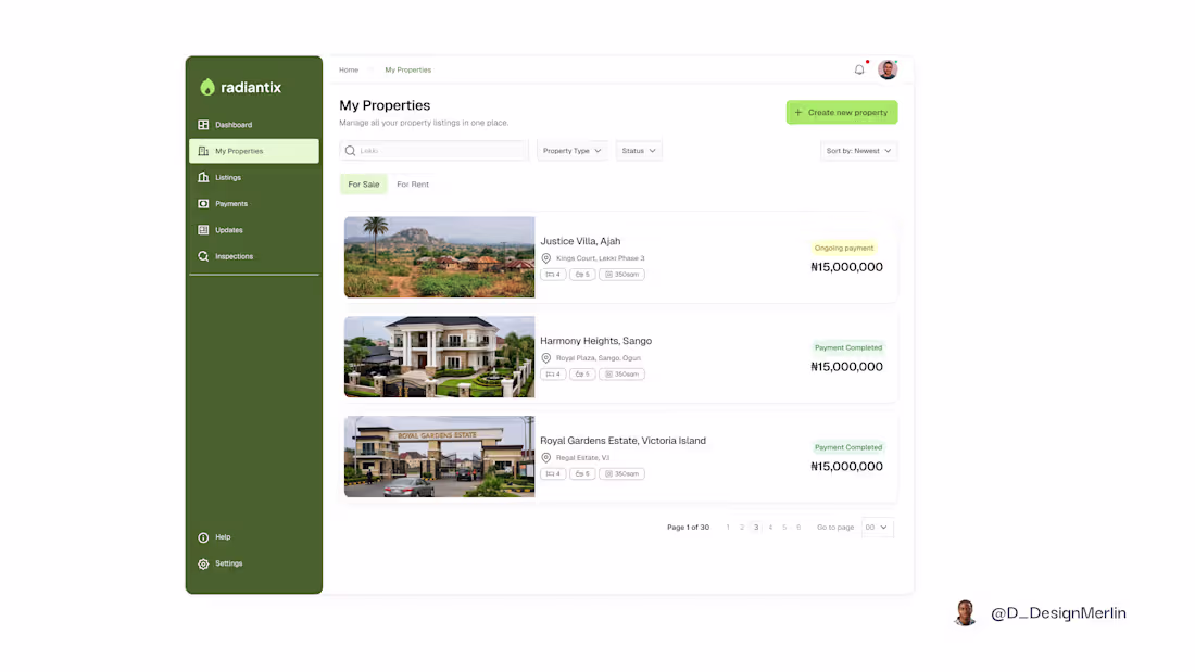
Deigned a real estate properties page where clarity does the selling.
No clutter.
No visual noise.
No “look-at-me” UI.
Just:
• Clean layouts
• Clear hierarchy
• Properties that feel easy to scan, compare, and trust
Open to collaborations, partnerships, and interesting product work.
#Contra #BuiltOnContra #DesignOnContra #ProductDesign #UXDesign #UIDesign #DesignSystems #StartupDesign #WebDesign #CreativeCollaboration #whennotai #feelsreal #asciidreams
2
79
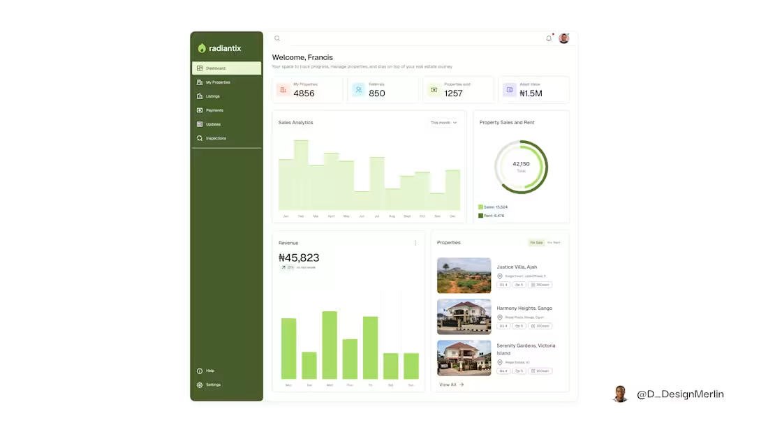
I explored designing a real estate agent dashboard where agents can track their property listings, manage sales and revenue. It was well thought out layout.
I'm actively looking to collaborate, and open for freelance gigs. I deliver 100%
#clienttips #whennotai #figma #buildinpublic
0
72
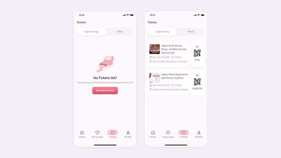
Currently building an event app, here is a snapshot of the event tickets page
0
94
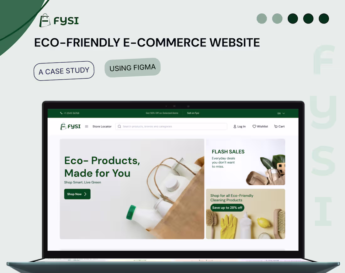
Fysi E-commerce(Eco-friendly) Website
0
2
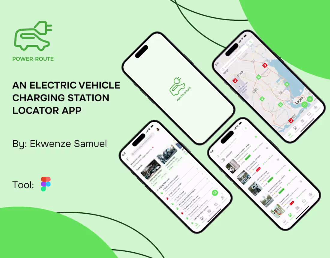
POWER-ROUTE EV CHARGING STATION LOCATOR APP
0
0

FundPath Crowdfunding App
0
0

Roamify Travels | Logo and Brand Identity
0
0