The network for creativity
Join 1.25M professional creatives like you
Connect with clients, get discovered, and run your business 100% commission-free
Creatives on Contra have earned over $150M and we are just getting started
Back to feedPost

𝐃𝐚𝐲 𝟑𝟎 𝐨𝐟 𝐫𝐞-𝐥𝐞𝐚𝐫𝐧𝐢𝐧𝐠 𝐟𝐫𝐚𝐦𝐞𝐫 𝐮𝐧𝐭𝐢𝐥 𝐢 𝐠𝐞𝐭 𝐦𝐲 𝐟𝐢𝐫𝐬𝐭 𝐠𝐢𝐠
Today I created a smooth horizontal scroll slider interaction to present content in a more engaging way.
This pattern helps:
• Highlight featured content
• Improve storytelling on long pages
• Add a premium interactive feel
Exploring how motion and layout can work together to create better web experiences.

The network for creativity
Join 1.25M professional creatives like you
Connect with clients, get discovered, and run your business 100% commission-free
Creatives on Contra have earned over $150M and we are just getting started







Related posts


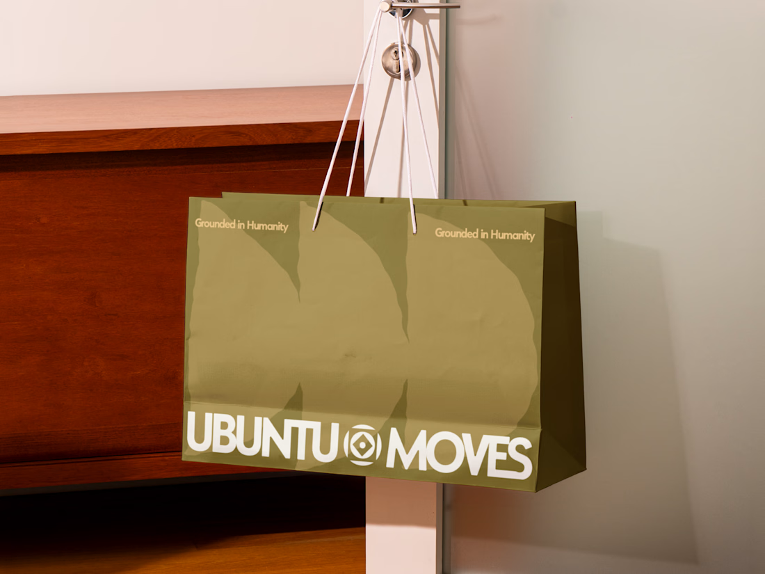
Grounded in humanity, made for movement.
Packaging and custom Framer website design for Ubuntu Moves, a wellness brand inspired by the belief that “I am because we are.”
Earthy colors, expressive patterns, and bold typography bring its sense of connection into the physical and digital experience.
Thanks @Can Girgin for the Framer development💫


The olive shopping bag with the wordmark split around that circular emblem looks great in the warm light, and the big tonal arches printed behind it add movement without shouting.



Visual identity revision for a psychology and management consulting firm


handsome works! anyway did you use any ai to generate mockups on that? or you did manual

Free FAQ Accordion Component - Smooth & Fully Customizable ⚡️
Just dropped my first interactive component on the Framer Marketplace!
I built this FAQ Accordion to make adding Q&A sections effortless, smooth, and responsive across all devices.
Key Features:
📐 Auto Layout & Responsive: Works seamlessly on Desktop, Tablet, and Mobile.
🎨 Fully Customizable: Easily adjust colors, typography, paddings, and directly in the properties panel.
⚡️ Smooth Animations: Clean accordion expand/collapse transitions out of the box.
Feel free to copy it into your projects or remixes!
🔗 Live Preview: https://smooth-faq-accordion.framer.website/
Would love to hear your feedback or thoughts on what component I should build next! 👇

Super clean work!