
Prasann Kumar Namdev
Data Analyst | Power BI | Excel | Financial Reporting
New to Contra
Prasann Kumar is building their profile!
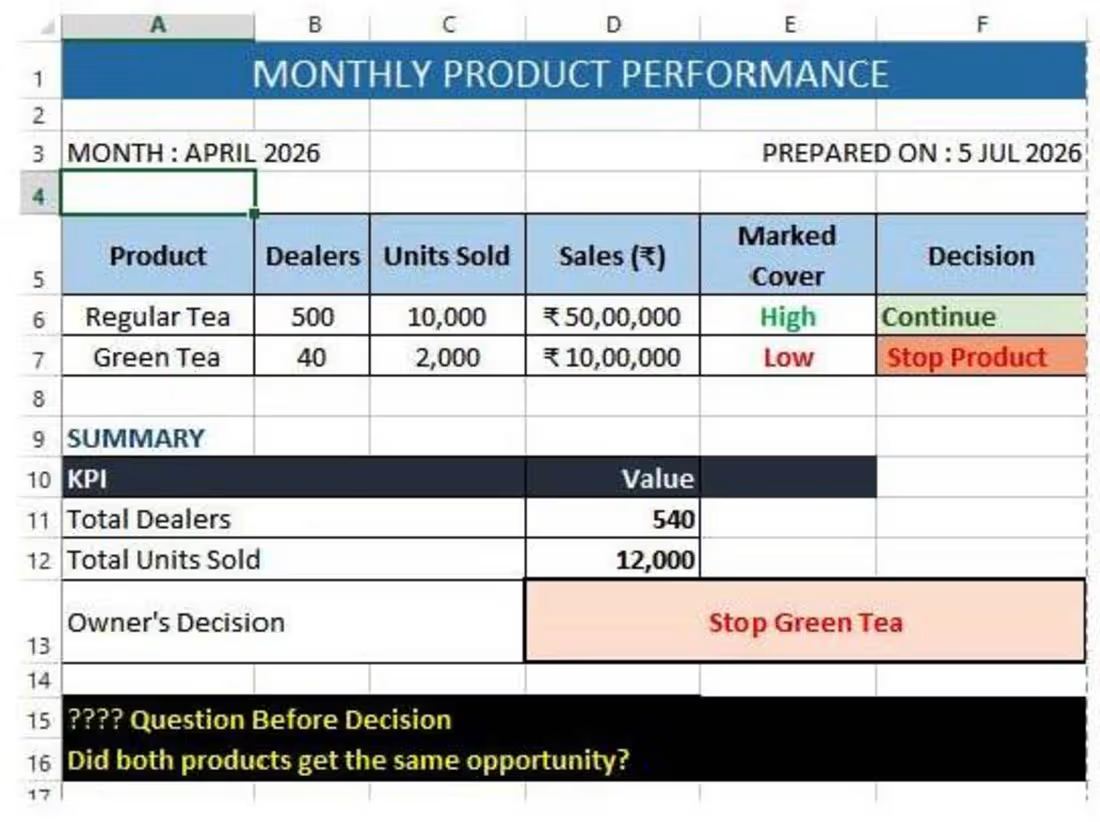
The Product Was Not the Problem. The Decision Was.
A manufacturing company had two products.
Every month, the owner checked the sales report.
The report always showed the same thing.
Premium Tea sold more than Green Tea
After a few months, the owner made a decision.
"Stop Product green tea. It is not performing well."
Before the meeting ended, one employee asked,
"Sir... can we check one more report?"
The owner agreed.
The second report told a different story.
Premium Tea was available in 500 dealer stores.
Green Tea was available in only 40 dealer stores.
The room became silent.
The question was no longer,
"Which product sold more?"
The real question was,
"Did both products get the same opportunity?"
The owner wasn't losing because of Green Tea.
He was about to lose because of a wrong comparison.
Imagine if Product Green Tea had reached 500 dealers too.
Would the result still be the same?
No one knew.
Because the product was judged...
before it was given a fair chance.
📌 Business Lesson
Numbers are important.
But numbers without context can lead to expensive decisions.
Before comparing products, branches, employees, or stores...
Ask one simple question:
"Am I comparing equal opportunities?"
Sometimes, the biggest business problem is not the product.
It is the decision based on incomplete information.
💬 What would you have checked before stopping Product Green tea?
👇 Share your thoughts.
📩 Give me an opportunity to understand your business.
A dashboard can show what happened.
Root Cause Analysis (RCA) helps explain why it happened.
I don't just build dashboards.
I work to understand the business behind the numbers, identify the real problem, and support better business decisions.
If you would like someone to understand your business before suggesting solutions...
Let's connect.
🔒 Your business data will always remain private and confidential.
🤝 Let's understand your business before making business decisions.
🛠 My Focus
📊 Excel | 📈 Power BI | 📖 Business Analysis | 📚 Business Storytelling | 🎯 Decision Support
#BusinessDNA (https://www.linkedin.com/search/results/all/?keywords=%23businessdna&origin=HASH_TAG_FROM_FEED) #BusinessAnalysis (https://www.linkedin.com/search/results/all/?keywords=%23businessanalysis&origin=HASH_TAG_FROM_FEED) #BusinessStorytelling (https://www.linkedin.com/search/results/all/?keywords=%23businessstorytelling&origin=HASH_TAG_FROM_FEED) #PowerBI (https://www.linkedin.com/search/results/all/?keywords=%23powerbi&origin=HASH_TAG_FROM_FEED) #Excel (https://www.linkedin.com/search/results/all/?keywords=%23excel&origin=HASH_TAG_FROM_FEED) #DataAnalytics (https://www.linkedin.com/search/results/all/?keywords=%23dataanalytics&origin=HASH_TAG_FROM_FEED) #DecisionMaking (https://www.linkedin.com/search/results/all/?keywords=%23decisionmaking&origin=HASH_TAG_FROM_FEED) #BusinessGrowth (https://www.linkedin.com/search/results/all/?keywords=%23businessgrowth&origin=HASH_TAG_FROM_FEED) #Manufacturing (https://www.linkedin.com/search/results/all/?keywords=%23manufacturing&origin=HASH_TAG_FROM_FEED) #MSME (https://www.linkedin.com/search/results/all/?keywords=%23msme&origin=HASH_TAG_FROM_FEED)
1
16
The Customers Who Never Spoke...
A restaurant owner wanted to know if his customers were happy.
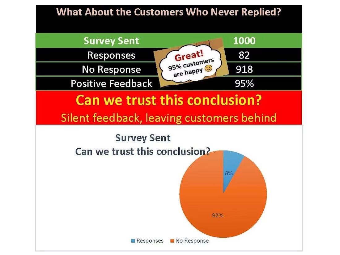
He sent a survey to 1,000 customers.
Only 82 replied.
😊 95% said they were happy.
The owner smiled.
"Great! My customers are happy."
But...
What about the other 918 customers?
Maybe they were happy.
Maybe they were busy.
Or maybe...
They never planned to come back.
Before making any decision, I'd ask:
Who didn't reply?
Are they new or repeat customers?
Did they stop ordering?
Did they move to a competitor?
Good decisions need complete data.
Missing customers can change the whole story.
This is called Non-response Bias.
Sometimes, the people who say nothing...
tell us the most.
💬 If only 8% of your customers replied, would you trust the survey?
👇 Share your thoughts.
📩 Want to understand what your business data is really saying? Let's connect.
🔒 Your business data will always remain private and confidential.
🤝 Let's understand your business together.
🛠 My Focus
Excel • Power BI | Business Analysis | Business Storytelling | Decision Support
#BusinessDNA (https://www.linkedin.com/search/results/all/?keywords=%23businessdna&origin=HASH_TAG_FROM_FEED) #BusinessAnalysis (https://www.linkedin.com/search/results/all/?keywords=%23businessanalysis&origin=HASH_TAG_FROM_FEED) #BusinessStorytelling (https://www.linkedin.com/search/results/all/?keywords=%23businessstorytelling&origin=HASH_TAG_FROM_FEED) #PowerBI (https://www.linkedin.com/search/results/all/?keywords=%23powerbi&origin=HASH_TAG_FROM_FEED) #Excel (https://www.linkedin.com/search/results/all/?keywords=%23excel&origin=HASH_TAG_FROM_FEED) #DataAnalytics (https://www.linkedin.com/search/results/all/?keywords=%23dataanalytics&origin=HASH_TAG_FROM_FEED) #BusinessIntelligence (https://www.linkedin.com/search/results/all/?keywords=%23businessintelligence&origin=HASH_TAG_FROM_FEED) #DecisionMaking (https://www.linkedin.com/search/results/all/?keywords=%23decisionmaking&origin=HASH_TAG_FROM_FEED) #BusinessGrowth
(https://www.linkedin.com/search/results/all/?keywords=%23businessgrowth&origin=HASH_TAG_FROM_FEED)#SmallBusiness (https://www.linkedin.com/search/results/all/?keywords=%23smallbusiness&origin=HASH_TAG_FROM_FEED) #MSME (https://www.linkedin.com/search/results/all/?keywords=%23msme&origin=HASH_TAG_FROM_FEED) #DataStorytelling (https://www.linkedin.com/search/results/all/?keywords=%23datastorytelling&origin=HASH_TAG_FROM_FEED)
0
2
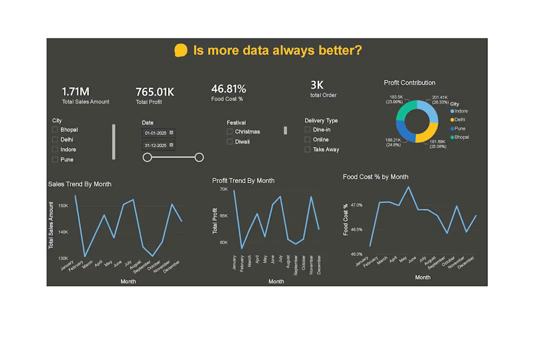
In this project, I explored a simple question: Is more data always better?
I built an interactive dashboard to analyze sales, profit, food cost, orders, cities, festivals, and delivery types.
The goal was not just to show more data, but to understand which information actually helps explain business performance.
While working on this project, I kept one thing in mind: a client may not only need a dashboard—they may also need clarity to make better decisions.
This project helped me see that more data does not always mean better insights. The real value comes from finding the right data, the right patterns, and the right business questions.
0
15
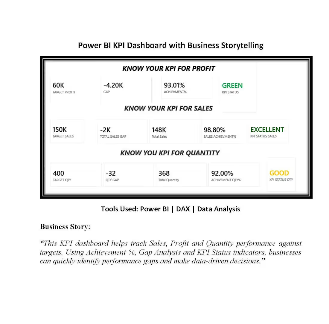
📊 Power BI KPI Dashboard Project
Recently completed a KPI Dashboard focused on Sales, Profit, and Quantity performance analysis.
The dashboard includes:
✅ Target vs Actual Analysis
✅ Achievement %
✅ Gap Analysis
✅ KPI Status Indicators
✅ Business Storytelling
Tools Used:
• Power BI
• DAX
• Data Analysis
The objective was to transform raw business data into meaningful insights that support data-driven decision-making and performance monitoring.
#PowerBI (https://www.linkedin.com/search/results/all/?keywords=%23powerbi&origin=HASH_TAG_FROM_FEED) #DataAnalytics (https://www.linkedin.com/search/results/all/?keywords=%23dataanalytics&origin=HASH_TAG_FROM_FEED) #BusinessAnalysis (https://www.linkedin.com/search/results/all/?keywords=%23businessanalysis&origin=HASH_TAG_FROM_FEED) #KPIs (https://www.linkedin.com/search/results/all/?keywords=%23kpis&origin=HASH_TAG_FROM_FEED) #DataVisualization (https://www.linkedin.com/search/results/all/?keywords=%23datavisualization&origin=HASH_TAG_FROM_FEED) #Dashboard (https://www.linkedin.com/search/results/all/?keywords=%23dashboard&origin=HASH_TAG_FROM_FEED) #Reporting (https://www.linkedin.com/search/results/all/?keywords=%23reporting&origin=HASH_TAG_FROM_FEED)
0
32