pro
Pramodh Ramesh
Shaping thoughtful, design led brands for the global stage.
Ready for work
Pramodh is ready for their next project!
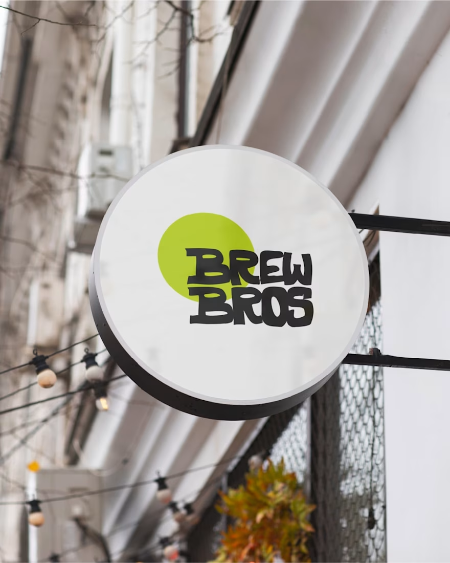
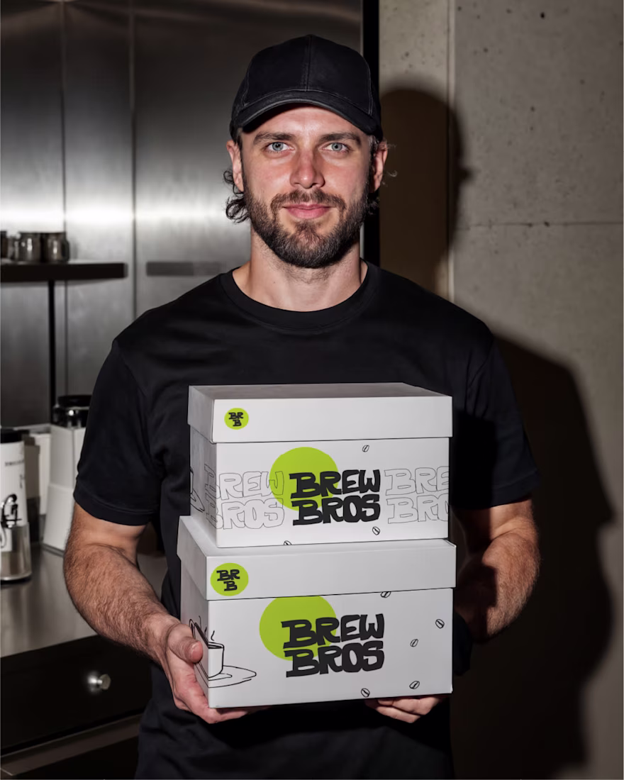
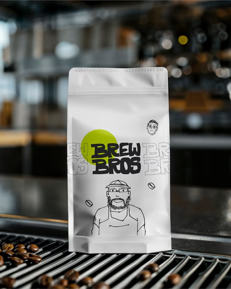
Wrapping up the Brew Bros identity.
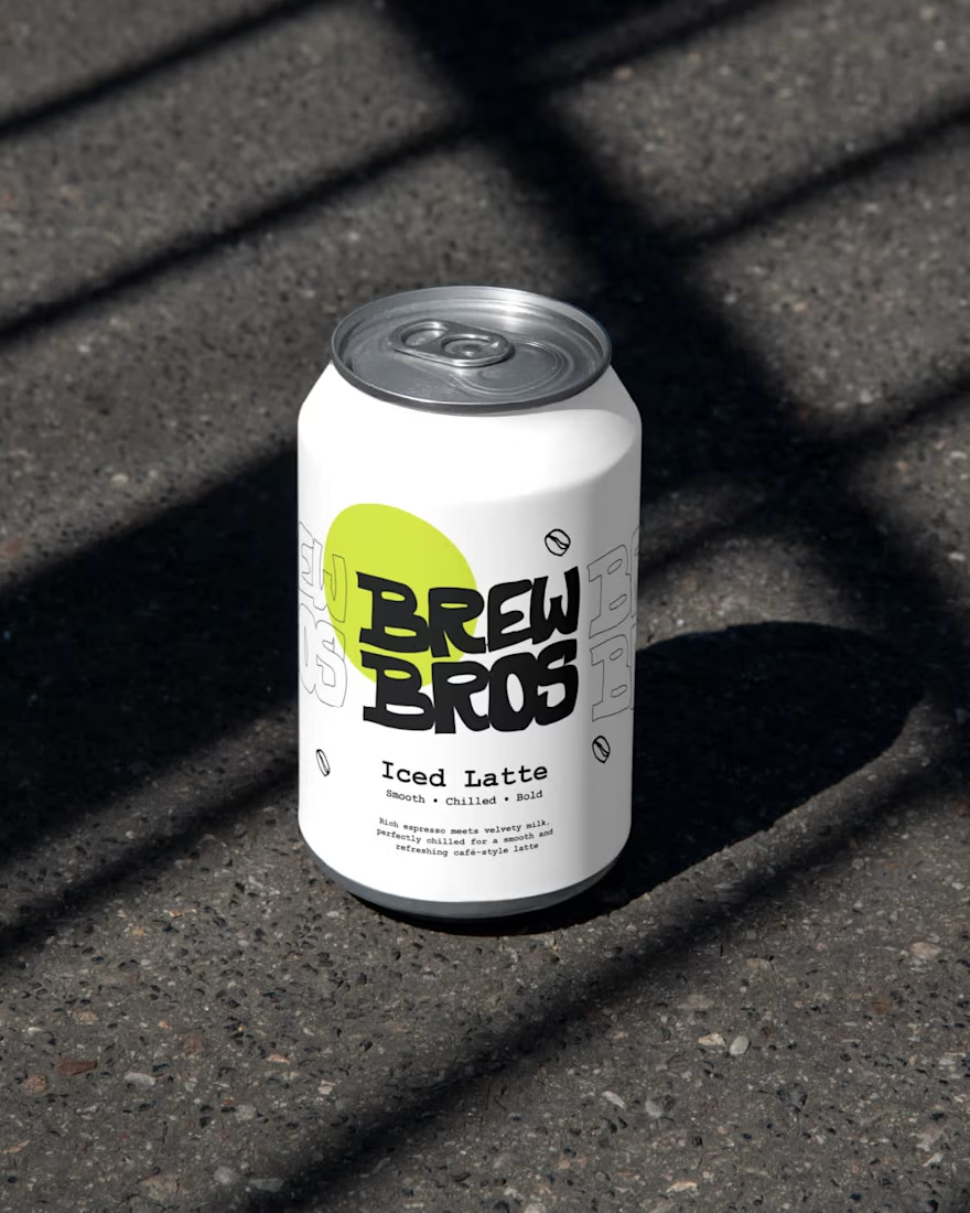
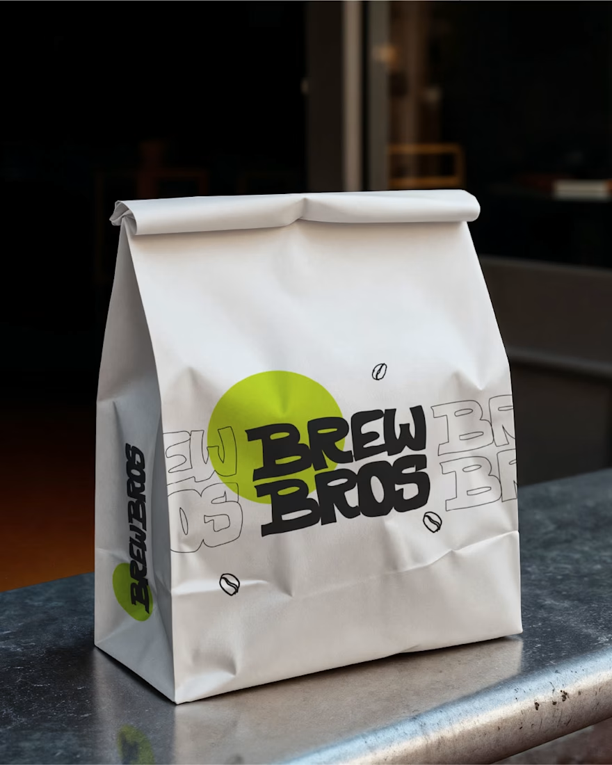
From cups to menus, every detail is designed to feel consistent, approachable, and easy to connect with. The hand-drawn style ties everything together, creating a brand that feels warm, familiar, and ready to be part of everyday routines.
That’s...

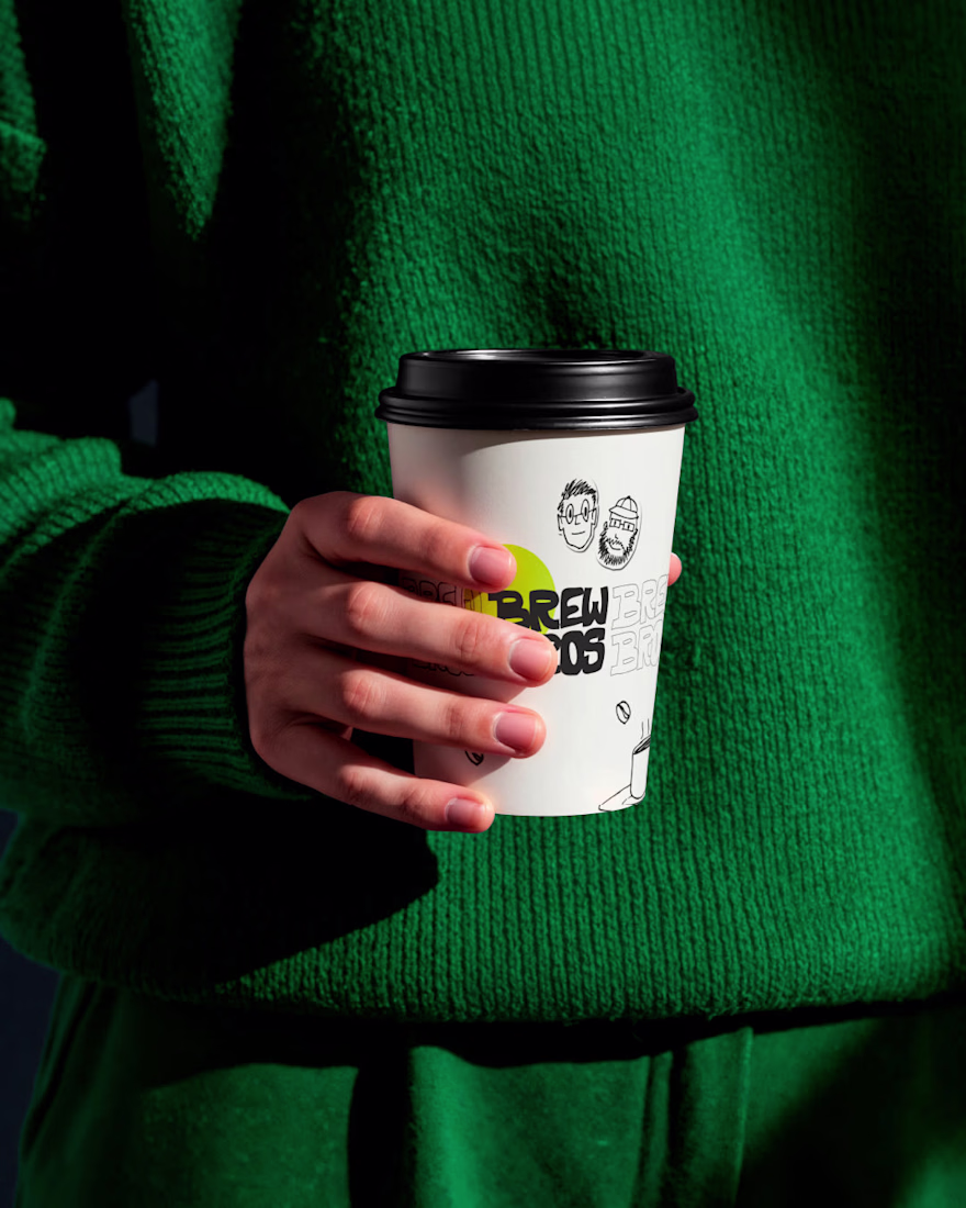
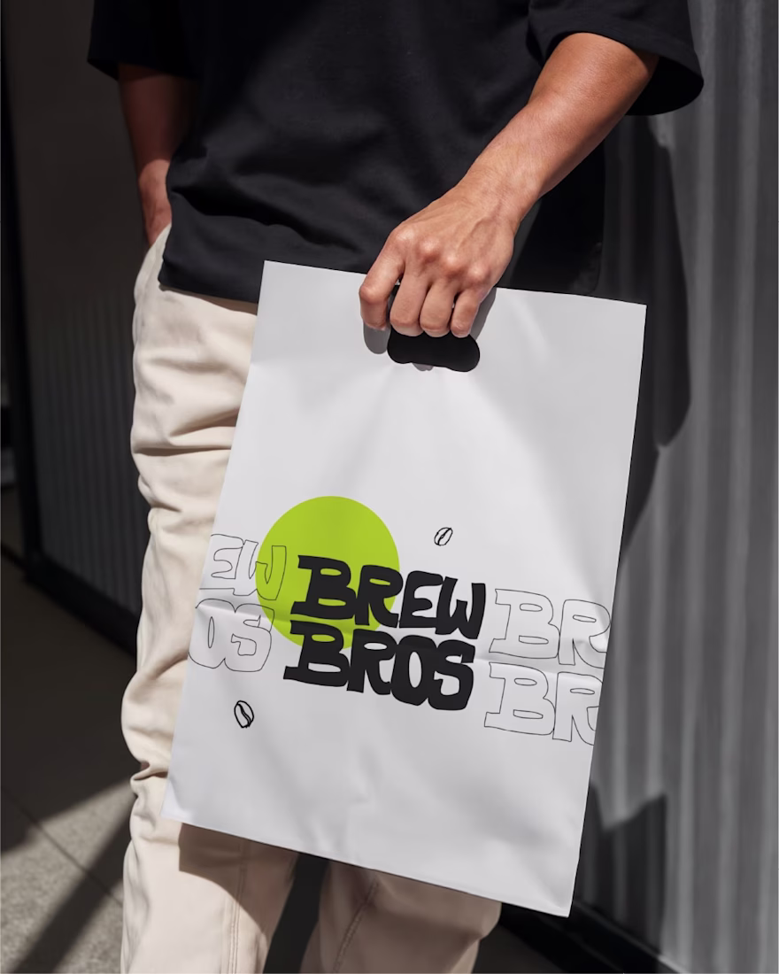
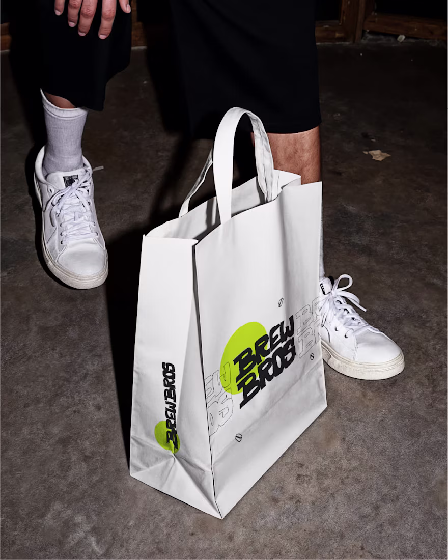
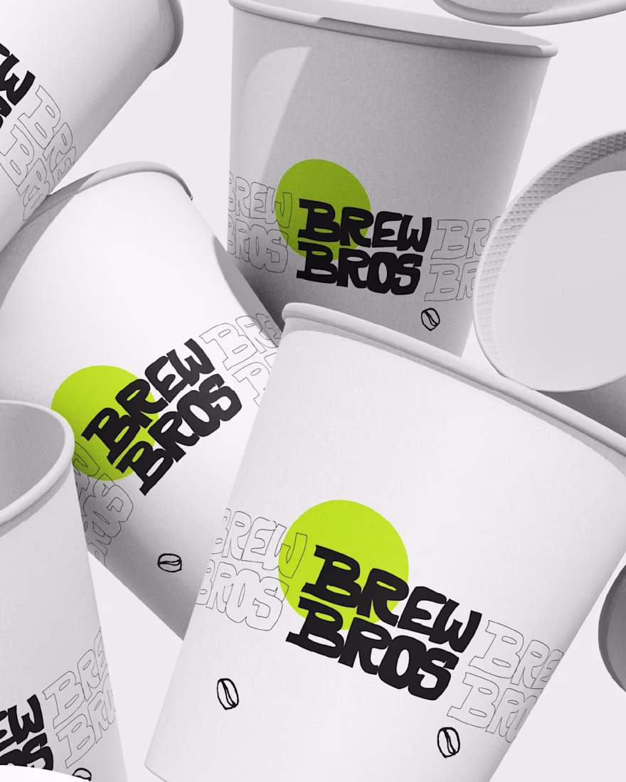
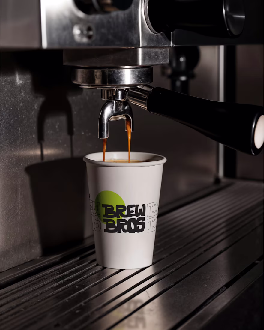
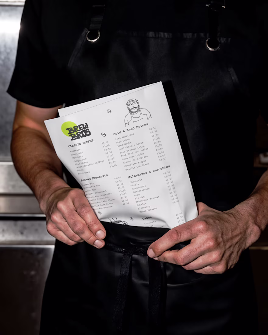
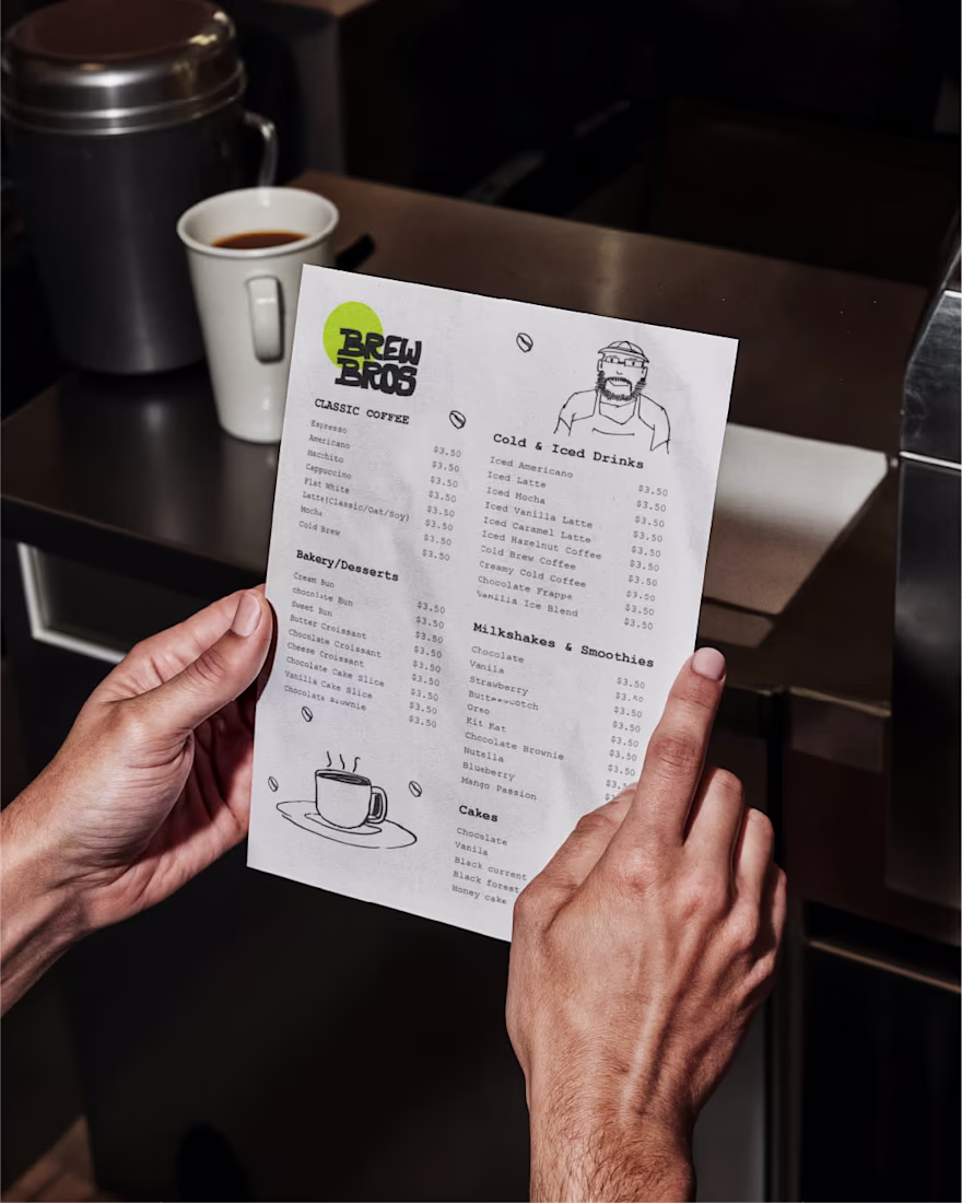
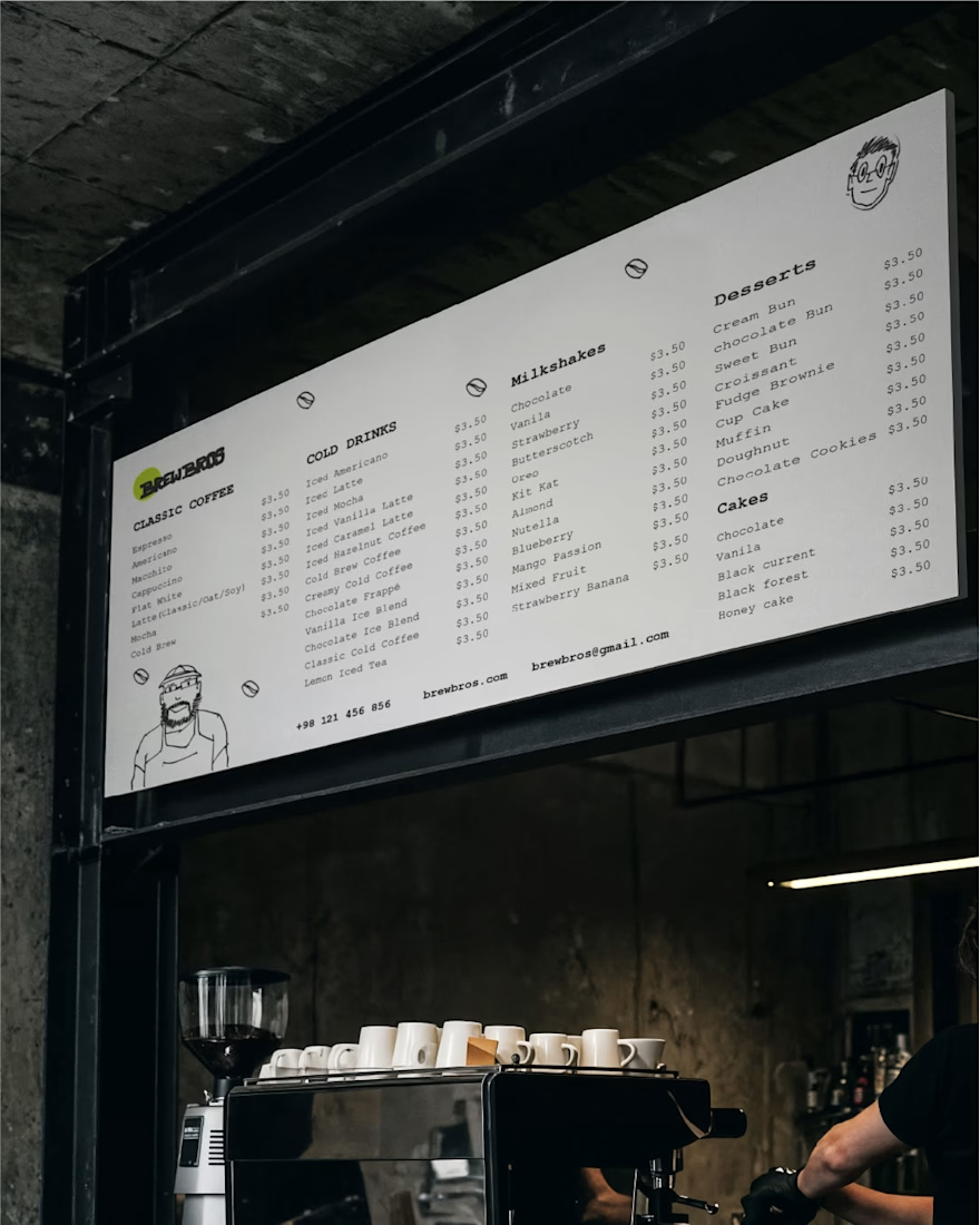
Applying the Brew Bros identity across everyday café essentials like cups and menus.
The hand-drawn visual language carries through these touchpoints, keeping the design warm, approachable, and consistent. Simple layouts paired with playful illustrations help maintain the...
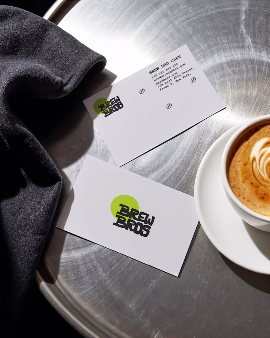
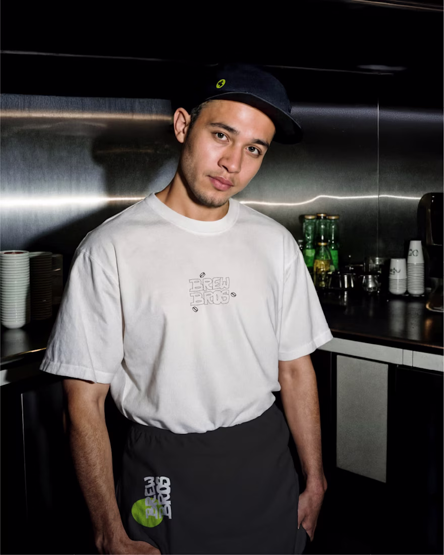
From logo construction and typography to earthy color palettes and tactile textures, every element was crafted to reflect authenticity, comfort, and community. The branding balances minimal aesthetics with a strong, approachable personality, ensuring Brew Bros. stands out while...
Built to feel familiar from the very first visit.
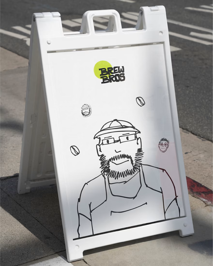
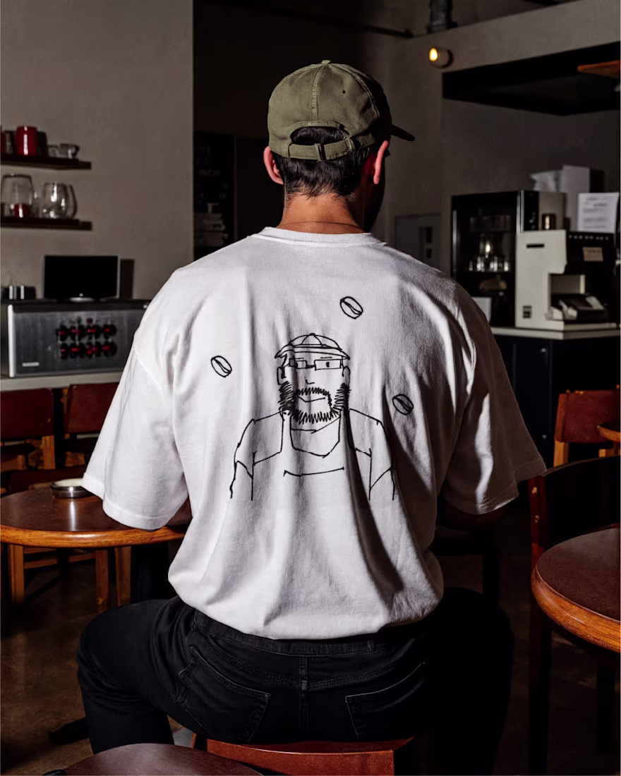
The Brew Bros identity leans into hand-drawn expression, soft imperfections, and playful details to mirror the people and moments that shape the space. Nothing feels rigid or overdesigned, just warm, relaxed, and naturally...
Exploring how small details can shape the feeling of a space.
Playful illustrations, imperfect lines, and tactile elements come together to create a visual rhythm that feels relaxed and lived-in rather than structured and rigid. The goal is to make every touchpoint feel familiar,...