
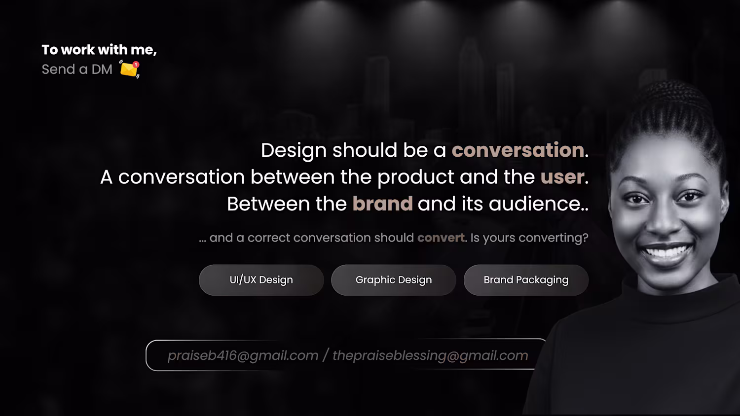
Visual storytelling!
Every brand (old or new) needs visual storytelling because people don't just buy your products, they buy WHAT your products makes them FEEL.
Emotional selling!
Let's talk🥰
you can send me a mail thepraiseblessing@gmail.com (mailto:thepraiseblessing@gmail.com) or praiseb416@gmail.com (mailto:praiseb416@gmail.com)
1
1
9
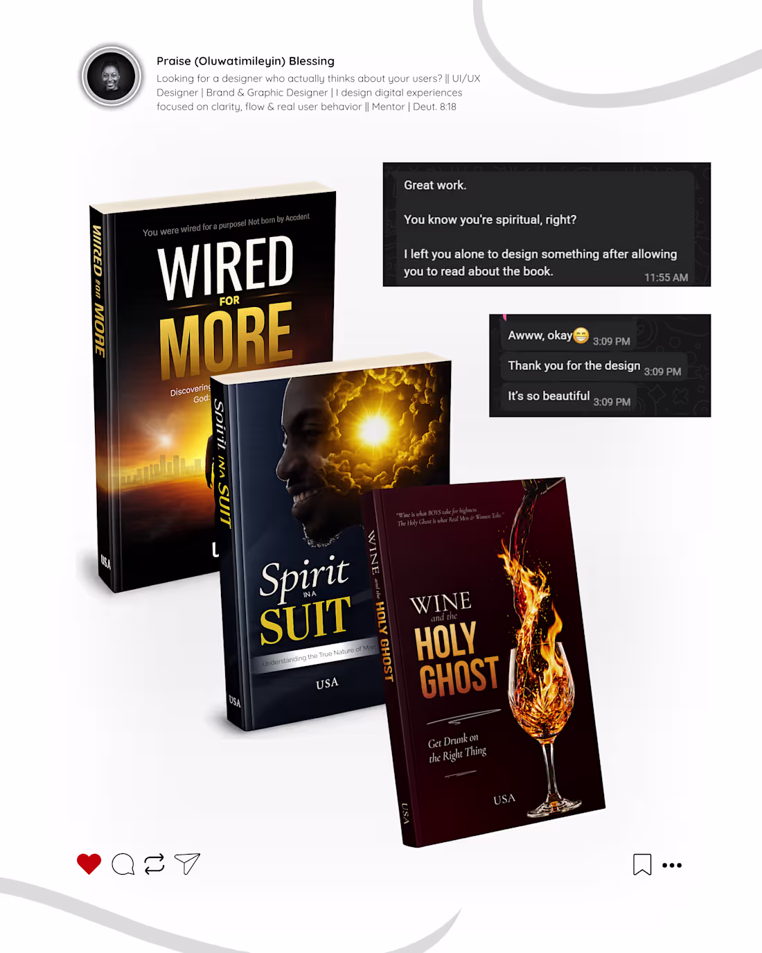
Designed three book covers and they are currently on amazon.
I focused on
-the image carrying the weight of the book title
-readability
-authors burden
-amazon style
What do you think?
check the comments for each book covers 🥰
1
1
14
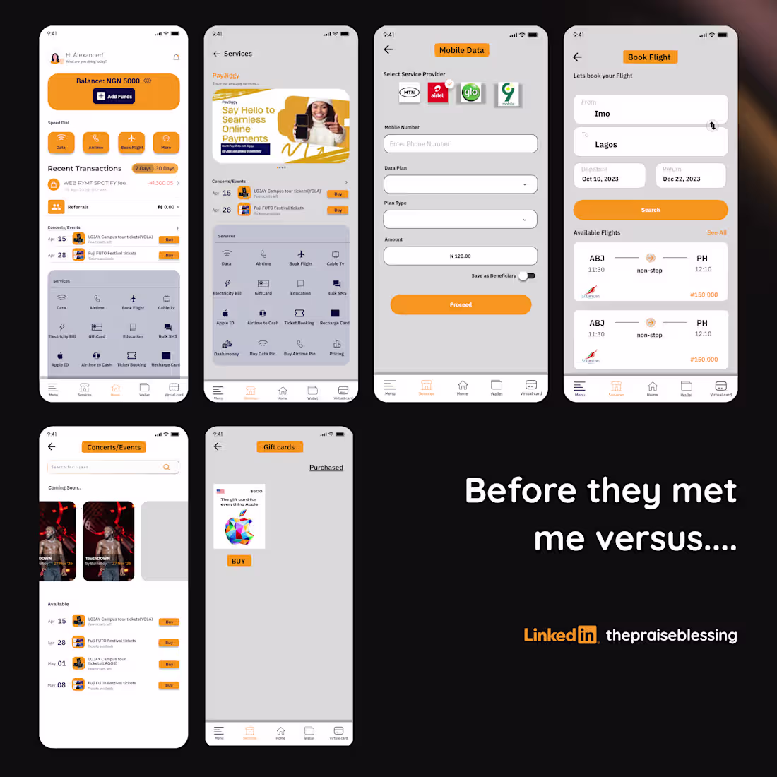
Recently redesigned a fintech mobile app.. 🥰
The goal of the redesign was
- simplicity
-less headache for the users
-usability
-trust
what do you think?
1
1
24
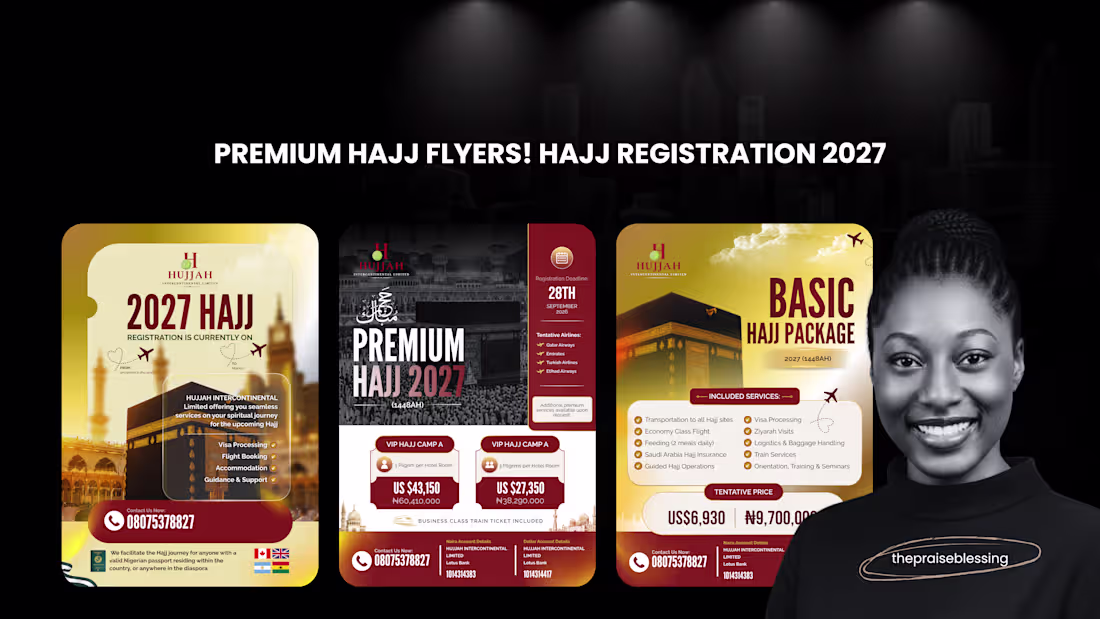
Designed a premium flyer campaign for Hujjah Intercontinental Limited to help position their Hajj packages as trustworthy, organized, and high-value. The challenge was to communicate a large amount of pricing and package information without overwhelming potential pilgrims.
I created a clean visual hierarchy using the brand's maroon and gold palette, premium imagery, and structured content blocks to make key information; package options, pricing, registration deadlines, and contact details... easy to scan while reinforcing credibility and luxury.
1
1
29
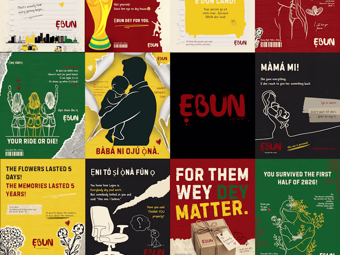
ẸBUN - A Perfectly Imperfect Brand Identity
1
2
Imagine driving past a store.
You're not stopping. You're not looking. You're just….. passing.
Then something catches your eye. And before your brain even processes it, your foot is on the brake.
That's a poster doing its job!
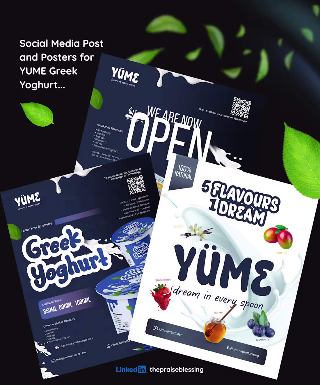
And that's exactly the assignment YÜME gave me.
Not just "make it beautiful." But, make a stranger stop.
Because nobody reads a poster. They feel it in 3 seconds and decide.
Attractive or invisible. Trust or doubt. Pick up or walk past.🫠
Same thing on social media.
Your potential customer is scrolling. Fast. Unbothered. Thousands of posts competing for one second of their attention.
What makes yours the one they stop at?
Not just colour. Not just a nice font.
The feeling!!
That's what I focused on for every single YÜME creative, from the packaging to the posters to the flyers.
Make it feel like something worth stopping for.
Your brand deserves visuals that stop the scroll and park the car. 😂
Send me BRAND, let's talk. 🤍
1
51
There’s a different feeling that comes with redesigning a product that already exists.
Because you’re not just “making things pretty”… you’re fixing confusion, improving flow, and helping users breathe easier inside the experience.🫴
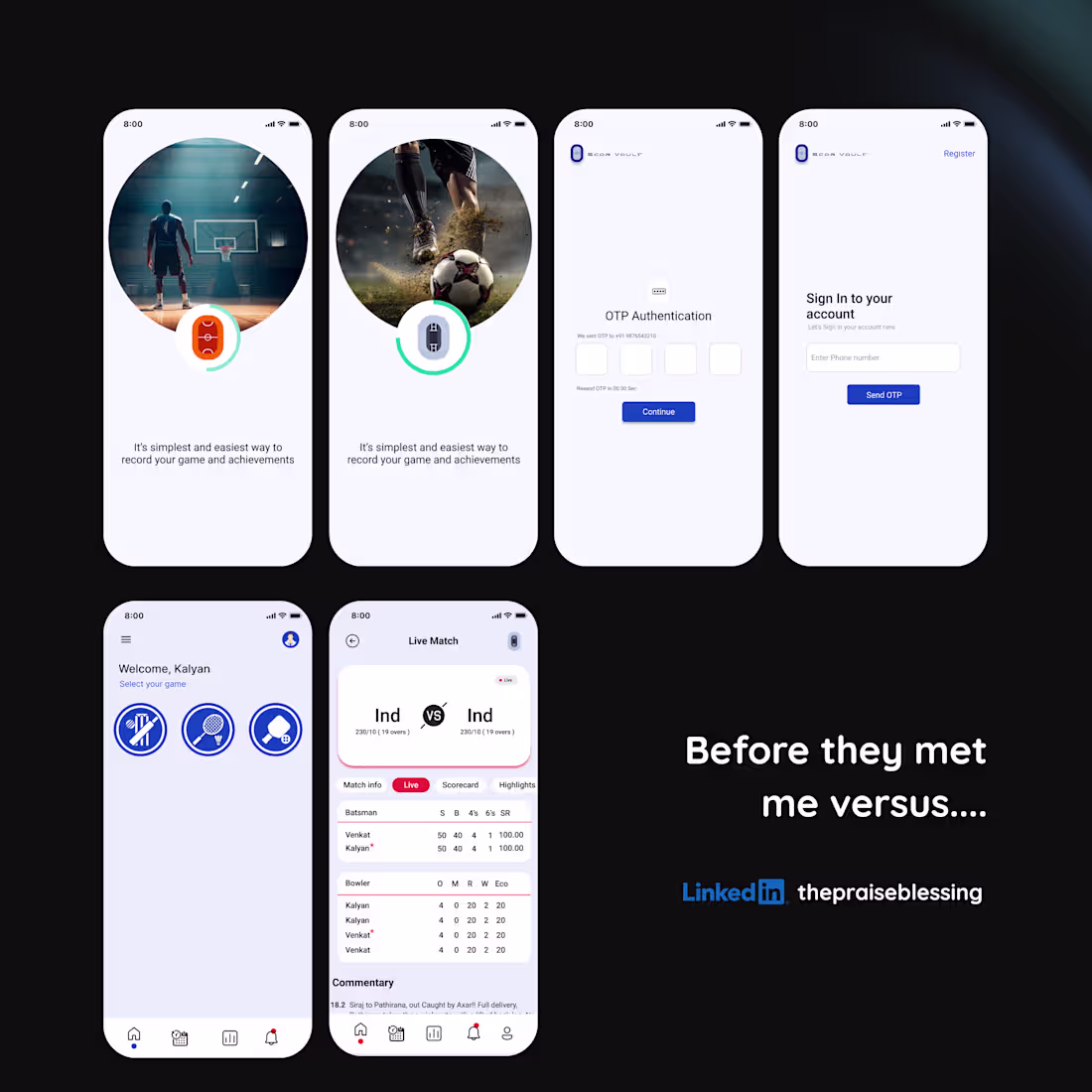
That was ScorVault before we met 🤝🏽
A sports app with potential… but needed structure, clarity, and a smoother experience for players, admins, and fans across Cricket, Badminton, and Pickleball.
So, I went beyond visuals....
I rethought the experience.
From live scoring flows, match timelines, player stats, tournament systems, multi-sport stat architecture, dropdown interactions, and performance dashboards… every screen became intentional.
Now?
✔️ Stats feel personalized
✔️ Navigation feels lighter
✔️ Data feels easier to understand
✔️ The experience feels built for real sports lovers
One thing I enjoy most about redesign projects is this:
seeing a product go from “we can manage it” to “this feels GOOD to use.”
And honestly? That difference changes everything...🤗🫶
If your product is functional but still feels overwhelming, outdated, or disconnected… maybe it’s time for a redesign that actually improves user experience, not just aesthetics.
I design experiences that make products clearer, smarter, and easier to use. ✨
1
43
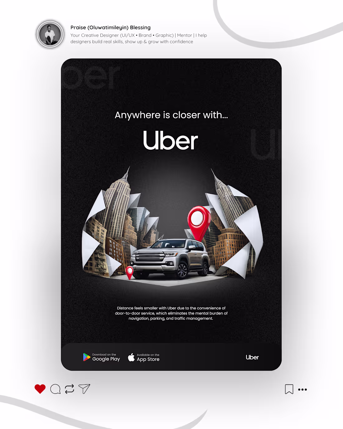
Great visual storytelling doesn't just show you what a product is.
It shows you how your life feels when you use it.
It's not like Uber (https://www.linkedin.com/company/uber-com/) have cars that can fly to escape the 'traffic' 😩 especially if you are in Lagos (iykyk).... but they are telling you that you wouldn't have to become sweaty, jumpy and already tired before getting to work because you used public transport....
That is the Uber (https://www.linkedin.com/company/uber-com/) Value!
Uber (https://www.linkedin.com/company/uber-com/) isn't selling a ride.
They're selling comfort, ease and the peace of getting somewhere without the stress of getting there.
A good visual storytelling sells the VALUE of a product or a company before a person even gets to use it...
....that's why you CANNOT miss it in your visuals because it's your not-so human sales person 🫴
What feeling did this image give you in the first 3 seconds of seeing it?
1
48
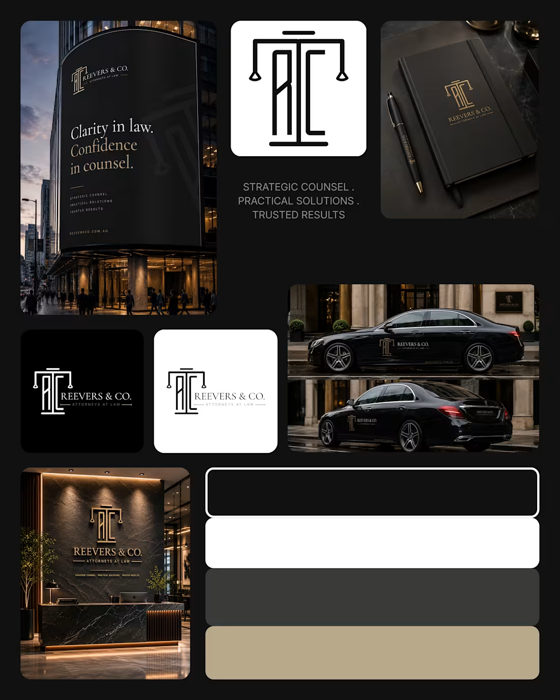
Brand Identity for Reevers and Co.
1
1