
Phadi Mabuya
Graphic designer creating compelling visuals+copy that sell
New to Contra
Phadi is ready for their next project!

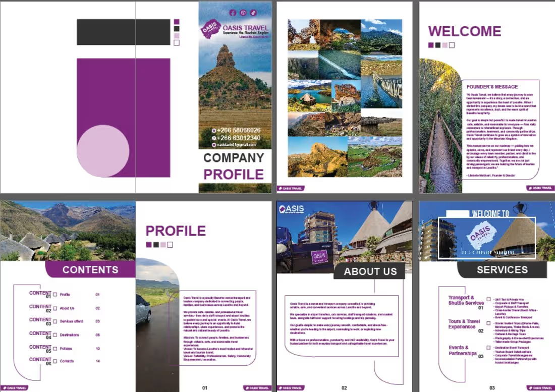
This multi‑page brochure was designed for Oasis Travel, a transport and travel company operating across Lesotho and Southern Africa. The design features a modern purple and white theme, paired with scenic photography of landscapes, bridges, and destinations to visually capture the spirit of travel. The brochure includes a cover page, welcome message, contents, and detailed sections such as Profile, About Us, and Services. The layout balances professionalism with visual appeal, making the company’s mission and offerings clear and engaging for potential clients.
My Role & Responsibilities as Graphic Designer
Conceptualized the overall design style to reflect trust, professionalism, and adventure.
Selected and integrated imagery to highlight travel destinations and create visual impact.
Designed a clean layout with structured sections for easy navigation and readability.
Applied consistent branding through color schemes, typography, and iconography.
Balanced text and visuals to ensure the brochure was both informative and aesthetically appealing.
Delivered a polished, multi‑page company profile that strengthens Oasis Travel’s brand identity and marketing presence.
1
30
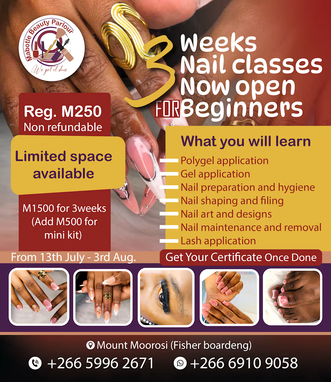
Poster Project – Mabote Beauty Parlour (Nail Classes)
This promotional poster was designed to advertise a 3‑week beginner nail class offered by Mabote Beauty Parlour. The layout combines bold typography with close‑up images of manicured nails and lash applications to visually showcase the skills students will learn. The design uses a professional yet vibrant style to attract attention, while key course details such as fees, dates, and contact information are clearly highlighted for easy readability.
My Role & Responsibilities as Graphic Designer
Conceptualized the overall design to align with the beauty industry’s aesthetic appeal.
Selected and arranged imagery to visually represent the training outcomes (nail art, lash application).
Structured course details into clear sections for quick understanding by potential students.
Applied color balance and typography to ensure the poster was eye‑catching yet professional.
Integrated pricing, registration, and contact information seamlessly into the design.
Delivered a marketing‑ready poster that communicates both the value of the course and the brand identity of Mabote Beauty Parlour.
1
60
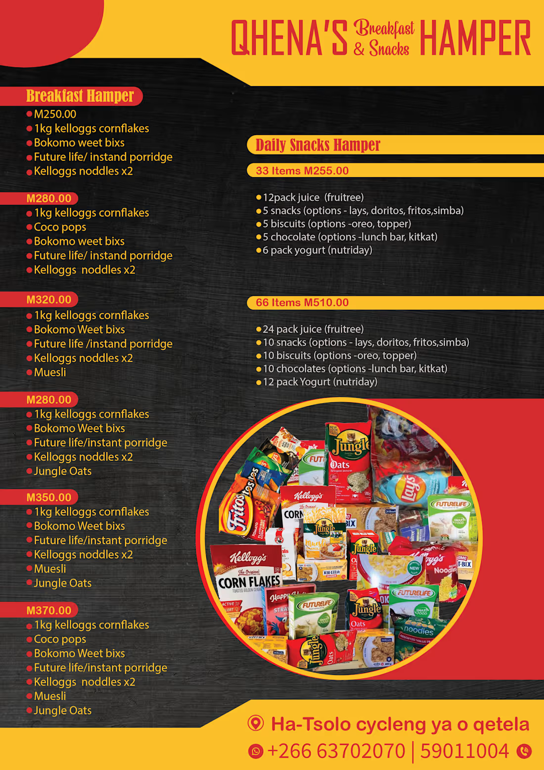
This promotional poster was designed to market a range of breakfast and snack hampers. The layout uses a bold red and yellow color scheme against a black background to create strong contrast and attract attention. Product options are clearly listed with prices and detailed contents, while images of popular food items (such as Kellogg’s Cornflakes, Jungle Oats, and Fritos) reinforce the offering visually. Contact details are placed at the bottom for easy customer access, making the design both informative and engaging.
My Role & Responsibilities as Graphic Designer
Developed the overall concept and visual direction to highlight affordability and variety.
Selected a vibrant color palette (red, yellow, black) to emphasize energy and appetite appeal.
Structured product information into clear, easy‑to‑read sections for quick customer decision‑making.
Integrated product imagery to strengthen trust and showcase the hamper contents.
Balanced typography and layout to ensure readability while maintaining visual impact.
Delivered a professional, marketing‑ready poster that communicates value and convenience effectively.
0
31

This logo was designed for Phaks Supplies, featuring a modern geometric cube enclosed by curved blue shapes forming a hexagonal frame. The design conveys depth, structure, and innovation, while the bold typography emphasizes strength and reliability. The dark blue background paired with contrasting white and blue elements creates a clean, professional aesthetic that reflects the company’s identity in the supply and packaging industry.
My Role & Responsibilities as Graphic Designer
Developed the concept and visual identity to align with the brand’s values of reliability and innovation.
Created a minimalist geometric symbol that communicates structure, trust, and modernity.
Selected color schemes to balance professionalism (dark blue) with energy and clarity (white and light blue).
Designed and refined typography to ensure readability and brand recognition.
Delivered a versatile logo suitable for both digital and print applications, ensuring scalability and consistency across platforms.
0
35