Paula Pakk
Strategy oriented graphic designer and creative director.
Profile in progress
Paula is building their profile!
One of my first digital illustration projects.
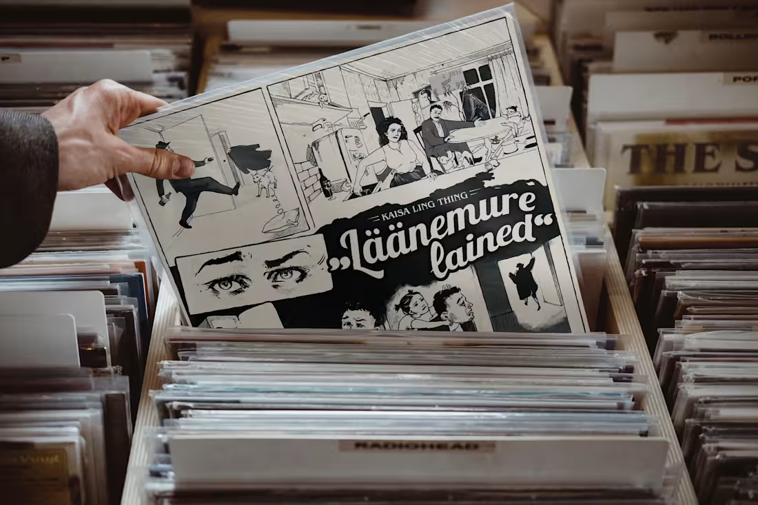
This client has always appreciated a vintage aesthetic, and for their second LP, we went all out with a full comic-strip design. She provided the story, and I had complete creative freedom to bring it to life. I had an incredibly good time planning the composition and illustrating each panel.
Taking advantage of the larger format, we hid several little details for fans to discover. For instance, the portrait hanging on the wall doesn’t match the rest of the comic - because it’s actually the cover art from her second LP.
12
88
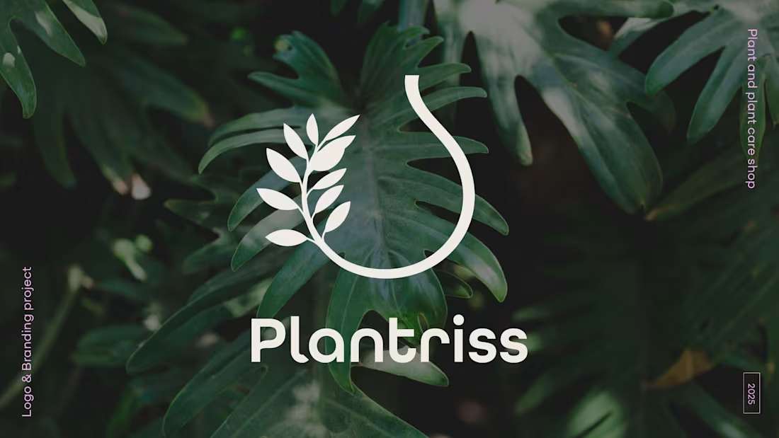
This is a light introduction to a branding project I worked on this year. You can probably find the product that inspired the logo’s form. The rest of the identity was designed to be bold, feminine, natural, simple, yet fun.
I really enjoyed working on this project and look forward to sharing more details that show how the whole brand comes together.
For the four images, I selected samples that best represent the core aesthetics. I’m very pleased that, within the local market context, this plant shop won't be confused with another. I feel it's organically rooted in its niche while still looking confidently unique.
18
152
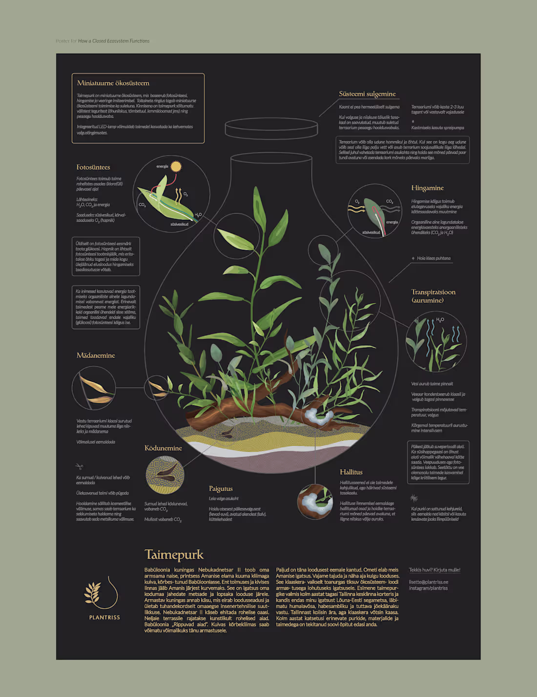
Throwback to one of my favorite poster projects. These two infographic posters were printed and framed for the plant shop that sells closed ecosystems.
The goal was to clearly convey all the organic processes taking place within the ecosystem and to show how to create one.
I was especially fond of the first poster, which I intentionally made dimmer so that, from afar, it appears visually balanced, and the text only reveals itself upon closer inspection.
Interestingly, this is the only poster the print shop has ever called me about, worried that I’d made a mistake — it was “too dark”! It actually turned out exactly as intended, though. What do you think, should the text have been white instead?
2
12
113