Paul Buck - Brand Designer | ContraWork by Paul Buck
Paul Buck
pro

Paul Buck

Graphic Designer

Ready for work

Paul is ready for their next project!

Cover image for Department of Landscape Architecture at
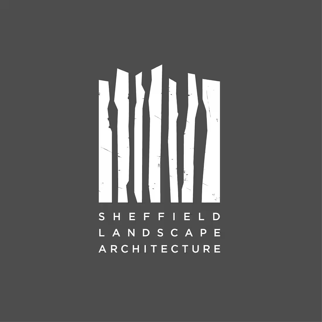
Department of Landscape Architecture at The University of Sheffield – Logo (2014–2020) Process: At its most abstract and minimalist, landscape architecture is about manipulating and structuring space. The negative space between the shapes in the logo is intentionally manipulated to define the landscape. The design has a ‘wild’ aesthetic, reflecting the hands-on nature of landscape architecture. The logo communicates the department’s creative, non-linear side. Seven abstract shapes represent Sheffield’s seven hills. The shapes are enclosed within a square, symbolizing a landscape architect’s role in bringing order to chaos.
0
202
Cover image for Department of Landscape Architecture at
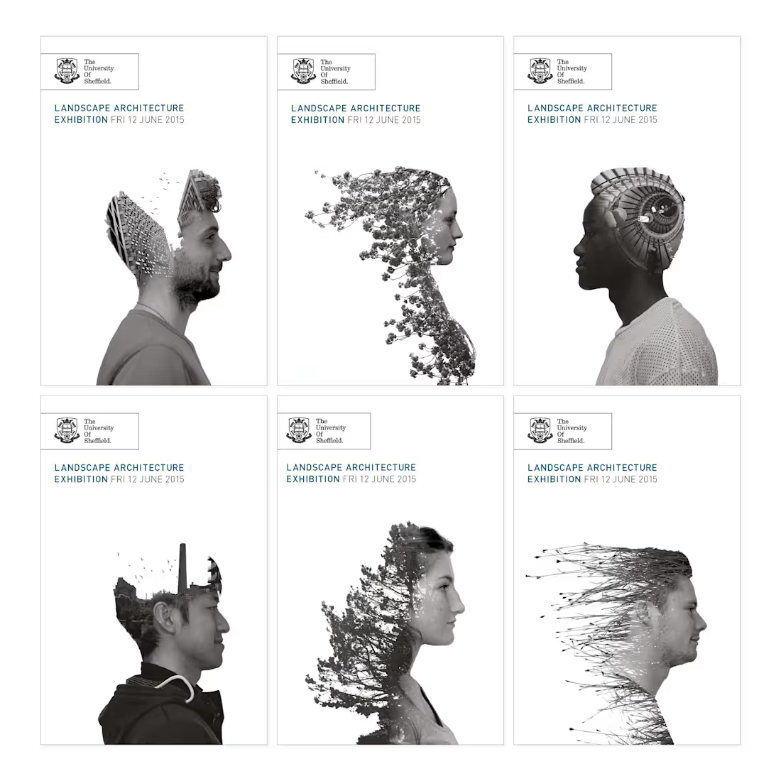
Department of Landscape Architecture at the University of Sheffield – Merging in to the Landscape I was responsible for the design concept, execution, format choice, output and setup of the annual student work exhibition. The example above uses heads of the students exhibiting work, each head was blended into various Sheffield landscapes and flora.
0
156
Cover image for Department of Landscape at The
Department of Landscape at The University of Sheffield – Brochures for UG and PG Study Part of The Department of Landscape Architecture rebranding. I wanted colours that could communicate the vibrancy and energy of the students and the people that work there. Also inspired by the aesthetics in colourful landscapes. The brochure is in a sleeve, the modified Gotham type is a die cut out, to reinforce the 'Shape Your World' message.
0
197
Cover image for Department of Landscape at The University of Sheffield – Bro...
Department of Landscape at The University of Sheffield – Brochures for UG and PG Study
0
83
Cover image for Concept for a Rooftop Bar
The
Concept for a Rooftop Bar The brief was to create something that reflected the bar's concept, that everyone receives the red-carpet treatment. For a few hours, every guest feels like they’re the most important person in the room. The mark is five spotlights converging from above, their beams forming the silhouette of a crown, merging two ideas with one shape.
0
11
Cover image for Logo for a Kid Centred,
Logo for a Kid Centred, Clean-Air Purification System Company Logo Concept for a company that provides clean-air purification systems for kids. I wanted to stay away from logo mark cliches usually associated with clean air and lungs.
0
111
Cover image for Furique — Brand Identity Concept
Furique
Furique — Brand Identity Concept Furique is a portmanteau of fur and unique. Every animal has a distinct personality, much of it expressed through body language. Ears are extraordinarily expressive and instantly identifiable across species, making them the perfect visual shorthand. The mark places a cast of different ear silhouettes peering over a picket fence — each one distinct, each one unmistakably theirs — capturing that familiar moment of joyful anticipation as a pet waits at the threshold for you to come home.
0
45
Cover image for Furique — Packaging
A vibrant, energetic
Furique — Packaging A vibrant, energetic colour palette distinguishes product variants and communicates health benefits at a glance, bringing the brand’s playful premium personality to life across the packaging range. The picket fence motif continues from the logo, with a cast of different ear silhouettes extending across each pack — reinforcing the core brand idea that every pet is unique, and that Furique celebrates that individuality in every product.
1
1
82
Cover image for Illustrations and branding for a
Illustrations and branding for a local Sheffield board game club. I wanted to communicate board gaming as a more accessible, fun and social hobby. To communicate that, I created some pop art comic book style illustrations. When people outside of the hobby think of board gaming, they usually think of games like Monopoly, I wanted to show that it goes way beyond that, so I added a cheeky and playful No Monopoly sign.
0
35
Cover image for Logo for Thermal Mug Customisation
Logo for Thermal Mug Customisation Business Concept for B2B service provider for personalized insulated tumblers and thermal mugs. The cup within the logo is partly made up of square bracket parenthesis that usually accompany an [insert logo here] across various print formats.
1
127
Cover image for Icons – Various Projects
Top Left:
Icons – Various Projects Top Left: Clear accessible menu icons for a Virtual Learning Environment (Blackboard VLE). Top Right: Icons for IT services. Bottom Left: Icons from a hospital after care flyer. Bottom Right: Icons to illustrate a research paper.
1
39
Cover image for Logo Concept for a Sandwich
Logo Concept for a Sandwich Shop The logo treats the sandwich as a small work of art — and the wordmark acts as the artist's signature beneath it. The mark itself is a single continuous line: a playful, hand-drawn illustration of a sandwich being served, deliberately loose and unpretentious.
0
29
Cover image for Logo for Fantasy Book Shop
To me,
Logo for Fantasy Book Shop To me, the name sounded like a tavern in a fantasy realm, so I imagined what the sign to this tavern or hall might look like and used pub signs and coats of arms as inspiration
1
112
Cover image for D&D Labyrinth Cards
Seven illustrated cards
D&D Labyrinth Cards Seven illustrated cards and a card back for a fan-made Dungeons & Dragons side quest game. The skull illustration — present on the card back and woven throughout every card — serves as a kind of chaotic puppet master within the Labyrinth, ever-present and watching from the shadows.
0
28
Cover image for Mboma Herbal – Rebranding and
Mboma Herbal – Rebranding and Packaging The brief was to design a cost effective package for production and shipping as well as stand out in a crowded market place of herbal supplements. My concept design was to a make at home package that consists of a liquid sachet and a paper envelope containing a herbal tea bag which is then wrapped in a single 3-fold sheet and eyelet punched to hold everything together. For the rebrand, the logo is inspired by a leaf connected to the family's roots and Zulu patterns.
1
124
Cover image for Imbiza, Yezimbiza, Yezimanga – Packaging
The
Imbiza, Yezimbiza, Yezimanga – Packaging The brief was to design a cost effective package for production and shipping (the old product was in a 750ml large glass bottle), as well as stand out in a crowded market place of herbal supplements. My concept design was to a make at home package that consists of a liquid sachet and a paper envelope containing a herbal tea bag which is then wrapped in a single 3-fold sheet and eyelet punched to hold everything together.
0
47
Cover image for Illustration for a British Seaside
Illustration for a British Seaside Trip Poster – Typographic Letter I love the old hand painted typography that is common to British seaside towns and fairgrounds.
0
31
Cover image for Interior Designer Logo
Concept for a
Interior Designer Logo Concept for a small Interior Designer business. This idea is a result of exploring how an interior designer could be represented without falling in to cliche. As part of that process, I came across the Bowerbird the only animal that arranges its environment purely for aesthetic reasons, selecting objects by colour and composition. The colour choices are a response to the brief, for wanting a brand identity that was 'feminine and not afraid of colour,' so I went all-in with this idea in mind. The geometric shapes that make up the bird convey the language of design.
0
21
Cover image for Unbagged Plant
Branding for a small
Unbagged Plant Branding for a small family run vegan food grab ’n’ go business. I loved the name Unbagged Plant, and I wanted an equally playful logo to accompany it. It’s a simple concept — the little radish character, inspired by the old ‘rubber hose’ cartoon style is unbagged and on the run, reinforcing the grab-and-go element of the business. I chose a radish because I wanted a leafy vegetable so the audience immediately makes the connection to fresh, healthy vegan food. The long leaves swept back really help convey that the character is in motion.
0
33
Cover image for Brand identity for an Antiques
Brand identity for an Antiques Fair.
1
114