Logo Icon Design for Vuldex Cybersecurity Company
Serhii Rovner
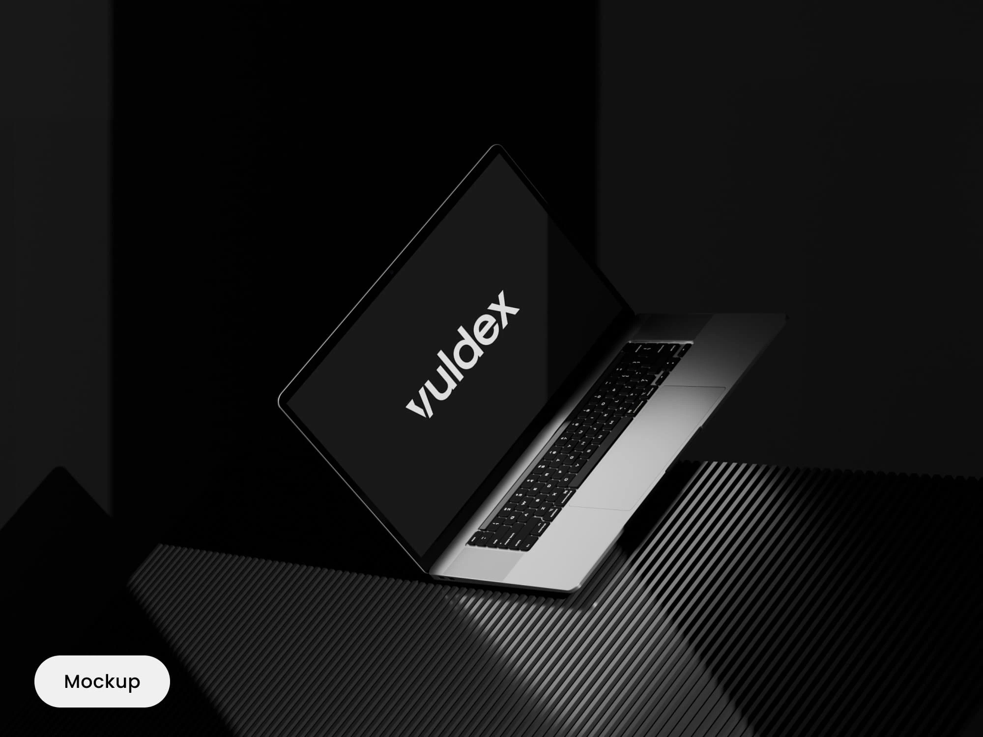
Project description:
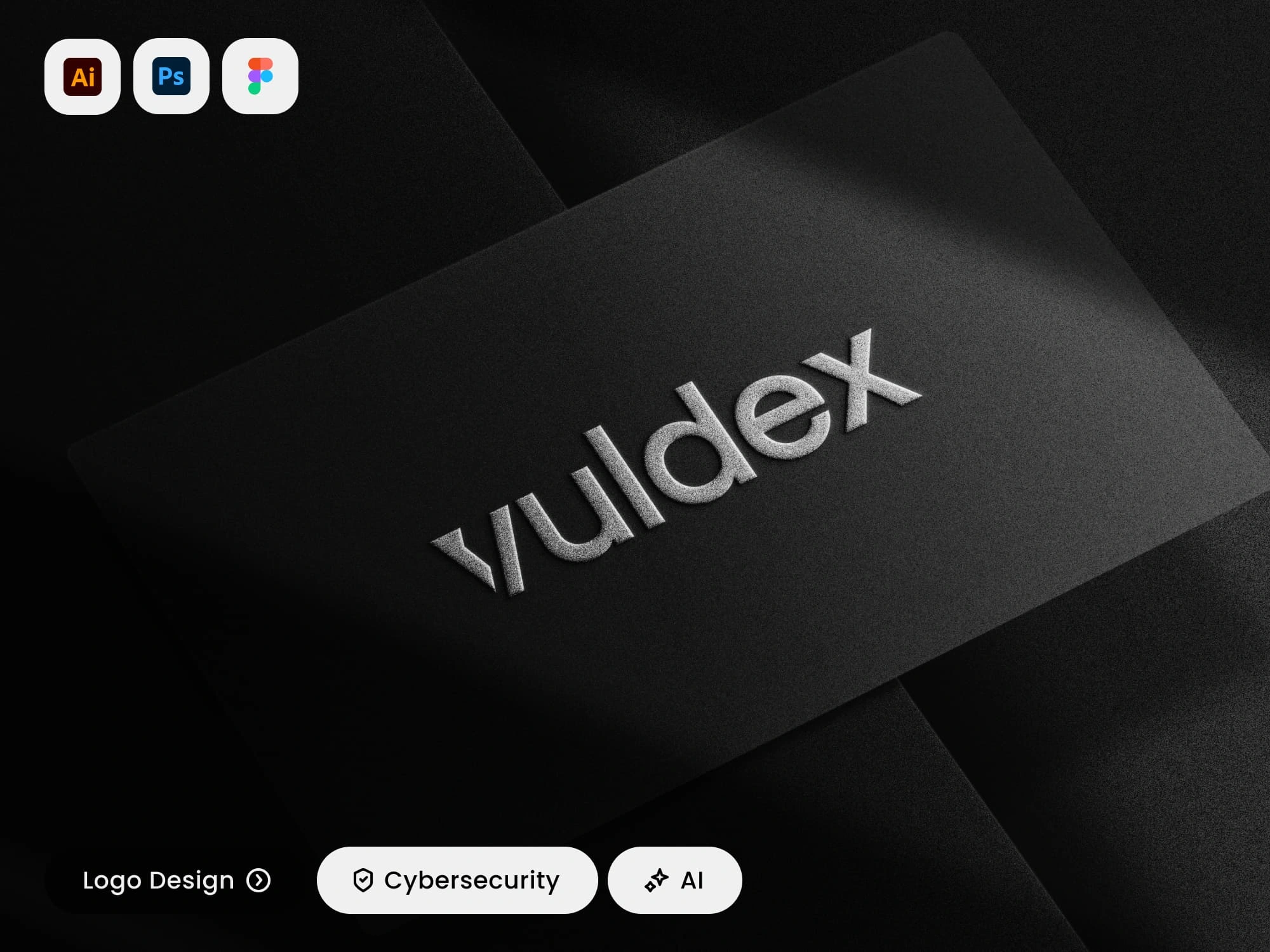
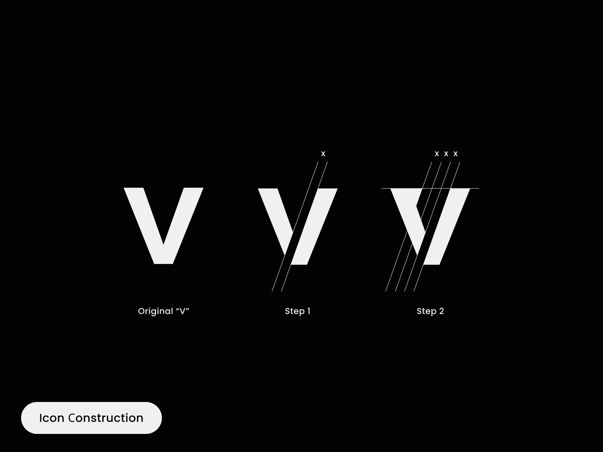
The task was to create a distinctive icon for Vuldex, a cybersecurity company based in Utrecht, Netherlands. The icon needed to be crafted from the first letter of the company's name, "V." It should seamlessly integrate with the existing logo or stand independently as a strong visual identifier. The goal was to ensure that the icon reflected Vuldex's robust and secure brand identity while being versatile enough to be used across various digital platforms.
Design Process:
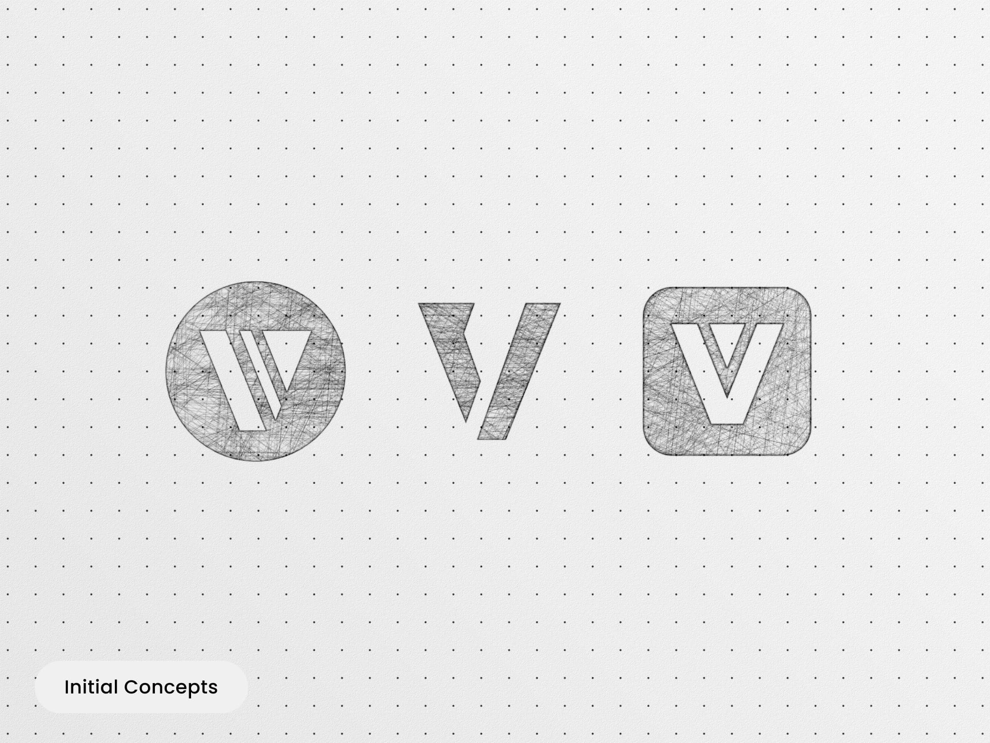
1. Initial Concepts: I developed three distinct icon concepts for Vuldex, each exploring different visual interpretations of the "V" to reflect the brand’s strength and focus on cybersecurity.
2. Client Collaboration: After the client selected their preferred concept from the three options, we collaborated closely to refine the design, ensuring it met their expectations and effectively represented Vuldex's identity.
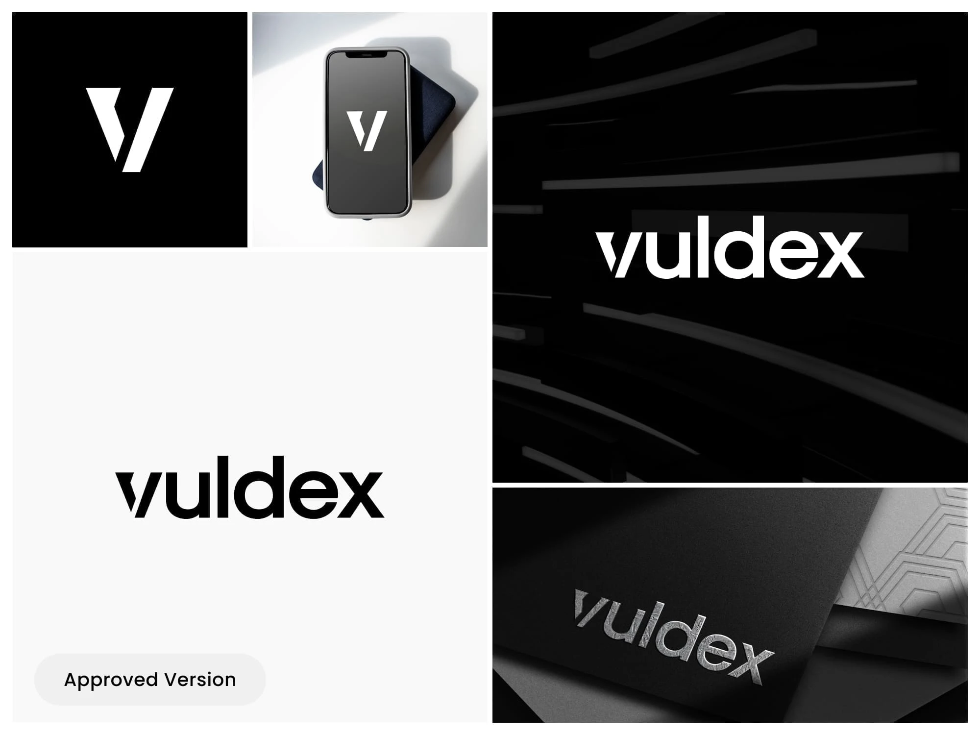
3. Finalization: The chosen icon design was meticulously polished based on feedback, ensuring it integrated seamlessly with the existing logo and could stand alone as a strong visual identifier for the brand across various platforms.
Results:
- Successfully designed a modern and impactful "V" icon that reflects Vuldex's secure and professional image in the cybersecurity industry.
- The icon is designed to be versatile, allowing it to be used both within the logo and as an independent visual element.
- Received positive feedback from the client, highlighting the icon’s perfect alignment with their brand identity and its potential for wide application.
Deliverables:
- Final icon in multiple formats (PNG, JPEG, AI, EPS, SVG, PDF) for versatile use across different platforms.
- Icon variations, including versions that integrate with the full logo and standalone options, as well as black and white versions.
Thank you for your attention!
.
If you are interested in working with me on your project, please feel free to contact me:
.
.
s.o.rovner@gmail.com
Like this project
Posted Jun 6, 2026