Moto Fitness App UI Design

Mohammed Thufail


Moto App
Optimise daily routine through mobile app
Market Segment : Fitness
Responsibilities : UI Design + Prototype
Duration : 5 months
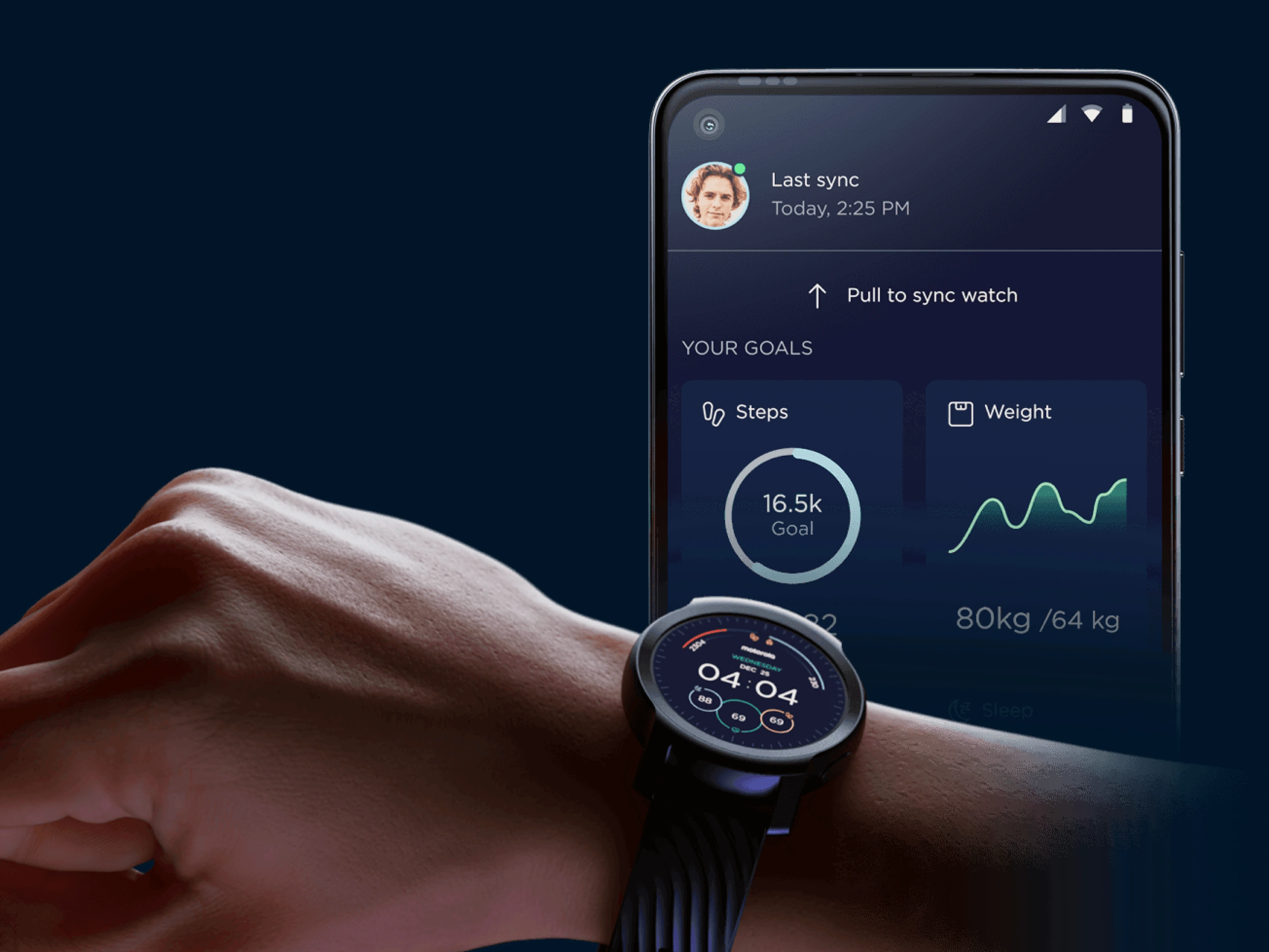
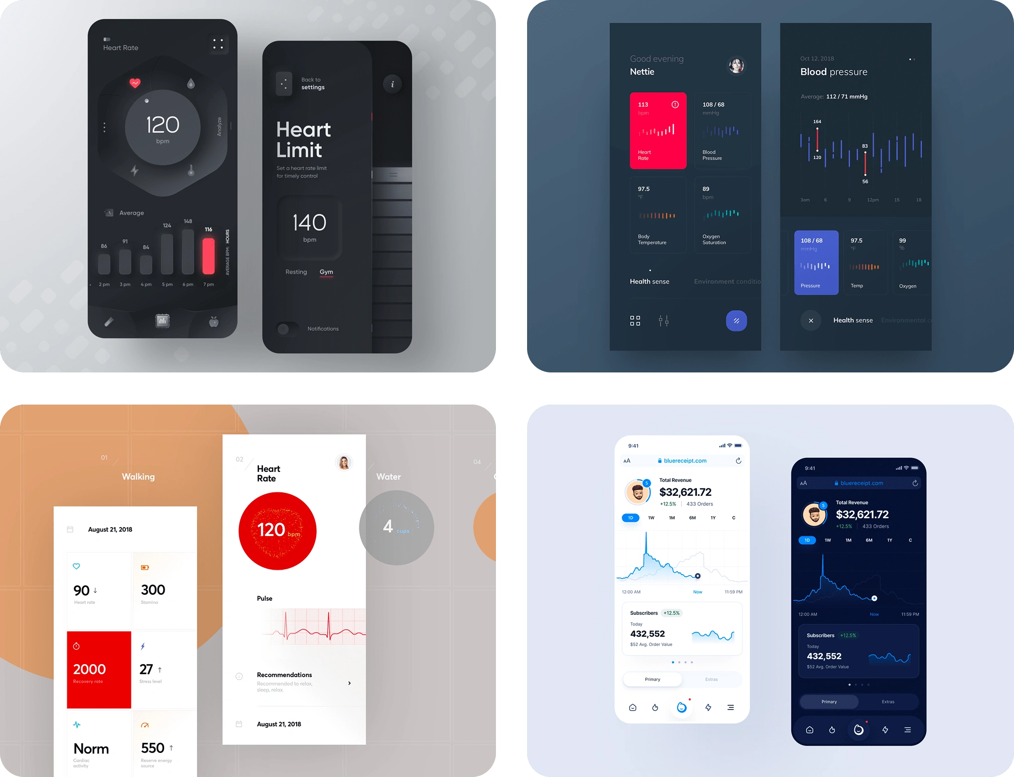
Moto fitness app allow us to track and monitor all activities from smart watch. Understanding your health has never been easier with a beautifully designed interface showing heart rate, sleep tracking, SPO2, Active Calories, GPS Tracking, Messaging Alerts exercise data and more. With the ability to track more than 26 sport modes, you can stay on top of your training schedule and smash that next PR.
Project Scope
Create a brand guideline for new moto fitness app.
Design an interface for smart watch.
Create prototype across all the modules.
The new design should be in dark mode.
All visual charts should be clearly visible and technically feasible.
The Process
For creating mobile application design, we had a dedicated UX team for crafting experience that can track all health activities who worked on discovery, user flows and then delivered wireframes in which all the UX process has covered. Once it is done, I took the wireframe turned into a visually usable product. So my job was to start working on the visual aesthetics of the application in terms of color, typography, iconography and illustrations to make it more visually appealing.
Inspirations : The more reference I collect, the more design ideas I can generate. I use Dribbble and Pinterest extensively as a tool for finding inspirations. I look for inspiration that comes from the small elements like buttons, number, etc. Sharing a few which I benchmarked, out of 100+ collections.
Design Discovery
The next step is to work to set the design direction. For that, we need a relevant input that covers all the design directions. So usually I create a Google Form link which has a list of few questionnaire regarding the colour, typography, icon style, illustration style and it also covers target audience, competitors, and reasoning for every design level inputs which is mandatory to make a logical direction.
Mood board & Direction
After getting inputs from the Motorola team, I proceeded further to work on mood board. Since the Motorola team has their brand guidelines and they requested to choose colours and typography from their brand guidelines for consistency. They had a limited colour palette in the colour system. So I had to pick a few which is relevant to the dark theme as a design direction. I first took blue as dark theme because it is representing some of Moto’s design elements. The dark theme should be in the blue shade so that other primary colours can be visible and blends together.
Color palettes
The visual aesthetics I defined rely heavily on colours and their association with other elements. To ensure balance and good contrast value, I carefully selected a palette of visually clear colours. While adhering to the brand guidelines, I experimented with blending the primary palette with other design elements.
Background color : that used for dark theme direction.

Primary colors : that used to across all the screens.

Accents colors : that accentuates playfulness.

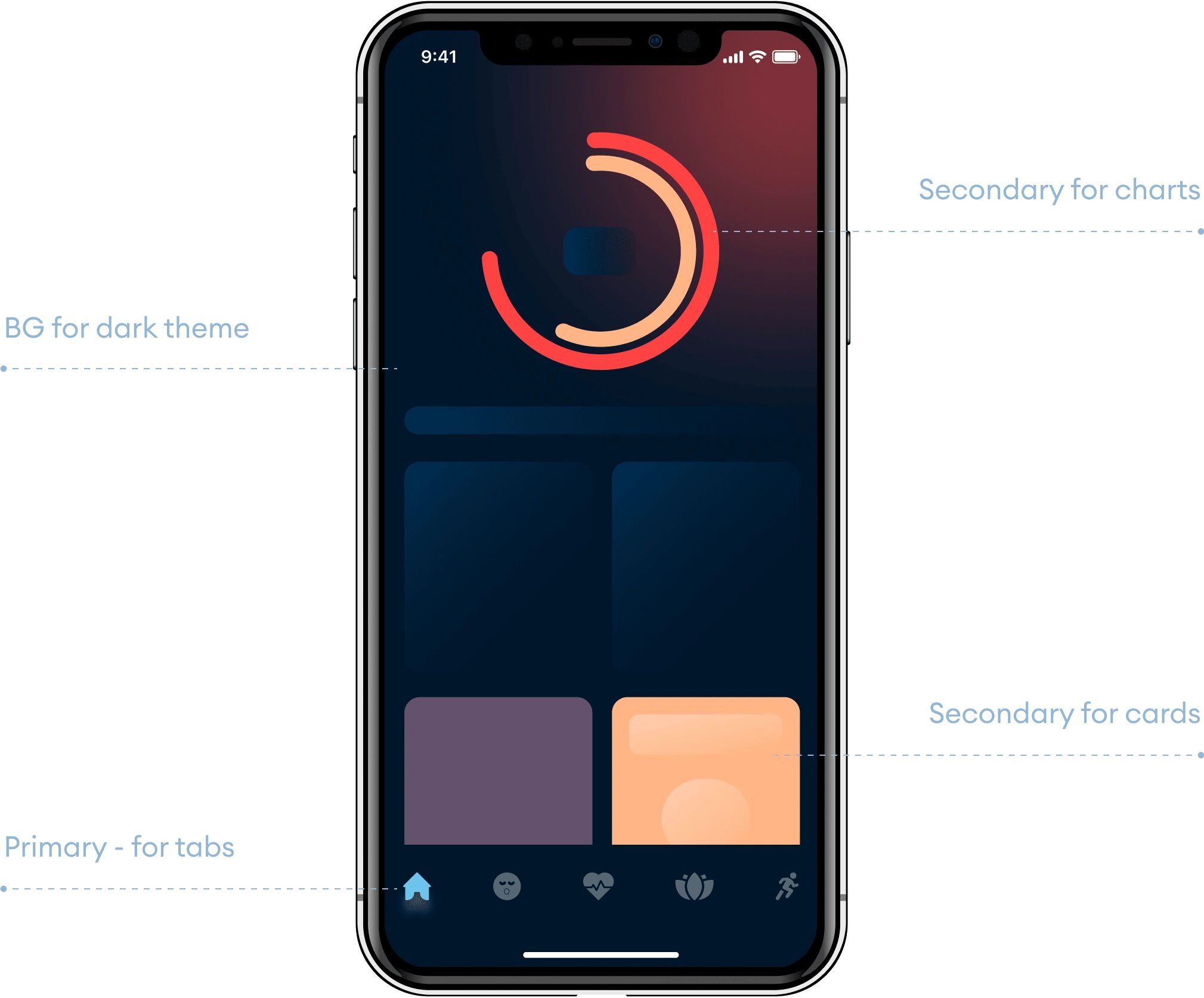
Color Usage in UI
In order to establish a consistent color palette, I created a hierarchy for how to use color balance throughout various sections and buttons. It helps client to understand its usage rather than just giving palettes.
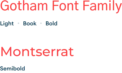
Typography
In the context of mobile apps, numbers are just as important as activities and KPIs. They should be easily legible, crisp, and clear, even from a distance. Therefore, I opted to use the Gotham font family throughout all screens, including the mobile application. This choice is in line with Motorola guidelines and helps maintain consistency
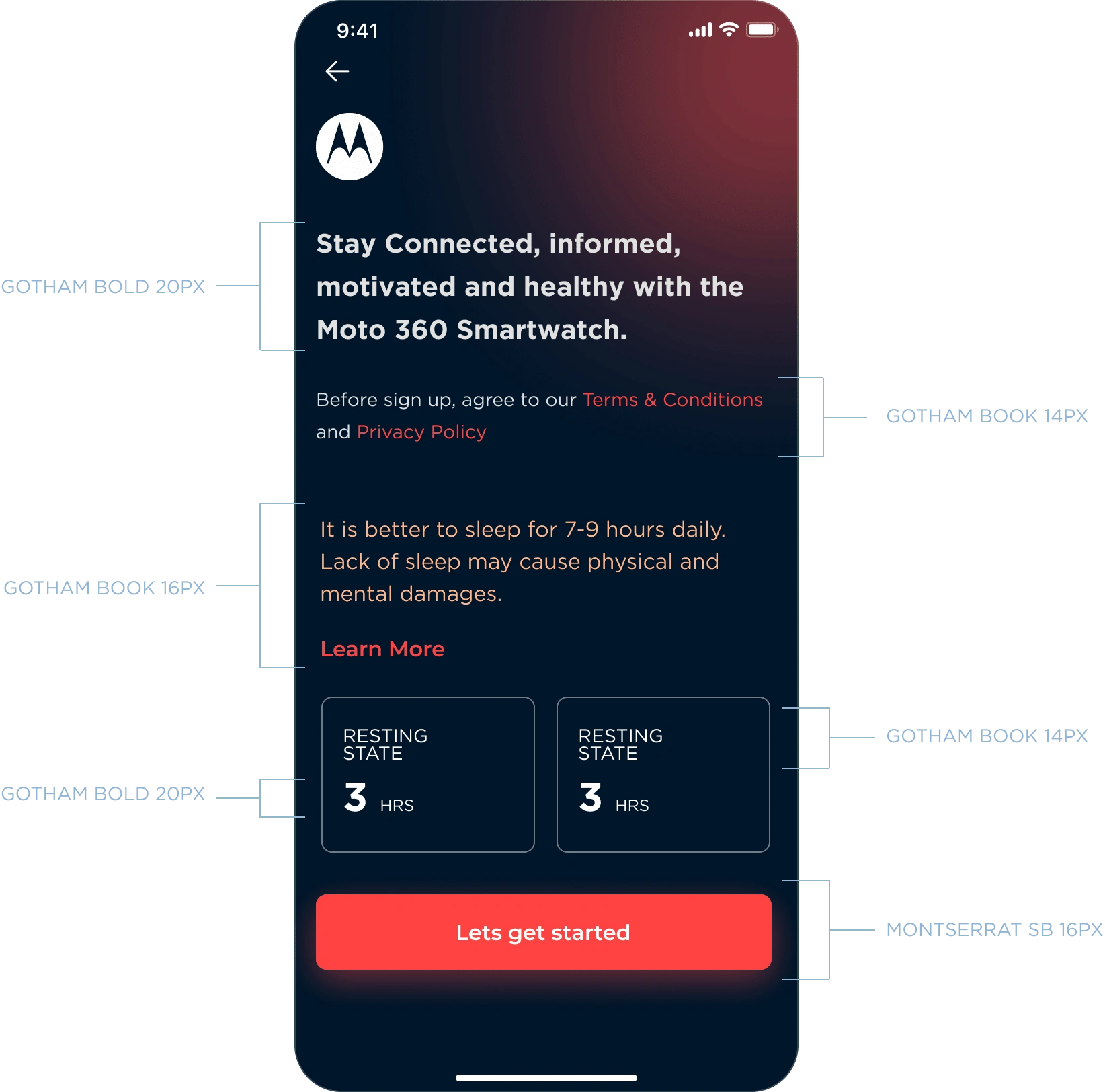
Typography Usage in UI
Similarly, to achieve a consistent typography, I developed a hierarchy for the usage of font and size across different sections and buttons. This hierarchy not only specifies the font family but also explains its usage to the client.
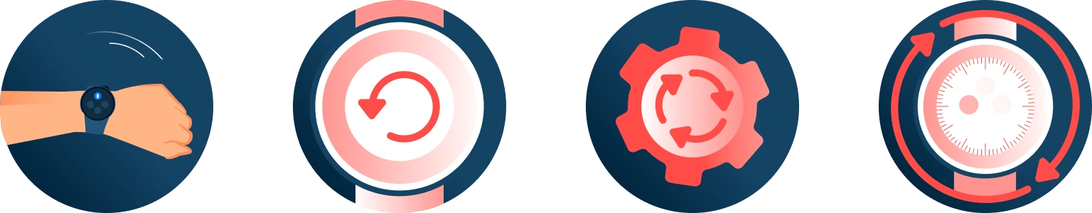
Iconography
Icons plays a vital role in helping users identify activities through visual cues, following typography. Legible and clear icons can simplify content and enhance usability. Engaging icons can keep users interested and invested in the product. After exploring various icon styles, we ultimately chose Line icon style. I created most of the icons and I also collaborated with Illustrator to complete the project before deadline.

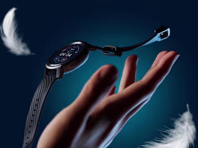
Illustrations
Illustrations are not just decorations but also serve as an interpretation of textual content or a concept, effectively telling a story. They provide users with a visual understanding of the product. After suggesting four trending illustration styles, the Motorola team ultimately chose the style called Detailed vector. This style represents realistic details such as shadows, lines, and other effects. So I collaborated with my illustrator team to work on those illustrations across all the screens.
UI Designs
In the end, I combined all the design elements to create a cohesive visual direction that complemented every screen and element. Each screen was meticulously crafted with curated visual elements, legible font sizes, crisp icons, subtle colours, and more, all intended to make the design stand out in the market.
Feel free to checkout apps listed in both Android and Apple store for real time experience.
Like this project
Posted May 1, 2025
Designed UI and prototype for Moto fitness app with a focus on dark mode and visual aesthetics.
Likes
0
Views
4
Timeline
Mar 1, 2021 - Jun 1, 2021
Clients
Motorola