urban farming brand | logo design


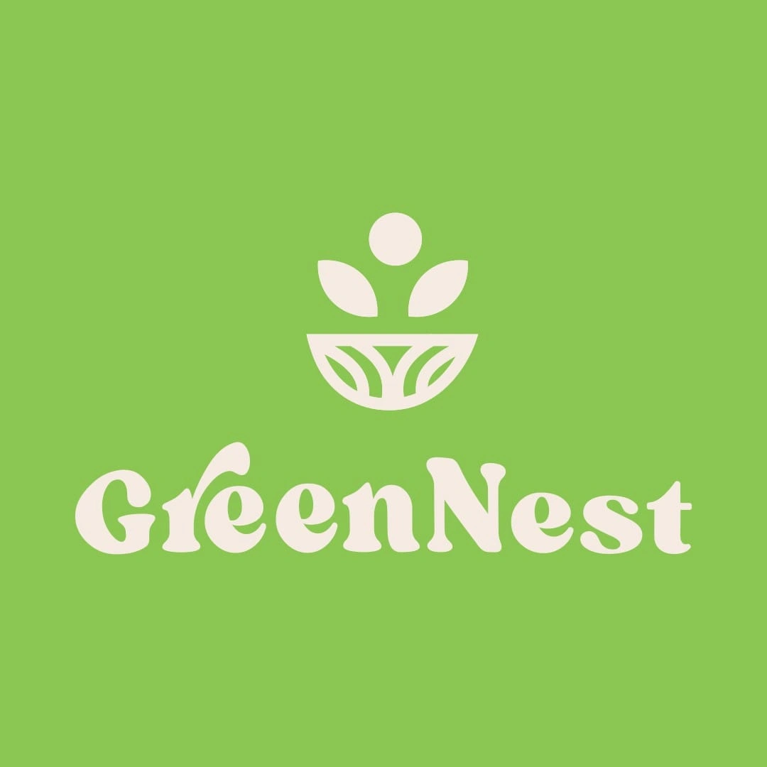
greennest logo design

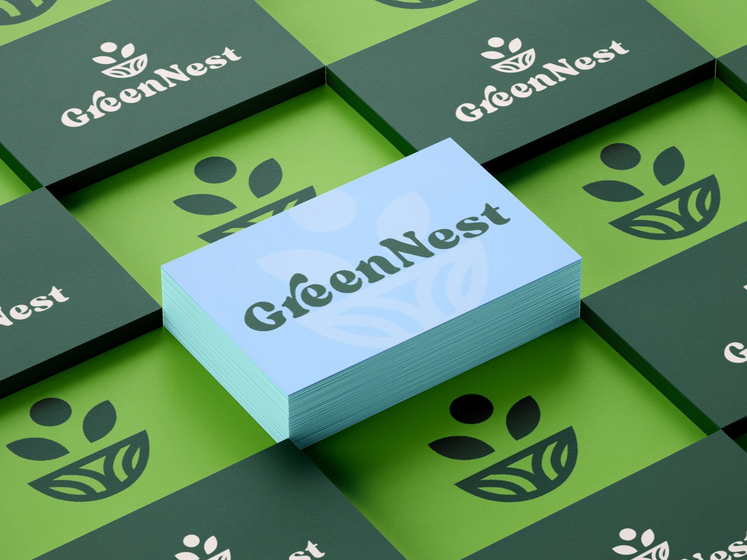
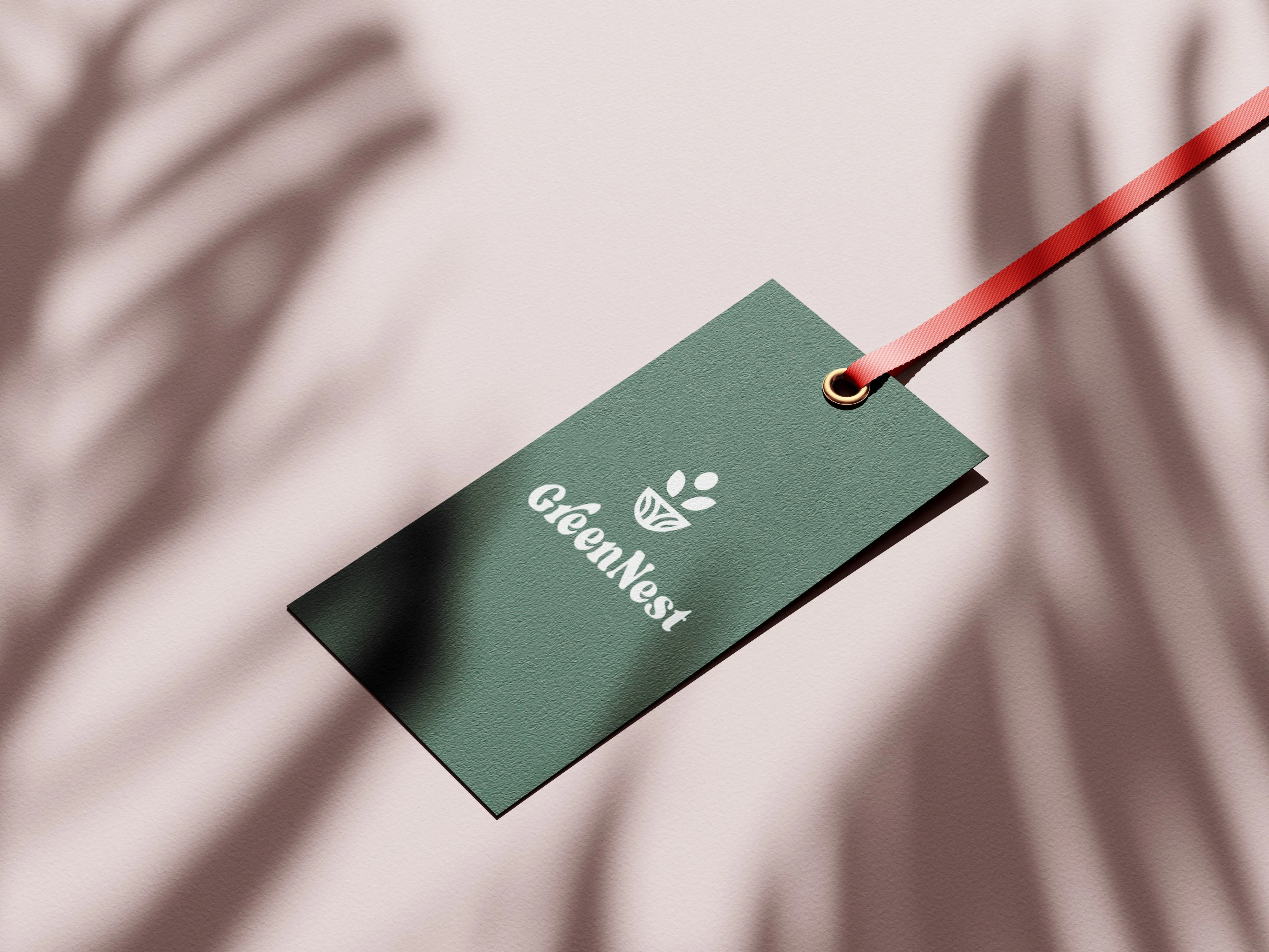
primary logo
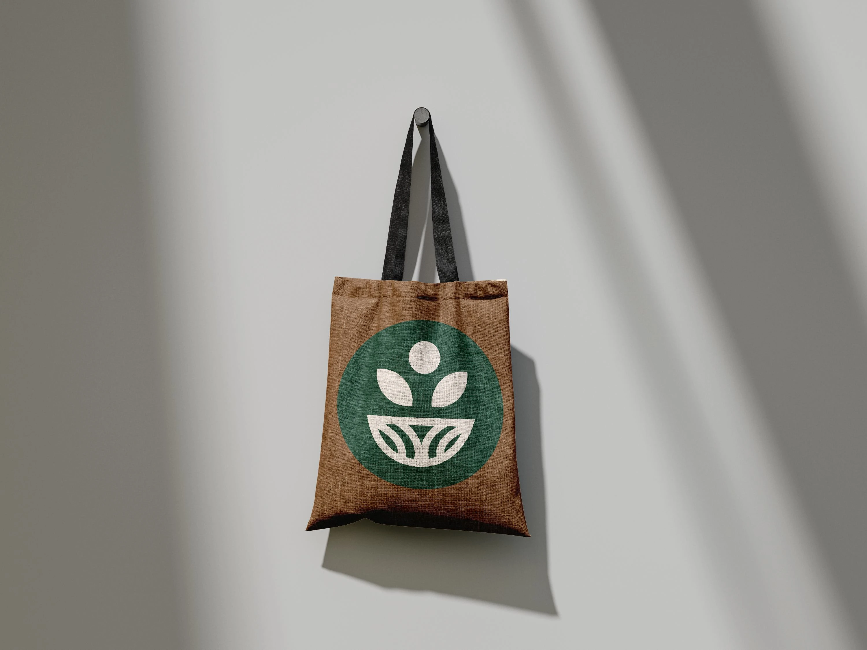
secondary logo
As a secondary logo, it likely serves as a simplified or smaller version of the primary branding, emphasizing the core values of nature, growth, and sustainability. It may be used in contexts where a more compact or alternate variation of the primary logo is needed.
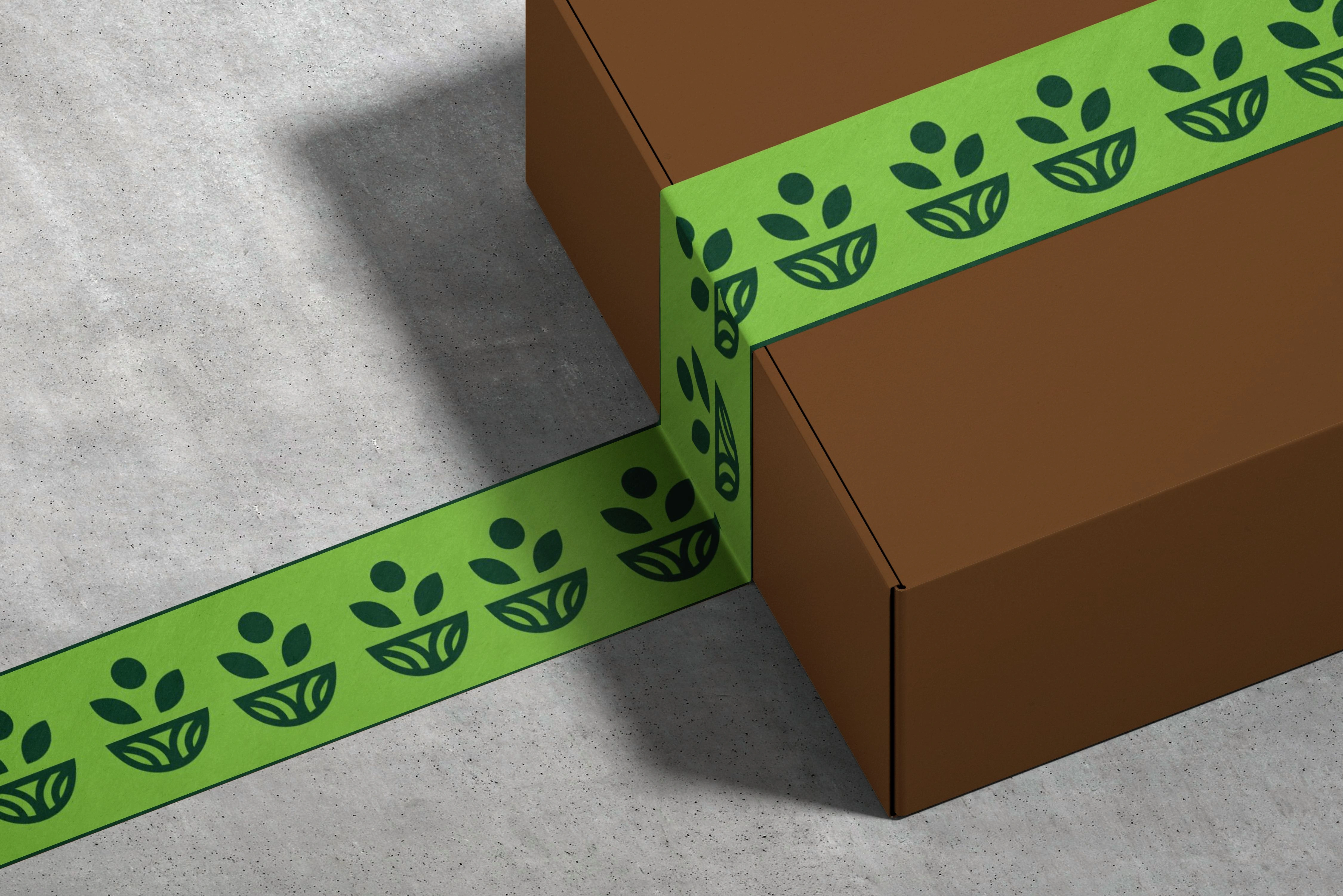
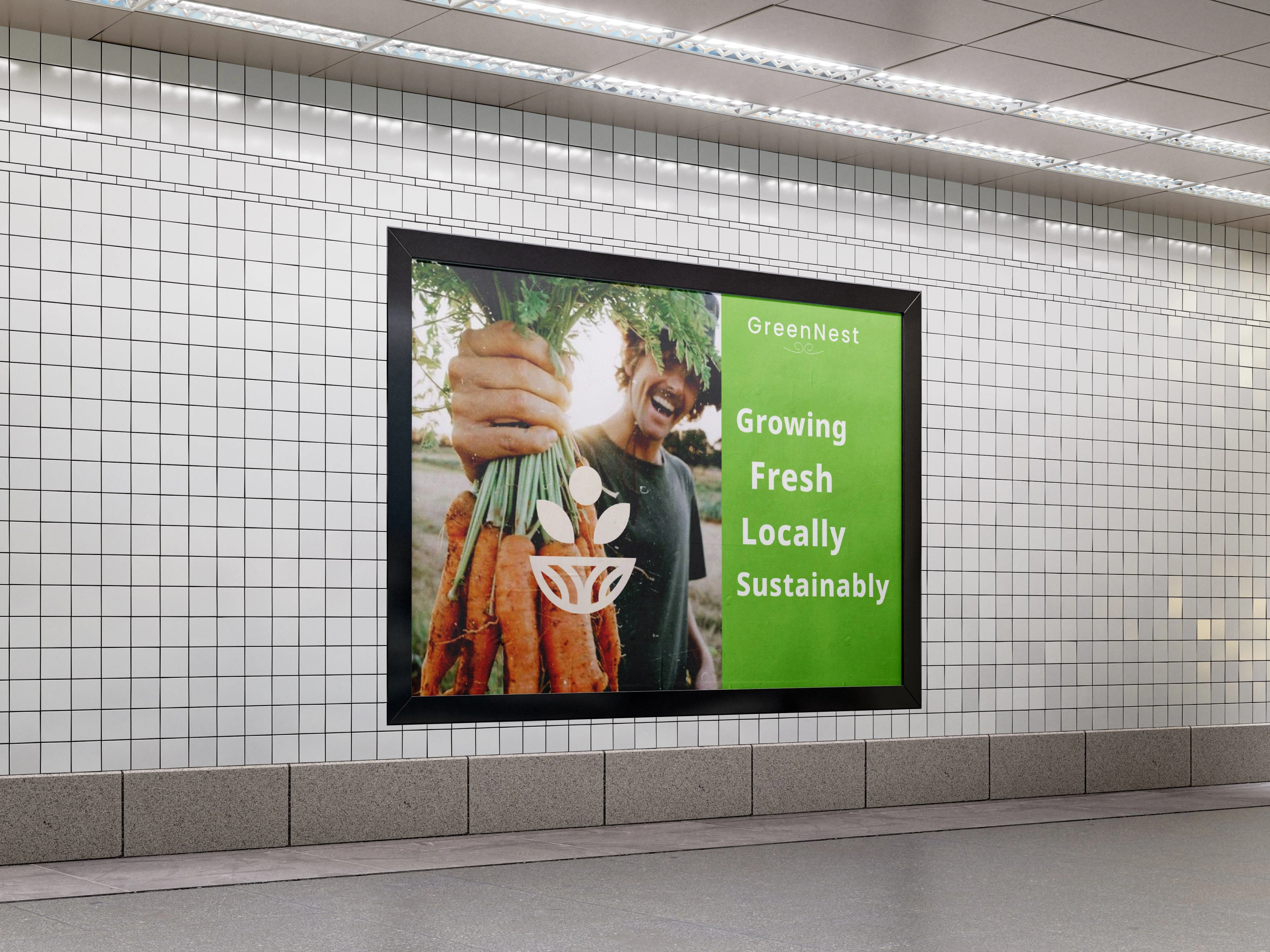
Design: The logo uses a simple, modern design, fitting within minimalist branding styles. The icon above the text represents a plant sprouting from a nest-like shape, suggesting growth, sustainability, and nature—a fitting symbol for an eco-friendly brand.
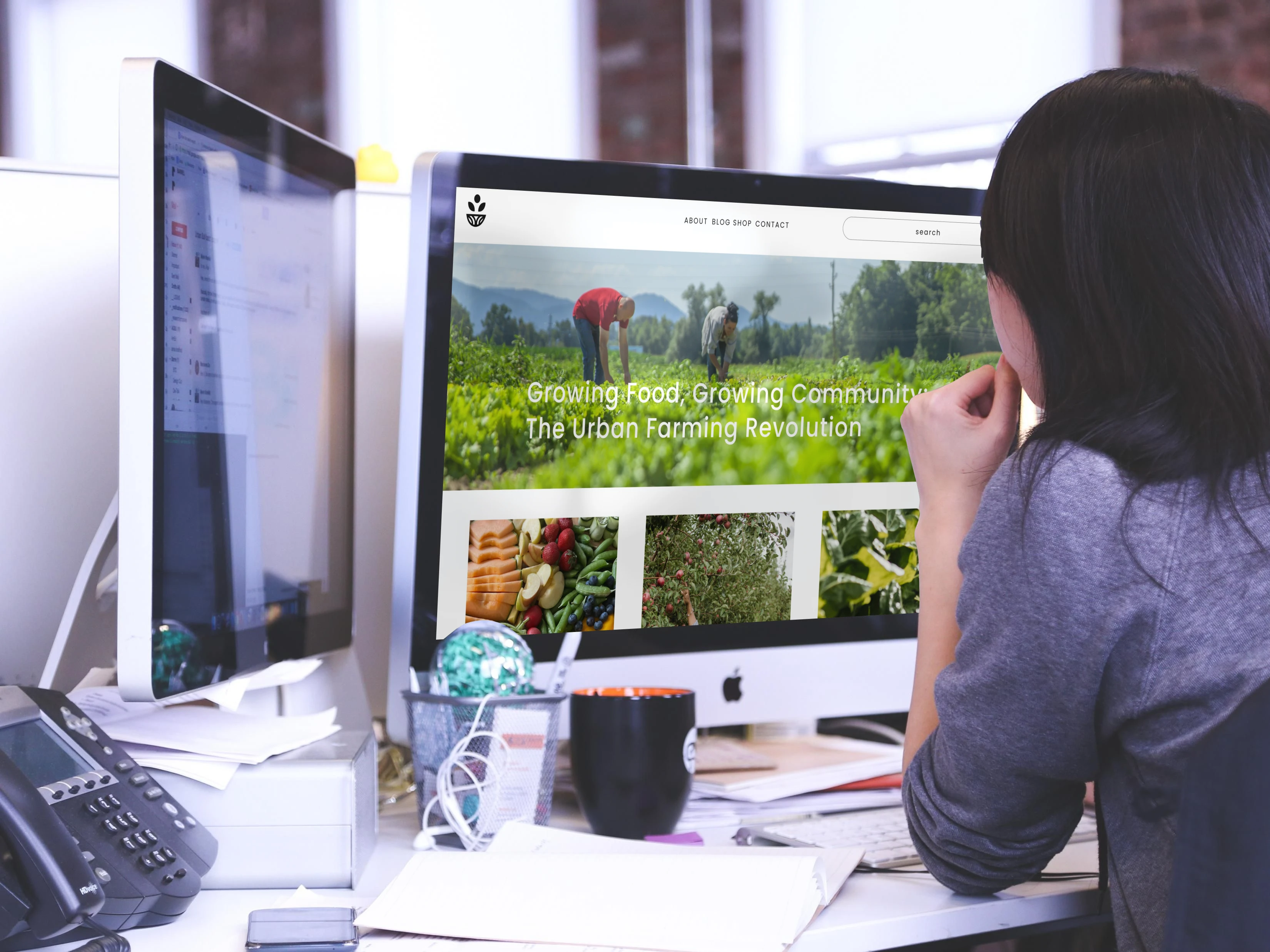
Typography: The word "GreenNest" is written in a smooth, rounded typeface that has a slightly playful feel with a soft curve on the letter “G.” The font choice gives it a natural and organic look, complementing the green, eco-conscious theme of the logo.
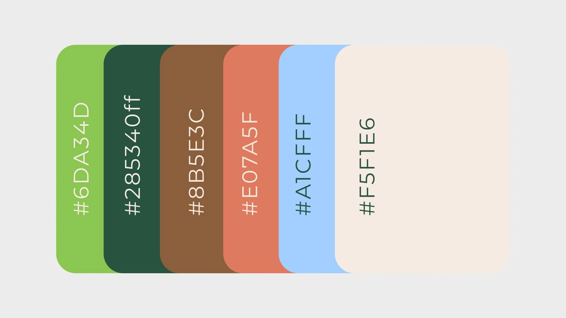
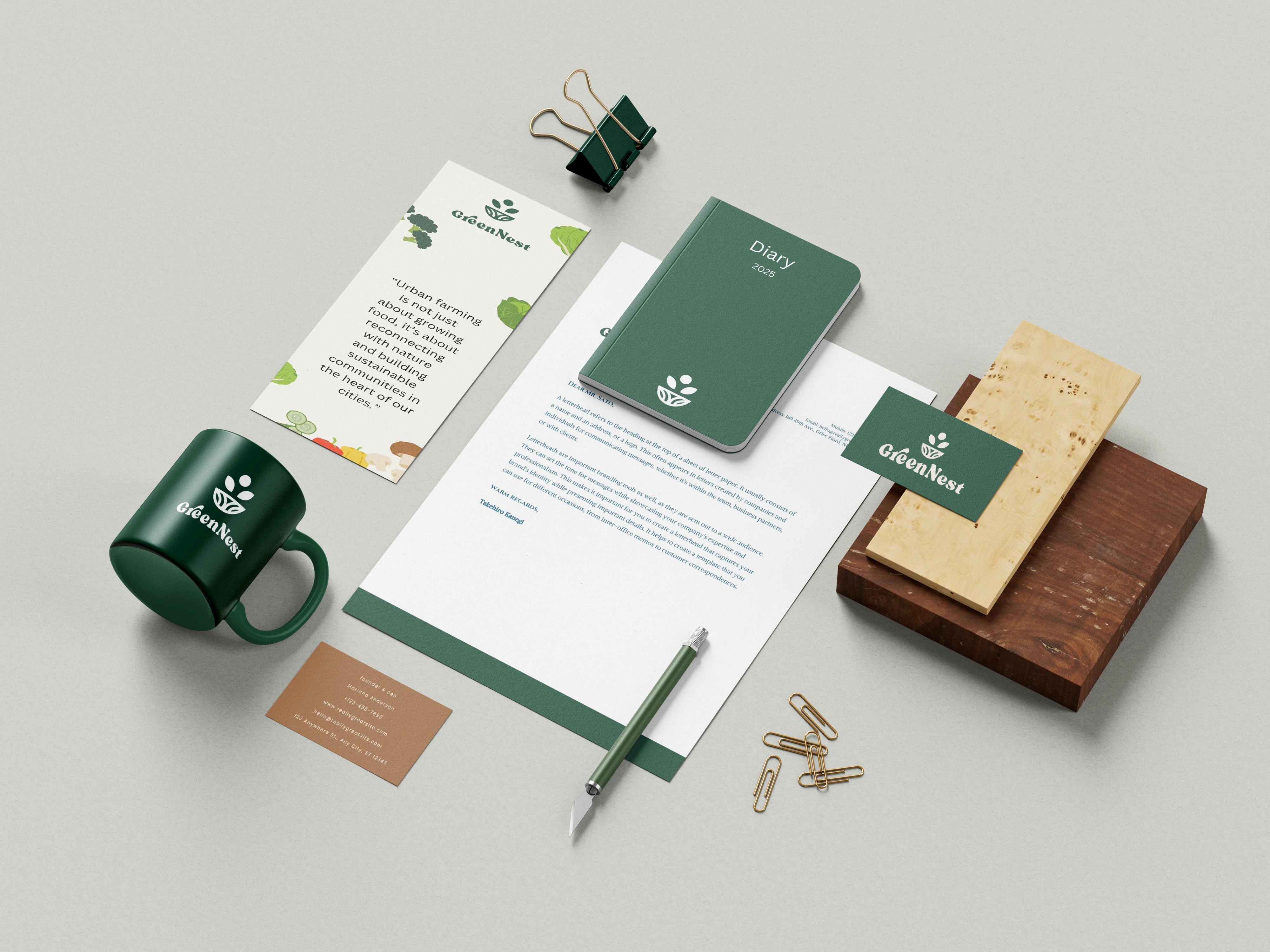
This palette conveys a strong connection to nature, sustainability, and earth, with the use of natural greens and browns, while the softer accents like blue and coral provide contrast and visual appeal. The beige ties everything together, ensuring the palette remains harmonious, minimalist, and modern—perfect for a brand like GreenNest focused on eco-conscious living.
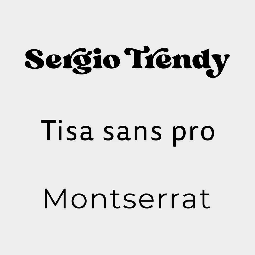
For the brand "Greenest," using Sergio Trendy for the logo and Tisa Sans Pro and Montserrat for headings and paragraphs creates a strong visual hierarchy and personality.


Like this project
0
Posted Oct 24, 2024
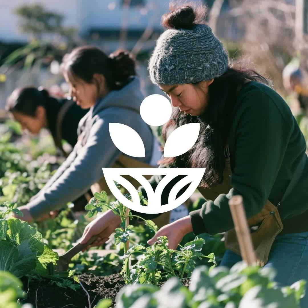
Greenest is an innovative urban farming brand focused on bringing sustainable, eco-friendly farming practices to city environments.
Likes
0
Views
0


Real estate project

Kiddo

skincare branding | logo