JANIA Brand Identity

JANIA - Tote Bag
JANIA is an emerging eco-bio skincare brand that wants to be the meeting point between cosmetics and pharmacopeia: creating a line of skincare products whose quality is tested through chemical-analytical verification methods.
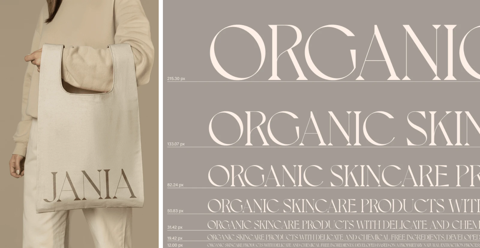
JANIA - Typoghraphy
Jania products contain a high concentration of natural active ingredients that act at a metabolic level, passing deeply through the skin and guaranteeing not only aesthetic benefits but also medical benefits, when necessary.
The raw materials are processed with precise scientific knowledge and the latest-generation technologies. The ingredients used for the composition of the products are treated so that they remain as close as possible to their natural characteristics, making the products extremely delicate, natural, and close to respecting the environment.

JANIA - Packaging Design
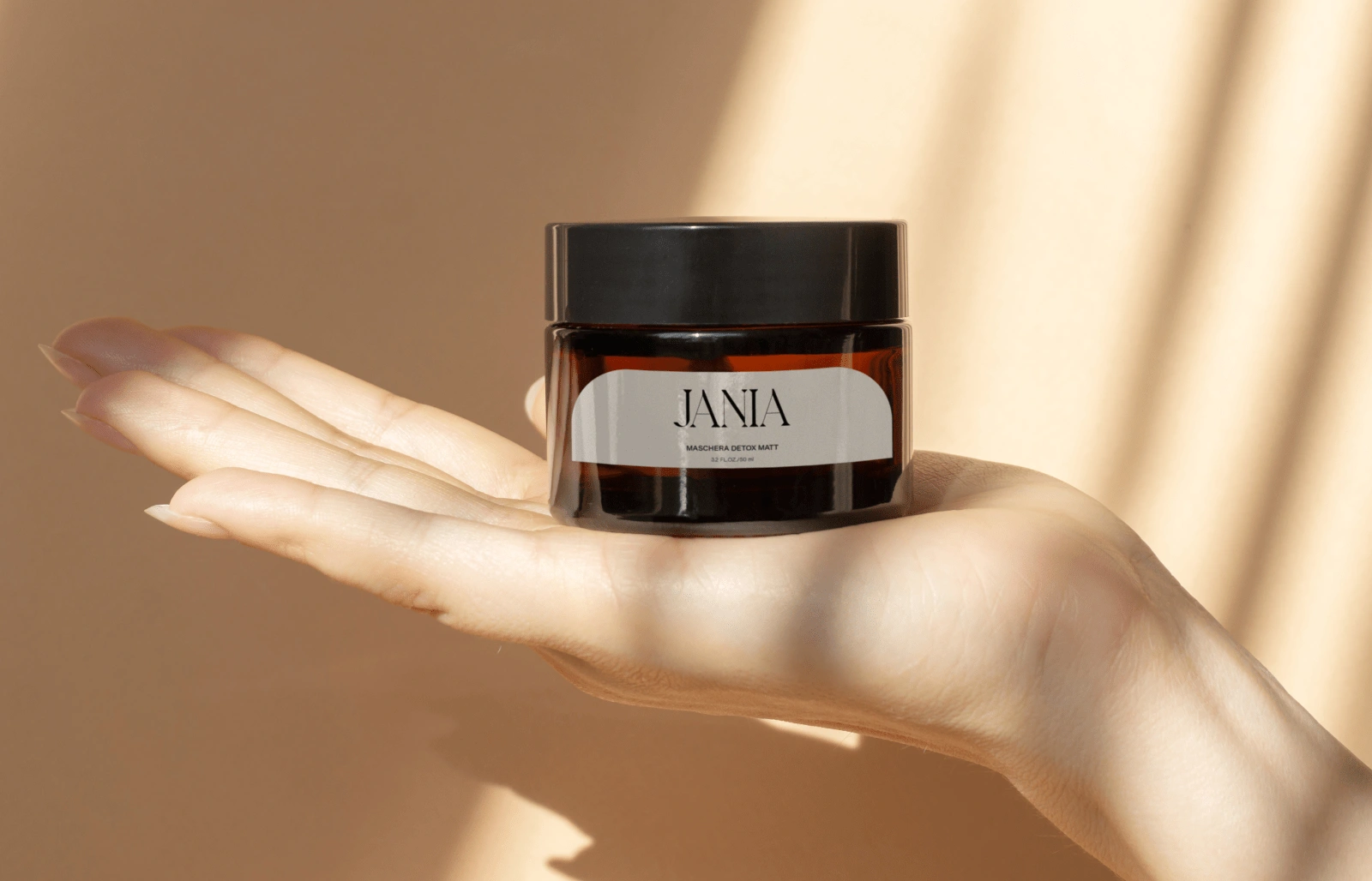
JANIA - Packaging Design
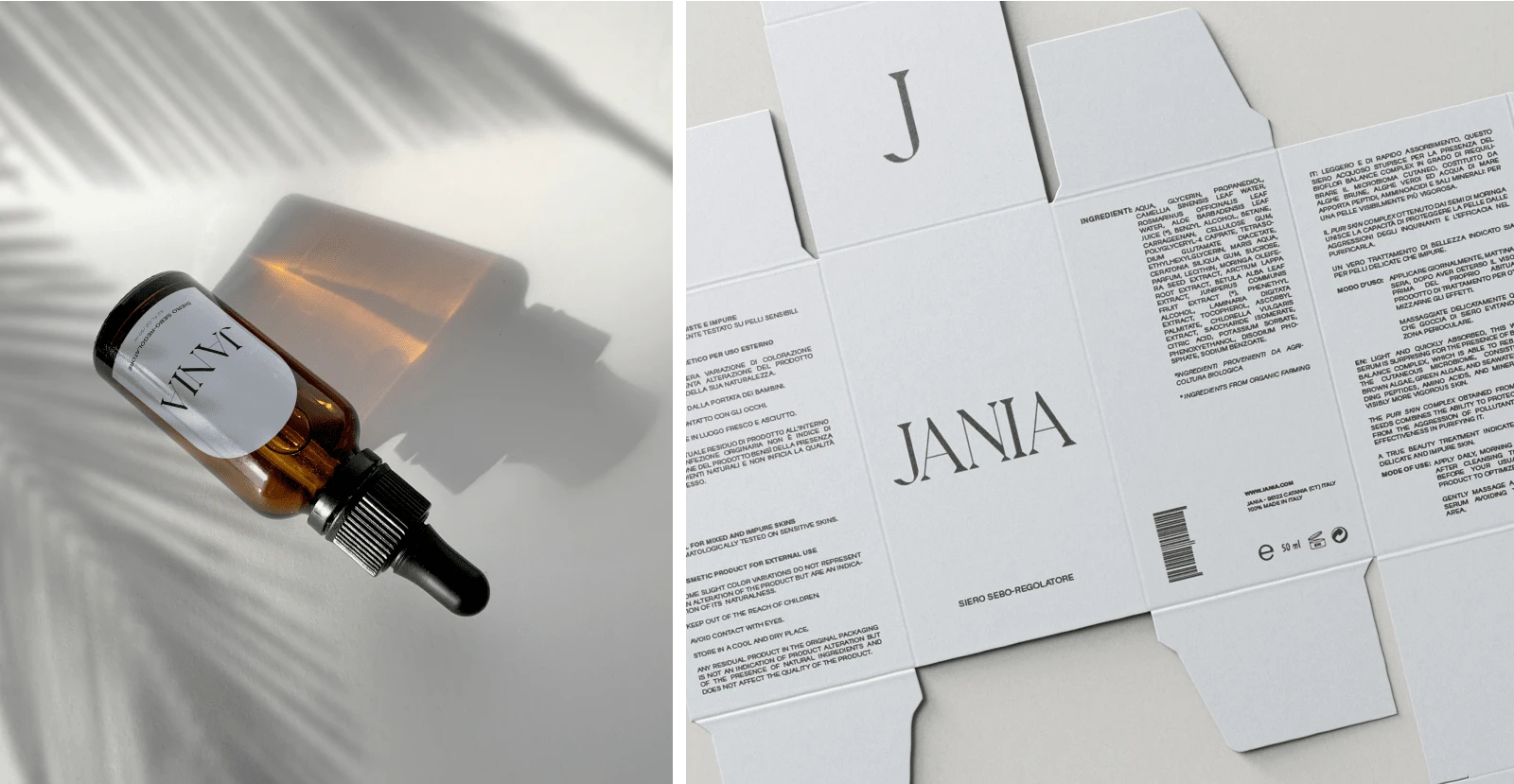
JANIA - Packaging Design
Considering the strengths of the product and the brand values, such as attention to the environment, naturalness, and well-being of the person as each one is different, it was decided to develop a brand identity based on soft, different but at the same time similar colors. The same process concerns the geometric shapes used as image frames and layouts, taken up in each designed article: from labels to images used on the website.
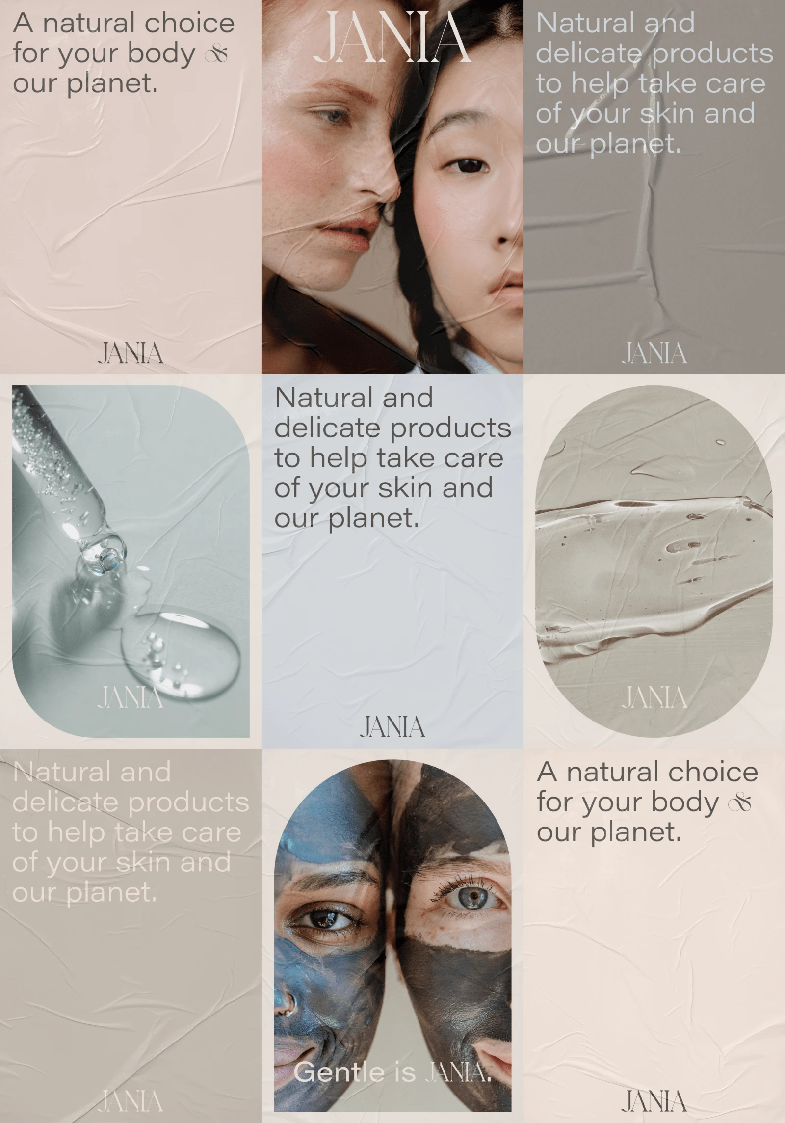
JANIA - Poster Design
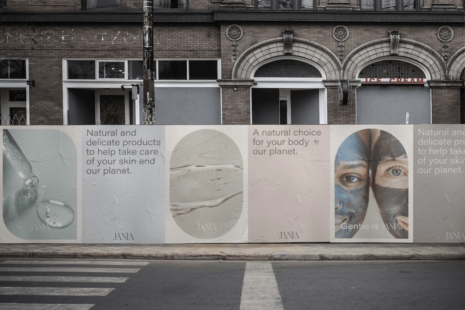
JANIA - Poster Design
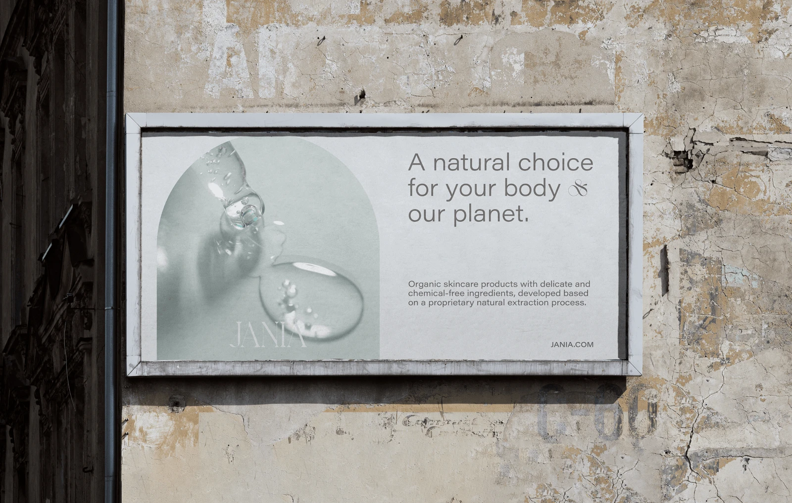
JANIA - Poster Design

JANIA - Store Sign
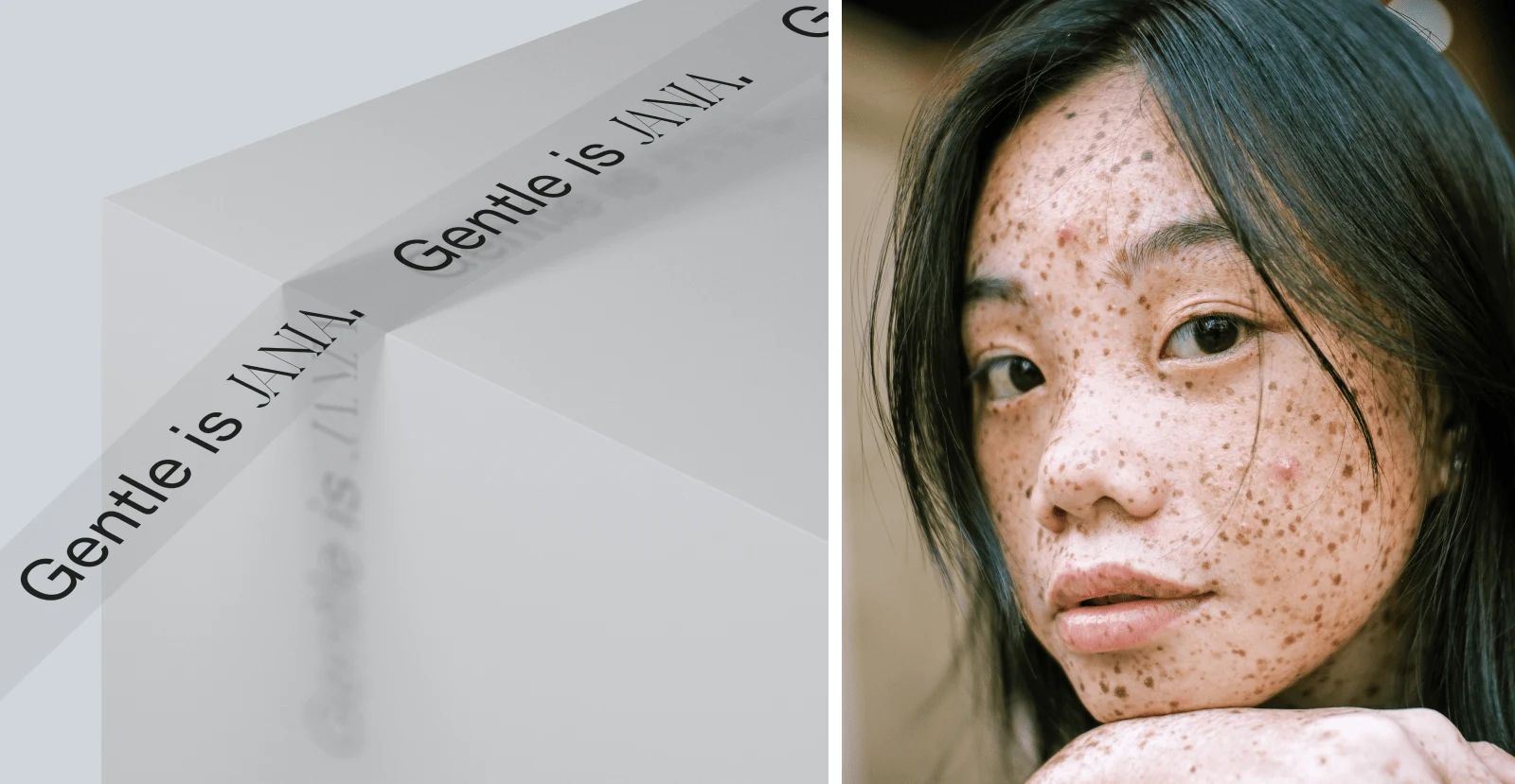
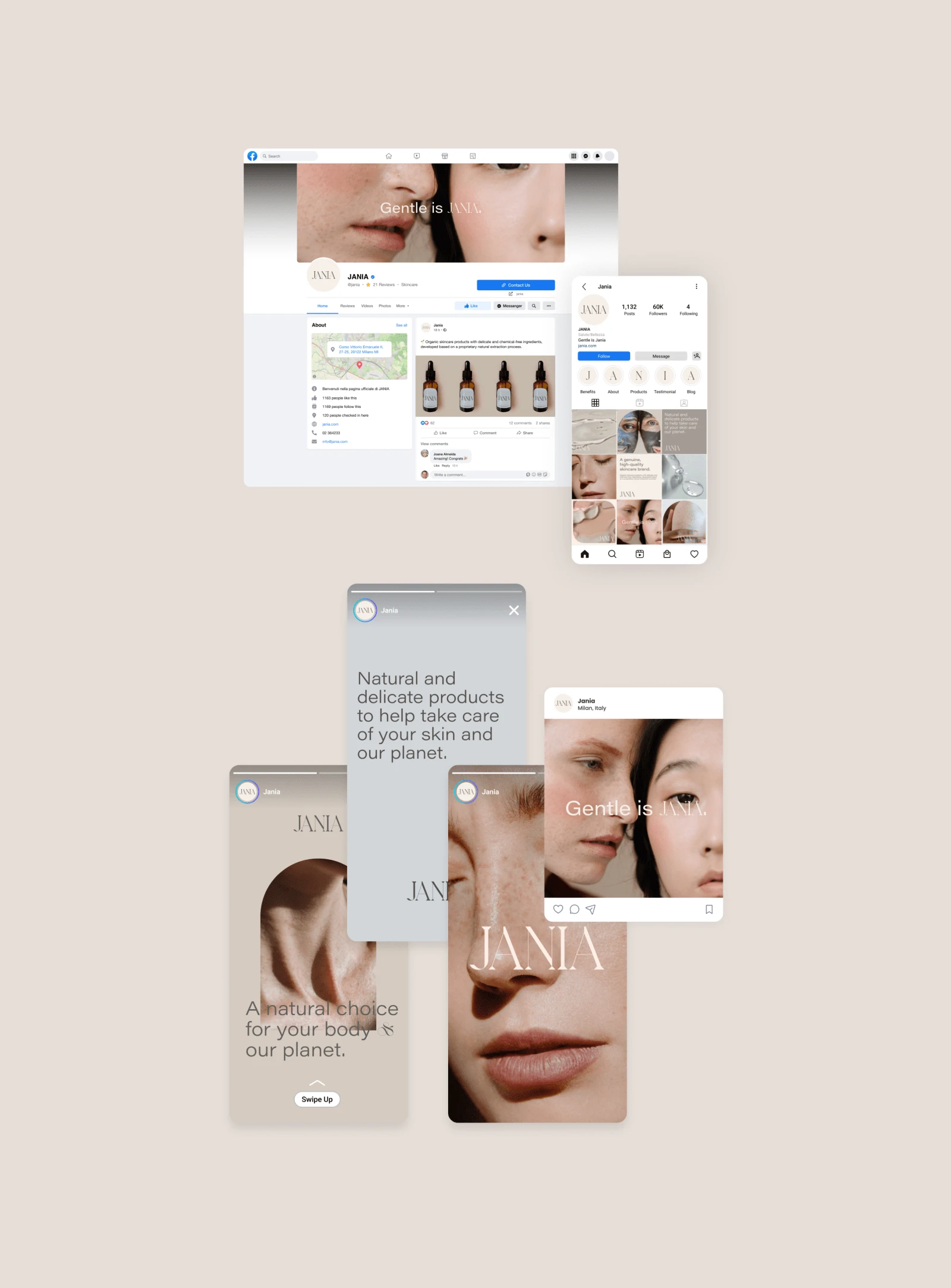
JANIA - Social Media Design

JANIA - Web Design
Full project on Behance:
Design by Antonio Calvino & Alessia Visicaro.
© All rights reserved.
Thanks for watching!
Like this project
Posted Aug 3, 2023
JANIA is an eco-bio skincare brand that wants to be the meeting point between cosmetics and pharmacopeia. Designed by Antonio Calvino & Alessia Visicaro.

