Built with Framer
Faceshift Landing Page Design
Munzir Kareem
Overview
Faceshift is a landing page designed for AI editing apps, face-swap tools, video enhancement platforms, and browser-based editing products.
The goal was to create a high-conversion, visually strong, and transformation-focused layout that conveys value instantly through its structure and clarity.
Full Landing page mockup
Problem
Many AI editing tools fail to convert because:
Messaging lacks clarity
Visual transformation isn't showcased properly
Pages feel cluttered or overly technical
Editing workflow is not clearly explained
Trust-building elements are missing
This creates friction and confusion for visitors, reducing sign-ups.
Section - Mockup
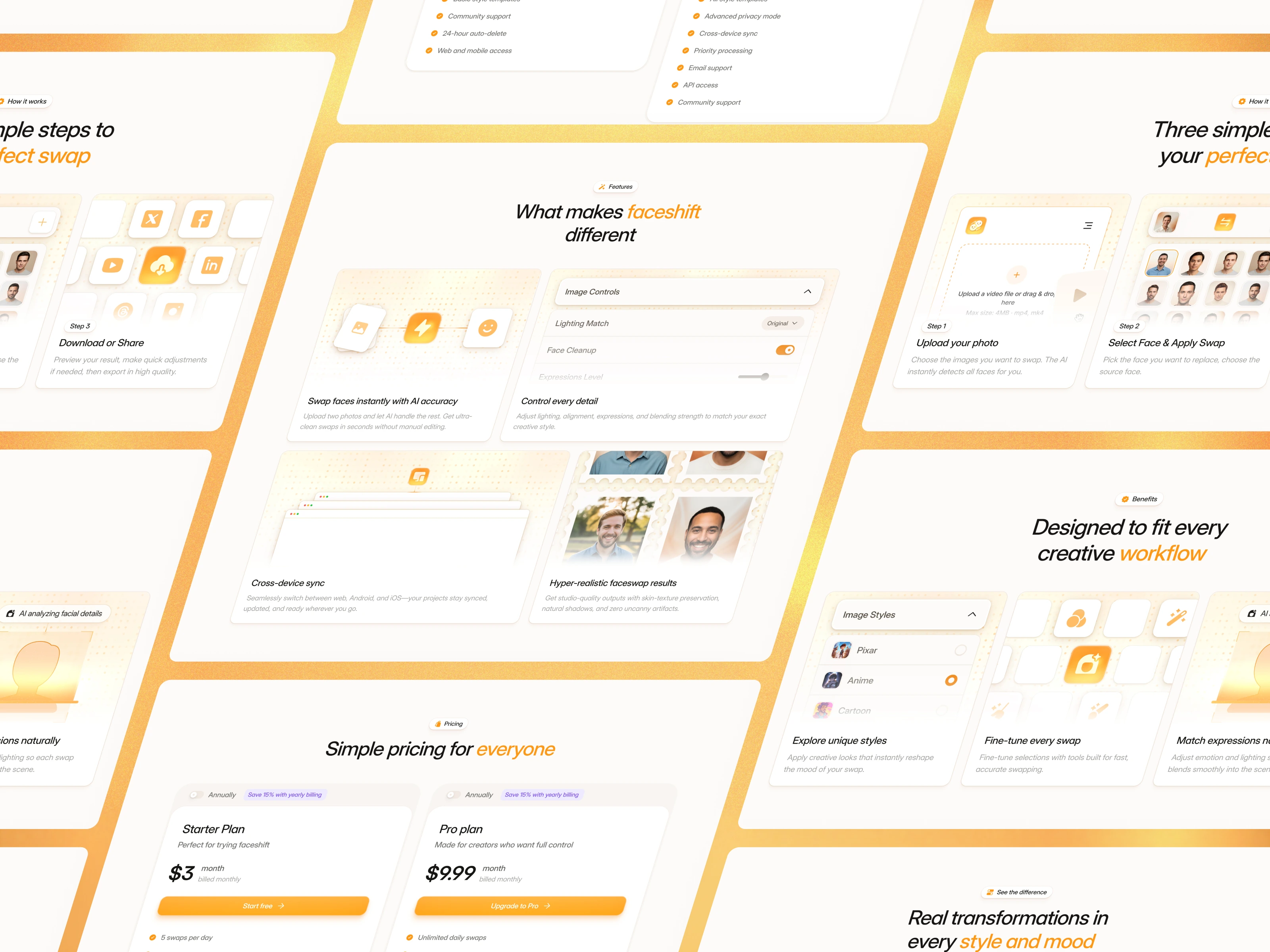
Design Approach
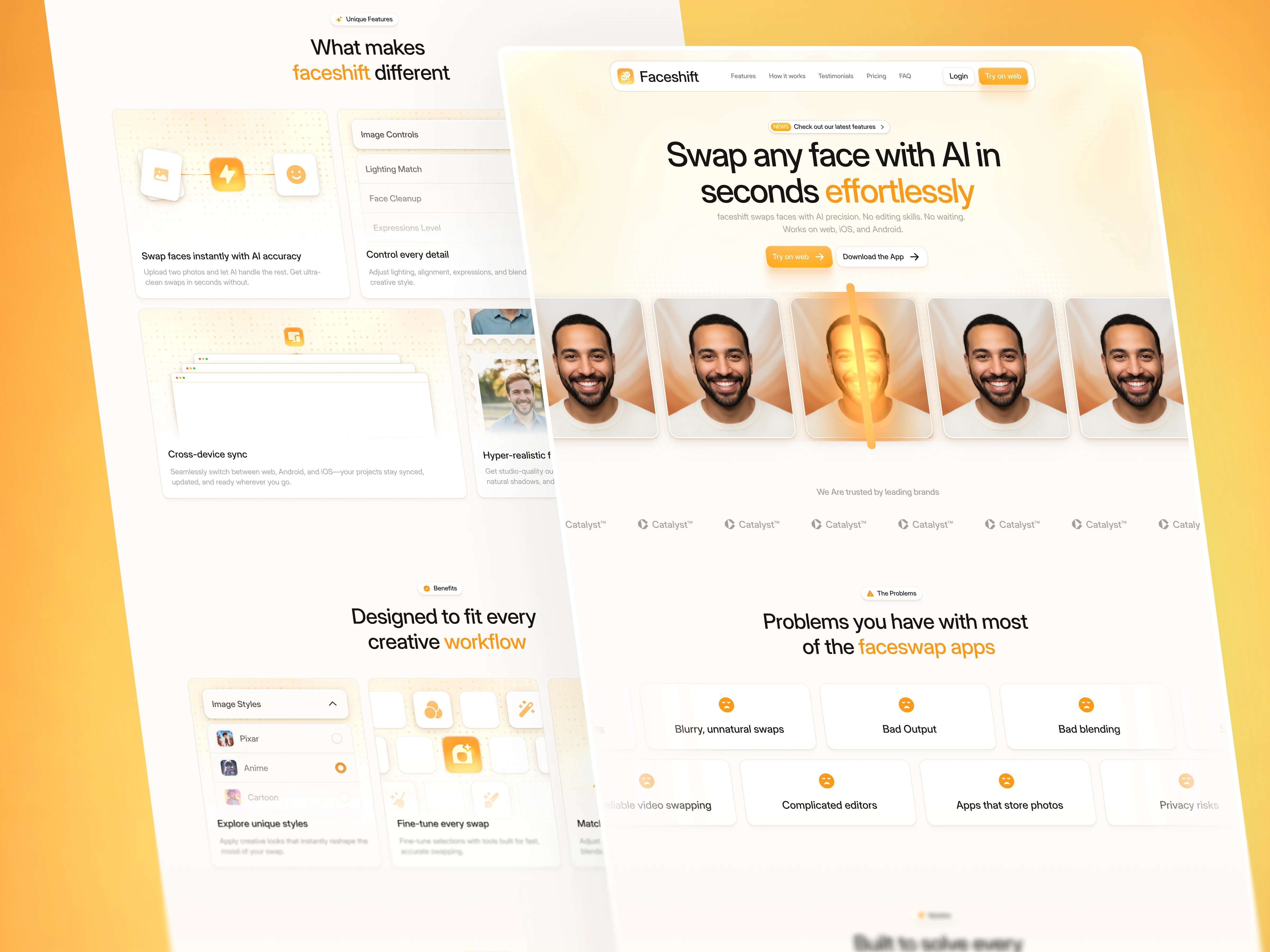
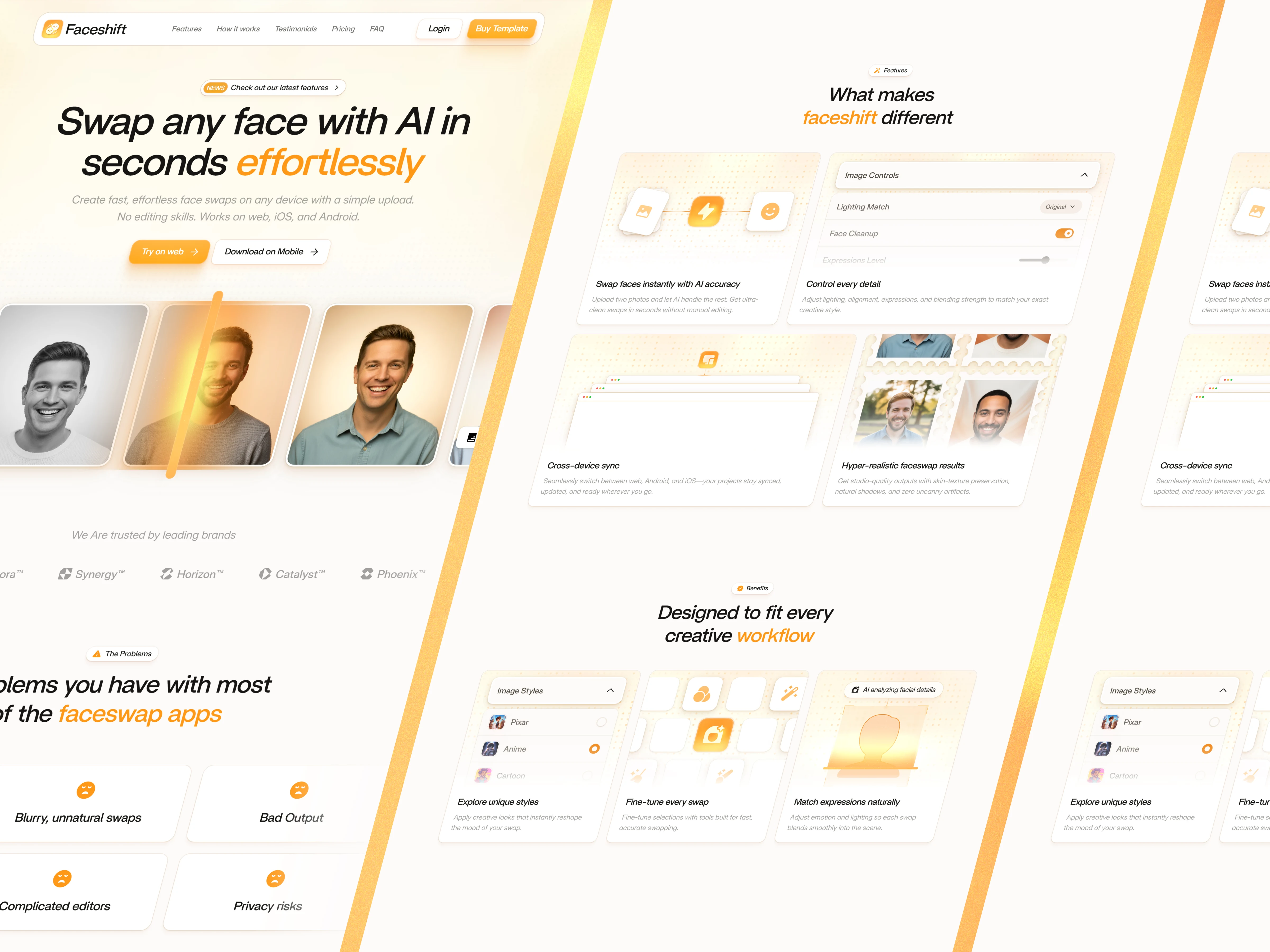
1. Hero Section
A bold headline and a clean visual preview provide instant understanding. I set the tone fast, what the product is and why it matters. The goal is instant clarity before users scroll.
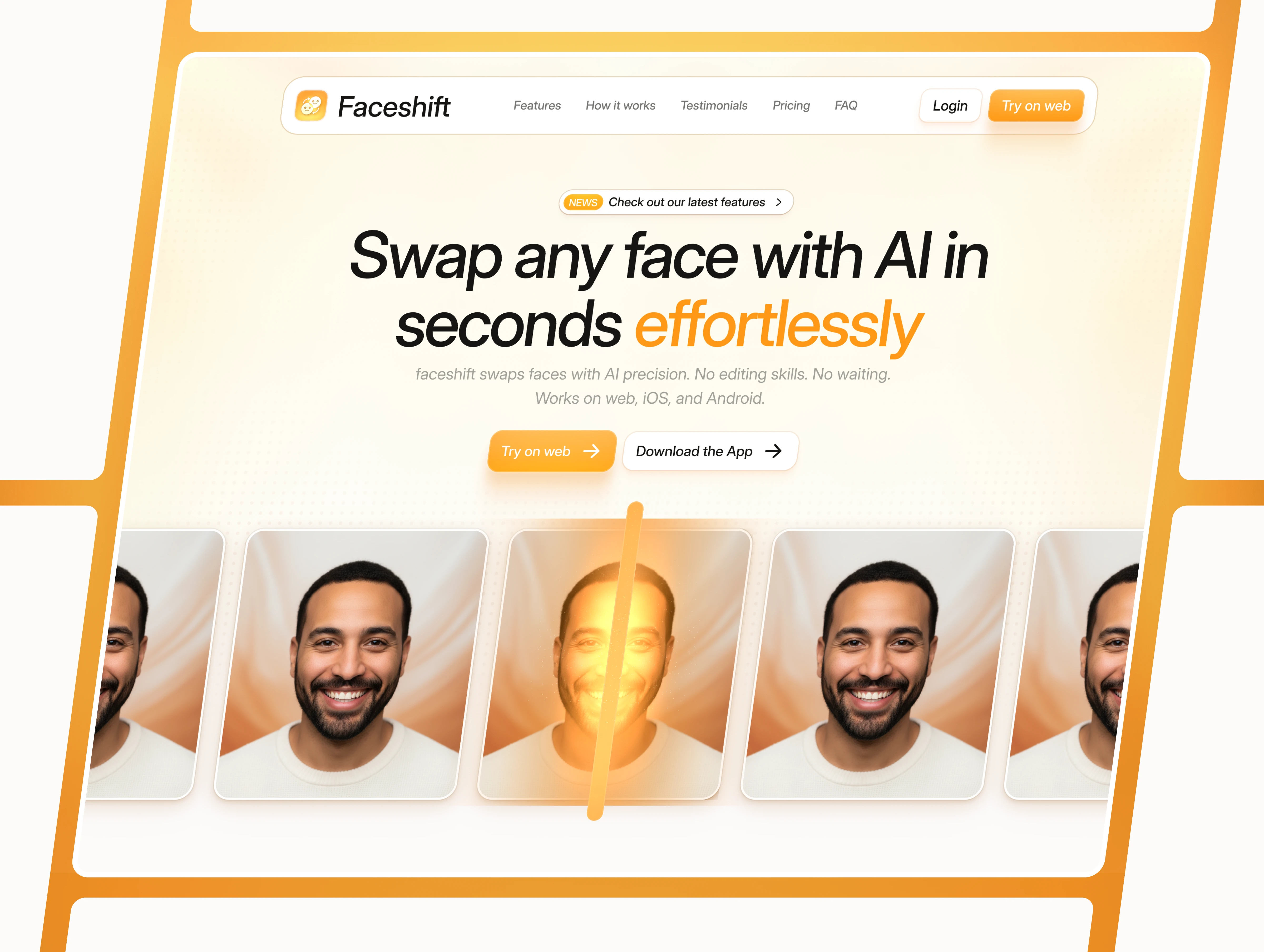
Hero - Desktop
2. Problem
I highlight the real struggles users face. Once the pain is clear, they’re ready for what comes next.
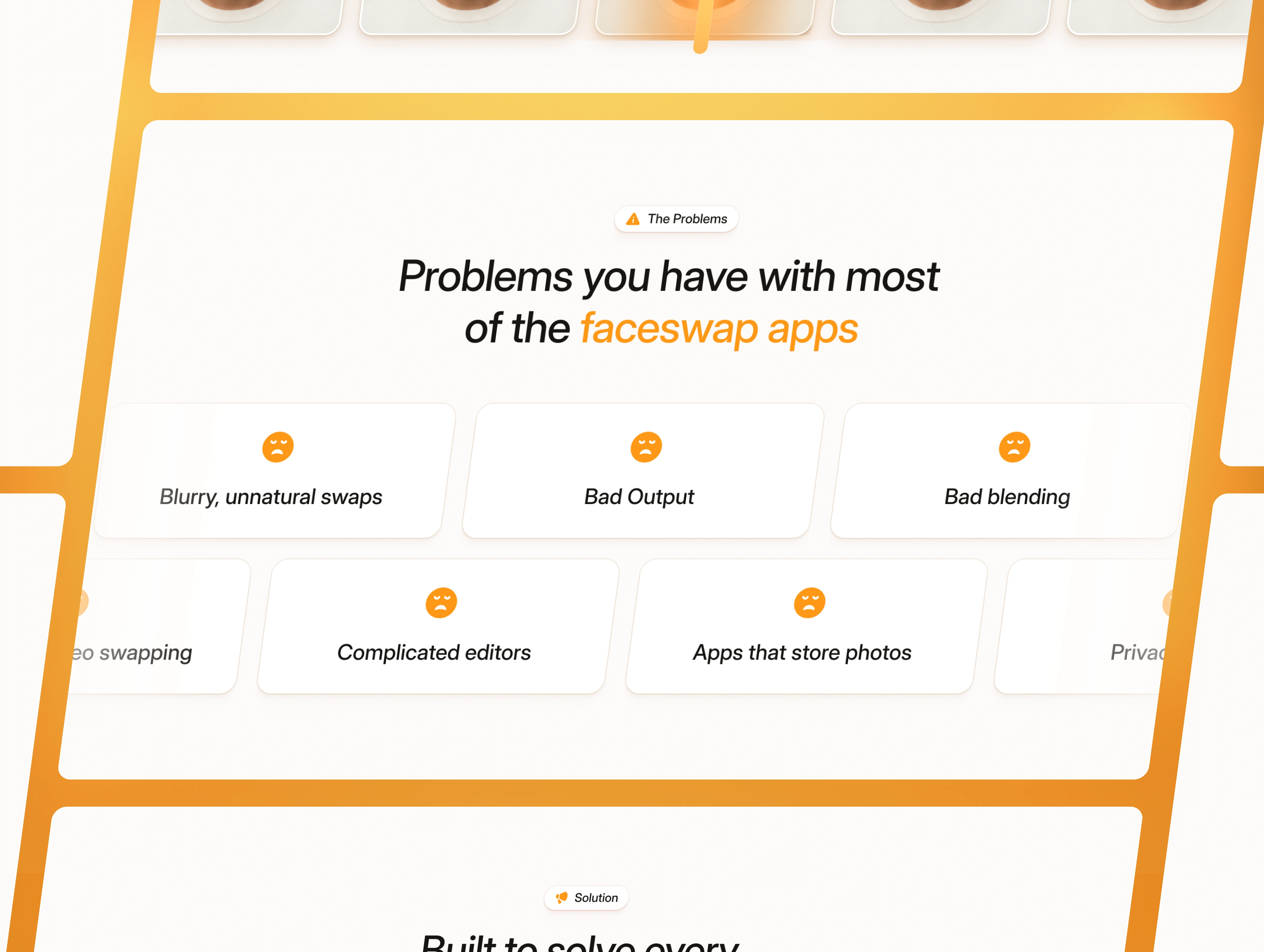
Problems
3. Solution
I introduce the fix right after the problem. It shows the clear shift from “here’s the issue” to “here’s the answer.”
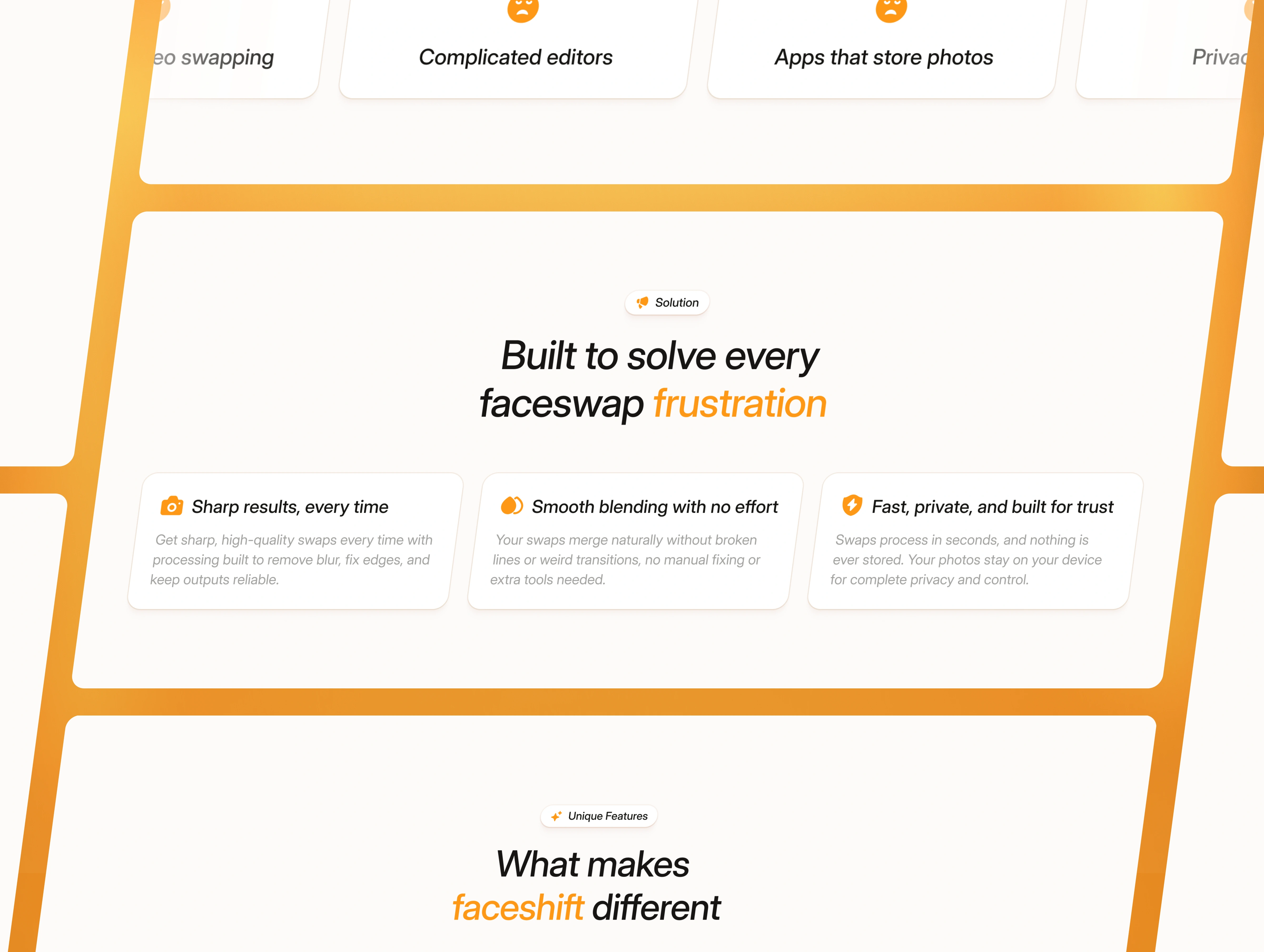
Solution
4. Feature
In this section, I break down what the product can actually do. After showing the solution, it’s the right time to show how it works.
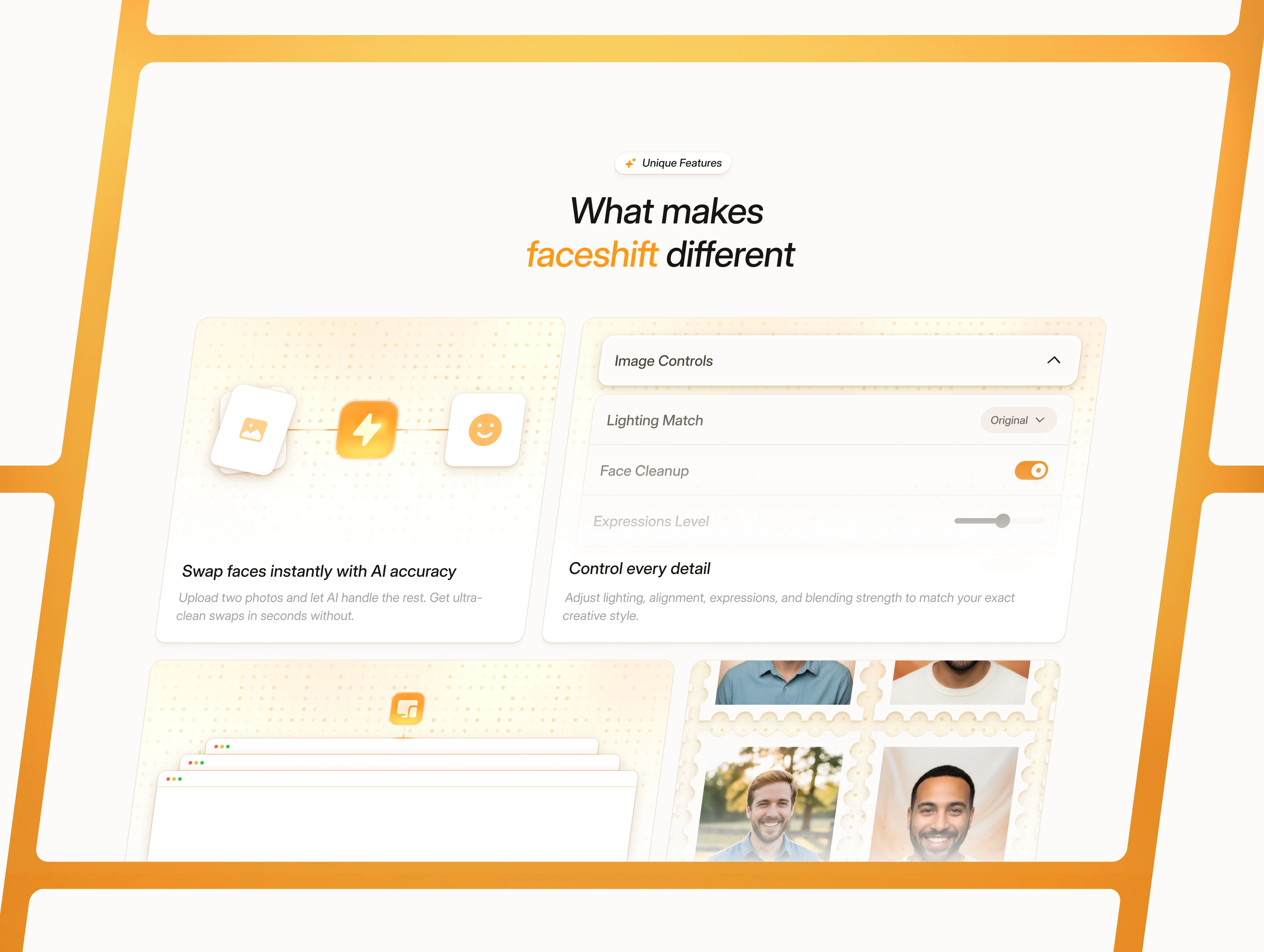
Features
Features - Bento
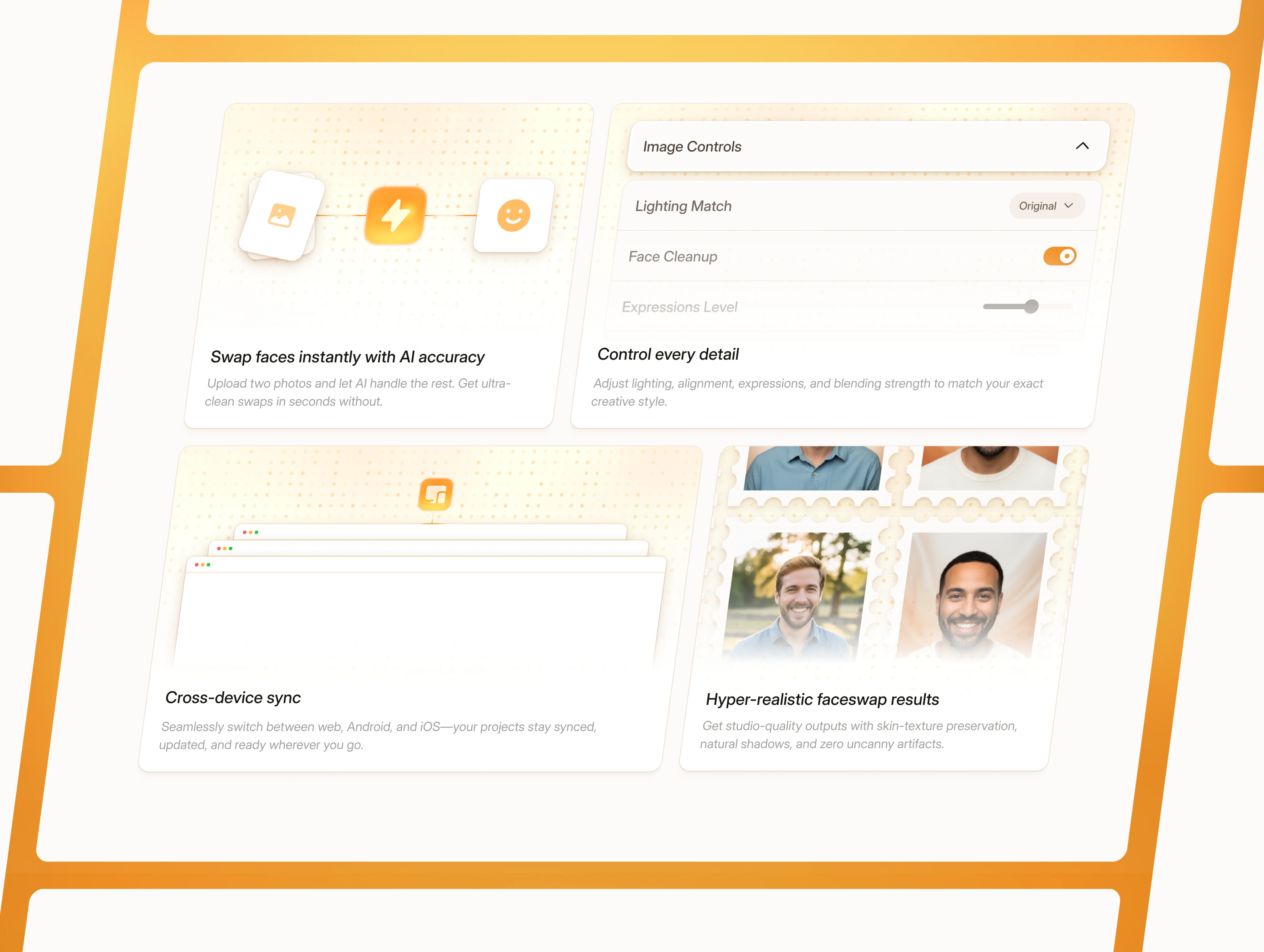
5. Benefits
I move from features to Benefits. This helps users understand what they actually get from using it.
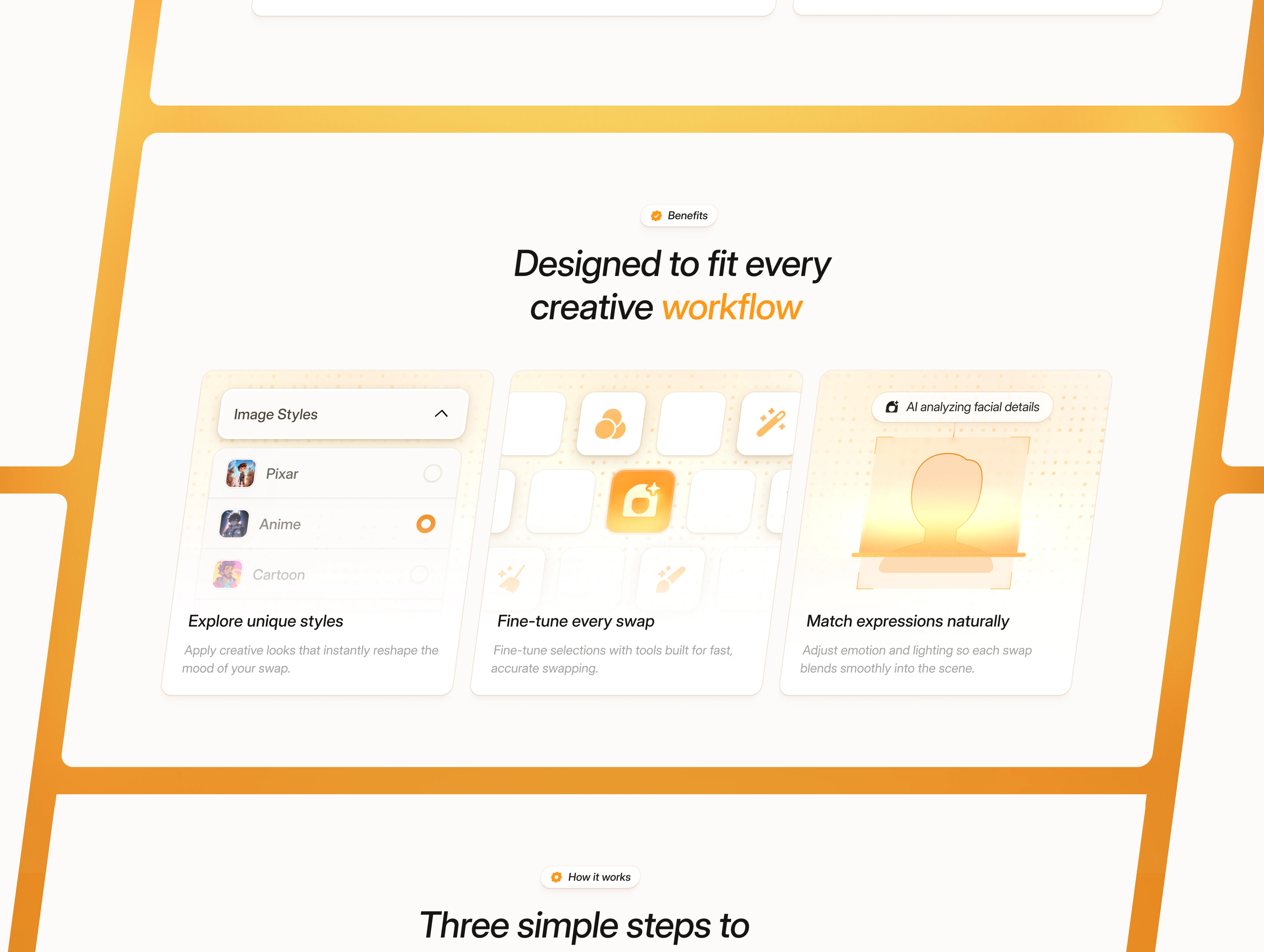
Benefits
6. Process
I explain the simple process step-by-step. Once benefits are clear, users want to know how to get started.
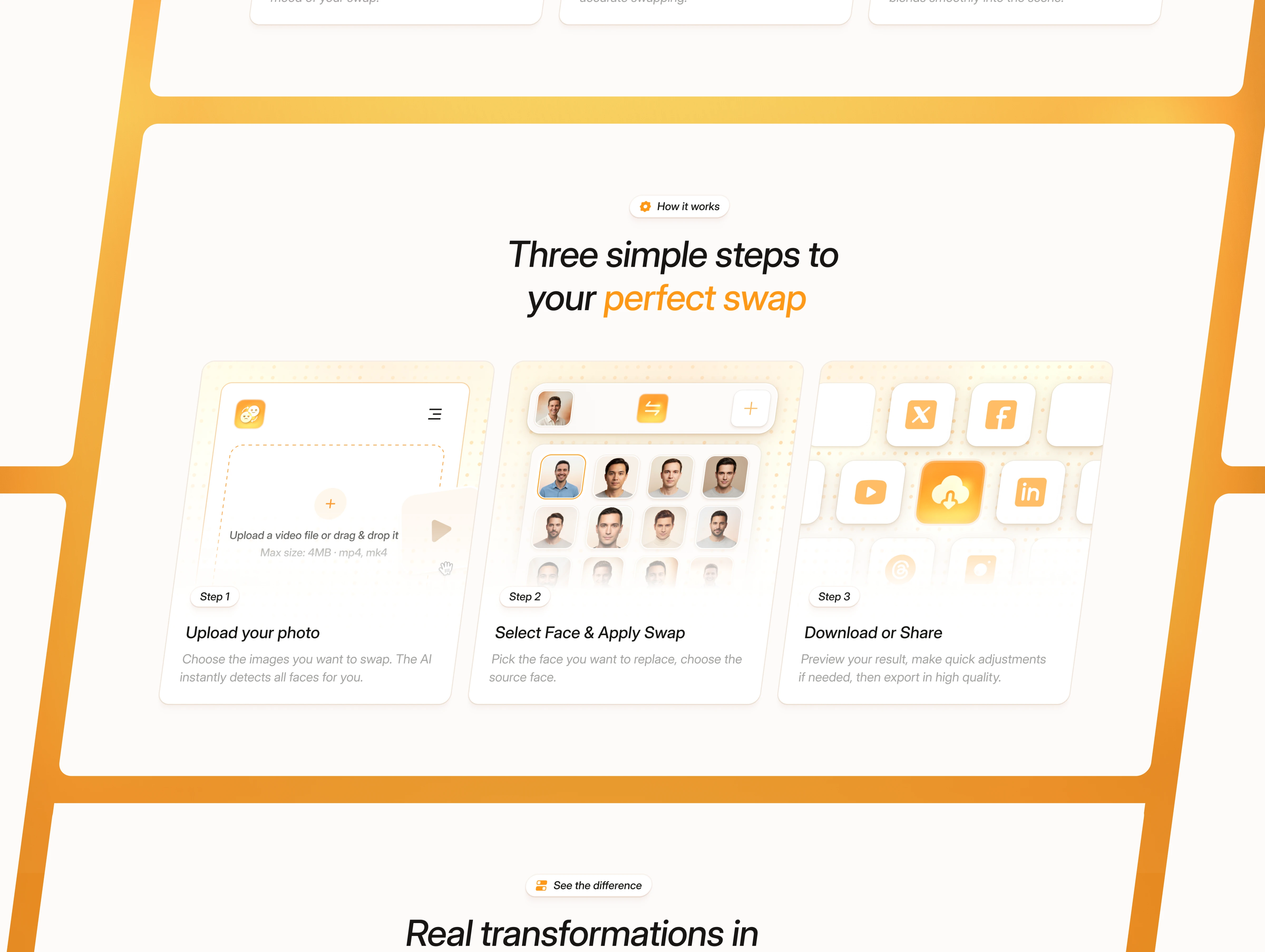
How it works
7. Before vs After
I show the transformation visually. It proves the product impact better than words alone.
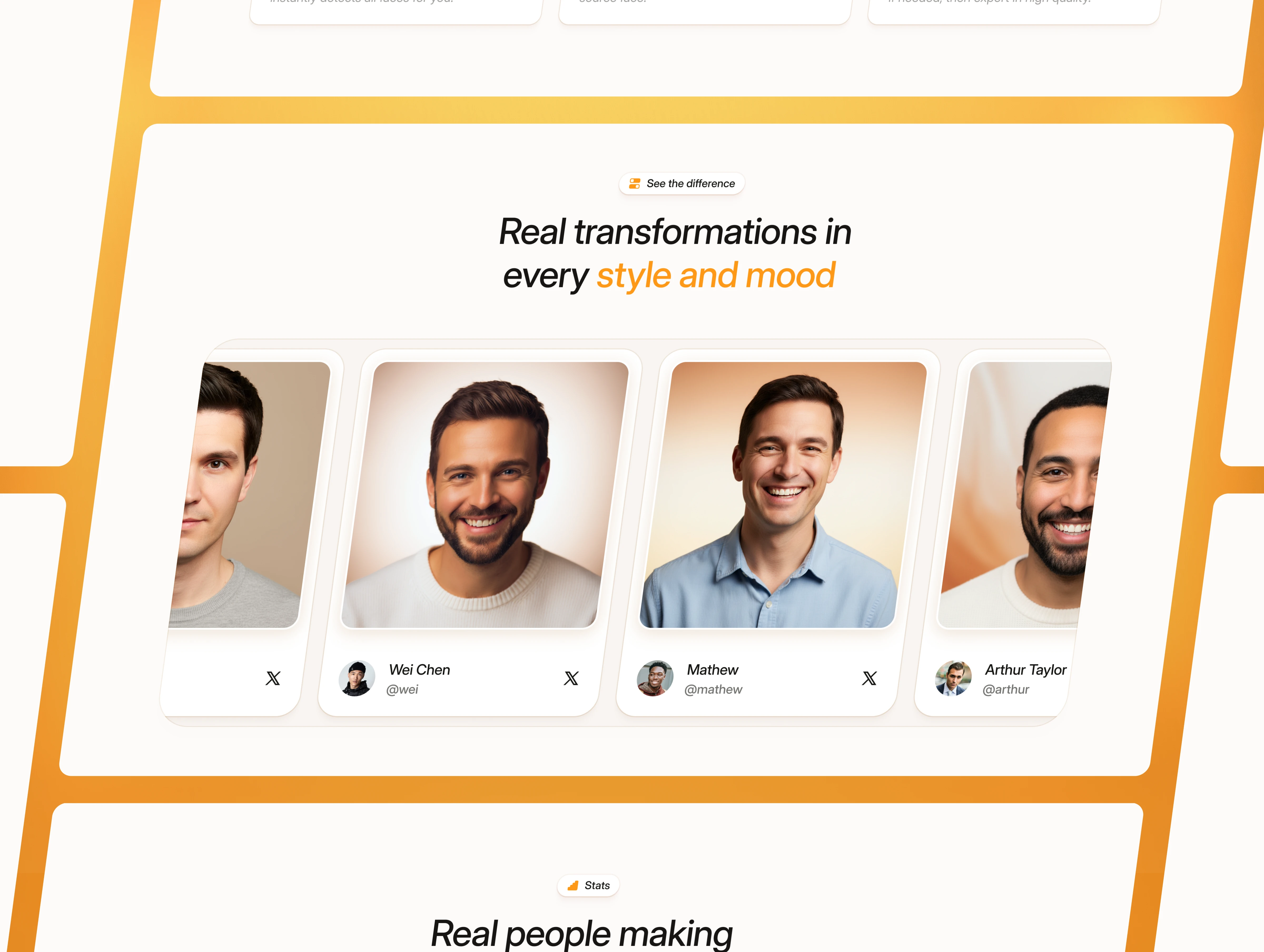
Before vs After
8. Stats
I add numbers to build trust. After showing the transformation, stats make everything more credible.
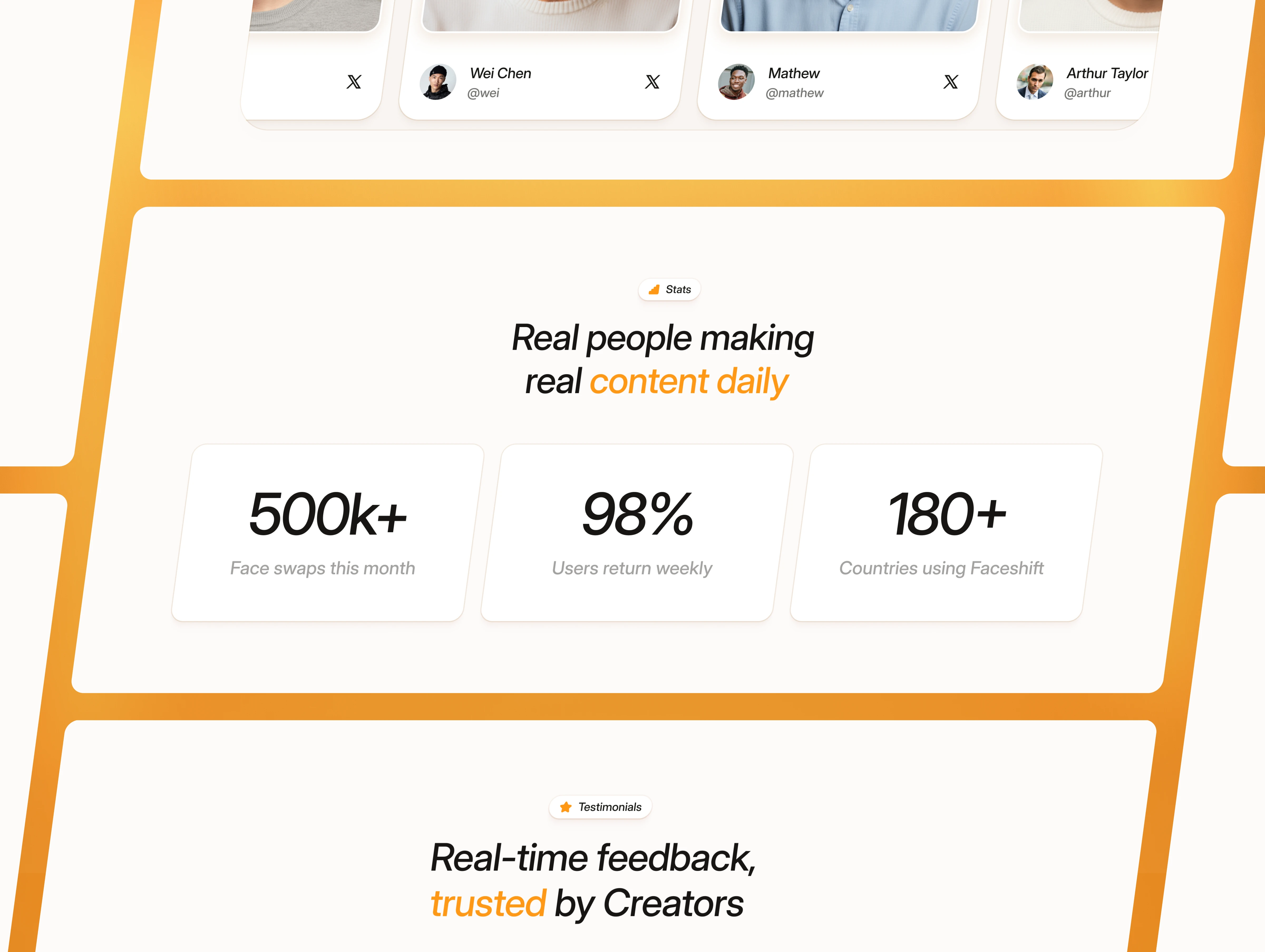
Statistics
9. Testimonial
I share quick comments from users. Just small proofs that the product actually works. Social proof here strengthens everything shown before.
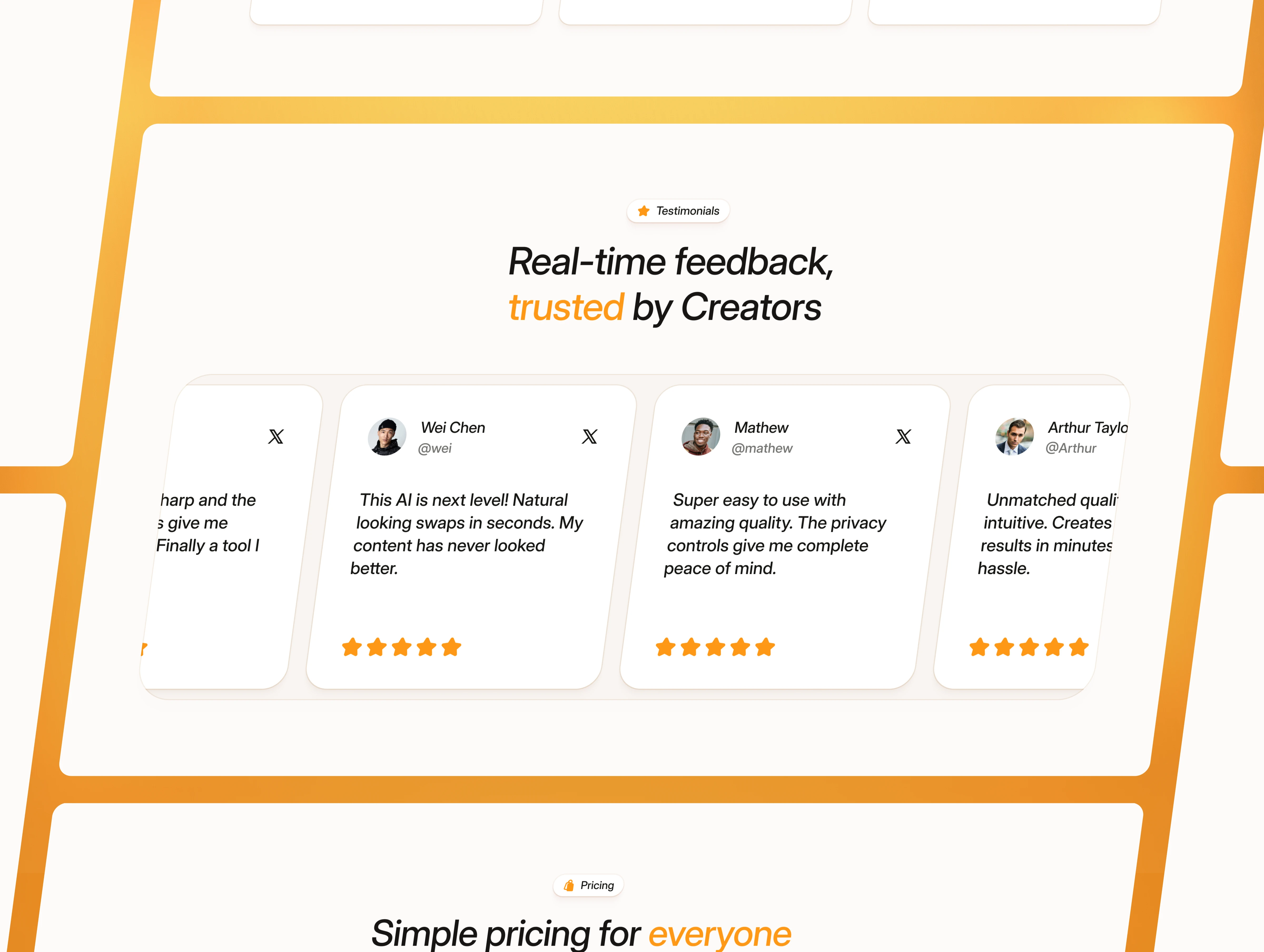
Testimonials
10. Pricing
I make the decision easy with clear plans. Perfect timing, trust is built, now users can choose.
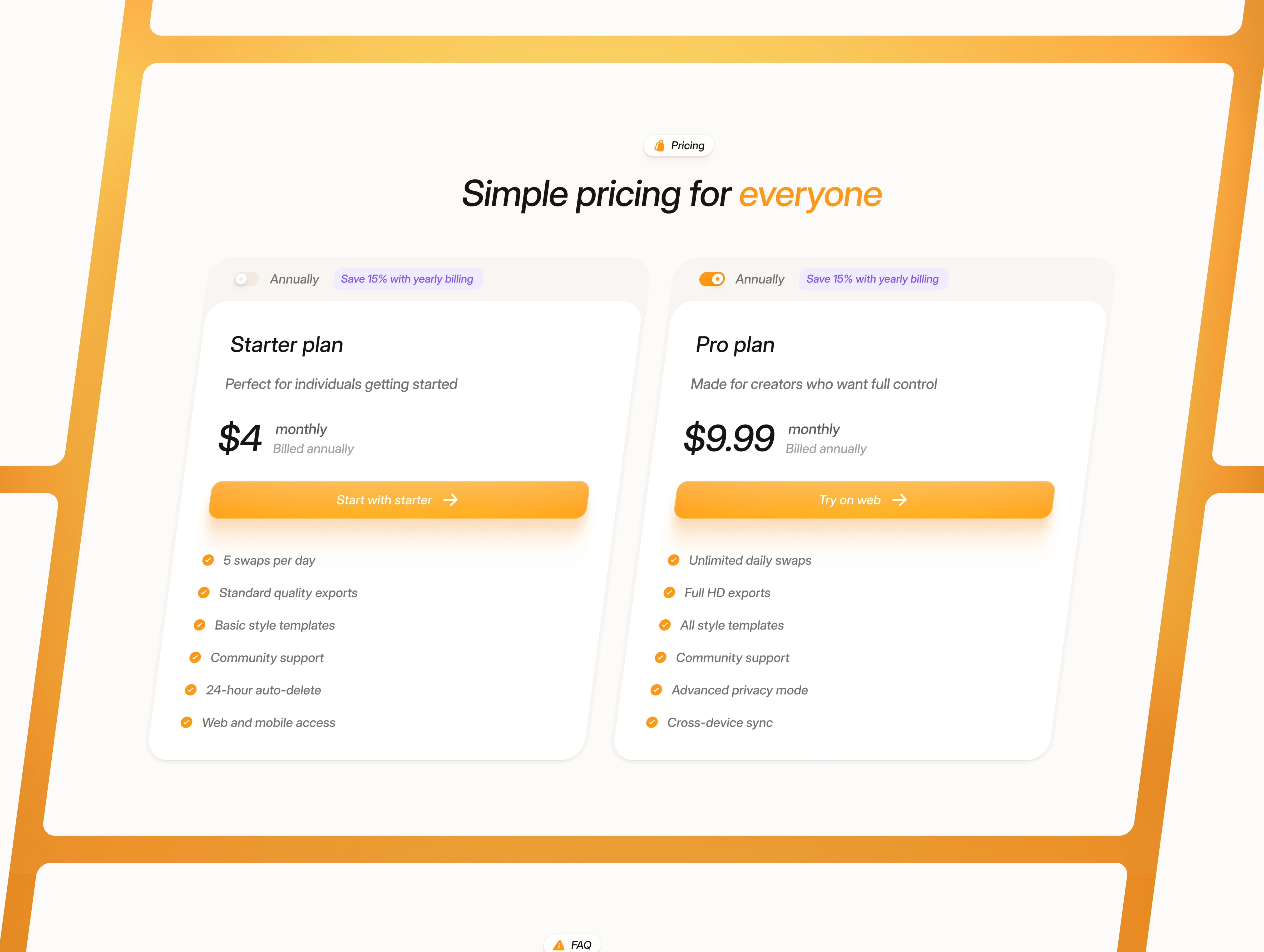
Pricing
11. FAQ
I addressed common concerns and objections. Each answer is kept concise to reduce friction for potential buyers.
FAQ
12. CTA + Footer
I push users toward one primary action. and add essential links. It’s the final nudge to convert while keeping the ending tidy.
CTA + Footer
Hero - Mobile
Full Landing Page - Tablet + Mobile
Full Landing Page - Desktop
Outcome
A clean, structured landing page that highlights the product clearly, removes friction, and guides visitors through the story with better flow and clarity.

Like this project
Posted Jan 23, 2026
This is the framer template that I design for editing apps, like faceswaper, cloth try on, or headshot generator.
Likes
3
Views
20
Timeline
Jan 10, 2026 - Jan 15, 2026