Financial Roadmap
Heather Peters
Made long-term financial progress easy to visualize (+$120K revenue impact)
Summary
Users struggled to understand how their financial decisions today impacted their long-term goals. I designed a visual roadmap that made progress, tradeoffs, and milestones easy to understand and adjust over time.
The Problem
Users had long term financial goals, but no clear way to see how they connected over time.
Without a clear view of progress or tradeoffs based on their monthly spending, it was difficult to stay motivated or make informed decisions about where to focus.
What I Did
I designed a visual planning experience that connected financial goals into a single, trackable timeline.
Introduced a roadmap view to visualize progress over time
Connected goals, milestones, and timelines into a single system
Made tradeoffs visible so users could adjust priorities
Designed for flexibility as plans changed
Key Decisions
Focused on a timeline-based visualization instead of static lists
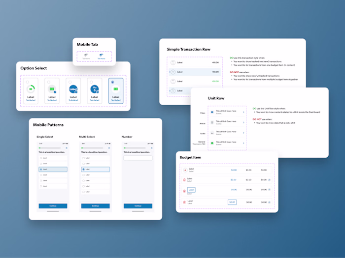
Simplified complex financial data into a clear, scannable structure
Prioritized clarity over precision to keep the experience approachable
Designed for quick adjustments so users could explore different scenarios
Early versions were too dense, so I simplified the layout and hierarchy to improve clarity
Constraints
Balancing clarity with complex financial data required simplifying what was shown without losing meaning. Some edge cases and deeper modeling were deferred to keep the experience usable and performant.
What Changed
Users could clearly see how their financial decisions impacted long-term outcomes, making it easier to stay engaged and adjust plans over time. This contributed to a $120K increase in revenue.
Hindsight
Future improvements could include deeper scenario modeling and more personalized recommendations based on user behavior.
Like this project
Posted Mar 24, 2026
Designed a forward-looking financial planning experience to help users connect daily budgeting decisions to long-term goals.