Built with Framer
Trowel Craft Website Design & Development

Hardikkumar Vinzava Top 1% Framer Creator
Verified


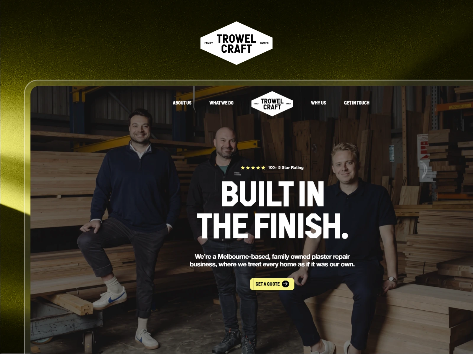
Trowel Craft Website Design & Development
A strong finish is what customers notice.
For Trowel Craft, the website needed to communicate that same level of care before the team ever stepped onto a job site.
Working from the supplied desktop Figma design, I developed a responsive Framer website, designed the missing mobile experience, introduced polished micro-interactions, and created a flexible project structure that could be easily updated after handover.
The result is a bold, trustworthy service website that reflects the company’s family values, workmanship, and attention to detail.
Project Overview
Project Type: Figma-to-Framer Website Development
Industry: Plastering, Home Services, Repairs & Restoration
Role: Framer Developer, Framer Designer & Responsive UI Designer
Platform: Framer
Design Source: Client-Provided Figma Design
Live Website:
https://www.trowelcraft.com.au/
At a Glance
Developed the complete website in Framer from a supplied Figma design
Designed the mobile experience from scratch
Built responsive layouts across desktop, tablet, and mobile
Added button hover and interactive states
Created scroll-triggered content reveals
Developed accordion-style FAQ interactions
Used temporary photography supplied through Figma
Structured the Framer project for easy future updates
Delivered a reusable and handover-ready component system
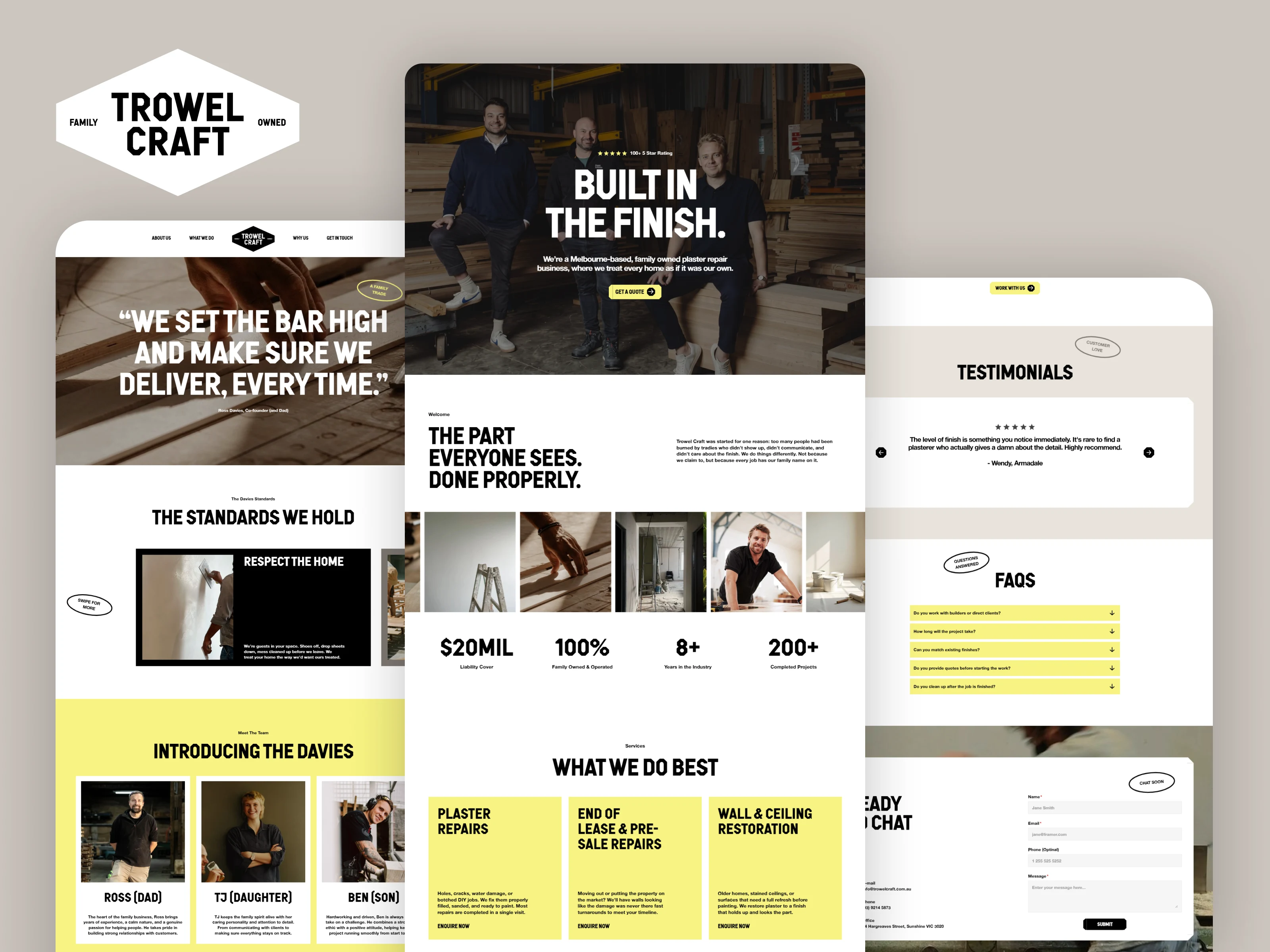
About Trowel Craft
Trowel Craft is a Melbourne-based, family-owned plaster repair and restoration business.
The company was built around a straightforward promise: arrive when expected, communicate clearly, respect the customer’s home, and deliver a finish that lasts.
Its services include plaster repairs, end-of-lease and pre-sale repairs, and wall and ceiling restoration. The brand positions itself around reliability, honest pricing, efficient service, attention to detail, and professional workmanship.
The website needed to translate those practical values into a digital experience that felt professional, approachable, and trustworthy.
The Challenge
The client had a polished desktop direction in Figma, but the website still needed to be fully developed in Framer.
Mobile layouts were not included in the supplied design, meaning the responsive experience had to be designed during development rather than simply recreated.
The project also required thoughtful interaction design. The website needed enough movement to feel modern and engaging without distracting from the company’s services or slowing down the user journey.
Another challenge was photography.
The final professional photoshoot assets were not yet available, so the initial build needed to use placeholder imagery while remaining flexible enough for the final images to be introduced later without rebuilding the layouts.
The website therefore needed to solve four connected problems:
Translate the desktop Figma design accurately into Framer
Create a complete responsive system for missing screen sizes
Add purposeful animations and interactions
Keep the project easy to update when final content became available
Project Goals
The goal was to build more than a visually accurate desktop website.
Trowel Craft needed a responsive, engaging, and maintainable Framer experience that could support customer enquiries while communicating the personality behind the family business.
The main objectives were to:
Recreate the approved Figma design accurately
Design a clear and usable mobile experience
Build reliable responsive behaviour across screen sizes
Communicate trust and professionalism immediately
Present the company’s services with clarity
Showcase the family behind the business
Reinforce reliability through standards and testimonials
Add subtle animations that improve engagement
Create a clear path toward requesting a quote
Prepare the project for future photography updates
Make ongoing edits simple after handover
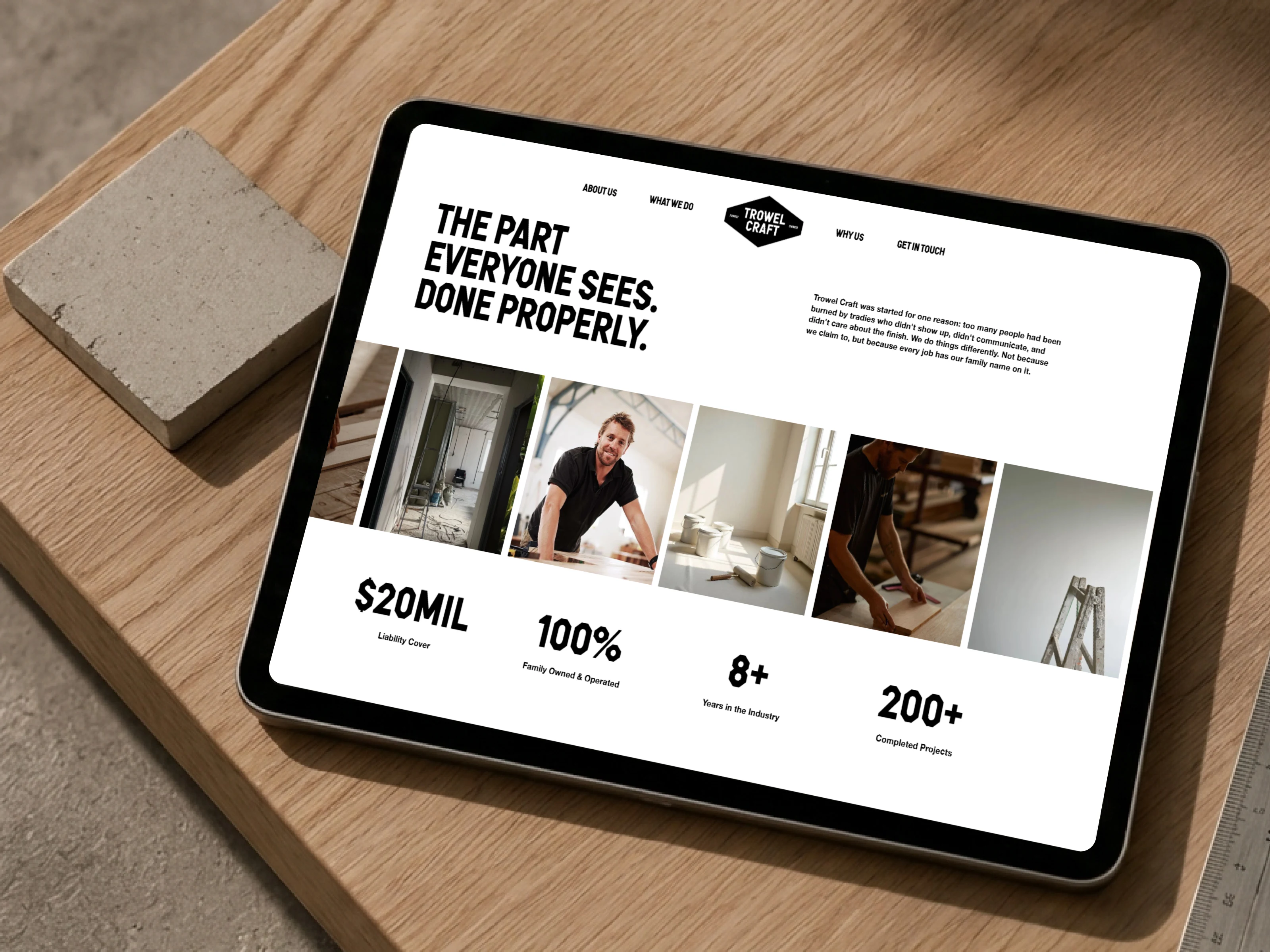
Scope of Work
Figma-to-Framer Development
The supplied Figma design was translated into a functional Framer website while preserving its visual identity, typography, spacing, colour palette, and strong editorial composition.
Responsive Mobile Design
Because mobile layouts were not included, each section required new responsive decisions.
This included defining:
Mobile content order
Typography scaling
Section spacing
Image proportions
Horizontal padding
Navigation behaviour
Card stacking
Testimonial presentation
Form layouts
Accordion interactions
Touch-friendly button sizes
Component Development
Repeated interface elements were structured as reusable Framer components to improve consistency and make future updates easier.
Micro-Animations
Purposeful interactions were added throughout the experience, including:
Button hover states
Link transitions
Scroll-based section reveals
Content pop-in effects
Interactive service elements
Accordion opening and closing
Testimonial navigation
Subtle image and text transitions
Placeholder Image Setup
Temporary imagery from the Figma design was implemented using flexible image containers so the final professional photography could be introduced later.
Project Structure and Handover
The Framer project was organized with clear components, sections, naming conventions, and layout behaviour to support efficient future editing.
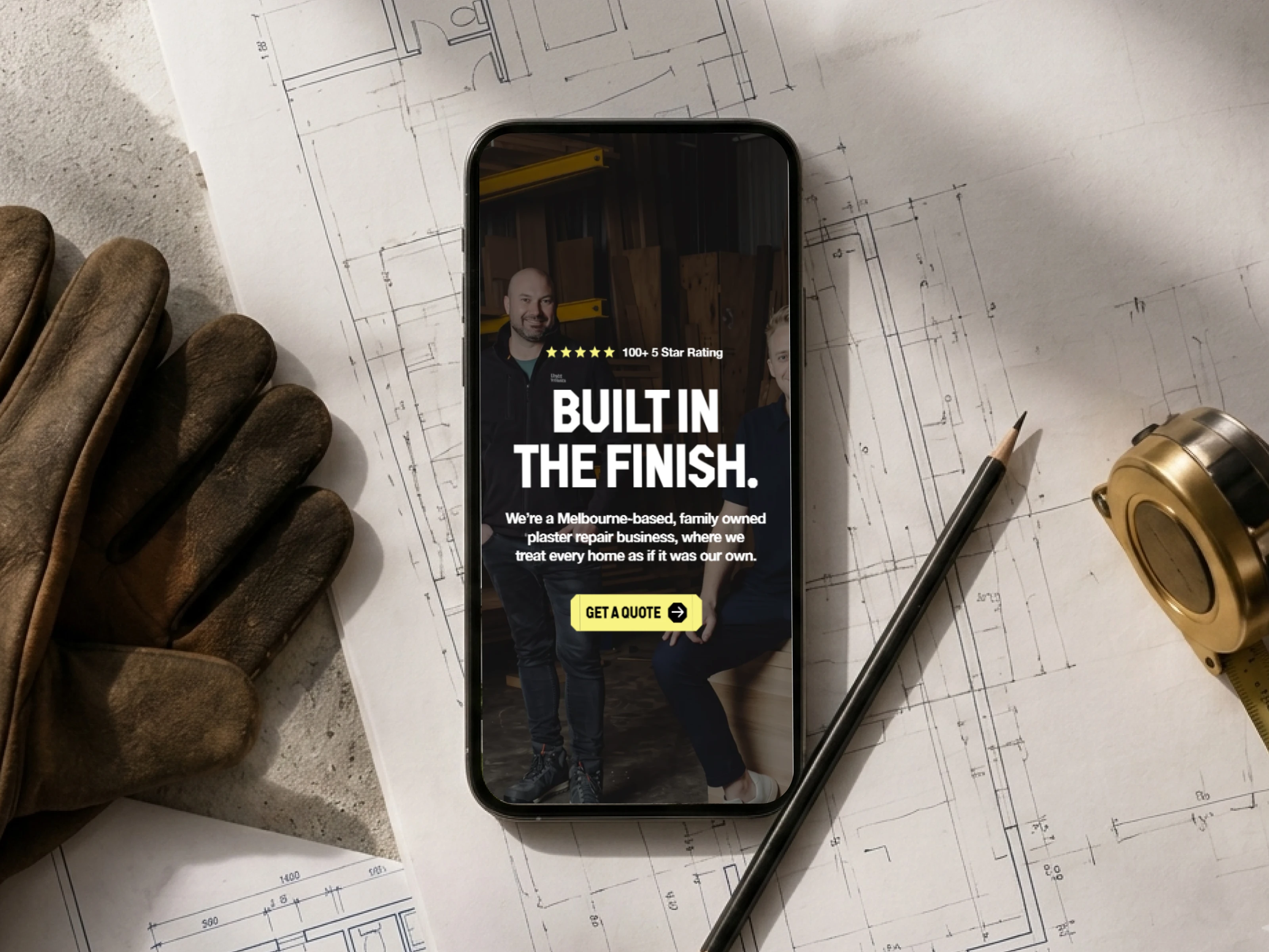
The Process
1. Understanding the Design Direction
I began by reviewing the complete Figma design and identifying the core visual language.
The direction combined bold typography, warm neutral colours, strong photography, and direct messaging. The brand needed to feel skilled and professional without becoming overly corporate.
2. Planning the Framer Structure
Before building, I identified repeated elements and content patterns that could become reusable components.
This included:
Navigation elements
Buttons and CTA styles
Service cards
Value and standards cards
Team profiles
Testimonials
FAQ rows
Contact details
Footer links
Planning this system early made the final build cleaner and easier to manage.
3. Developing the Desktop Experience
The supplied desktop Figma design was recreated in Framer with close attention to alignment, spacing, typography, imagery, and visual hierarchy.
The focus was not only on matching the static design. Each section also needed a stable structure that could respond smoothly as the browser width changed.
4. Designing the Missing Mobile Layouts
The mobile experience was designed directly in Framer.
Instead of simply shrinking desktop sections, I reconsidered each layout based on content priority and touch-screen behaviour.
Large horizontal compositions became stacked experiences. Text widths were reduced for readability, cards were adjusted for swipe or vertical navigation, and calls to action were made easier to reach.
5. Adding Interaction and Movement
Micro-animations were introduced to make the site feel polished and responsive.
Buttons provide visual feedback on hover, sections enter naturally as visitors scroll, and FAQ content expands through clear accordion-style interactions.
The animations were intentionally lightweight so they enhanced the experience without competing with the message.
6. Preparing for Future Photography
Placeholder images were placed within flexible containers that preserve the intended cropping and composition.
This allows the professional photoshoot assets to be swapped into the project without changing the section structure.
7. Testing and Refinement
The complete website was reviewed across desktop, tablet, and mobile layouts.
Final QA covered:
Responsive spacing
Typography
Image behaviour
Button interactions
Scroll animations
Accordion states
Testimonial controls
Navigation links
Contact details
Form layout
Footer consistency
The Solution
The final website gives Trowel Craft a distinctive digital identity that feels as considered as the company’s workmanship.
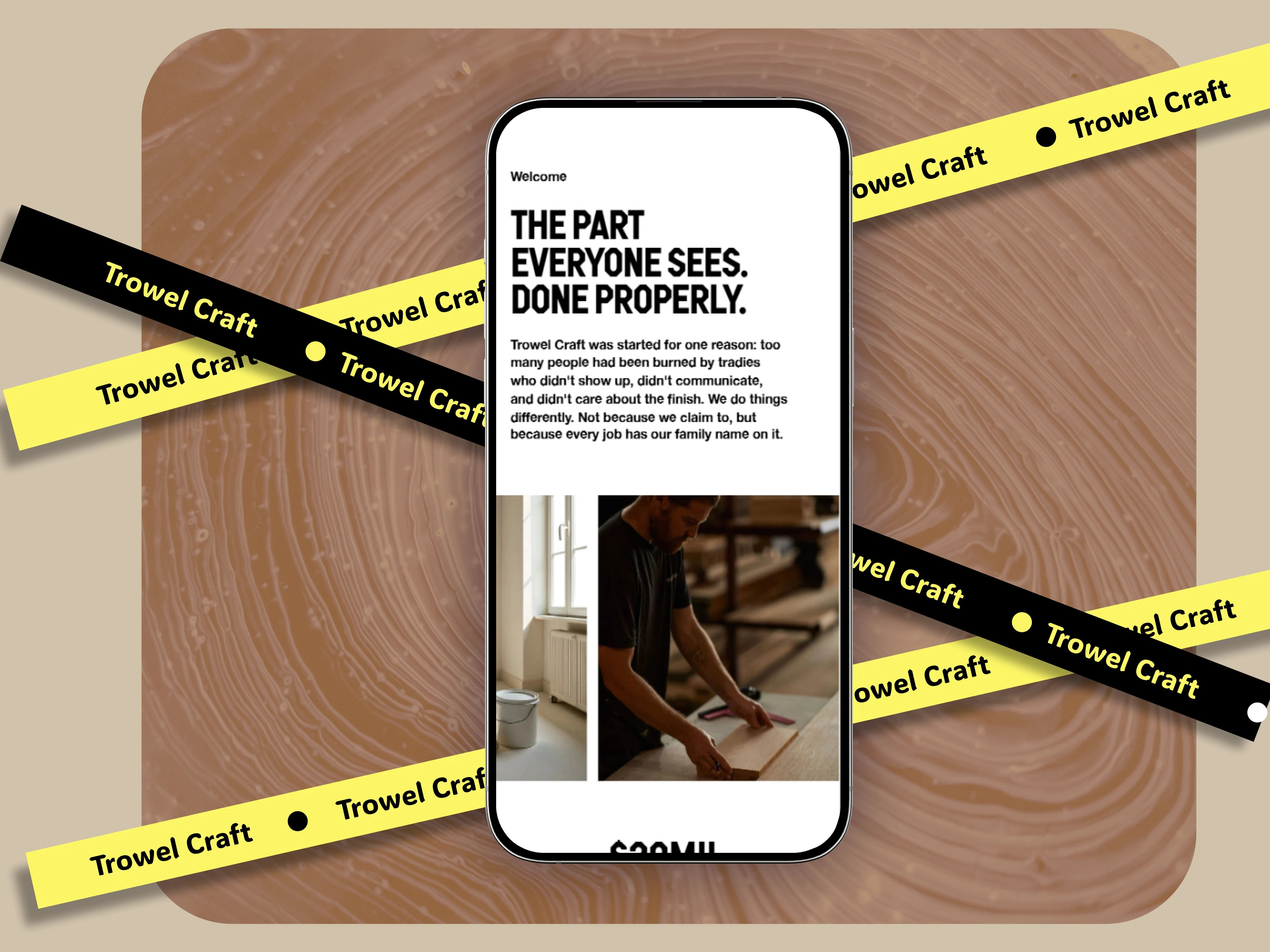
The homepage leads with the message “Built in the finish,” immediately positioning the brand around quality and visible results. The supporting copy introduces Trowel Craft as a Melbourne-based family business that treats every home with care.
From there, the experience builds trust through several layers:
Clear Services
Visitors can quickly understand the company’s plaster repair, pre-sale repair, and restoration capabilities.
A Human Brand Story
The family story and team profiles make the business feel personal and accountable.
Defined Standards
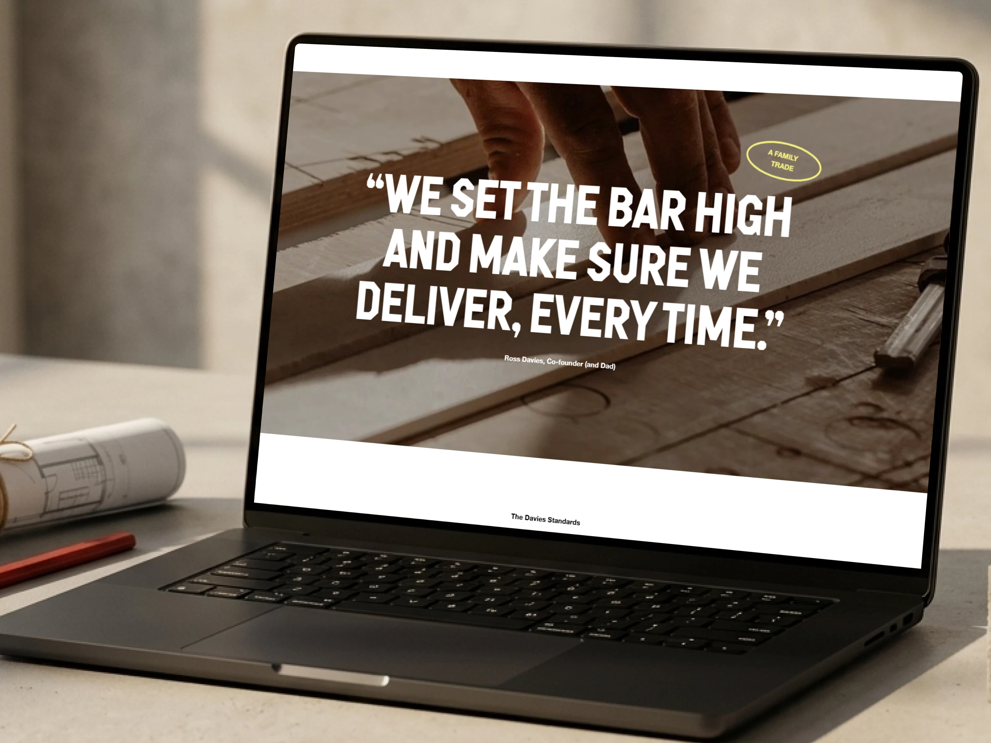
Statements such as respecting the home, communicating clearly, and standing behind the work turn brand values into tangible customer promises.
Customer Proof
Testimonials reinforce workmanship, reliability, clean job sites, transparent pricing, and professional service.
Easy Enquiry
Repeated quote and enquiry calls to action guide visitors toward the contact form without making the website feel overly sales-focused.
The live site includes service explanations, family profiles, company standards, customer testimonials, FAQs, contact information, and a quote enquiry form.
Key Features
Accurate Figma-to-Framer implementation
Fully custom mobile layout design
Responsive desktop, tablet, and mobile experience
Reusable Framer components
Interactive button hover states
Scroll-triggered content animations
Accordion-style FAQ interactions
Services presentation
Company standards and values section
Family team profiles
Customer testimonial slider
Quote enquiry form
Contact information and location details
Social media links
Flexible image containers for future photography
Maintainable Framer project architecture
Building Trust Through Design
Home-service websites need to address a different kind of conversion challenge.
Customers are not only comparing technical services. They are deciding whether they can trust a team inside their home.
The website therefore needed to answer key questions quickly:
Will they arrive when promised?
Will they communicate clearly?
Will they protect and respect the property?
Will the pricing be transparent?
Will the finished repair look professional?
Will they return if something is not right?
The design uses service explanations, family-led messaging, company standards, and detailed testimonials to respond to those concerns naturally.
The site’s standards section specifically emphasizes respecting the home, communicating proactively, standing behind the work, and leaving the job site clean.
Responsive Design Approach
The missing mobile designs created an opportunity to improve the experience rather than simply adapt it.
Each section was reviewed based on how users would read and interact with it on a smaller screen.
Hero Section
The main message, supporting copy, rating, and quote CTA were prioritized so visitors could understand the business immediately.
Service Content
Service descriptions were stacked into a clear reading order with touch-friendly enquiry actions.
Brand Standards
Value-based content was restructured into an easy-to-browse mobile experience without overwhelming the screen.
Team Profiles
Family profiles were adapted to keep photography and personal introductions readable and balanced.
Testimonials
Customer reviews were organized into a controlled interactive experience suitable for smaller screens.
FAQs
Accordion interactions reduced page length while allowing users to open only the answers relevant to them.
Contact Form
Fields were reorganized vertically to improve completion and reduce input friction on mobile devices.
Animation Strategy
The animation system was designed around clarity and feedback.
Button Hovers
Buttons use subtle hover changes to confirm interactivity and make calls to action feel more responsive.
Scroll-Based Pop-Ins
Sections reveal as visitors move through the page, creating visual rhythm and helping each content group receive attention.
Accordion Interactions
FAQ answers open and close smoothly, keeping the interface compact while making information easy to access.
Content Transitions
Text, imagery, and supporting elements use restrained entrance effects to give the website a polished finish.
The intention was never to animate everything.
Movement was used only where it helped guide attention, communicate state, or make the experience feel more tactile.
Deliverables
Complete Framer website development
Figma-to-Framer implementation
Responsive desktop layout
Custom tablet layout
Custom mobile layout
Reusable component system
Button hover interactions
Scroll-based section animations
Accordion FAQ interactions
Testimonial interaction setup
Flexible placeholder image implementation
Contact and enquiry form structure
Organized Framer project
Future-ready content framework
Client handover-ready build
The Results
Trowel Craft now has a professional and responsive website that reflects the company’s practical values and high standards.
The finished project delivers:
A close translation of the supplied Figma design
A complete mobile experience created from scratch
Clear communication of services and company values
Stronger trust through family storytelling
More engaging page movement and interaction
Clear enquiry and quote pathways
Responsive behaviour across major device sizes
Flexible photography sections ready for final assets
A reusable structure for future content updates
A polished Framer project ready for handover
The result feels bold and distinctive while remaining clear, approachable, and conversion-focused.
Content Management Efficiency
The website was structured to make future updates straightforward.
When the final photography becomes available, images can be replaced directly without rebuilding the layouts.
The team can also update:
Service descriptions
Statistics
Team profiles
Company standards
Testimonials
FAQ content
Contact information
Social links
Calls to action
Reusable components help maintain consistency across these changes and reduce the risk of accidentally disrupting the responsive layouts.
Tech Stack
Figma
Framer
Framer Components
Component Variants
Responsive Stacks
Layout Constraints
Scroll Animations
Hover Interactions
Accordion Components
Native Framer Forms
Responsive Image Containers
Lessons & Insights
Mobile Design Is More Than Scaling
When mobile layouts are not supplied, each section must be redesigned around readability, touch interaction, and content priority.
Motion Should Support the Message
Small animations can make a service website feel more polished, but they should never compete with trust, clarity, or conversion.
Structure Makes Handover Easier
Reusable components, logical naming, and predictable layout rules allow future editors to make changes with confidence.
Placeholder Content Still Needs a System
Temporary photography should be implemented with the same care as final assets. Flexible containers make future replacements faster and safer.
Family Businesses Benefit From Human Storytelling
Introducing the people behind the work gives customers a stronger reason to trust the service.
Service Websites Convert Through Reassurance
Clear pricing expectations, reliability, cleanliness, communication, and customer proof can be just as important as describing the technical service.
Final Outcome
Trowel Craft now has a responsive Framer website that turns a static desktop concept into a complete digital experience.
The build combines accurate design execution, custom mobile layouts, purposeful animations, trust-driven storytelling, and a maintainable Framer system.
It is ready for handover today and structured to evolve when the final photography and future content become available.
Like this project
What the client had to say
Great experience as always with Hardik. Will use again


James Hill, Something Great
Jun 22, 2026, Client
Posted Aug 4, 2026
Developed a Trowel Craft in Framer from Figma, adding responsive mobile layouts, micro-animations, reusable components, and an easy-to-manage structure.
Likes
0
Views
12
Timeline
Jun 8, 2026 - Jun 22, 2026
Clients
Something Great