Fruvia - Brand Identity Design

Zain Khan
1 collaborator


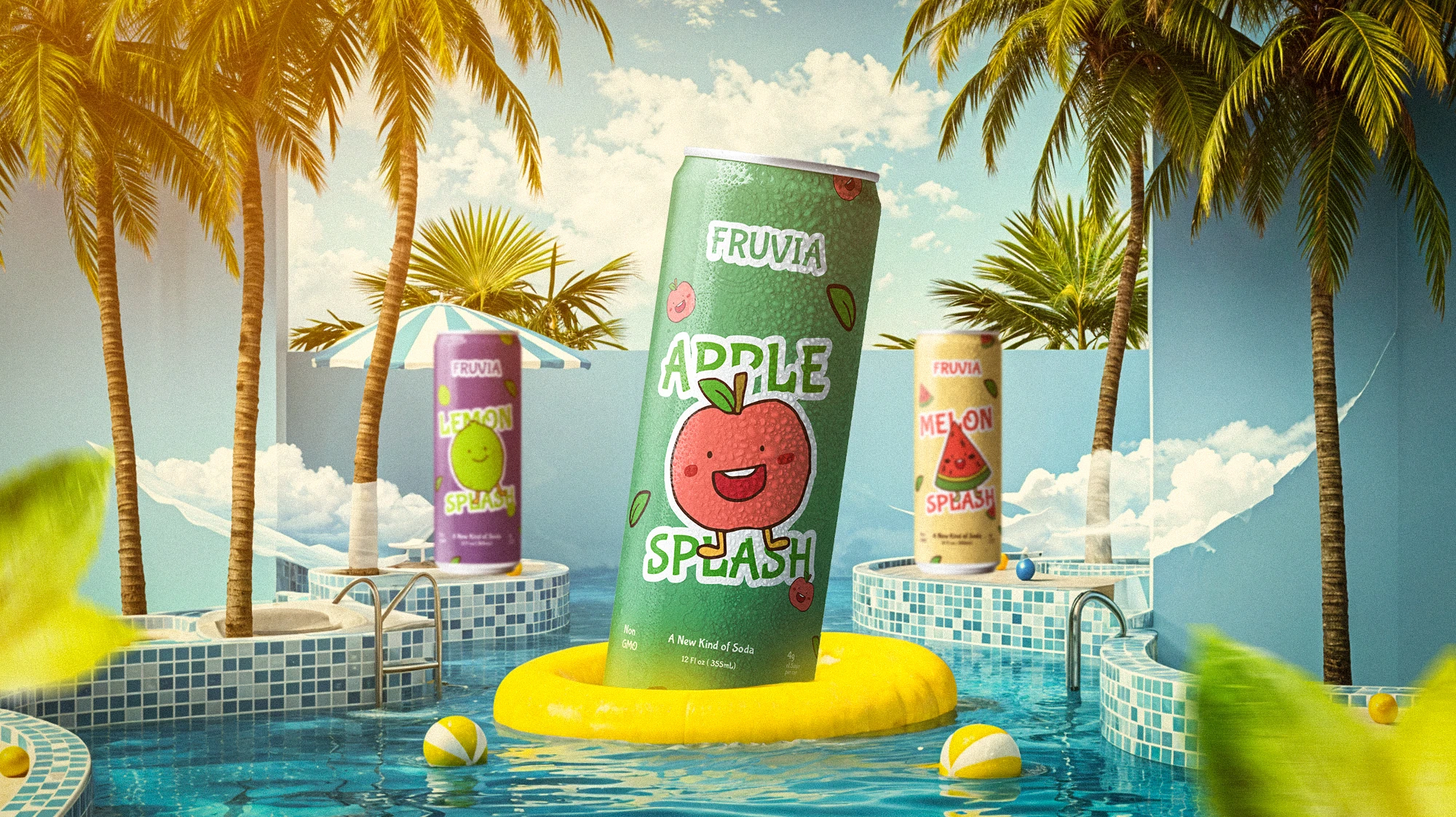
A soda that looks as fresh as it tastes
A clean, fruit-forward identity for a new kind of sparkling drink.
Brief
Fruvia needed an identity that felt fresh, natural, and premium without leaning on the tired greens and cartoon fruit that fill the aisle. It had to look clean on a shelf, confident on a phone screen, and playful enough to build a following.
The idea and system
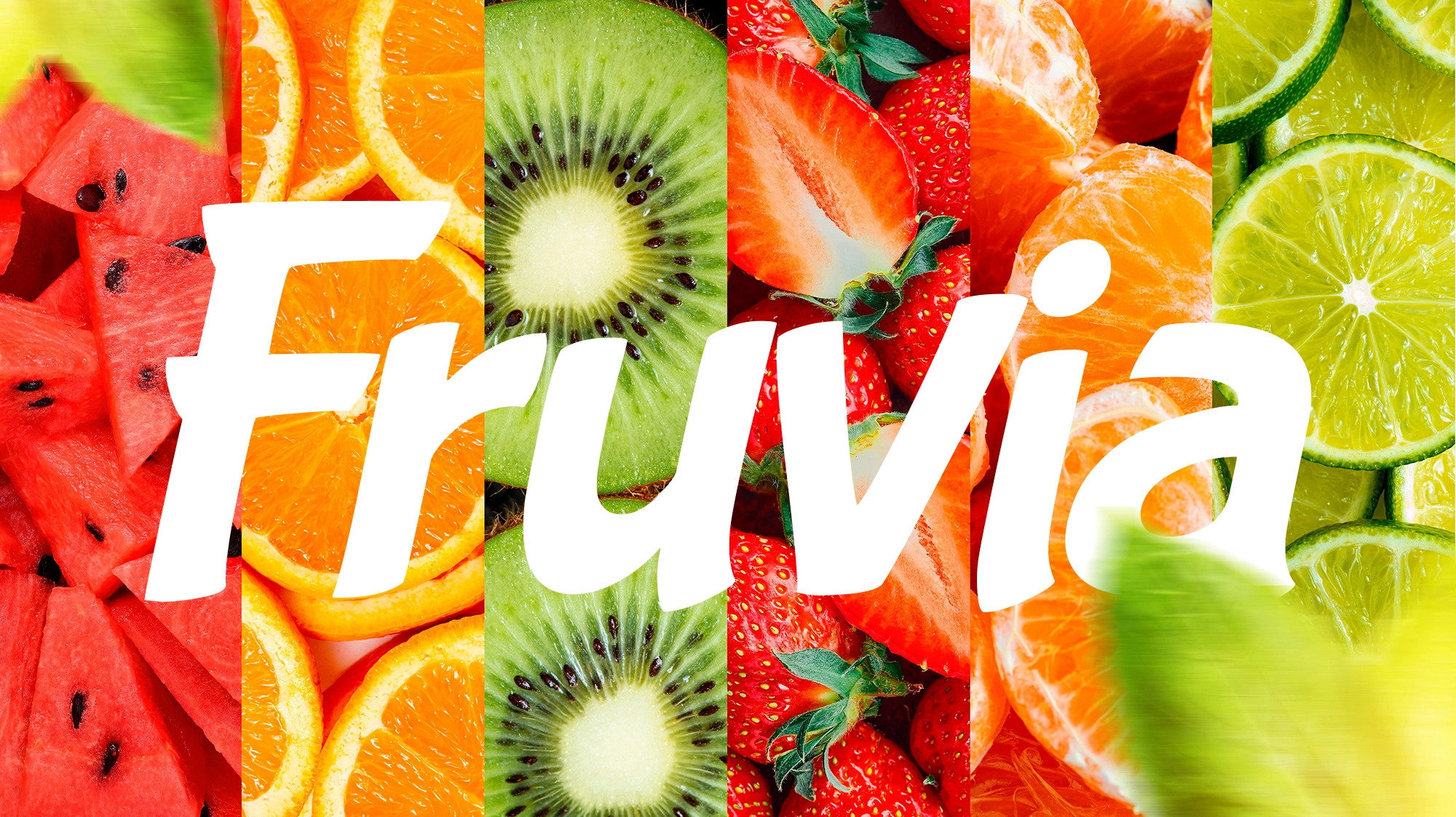
The whole system starts from one thought: freshness you can see. A soft rounded wordmark, a bright natural palette, and a small set of fruit characters carry the brand from a can to a billboard without repeating the same image twice.
Packaging
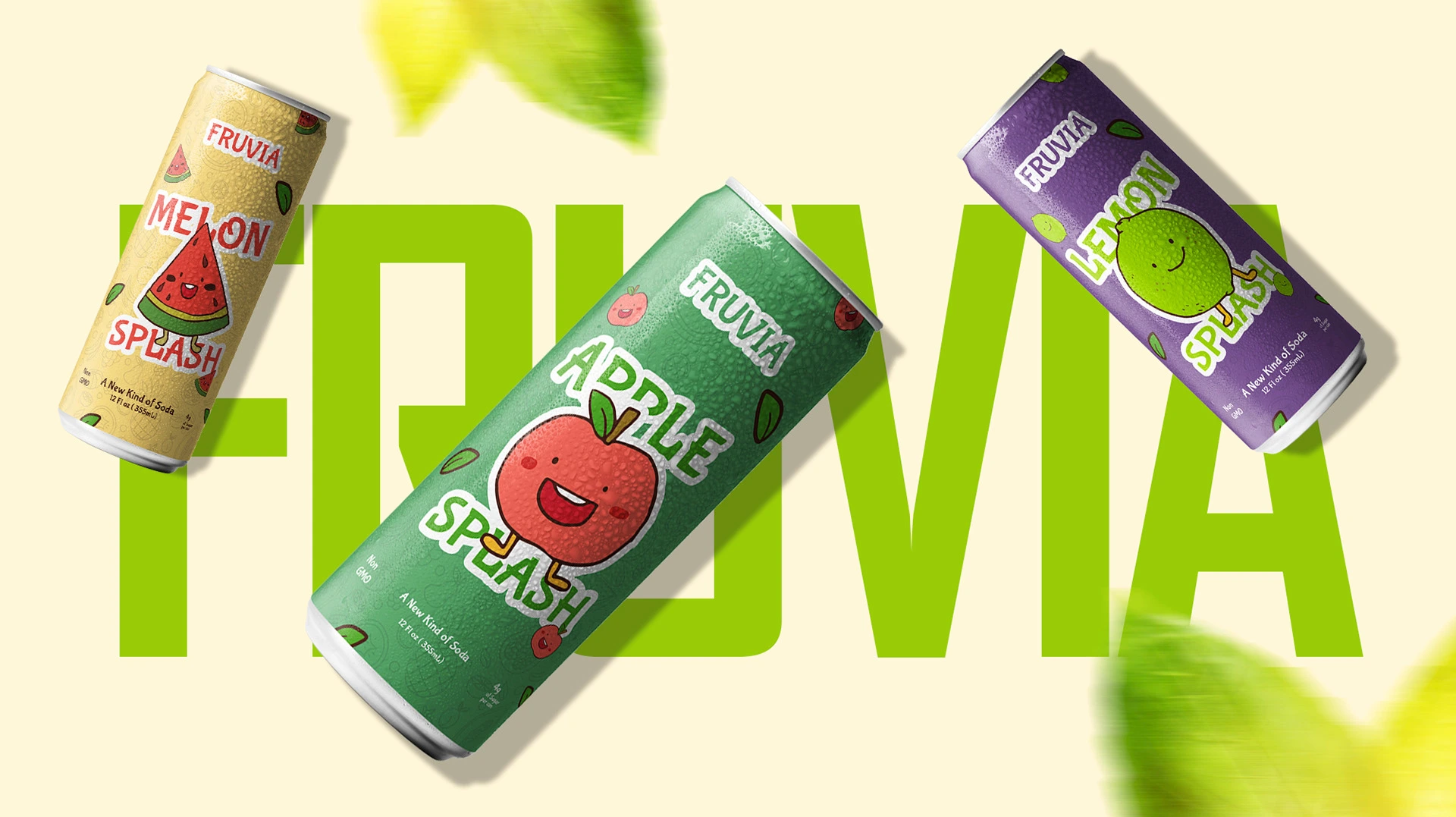
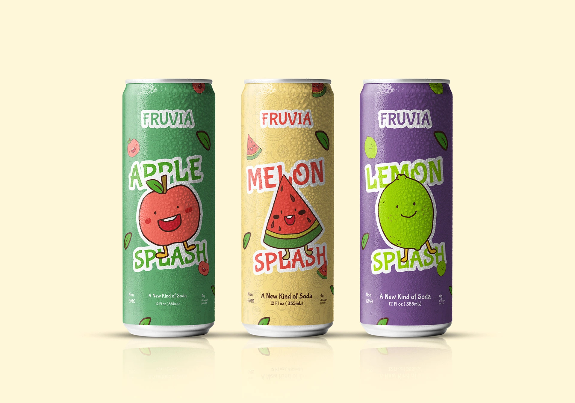
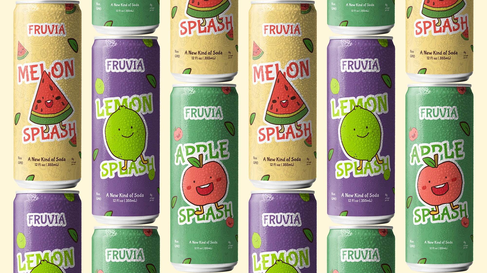
Packaging keeps things minimal: strong color blocking, clear flavor names, and just enough fruit detail to read at a glance. The animated label reveal gives the brand movement in ads and reels.
Social
The identity becomes a content engine. Bold headlines, consistent color, and product-led posts that stay recognizable in a busy feed. Stories reuse the same building blocks in a lighter, faster format.
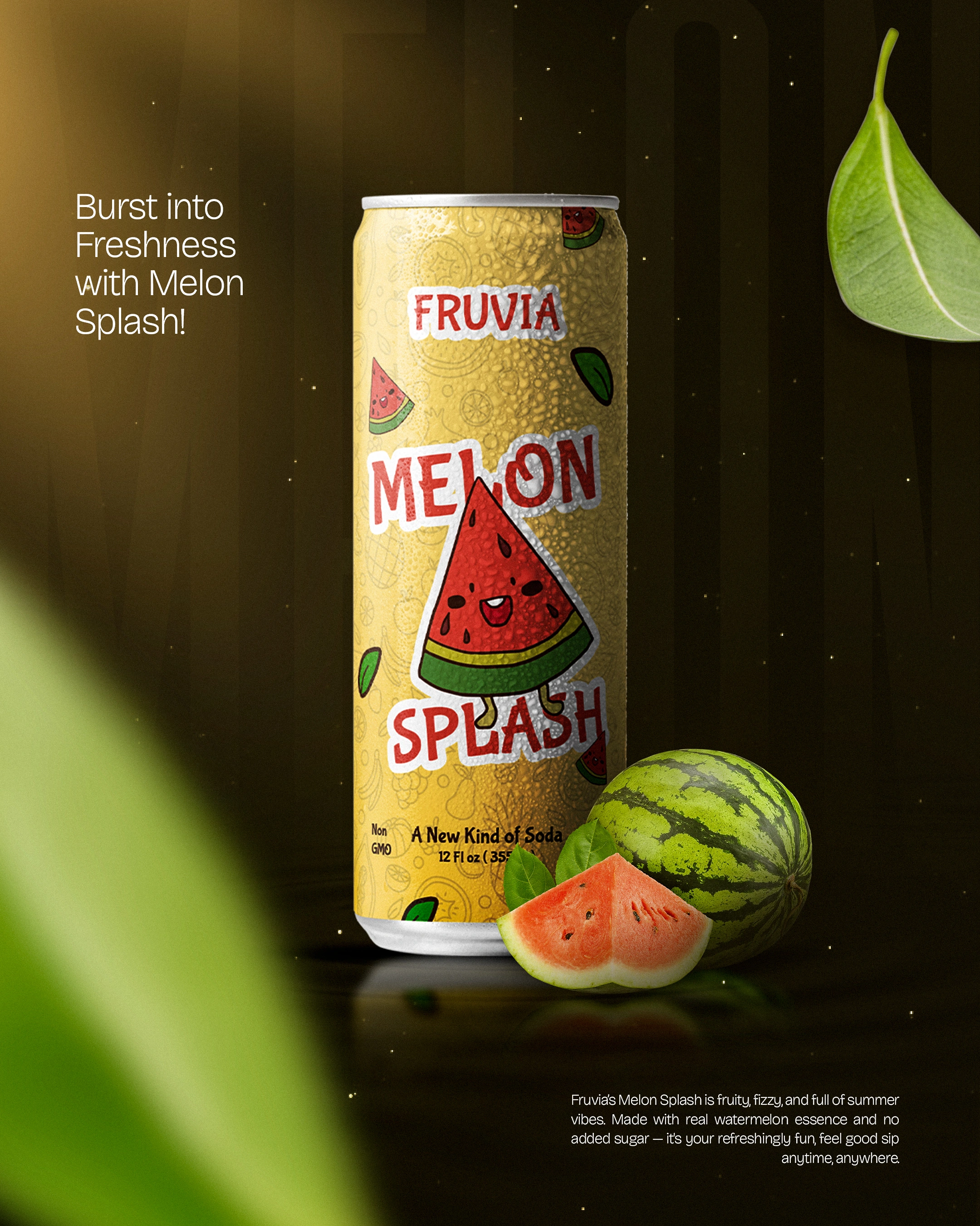
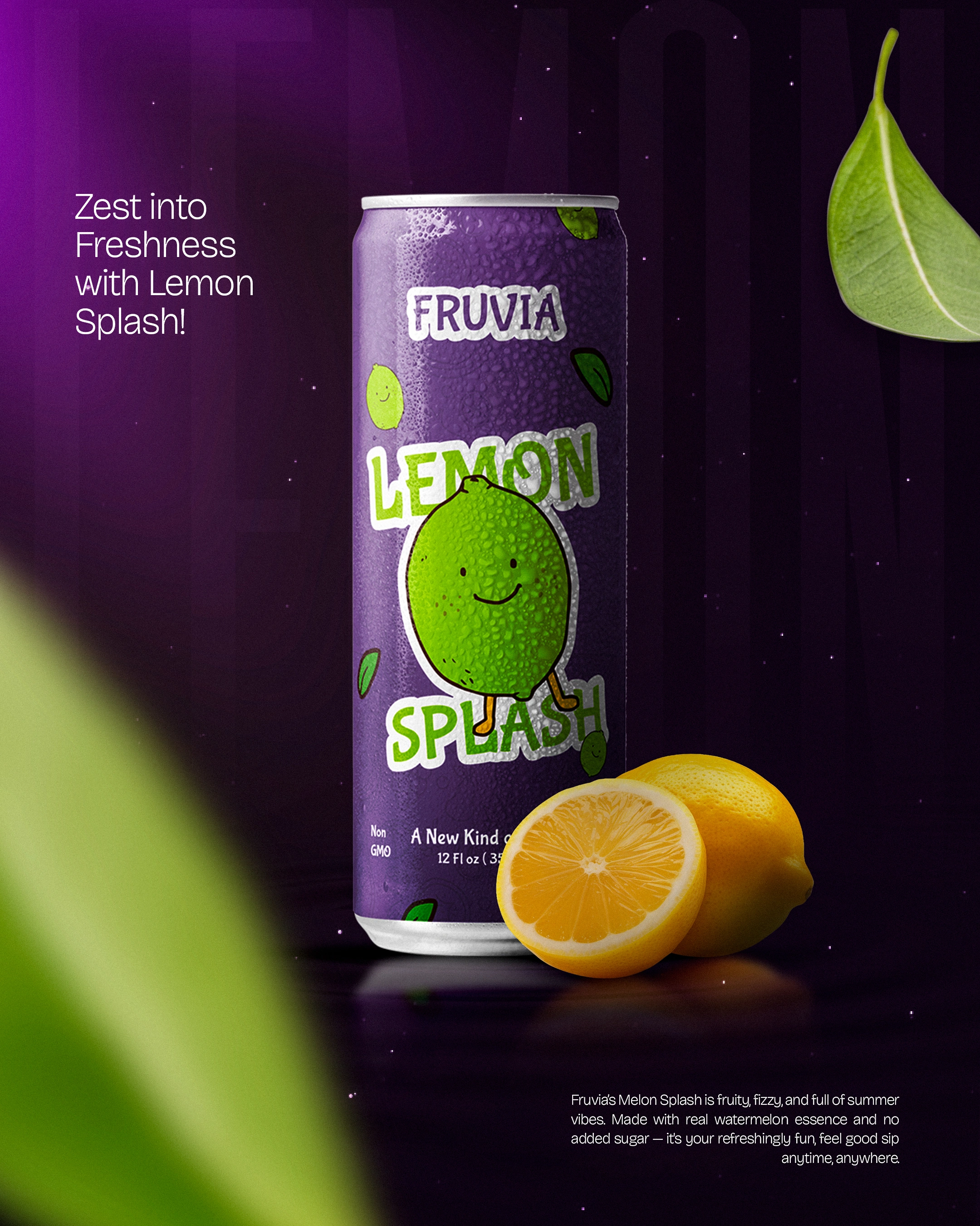
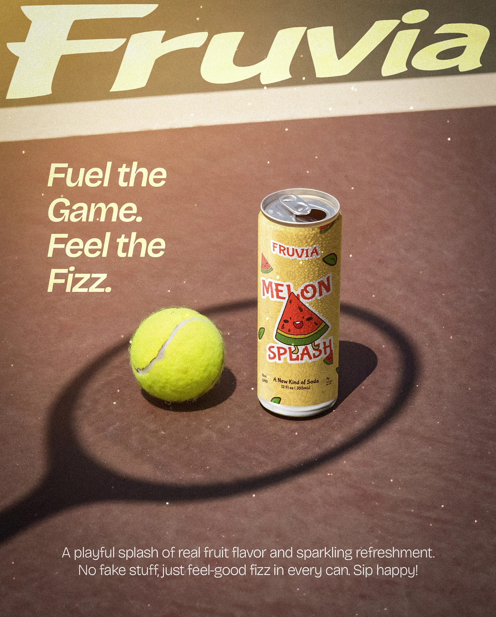
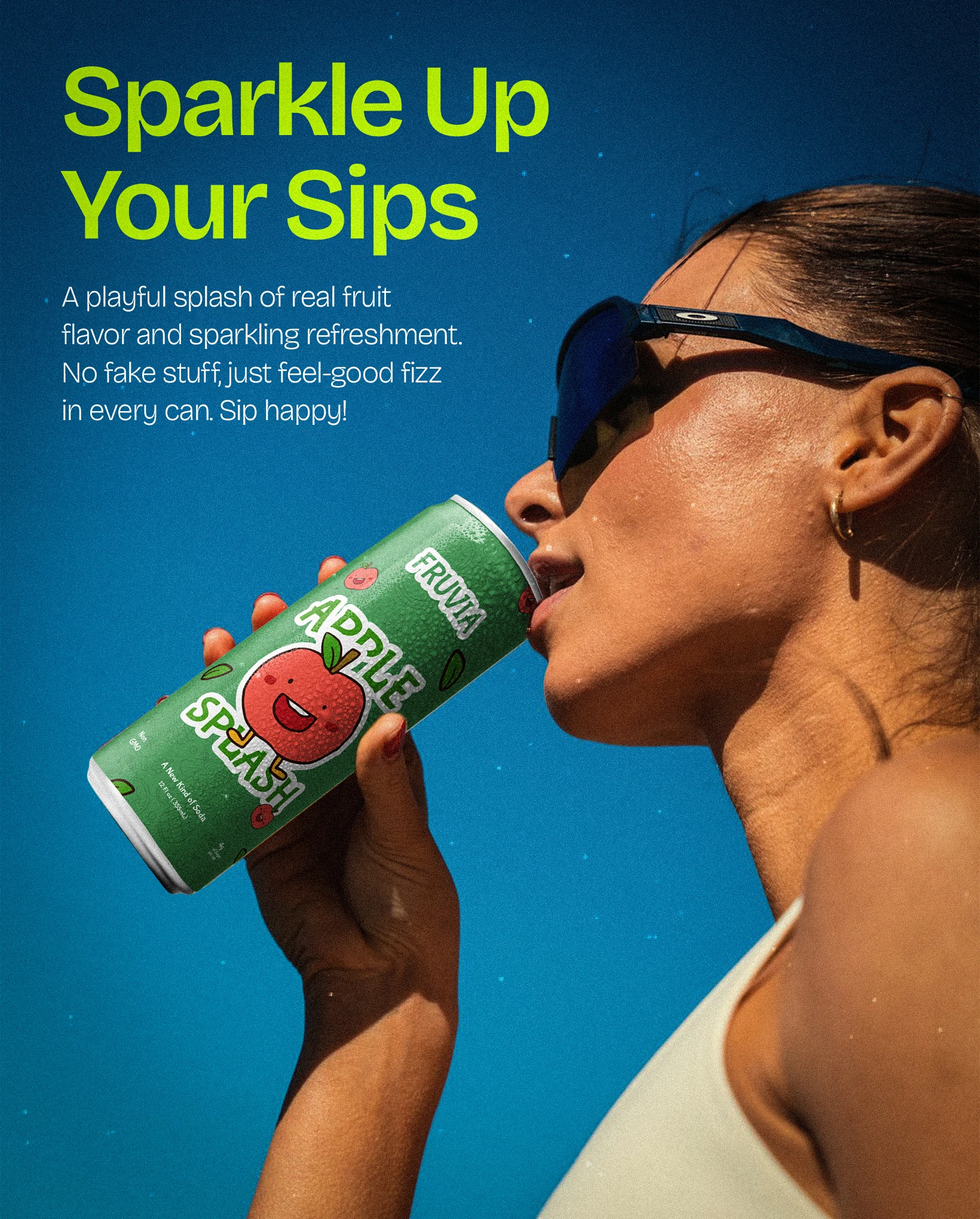
Fruvia ended up with more than a logo. It has a system: a palette, a cast of fruit characters, and a set of layouts that hold together whether they show up on a can, a poster, or a Tuesday story. The look does the hard part, so the brand stays recognizable no matter who is making the next post.
Like this project
Posted Jul 15, 2026
Brand identity for Fruvia, a playful sparkling soda: logo, packaging, motion, and a full social kit built to pop from shelf to phone.
Likes
1
Views
30
Collaborators