Flowless – Clean Water, Restored At Scale.

Hamza H. Taieb


Flowless – Clean water, restored at scale.
Flowless restores polluted rivers and watersheds. Designed and built it with: eight, animated sections that carry the pitch from first frame to footer. The goal wasn't to list what the technology does. It was to make a skeptical visitor, a funder, a city official, a partner, believe the work is real before they read a single word.
real footage, not illustrations
Roles
Art Direction · UI Design · Design Engineer
Tools
React · Tailwind CSS · Framer Motion · Three.js
Category
Environmental Tech
The Tension
Every environmental brand looks the same. Green gradients, a leaf icon, a hopeful stock photo of a diverse team pointing at a solar panel. It all rhymes, so none of it registers. A visitor who has seen ten of these pages arrives already tuned out. On the day it matters — when someone with a budget is deciding whether this company is serious — the default look does the opposite of its job. It makes real work sound like a brochure. The rivers don't get funded because the site sounds like everyone else's.
green tech all rhymes
The Decision
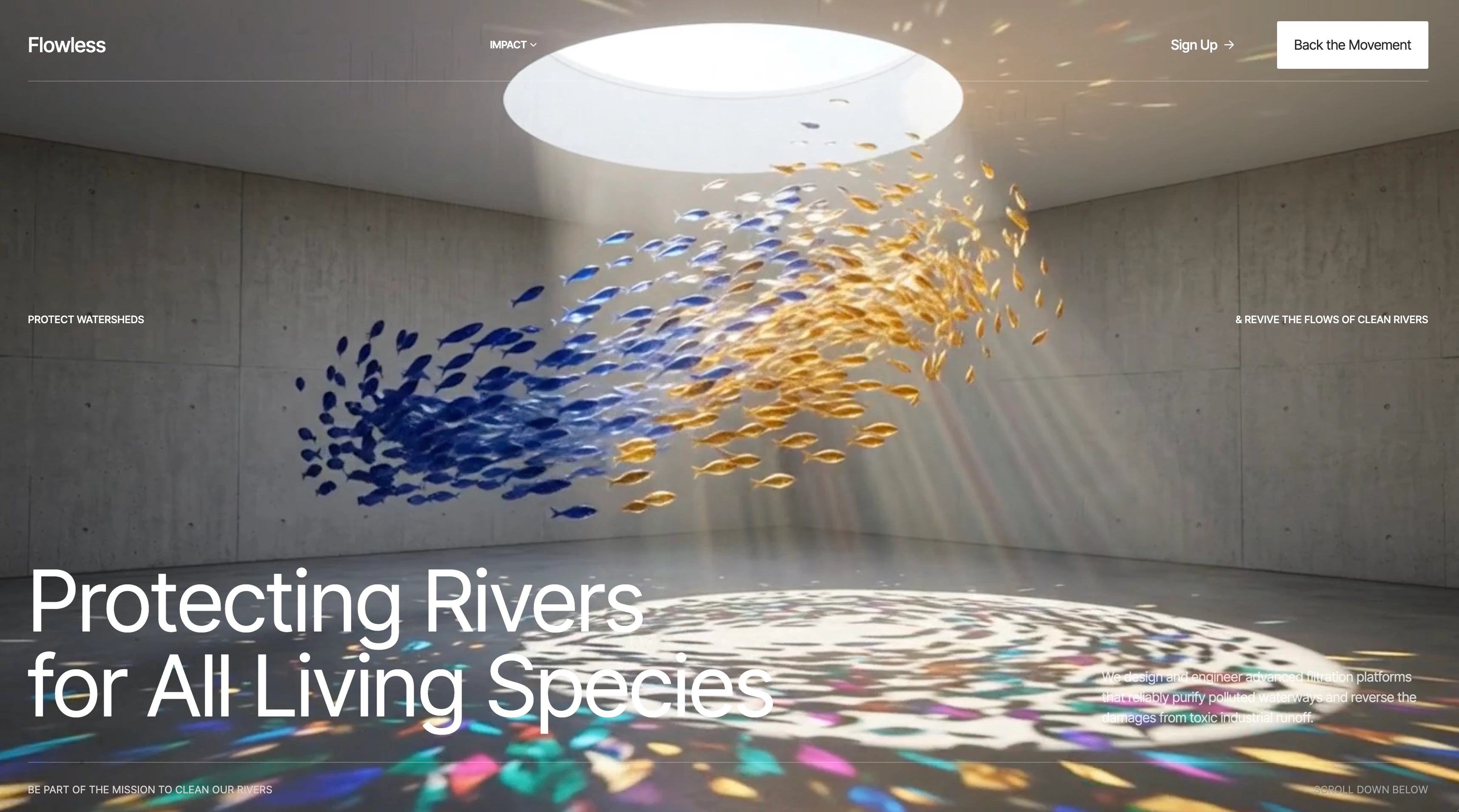
I didn't start with the logo. I started with the water. The hero is real footage — a school of fish turning under a skylight — and everything else gets out of its way. Then I subtracted. No green. No leaf iconography. No mascot. And late in the build, the logo mark itself: I pulled it out of the navbar so the name stands alone. If the footage is doing the convincing, a badge next to the wordmark is just noise. The brand earns attention by removing things, not adding them.
The System
The pieces:
Hero — full-screen looping footage, text layered at the edges so it never fights the image.
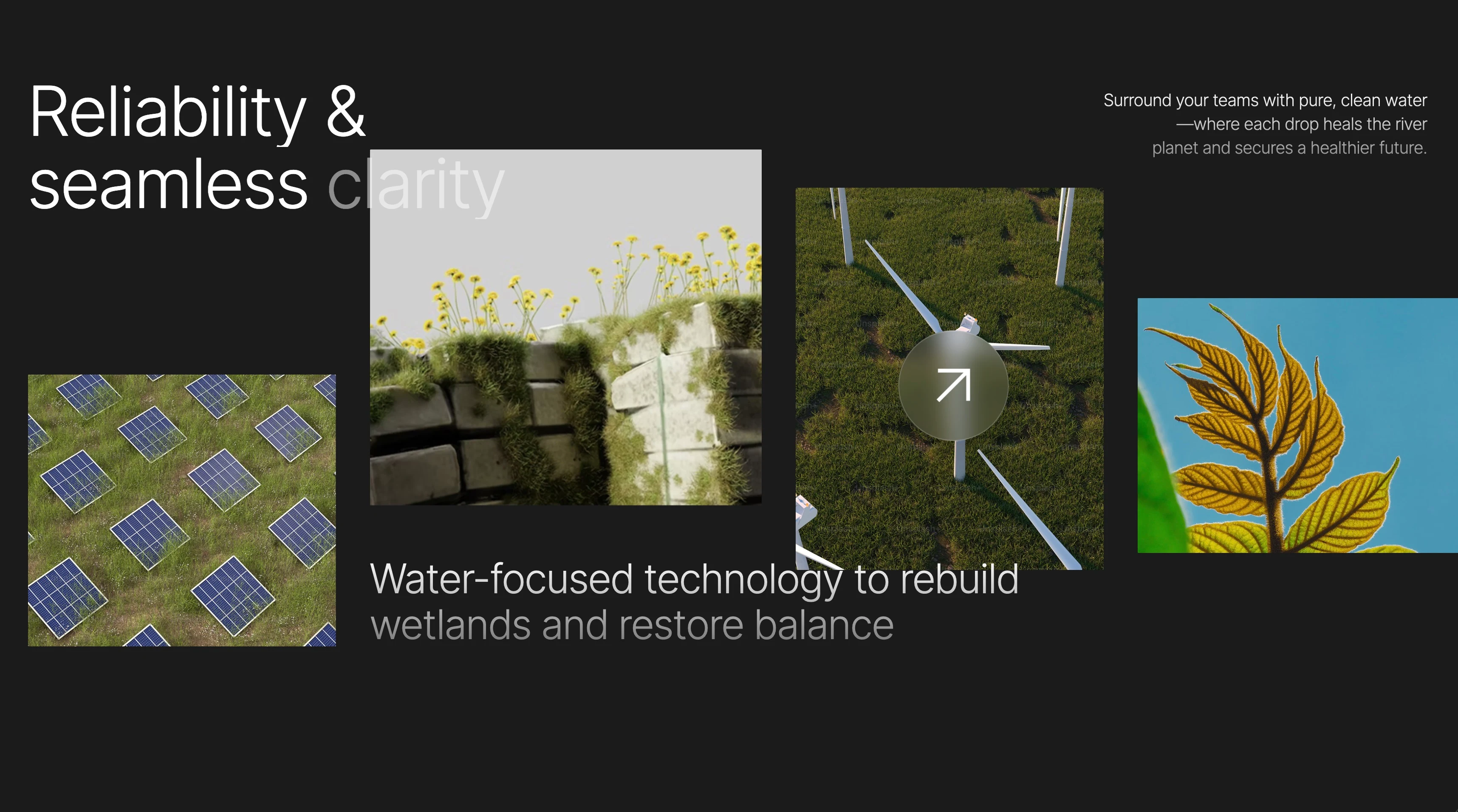
Drag collage — a scrub-able row of project stills with a glass cursor.
Focus areas — the work, in plain columns, no icons.
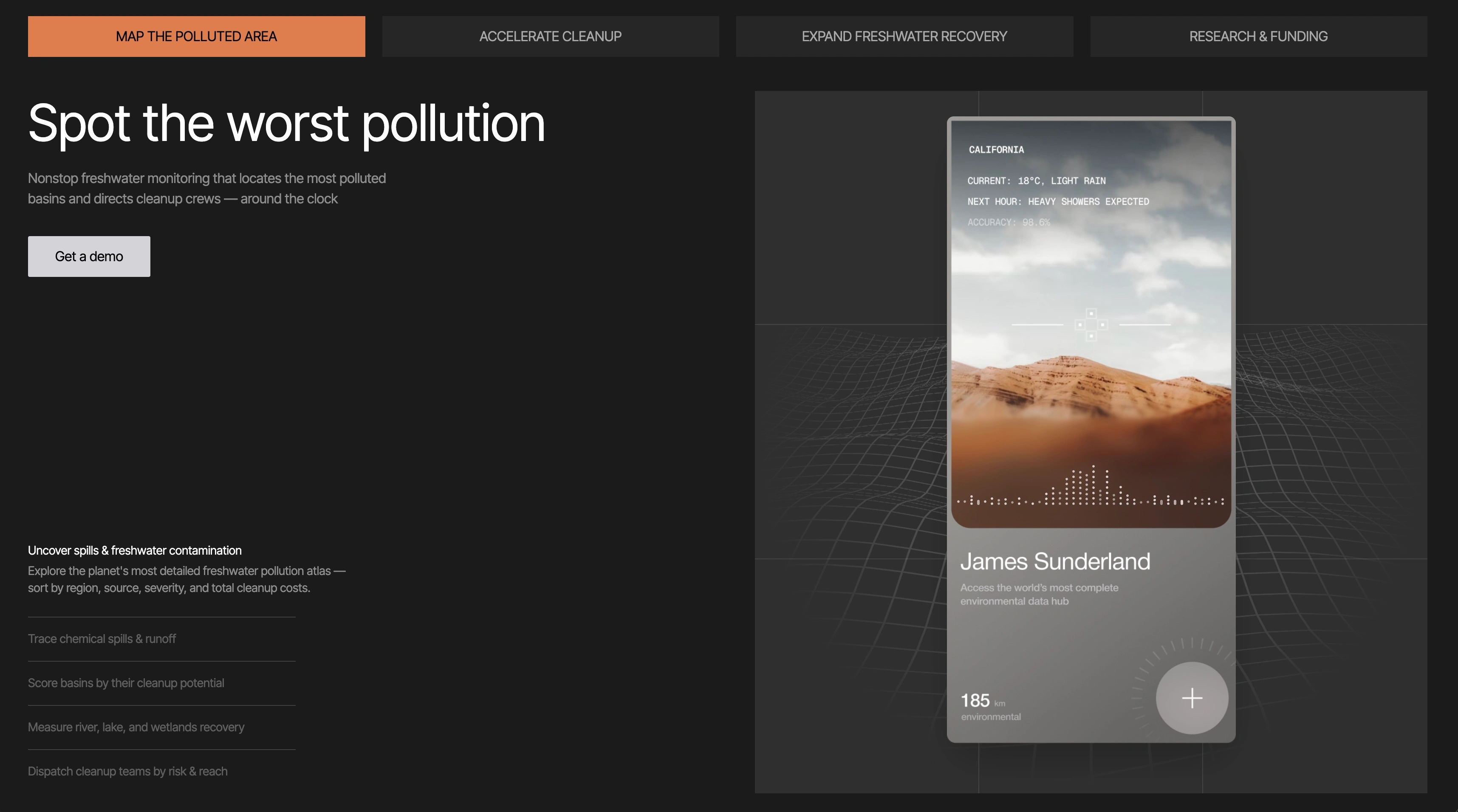
3D wave tabs — a live Three.js wave grid behind the product card.
Sticky impact counter — a full-viewport counter that holds as you scroll.
Hover-weight wordmark —
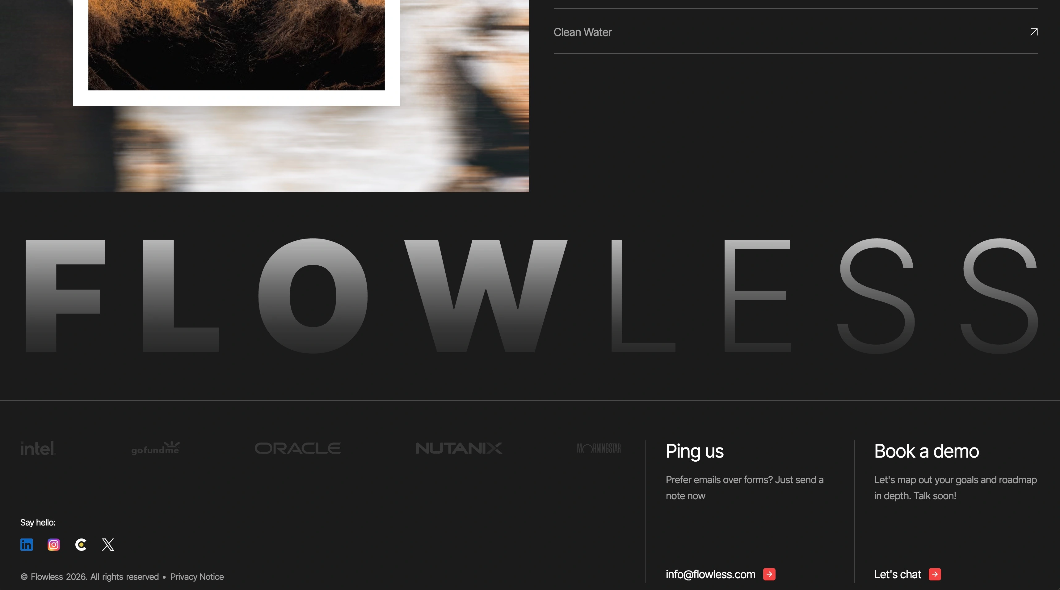
FLOWLESS at display scale, letters that thin and thicken under the cursor.Footer — contact, plain and direct.
The rules that hold it together: one accent (a purple-to-cyan flow gradient), one type family (Inter Tight, weight doing the work), real footage over illustration everywhere, and motion that behaves like water — staggered reveals that rise into place, nothing that snaps.
Kill list — what the system refuses: no green, no leaf icons, no mascot, no stock team photos, no buzzwords, no logo badge in the nav.
one accent, one family
The Sections
Hero
Hero video. Real water, full frame, before any claim is made, the proof comes first.
Drag Collage
The drag collage. The visitor scrubs through the work themselves instead of watching a carousel.
Wave Tabs
Wave tabs. A live wave grid renders behind the feature card, so the product sits inside motion, not on top of it.
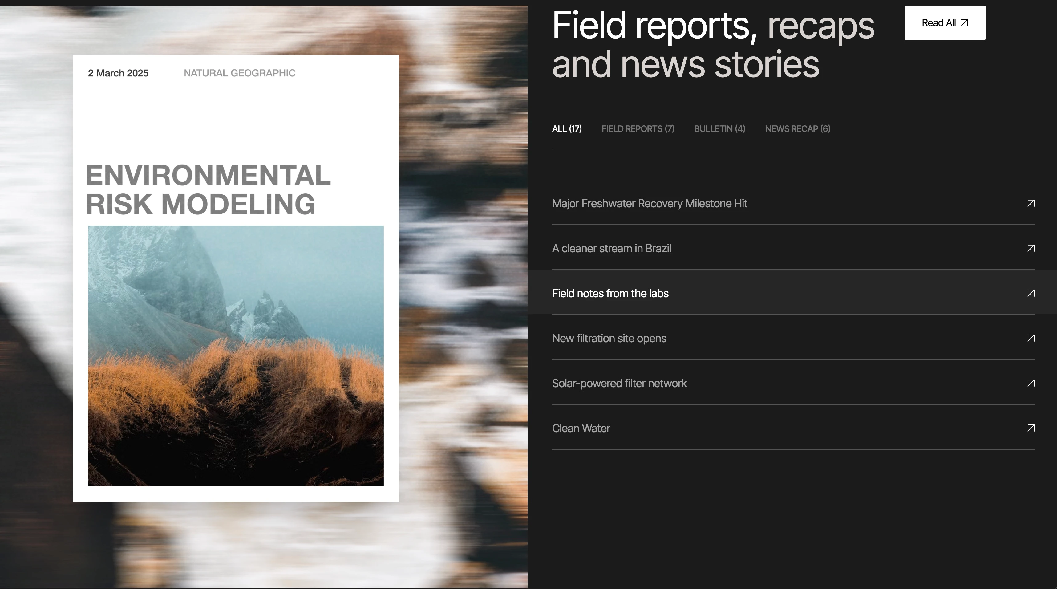
Impact Counter
Impact counter. One number, held on screen at full height — the result, given room to land.
four screens, one current
The Impact
Shipped as a responsive site — eight animated sections, mobile and desktop, built on a strict TypeScript setup that compiles clean with zero type errors. The 3D wave grid runs live in the hero without dropping the page's motion feel (confirm frame rate). Every string, the accent, and the motion language resolve to one system: restraint reads as credibility.
The Takeaway
The flow is the feature. The restraint is the brand.
Like this project
Posted Jul 29, 2026
Designed and built Flowless, a clean-water initiative site with animated, story-led sections that win over funders and partners. Figma, Framer, Next.js.