Fivetran

Omar Younis

Fivetran
2019-2021
Background
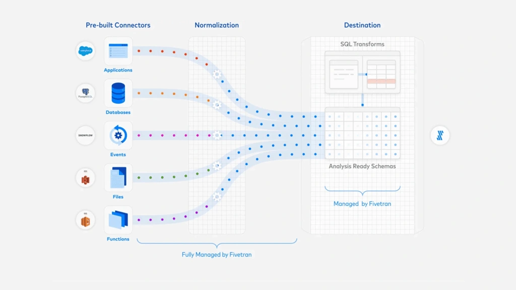
Fivetran is a leader in the data integration product category. They introduced fully-managed connectors that automated data replication from a wide range of data sources into various data stores. With Fivetran handling the underlying maintenance tasks such as schema normalization and table structures, data teams were liberated from the complexities associated with traditional ETL workflows. Customers of Fivetran save time and money by using our software to set up and maintain data pipelines. Data is then automatically synced at regular intervals so analysts within our customer orgs have fresh, reliable data for use in their analysis.
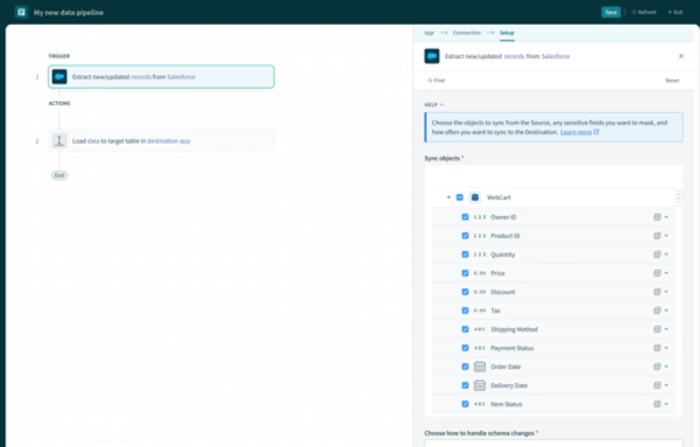
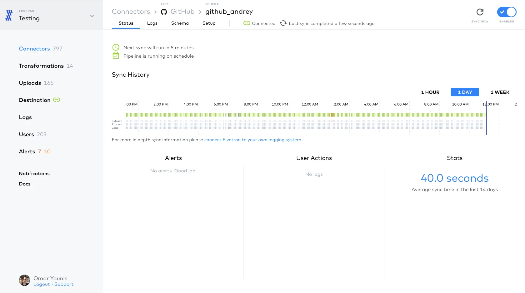
I joined as the first product designer. The first version of the app had been designed and built by Fivetran’s Russia-based engineering team, without any design resources for support. As the first design lead, I was tasked with redesigning the entire dashboard UX. Here’s some screenshots of the original app:
Problem statement for Fivetran
Design a system for the Fivetran application that enables non-technical users to self-serve data.
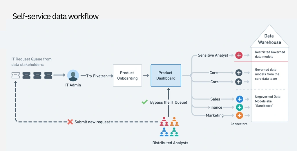
At the time, business teams had to interface with IT teams and data engineers in order to get required data flowing for their analysis use cases. It was a costly and inefficient system that Fivetran had the opportunity to improve.
Primary research
I held a series of customer interviews with key personas which helped me understand user goals when engaging the platform.
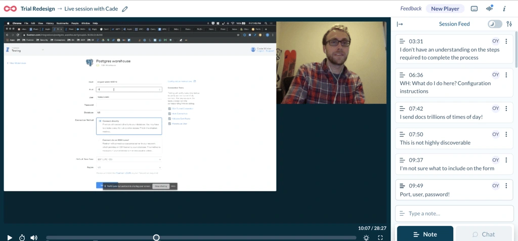
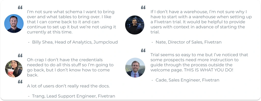
From research, I synthesized the following pain points:
Source and destination setup:
Lack of access credentials to source systems
Anxiety around connecting the data warehouse as a first step
Trouble completing technical source setup forms*
Navigation friction (what do i do next?)
Data schema setup:
Long waiting times when fetching large database schemas
Anxiety whether PII would being synced
Not knowing what schema objects to sync
After initial setup:
Notification emails were too noisy
Monitoring sync errors was difficult
Lack of transparency in Sync progress, esp. for large database “historical” syncs
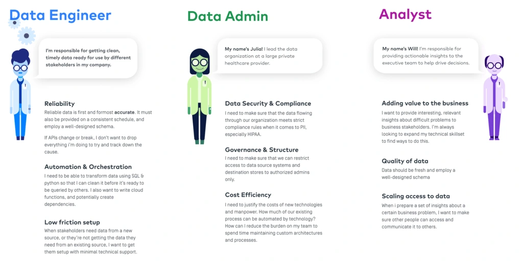
I modeled some personas to help me understand the data integration space and the motivations of the solution-seekers.
Improving task flows for users
Continuing from research, we identified pain points across the entire user journey, but could not address it all at once. In order to enable self-service usage, we had to increase user confidence in completing setup tasks to start with.
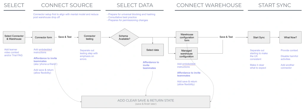
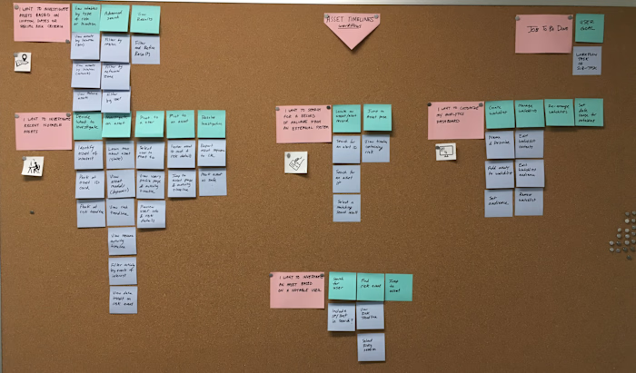
I continued to map out user flows to better understand how they connect to each other, and where opportunities for optimization were.
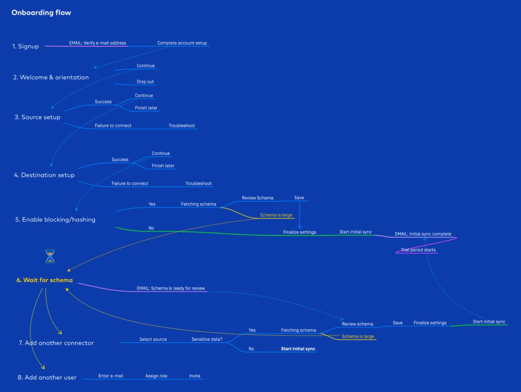
Getting a phased plan together
In collaboration with my PM, we decided to measure our impact on this using metrics that our data analytics team was already tracking.
PHASE 1 / Goal
Optimize order of onboarding flow steps / Reduce TTV & Dropoff at key steps
Make Source Setup easier / Reduce error rates & increase success rates
PHASE 2 / Goal
Let users review data schema and PII risks / Reduce PII Anxiety & Increase Sync rates
PHASE 3 / Goal
Add more sync observability features / Reduce time to error resolution
Hypothesis for reducing dropoff rates during onboarding setup
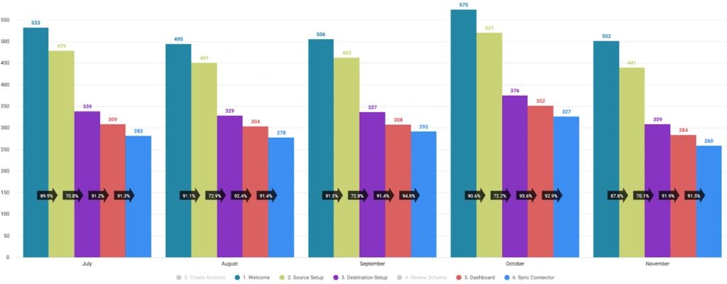
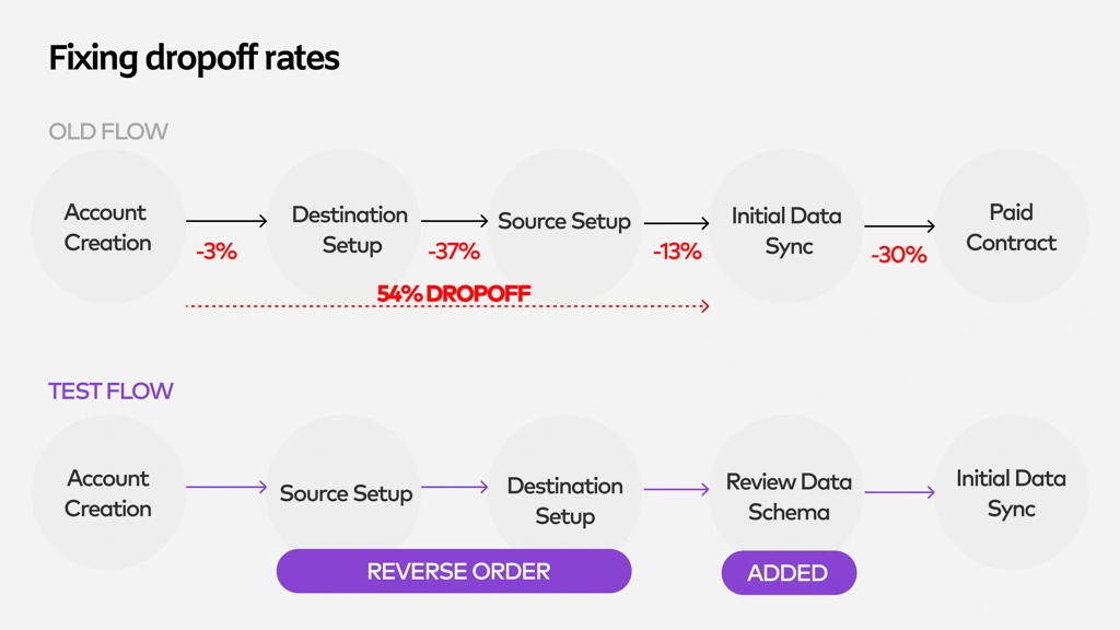
Proposal for reducing dropoff rates during onboarding setup
Building a better onboarding experience
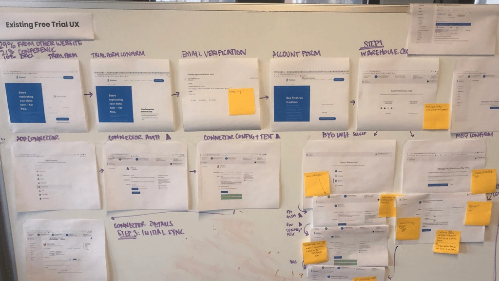
First I decided to capture pain points in the existing flow using lo-fidelity mockups, in order to keep track of them when we created the new experience. I
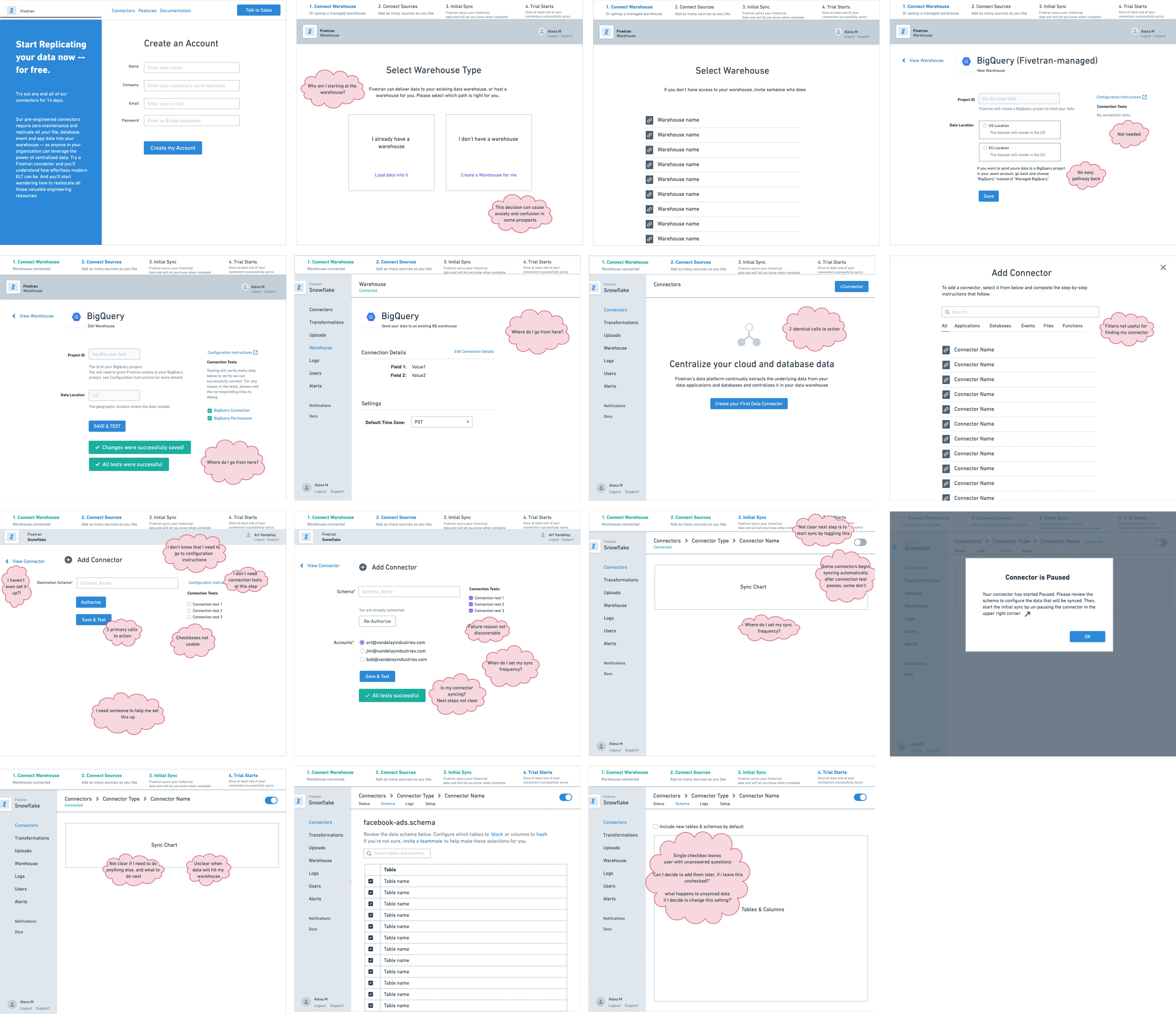
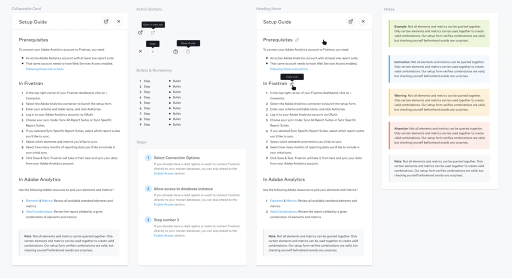
In addition to moving steps around, we wanted to provide room for in-line user education (“embedded docs”) during the setup process, and standardize the visual system.
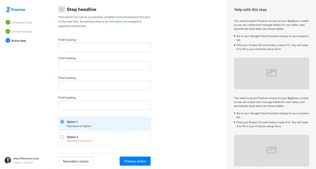
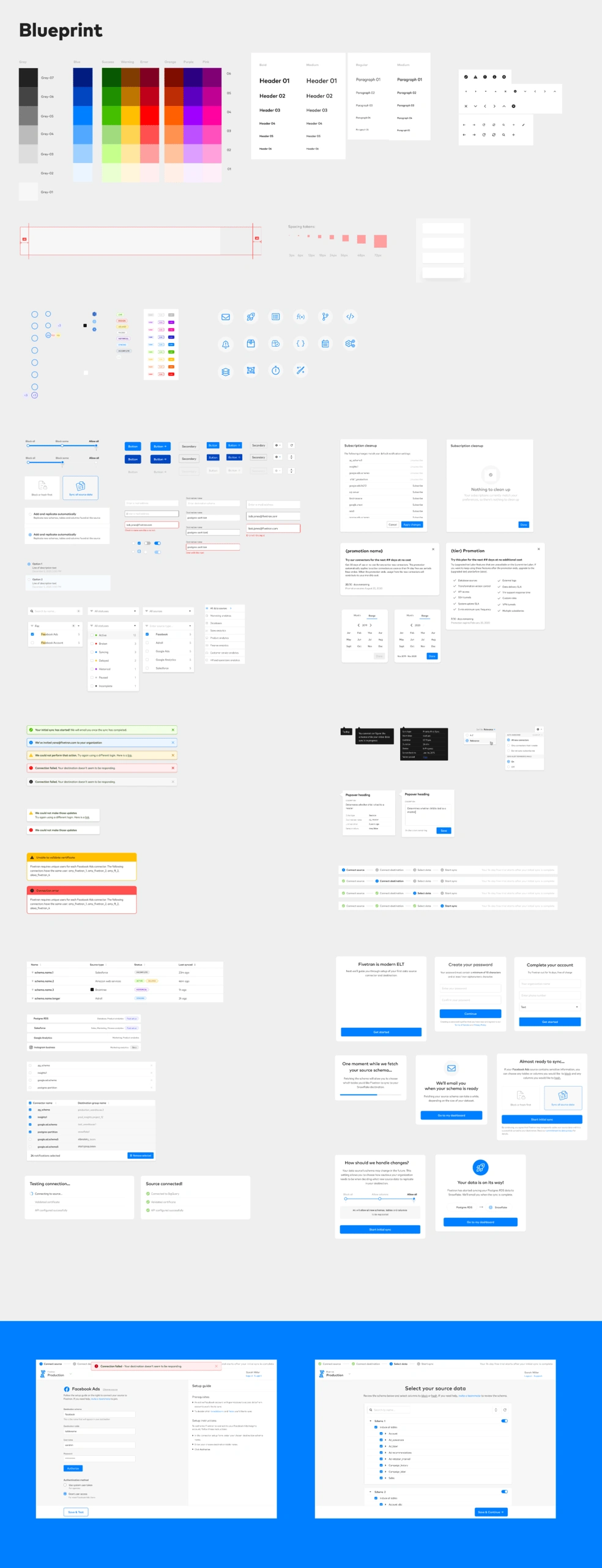
Designing components and visual style
First release
We released a redesigned onboarding flow, with standardized visual components and a re-arranged order of steps.

Results
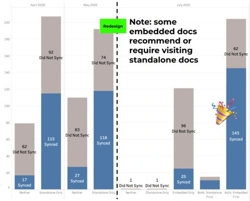
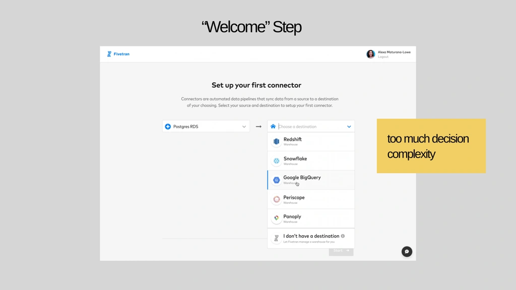
The results were mixed. Adding the embedded in-line docs during setup resulted in more completed syncs during onboarding.
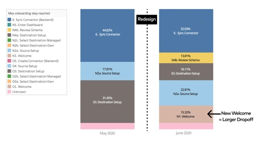
But the new “Welcome” step requiring users to select a source and destination resulted in more dropoff earlier in the flow than existed prior.
Follow-up release
We quickly released a follow-on, which provided a more non-committal experience when deciding on which source and destination to select:
This release resulted in an overall 36% improvement in sync rates upon new user onboarding, which was a success as it validated our hypothesis. We continued to optimize certain steps with continuous usage tracking.
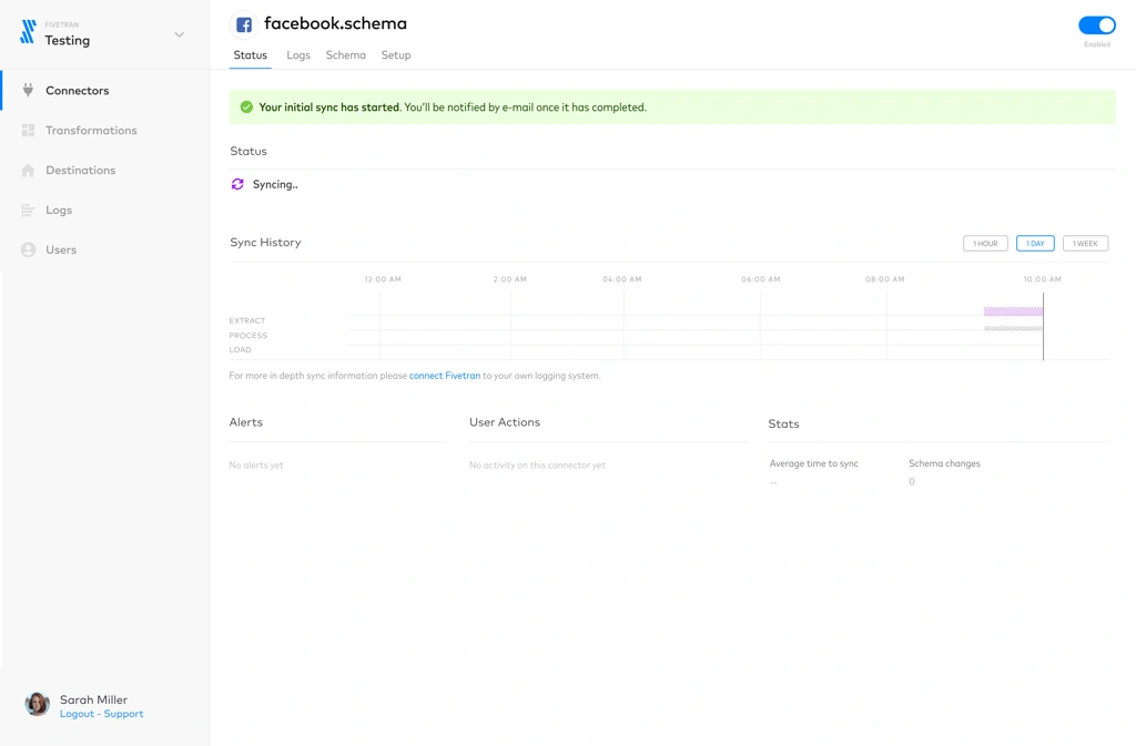
This is a mockup showing a connector detail page using updated components.
Wrap up
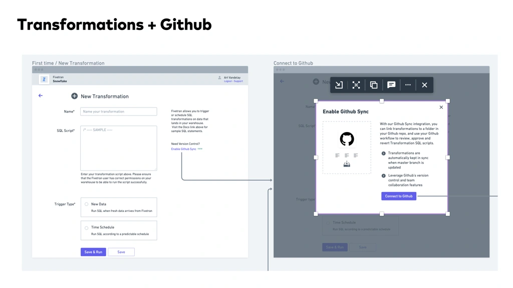
I got a chance to work on a lot of core roadmap features in addition to the setup workflows. This included transformations, sync chart UI, and a lot more.
I learned the importance of UX copy and involving the right stakeholders in copy and content related decisions, as someone new to the data integration space. Educating myself was the only way I could effectively design educational experiences for technical and non-technical users.

Like this project
Posted Jul 7, 2026
Redesigned Fivetran’s dashboard UX and onboarding to enable non‑technical users to self‑serve data and improve sync observability.
Likes
0
Views
4
Tags