Brand Kit - Logo Suite / Typography / Color Theory
Mo Houston
Verified
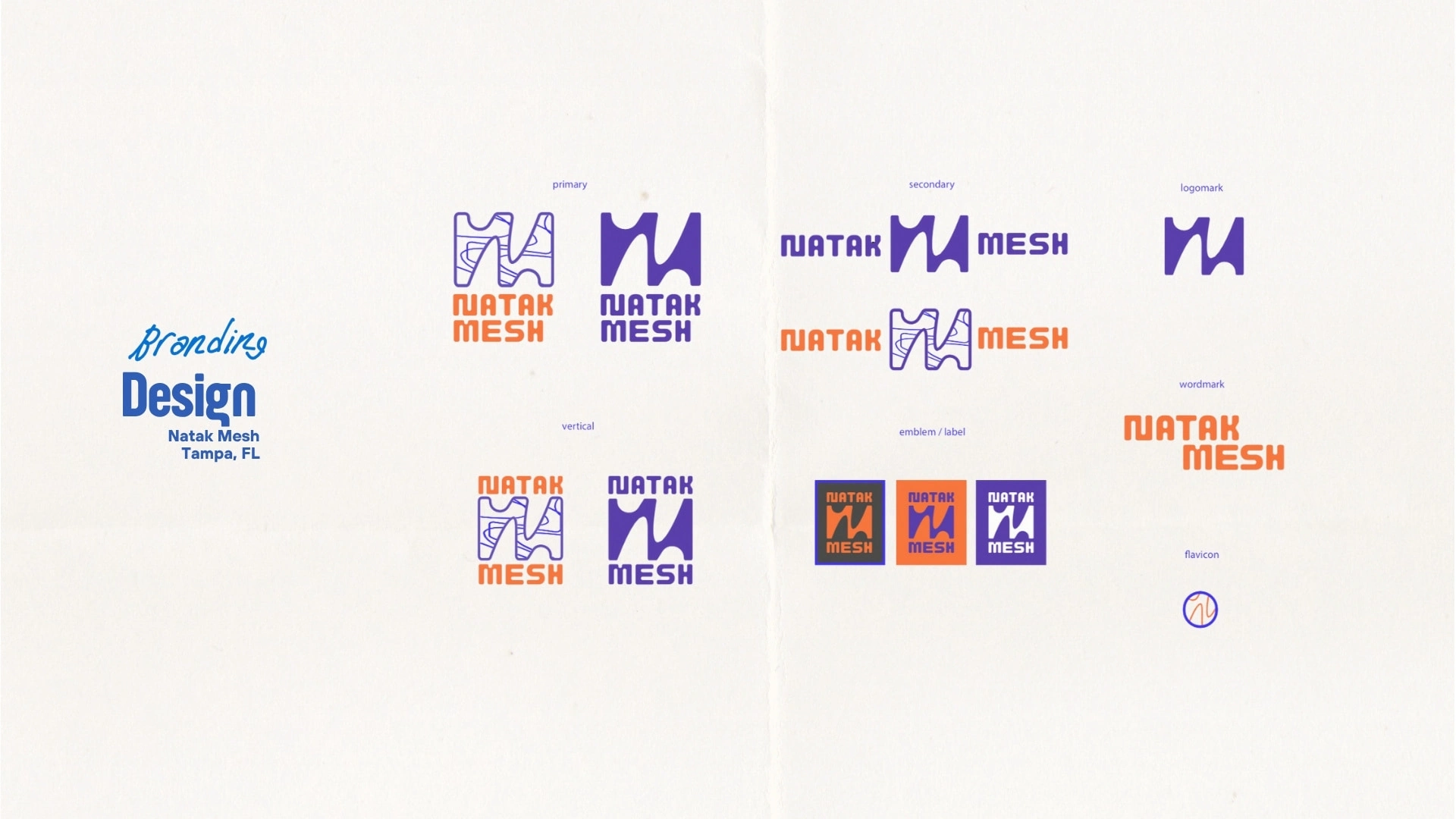
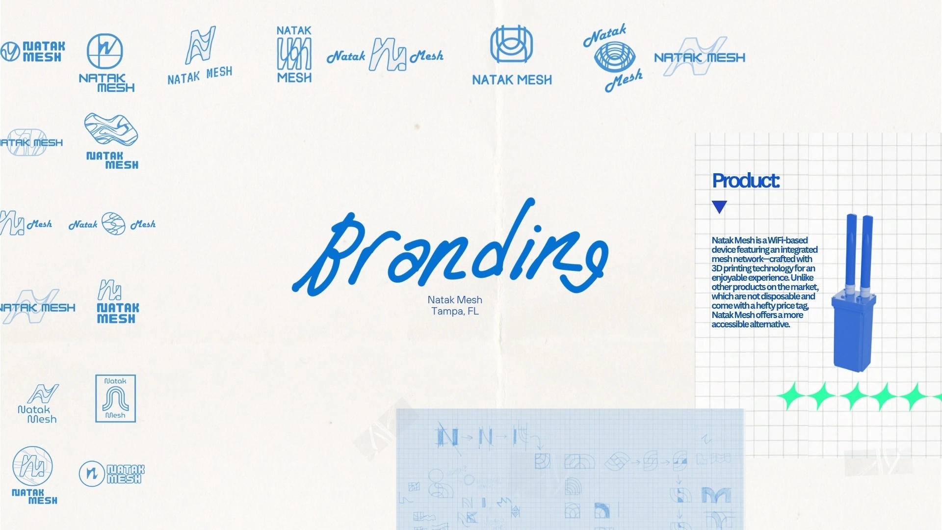
A high level overview of the visual branding for Natak Mesh, a WiFi based device that features a mesh network. Our creative direction for the logo design was to channel wavelength, vintage, arcade, and nerdiness. I think we succeeded with choosing a dynamic logo design, that has a strong silhouette and provides pivotal dexterity in application. Meaning it looks good on dark backgrounds, 3d printed on small products, and even lent itself to some rad pattern design for future packaging and implementation .
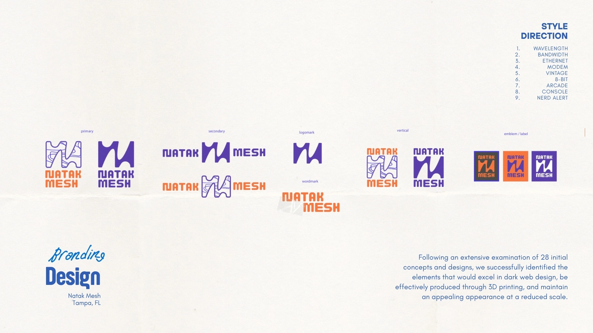
Final Logo Suite Deliverables for Natak Mesh: Primary Color & Solid // Secondary Color & Solid // Logomark // wordmark // vertical color & solid // Emblem options
Like this project
What the client had to say
Very happy with the experience. Mo spent a ton of effort to understand the project and created many options that were extremely well thought out. It was almost a shame to have to narrow down the field.
Nate Quinn, Natak Mesh
Jun 29, 2025, Client
Posted Jul 19, 2025
Natak Mesh was a visual branding project that allowed quite a bit of exploration in design. Overall the desire was for a versatile logo suite that was fun.
Likes
2
Views
5
Timeline
May 12, 2025 - Jun 25, 2025
Clients
Natak Mesh