Website Redesign for Siphter.io – A Platform Connecting Startups
Atif has helped us with a major redesign of our old website by doing a complete revamp of our brand and providing the best possible designs. The New Website looks great and I can't wait to develop it myself - Dennis v Dveen (Founder Siphter.io)

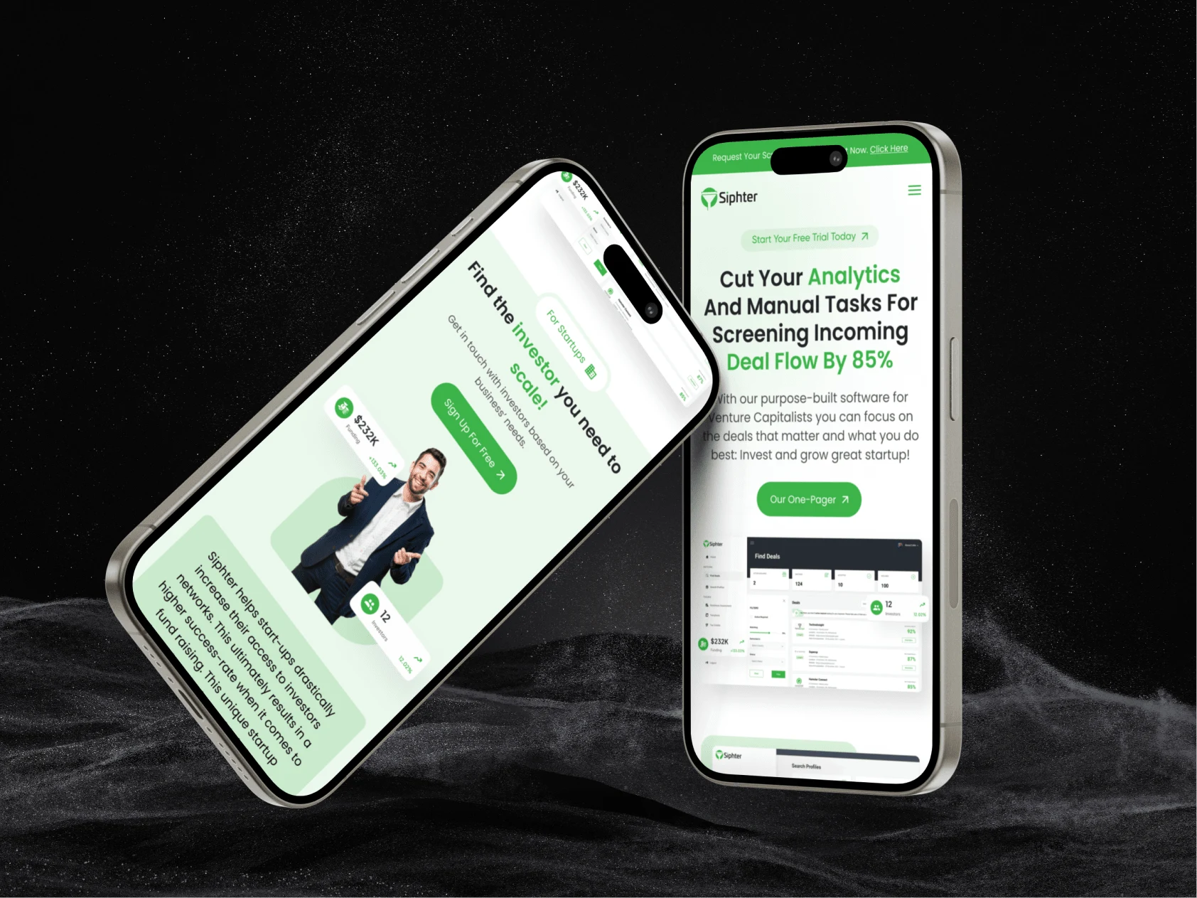
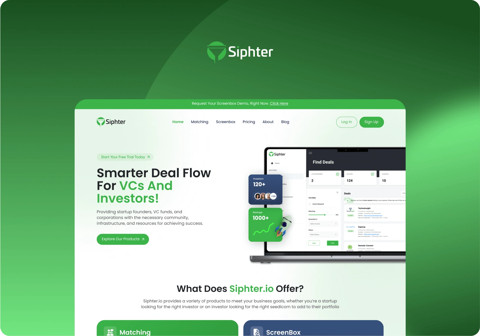
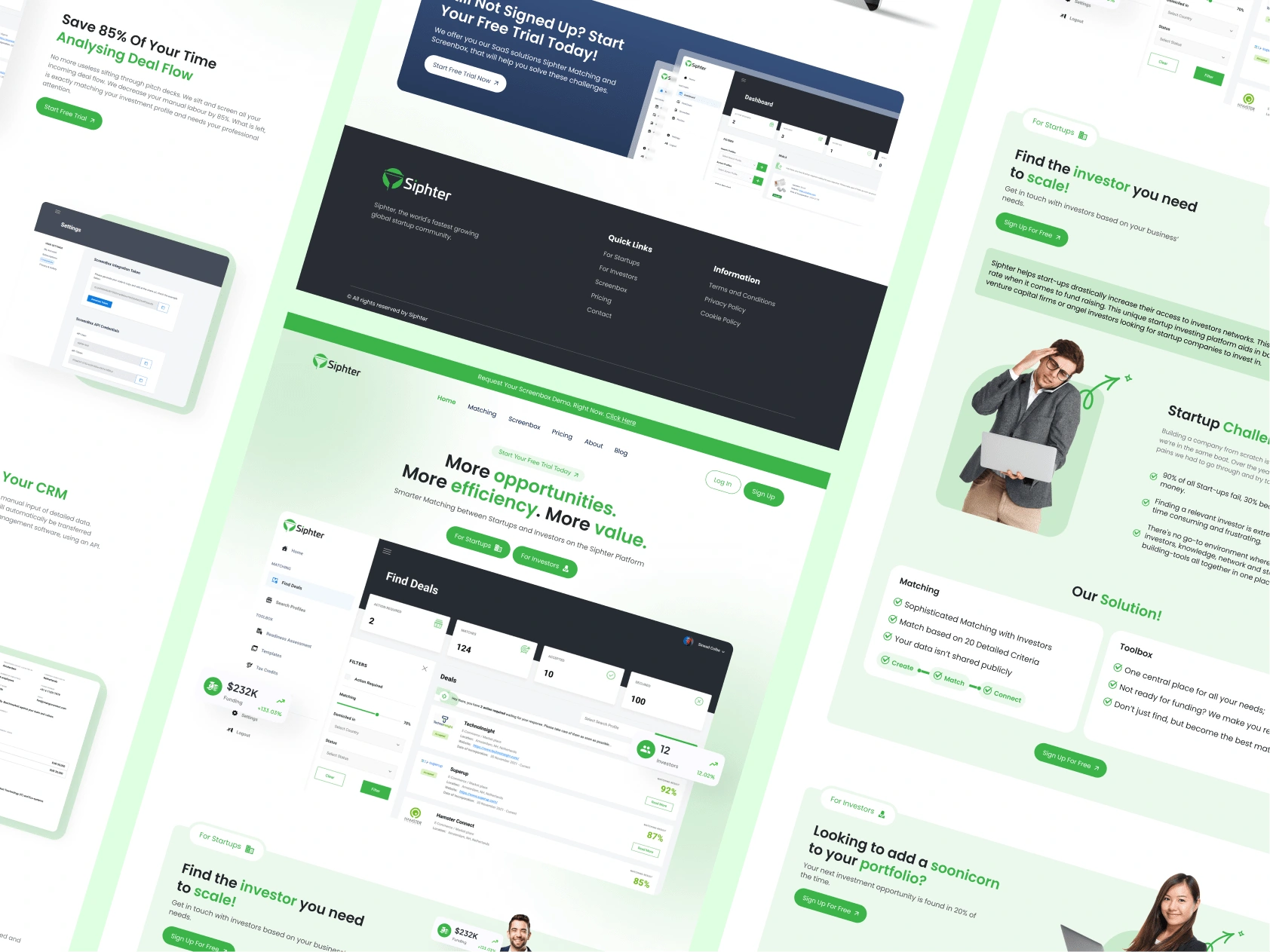
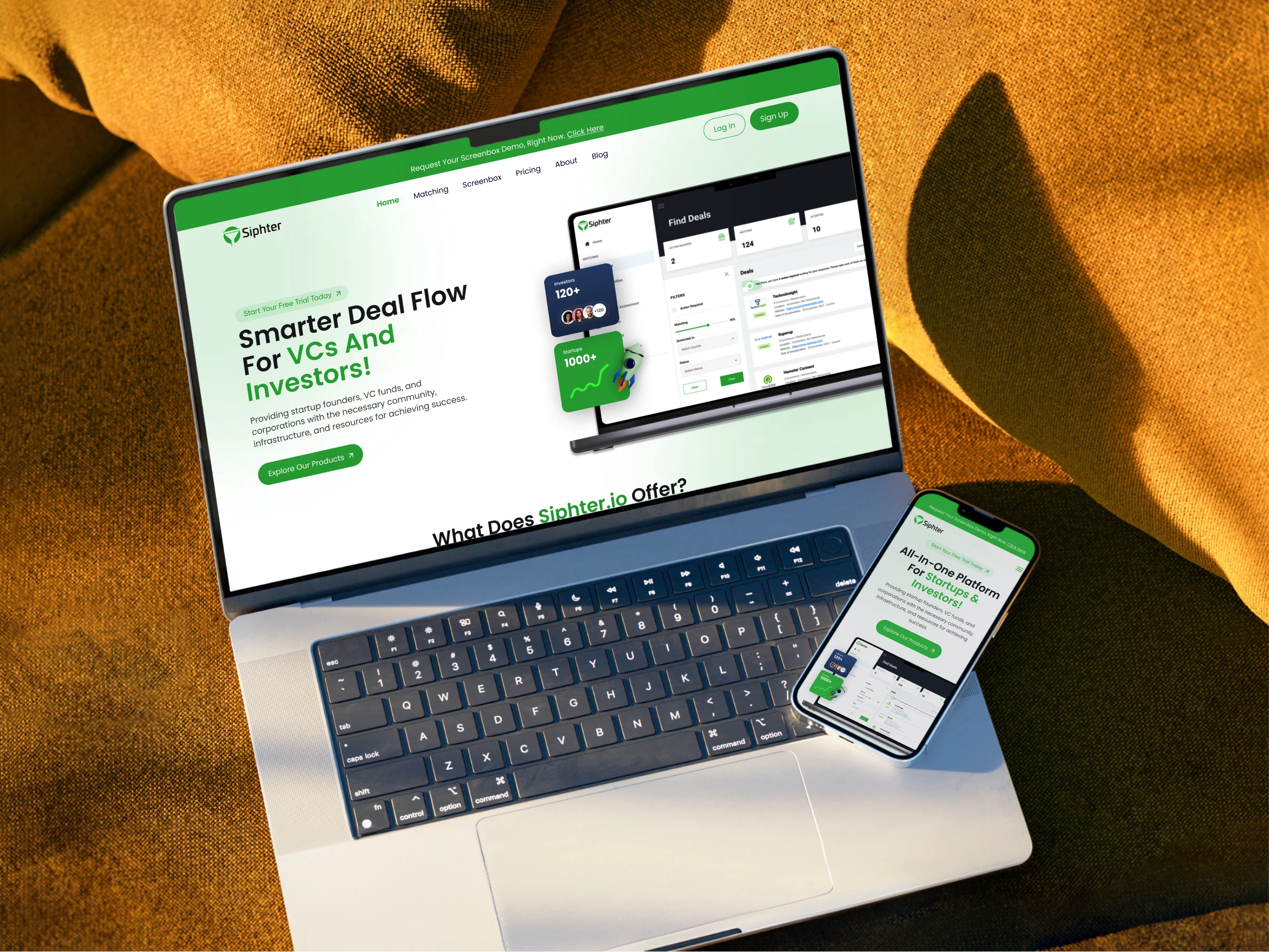
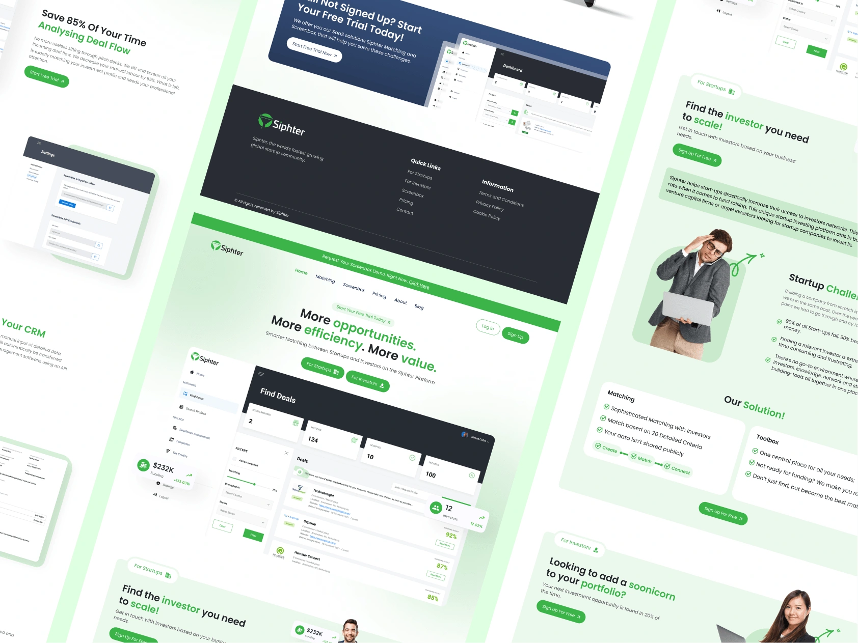
New Website Glimpse
Project Overview
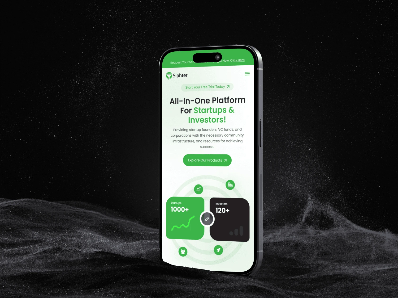
Siphter.io, a dynamic platform bridging the gap between startups and venture capitalists (VCs), approached me with the goal of revamping their website to enhance user experience and streamline their business model. As the digital landscape for startups continues to evolve, Siphter.io sought a more intuitive, visually appealing, and functional website that could cater to both emerging startups and seasoned investors. My role was to overhaul the website’s design, ensuring seamless navigation, improved functionality, and a modern aesthetic that aligns with the platform's target audience.
Objectives
The primary objectives of the website redesign were:
Improve User Experience (UX): Ensure a user-friendly interface that caters to the needs of startups looking to attract investors and VCs looking to discover promising startups.
Increase Engagement: Redesign key elements to increase user retention and engagement through intuitive navigation, clear call-to-actions, and visually appealing elements.
Streamline the Signup Process: Simplify and enhance the onboarding process for both startups and VCs, reducing friction points and improving conversion rates.
Establish Brand Consistency: Create a cohesive and professional visual identity across all pages that reflects Siphter.io's mission of connecting and empowering entrepreneurs and investors.
Design Approach
Discovery & Research:
The redesign process began with an in-depth discovery phase where I analyzed the current website's performance, conducted competitor analysis, and gathered feedback from existing users. This research helped identify key pain points such as complex navigation, outdated aesthetics, and an inconsistent brand experience. The goal was to identify areas of improvement that would make the platform more attractive and functional for both startups and investors.
Wireframe & Prototyping:
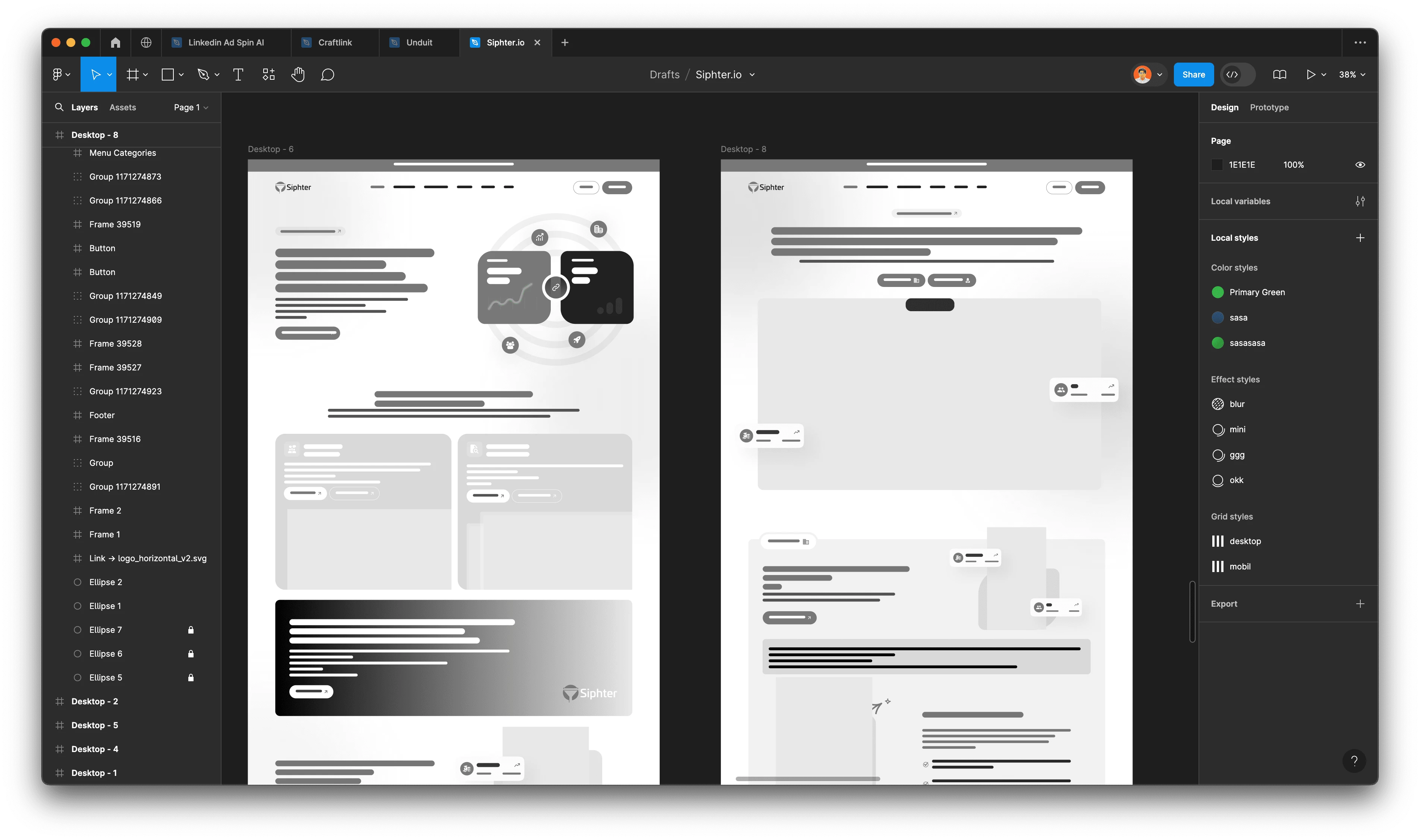
Based on the findings from the discovery phase, I created wireframes to map out the new user flows. The wireframes focused on creating a simplified structure for the website, particularly around core functions like startup registration, VC browsing, and investment opportunities. I then developed high-fidelity prototypes to showcase the visual direction of the website, ensuring the design was in alignment with Siphter.io's brand identity and audience expectations.
UI/UX Design
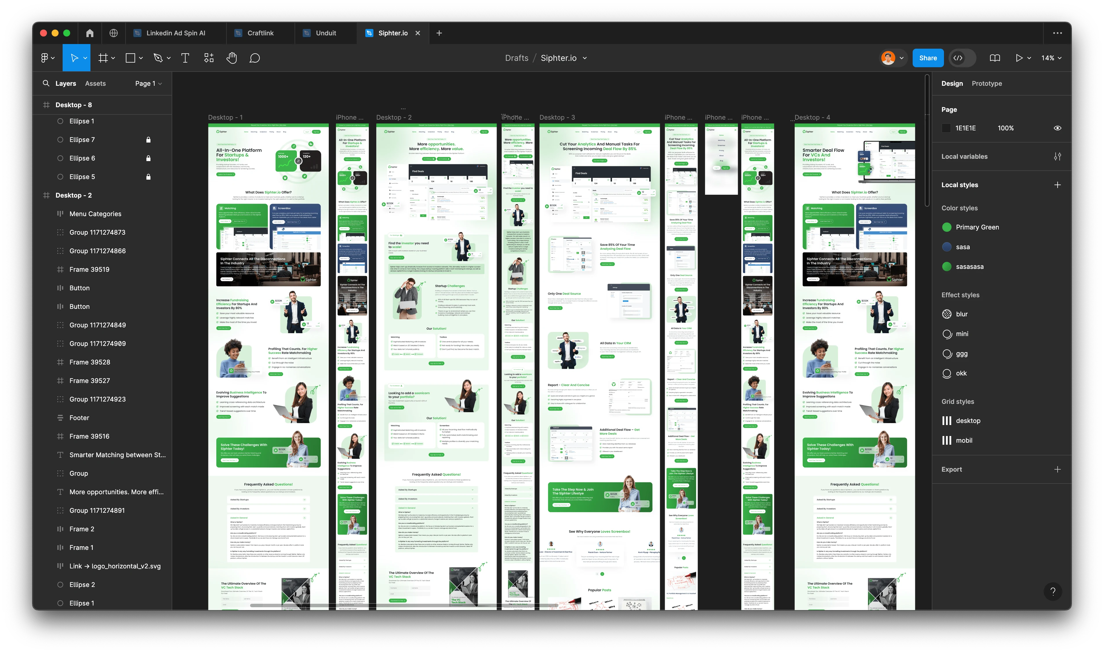
The new UI/UX design emphasized minimalism and clarity, allowing users to focus on the content that matters most. Key features of the redesign included:
Clean and Modern Aesthetic: I used a palette of professional, vibrant colors that represent innovation and growth, creating a welcoming yet professional vibe for users. The use of whitespace and clean typography ensured that the content remained easy to read and navigate.
Simplified Navigation: I restructured the navigation bar to make it more intuitive. Categories like "For Startups" and "For VCs" were prominently displayed, ensuring each user type could easily access relevant content and services. Additionally, dropdown menus and contextual links were streamlined to minimize user confusion.
Enhanced Call-to-Actions (CTAs): I placed strategically located CTAs throughout the site to encourage users to sign up, schedule consultations, or explore opportunities without feeling overwhelmed.
Results:
The redesign delivered tangible improvements for Siphter.io, positively impacting key performance metrics:
User Engagement: Post-launch analytics showed a 35% increase in user engagement, particularly in the startup and VC browsing sections. The simplified navigation and redesigned CTAs contributed significantly to this improvement.
Conversion Rates: The optimized onboarding process led to a 20% increase in conversion rates for both startups and VCs signing up for the platform.
Time on Site: The average time spent on the site increased by 40%, indicating that users found the new layout and features more engaging and easier to navigate.
Brand Perception: The feedback from users reflected a stronger sense of trust and professionalism in the platform, helping Siphter.io establish itself as a credible player in the startup investment space.


Conclusion
The website redesign for Siphter.io successfully addressed the platform's challenges by focusing on user-centric design principles. By improving the user experience, enhancing functionality, and reinforcing brand identity, the new website now serves as a valuable asset for Siphter.io in its mission to connect startups with venture capitalists. The improved engagement, conversion rates, and user satisfaction highlight the success of the redesign and demonstrate the power of thoughtful, strategic design in the digital space.
This project was an opportunity to leverage design thinking to make a tangible impact on a growing platform, and the results speak for themselves. Siphter.io is now better positioned to serve its community of innovators and investors, fostering growth and collaboration in the startup ecosystem.
Like this project
Posted Aug 18, 2024
My role was to overhaul the website’s design, ensuring seamless navigation, improved functionality, and a modern aesthetic.
Likes
0
Views
12

