Built with Jitter
Custom Animation Showcase | Website + Dashboard + Mobile Apps
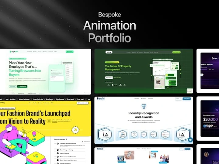
Custom Animation Showcase | Website + Dashboard + Mobile Apps
Overview
This case study showcases a series of custom animation projects created using Jitter, custom JS to enhance user engagement, support brand messaging, and optimize visual storytelling across various platforms.
In each animation project, the goal was to create dynamic visuals that effectively conveyed the client’s message while maintaining brand consistency. Jitter provided the ideal platform for delivering efficient, high-quality motion graphics. Each animation contributed to improving user engagement, storytelling, and overall brand presence.
Custom Animation Workflow
Discovery & Briefing – Understood project goals, audience, platforms, and desired animation style.
Asset Preparation – Gathered or designed custom assets like logos, icons, and illustrations.
Storyboarding – Mapped out key scenes and transitions to visualize the animation flow.
Animation Production – Imported assets, applied motion, and refined timing with keyframes.
Client Review – Shared drafts and revised based on feedback to match brand vision.
Final Delivery – Exported and optimized files in formats like MP4, GIF, and Lottie.
Post-Delivery Support – Assisted with embedding and using animations across platforms.
.................................................................................................................................................
Project 1: CtrlPlain - Sales Enablement & AI-Driven Pipeline Management:
Client: Ctrlplain
_____________________________________________________________________________________
Industry: Sales Enablement Software [B2B]
_____________________________________________________________________________________
Animation:
Project Detail
.................................................................................................................................................
Project 2: AI-Powered Customer Service & Conversational AI Agent
Client: Sagepilot
_____________________________________________________________________________________
Industry: Customer Service & Conversational AI Agent
____________________________________________________________________________________
Hero section animation
Version 2 (Hero section Animation)
Text Reveal Effect
Project Link
.................................................................................................................................................
Project 3: Telecommunications & Cloud Communications
Client: Faxsipit (34 years in Industry)
_____________________________________________________________________________________
Industry: Telecommunications & Cloud Communications
_____________________________________________________________________________________
Hero section animation
Project Link
.................................................................................................................................................
Project 3: Networking Platform
Client: Infraction
_____________________________________________________________________________________
Industry: The go-to platform for companies seeking the benefits of fractional leadership.
_____________________________________________________________________________________
USP/ Features Animation
Project Link
.................................................................................................................................................
Project 5: Real Estate Tech & AI-powered Property Management:
_____________________________________________________________________________________
Industry: Real Estate Tech & AI-powered Property Management
_____________________________________________________________________________________
Hero Section Animation
Project Link
.................................................................................................................................................
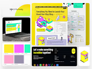
Project 6: Fashion Brand Accelerator:
Client: Ink & Runway
_____________________________________________________________________________________
Industry: Empower aspiring fashion designers and emerging brands through a comprehensive array of services
_____________________________________________________________________________________
Loading Animation
Project Link
.................................................................................................................................................
Project 7: AI-Powered Workforce Management & Field Operations :
Client: Quantiantech (backed by India Accelerator) __________________________________________________________________________________
Industry: Workforce Management & Field Operations (SaaS)
_____________________________________________________________________________________
3d Image Scroll
Logo Reveal Effect On Scroll
Project Link
Project - 8 Interactive Button Animations across different websites :
Overview
In the digital age, the subtle nuances of user interface design can significantly impact the user experience. Buttons, as primary interactive elements on websites, play a critical role in guiding user actions. This case study explores various interaction animations for buttons, aimed at enhancing user engagement and providing intuitive feedback.
Hover Effects :
1. Colour Change:
- Implementation: The button changes color when hovered over.
- Impact: Provides immediate visual feedback, indicating the button is interactive. This simple change can significantly enhance the user’s understanding of clickable elements.
2. Scale Up:
- Implementation: The button slightly enlarges on hover.
- Impact: By increasing in size, the button draws attention and clearly indicates its interactivity, leading to higher click-through rates.
3. Shadow:
- Implementation: A drop shadow appears on hover.
- Impact: Creates a 3D effect, making the button appear elevated and more prominent, which improves visibility and user engagement.
4. Border:
- Implementation: A border appears or changes color when hovered over.
- Impact: Provides a clear visual cue that the button is active, enhancing the overall user interface’s visual hierarchy.
Click Effects
1. Press In:
- Implementation: The button appears to be pressed inwards when clicked.
- Impact: Simulates a physical button press, providing tactile feedback that reassures users their action has been registered.
2. Fade Out and In:
- Implementation: The button briefly fades out and back in on click.
- Impact: This transient effect indicates that the button has been successfully pressed, enhancing user feedback without disrupting the visual flow.
Transformations
1. Flip:
- Implementation: The button flips to reveal additional information or options.
- Impact: Adds an element of surprise and interactivity, which can make the user experience more engaging and informative.
2. Morph:
- Implementation: The button changes shape, such as from a rectangle to a circle.
- Impact: Indicates a change in state, providing visual feedback that can signal different actions or modes, making the interface more dynamic.
Text Effects
1. Slide In:
- Implementation: The button text slides in from the side on hover.
- Impact: Adds movement to the button, making it more engaging and drawing attention to the text, which can improve readability and user interaction.
2. Underline:
- Implementation: An underline animation sweeps in from the side or center.
- Impact: Emphasizes the button text, making it clear that the button is interactive and enhancing the overall aesthetic appeal.
Icon Animations
1. Spin:
- Implementation: An icon within the button spins on hover or click.
- Impact: Adds a playful element to the button, making the interaction more enjoyable and attracting user attention.
2. Pulse:
- Implementation: The icon pulses or grows slightly.
- Impact: Draws attention to the button and signifies its importance, encouraging users to interact with it.
3. Swap:
- Implementation: The icon changes to another icon.
- Impact: Indicates a change in state or action, providing clear visual feedback and enhancing the user experience.
Microinteractions
1. Shake:
- Implementation: The button shakes slightly to indicate an error.
- Impact: Clearly signals to users that an action is invalid, helping to prevent errors and improve usability.
2. Glow:
- Implementation: The button glows softly when hovered over or focused.
- Impact: Draws subtle attention to the button, making it stand out without being overly intrusive, thus enhancing the overall user experience.
Project - 9 Progress Bar Animation
Objective :
To improve user navigation and provide intuitive feedback on scroll progress through website sections using a dynamic progress bar located below the navigation bar.
Design Concept
Strategic Placement:** Positioned below the navigation bar for continual visibility.
Visual Design: Utilized a sleek, contrasting horizontal bar that dynamically fills as users scroll through content.
Animation and Interaction
Scroll Detection: JavaScript detects user scroll actions.
Progress Calculation: Updates dynamically based on the user's scroll position relative to content sections.
Smooth Animation: Implemented CSS transitions for seamless visual updates.
Benefits
Enhanced User Guidance: Provides clear indication of the user's current position on the page.
Improved Engagement: Encourages exploration and continued interaction by visualising progress.
Usability Boost: Reduces cognitive load and enhances overall browsing experience.
Like this project
Posted Jul 9, 2024
CUSTOM WEBSITE MOTION DESIGN : From subtle micro-interactions to immersive parallax effects, tailored to elevate user engagement.


