Dashboard Revamp
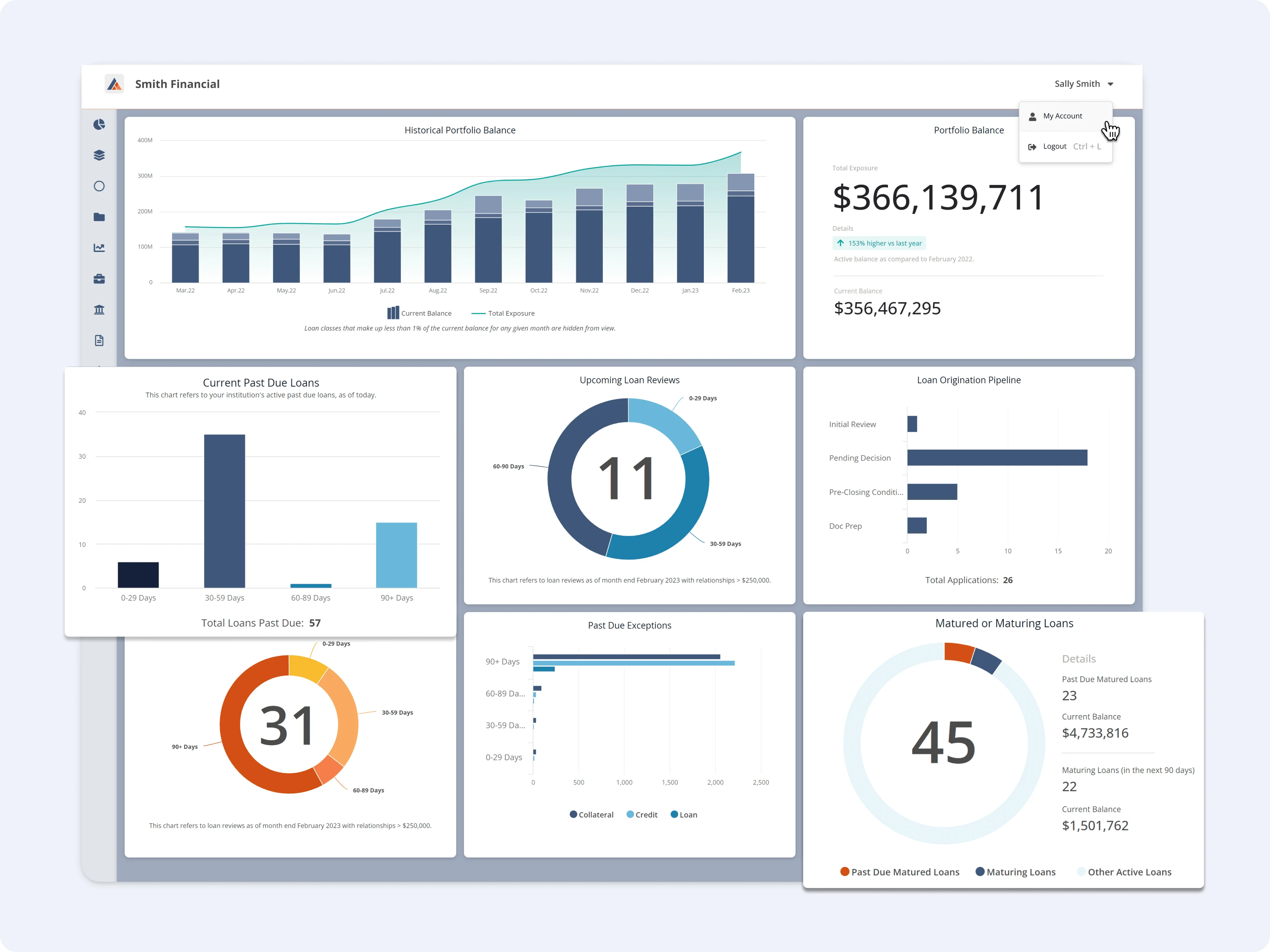
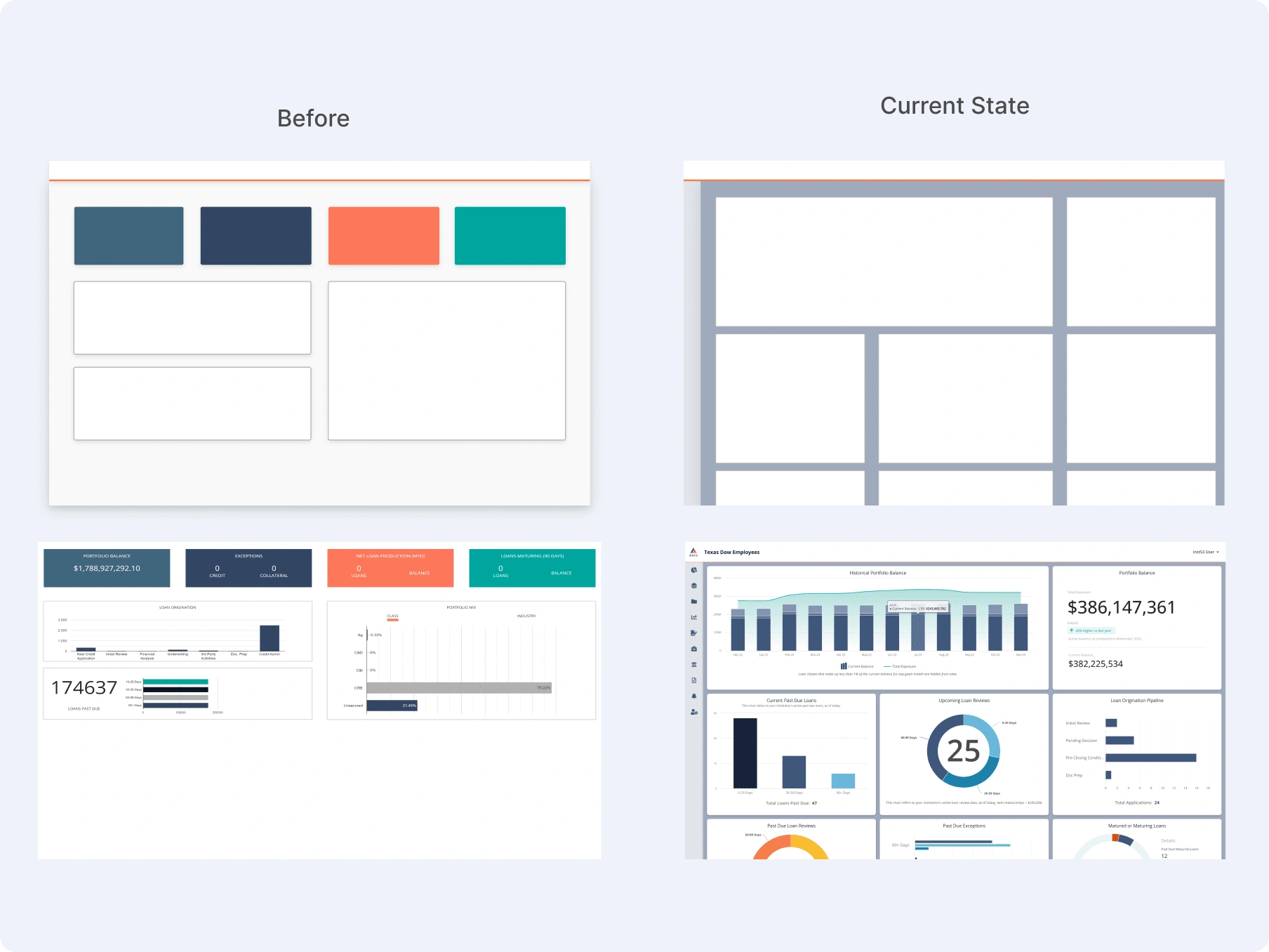
Revamping the Company's dashboard view to showcase the details and features of the Institution and its Commercial Loans
Problem to Solve
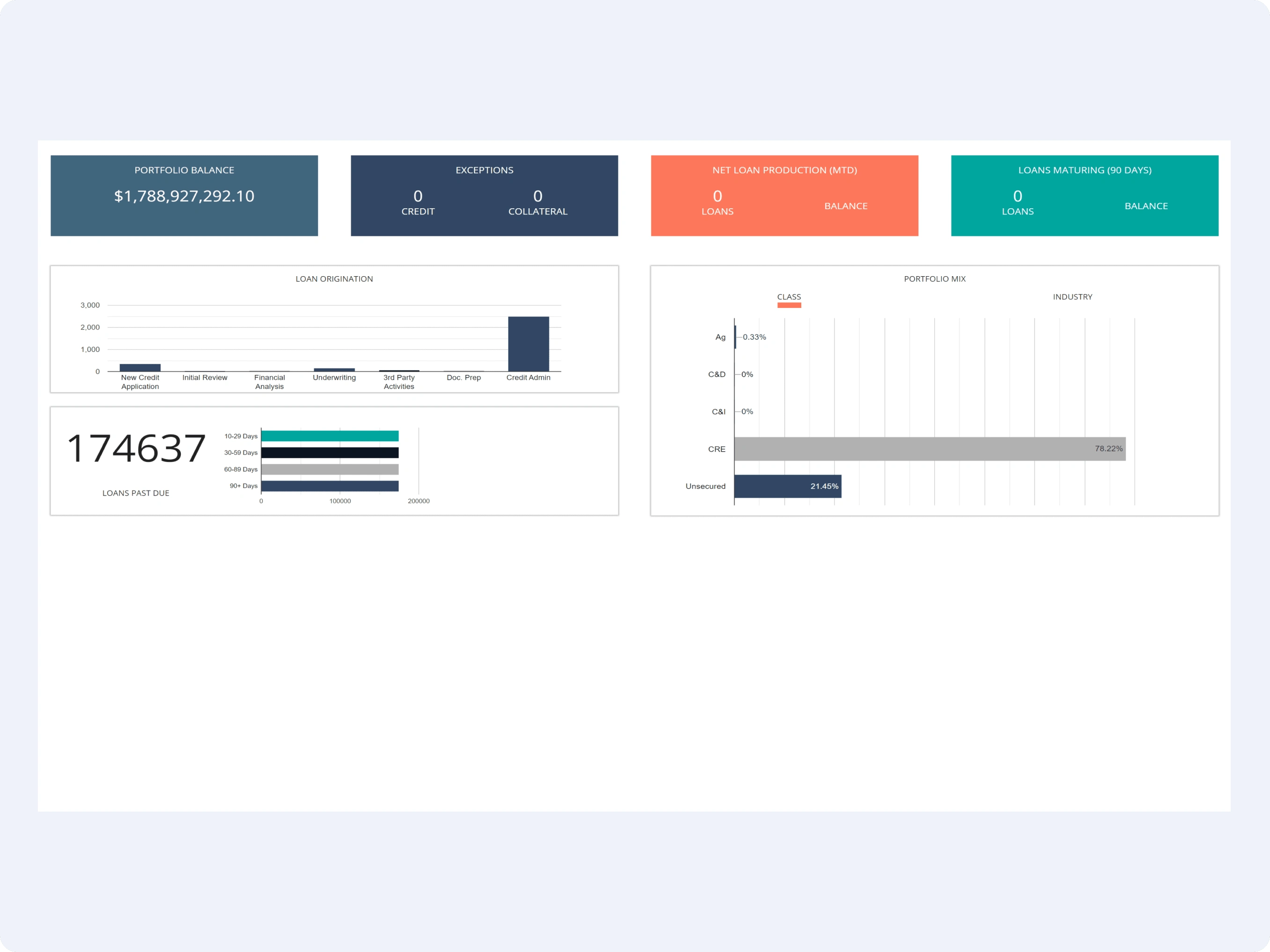
The dashboard was already existing when I joined BAFS and though it was functioning users were struggling to consume and access the data. The dashboard allowed for very limited interaction, frustrated the user, and unable to access key metrics overall hindering productivity. Some other problems we were facing… Poor integration with other systems, lack of customization, and data overload.
Given these concerns, the question raised was:
How can we give our internal/external clients an easy-to-digest / customized dashboard that makes complex data understandable at a glance?
Stakeholders Validations
During the project's wireframing stage, stakeholders proactively joined calls and confirmations to evaluate different features. These stakeholders were specialists in the client experience, data visualization, and data reporting. We utilized their preexisting relationships with clients to reform our dashboard experience and ensure the best solution for our users.
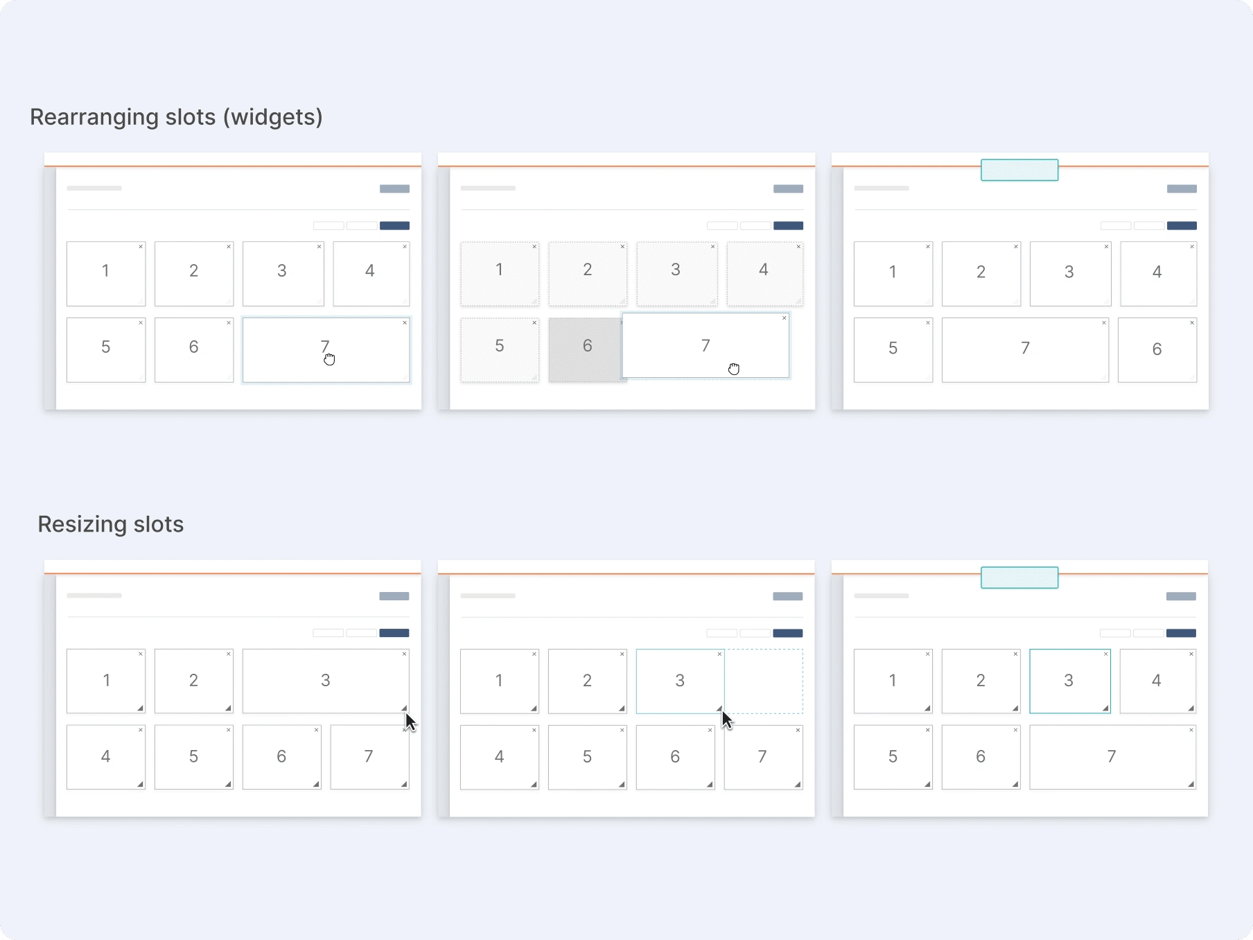
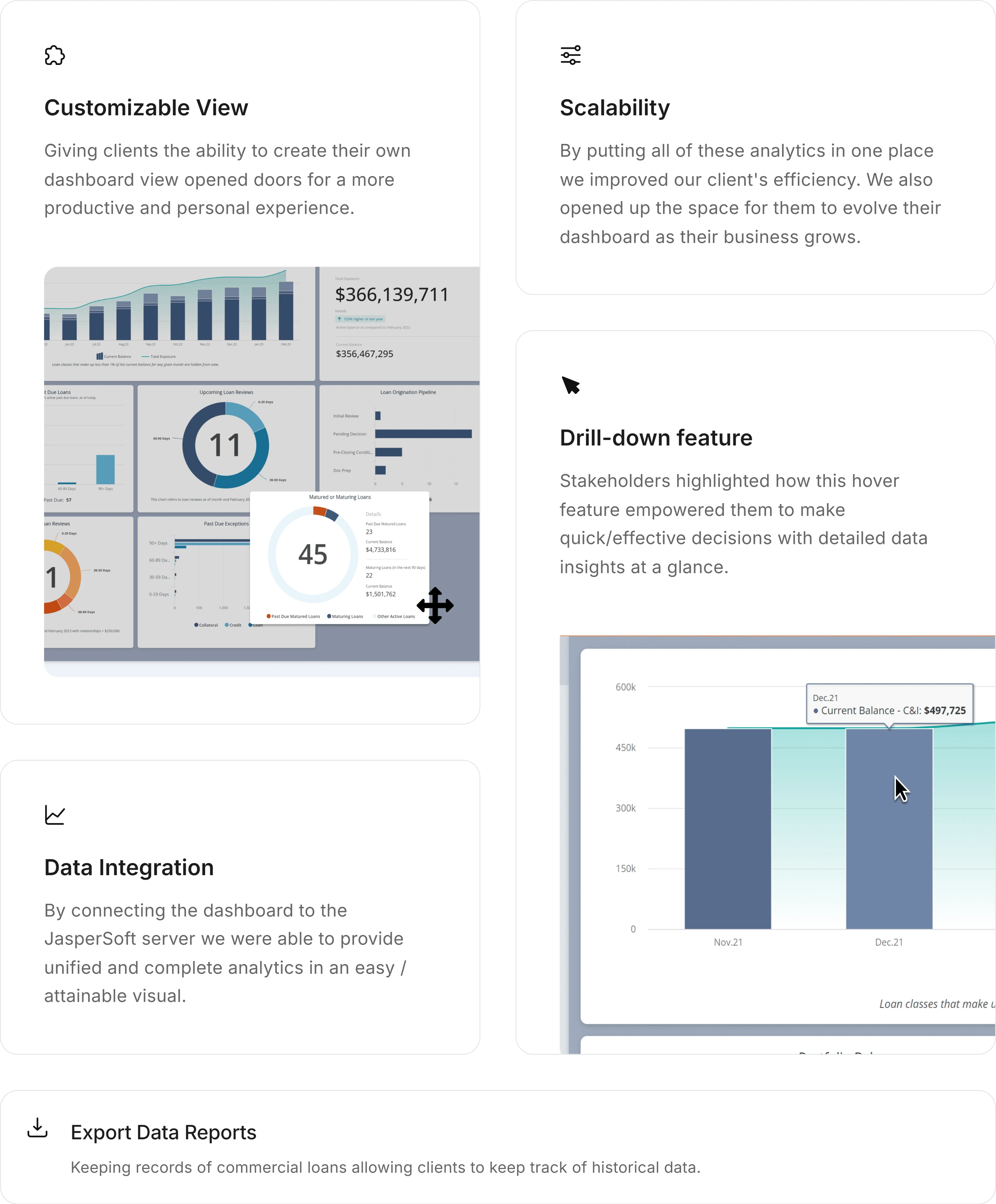
This process consisted of modifying states, removing and inserting widgets, adjusting widget sizes, and repositioning widgets within the dashboard's UI, the utility of aspects such as the "Restore Profile View" function, in-depth widget operations, and the exporting data action.
The participation of each stakeholder was beneficial as it facilitated thorough communication.
Some of the ideas of the MMP implemented
Challenges & requirements
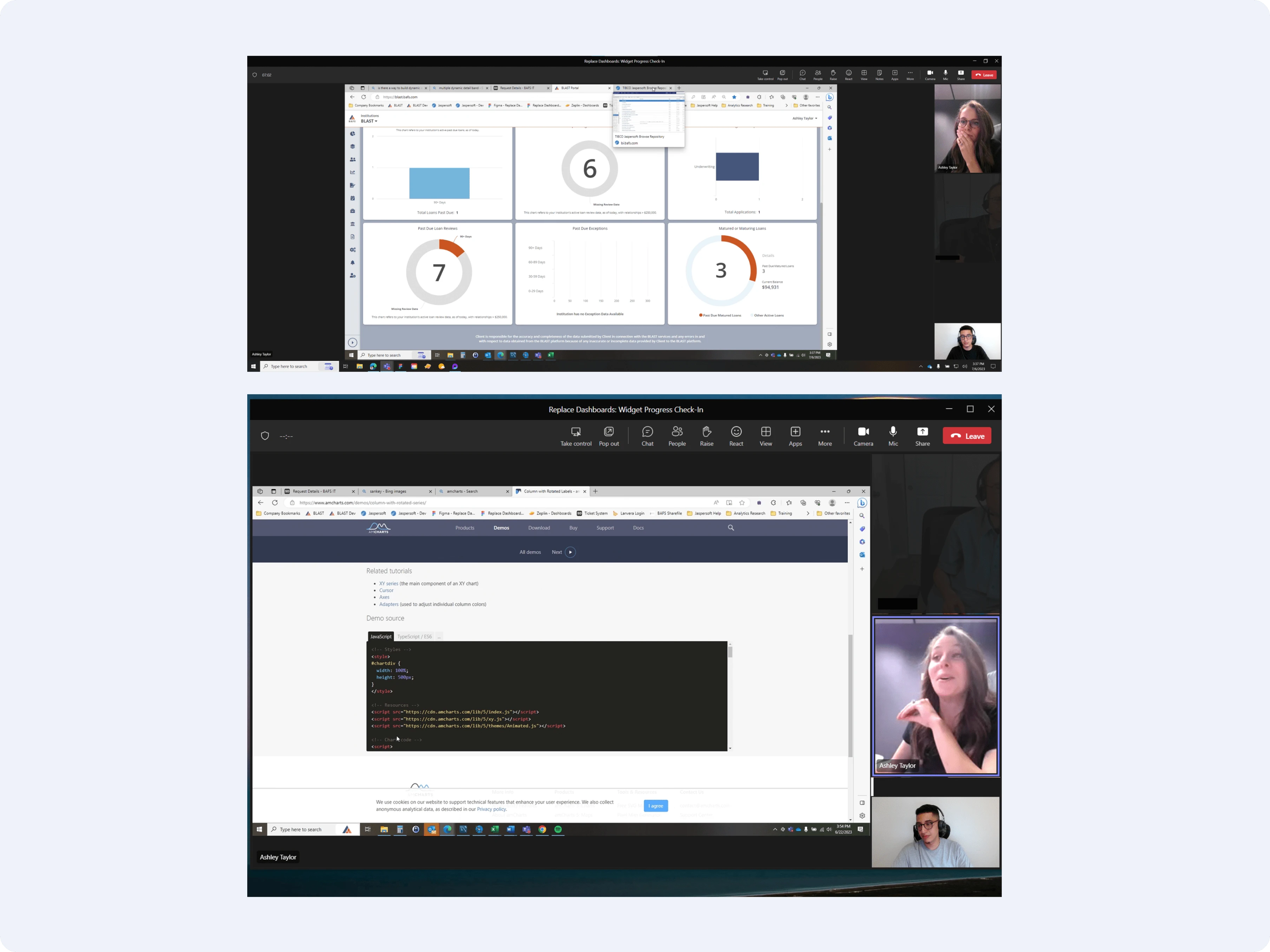
Since we (Data visualization team member - Ashley Taylor and Design team member - Myself) were limited to using Jaspersoft for our data and analytics we ended up being unable to do everything we wanted visually with the dashboard. Some of the restrictions we had were with widget sizing, appearance, colors, and the type of files available for exportation.
This was frustrating for the whole team but challenged us to adapt and deliver a visually pleasing and user-friendly product despite the restrictions.
Impact & Insights
The duration of this project allowed me to collaborate with the Data Visualization Team, which gave me a full perspective of how the widgets would work better and how we could achieve the design upgrade with the TIBCO Jaspersoft system! I also had the opportunity to experience a brief immersion in SQL with this project by analyzing the data behind every widget.
This project was challenging as it required me to work with many different teams some of which had no experience with UX design. However, this resulted in a great opportunity to practice humility, clear communication, and respect for each coworker's expertise.
Like this project
Posted Sep 17, 2024
Revamping the Company's dashboard view to showcase the details and features of the Institution and its Commercial Loans.

