The Raconteuse: Elegant Brand Design for a Story-Driven Substack
The Vision
The Raconteuse was conceived as a space for readers to explore themes of self-discovery, entrepreneurship, art, and design. This Substack newsletter brings a touch of elegance and introspection to each edition, offering insights wrapped in rich storytelling. My goal for The Raconteuse’s brand was to create a visual identity that reflects this sense of wonder and depth, inviting readers into a beautifully crafted world of ideas.
Strategic Foundation
To capture the essence of The Raconteuse, the brand strategy was built around three guiding themes:
Timeless Sophistication: The design needed to feel classic and refined, appealing to readers who value thoughtful, enduring beauty.
Explorative Wonder: Inspired by the newsletter’s focus on introspection and creativity, the brand had to evoke curiosity and discovery.
Approachable Elegance: While elevated, the brand needed to feel welcoming, inviting readers to immerse themselves in insights with warmth and accessibility.
Visual Language
The visual identity for The Raconteuse is designed to embody a sense of literary charm, combining classic elements with a contemporary sensibility.
Logo & Wordmark
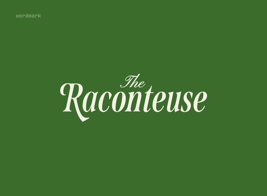
The wordmark, The Raconteuse, is rendered in an elegant serif typeface with graceful curves, evoking the feeling of an old-world book cover. It captures both the sophistication and warmth of the newsletter, establishing a recognizable and inviting signature.
Color Palette
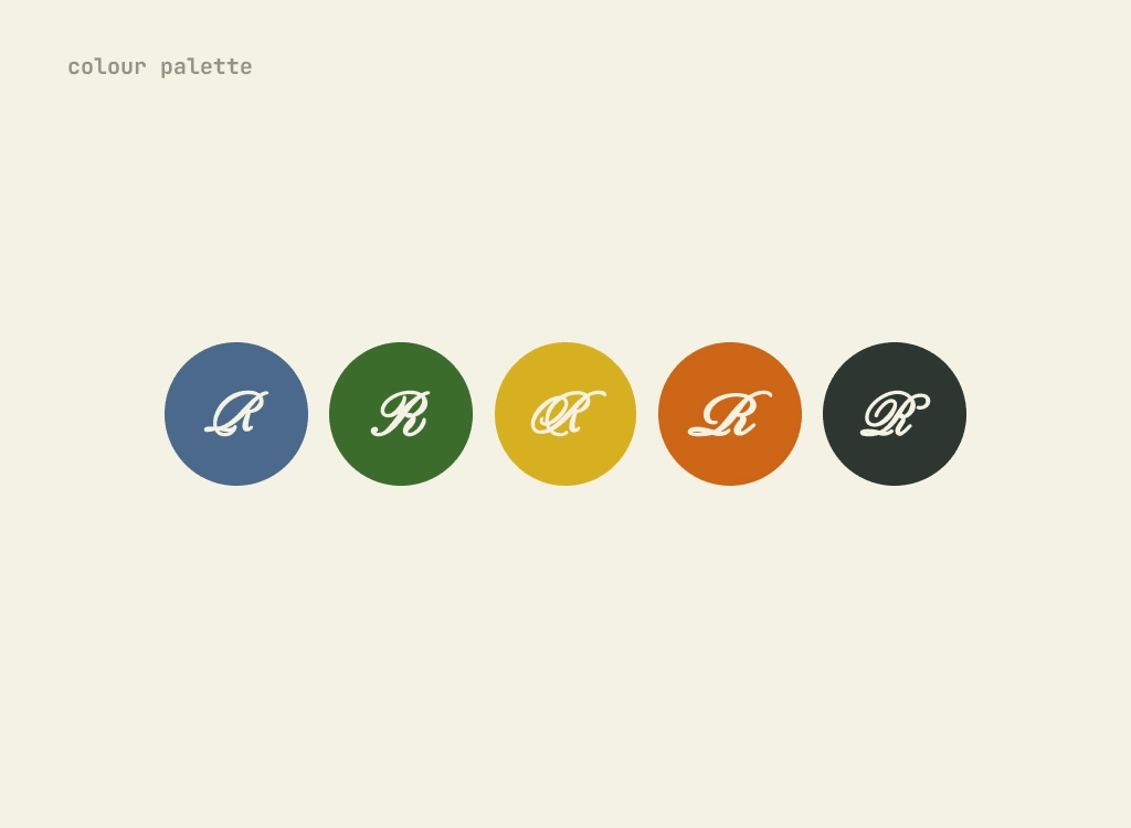
The colors were chosen to reflect a sense of warmth, curiosity, and sophistication:
Forest Green: The primary brand color, representing growth and exploration, gives the identity a grounded yet sophisticated feel.
Mustard Yellow & Burnt Orange: These accents add vibrancy and warmth, aligning with themes of creativity and self-discovery.
Deep Navy & Charcoal: Darker tones provide contrast, adding depth and stability to the visual language.
Typography
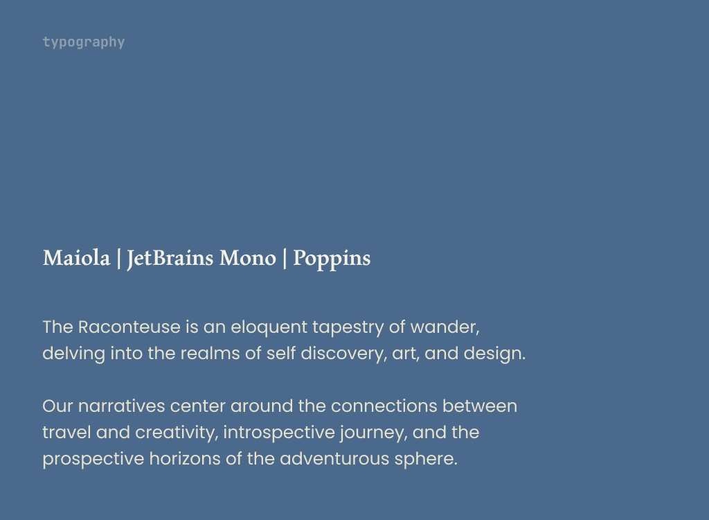
The typeface selection reinforces both clarity and charm, balancing readability with character:
Serif Headings: The serif font used in the wordmark and headings adds a timeless quality, making each edition feel like an entry in a beautifully bound collection.
Sans Serif Body Text: Clean and modern, this font ensures readability, allowing readers to flow through each narrative seamlessly.
Brand Implementation
The brand identity is applied thoughtfully across all digital touchpoints, creating a cohesive and immersive experience that mirrors the newsletter’s content.
Newsletter Layout: Each edition on Substack is visually inviting and easy to navigate, with the color palette and typography establishing a consistent, welcoming experience. Each edition feels like a personal exploration into ideas of growth, art, and entrepreneurship.
Social Media Presence: On platforms like Instagram, The Raconteuse shares snippets, quotes, and insights styled with the brand’s typography and color scheme. These visuals capture the charm of the newsletter, drawing in followers and encouraging them to dive deeper.
Substack Profile & Landing Page: The digital entry points for new subscribers mirror the elegance of the newsletter itself. The refined color scheme and thoughtfully selected typography make an inviting first impression, encouraging visitors to subscribe and explore.
Content Strategy & Storytelling Approach
The content strategy for The Raconteuse is rooted in storytelling that’s as introspective as it is inspiring. Each edition delves into themes of entrepreneurship, art, and personal growth, creating a rich experience for readers. Feedback and engagement metrics are regularly reviewed to refine content topics, ensuring the stories resonate deeply with the audience.
The Impact
The branding and design of The Raconteuse have positioned it as a digital sanctuary for those who seek inspiration across self-discovery, art, and entrepreneurship. The identity offers:
Distinctive Visual Appeal: The elegant design draws in readers who appreciate beauty and depth, making each edition feel special and memorable.
Engagement & Emotional Connection: With its focus on storytelling, the brand invites readers to journey with The Raconteuse, fostering loyalty and connection.
A Unique Brand Voice: Blending sophistication with approachability, The Raconteuse has carved a niche in the Substack landscape, becoming a go-to for readers who value meaningful content.
Through carefully curated design and a commitment to narrative depth, The Raconteuse creates a space where readers can reflect, explore, and be inspired by themes that matter.
Like this project
Posted Apr 18, 2024
Brand development for The Raconteuse: a Substack with a timeless identity, blending elegance and storytelling in self-discovery, art, and entrepreneurship.

