Gloresense Brand Identity Design
Hamza Zulfiqar
Gloresense— The Skincare Saga That Sparked a Revolution!
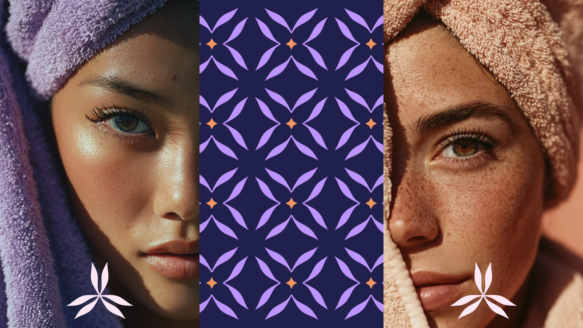
Gloresense hit our doorstep like a comet. They were bright, promising, but a bit scattered. The mission? Enhance the true glow of your skin. Sounds simple, right? Wrong! Their audience bridge across young trendsetters scrolling TikTok for the next big thing to women in their 40s chasing that timeless radiance without the hassle, beauty-conscious folks who want products that feel like a hug from Mother Nature, not a chemical cocktail.
The drama? The skincare market is a battlefield. Competitors are everywhere —from drugstore dupes to luxury lines promising eternal youth. Beauty Products are everywhere, claiming to be the best.
We had a great challenge ahead of us to position the brand so it could stand out in a saturated market. That is only possible by doing the strategy and the Visual Identity in such a way that it can set Gloresens as a beauty giant.
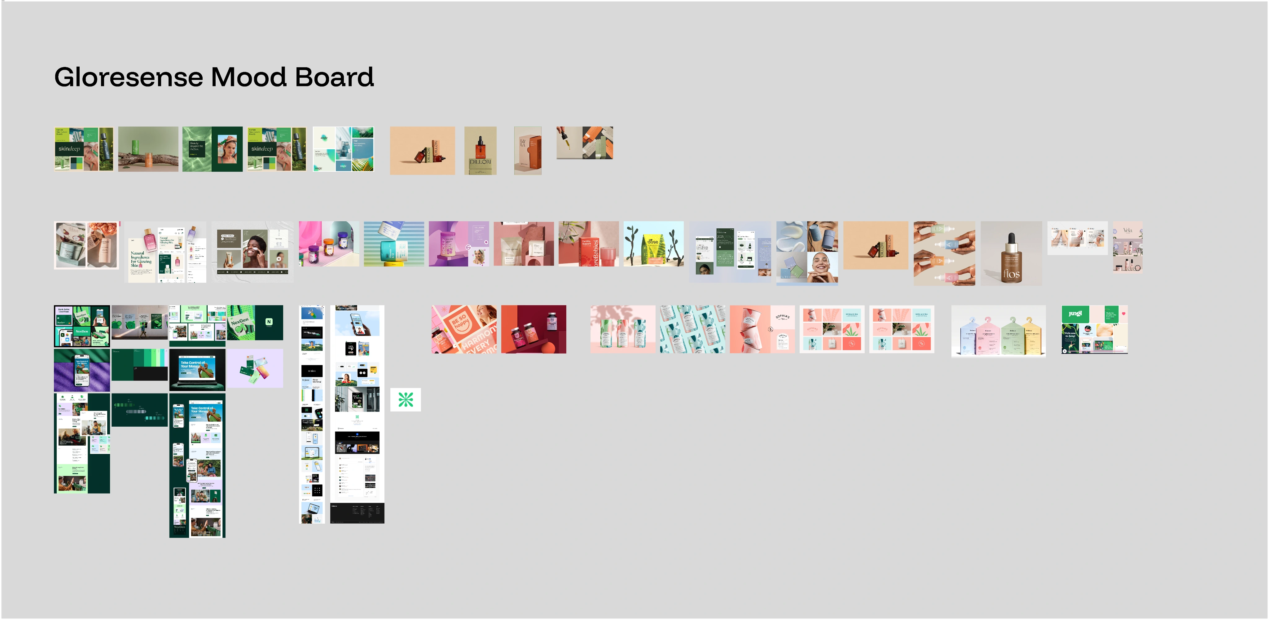
These moodboards give us the idea of what already exists and what does not… After the moodboards, we started the brand mark exploration along with the typeface.
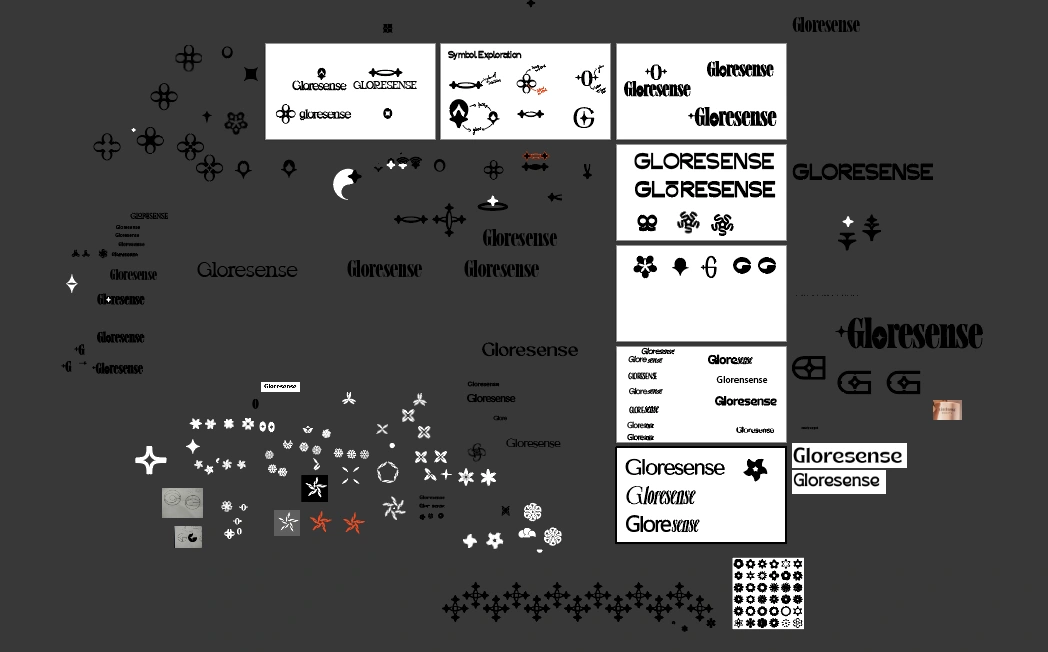

Brand Mark

Secondary Mark
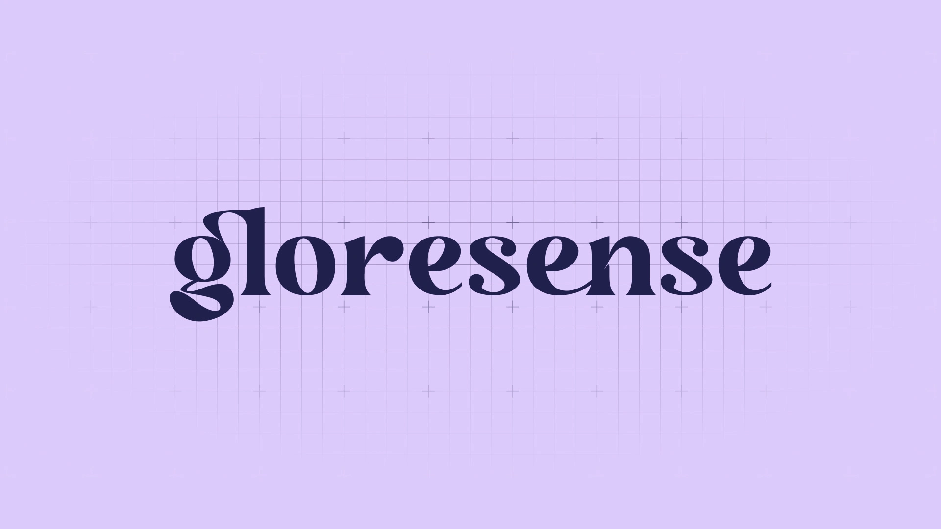
Logotype
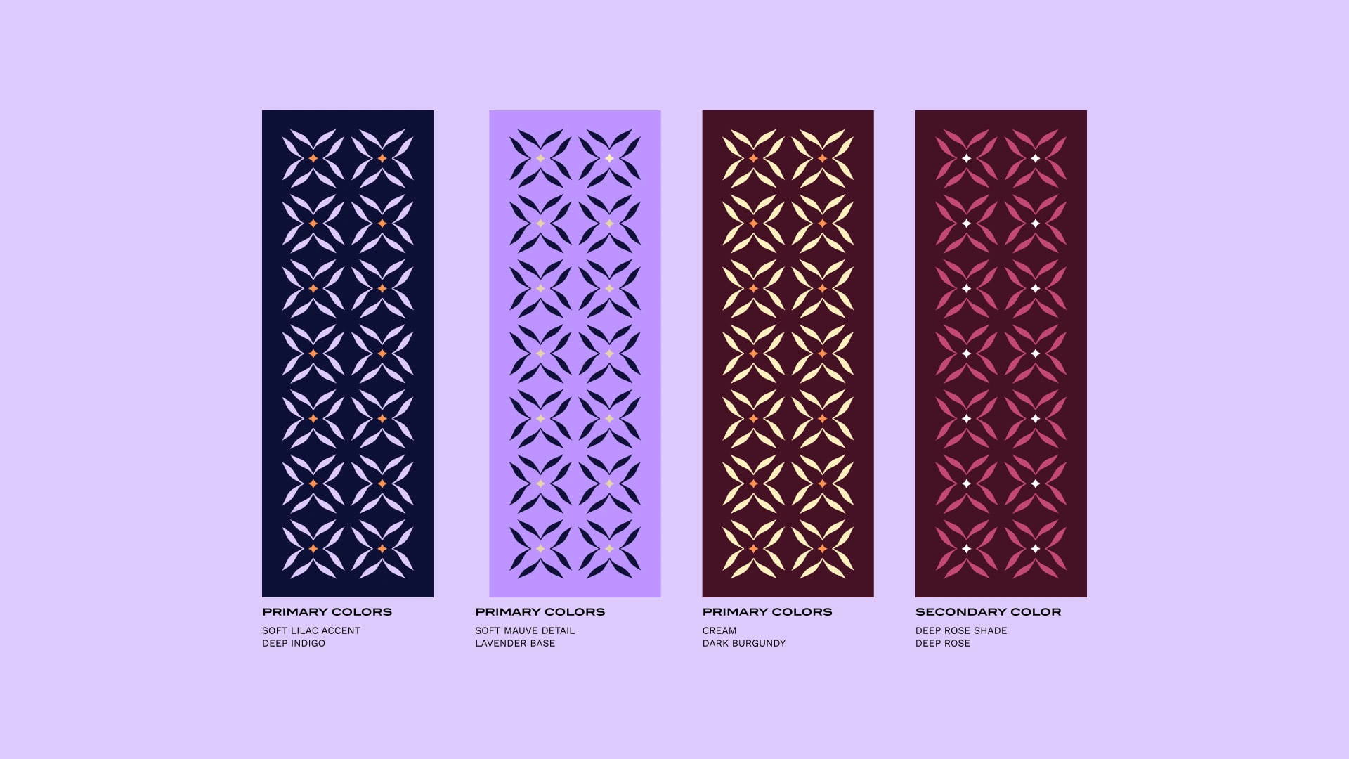
Brand Colors

Complete Brand Identity Design
Like this project
Posted Nov 5, 2025
Developed brand identity for Gloresense to stand out in the skincare market.