BRANDING - SENSO! :: Behance


SENSO is a Marketing company whose values are FREEDOM, PARTNERSHIP and INNOVATION.
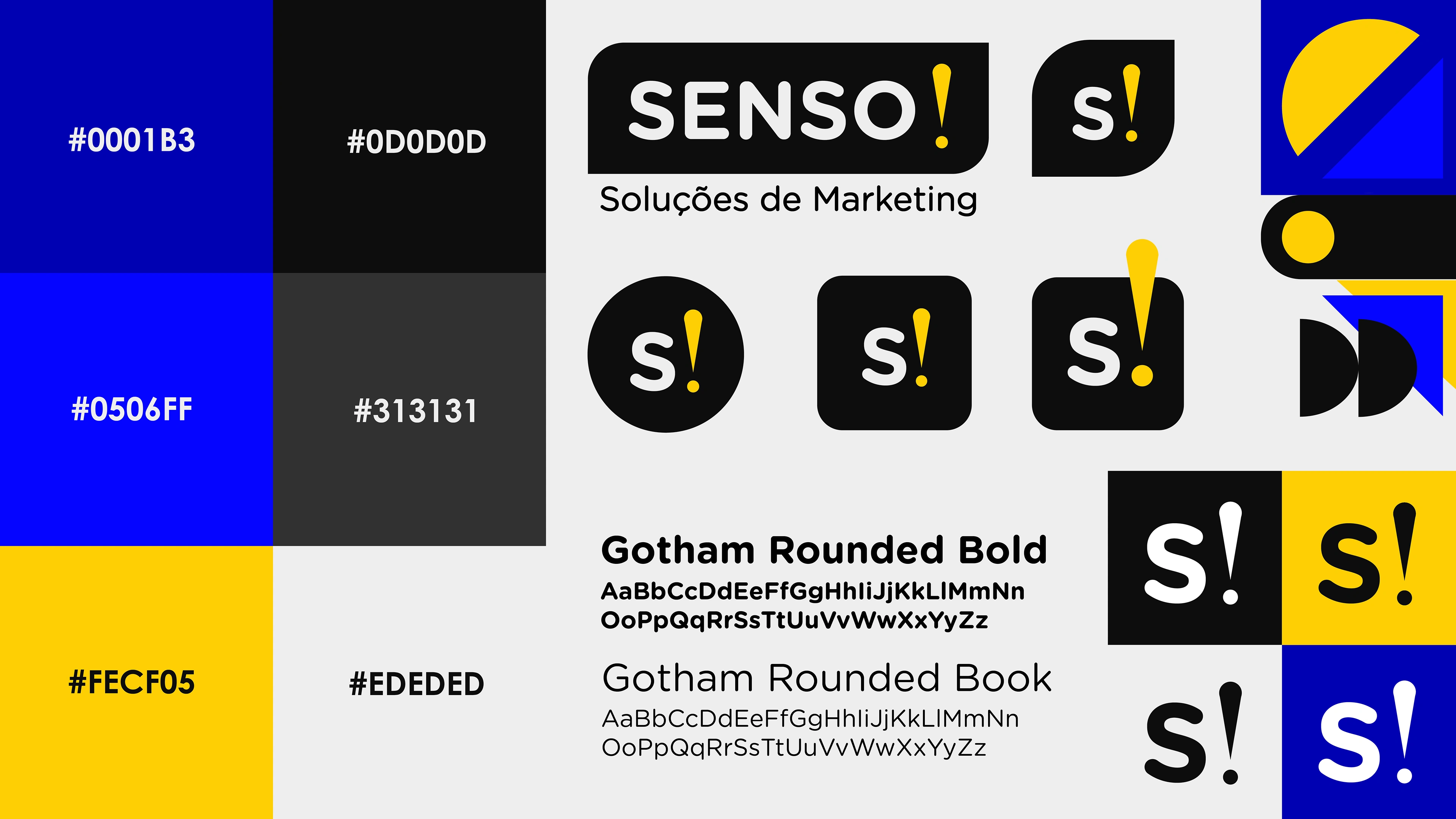
When developing its visual identity, I brought in yellow and blue in order to present a balance between creativity, optimism, professionalism and loyalty.
The Gotham Rounded typography is friendly but brings a sense of technology and precision.
The exclamation point was added and became a crucial point of the brand's identity, suggesting its intonation and graphic representation.
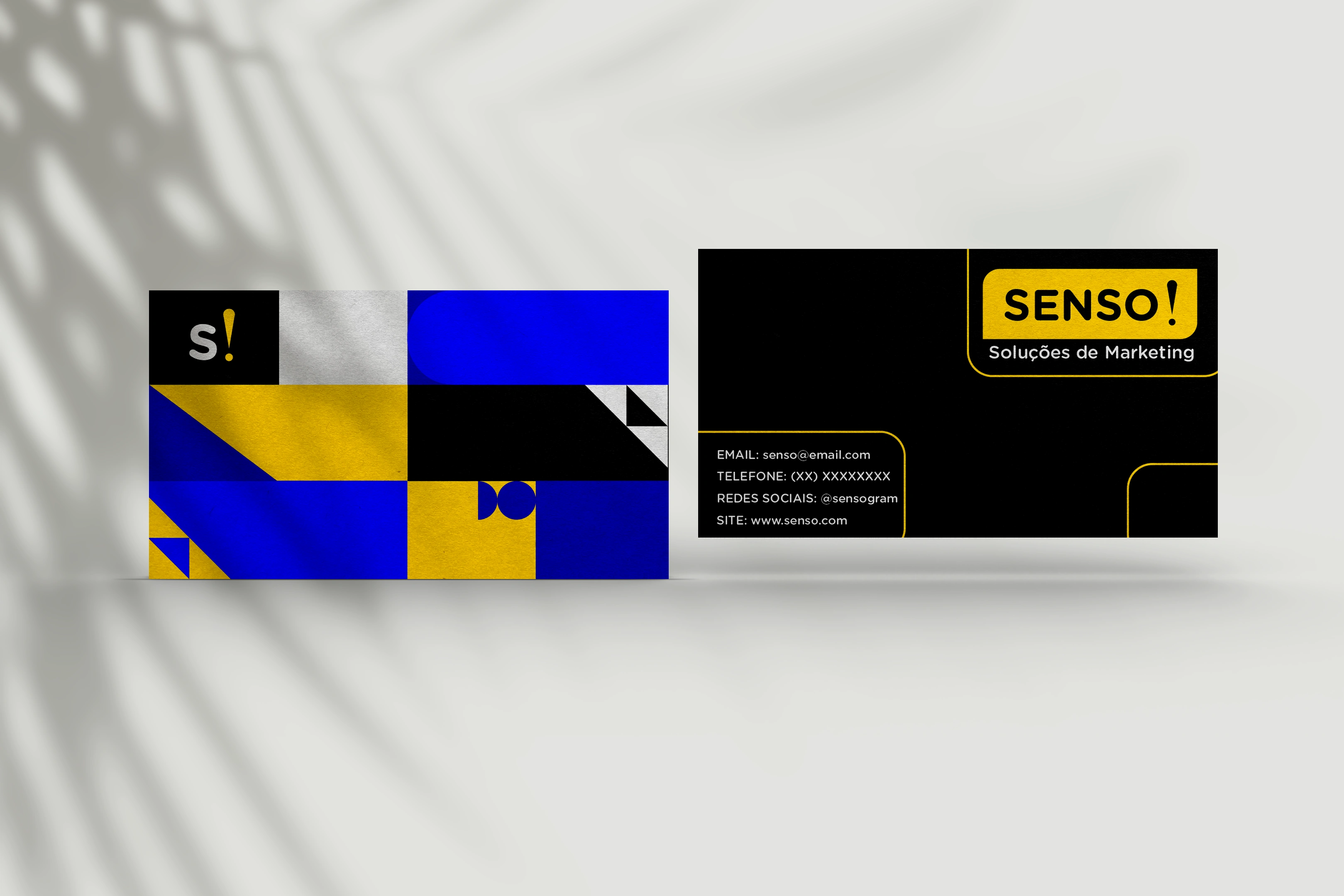
Geometric patterns have also become a focal point at SENSO. In addition to being intrinsic to graphic design, geometric shapes together bring an organic, bold and balanced look.

Like this project
Posted Jan 9, 2024
SENSO: Marketing firm embracing FREEDOM & INNOVATION.


