Chaudhary Brand Identity Design
Sahil Roy
Chaudhary
A brand built for the person Starbucks forgot
There's a café you've been to in every Indian city. The music is ambient. The lighting is warm in a studied way. The menu says "single origin." The prices say the same thing. By 2024, eleven different chains were running the same playbook across India's metros. Starbucks, Barista, and Blue Tokai, and third-wave imports with Italian names and Nordic aesthetics. Every one of them was trying to sound global. Chaudhary was about to make twelve.
The brief was different. Build a brand that speaks to the everyday Indian — not in the way a souvenir shop feels Indian, but in the way a roadside chai stall does. Confident. Warm. Completely unbothered by what London thinks.
The work began with one question: What does a brand look like when it stops apologizing for being from here?
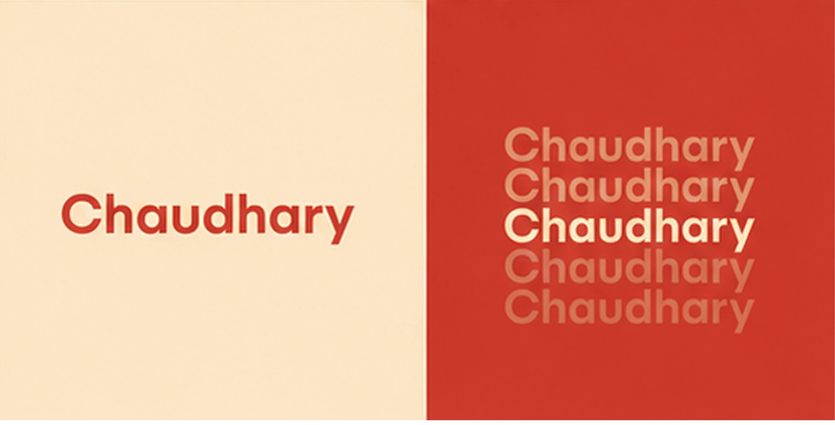
Fonts
You stop borrowing someone else's language.
The logo is a turbaned man with a commanding mustache. The Chaudhary himself. Not a mascot designed to be cute. A character designed to be recognized because every Indian already knows this face. He's the uncle who runs the best chai stall in the mohalla. The one who remembers your order without writing it down.
The wordmark sits below, rounded and warm, with the weight of something that's been here for decades rather than launched last quarter. No serifs borrowed from European heritage brands. No geometric coldness. Just something that reads as effortlessly, unapologetically Indian.
Animated Logo
A logo reveal is either a formality or a statement. This one is a statement. The animation carries the same warmth as the mark — nothing mechanical, nothing that looks like it was generated. It moves the way the brand talks: with ease.
Red and cream. That's the entire palette. Warm red that reads as festive without screaming it, not the aggressive primary of a sale banner, but the red of a freshly painted temple door. Cream that feels like a pressed cotton kurta on a Sunday morning.
No gradients. No secondary palette. No neutrals were brought in to "modernize" it. Two colors, completely committed because confidence doesn't hedge.
The mascot repeats a pattern. Joyful, slightly overwhelming in the best way, the visual equivalent of walking into a house full of family.
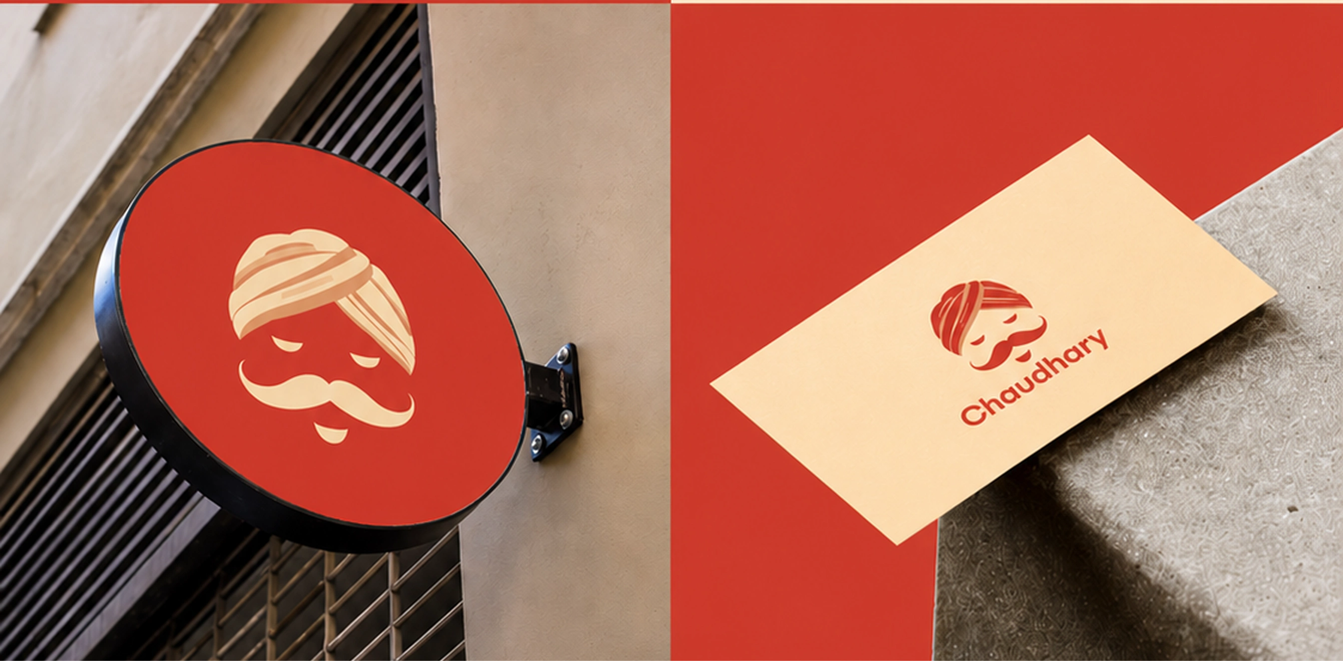
Design Examples
The system works at every scale: a circular street sign outside a dhaba, a tote bag carried through a Sunday market, a business card left on a chai-stained table, an app icon on the phone of someone who orders every morning.
It reads the same everywhere. That's the job.
Brand Values
Chaudhary can't go back to looking like a café chain now. It also can't slide into the saffron-and-spice clichés that pass for "Indian branding" online. The identity closed both doors at once.
That's all a brand is supposed to do.
Like this project
Posted Jun 13, 2026
Created a brand identity for Chaudhary that reflects an authentic Indian experience.