Been Stellar Chapbook | Print Design

Sam Cordell


Pamphlets stacked awaiting hand-binding. Almost ready!
The New York City-based rock band Been Stellar commissioned these chapbooks to be presented alongside the release of their single titled Louis XIV in early 2021. They included images from the recording and production of the song that gave some insight and context to their work.
Ideation
Been Stellar reached out to me with the intention of creating a booklet that stylistically meshed with their music release. In our early conversations, they brought up the design influence of typewritten manuscripts, 1960s and 70s poetry anthologies, as well as the appearance of a formal event program.
The client came into the project with text in mind. This included song lyrics, prose, image captions, and poetry. All of these elements were discussed and laid out, and that informed the overall structure of the project.
Through conversation and a few rough sketches, we settled on a basic layout. The image below is a sketch sent to me by the client following our first meeting, outlining their vision for the first spread of the booklet when you open the cover.
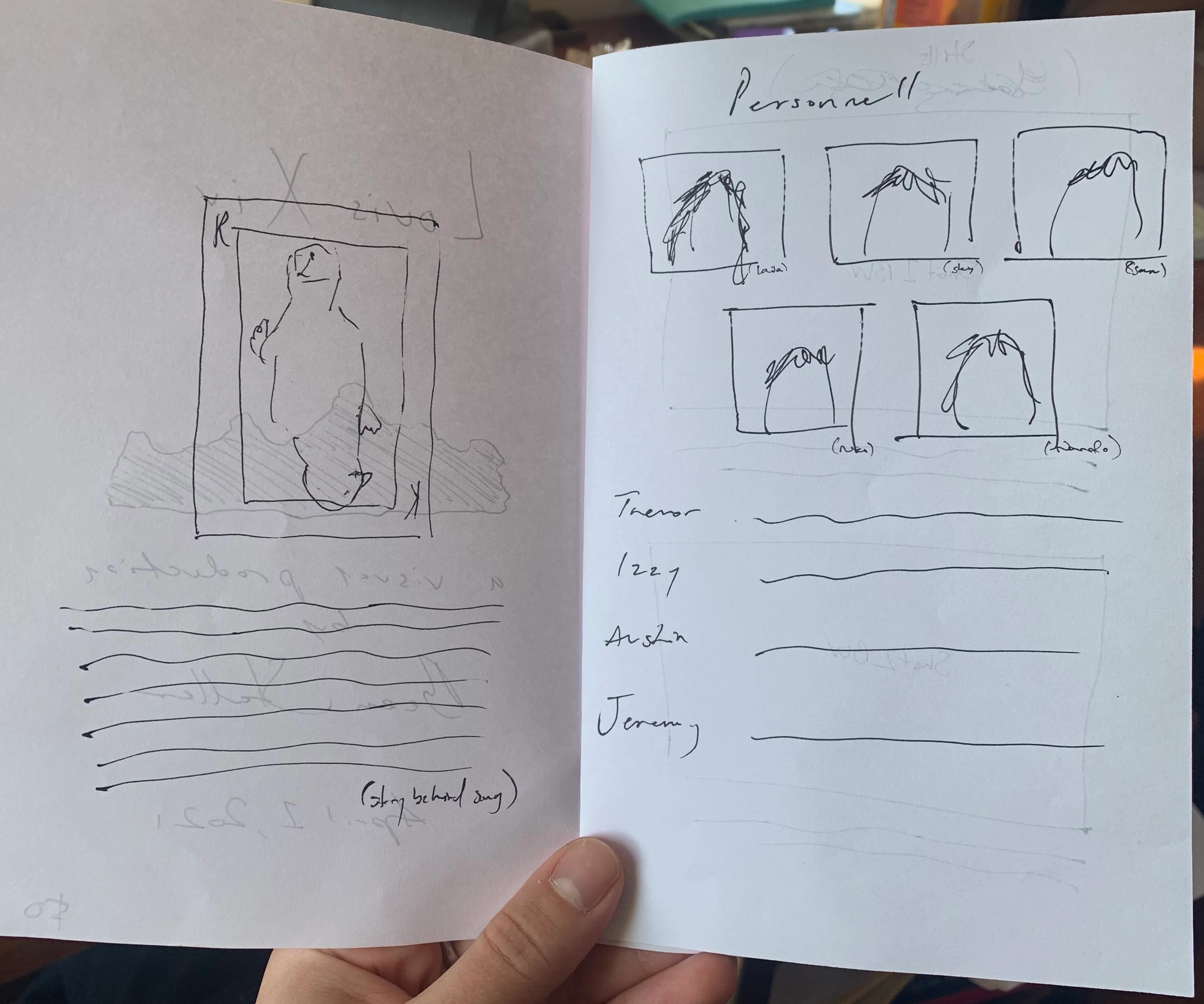
An early hand-drawn outline from the client following our first meeting
This project served as a great lesson in translating a rough outline into a finalized product.
Refinement
After we finished our initial outlines and went through a series of rough drafts, the layout solidified and the content could be placed and played around with.
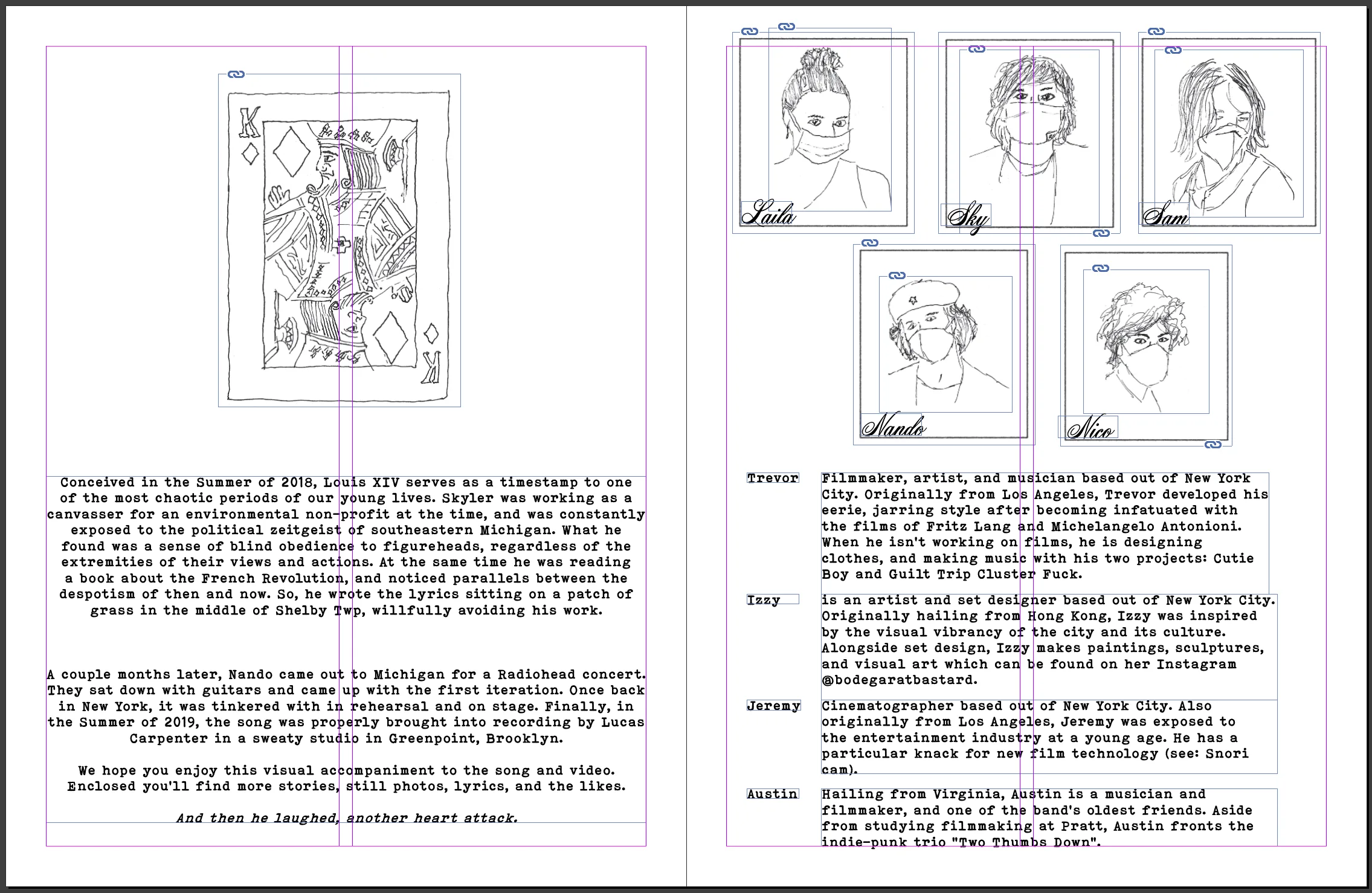
This spread remained largely unchanged from the initial sketch shown above
The band members were quite involved in the decisions being made through this transparent and fluid design process. We altered text and swapped out images, and also tried multiple different page orders to best suit the contents of the booklet. Sizing and layouts were refined and we chose a final layout for the front and back covers:
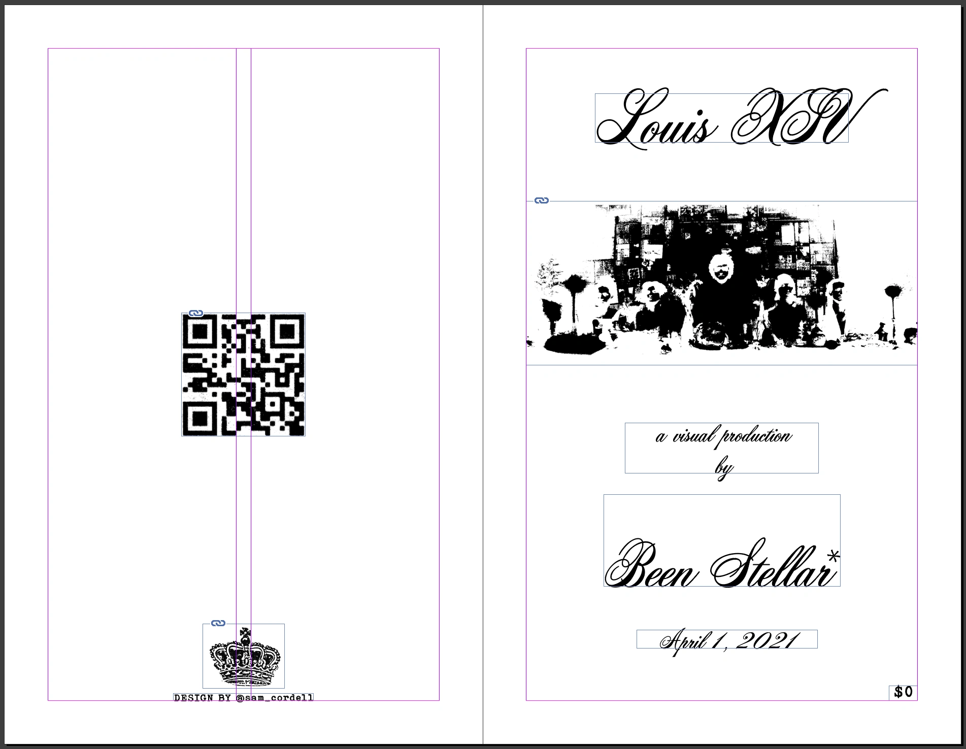
Finalized layout and spacing of the front and back covers
Finishing Touches
I worked hard to emulate the varied textures found on pieces that inspired this chapbook. The choice of fonts and typesetting as well as the image and paper textures were all accounted for. I loved this part of the process as the clients were able to begin to understand what the final printed version would feel like in-hand.
Although the creation of this booklet was solely digital, I replicated the halftones that would be present as a result of an analog printing process. This was added to each photo individually following rounds of color correction and adjustment. The image below shows both the halftone texturing and the imperfections in the typeface chosen for the booklet.
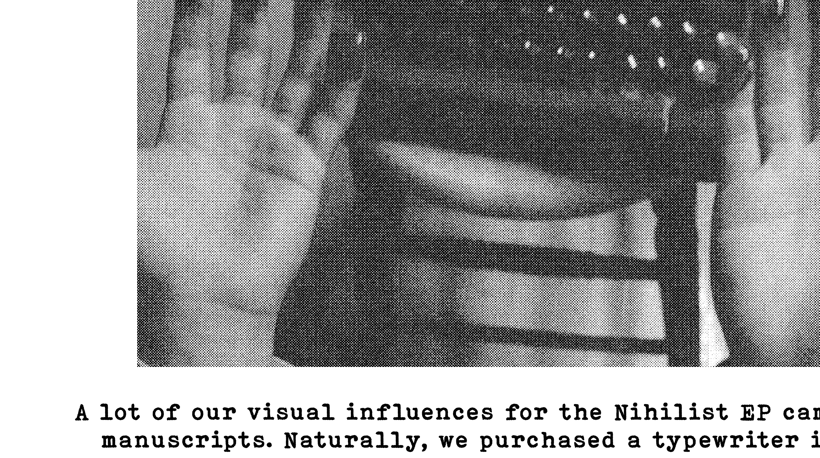
The stippled halftone along with imperfect type work together to sell an older look
The printing paper of choice was a crucial touch. We chose a rough off-white recycled newsprint for the final version which was an environmentally-conscious and economical choice.
Final Product
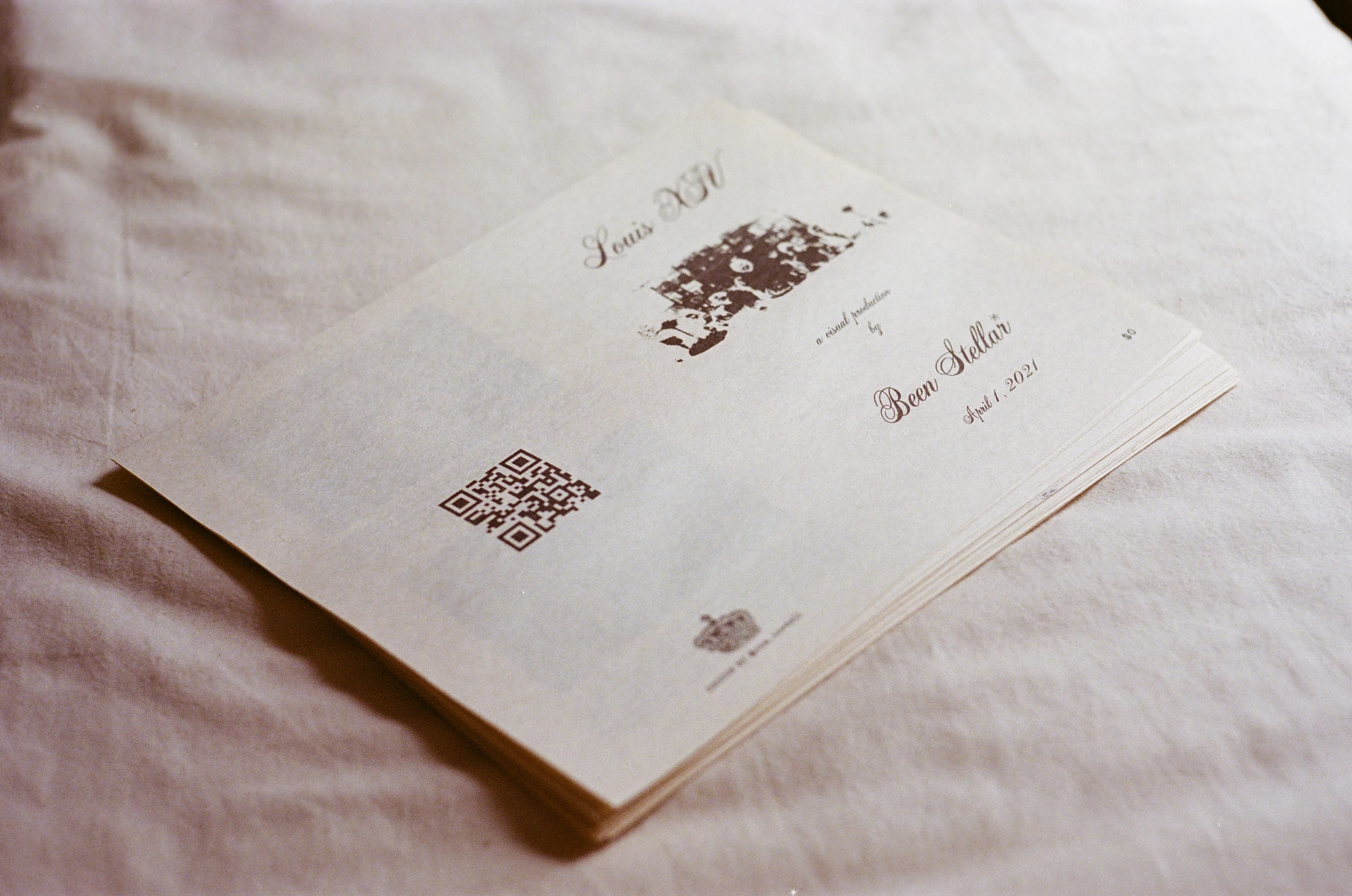
As they were only eight-page booklets, it was a relatively quick binding process for this edition of 100. They were ready for the client the same evening and were very well-received. Always a satisfying feeling.
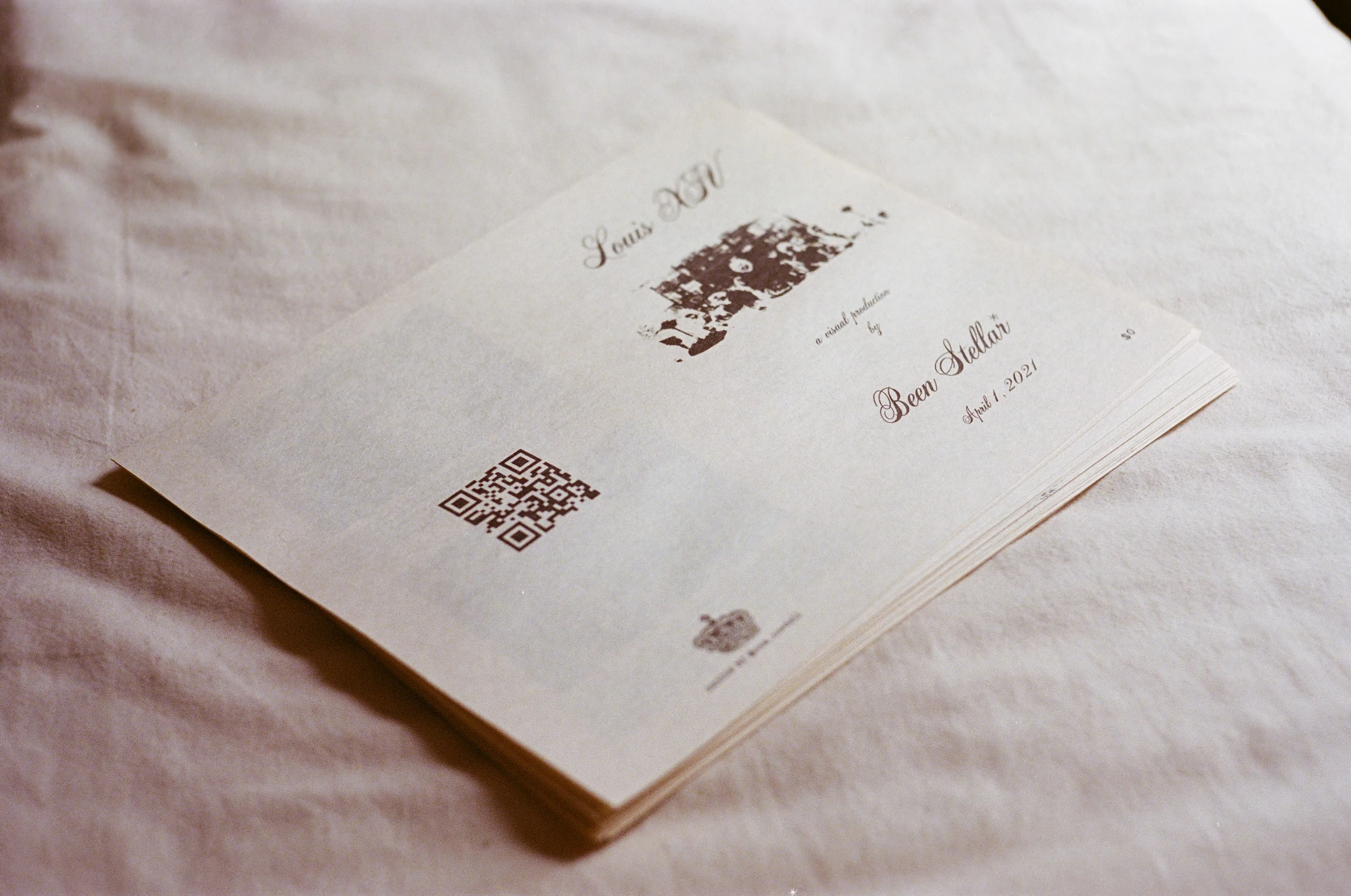
For anyone curious, the QR code printed on the back of the booklet links to the music video for Been Stellar's Louis XIV. It strikes similar stylistic notes to the project above and was first shown on the night this booklet was released.
Like this project
Posted Jul 13, 2021
Layout, typography, and print design for a Brooklyn-based rock band.


Airmaster Toy Airplane
Concorde | Brand, Web Design
Candylab | Product Design
Summer in Argyle | Graphic Design