Responsive design - Shopify
Sanjay Jethva

Shopify Responsive Design
Overview
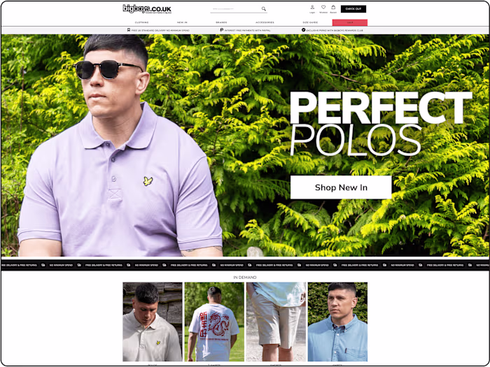
The Shopify Responsive Design project is dedicated to building a modern, fully functional e-commerce store on the Shopify platform, with a strong emphasis on responsive design to ensure an exceptional user experience across all devices—desktops, tablets, and smartphones. The primary objective is to deliver a visually stunning, intuitive, and high-performing online store that drives customer engagement, boosts conversion rates, and adheres to contemporary web design standards. By leveraging Shopify’s powerful ecosystem, the project will prioritize responsiveness, accessibility, and performance optimization to create a seamless shopping experience for users worldwide.
Objectives
Seamless Responsive Design: Develop a Shopify theme that dynamically adjusts to various screen sizes and resolutions, providing a consistent and engaging experience on all devices.
Optimized User Experience: Design intuitive navigation, fast-loading pages, and aesthetically pleasing layouts to enhance customer satisfaction and encourage repeat visits.
Performance Excellence: Optimize the store for speed and efficiency, following Shopify’s theme development best practices to minimize load times and improve user retention.
Cross-Browser Functionality: Ensure compatibility across major browsers (e.g., Chrome, Firefox, Safari, Edge) to guarantee a uniform experience for all users.
SEO and Accessibility Compliance: Implement SEO best practices and adhere to Web Content Accessibility Guidelines (WCAG 2.1) to improve search engine rankings and ensure inclusivity for all users.
Scope of Work
Custom Theme Development:
Create a bespoke Shopify theme using Liquid, HTML5, CSS3, and JavaScript, following a mobile-first design philosophy.
Utilize Shopify’s section and block features to enable dynamic content management, such as customizable homepage banners, product carousels, and featured collections.
Integrate Shopify’s built-in features (e.g., product filtering, cart, checkout) with responsive design principles to ensure functionality across devices.
UI/UX Design:
Develop wireframes and high-fidelity mockups for core pages, including the homepage, product pages, collection pages, cart, and checkout.
Design a modern, visually cohesive layout with consistent branding elements (e.g., typography, color palette, imagery) to reinforce brand identity.
Incorporate user-friendly features like sticky navigation, collapsible menus for mobile, and interactive elements such as product quick views and hover effects.
Responsive Design Features:
Implement responsive images using Shopify’s image optimization tools and
srcset to deliver appropriately sized images based on device resolution.Design a mobile-optimized navigation system, including a hamburger menu with smooth animations and accessible touch targets.
Ensure that forms (e.g., checkout, login) and payment gateways are fully functional and visually appealing on smaller screens.
Performance Optimization:
Minimize and bundle CSS and JavaScript files to reduce page load times, leveraging Shopify’s asset pipeline for efficient delivery.
Apply lazy loading for images and defer non-critical scripts to prioritize above-the-fold content rendering.
Conduct performance testing using tools like Google Lighthouse, aiming for a mobile and desktop score of 90+ across all metrics (e.g., First Contentful Paint, Time to Interactive).
Testing and Quality Assurance:
Perform extensive testing on multiple devices (e.g., iPhone, Android, iPad, laptops) and screen sizes to identify and resolve layout or functionality issues.
Validate code against W3C standards and Shopify’s theme submission guidelines to ensure compliance and compatibility.
Conduct usability testing with a sample user group to gather feedback on navigation, responsiveness, and overall experience.
SEO and Accessibility Enhancements:
Optimize on-page SEO elements, including meta titles, descriptions, and alt texts for images, to improve search engine visibility.
Ensure accessibility through keyboard navigation support, screen reader compatibility, and sufficient color contrast ratios (WCAG 2.1 Level AA compliance).
Implement structured data using Schema.org to enhance product listings in search engine results (e.g., rich snippets for products).
Key Deliverables
A fully responsive, custom Shopify theme ready for deployment on the Shopify platform.
Comprehensive documentation detailing theme customization, maintenance, and troubleshooting.
Test reports confirming compatibility across devices, browsers, and screen sizes.
A performance audit report with optimization metrics, including Google Lighthouse scores for mobile and desktop.
An SEO and accessibility checklist with implemented improvements and recommendations for ongoing maintenance.
Timeline
Weeks 1-2: Gather requirements, conduct stakeholder interviews, and create wireframes and initial design mockups.
Weeks 3-6: Develop the Shopify theme, implement responsive design features, and perform iterative testing on core functionalities.
Weeks 7-8: Focus on performance optimization, SEO and accessibility enhancements, and final rounds of cross-device testing.
Week 9: Facilitate client review, incorporate feedback, and finalize revisions.
Week 10: Deploy the theme to the live Shopify store and provide post-launch support for any immediate issues.
Tools and Technologies
Shopify Platform: Utilize Shopify’s theme development framework with Liquid templating for dynamic content rendering.
Frontend Technologies: HTML5, CSS3 (with media queries for responsive layouts), and JavaScript (for interactive features like modals and sliders).
Design Tools: Figma or Adobe XD for creating wireframes, mockups, and design prototypes.
Testing Tools: BrowserStack for cross-browser and device testing, Google Lighthouse for performance and SEO audits.
Version Control: Git for code versioning and collaboration, hosted on platforms like GitHub or Bitbucket.
Assumptions and Constraints
The client will provide all necessary branding assets (e.g., logo, color scheme, typography) and content (e.g., product images, descriptions, translations) within the agreed timeline.
The project scope is limited to Shopify Community Edition (CE) features; Shopify Plus-specific functionalities (e.g., advanced checkout customization) are not included unless specified.
Third-party app integrations (e.g., payment gateways, analytics tools) will be configured but not developed as part of this project.
Any significant scope changes or additional revisions beyond the agreed timeline may require adjustments to the project schedule or budget.
The project assumes a stable Shopify hosting environment with no significant platform updates during development that could impact compatibility.
Success Criteria
The Shopify store achieves a responsive design that provides a seamless user experience across devices, with no layout or functionality issues.
The store meets performance benchmarks, with a Google Lighthouse score of 90+ for mobile and desktop on key metrics (e.g., First Contentful Paint, Largest Contentful Paint).
The store complies with WCAG 2.1 Level AA accessibility standards and follows SEO best practices, resulting in improved search engine rankings post-launch.
Client satisfaction is achieved through a visually appealing design, intuitive navigation, and a successful launch within the agreed timeline.
Conclusion
The Shopify Responsive Design project aims to deliver a state-of-the-art e-commerce store that prioritizes responsiveness, user experience, and scalability. By focusing on mobile-first design principles, performance optimization, and accessibility, this project will create a seamless and engaging shopping experience that drives customer satisfaction and business growth. The end result will be a robust Shopify store that not only meets current industry standards but also positions the client for long-term success in the competitive e-commerce landscape.
Like this project
Posted Oct 10, 2024
The Shopify Responsive Design project is dedicated to building a modern, fully functional e-commerce store on the Shopify platform.