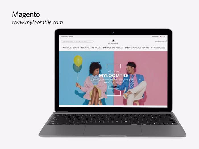
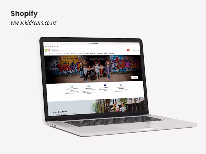
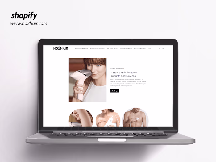
Responsive Design Changes - Shopify
Sanjay Jethva
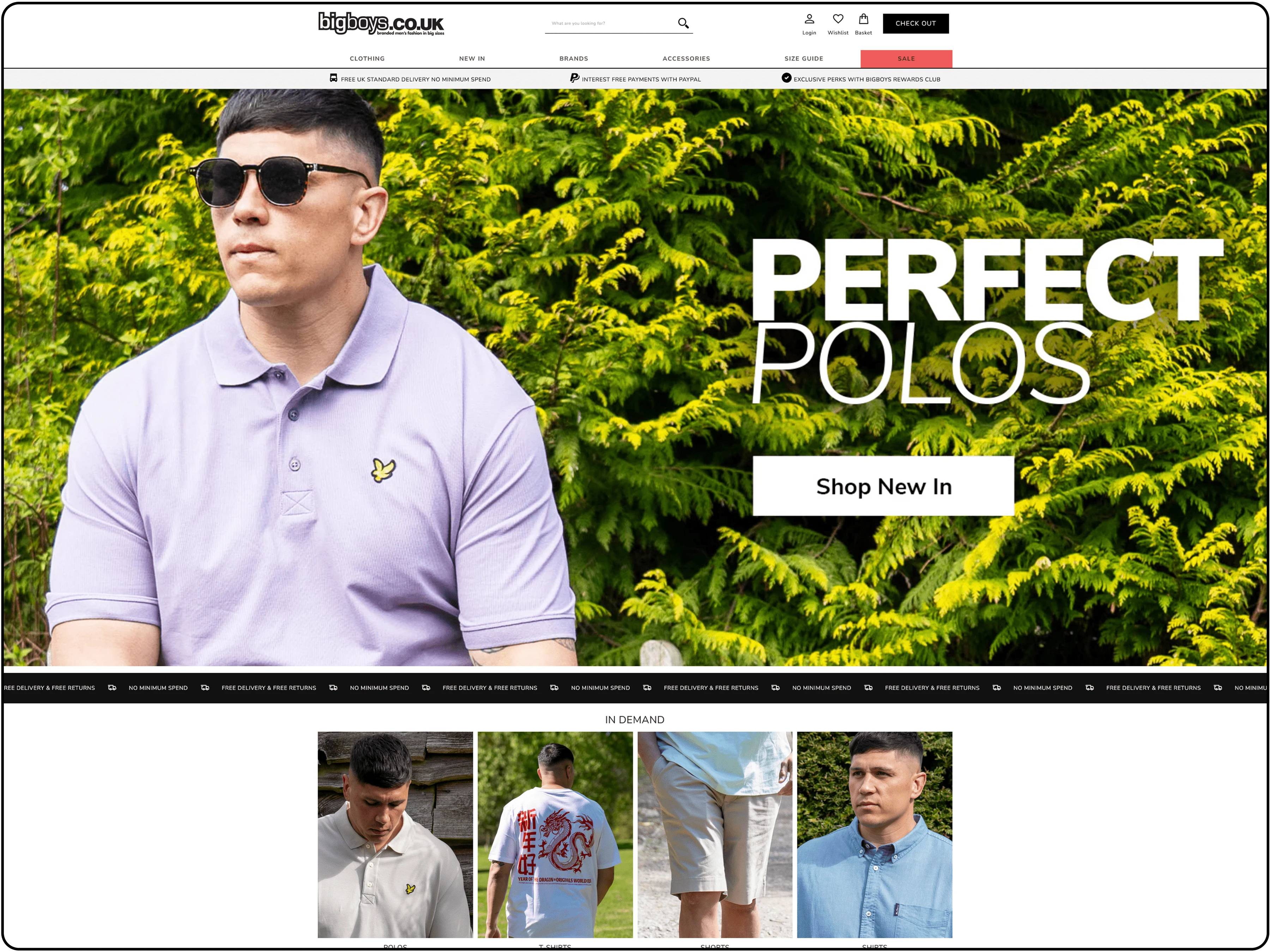
Shopify Responsive Design Project Description
Overview
The Shopify Responsive Design project aims to develop a fully functional, mobile-first e-commerce store on the Shopify platform, tailored to provide an optimal user experience across all devices, including desktops, tablets, and smartphones. The primary goal is to create a visually appealing, intuitive, and high-performing online store that enhances customer engagement, increases conversions, and aligns with modern web design standards. The project focuses on leveraging Shopify’s robust ecosystem while ensuring responsiveness, accessibility, and performance optimization.
Objectives
Responsive Design Implementation: Build a Shopify theme that adapts seamlessly to various screen sizes and devices, ensuring a consistent and user-friendly experience.
Enhanced User Experience: Design an intuitive navigation structure, fast-loading pages, and visually appealing layouts to improve customer satisfaction and retention.
Performance Optimization: Optimize the store for speed and efficiency, adhering to Shopify’s best practices for themes and ensuring minimal load times.
Cross-Browser Compatibility: Ensure the store functions flawlessly across major browsers (Chrome, Firefox, Safari, Edge) without layout or functionality issues.
SEO and Accessibility: Incorporate SEO best practices (e.g., semantic HTML, meta tags) and accessibility standards (WCAG 2.1) to make the store discoverable and inclusive.
Scope of Work
Theme Development:
Develop a custom Shopify theme using Liquid, HTML, CSS, and JavaScript.
Implement a mobile-first design approach, ensuring all elements (e.g., product grids, menus, checkout) are fully responsive.
Customize Shopify sections for dynamic content (e.g., homepage banners, product sliders, featured collections).
UI/UX Design:
Create wireframes and mockups for key pages (homepage, product pages, collection pages, cart, checkout).
Design a clean, modern layout with consistent branding (e.g., typography, color schemes, imagery).
Include interactive elements like hover effects, collapsible menus, and quick-view modals for enhanced usability.
Responsive Features:
Ensure responsive images using Shopify’s built-in image optimization and srcset for different screen resolutions.
Implement a hamburger menu for mobile devices with smooth transitions and easy navigation.
Adapt checkout forms and payment gateways for smaller screens without compromising functionality.
Performance and Optimization:
Minimize CSS and JavaScript to reduce load times, leveraging Shopify’s asset management.
Use lazy loading for images and defer non-critical scripts to improve page speed.
Test performance using tools like Google Lighthouse to achieve a score of 90+ for mobile and desktop.
Testing and Quality Assurance:
Conduct thorough testing across devices (iPhone, Android, iPad, desktop) and browsers to identify and fix layout issues.
Validate code for W3C standards and ensure compliance with Shopify theme guidelines.
Perform user testing to gather feedback on navigation, usability, and overall experience.
SEO and Accessibility:
Optimize meta titles, descriptions, and alt texts for images to improve search engine visibility.
Ensure keyboard navigation, screen reader compatibility, and sufficient color contrast for accessibility.
Use structured data (e.g., Schema.org) to enhance product visibility in search results.
Key Deliverables
A fully responsive Shopify theme, ready for deployment.
Documentation for theme customization and maintenance.
Test reports confirming cross-device and cross-browser compatibility.
A performance report with optimization metrics (e.g., Lighthouse scores).
SEO and accessibility audit with implemented improvements.
Timeline
Week 1-2: Requirement gathering, wireframing, and initial design mockups.
Week 3-5: Theme development, responsive design implementation, and initial testing.
Week 6: Performance optimization, SEO/accessibility enhancements, and final testing.
Week 7: Client review, revisions, and deployment.
Tools and Technologies
Shopify Platform: Shopify theme development with Liquid templating.
Frontend: HTML5, CSS3 (with media queries for responsiveness), JavaScript (for interactive elements).
Design Tools: Figma or Adobe XD for wireframes and mockups.
Testing Tools: BrowserStack for cross-browser testing, Google Lighthouse for performance audits.
Version Control: Git for code management and collaboration.
Assumptions and Constraints
The client will provide branding assets (logo, color scheme, fonts) and content (product images, descriptions).
Shopify Plus features are not included unless specified; the project focuses on Shopify CE capabilities.
Third-party app integrations (e.g., payment gateways, analytics) will be configured but not developed.
The timeline may shift if additional revisions or scope changes are requested.
Conclusion
The Shopify Responsive Design project will deliver a modern, high-performing e-commerce store that prioritizes user experience and scalability. By focusing on responsiveness, accessibility, and performance, the project aims to create a seamless shopping experience that drives engagement and sales, positioning the store for long-term success in a competitive online market.
Like this project
Posted Oct 10, 2024
Expertly implement design changes for Shopify collection & home pages, tailored to client needs, ensuring seamless, visually appealing & functional experience.