Teamlytical Brand Guidelines Development

Williams Ajiboye


Teamlytical Brand Guidelines
Teamlytical needed a cohesive brand guideline system that could bring clarity, consistency, and confidence to how the business appears across its digital platforms. As the brand continued to develop its website, CRM environment, client communications, and marketing materials, it was important to create a visual foundation that could be used repeatedly without making every new asset feel like a separate design project.
The goal was not simply to choose attractive colors and fonts. The brand needed a practical identity system that would communicate professionalism, trust, structure, and modern digital capability—while remaining flexible enough to work across multiple formats, from website sections and dashboards to email campaigns, lead magnets, presentations, and social media content.
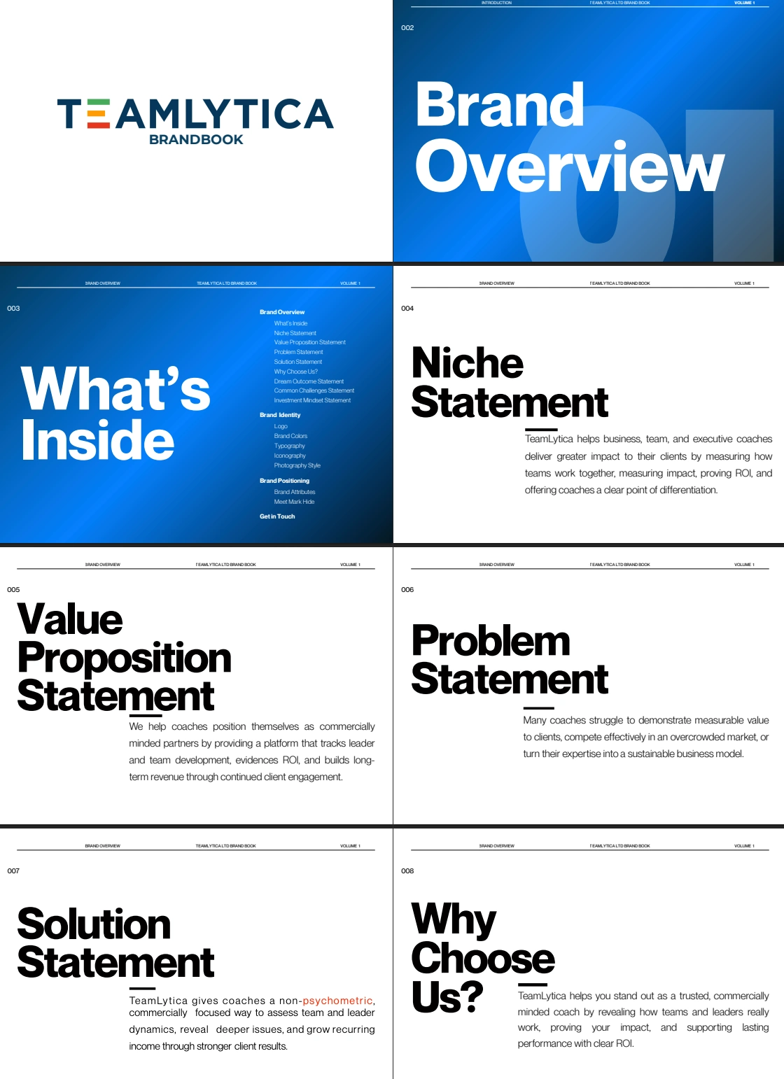
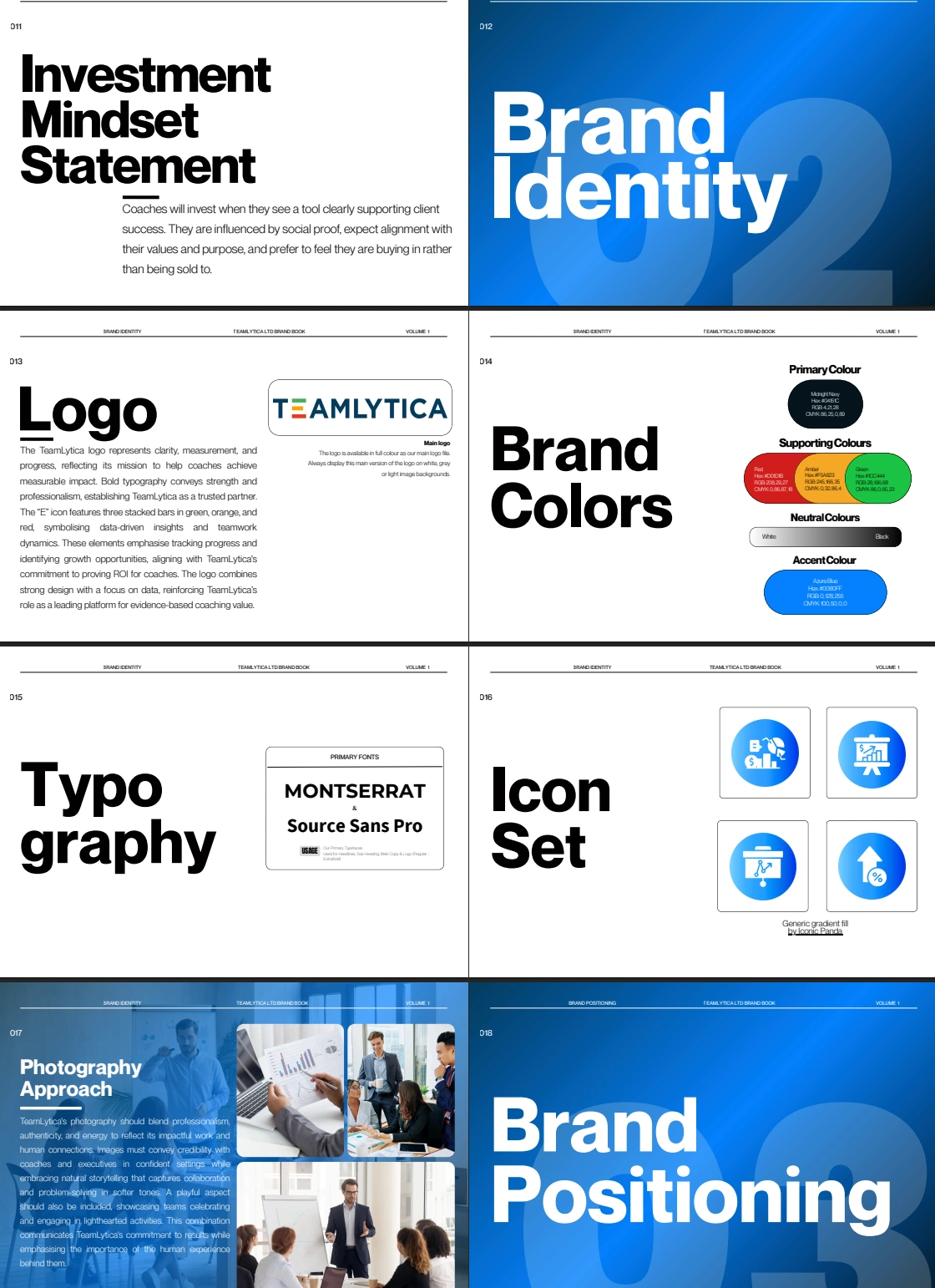
I developed a detailed brand guideline direction for Teamlytical that established the key elements needed for long-term consistency. This included defining a clear color palette, typography hierarchy, visual tone, button and call-to-action styling, logo usage guidance, spacing principles, imagery direction, and content presentation standards.
The typography system was structured to create a clear distinction between headlines, subheadings, body text, labels, and calls to action. This helps the brand communicate clearly and keeps every page or asset easy to scan. The visual direction focused on a clean, modern, digital-first style that feels polished and credible without becoming overly corporate or generic.
The guidelines also created a consistent approach for using colors across key brand touchpoints. This included recommendations for primary brand colors, supporting colors, neutral backgrounds, text contrast, button states, and highlight elements. The aim was to ensure every design remains visually balanced and recognizable, whether it is used on a website, CRM interface, form, email, or presentation.
To make the system easier to apply in real-world marketing, the brand guideline direction included practical usage considerations such as:
Primary and secondary color palette usage
Typography choices and font hierarchy
Headline, body copy, and button styling
Logo placement and clear-space guidance
Website and landing-page visual direction
Email and CRM communication styling
Form, dashboard, and interface design consistency
Social media and promotional graphic direction
Image treatment, icon use, and graphic accents
Layout, spacing, and alignment standards
Calls-to-action and conversion-focused button styling
Recommendations for maintaining a unified tone across future assets
The final outcome gave Teamlytical a clear, scalable system for presenting the brand consistently. Instead of relying on individual design decisions each time a new asset is created, the team now has a defined visual and communication direction that supports faster execution, stronger brand recognition, and a more professional customer experience.
This project established the foundation for Teamlytical to grow its website, CRM, marketing materials, and customer communications with a unified identity that feels intentional at every touchpoint.
Like this project
Posted Aug 13, 2026
Developed a cohesive brand guideline system for Teamlytical, creating a consistent, professional identity across its website, CRM, emails, and marketing assets.