Tier Mobility | Rewards Program
Overview
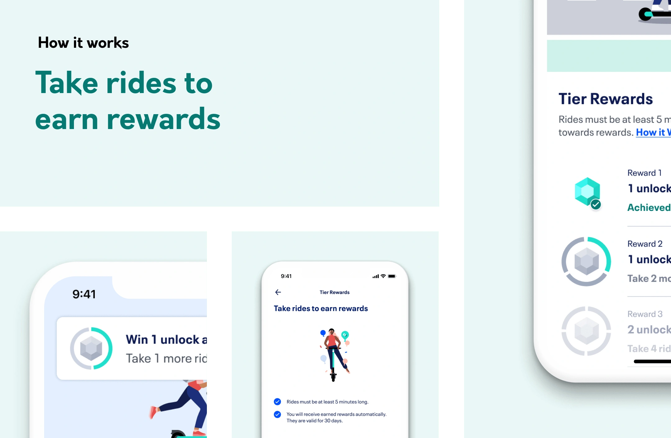
I created a loyalty program for Tier Mobility, an eScooter sharing startup valued at over $1bn.
I used eye catching design and gamification to create an immersive experience.
I analysed data and performed user testing to maximise the effectiveness of the program.
I was responsible for the Strategy, UX and UI.
My designs directly led to an increase in ride frequency amongst users
Brief
Incentivise occasional riders with rewards to encourage them to ride more often with Tier
KPIs
% increase of rides by occasional riders
% users who complete more than 1 loyalty cycle
% users who visit loyalty program main screen more than once a month
Benchmarking
Voi
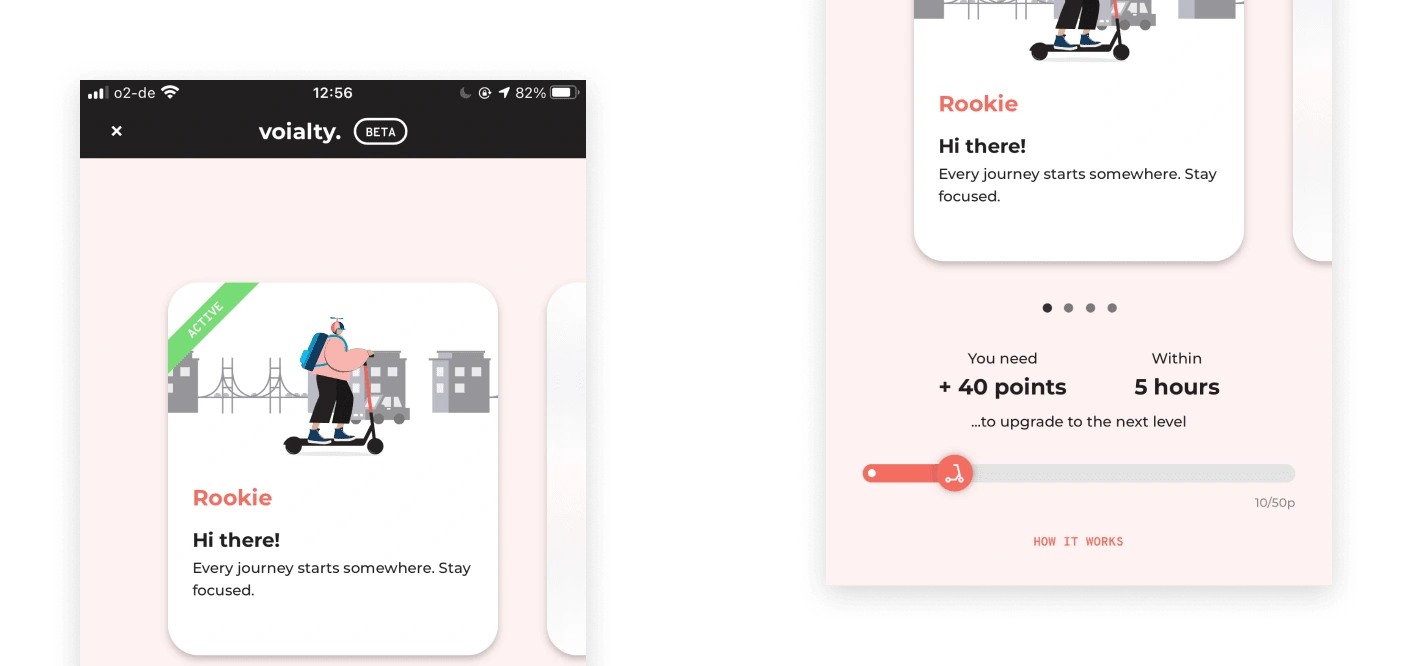
Voi use a status model. As you ride more you achieve status levels, which each provide a certain discount amount on rides.
Positives:
Animated illustrations are fun and engaging
Discount model is simple. It is easy to understand how much you save on rides
Negatives:
The UI is a little confusing
The blurred out levels do not create a sense of excitement.
Free Now
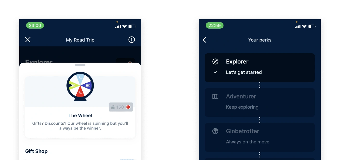
Free Now offer a points based system. After accumulating a certain amount of points, you win a percentage discount. The more points you accumulate the higher the percentage
Program positives
Clear progression
Engaging visuals
Program negatives
Translating rides into points is a bit confusing
Stakeholder Workshops
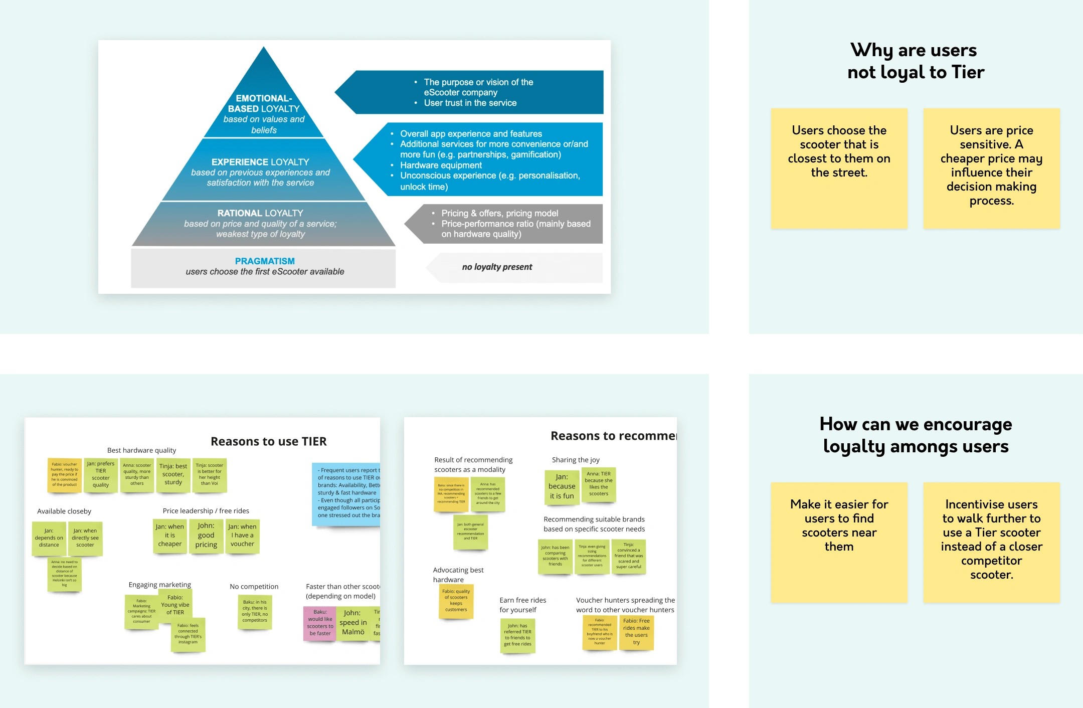
I ran an initial workshop to help us define loyalty and generate early ideas for how the program could work. In this workshop we identified
Testing Concepts
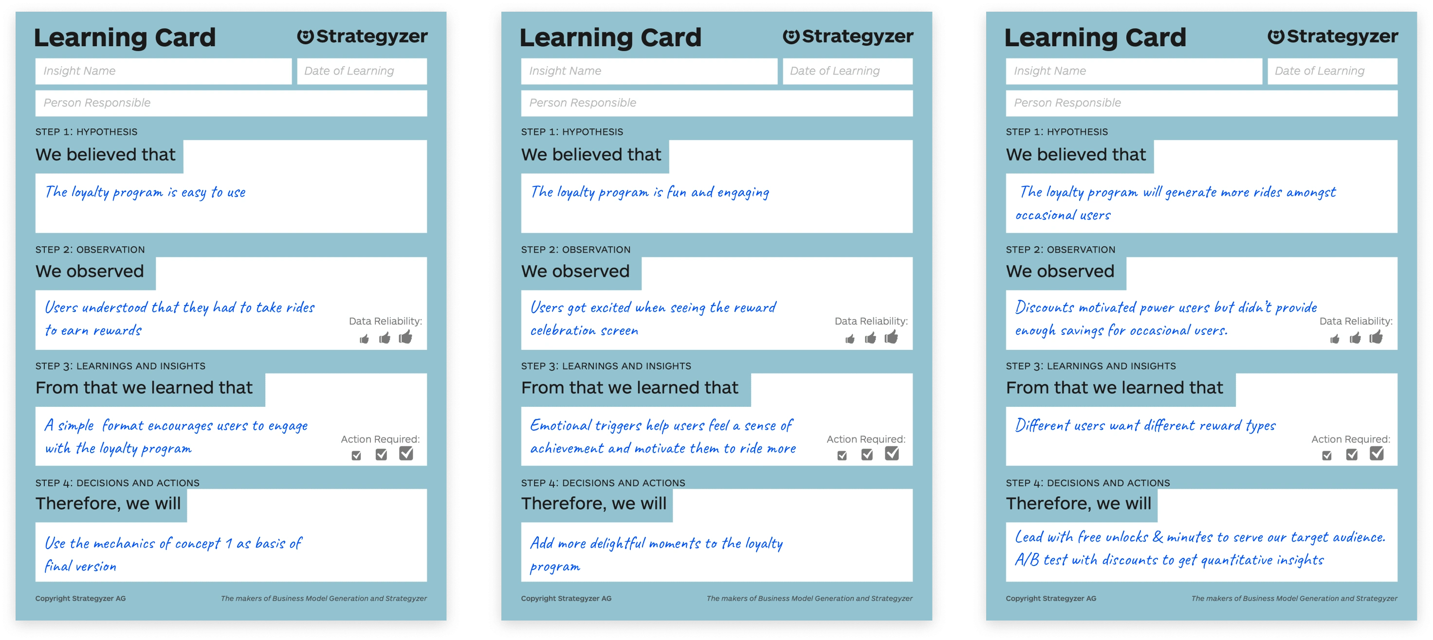
After this, alongside key stakeholders, I facilitated sessions to ideate 3 different concepts that we would test.
Loyalty Program Design
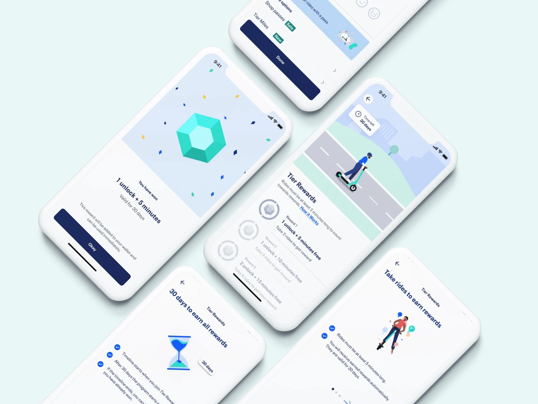
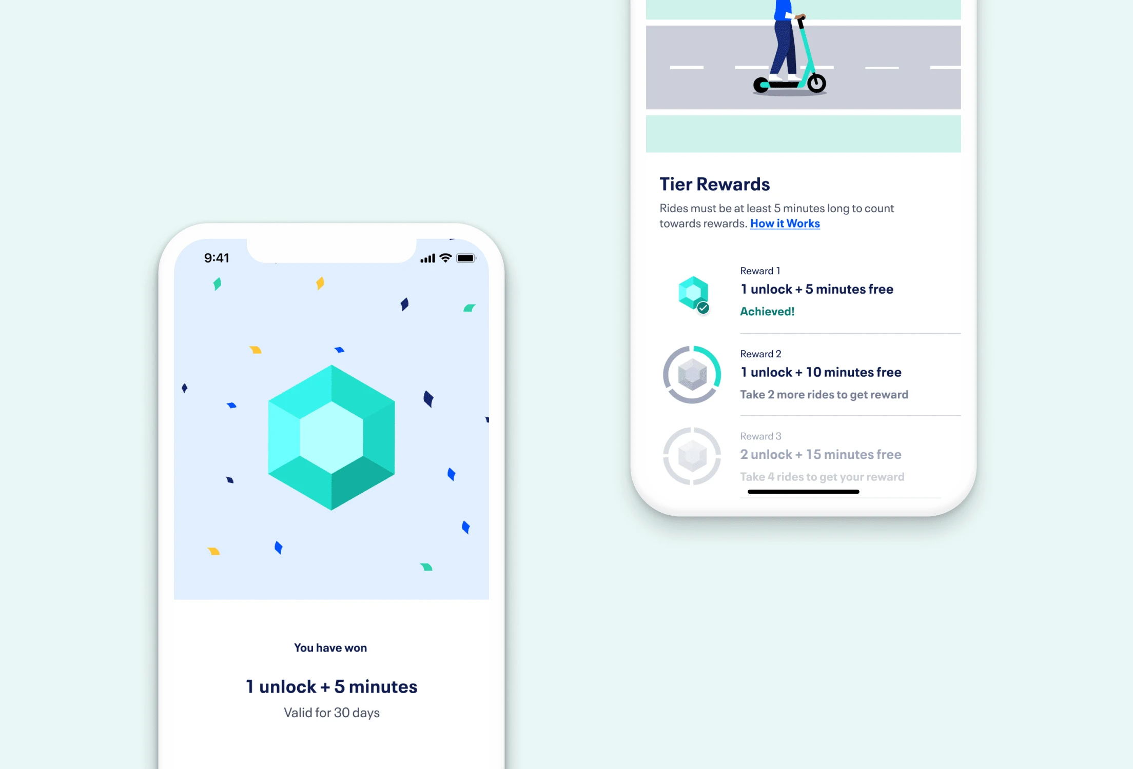
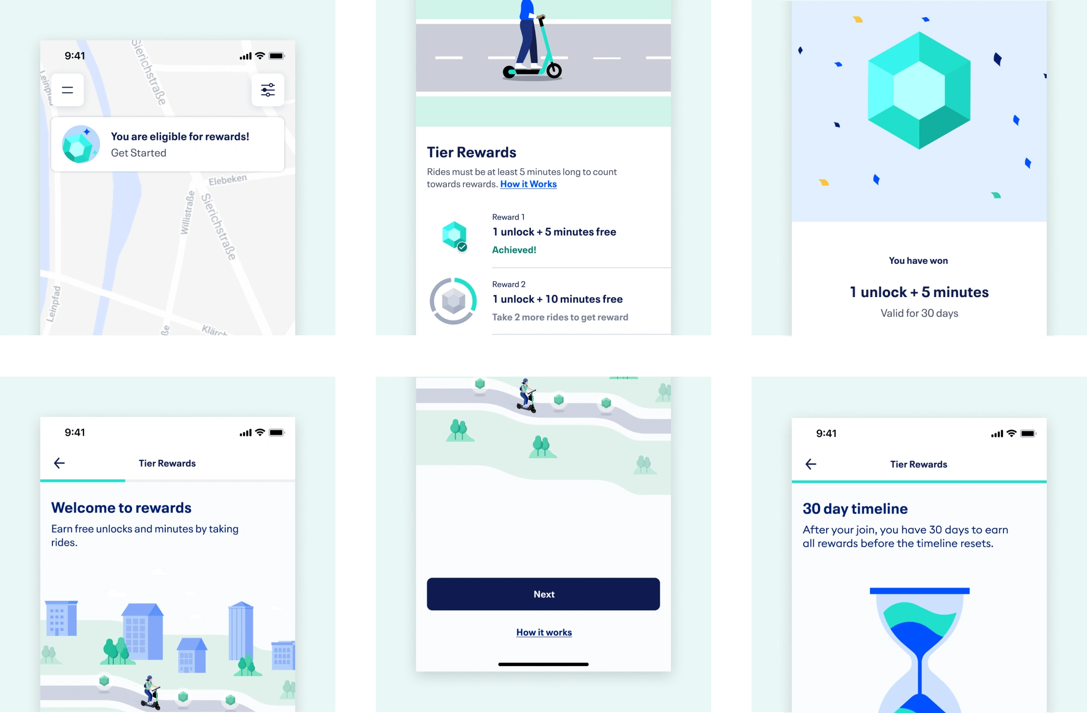
Based on the test learnings, I created an first version of the program with delight moments including playful illustrations and an animated main screen and reward won notification.
Data insights & Design Updates
Data Insights
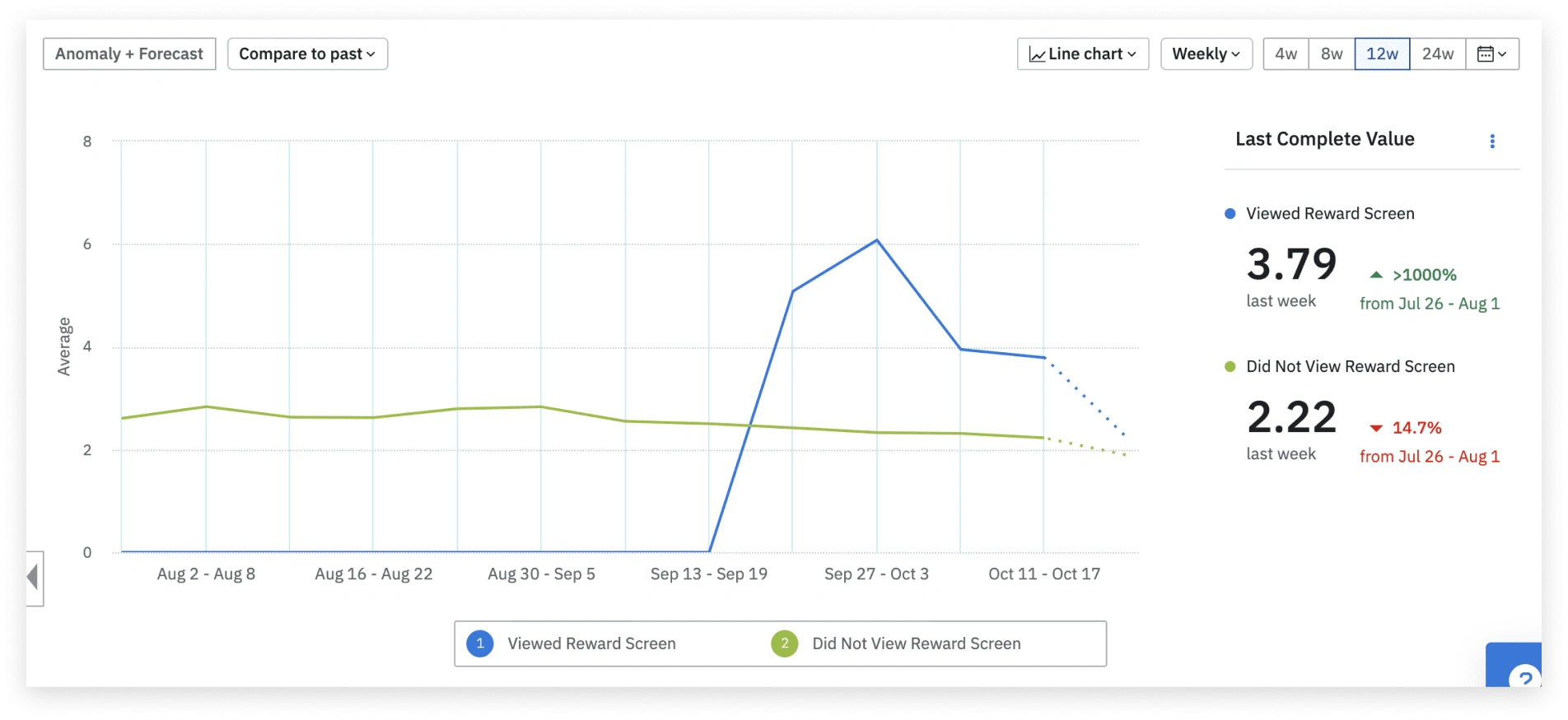
The data post release showed that users who had visited the Loyalty Program main screen did increase their ride frequency by on average 3 time. This was very promising and suggested that the loyalty program is very effective when the user is aware of it. I wanted to drive even more people to the main screen.
Design Update #1
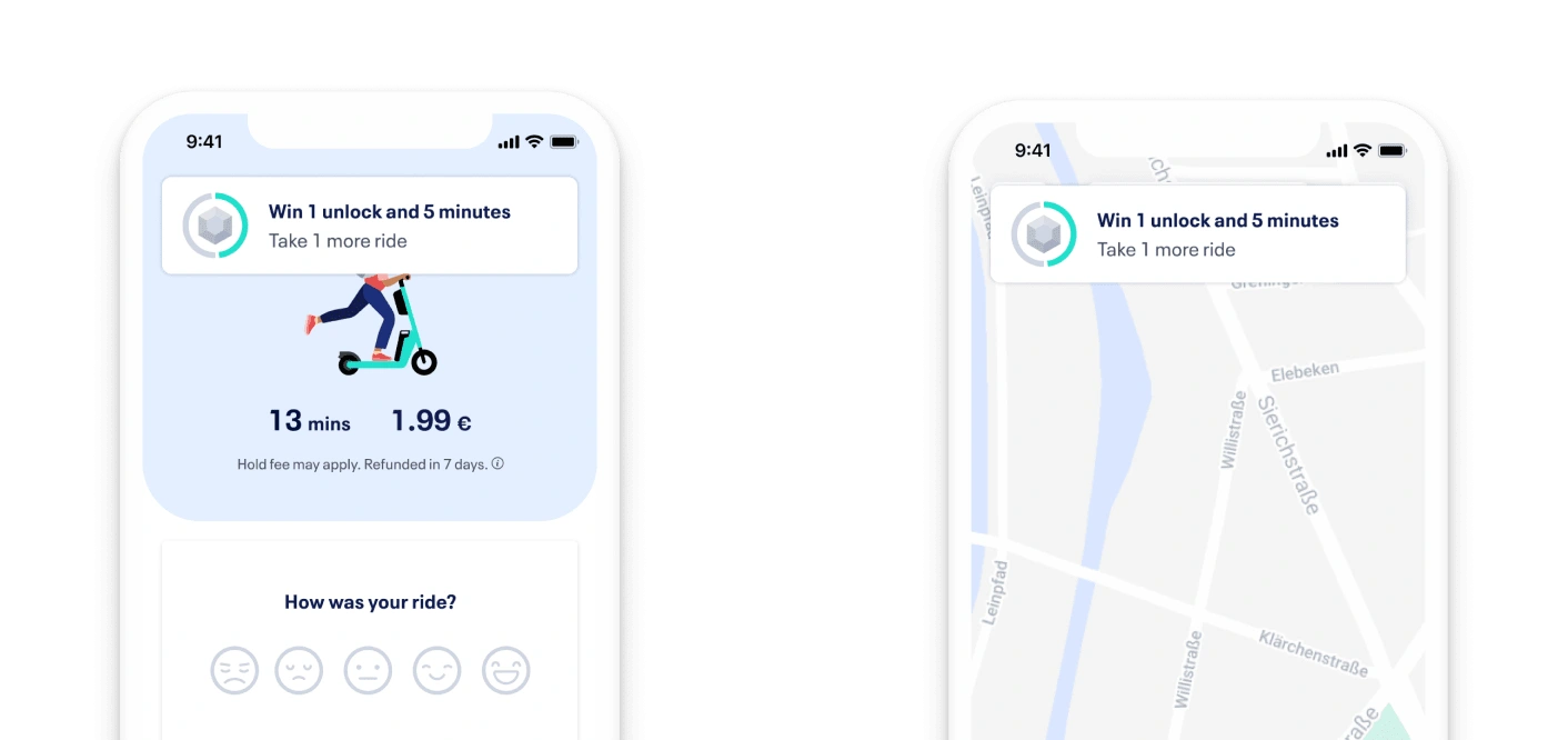
Fly ins after ending a ride and upon reopening the map. These fly ins informed users of their reward progress, and showed how many more rides they needed to take to earn a reward.
Design Update #2
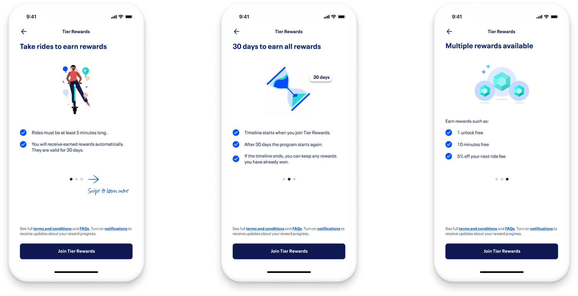
Allowing the user to skip onboarding. After launch, I also conducted interviews with users who had participated in the program for about a month. This gave me qualitative insights around improvements needed for the program. One key insight was that users first joined the program they were typically standing by a scooter and about to start a ride. They did not have time to read through each onboarding screen. Instead they would prefer to refer to the screens later if they needed. I therefore implemented a carousel on the onboarding main screen, allowing users to swipe to see the program details if they’d like. However, they could also ignore the carousel if they wished and join the program straight away.
Like this project
Posted Jan 22, 2022
Likes
0
Views
5


