Introducing accessibility standards to internal systems @LSEG
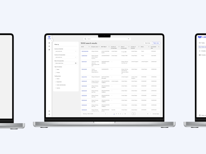
As part of the LSEG Microsoft partnership, we are redesigning a new experience for searching records in an internal tool, which also introducing tab order and other accessibility features to enhance the experience.

## Project Overview:
The LSEG sought to improve the usability and accessibility of its internal tools, particularly the record search experience within its proprietary platform.
Recognising the importance of inclusivity and user friendly design, LSEG partnered with Microsoft to undertake a comprehensive redesign project.
## Objective
For users of Organisation Authority (another DBoR) to migrate to EM
To enhance the UX of search records within the internal tool while ensuring accessibility for all users, including people with disabilities or mobility impairments
## Key goals
- Improving navigation efficiency
- Simplifying search processes
- Implementing accessibility features like tab order
## Pain points
- There weren’t any accessibility features, like tab order, or even basic header tags
- Users prefer using their keyboards more than the mouse
- They work from home or work in the office once a month
## Solution
Working collaboratively, the LSEG and Microsoft teams conducted extensive user research to identify pain points and accessibility barriers within the existing system, based on the insights gathered the following solutions were implemented:
1. **Redesigned experience**: The UI underwent a significant overhaul to streamline the search process and improve overall usability. Clearer navigation paths and intuitive design elements were introduced to enhance user engagement.
2. **Tab order implementation**: Recognising the importance of keyboard navigation for accessibility, tab order functionality was integrated into the redesigned interface. This allows users to navigate through interactive elements using the keyboard, ensuring a seamless experience for individuals with mobility impairments or those who prefer keyboard input.
3. **Accessibility features**: In addition to tab order, various other accessibility features were incorporated to cater to diverse user needs. This included high contrast mode and screen read compatibility, ensuring compliance with accessibility standards such as WCAG.
## Success criteria
- Users with motor impairments can effectively navigate through the system using only keyboard inputs
- Users who use only keyboards to navigate can easily access through the system
- Evaluate improvements in user experience and can be evaluate by monitoring user feedback and observing any improvements in user satisfaction metrics, like task completion time and ease of use ratings.
- Tracking the frequency of user errors or instances of users getting stuck or lost within the system
- Success in conducting accessibility audits and ensuring that the system meets the required standards and guidelines.
## Designs
I was in charge of designing the tab order for the search results and change layout pages as I worked on the entire user experience of those tickets. This documentation was reviewed and approved by my design manager.
### **Documenting tab order once the user clicks on skip to search bar link**
Clear documenting the tab order and the skip to links fosters a smooth user experience, enabling individuals to easily locate and interact with the search bar and other essential functionalities.

1. The left navigation is out of scope
2. If the user minimises the filter by sidebar, the skip to links for filter by vanishes
3.
### Reverse tab order from the search bar
If the user clicks on Shift+tab once they’re on the search bar

### Tab order for change layout modal
- If the user navigates the modal with the tab, the drag and drop icon doesn’t have a focus. Drag and drop icons can disrupt the natural flow of keyboard navigation, making it difficult for users to predict the order of interaction. Secondly, using this icon may not be feasible for users with mobility impairments who rely solely on keyboard input. To eliminate the use of drag and drop icon, I have added the up and down button there for keyboard users to navigate without using the mouse.

## What comes next?
- Create landmarks for filter and table - this should be across all pages ideally.
- For filter component and perhaps the table, use arrow keys rather than tabs to navigate. Ideally there shouldn’t be any nesting of components.
- Accessibility audits with a consultant and user test these with different users once the designs are live.
## **Takeaways:**
<aside>
✅ The project helped me to learn more about the process of a design thinking framework. Learned to do better visuals with the material design guidelines, by creating a small component library. Also learned how to empathize with the users in a better way.
</aside>
Like this project
Posted Apr 29, 2024
Accessibility
Likes
0
Views
0


