Social Media Design for B2B Brand

Roseline Bassey


Explaining business insights, data, or technical concepts gets difficult when everything is squeezed into a single graphic.
Breaking the content into a carousel gives each idea a little more room to breathe. Instead of asking people to process everything at once, you can guide them through it one swipe at a time.
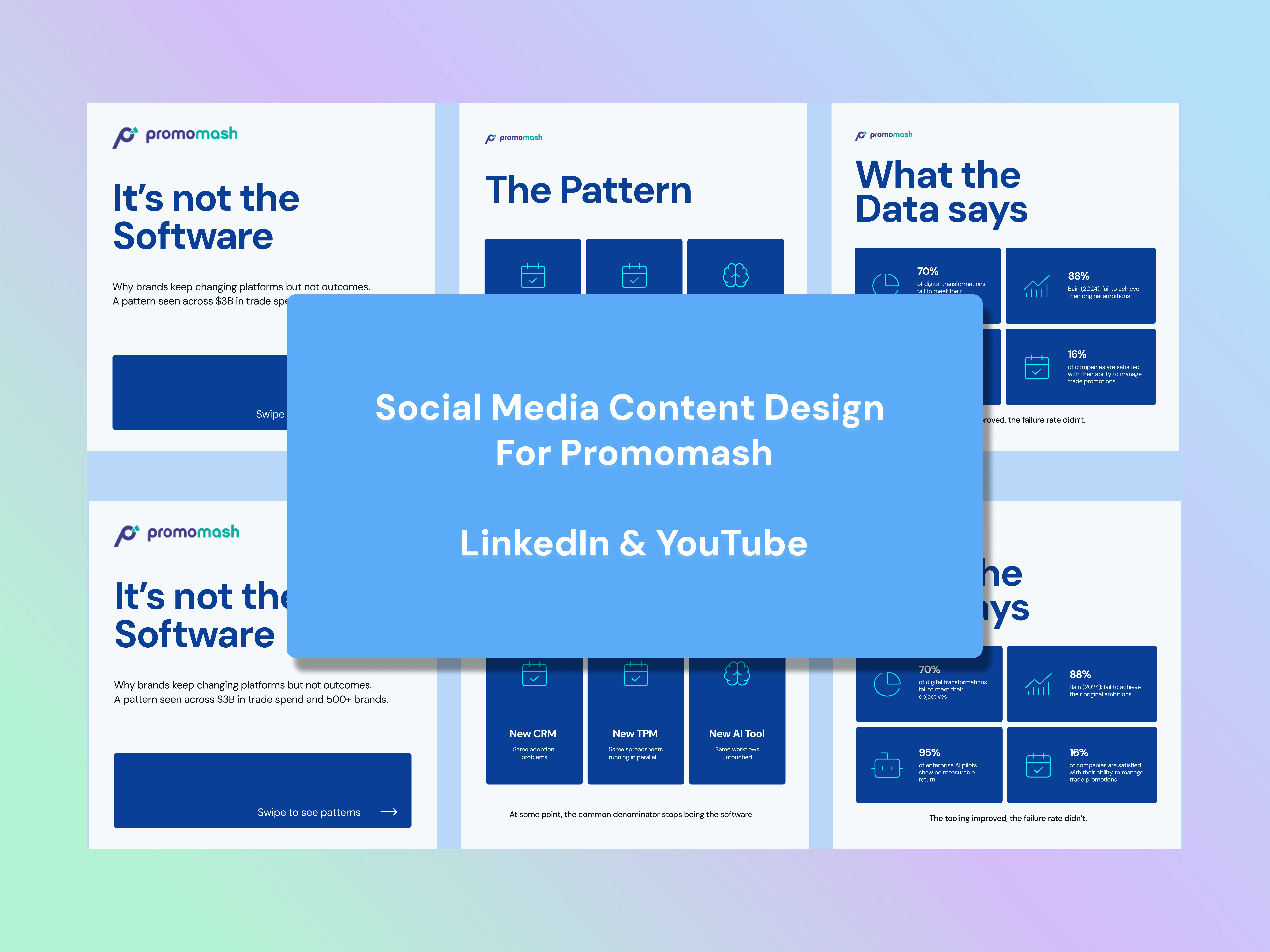
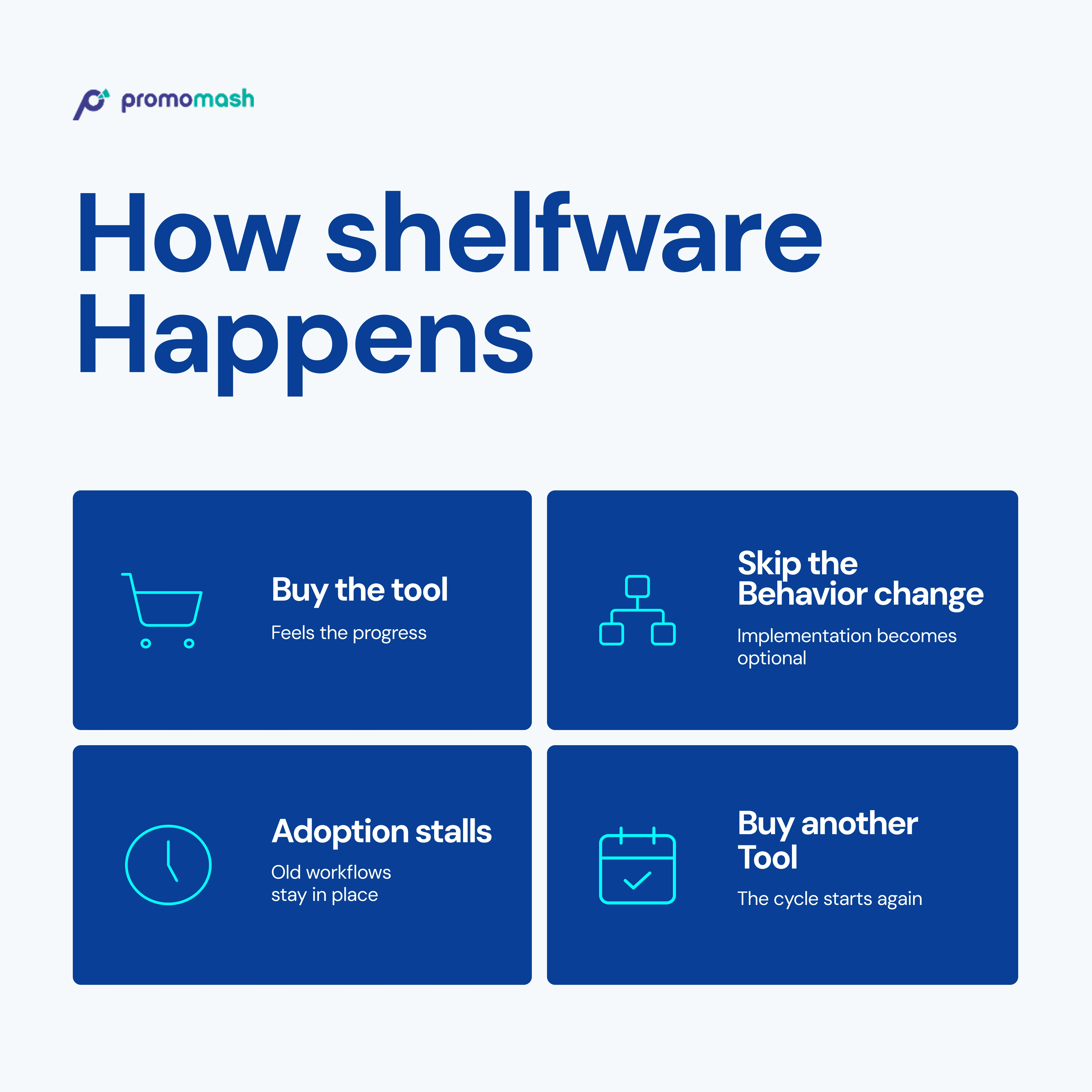
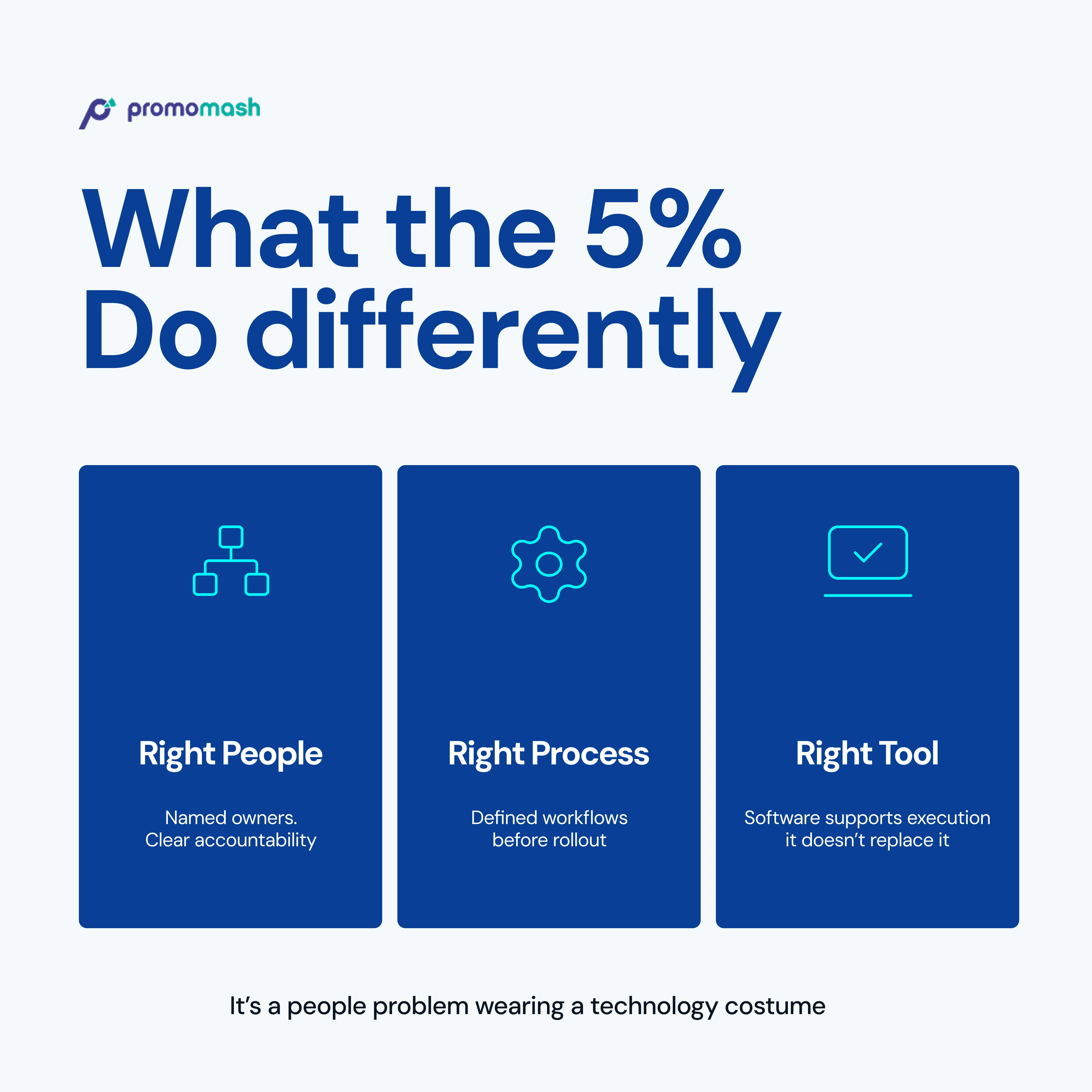
I redesigned some of Promomash founder Yuval Selik's LinkedIn posts from dense static into LinkedIn carousels while keeping the original message intact.
My focus was simply to make the content easier to follow:
One idea per slide
Better spacing and structure
Clearer reading flow
A smoother experience from one slide to the next
And keeping the design on-brand
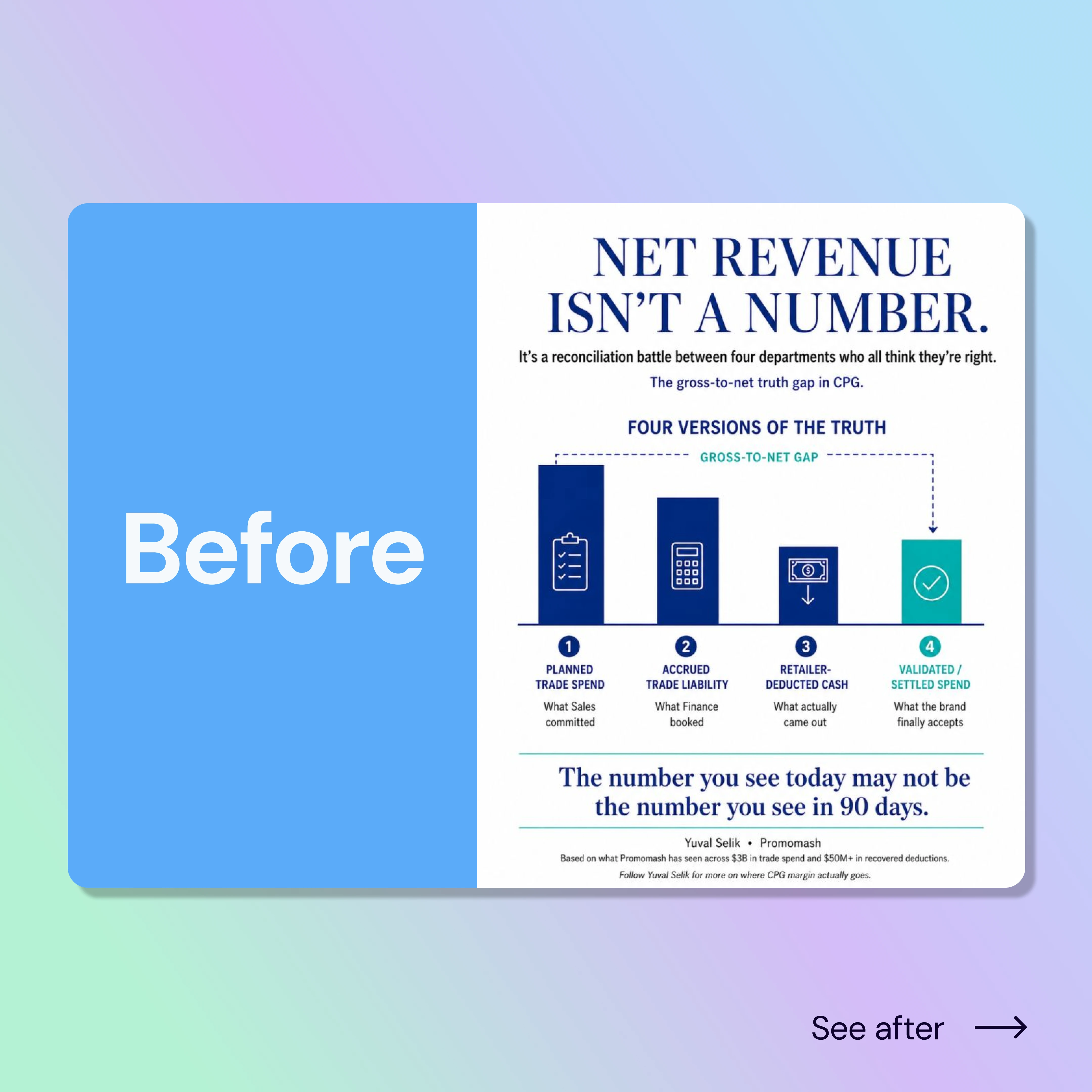
BEFORE
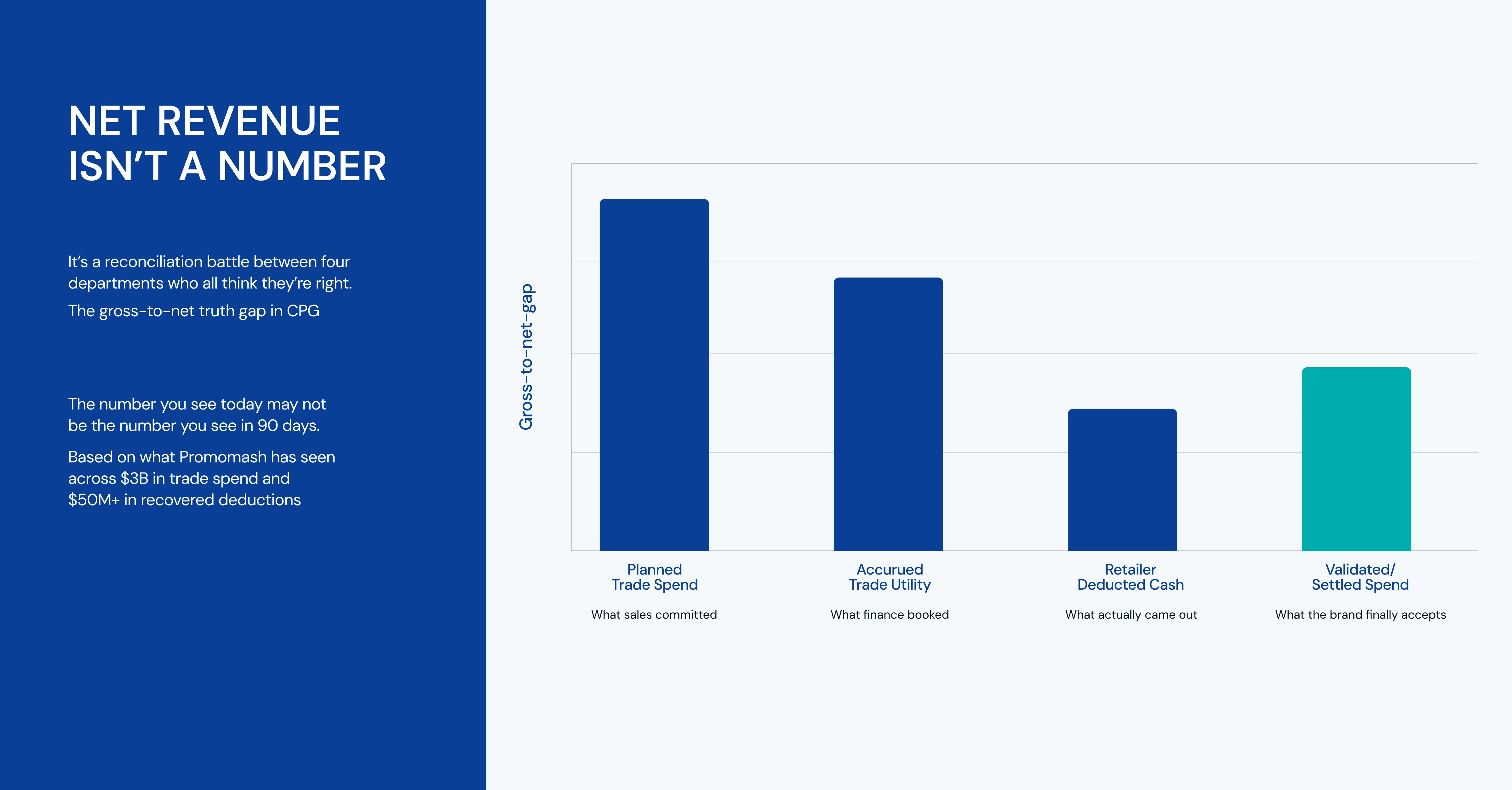
AFTER
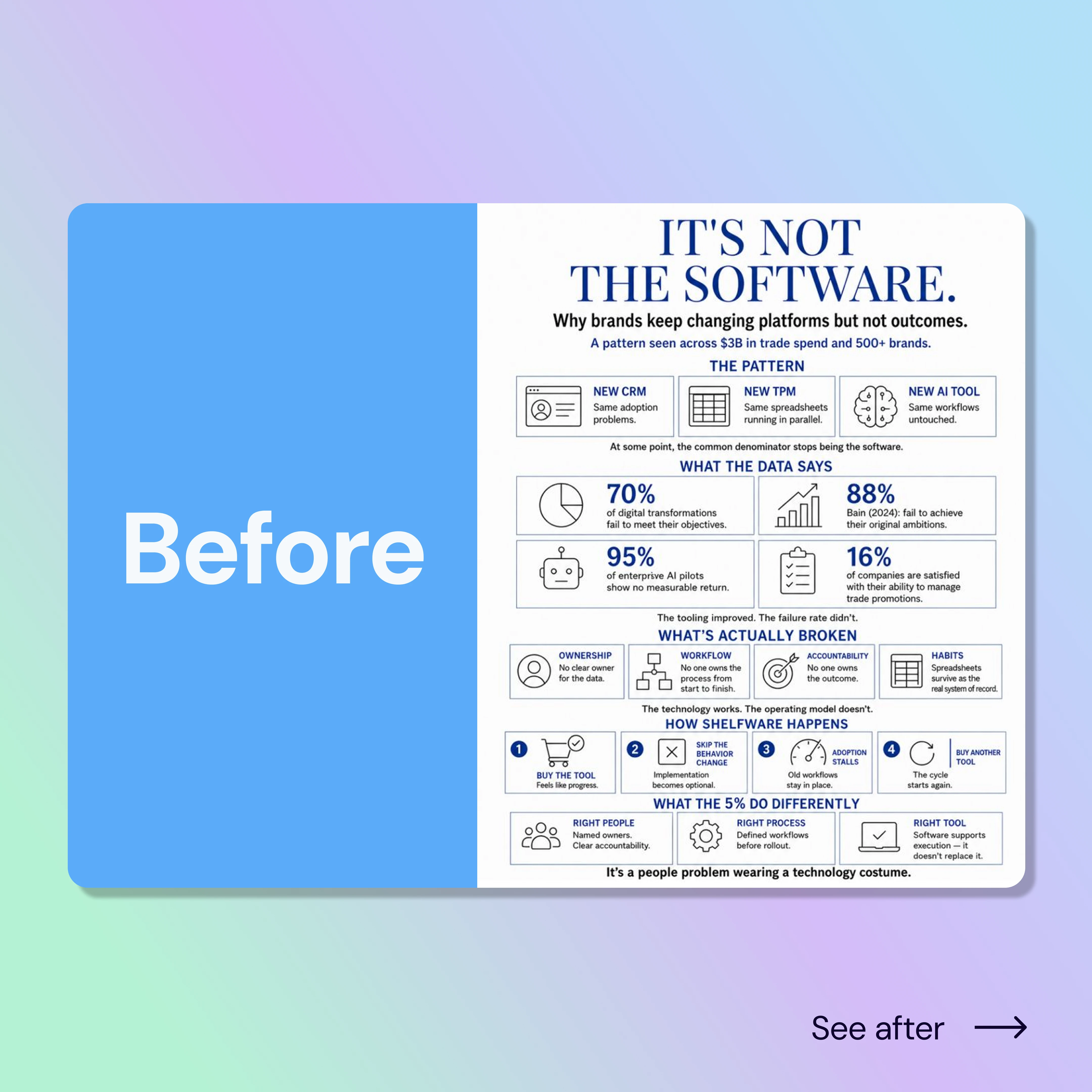
BEFORE
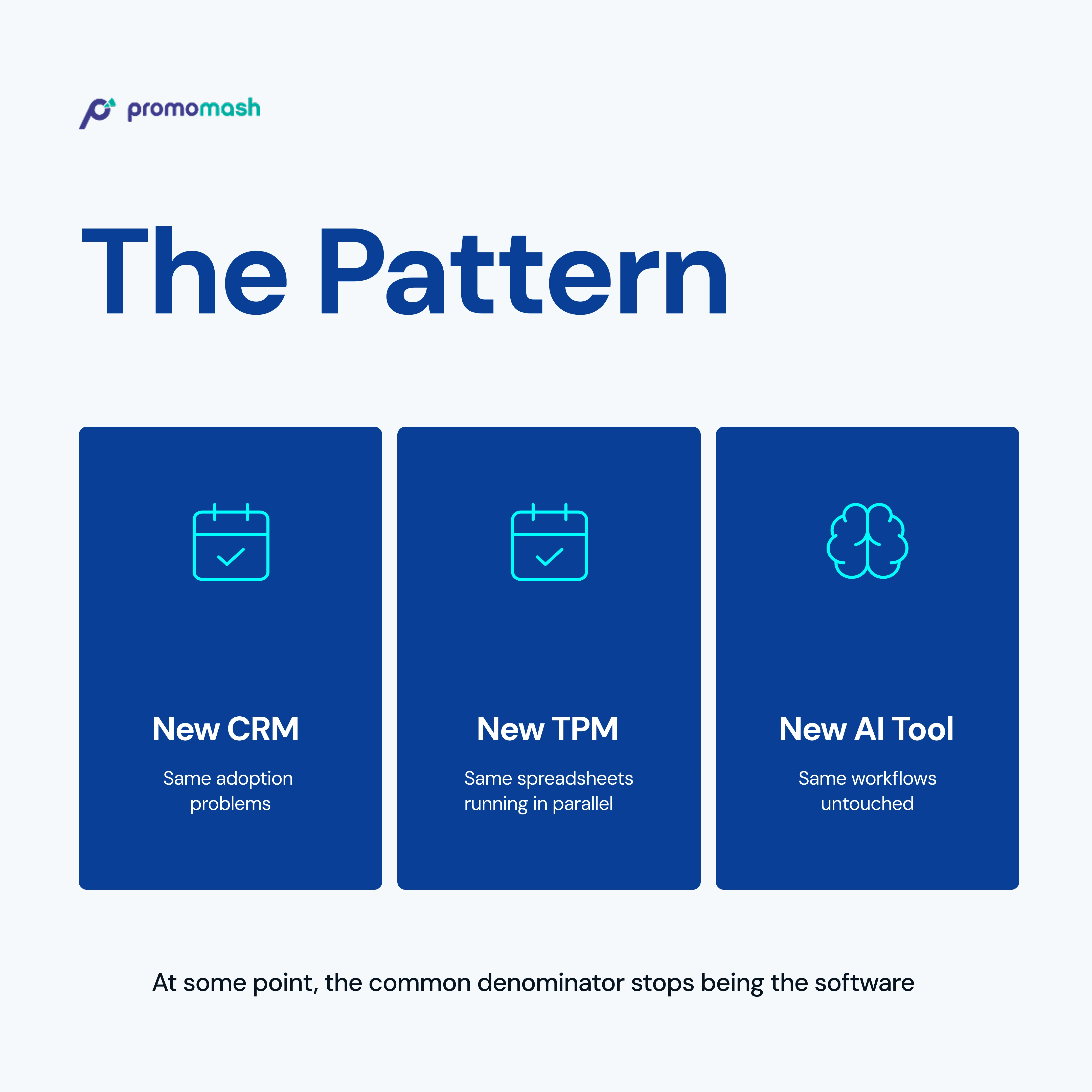
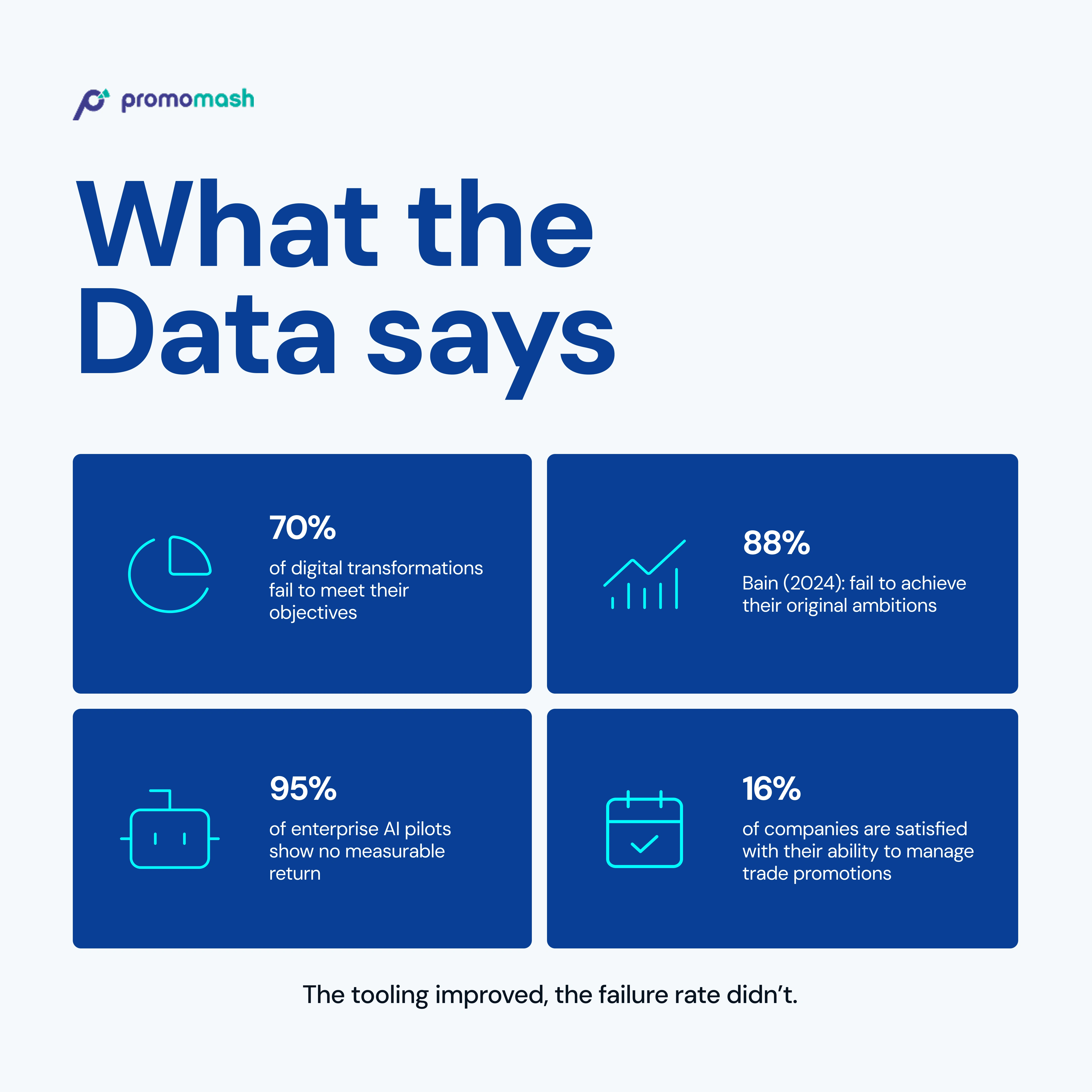
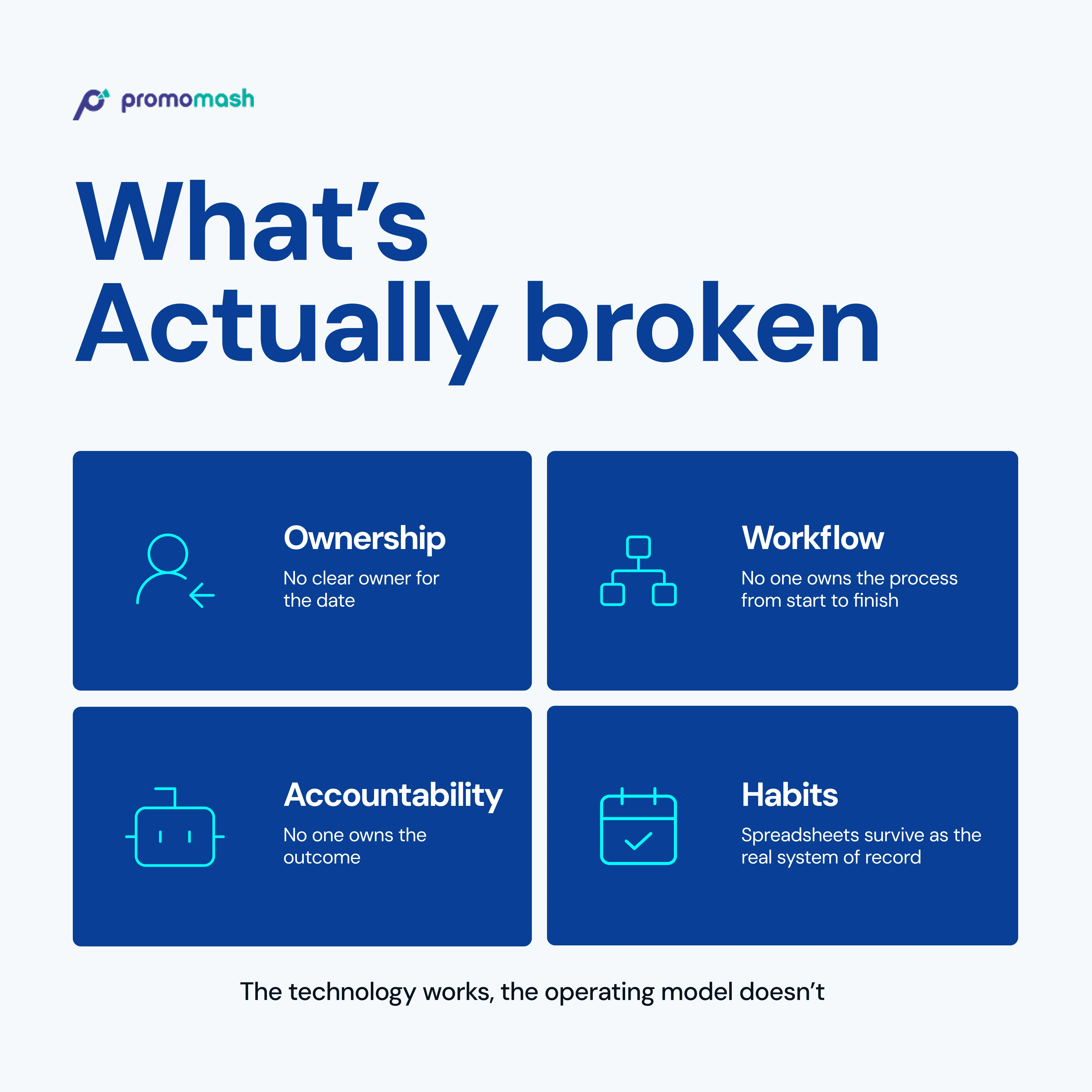
For the redesign of the design above, I transformed it into a single-slide infographic into a LinkedIn-friendly carousel, breaking the information into smaller, more digestible sections to improve readability, engagement, and information flow.

AFTER
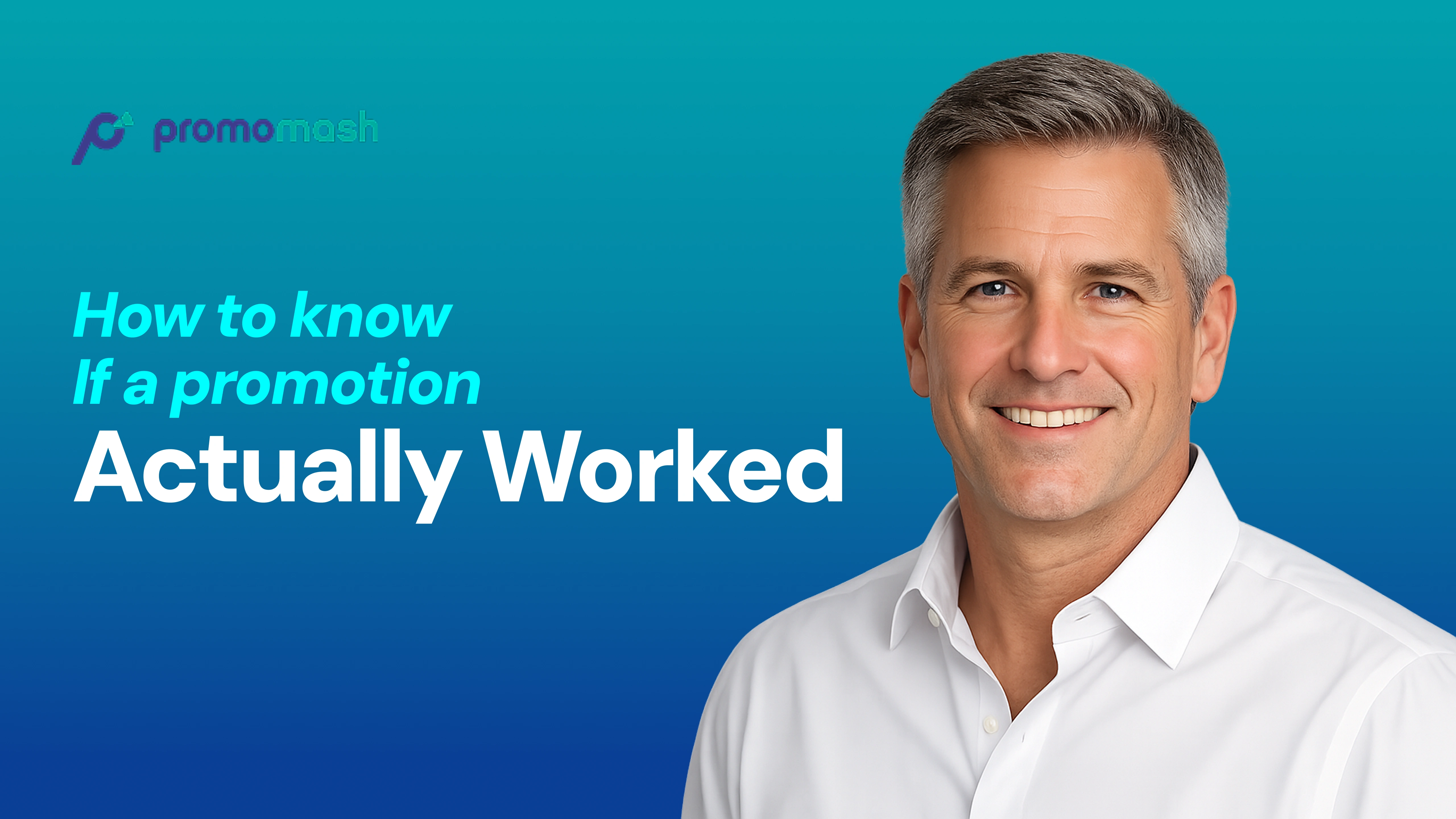
YouTube Thumbnail
Like this project
Posted Jul 15, 2026
Redesigned complex CPG insights into a LinkedIn-friendly carousel.