Alphilus: Brand Identity Design
Paul Omonzejele
INDUSTRY: Mining
SERVICES: Brand Identity | Brand naming
Alphilus is an organization that specializes in mechanized mining on a large scale, as well as the exportation and importation of mined items. Knowing how much neglect and unpopularity the mining busness has here in Nigeria, Alphilus is aiming to explore the extraction, processing, and sales of some of our not so popular natural resources, while also creating an awareness to making Nigeria a holy grail for the exportation of some of the world's most reserved or undiscovered natural resources.
CHALLENGE: After jumping on a 45 mins zoom call, we discovered that some of his challenges included:
Getting the perfect and unique name for his mining business.
The need of an identity that captured ALPHILUS' uniqueness in the mining business world, as well as one that resonates with its ideal customers home and abroad. One that represented his quality of service & look that appeal to business owners who would want to invest in his business.
Creating a modernized and minimalist brand for his business.
RESULTS:
Elevated brand presence with a sophisticated, cohesive identity that resonates with their audience.
Polished brand and marketing strategy to get his expertise to the right audience.
Brand Identity & Creation
The goal was to create a modern, cohesive brand identity with consistent visuals, colors, and typography, to enhance Alphilus' recognition.
Brand Naming
The name ALPHILUS is derived from the name "Alpheus", a name used commonly for boys from the Hebrew and Greek origin. It's a name that was quite popular in the 19th century, but in recent or current times has been considered an unusual name. Stemming from both roots, this name means changing, traverse or exchange. Whereas in Greek alone, it means “whitish” as well as “produce,” “gain,” or “profit.”
The client wanted us to craft out a unique name for the brand, one done in such a way that it still has some letters from his personal name, "Phillip", infused into the brand name or some sort of pronounciation from his name. So knowing one important part of creating a unique brand name is making it easy to pronounce, we decided to replace the E in the name with I & L, making it sound as ALPHILUS!
Conceptualization
A couple of things were considered, in creating the ideal logo for Alphilus. One of which was geared toward using elements associated with the brand. The client trusted us with whatever concept we came up with since he was referred by his close friend, who was also a satisfied client we had recently just worked with. After carrying out a lot of research through wordmappings from the use of some words associated with the mining industry, their core values, as well as other elements, we finally decided to go with the idea of incorporating rocks, as well as a representation of importation and exportation of products.
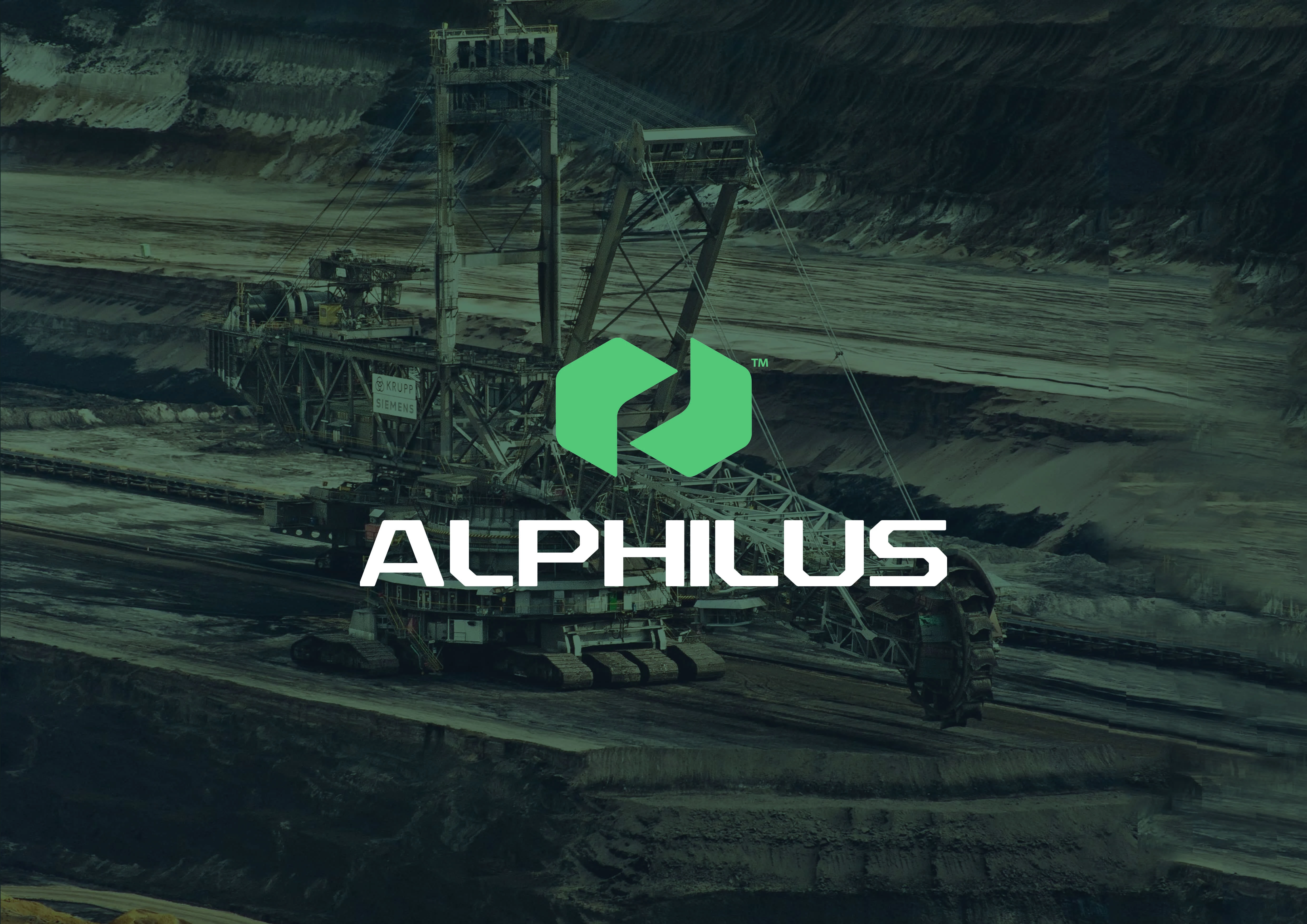
The idea of the logomark we created was a combination of a rock being splitted into two parts, thereby creating a crack crevice, which symbollically represents a digged up dredge where precious stones are found. The continous opening depicts a continous flow of mining products without any exhaustion of supply, which is one of the missions Alphilus aims to ahcieve as a mining organization. The abstract rocks were also formed into a unique arrow representation, which also symbolized an aspect of the business that has to do with import and export of mined resources.
Typography
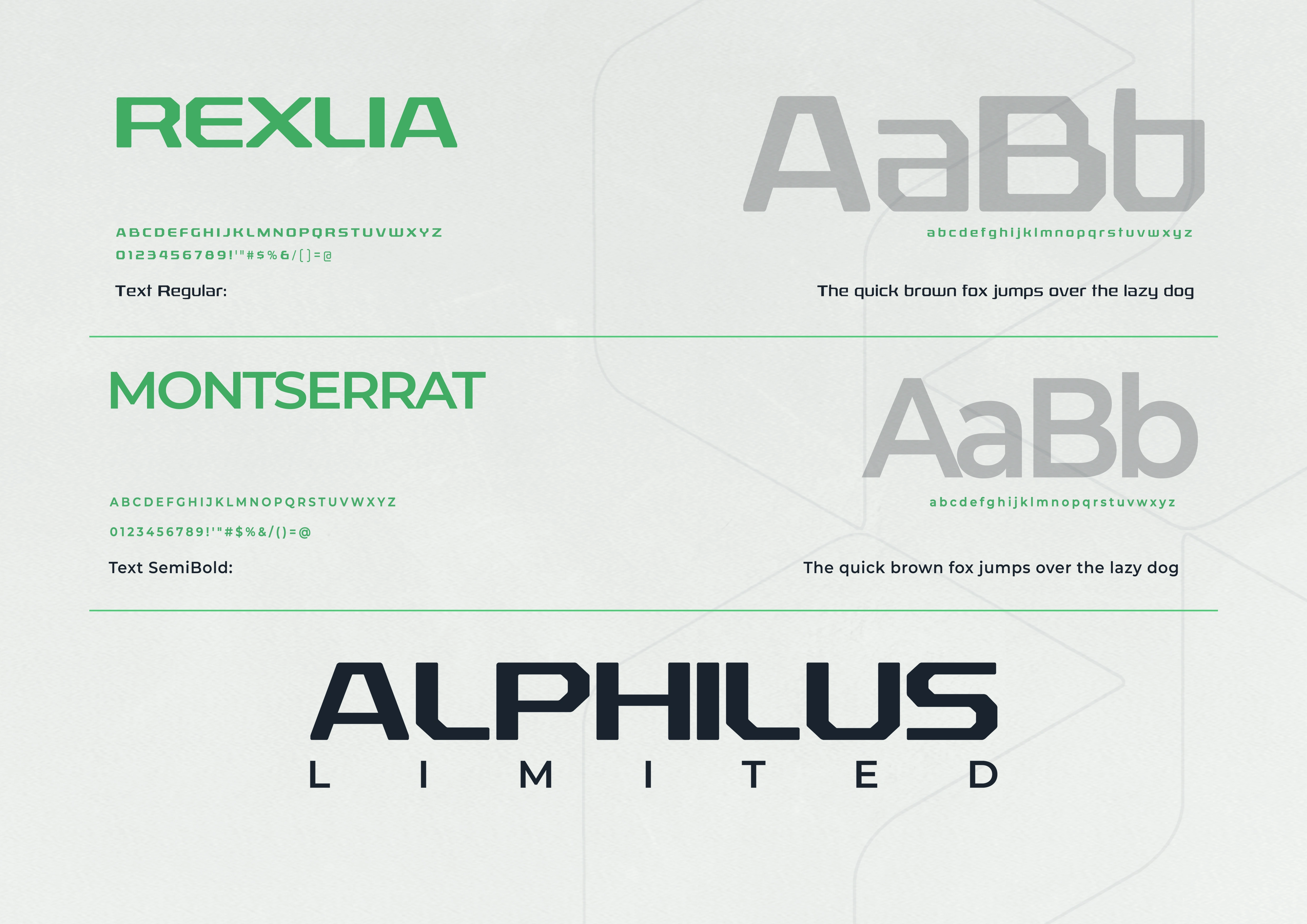
The logotype embodies the essence of the brand's philosophy through its design. Rexlia is an industrial headline typeface, and a modern sans-serif font inspired by modern military equipment.
Its geometric shapes and clean lines evoke an industrial, technical atmosphere, fitting for a mining brand. Its robust and contemporary design conveys a sense of reliability, stability, and resilience, which are essential qualities for a mining company, as well as also ensures a professional, up-to-date image suitable for our mining brand. The font's sturdy design conveys the reliability and strength required in mining operations.
Overall, Rexlia is a suitable font for the Alphilus brand due to its industrial feel, strength, legibility, versatility, and modern design.
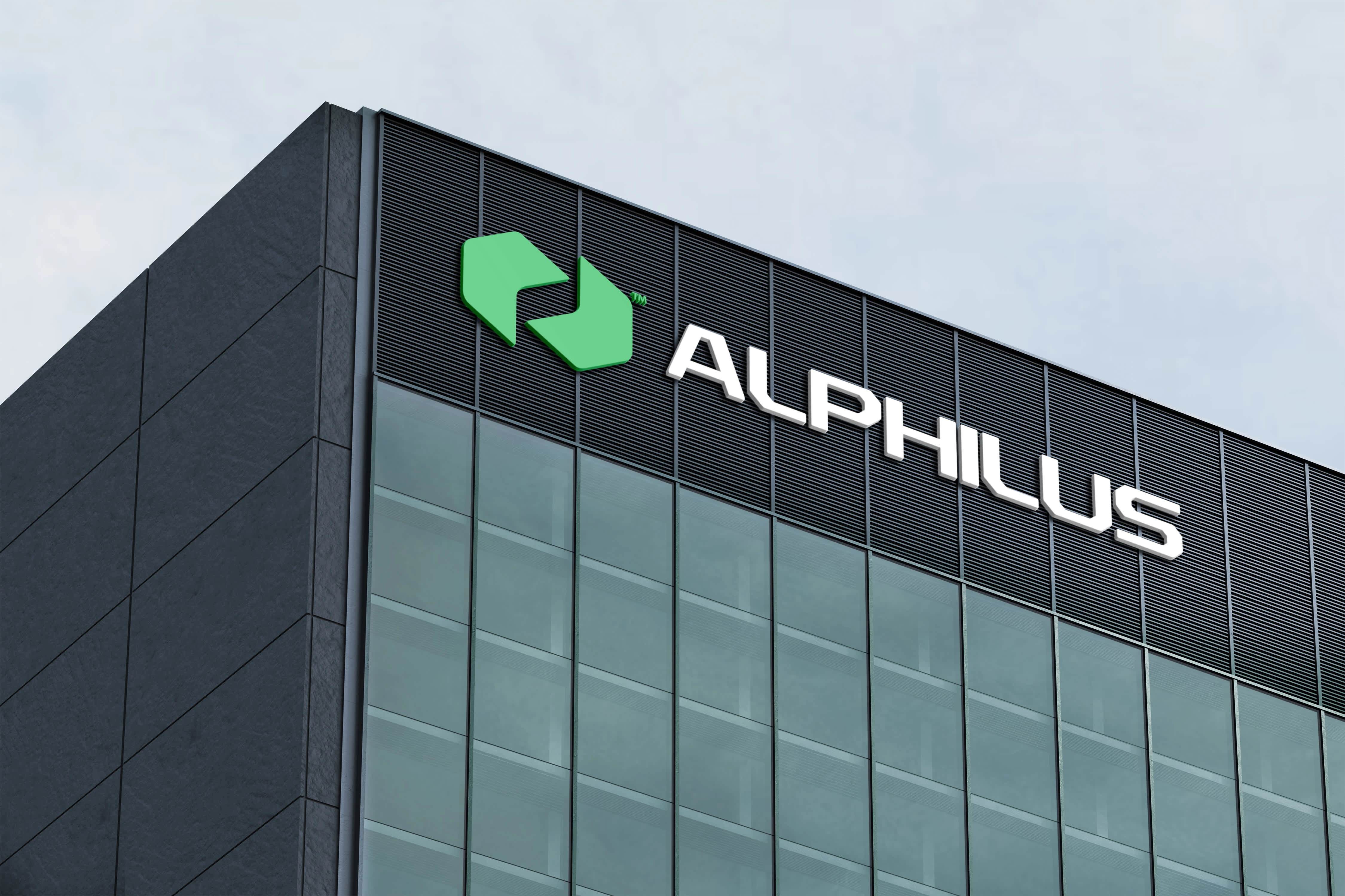
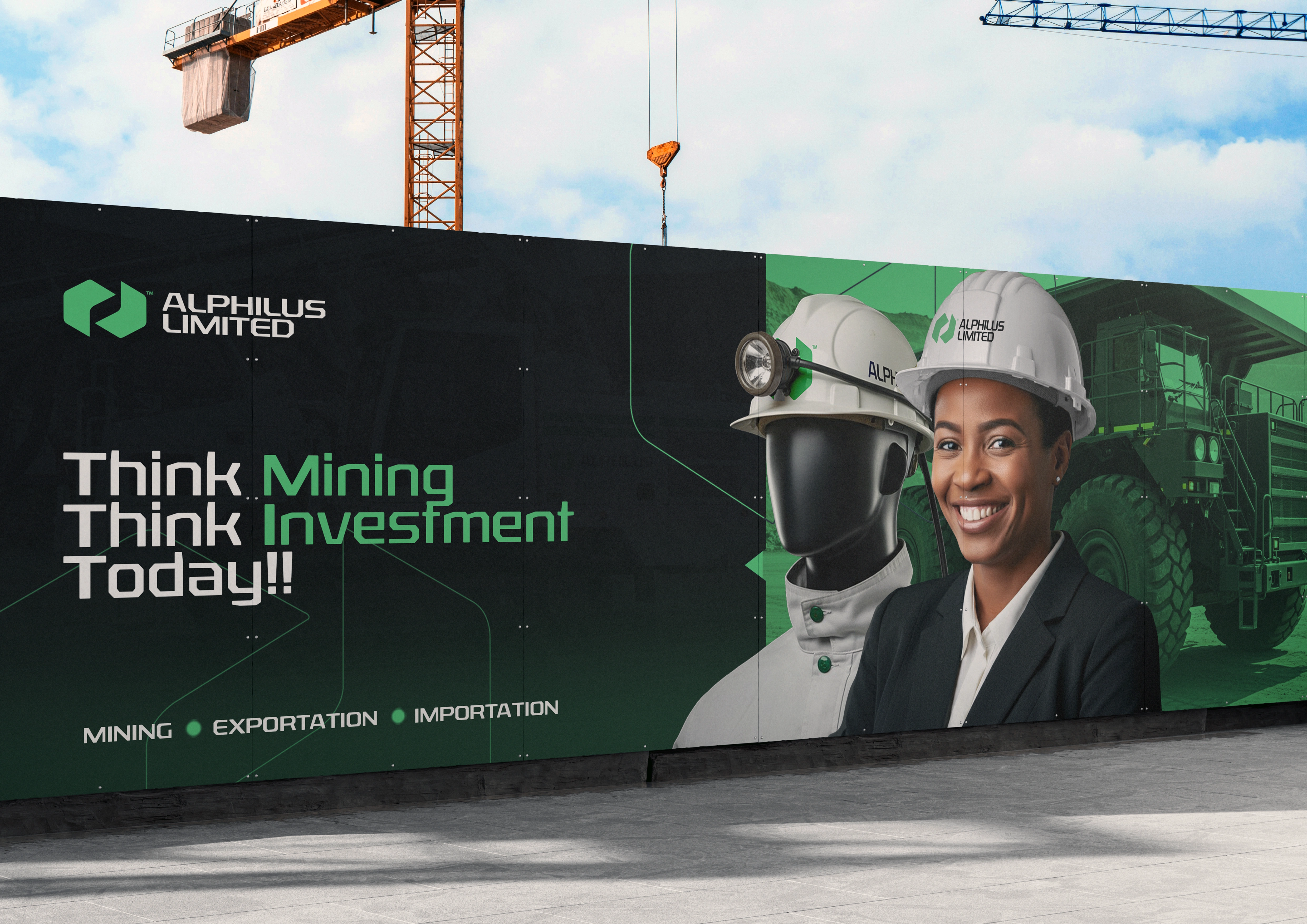
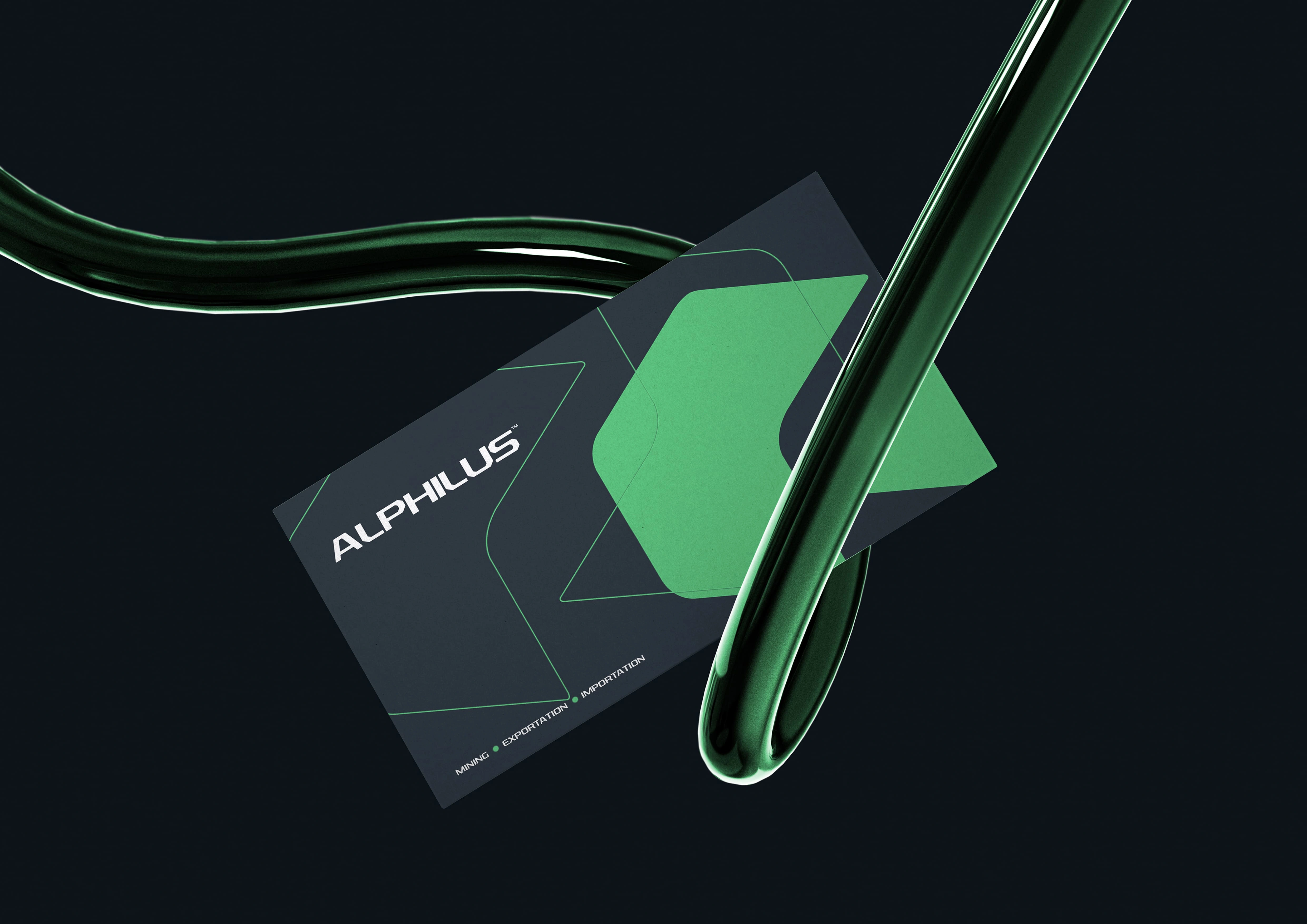
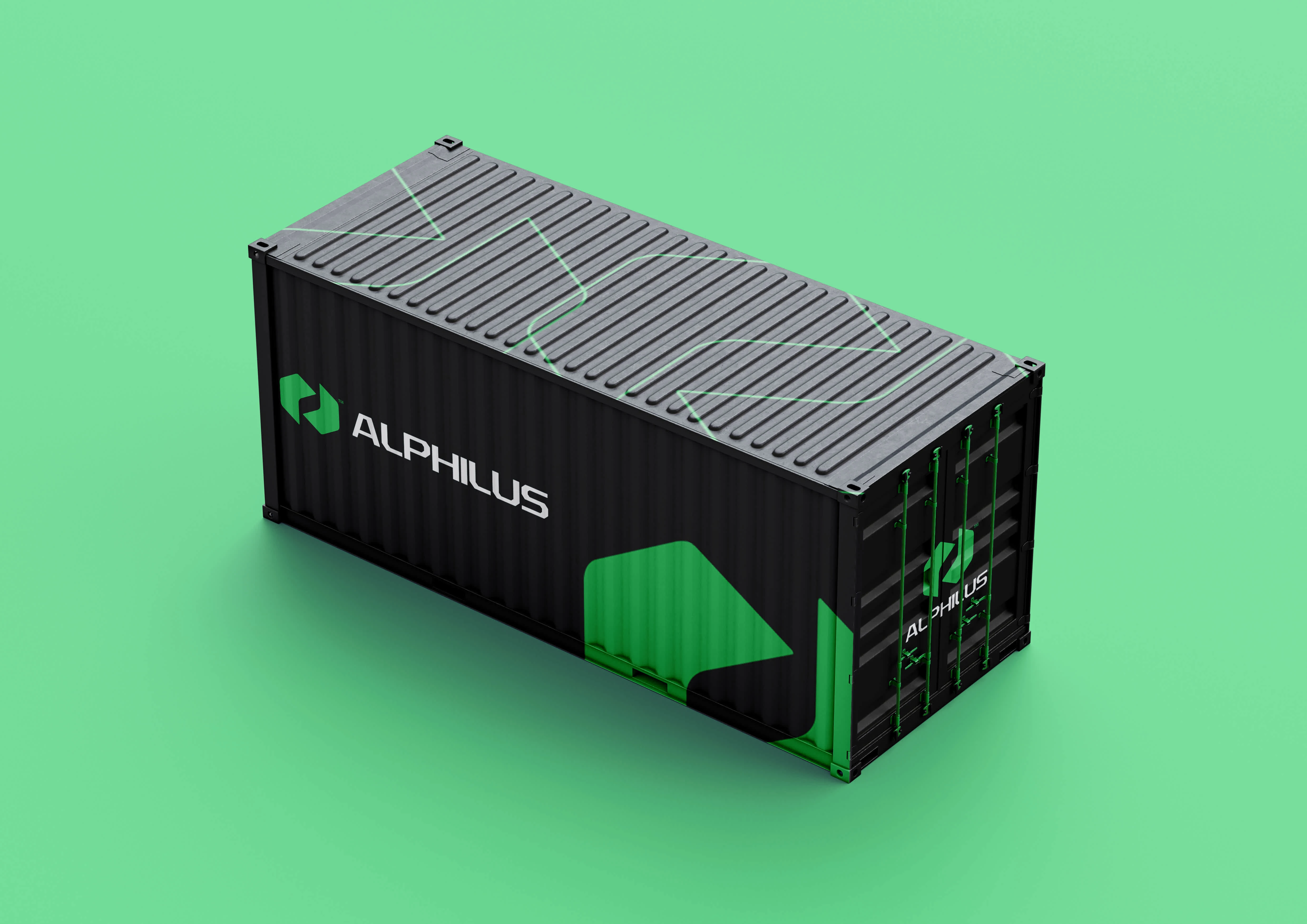
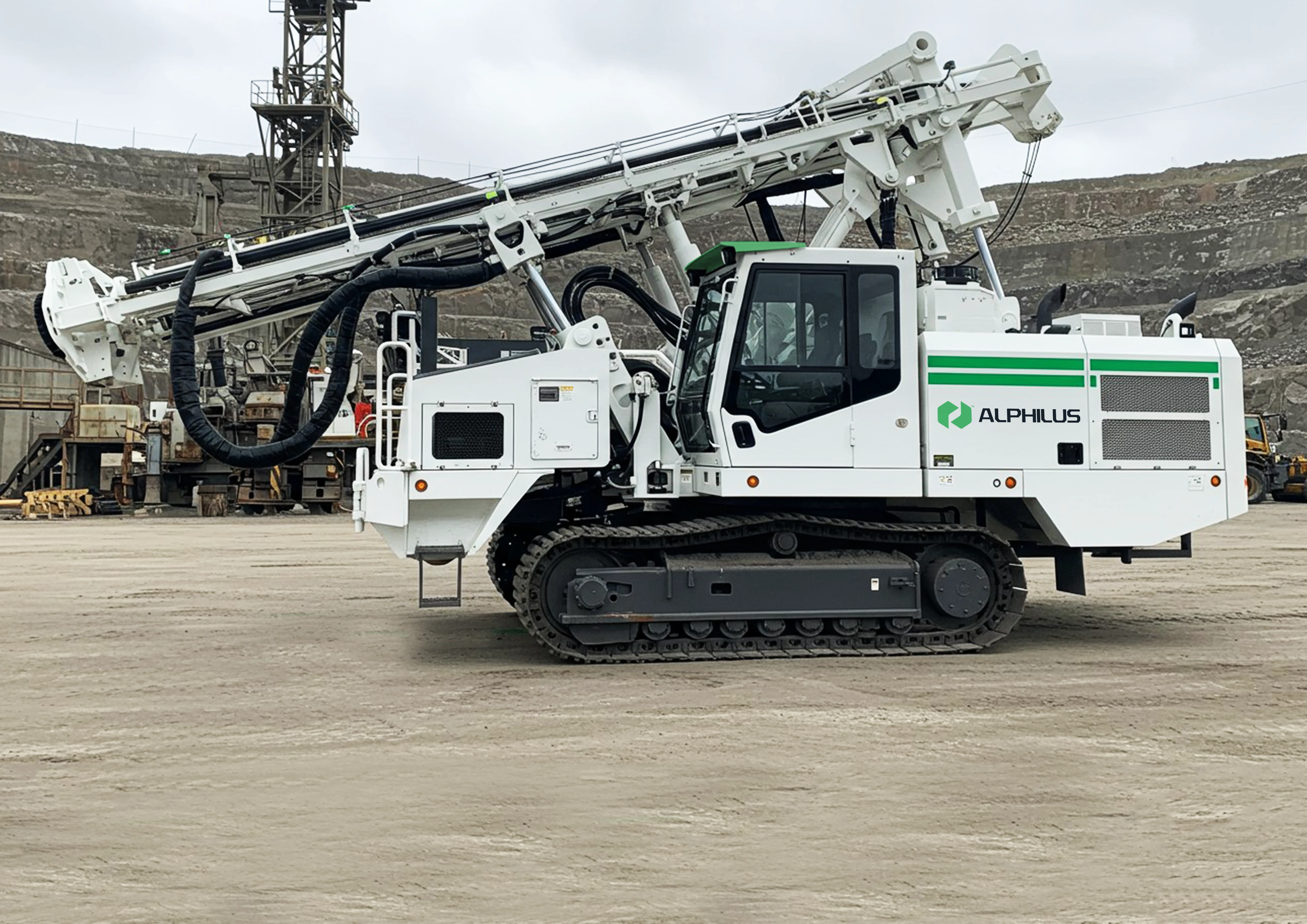
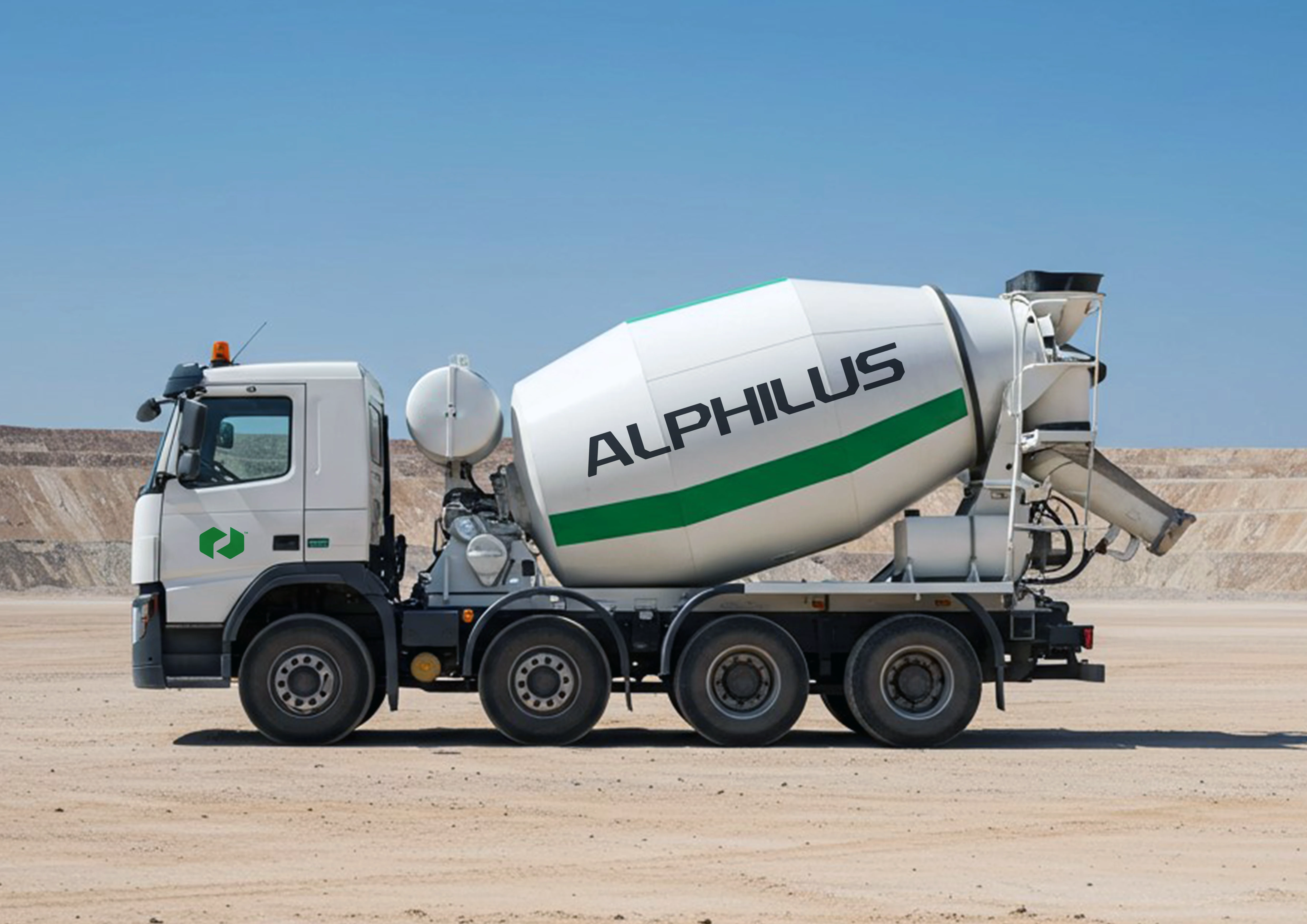
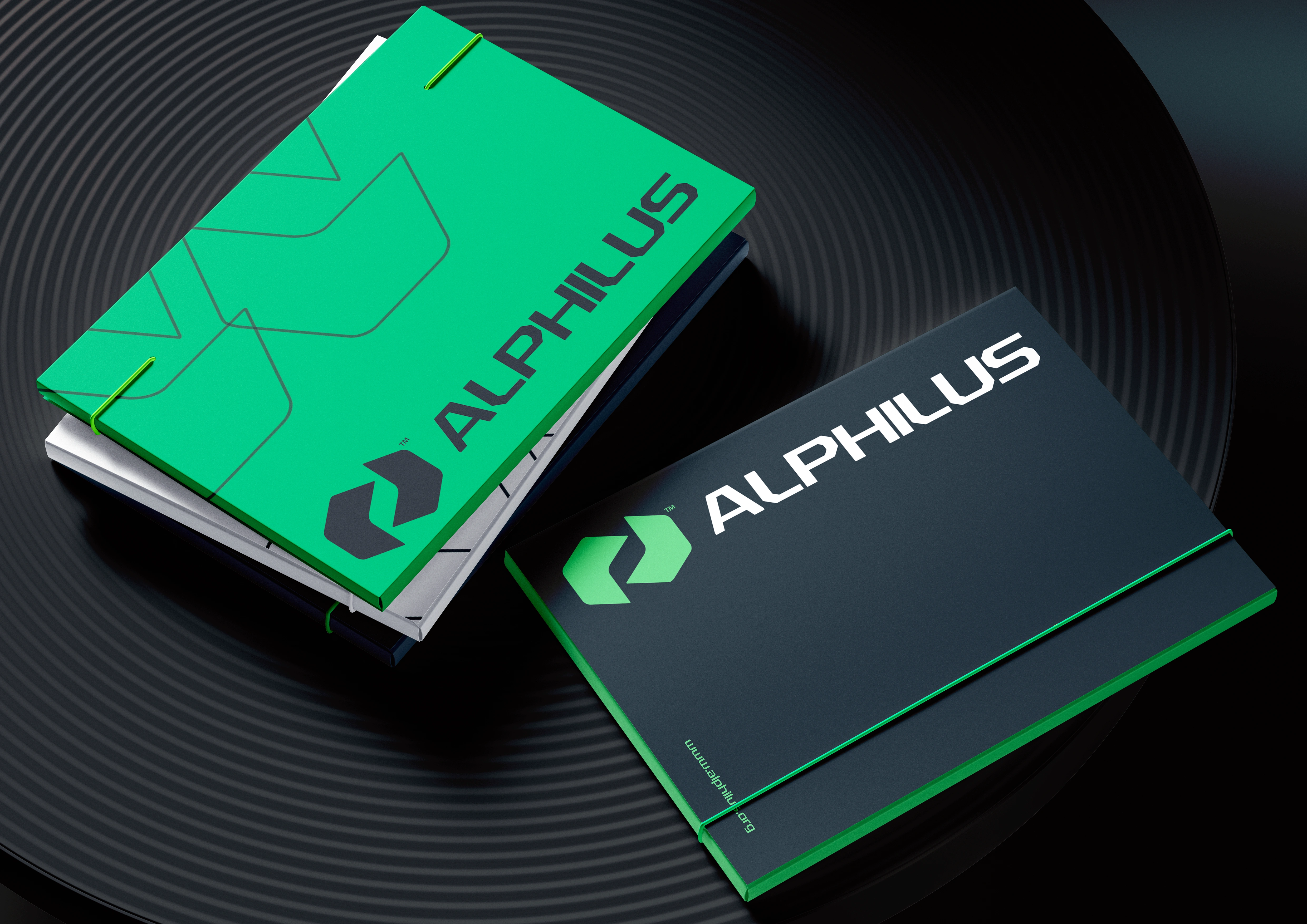
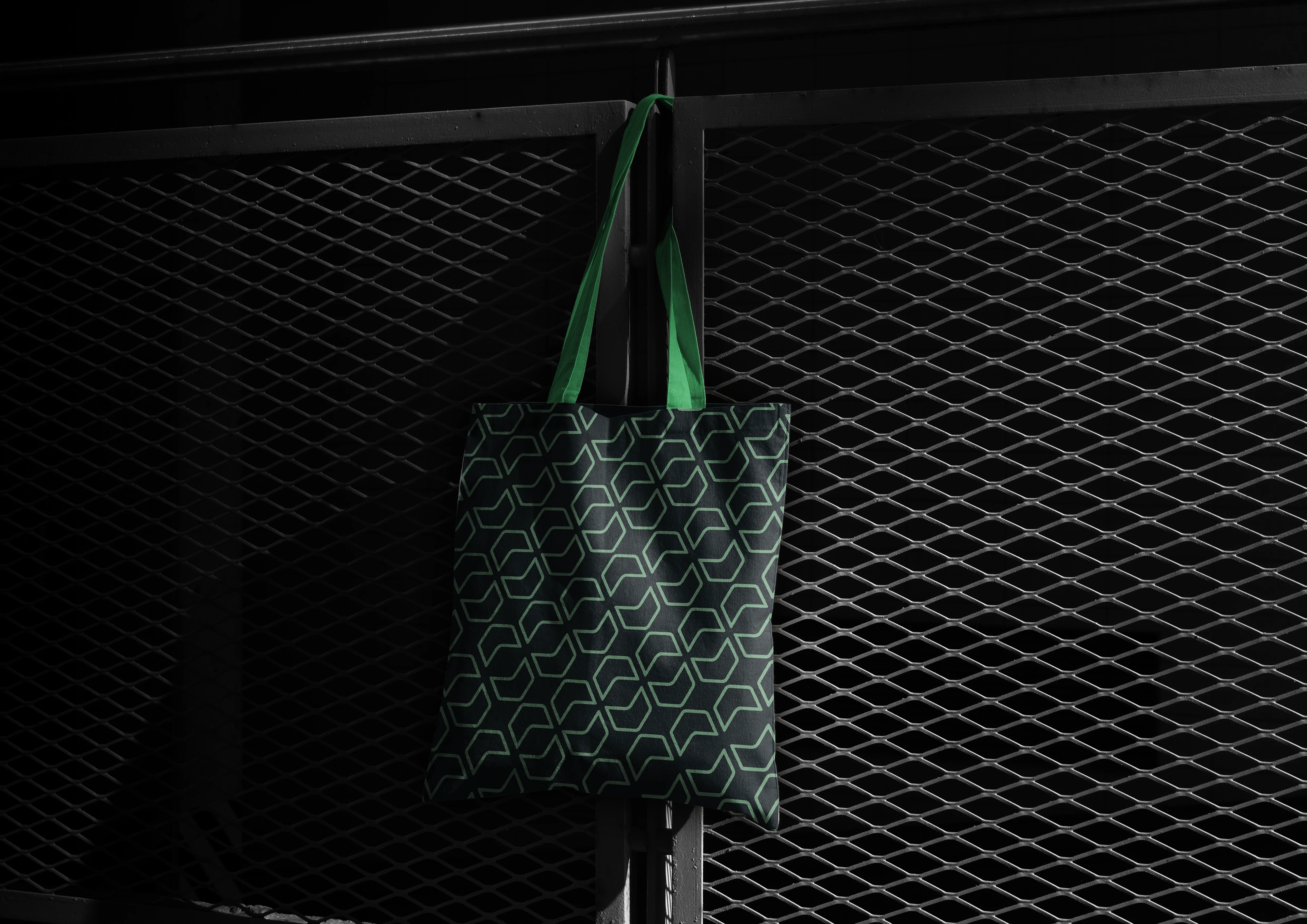
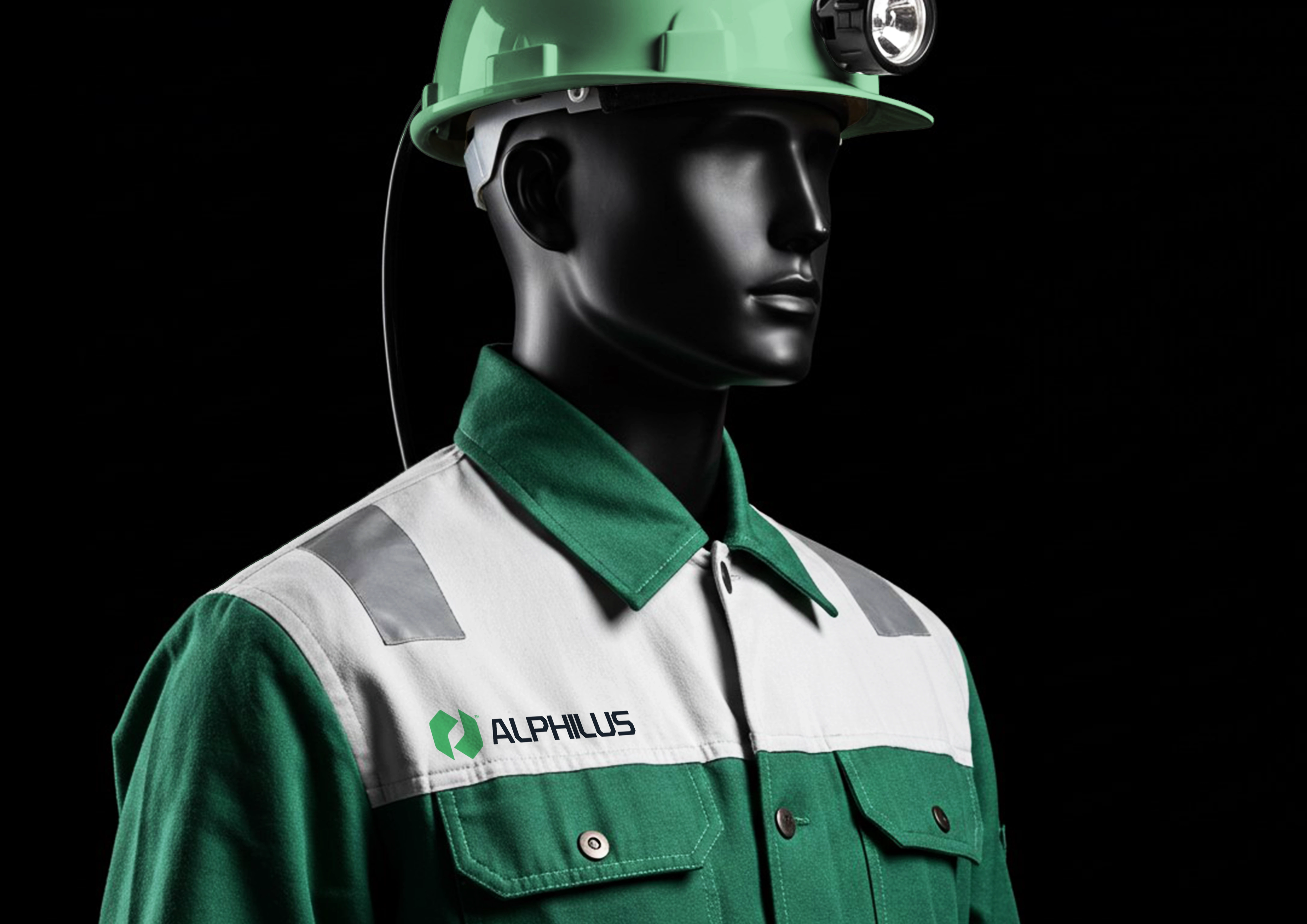
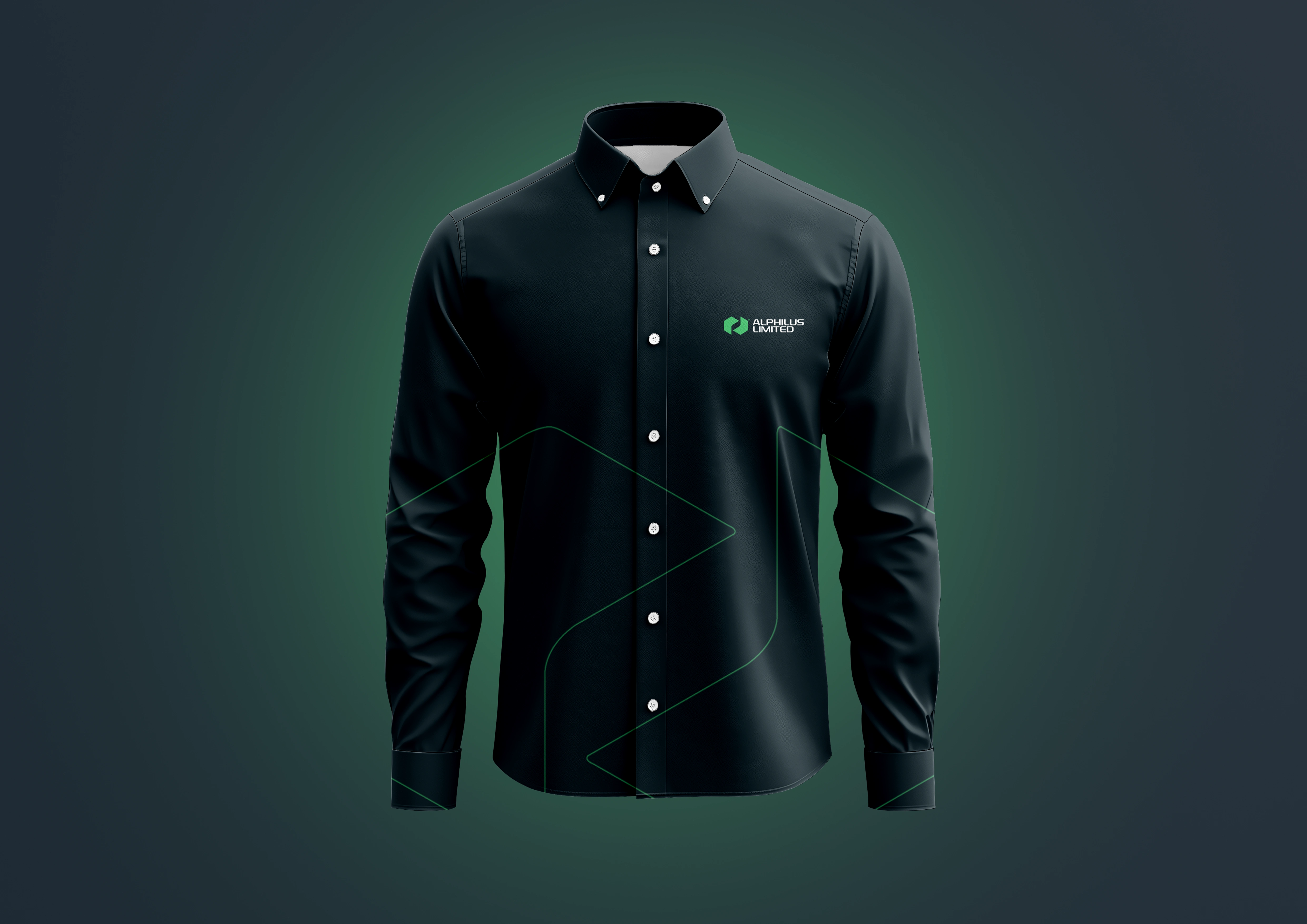
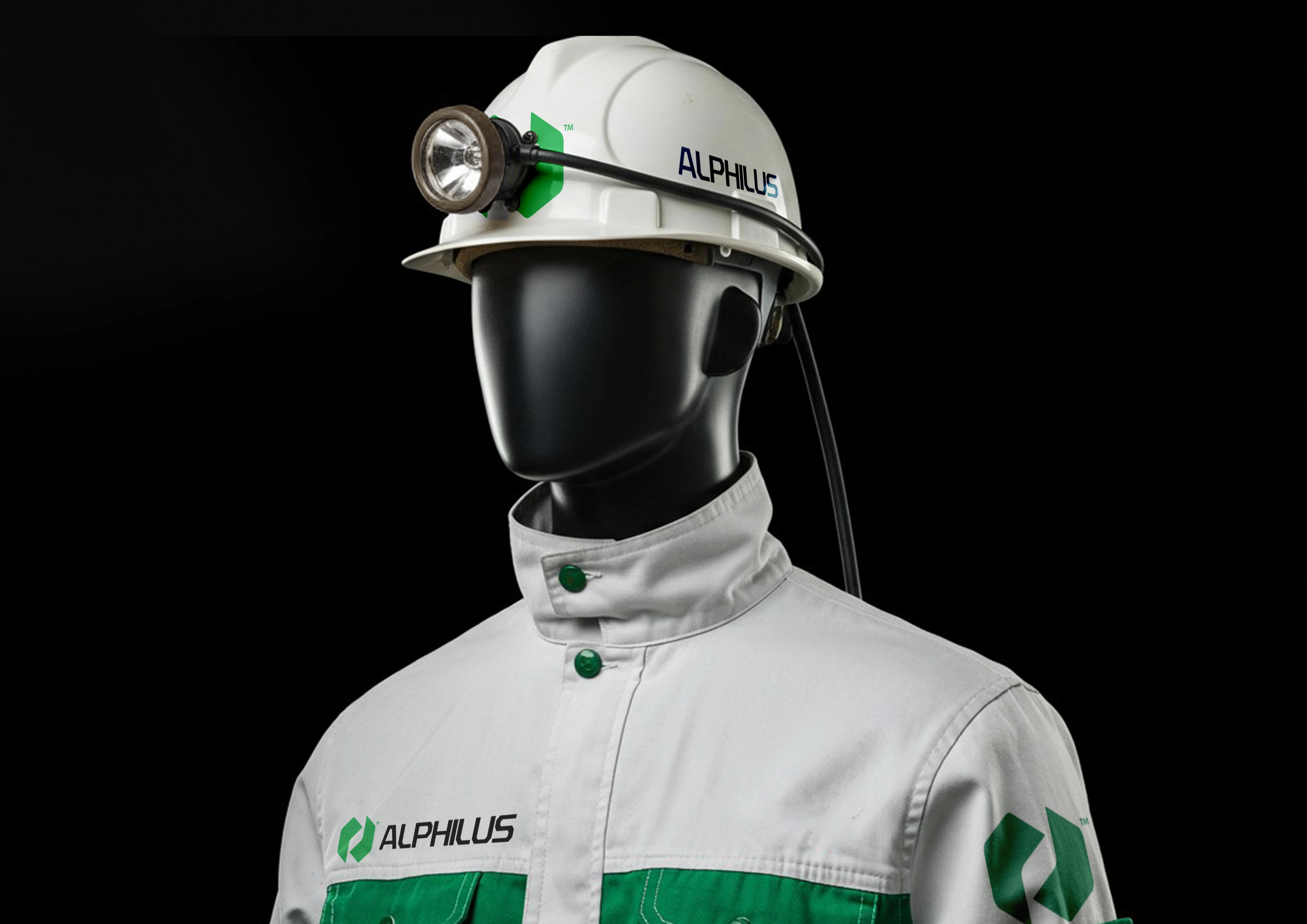
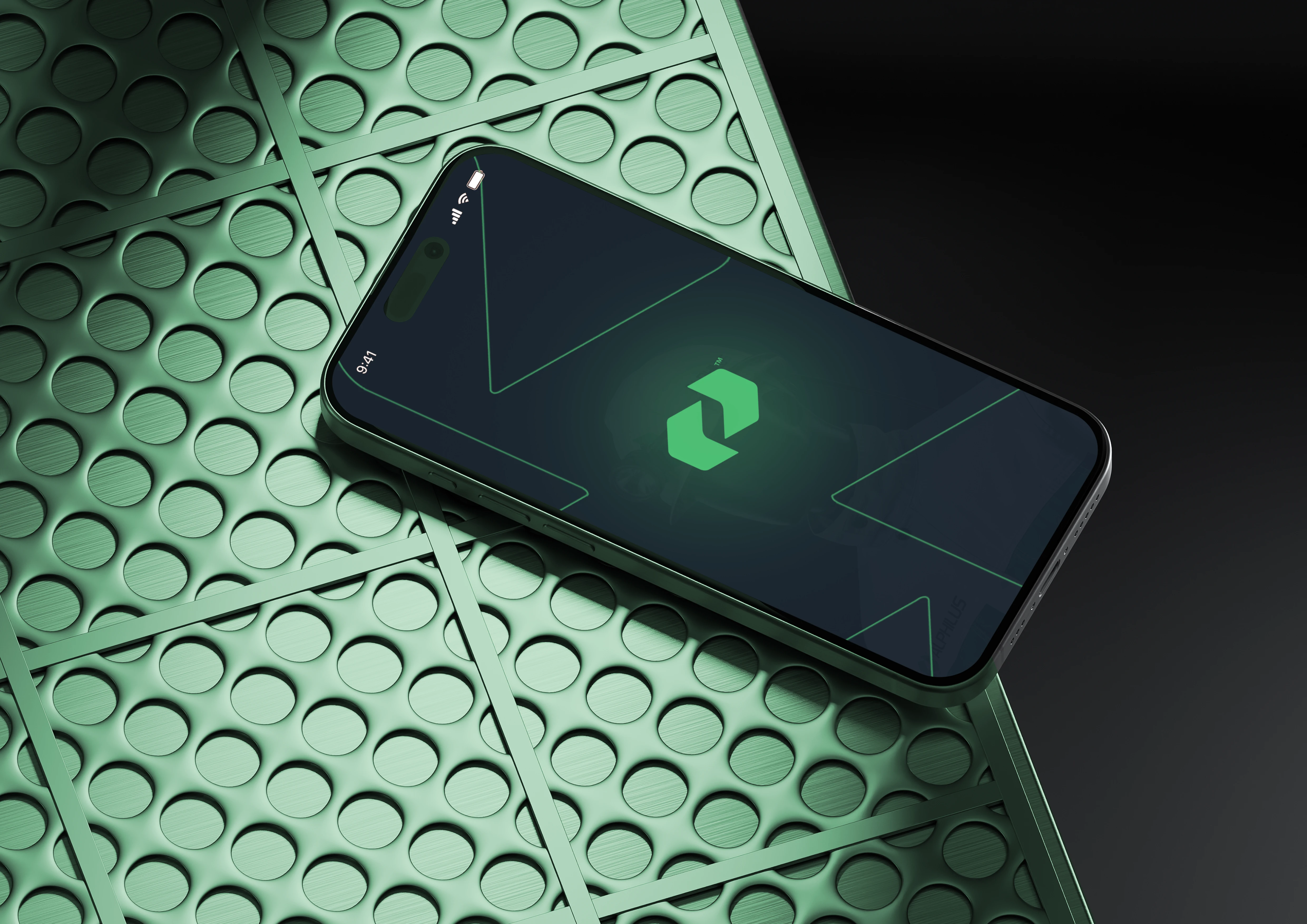
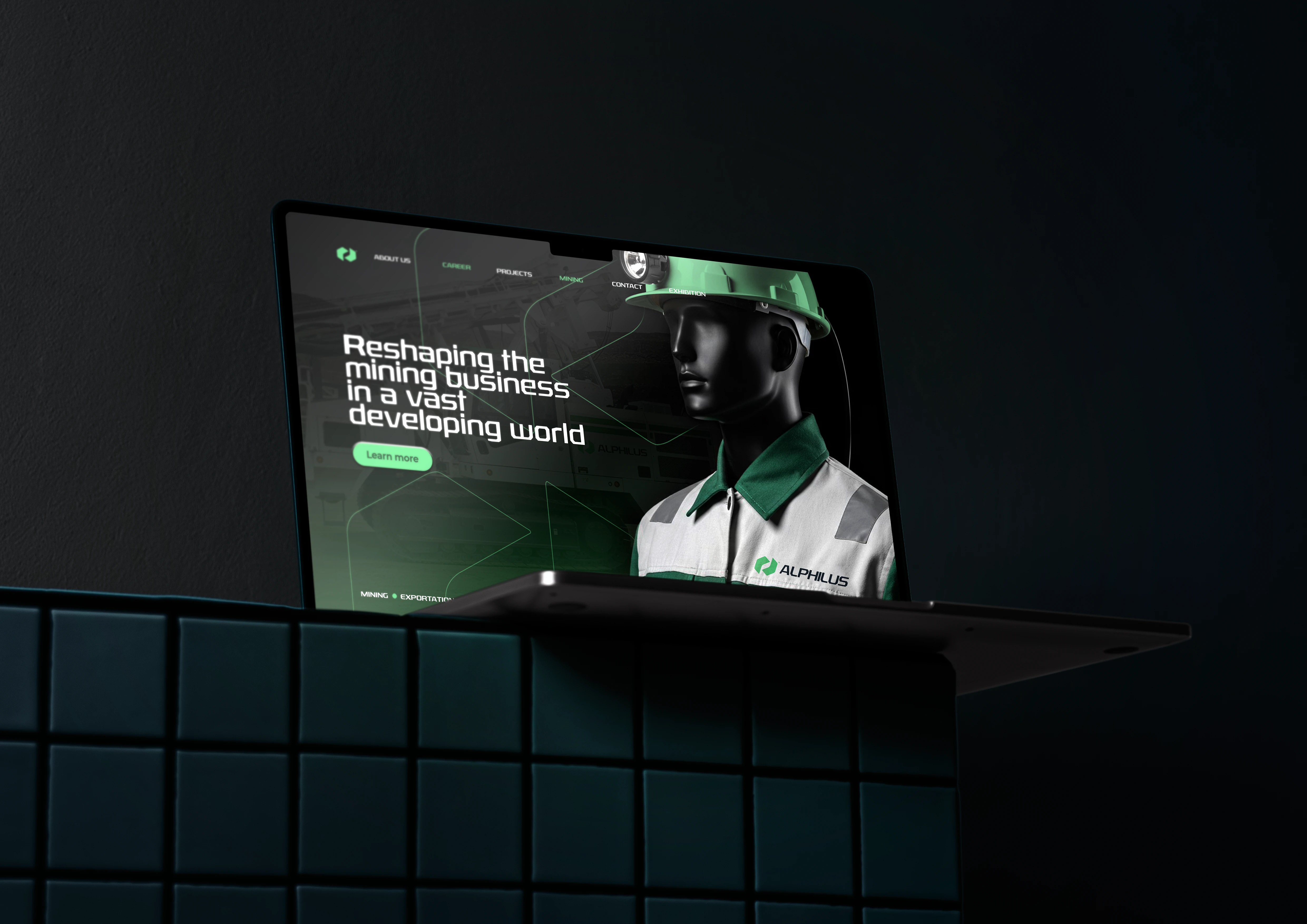
Mockup applications
Like this project
Posted Jan 22, 2025
A modern, cohesive brand identity design for Alphilus Ltd, an organization that specializes in mechanized mining, as well as import & exports of mined products.