Visual Concept + Digital Hub
Overview
Hero is a diverse group of companies dedicated to providing nutritious food using natural ingredients. To streamline various internal processes such as ticketing, communication, and upskilling, they needed an internal Digital Hub for desktop use.
This hub aimed to enhance communication and help employees organize their most important documents and guidelines. The ctrl QS team would be responsible for maintaining the hub.
Goals
Our primary goals were to deliver a fresh, intuitive experience while working with limited features. Our deliverables had to serve as a visual guide for all subsequent pages to be created within the Hub.
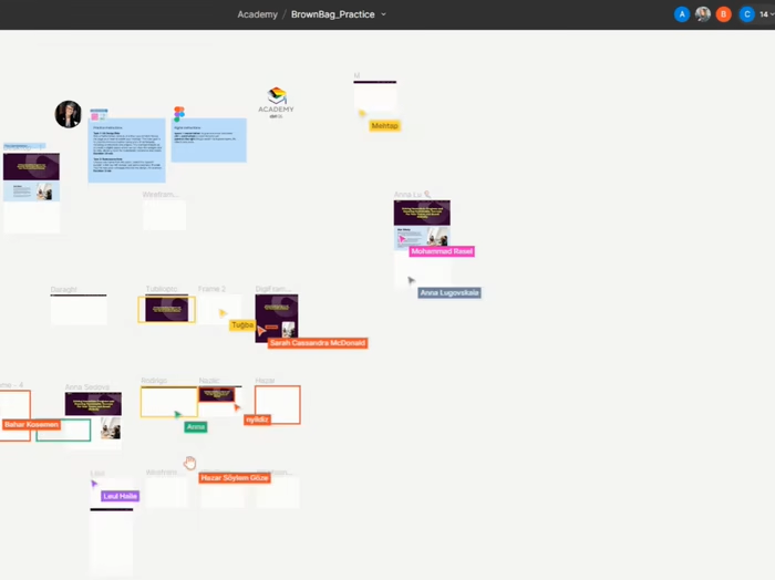
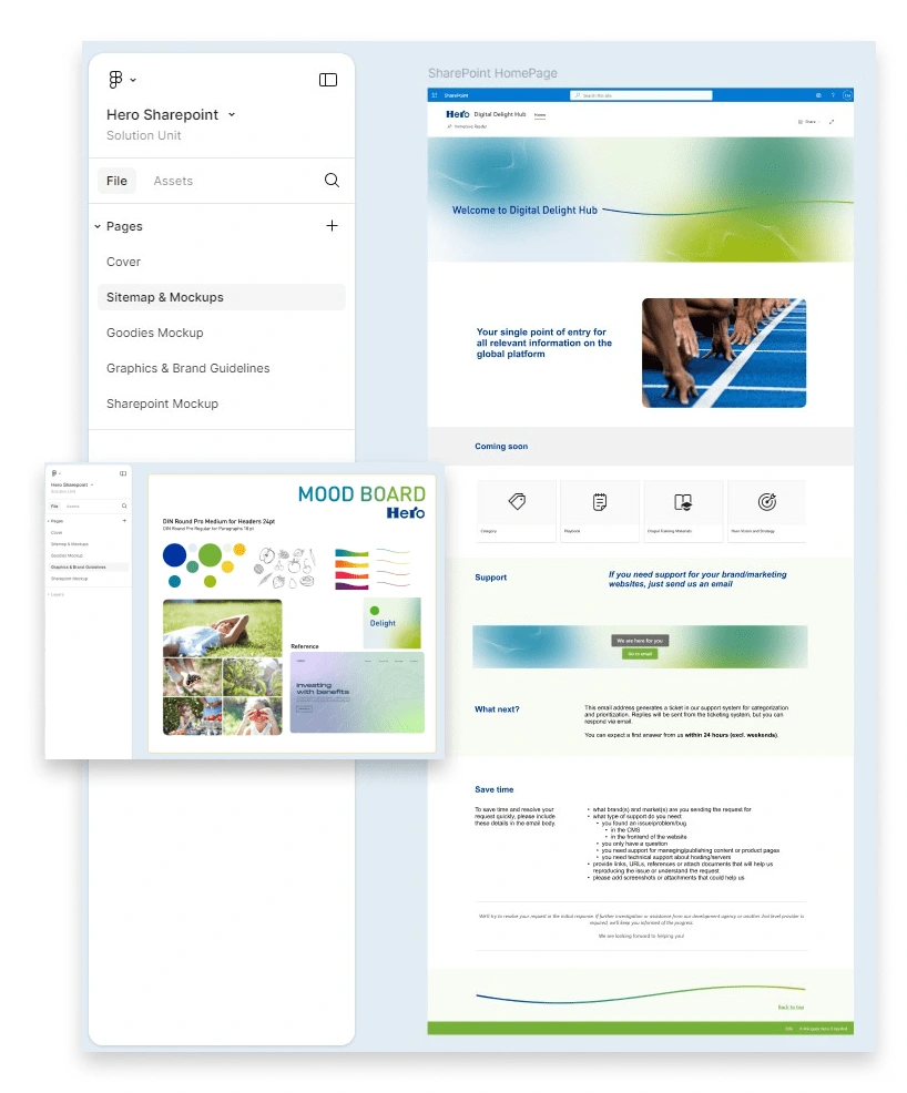
To ensure consistency and alignment with Hero’s brand identity, we created a comprehensive visual guide to assist the ctrl QS team, who would continuously update the Hub. Given the collaborative nature of a Hub, our Figma board had to be self-explanatory and easy to use.
Process
To achieve these goals, our first step was defining the site map and creating a Figma board to facilitate collaborative teamwork. We familiarized ourselves with Hero’s brand guidelines and designed a mood board to align new ideas.
Meanwhile, we developed mockups to identify the client’s needs and help them visualize what the Digital Hub would look like. With the design direction established, we created various assets, including banners and thumbnails, and set up the SharePoint site within Hero’s system.
Results
The Digital Hub, with its modern look and feel, significantly streamlined the ticketing process, guiding users to the appropriate actions with ease. It also enhanced the findability of essential information for over 4,000 employees, consolidating all necessary guidelines and documentation under one platform.
Confidential content. Unfortunately, I cannot share the link.
Like this project
Posted Jul 8, 2024
A Digital Hub asking for a modern look and feel, guiding users to the appropriate actions easily.
Likes
0
Views
8

