A1 Dixie – Dog Training Landing Page (Figma + Framer)
Jhulan Dey
🌐 A1 Dixie — Website Design & Build
Project Type: Portfolio Practice | Role: UI/UX Designer & Webflow Developer
Tools: Figma, Framer | Status: ✅ LIVE
🔗 View Project
🧠 The Challenge
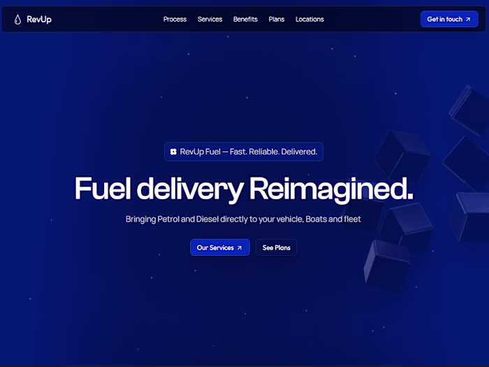
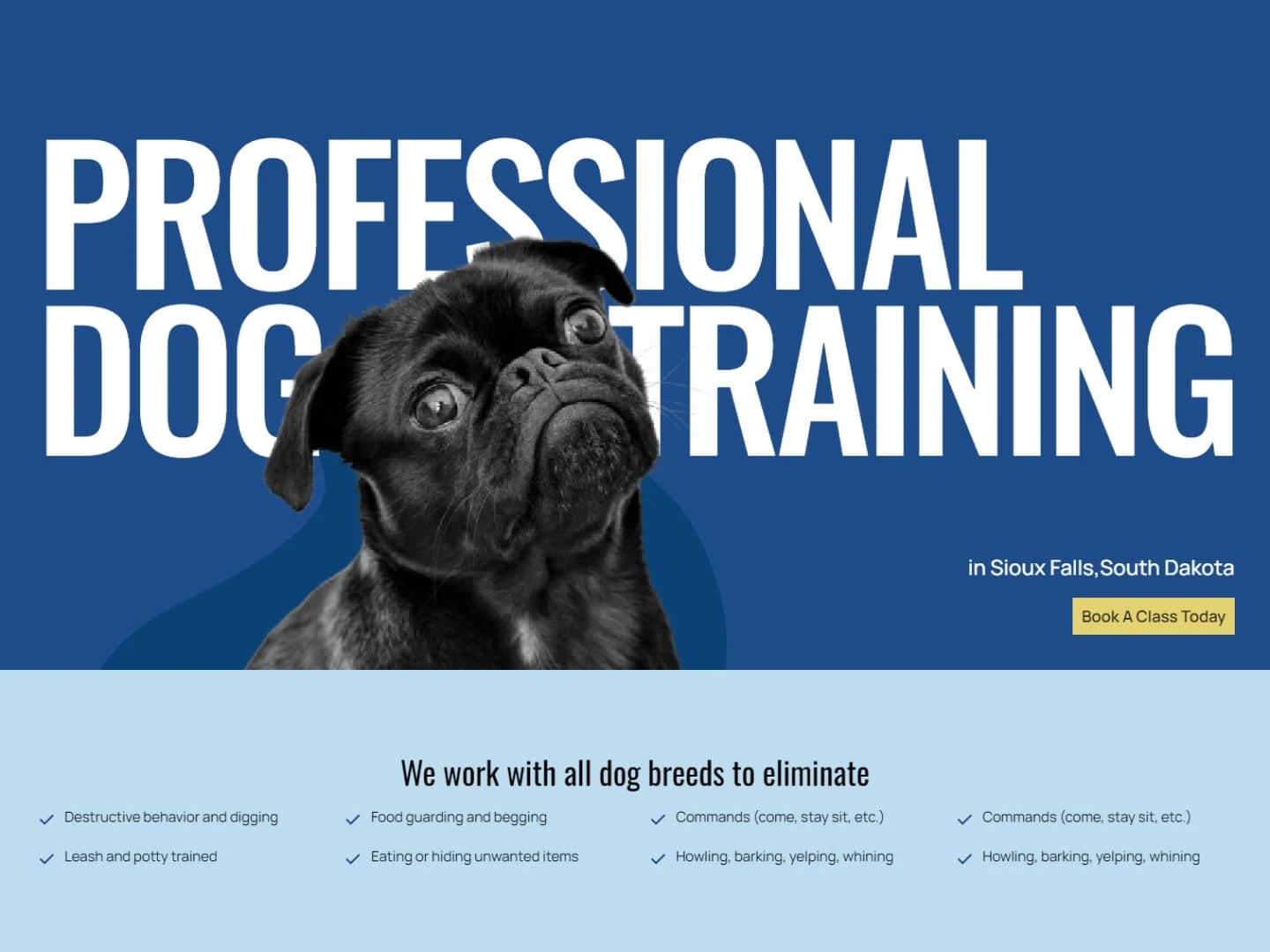
Reimagine and build a smooth, modern landing page for A1 Dixie — a concept brand inspired by a Flux Academy tutorial. The goal? Learn by doing, while refining interaction design, visual hierarchy, and responsive build workflows in Framer.
✍️ My Role
UI/UX Design: Wireframing, visual design in Figma
Web Build: Full build in Framer from scratch
Interaction Design: Hero section animations + subtle UX transitions in help section
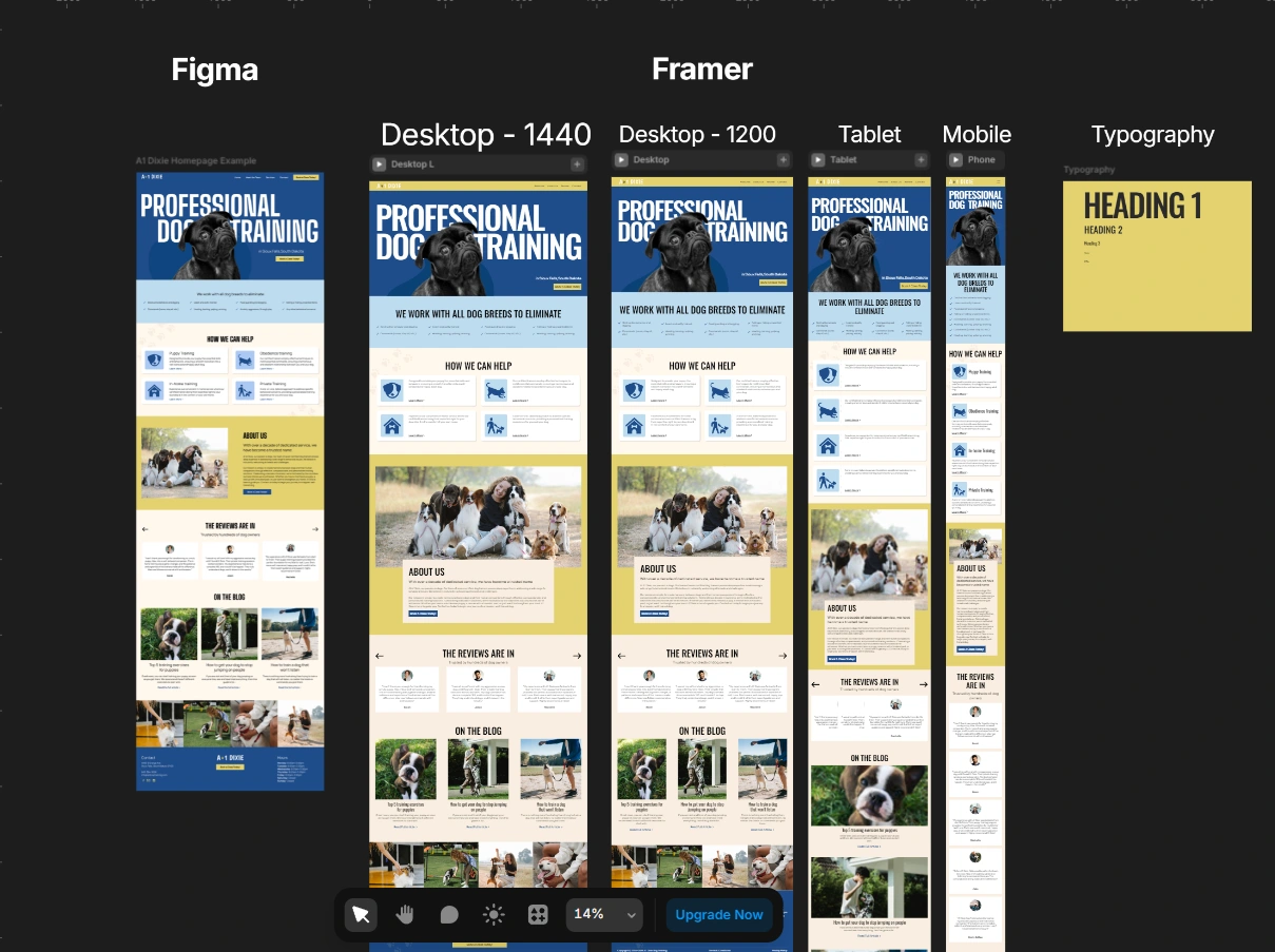
Responsiveness: Fully optimized across desktop, tablet, and mobile
🧩 Design Goals
✅ Clean, trust-building layout with modern typography
🎯 Create motion that supports, not distracts
⚡ Highlight clarity in user flow from hero to call-to-action
📱 Ensure seamless responsiveness across all breakpoints
🛠 Process
Inspired Learning – Started with a Flux Academy design tutorial
Personal Tweaks – Customized color palette, microcopy, animations
Built in Framer – Fine-tuned interactions, refined layout, tested responsiveness
Launched Live – Polished design and deployed the full site
🌟 Key Highlights
💡 Hero Section: Smooth scroll + reveal transitions
🔧 Help Section: Interactive toggles and section transitions
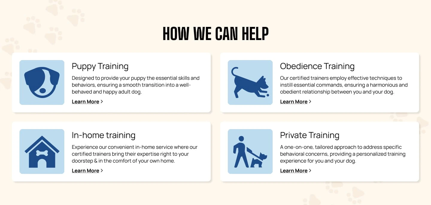
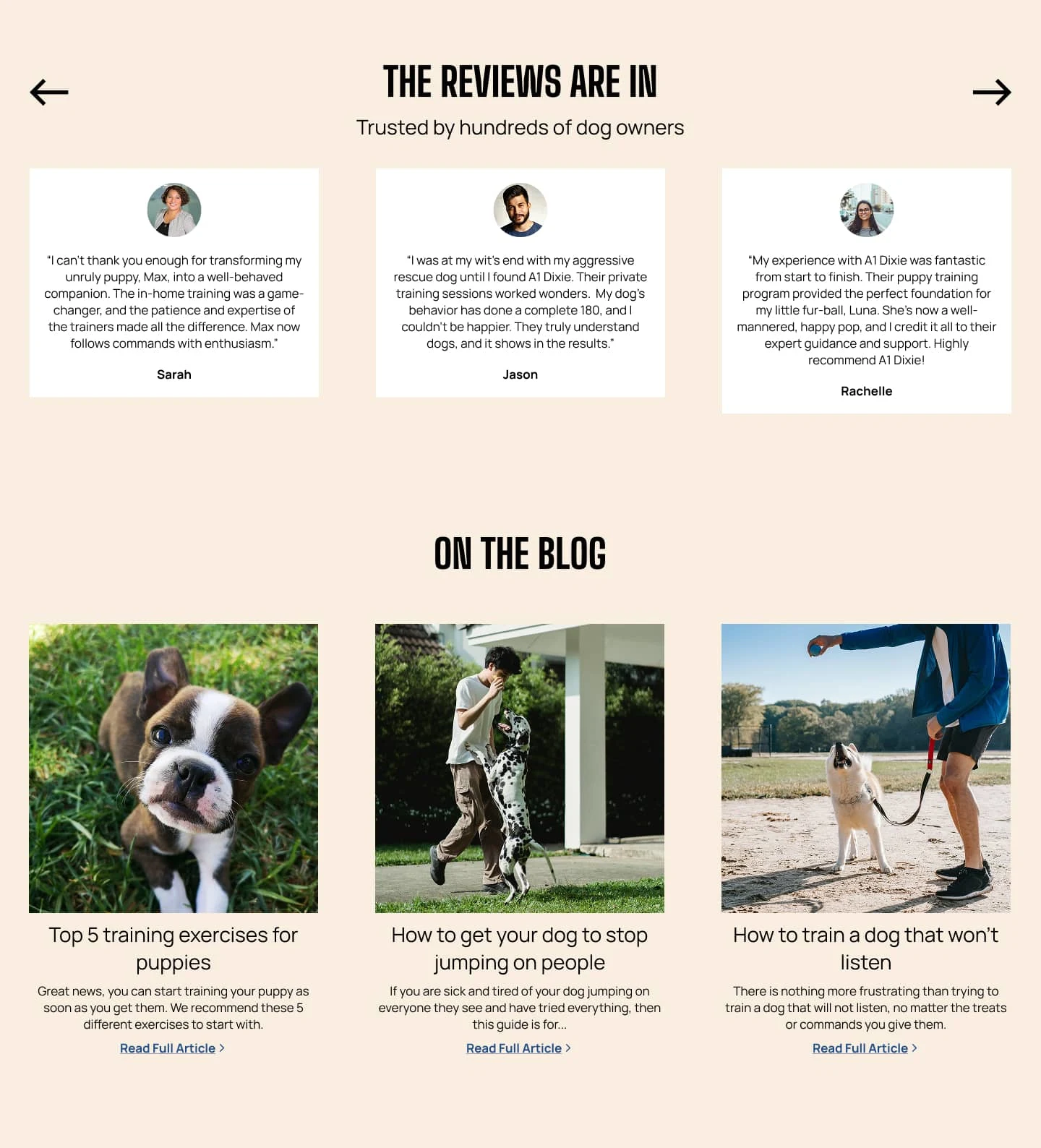
📝 Blog Section: Structured layout with scalable content cards for future SEO & engagement
🌍 Fully Responsive: Optimized for desktop, tablet, and mobile
🧪 Blend of learning + original design thinking
💬 Reflection
This project taught me a ton about refining animation timing, managing content hierarchy, and getting comfortable shipping full responsive builds in Framer. More than just a tutorial—this one became a personal milestone.
🔗 Links
💻 Live Site: A1 Dixie Website
Like this project
Posted Jun 1, 2025
Designed & built a responsive site for A1 Dixie in Framer. Smooth hero interactions, clean layout, and a UX-first approach from Figma to launch.
Likes
0
Views
12
Timeline
May 10, 2025 - Jun 1, 2025