Built with Framer
Brand Identity Concept for Synnk
Ronak Jain
Synnk — Brand Identity Concept
A calmer social space for real connection
Overview
Synnk is a conceptual social media platform designed for people who feel overwhelmed by today’s noisy, cluttered apps. The idea is simple — create a space that feels lighter, friendlier, and more playful without losing the fun of sharing moments with close friends.
My goal was to build a visual identity that makes the product feel calm, human, and energetic in the right places, while distancing it from the typical sharp and hyper-stimulating social app aesthetic.
Overview
Synnk is a conceptual social media platform designed for people who feel overwhelmed by today’s noisy, cluttered apps. The idea is simple — create a space that feels lighter, friendlier, and more playful without losing the fun of sharing moments with close friends.
My goal was to build a visual identity that makes the product feel calm, human, and energetic in the right places, while distancing it from the typical sharp and hyper-stimulating social app aesthetic.z
Challenge
Here’s the thing — most social platforms scream for attention.
Bright notifications, overloaded screens, heavy gradients. Everything pulls at the user.
The challenge was to create a system that:
feels fresh but familiar,
stands out without shouting,
supports both quiet moments and playful expression,
and remains flexible across UI, marketing, and product screens.
This was a concept brief, so the goal wasn’t to please a client — it was to see how far I could push simplicity and clarity while still keeping a strong identity.
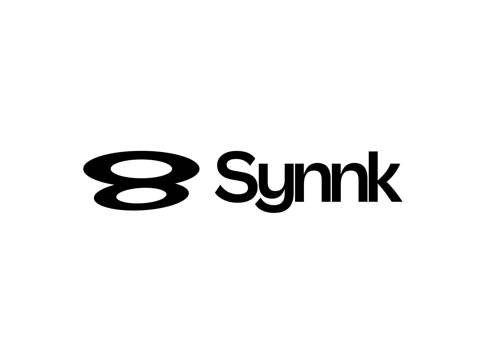
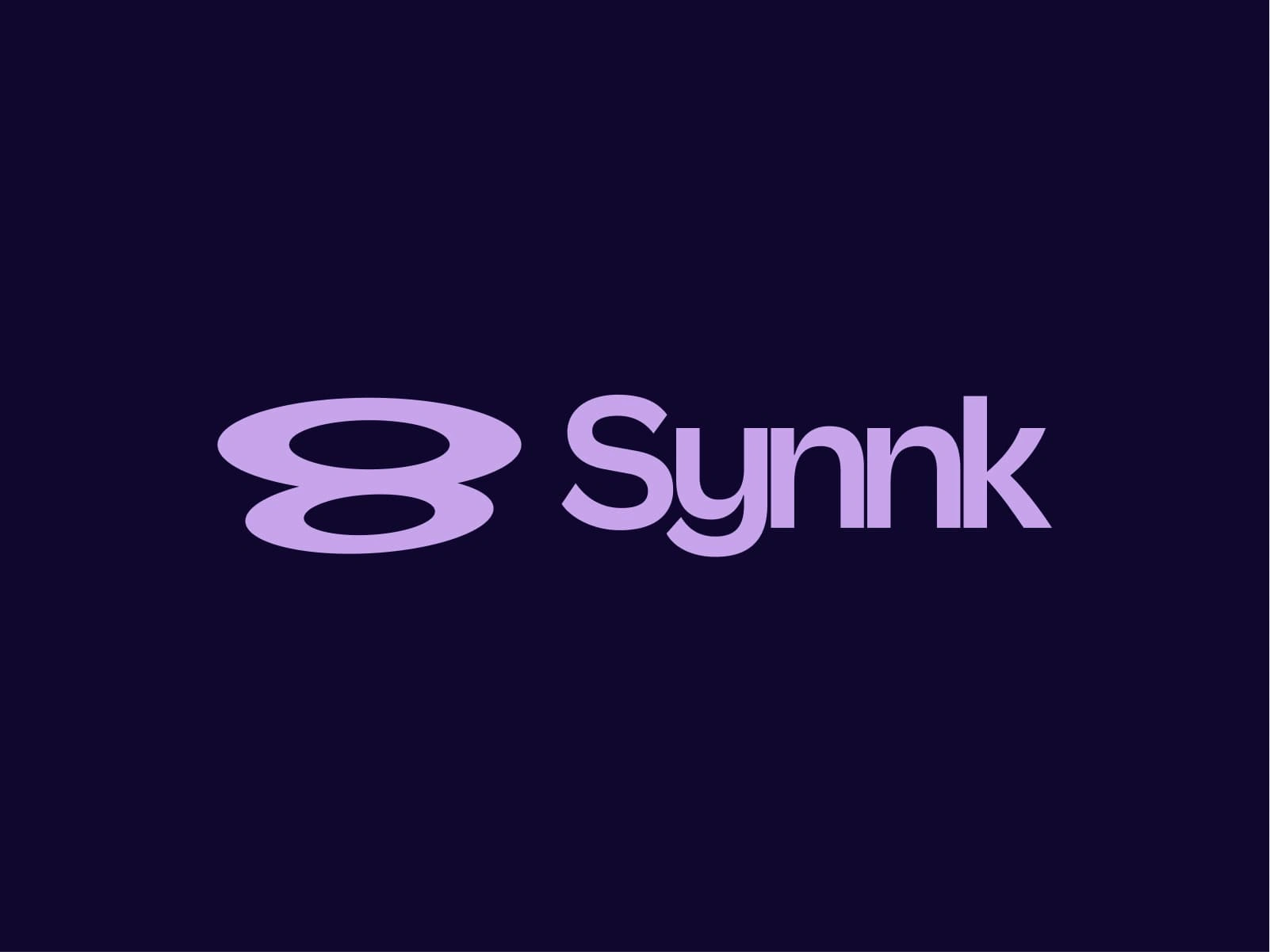
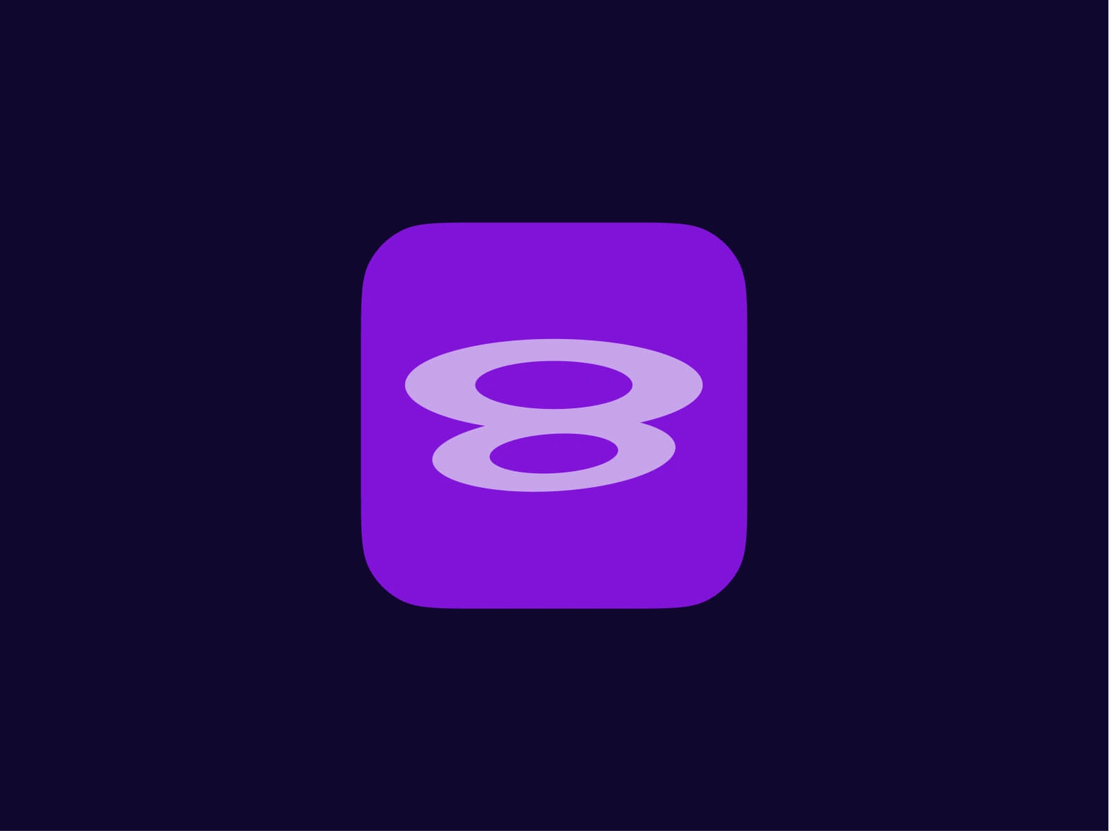
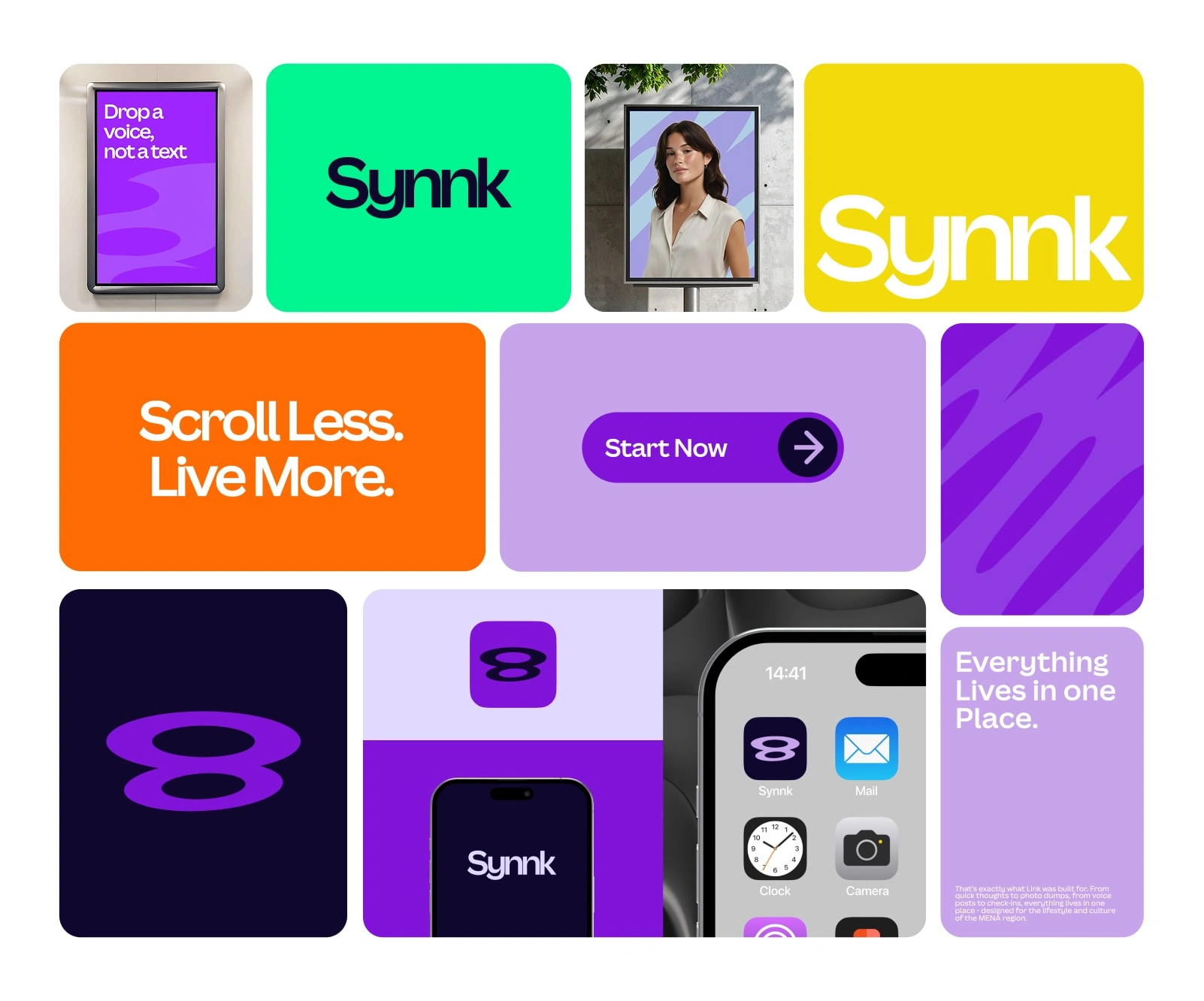
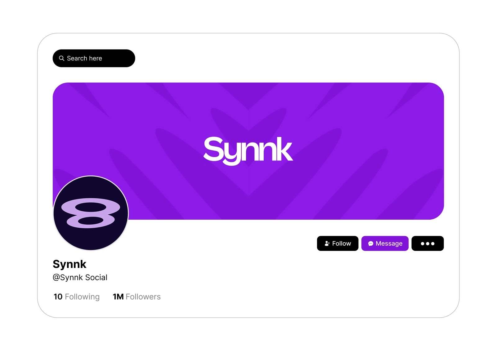
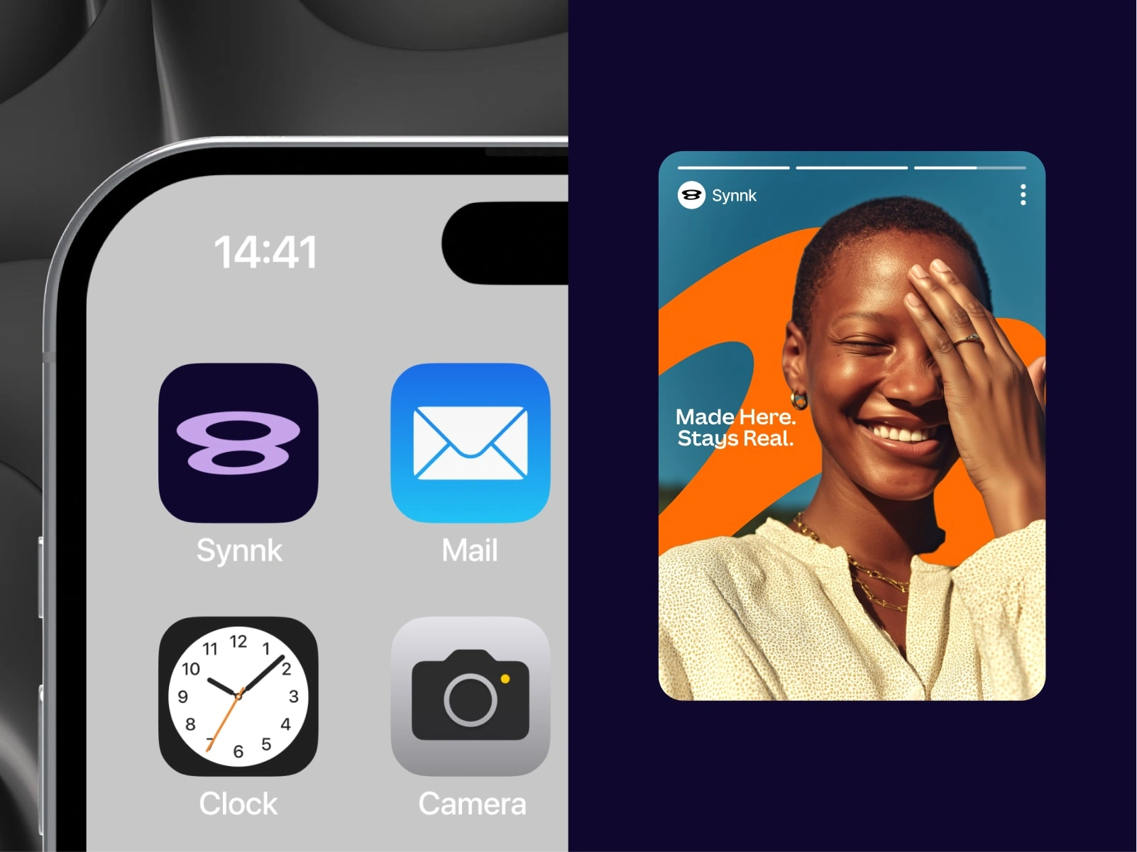
Logo & Symbol
The symbol is a fluid loop representing:
connection,
continuity,
and the ease of staying in sync.
The wordmark keeps a geometric balance — clean enough for digital use, unique enough to feel memorable.
I created three variations:
solid logo
outlined logo
reversed/logo on color blocks
Each works across light and dark themes.
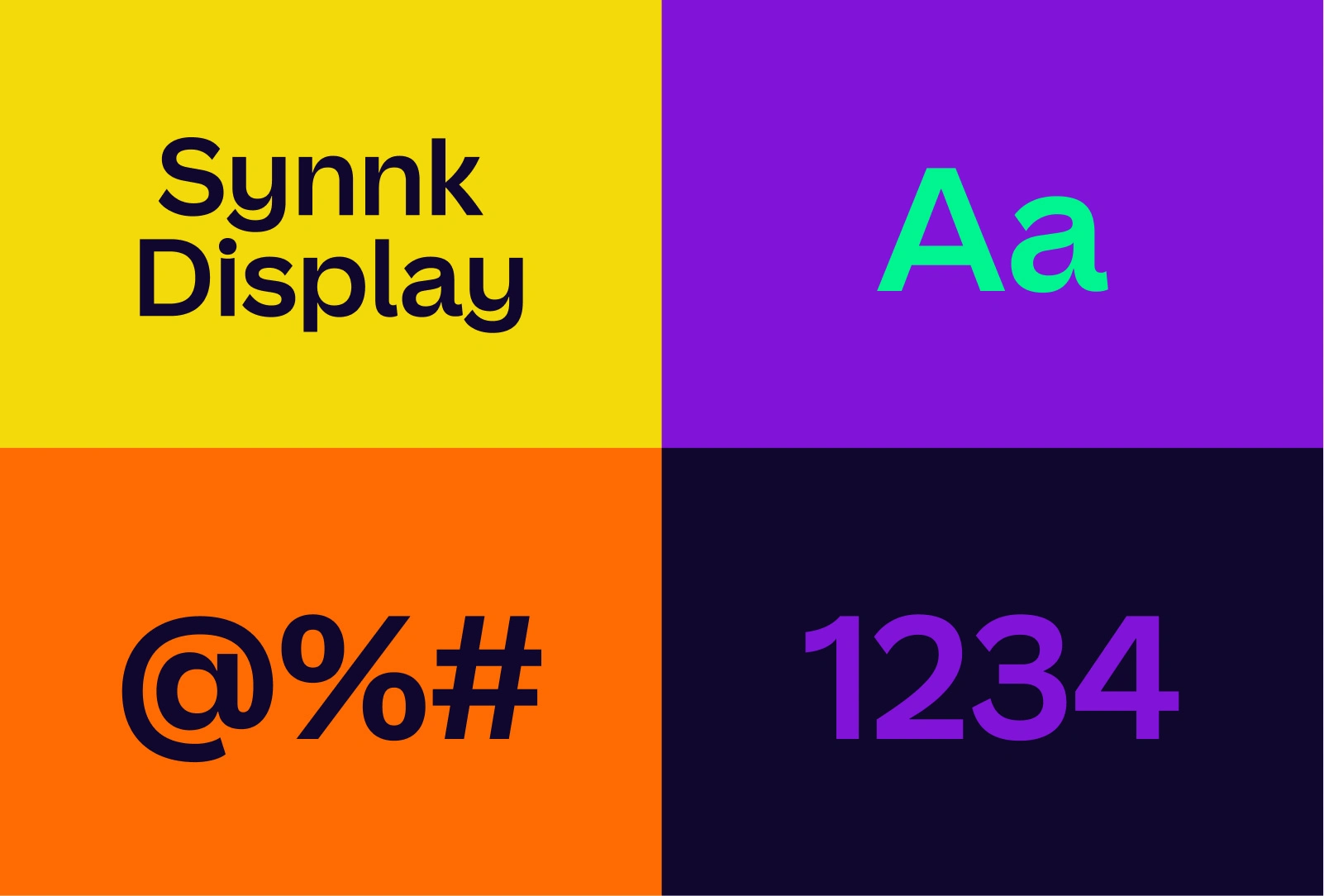
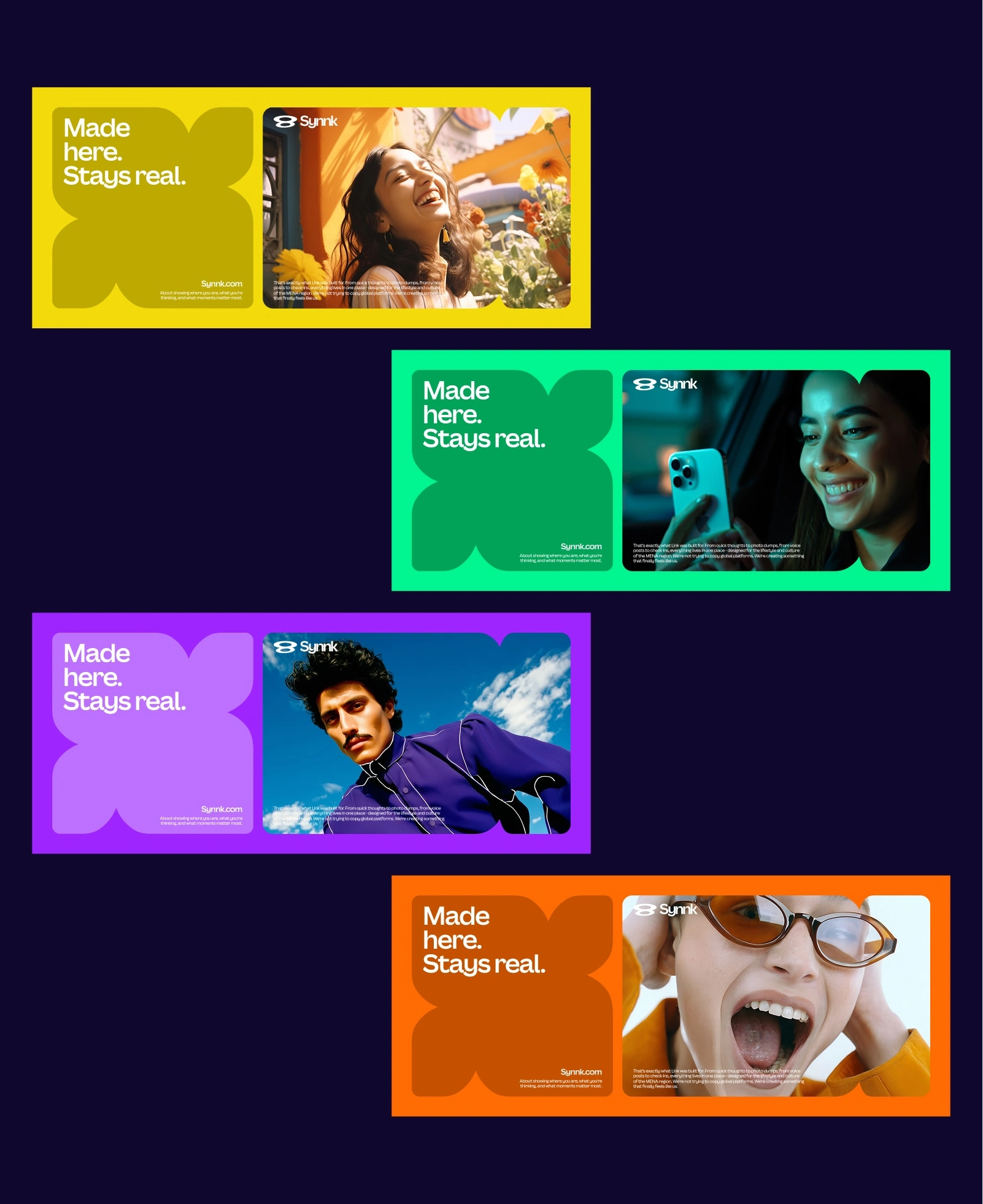
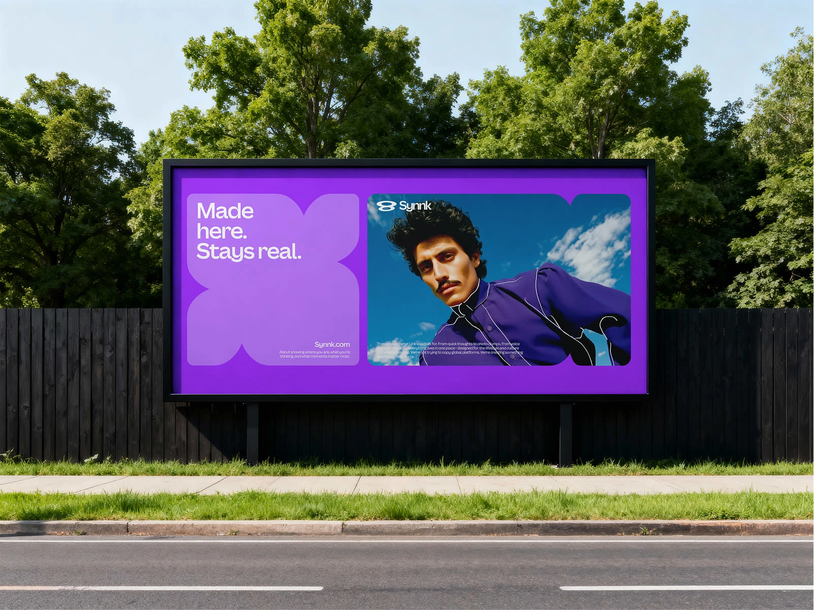
Color System
The palette combines:
Deep purple for trust and calm
Vibrant orange & green for energy and play
Clean whites to keep everything breathable
The key was contrast without chaos. Each color has a defined role so visuals feel intentional, not random.
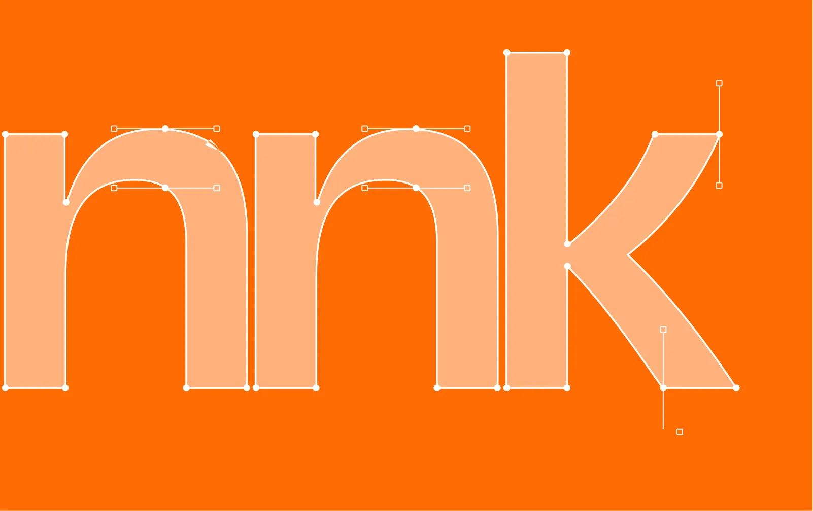
Typography
A modern, rounded sans-serif that:
pairs well with bold colors
feels friendly
scales beautifully across UI and marketing
Numbers and special characters were customized to keep the system tight and cohesive.
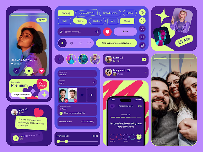
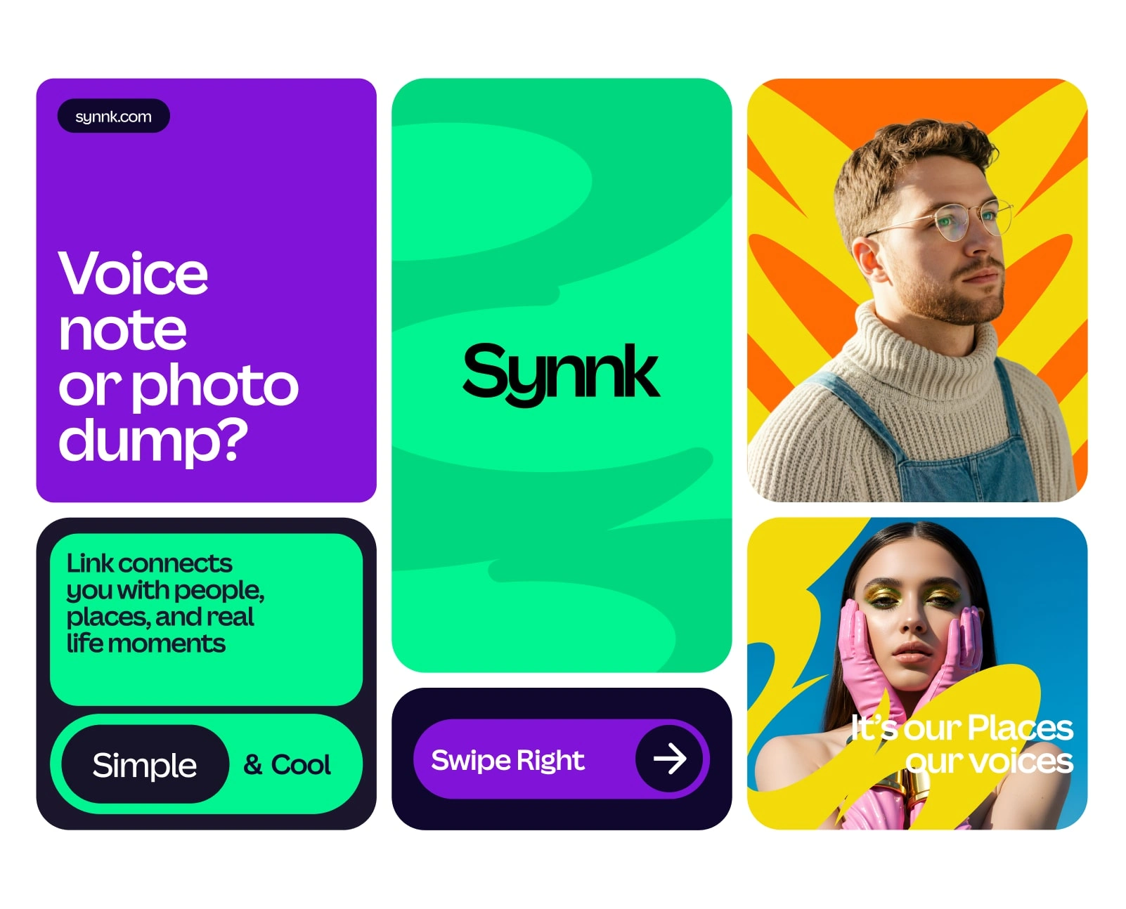
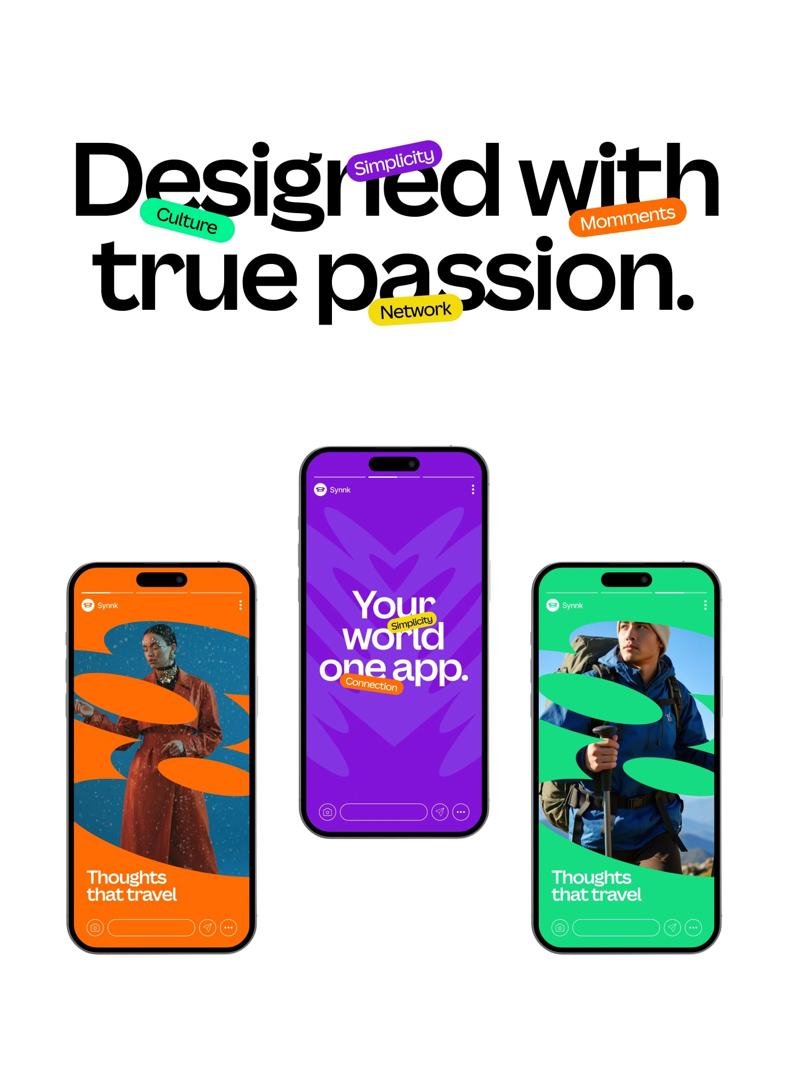
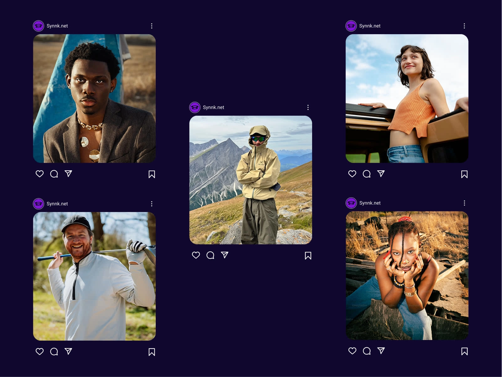
Visual Language
To bring the brand to life, I built:
content cards
mock social posts
outdoor billboard visuals
website layout mockups
app UI screens
device mockups (mobile + laptop)
The layout system uses grid-based cards, rounded frames, and playful overlays. It gives Synnk its personality without relying on loud effects.
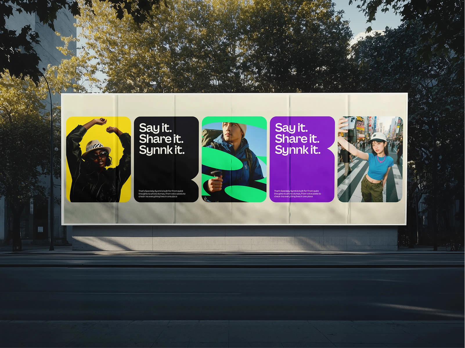
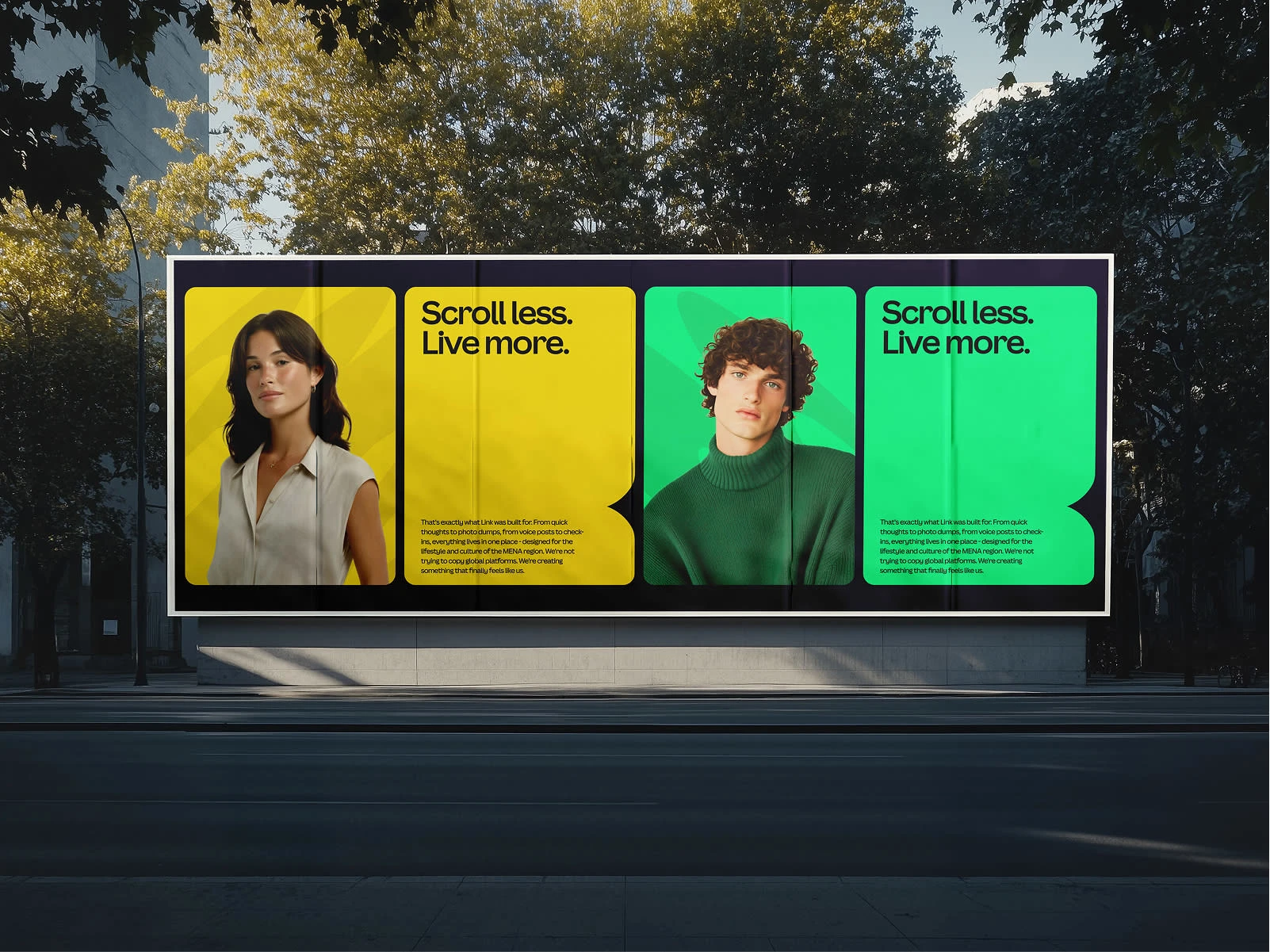
Marketing Explorations
To imagine Synnk out in the real world, I created:
billboard series
street signage
social ads
themed promotional layouts
The messaging angle was consistent — “simple, calm, and made for real connection.”
Outcome
This concept project showcases how a social media brand can feel modern without being overwhelming, and playful without being chaotic. The identity system is flexible enough for real product development and expressive enough for marketing.
In short:
A brand built for people who want connection without the noise.
Want something like this for your brand?
I help early-stage products build identities that feel clear, human, and memorable — not generic.
Like this project
Posted Jan 17, 2026
Designed a brand identity for Synnk, a conceptual social media platform.
Likes
0
Views
4