Brave's design system
Agustín Ruiz
Overview
When I joined Brave as a Product Designer, I encountered a familiar challenge that many rapidly growing companies face: a fragmented design system with inconsistent user experiences across different products and platforms.
What began as an initiative to bring order to this chaos evolved into Nala, a comprehensive design system that now serves as the foundation for all of Brave's products.
Impact and results
The implementation of Nala has transformed how Brave approaches product design and development. Some highlights are:
Efficiency gains
Significantly reduced time spent on component creation and reduction of duplicate occurrences.
Substantial decrease in design inconsistency reports.
Notably faster design-to-development handoff time.
Eliminated orphaned design tokens through cascading updates: changes to foundational tokens (like a color shade) now automatically propagate across all products and instances, ensuring complete system-wide consistency.
New Chromium features are not headache inducing for us anymore. If they add or change something, we can probably just take it in without needing to spend days or weeks patching up our customization layer (not always, of course).
Resource utilization
Reduced design debt across all products. Now updates don't even require coordination from designers or developers from a pod to make any changes, they come from upstream to all teams at once.
Decrease component-related bug reports.
Achieved high component reuse rate across new features.
Significantly reduced new features development time.
Fostered cross-team collaboration through shared component development: developers from different pods now contribute to a central component library, reducing duplication of effort and increasing knowledge sharing across teams.
Prevented component duplication through centralized oversight: my role provides a company-wide view of all design work, allowing me to identify opportunities for component reuse and standardization across different products and teams.
Team impact
Markedly increased designer productivity and reduced time spent sweating out little details or figuring out component edge cases.
Shortened development cycles for major features.
Achieved widespread design system adoption across teams.
Substantial reduction in development hours and QA testing times.
My role
As the Design System owner and later DesignOps Lead, I spearheaded the creation and evolution of Nala from its inception to its current mature state. My responsibilities included:
Architecting and building the design system from the ground up.
Creating and maintaining product libraries across all platforms.
Creating flexible components, and making sure they were adaptable to as many requirements as possible, giving designers more freedom of use.
Establishing processes for design-to-development handoff and component documentation.
Facilitating communication between design, product and development teams.
Leading the migration to a Material Design-based token architecture after Chromium's 2023 material you update.
Nala: a three-layer approach
Rather than creating a one-size-fits-all solution, I developed a three-level architecture that balanced consistency with flexibility:
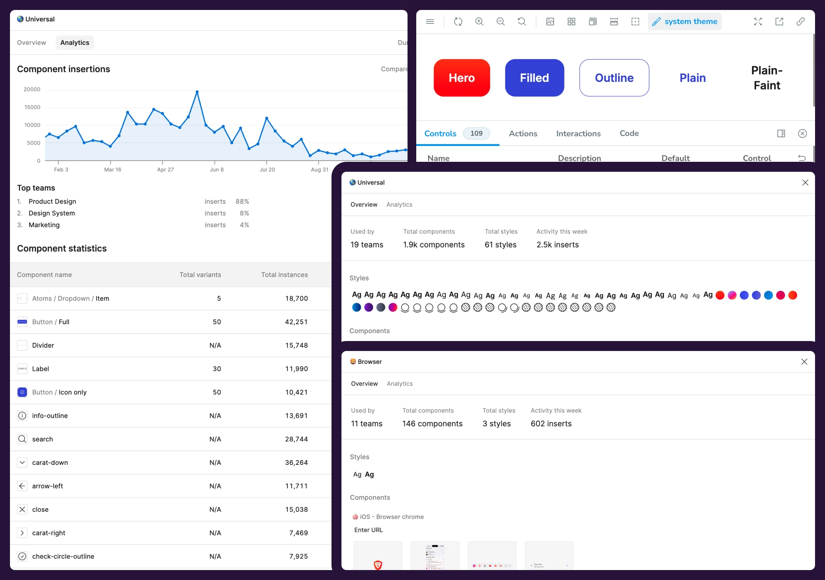
Universal foundation
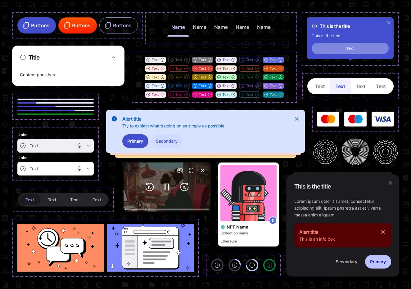
At the core of Nala lies a universal library containing shared elements that maintain consistency across all Brave products:
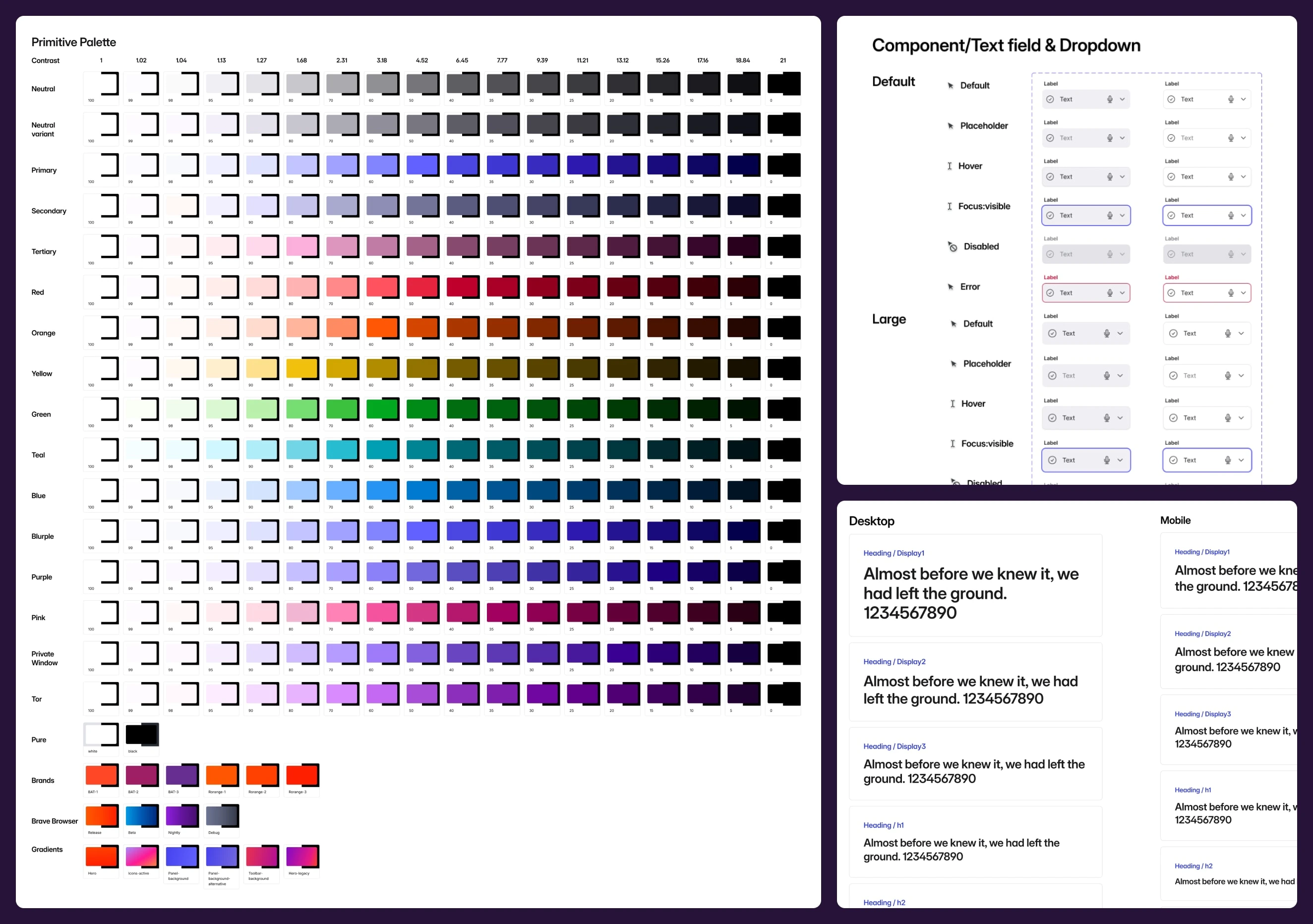
A perceptually uniform color system with predictable contrast ratios.
Typography foundations.
Basic components (buttons, inputs, tooltips, illustrations, icons, etc.).
Cross-platform design tokens.
Platform libraries
The second layer addresses the unique requirements of different platforms:
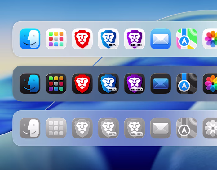
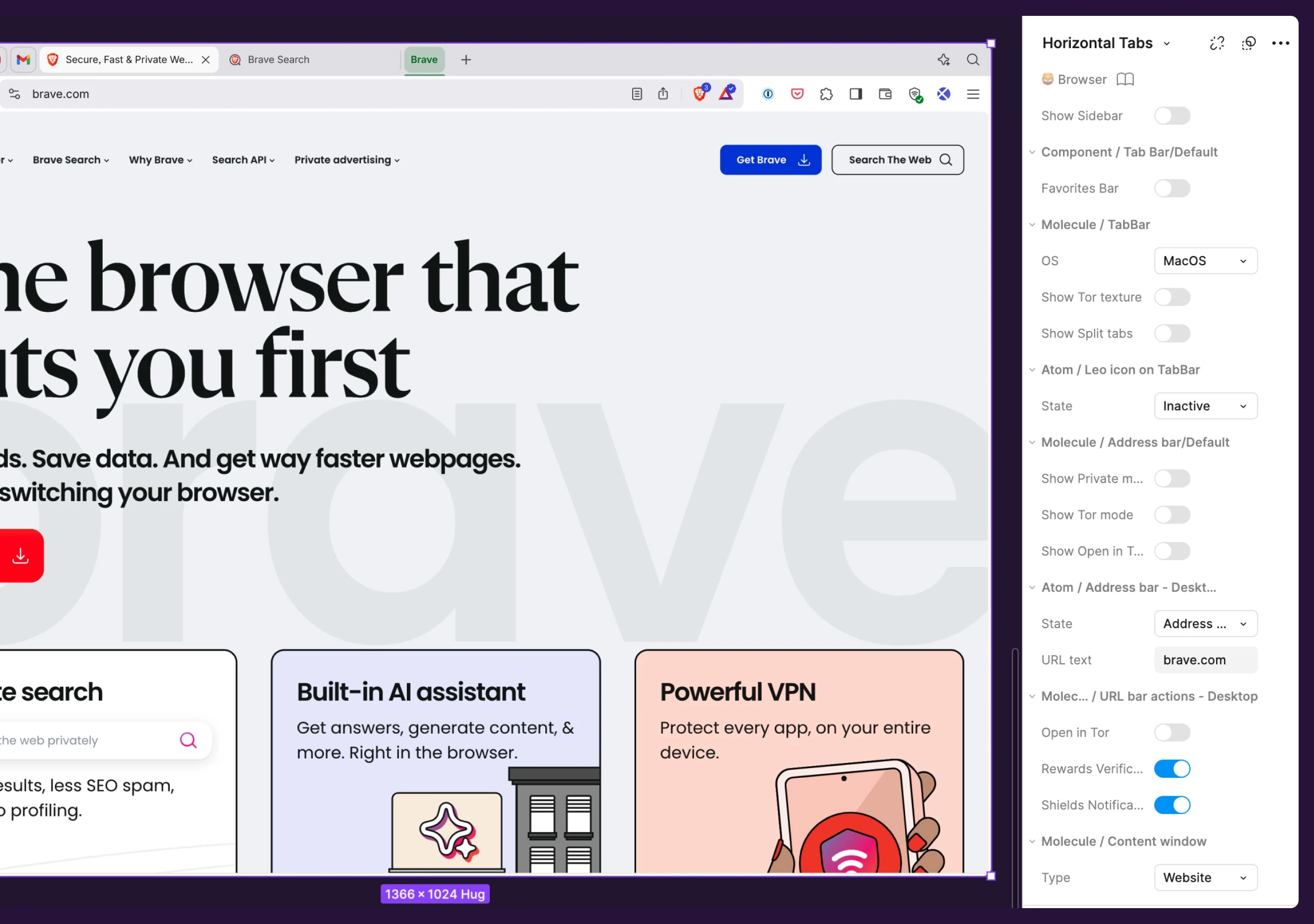
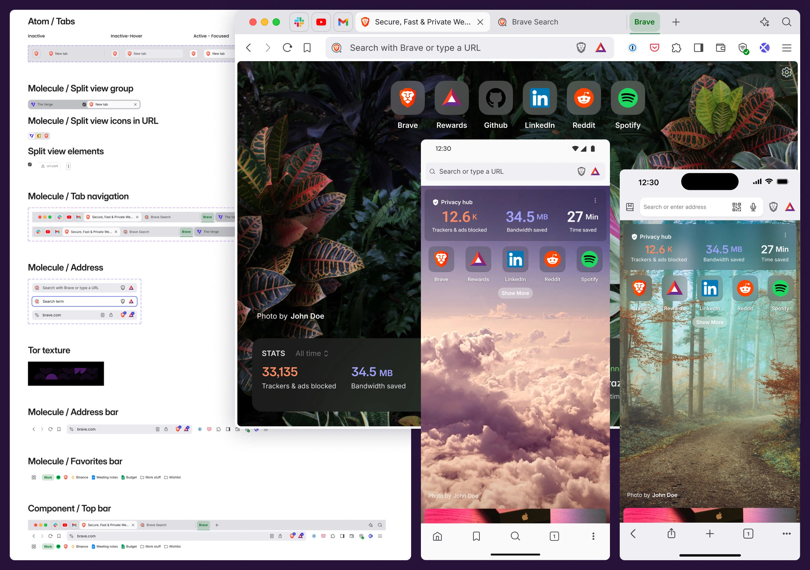
Specific components and patterns for the desktop browser.
Material Design components and patterns for Android.
iOS-native design patterns.
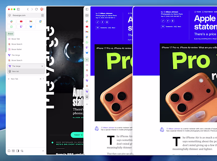
Web-specific components.
Product libraries
The top layer enables product teams to maintain their unique identity and style, while staying within the broader design language:
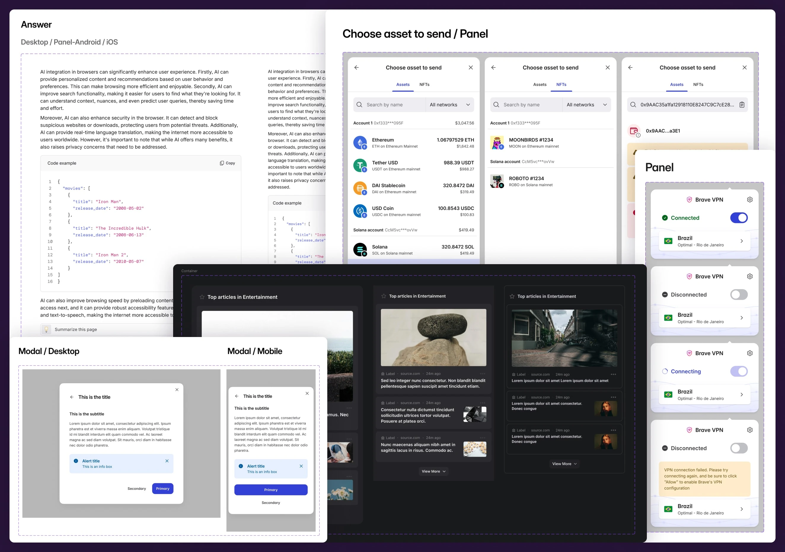
Custom components for Brave Search.
Specialized UI patterns for Brave Wallet.
Unique elements for Brave News and Leo.
Of course, since most of our products live within the browser UI, there's a lot of cross-referencing between the different libraries: Our Wallet, for example, has implementations that live within the browser in all platforms, but also has a web version. So they all have to be in sync and make for a streamlined experience.
System architecture
Our token system is the result of a lot of work in bridging design and development. We implemented a custom Style Dictionary configuration that transforms Figma tokens into platform-specific code. The system handles
A color system that consists of 3 layers:
Primitive raw colors.
Themable light/dark versions of those colors.
Semantic tokens that make it very straightforward to choose a color for the right design piece.
Typography scale with responsive breakpoints and OS specific variables (MacOS / Windows / Android / iOS / Web).
Spacing and layout grid systems.
Shadows and other effects, like blurs, glass effects, etc.
Grid systems.
Component-specific tokens.
Animation and transition definitions.
Like this project
Posted Dec 22, 2025
Led the creation of Nala, Brave's design system from the ground up to solve the company's fragmented user experience across multiple products and platforms.
Likes
0
Views
4
Timeline
Feb 1, 2022 - Dec 22, 2025
Clients
Brave