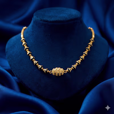
1. The "Midnight Silk" Aesthetic The

NARENDRA DEWANGAN


1. The "Midnight Silk" Aesthetic
The most striking choice here is the deep charcoal/black silk background.
The Contrast: In jewelry design, background choice is everything. By moving away from traditional red or white, you’ve allowed the gold to "pop" with incredible intensity. Dark silk suggests a high-end, boutique experience.
Tactile Appeal: The way the fabric ripples creates a sense of movement, making the jewelry feel like it’s resting on something soft and expensive.
🕯️ 2. The Chiaroscuro Lighting (Light & Shadow)
These designs don't just use flat light; they use atmospheric lighting:
The Diya Glow: The warm, flickering light from the diyas isn't just a prop—it serves as the primary light source for the gold. This creates natural highlights on the Jhumkas and necklaces, making them look 3D and "alive."
Warmth vs. Coolness: The cool, dark tones of the silk vs. the warm, fiery glow of the gold and diyas creates a color temperature tension that is very pleasing to the eye.
✍️ 3. Typography & Information Hierarchy
Each of the three layouts serves a different psychological purpose:
The Minimalist (Image 1): The typography is thin, spaced out, and elegant. It lets the Jhumkas be the hero. This is "Editorial" style—perfect for a brand that wants to look like a luxury magazine.
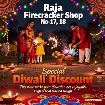
The Bold Retailer (Image 3): Using a high-contrast Serif font for "DIWALI DISCOUNT" makes the offer feel official and prestigious. It’s not a "cheap" sale; it’s an exclusive event.
The Mobile-First Layout: The 9:16 vertical aspect ratio is perfectly optimized for Instagram Stories and WhatsApp Status, which is where the modern jewelry customer in Champa is most likely to engage.
🖋️ Designer’s Final Take
This work successfully elevates JK Jewellers from a local shop to a luxury destination.
Image 1 (The Jhumkas) is the best for building "Brand Desire."
Image 2 (The Necklace) is the best for showing "Product Detail."
Image 3 (The Full Set) is the best for "Conversion" and driving foot traffic to Lions Chauk.
The inclusion of the Champa location and phone number in a clean, sans-serif font at the bottom provides a "foundation" of trust without cluttering the beautiful visuals.
Like this project
Posted Mar 30, 2026
1. The "Midnight Silk" Aesthetic The most striking choice here is the deep charcoal/black silk background. The Contrast: In jewelry design, background choice...
Likes
0
Views
0
Timeline
Mar 4, 2026 - Mar 5, 2026