
NARENDRA DEWANGAN
AI specialist in graphic designing like thumbnail, logo, etc
New to Contra
NARENDRA is building their profile!
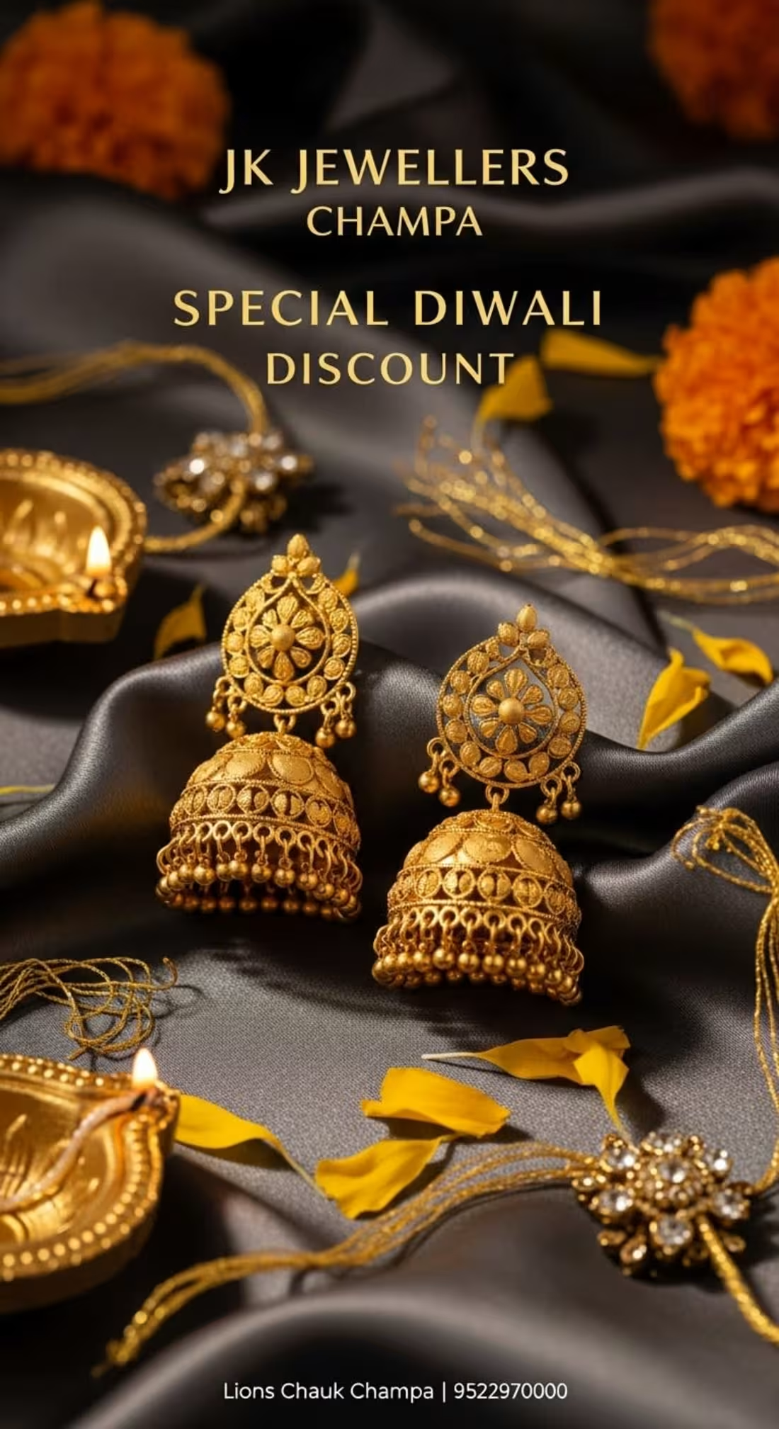
1. The "Midnight Silk" Aesthetic
The most striking choice here is the deep charcoal/black silk background.
The Contrast: In jewelry design, background choice is everything. By moving away from traditional red or white, you’ve allowed the gold to "pop" with incredible intensity. Dark silk suggests a high-end, boutique experience.
Tactile Appeal: The way the fabric ripples creates a sense of movement, making the jewelry feel like it’s resting on something soft and expensive.
🕯️ 2. The Chiaroscuro Lighting (Light & Shadow)
These designs don't just use flat light; they use atmospheric lighting:
The Diya Glow: The warm, flickering light from the diyas isn't just a prop—it serves as the primary light source for the gold. This creates natural highlights on the Jhumkas and necklaces, making them look 3D and "alive."
Warmth vs. Coolness: The cool, dark tones of the silk vs. the warm, fiery glow of the gold and diyas creates a color temperature tension that is very pleasing to the eye.
✍️ 3. Typography & Information Hierarchy
Each of the three layouts serves a different psychological purpose:
The Minimalist (Image 1): The typography is thin, spaced out, and elegant. It lets the Jhumkas be the hero. This is "Editorial" style—perfect for a brand that wants to look like a luxury magazine.
The Bold Retailer (Image 3): Using a high-contrast Serif font for "DIWALI DISCOUNT" makes the offer feel official and prestigious. It’s not a "cheap" sale; it’s an exclusive event.
The Mobile-First Layout: The 9:16 vertical aspect ratio is perfectly optimized for Instagram Stories and WhatsApp Status, which is where the modern jewelry customer in Champa is most likely to engage.
🖋️ Designer’s Final Take
This work successfully elevates JK Jewellers from a local shop to a luxury destination.
Image 1 (The Jhumkas) is the best for building "Brand Desire."
Image 2 (The Necklace) is the best for showing "Product Detail."
Image 3 (The Full Set) is the best for "Conversion" and driving foot traffic to Lions Chauk.
The inclusion of the Champa location and phone number in a clean, sans-serif font at the bottom provides a "foundation" of trust without cluttering the beautiful visuals.
1
11
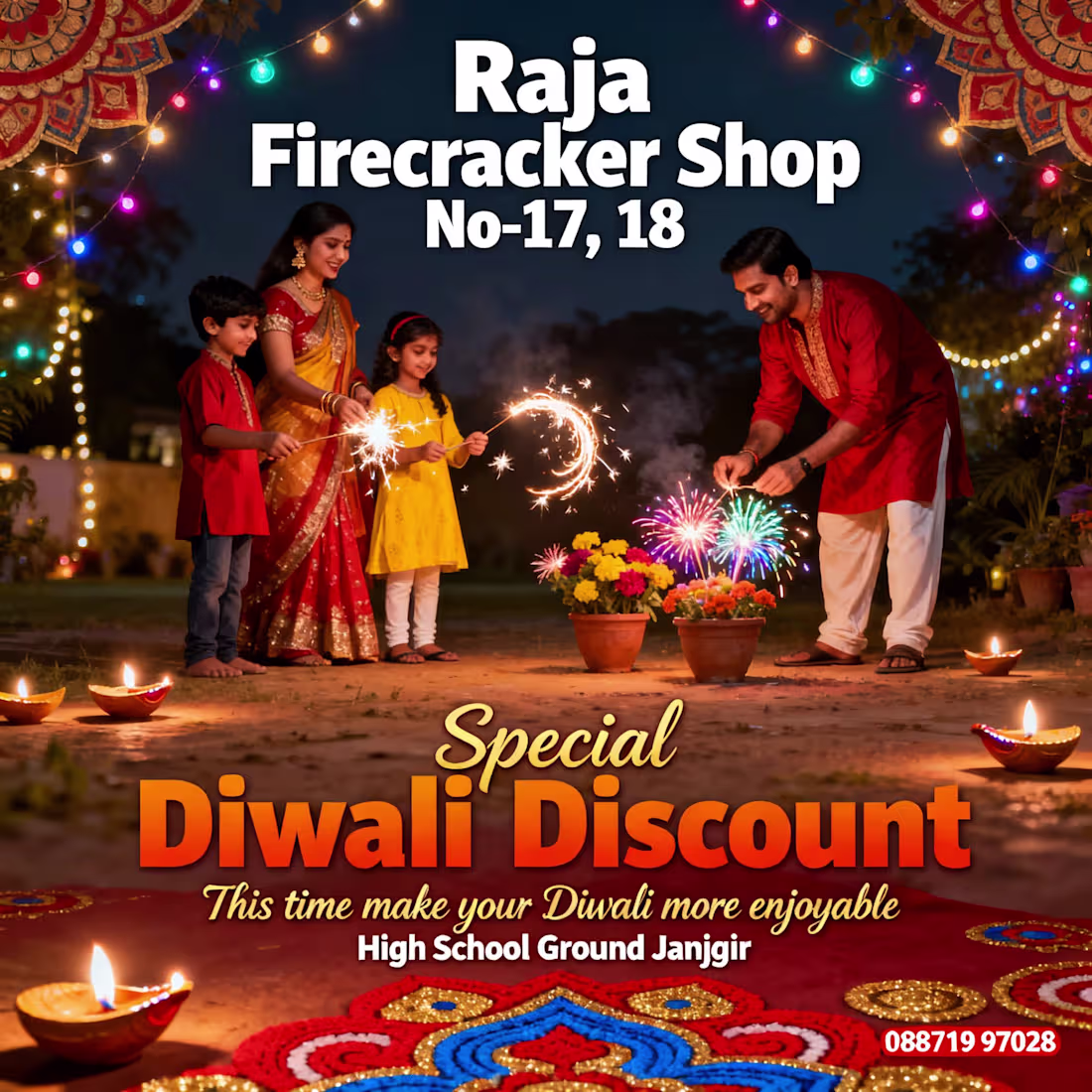
The Cinematic Traditionalist (Image 1)
This is the "Golden Standard" for festive advertising.
The Vibe: Emotional and aspirational. It captures the Ghar Wali Diwali (Diwali at home) feeling perfectly.
Color Palette: The warm glow from the diyas and sparklers creates a natural "bokeh" effect that makes the shop information pop without being aggressive.
Design Win: Using a classic orange-to-yellow gradient for the "Special Diwali Discount" text mirrors the color of fire, tying the typography directly to the product.
🎈 2. The Whimsical "Pop Art" Approach (Image 2)
This moves away from realism and enters the world of storytelling and humor.
Visual Style: The 2D vector illustrations are reminiscent of comic books. It’s lighthearted and specifically designed to appeal to families with young children.
The "Wow" Factor: Including the dog adds a layer of personality that photography often misses. It makes the brand feel approachable and "fun."
Clarity: This is the most "readable" design. The white background ensures that the Shop Number (17, 18) and the High School Ground location are the first things a customer sees.
🚀 3. The "Viral" Creative Concept (Image 3)
As a designer, this is my favorite because it takes a creative risk.
The Concept: Dressing the family as the firecrackers (the flower pots and the rocket) is a genius bit of visual wit. It’s memorable, quirky, and highly shareable on WhatsApp or Instagram.
Impact: In a sea of generic "Happy Diwali" posters, this one stops the scroll. It personifies the product in a way that feels joyful and unique to the "Raja" brand.
Typography: The use of green script font for the tagline provides a nice organic contrast to the heavy, outlined headers.
🖋️ The Designer’s Strategy
If you are rolling these out in Janjgir, here is how I would deploy them:
Image 1 (Cinematic): Use this for large-scale Flex Banners near the High School Ground. It looks premium and sets a high-quality tone for the shop.
Image 2 (Cartoon): Perfect for Flyers/Handouts given at schools or local markets. Kids will point at the dog and the rocket.
Image 3 (Creative): This is your Social Media Hero. Post this on Instagram and Facebook. Its uniqueness is likely to get more "likes" and shares than a standard photo.
1
17
The "Nothing" brand is famous for its transparent, industrial, and "stripped-back" look. These posters navigate that beautifully:
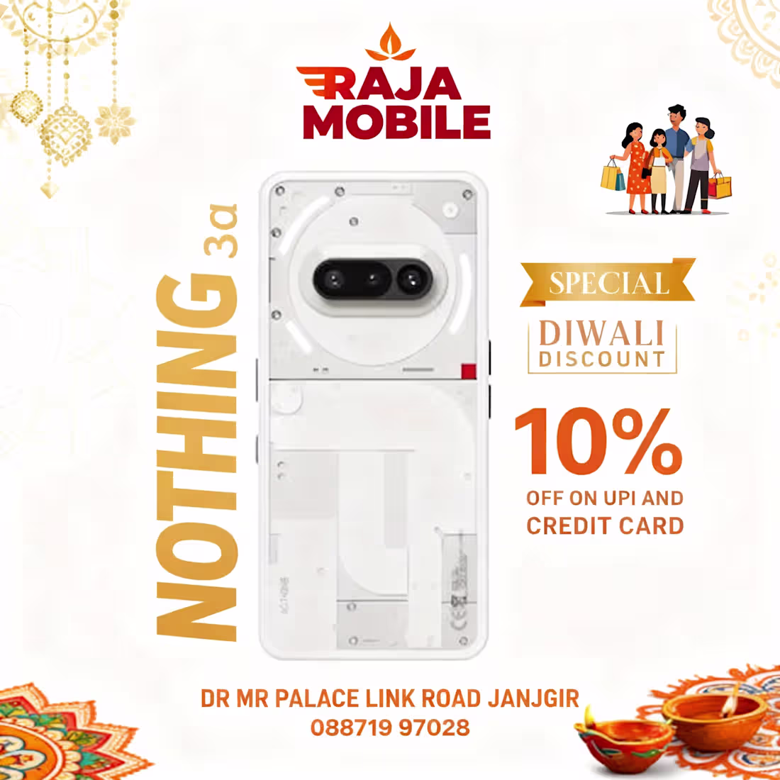
Minimalism vs. Tradition (Images 5 & 6): These versions honor the product's design language. By using a lot of white space (negative space), you allow the intricate details of the phone's back panel to be the star. The festive elements are relegated to the corners, acting as a frame rather than a distraction.
Maximalist Impact (Image 3): The deep red and orange palette creates high urgency. This is a classic retail "Sales" look that grabs attention instantly on a busy social media feed.
✍️ 3. Information Hierarchy & CTA
A key strength across all designs is the clarity of the offer:
The "10% OFF" Badge: This is consistently placed in high-visibility areas (usually the right-hand side or center-right), which is where the eye naturally lands after scanning the product.
Localized Trust: Keeping the address and contact number clear at the bottom (DR MR Palace Link Road) provides immediate local context and trust—essential for a physical retail store in Janjgir.
Typography: The bold, sans-serif fonts used for "NOTHING 3a" mirror the modern, digital-first feel of the brand itself.
🛠️ Designer’s Final Take
If I were to pick a winner for a high-performance ad campaign:
Use Image 2 for Facebook/Instagram (Engagement & Trust).
Use Image 6 for WhatsApp Status/Stories (Clean, easy to read on mobile).
Use Image 3 for physical print/posters (High visibility from a distance).
The work successfully positions Raja Mobile not just as a shop, but as a destination for premium tech during the festive season.
1
22
🎨 The Visual Strategy
1. Color Theory: The "Golden" Hour
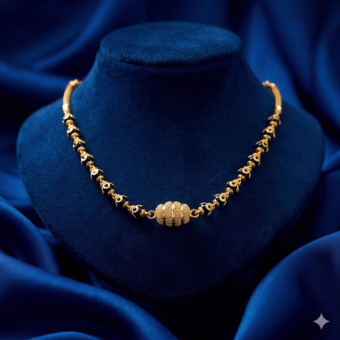
The choice of a deep blue background is intentional. On the color wheel, blue is the direct complement to the orange-yellow hues of gold. This creates simultaneous contrast, making the jewelry appear brighter and more "alive" than it would on a standard white or black background. It feels less like a product shot and more like a curated exhibit.
2. Texture Interplay
There is a beautiful tension between the three primary textures here:
The Matte: The velvet bust absorbs light, providing a non-reflective stage that doesn’t compete with the jewelry.
The Luster: The silk draping adds fluid lines and highlights, guiding the viewer’s eye toward the center.
The Brilliance: The polished metal and gemstones provide the sharp, high-frequency detail that anchors the composition.
3. Composition & Lighting
The lighting is "moody" yet precise. By using a single primary light source, you’ve created deep shadows that give the pieces three-dimensional weight. The filigree work in the large floral pendant (Image 4) and the delicate enamel on the red blossom (Image 2) are highlighted perfectly, showing off the craftsmanship without blowing out the highlights.
💎 The Collection Narrative
This work bridges the gap between heritage and high-fashion:
The Modern Traditionalist: The pieces featuring black beads (Images 1 and 5) take the sacred Mangalsutra aesthetic and elevate it into a luxury minimalist statement.
The Botanical Muse: The organic shapes—from the intricate 24K-style gold flower to the ruby-encrusted "berries" (Image 3)—suggest a brand that finds symmetry in nature.
The Premium Finish: The consistency across all five frames creates a cohesive "Brand Identity." Whether these are for a catalog or a social media campaign, they communicate uncompromising luxury.💯
2
53