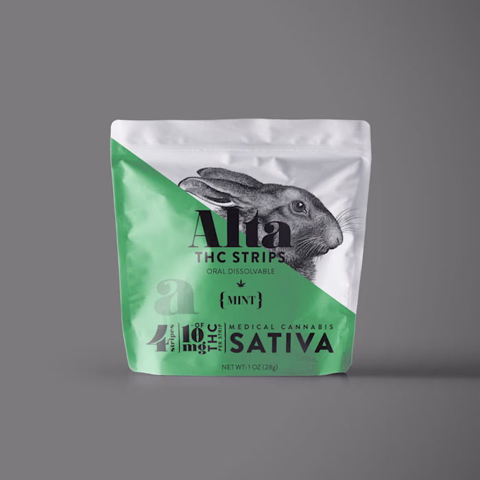
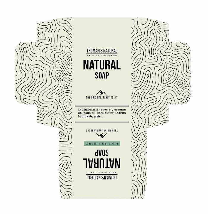
Label redesign for an Australian men's grooming brand.
Fernanda Melo
Brutal Truth – Bold Label Design for Modern Men’s Grooming Brand
Client: Brutal Truth
Industry: Men’s Grooming Products
Role: Graphic Designer & Illustrator
Experience: 15+ Years
Overview
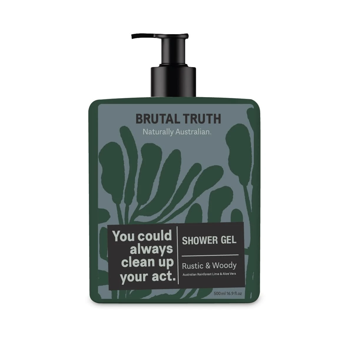
early concept
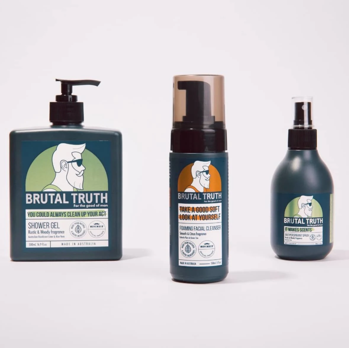
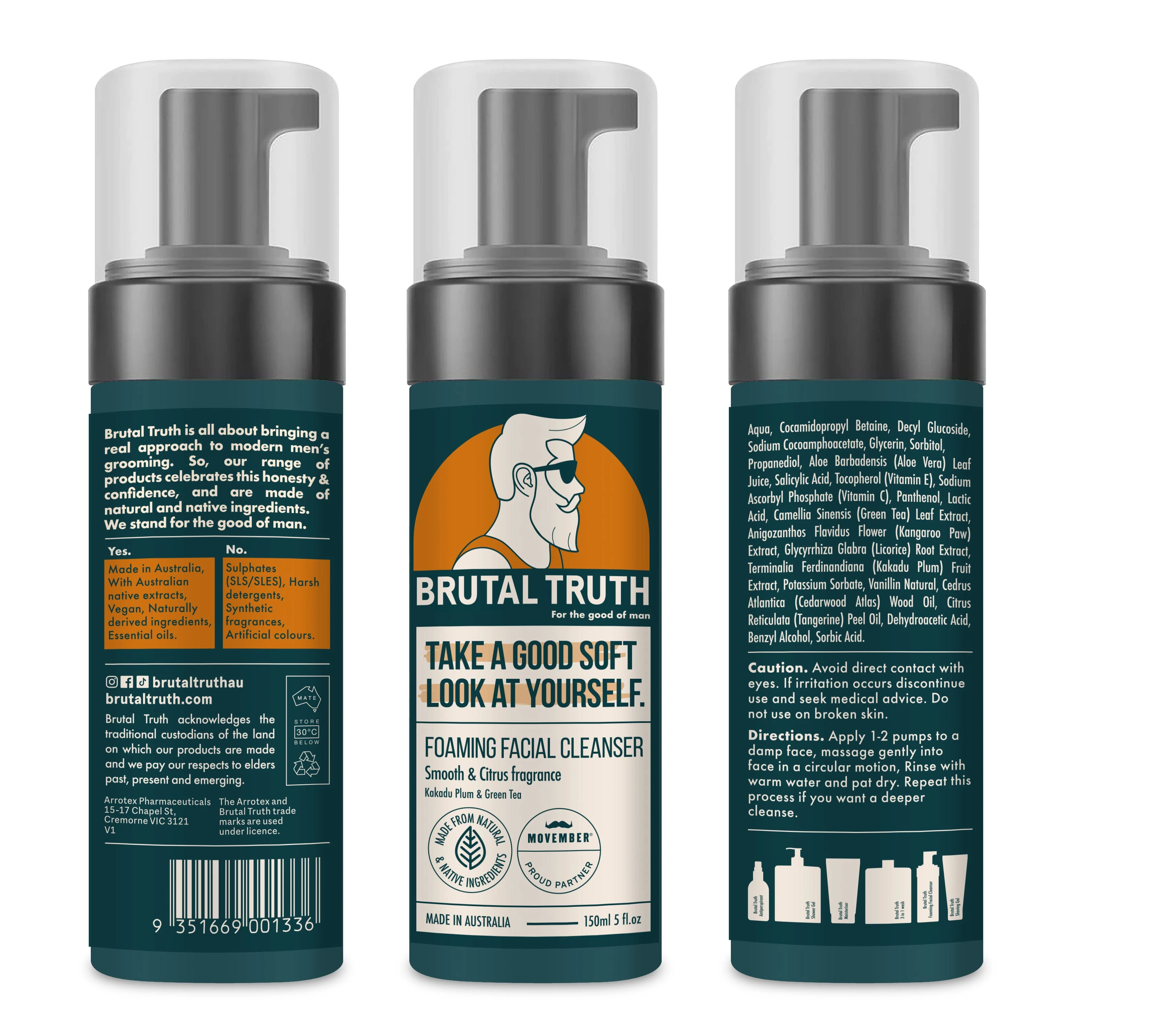
Brutal Truth, a men’s grooming brand, needed a bold new look that would stand out on crowded shelves while staying true to their modern, no-nonsense values. I first entered a design competition where my concept was selected from hundreds of entries as a top 10 finalist, then won the public vote on social media. From there, I was commissioned to fully redesign the brand’s packaging. With a focus on masculine, modern, and approachable branding, I created a visual identity that combines strong aesthetics with clear shelf appeal.
Design Goals
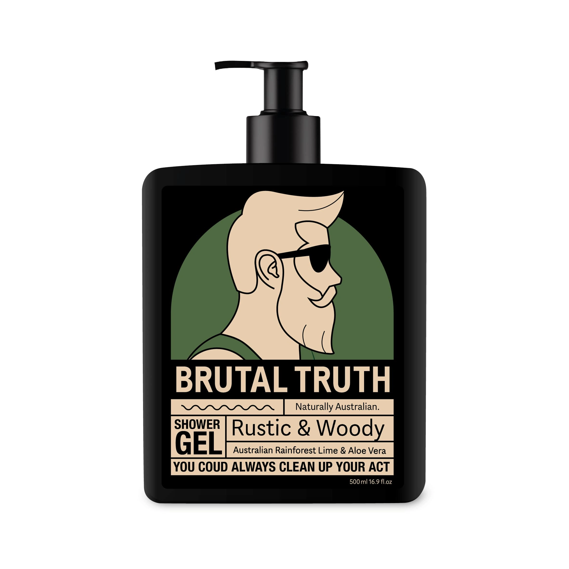
early concept
The challenge was to create original label designs that felt confident, clean, and eye-catching—while making Brutal Truth feel approachable and professional. The brand’s core values of honesty, simplicity, and quality were central to the design process.
Shelf Impact: Bold typography, high contrast, and clear layout for easy recognition.
Masculine & Friendly: A visual tone that speaks to men but avoids cliché “hyper-masculine” tropes.
Modern Grooming Identity: A look that feels fresh and current in the self-care and wellness space.
Cohesive System: Creating a consistent layout across product lines while allowing room for variety and growth.
Key Deliverables
Winning Concept Design: Selected through a public vote from hundreds of global submissions.
Complete Label System: Custom labels for a variety of grooming products, with clear product hierarchy.
Typography & Layout: Clean, custom type treatment that balances strength and clarity.
Packaging Files: Final print-ready PDFs, editable AI files, and mockups for production and marketing use.
Scalable Branding Assets: Design system built for future product launches and marketing collateral.
The Design Process
Concept Pitch & Selection: Submitted an original design to a global competition; selected as the winner by public vote.
Visual Direction & Strategy: Collaborated with the client to refine the brand’s tone—bold, modern, and direct.
Label Development: Designed packaging across the product range, optimizing for print, visual impact, and brand consistency.
Final Production Files: Delivered high-quality design assets, ready for use across print and digital applications.
Results
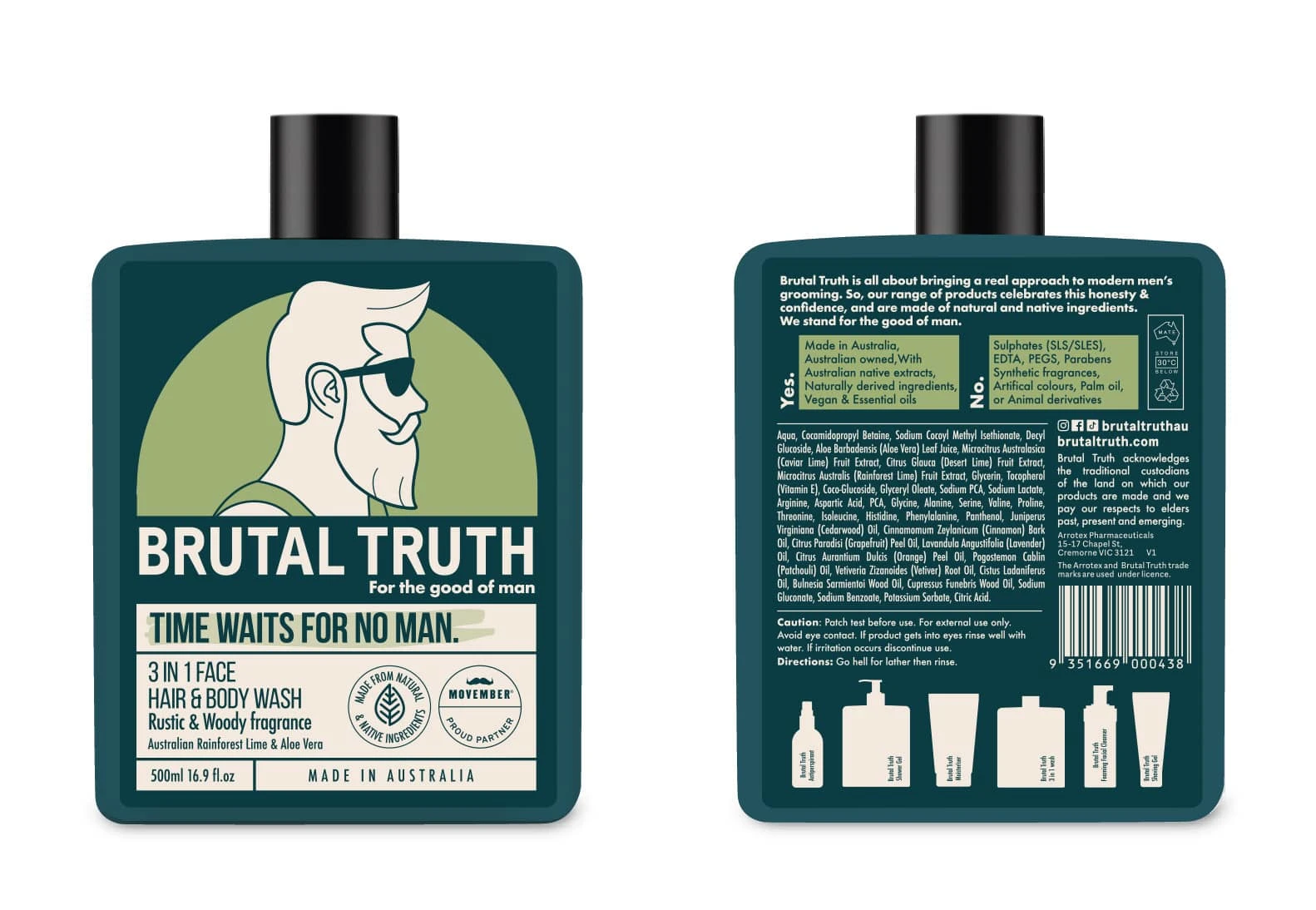
The new packaging gave Brutal Truth a strong shelf presence and a clearly defined voice in the competitive grooming market. The masculine yet friendly design speaks to modern consumers, while the bold labels ensure the products are immediately recognizable and aligned with the brand’s identity.
Conclusion
This project is a great example of how strategic package design and handcrafted visuals can transform a grooming brand. With over 15 years of experience and a background in branding and illustration, I help businesses like Brutal Truth create packaging that’s not only visually strong, but also built to sell. From winning the pitch to building out a full label system, this collaboration shows how good design leads to lasting brand impact.
Like this project
Posted Mar 24, 2025
I designed a friendly yet bold label for Brutal Truth, adding pops of colour and illustration to stand out in the OZ market.