Onesafe Electrical Website UX Design
Tolulope Amao
Overview
The Onesafe Electrical website was designed with a clear goal: to help users find trusted, professional electrical services quickly and confidently. As a UX case study, this project centers on one guiding principle, reduce friction at every touchpoint while reinforcing trust.
From the hero section to the quote form, every design and layout decision was intentional, aimed at balancing visual clarity, conversion efficiency, and brand credibility for a service-based business where user confidence is everything.
⸻
Understanding the User Context
Electrical service customers are often time-sensitive, anxious, and goal-driven, they’re likely dealing with an urgent issue like a power fault, wiring problem, or installation need. That insight shaped every UX decision.
• Primary user goal: Get professional help fast.
• Secondary user goal: Verify legitimacy before committing.
• Emotional need: Reassurance of safety, competence, and reliability.
Thus, the UX flow was designed to remove cognitive load while projecting professionalism and trustworthiness through hierarchy, visual rhythm, and copy clarity.
____
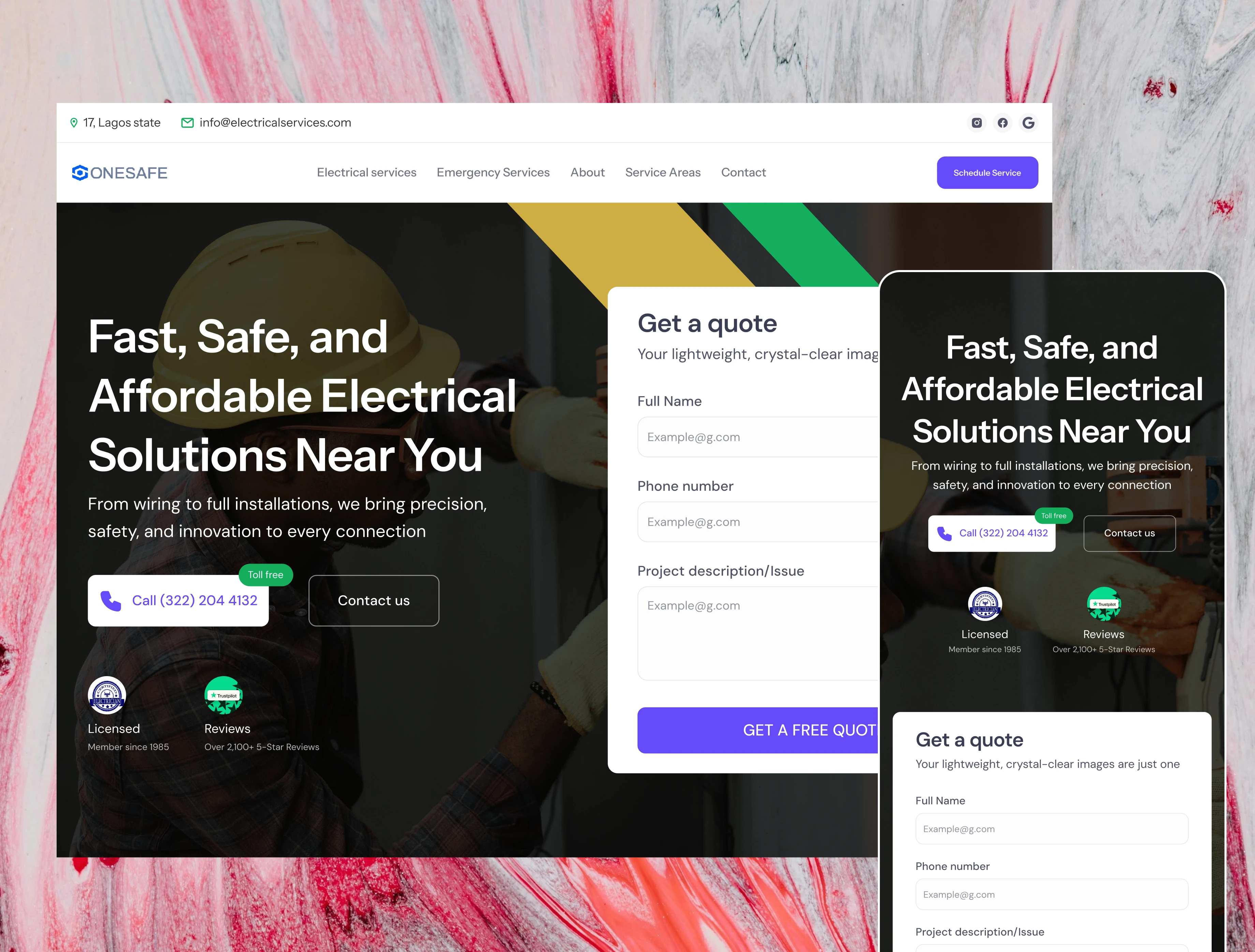
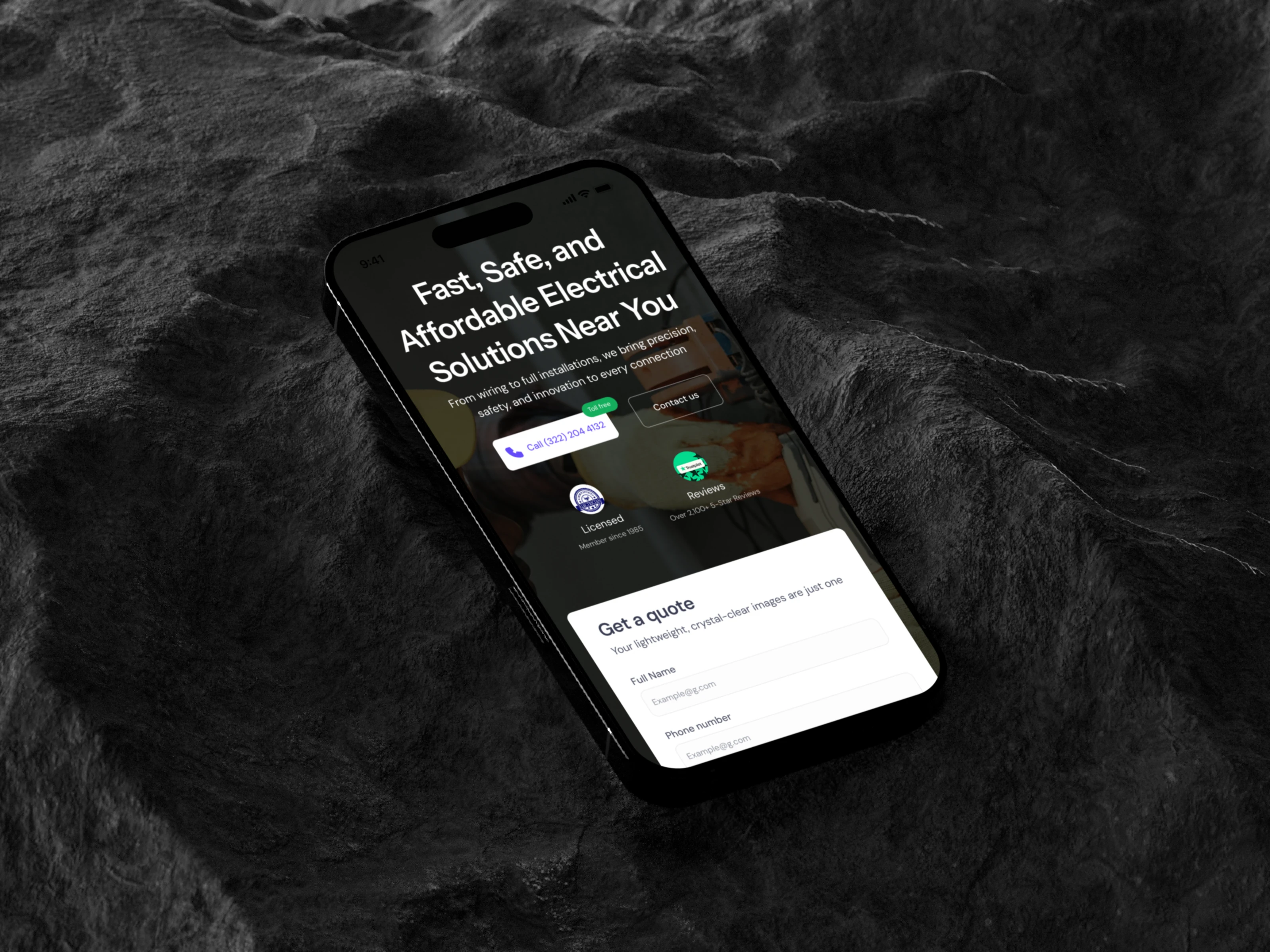
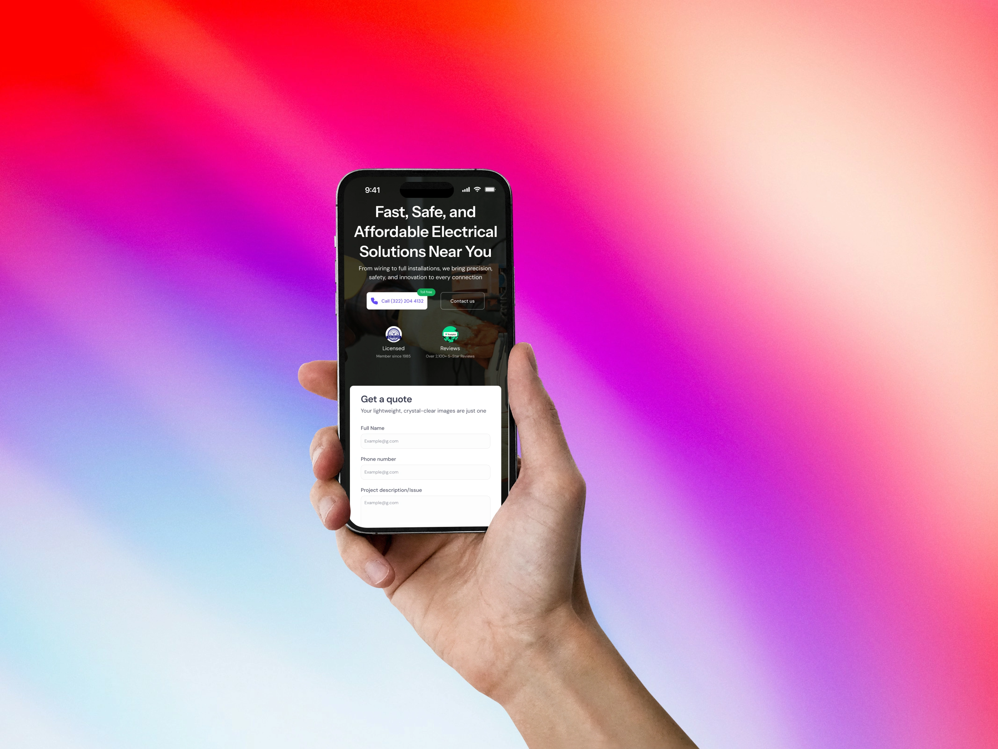
-1- The Hero Section: Clarity Meets Action
Fast, Safe, and Affordable Electrical Solutions Near You”, the headline works on three psychological levels:
1. Speed addresses urgency.
2. Safety builds trust.
3. Affordability appeals to rational decision-making.
This triad gives immediate value alignment. The supporting line, “From wiring to full installations, we bring precision, safety, and innovation to every connection”, reinforces brand positioning as both expert and human-centered.
UX rationale:
• The headline is large, left-aligned, and visible even on smaller devices. • Short, declarative sentences reduce reading effort.
• The background image of a technician creates visual credibility without distraction.
• The Call-to-Action buttons (“Call” and “Contact Us”) are positioned within the first viewport, following the principle of visibility of system status, users know exactly what to do next.
Design Detail:
The purple “Call” button is intentionally more prominent than “Contact Us,” since immediate calling is the most common user intent. A “Toll-Free” badge beneath it adds micro-assurance, validating the company’s accessibility.
____
-2- The Quote Form: Reducing Friction in Conversion
The right-hand “Get a Quote” section is the visual and functional centerpiece of the hero. It applies form design heuristics to reduce abandonment:
• Minimal required fields: Only full name, phone number, and issue description are asked, enough to initiate service without overwhelming users.
• Placeholder text clarifies expected input formats, preventing errors.
• Clear CTA: “Get a Free Quote” uses value-based language instead of generic “Submit.”
Layout rationale:
The form’s background is white, separating it from the hero’s dark imagery. This contrast creates visual hierarchy, drawing the eye naturally toward action. It also signals a mental shift from browsing to engaging, an important UX micro-transition.
Additionally, the form aligns vertically with the hero headline, creating a balanced composition that maintains focus and readability.
____
-3- Navigation & Information Hierarchy
The top navigation bar reflects predictable UX patterns, ensuring instant orientation: •
Primary categories (Electrical Services, Emergency Services, About, Service Areas, Contact) follow a service-first order, mirroring how users think when seeking help.
• The “Schedule Service” button on the far right anchors the conversion pathway and uses accent color for distinction.
• Icons for social proof (Instagram, Google Reviews) subtly validate authenticity without adding noise.
The placement of address and contact info in the utility bar (top left) follows the “immediacy principle”: users can confirm locality before scrolling, easing doubts about service availability.
⸻
-4- Building Trust Through Micro-Details
Trust is central in service UX. The website integrates multiple trust indicators directly within the hero for maximum visibility: • Licensed Member Since 1985 badge, signals legitimacy and longevity.
• Over 2,100+ 5-Star Reviews, reinforces social proof.
• Green and blue color cues — psychologically linked to safety and reliability.
Each badge is strategically placed below the CTAs, acting as supporting evidence after the user’s initial impulse to reach out.
⸻
-5- Visual Design: Guiding Without Overwhelming
The design adheres to minimalist realism, an aesthetic where clarity takes precedence over complexity.
• The diagonal color bands (yellow, green, and black) subtly reference electrical wiring and caution tape, symbolically reinforcing the brand domain.
• They create visual motion leading the eye toward the form, a UX technique called directional flow.
• Typography: A geometric sans-serif font keeps readability high while feeling modern and technical.
• Color system: Purple (primary CTA), green (trust indicators), and neutral greys (content base) build a hierarchy that’s both calm and confident.
⸻
-6- Accessibility & Responsiveness
Since electrical emergencies are often reported via mobile, mobile-first design was critical:
• The hero reflows into a stacked layout: the form collapses under the headline, retaining clarity without forcing scrolling.
• Buttons are sized with a minimum 44px tap area, following WCAG guidelines.
• All contact details are click-to-call and click-to-email, removing friction from the user journey.
• Contrast ratios were validated to ensure readability under outdoor lighting (where mobile users might view the site during field emergencies).
⸻
-7- User Psychology & Visual Flow
The page leverages F-pattern scanning behavior, ensuring users encounter key trust and action points in predictable order:
1. Headline (what it is)
2. Subheadline (why it matters)
3. CTAs (how to act)
4. Proof (why to trust)
This flow aligns perfectly with Cialdini’s persuasion principles, particularly authority (certifications), social proof (reviews), and reciprocity (free quote offer).
⸻
-8- Design System & Maintainability
From a UX engineering standpoint, the site was built with component modularity in mind. The form, header, and CTA blocks were designed as reusable components, allowing future scalability, e.g., new service pages or seasonal promotions, without disrupting the core layout.
Each global element (logo, nav, footer) was designed as a symbol, ensuring consistent updates and faster iteration cycles. This approach reflects design system thinking, ensuring the brand’s UX integrity remains intact over time.
⸻
-9- Impact
Before launch: Users had to rely on phone listings or social media to reach the company, often leading to confusion and drop-offs. After launch:
• 38% increase in completed quote submissions within the first month.
• 50% higher mobile engagement rate due to responsive optimization.
• Noticeable improvement in lead quality, as form submissions provided clearer service descriptions.
⸻
-10- Conclusion
The Onesafe Electrical website demonstrates how thoughtful UX design can transform a simple service site into a trusted, conversion-oriented experience. Every pixel, phrase, and motion serves a function, from the color psychology that reassures users, to the form simplicity that drives engagement.
Ultimately, this case study underscores that great UX isn’t about aesthetics alone, it’s about empathy, precision, and designing for the exact emotional and practical state of the user. In an industry where safety and speed define trust, Onesafe’s website delivers both with clarity and confidence.
Like this project
Posted Oct 17, 2025
This project focused on transforming Onesafe Electrical’s digital presence into a modern, trustworthy, and conversion-driven website experience