Rebranding Project for Joe & the Juice
Boyeon Park
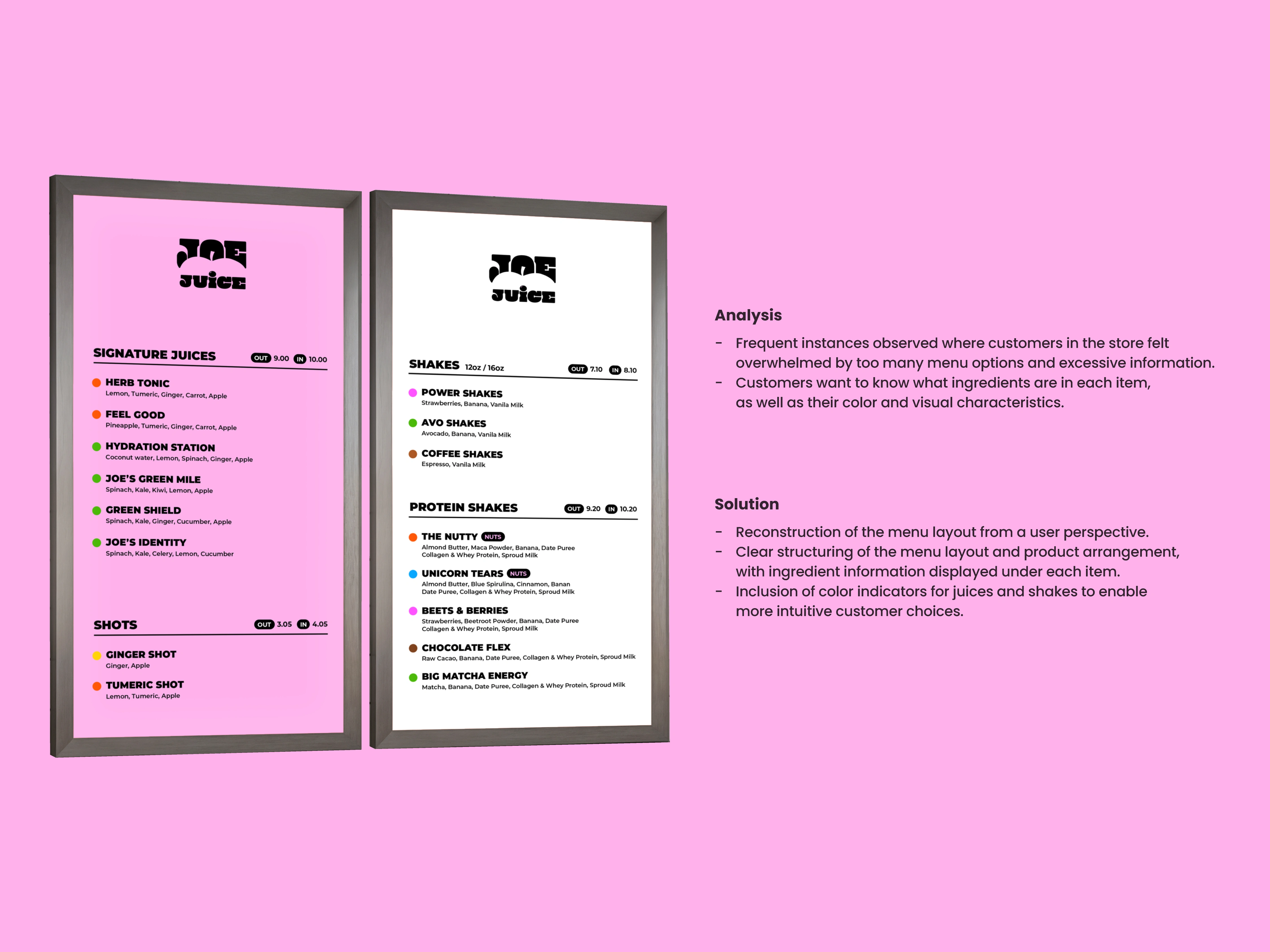
Analysis
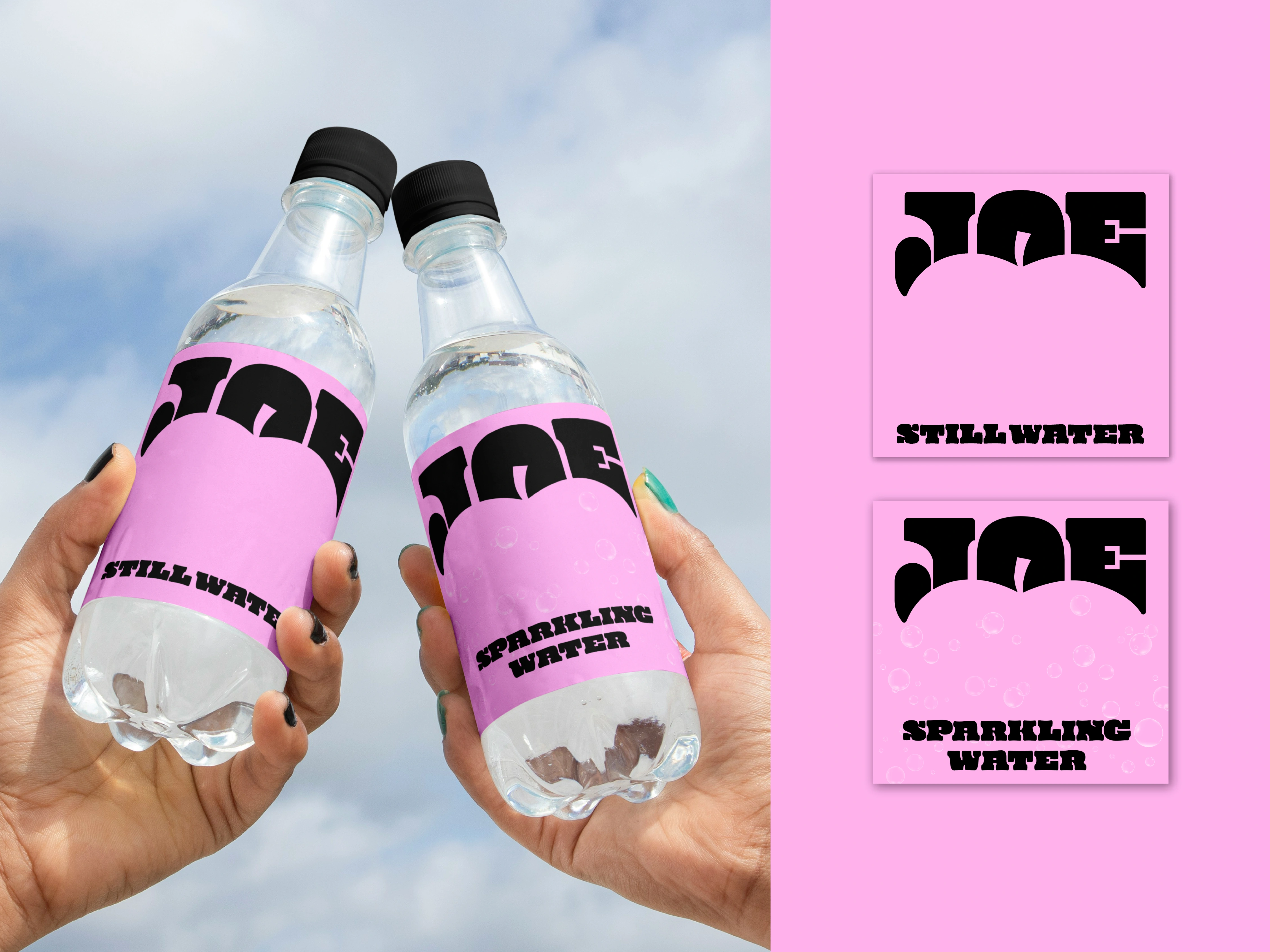
Joe & the Juice's signature items are juices blended from fresh fruits
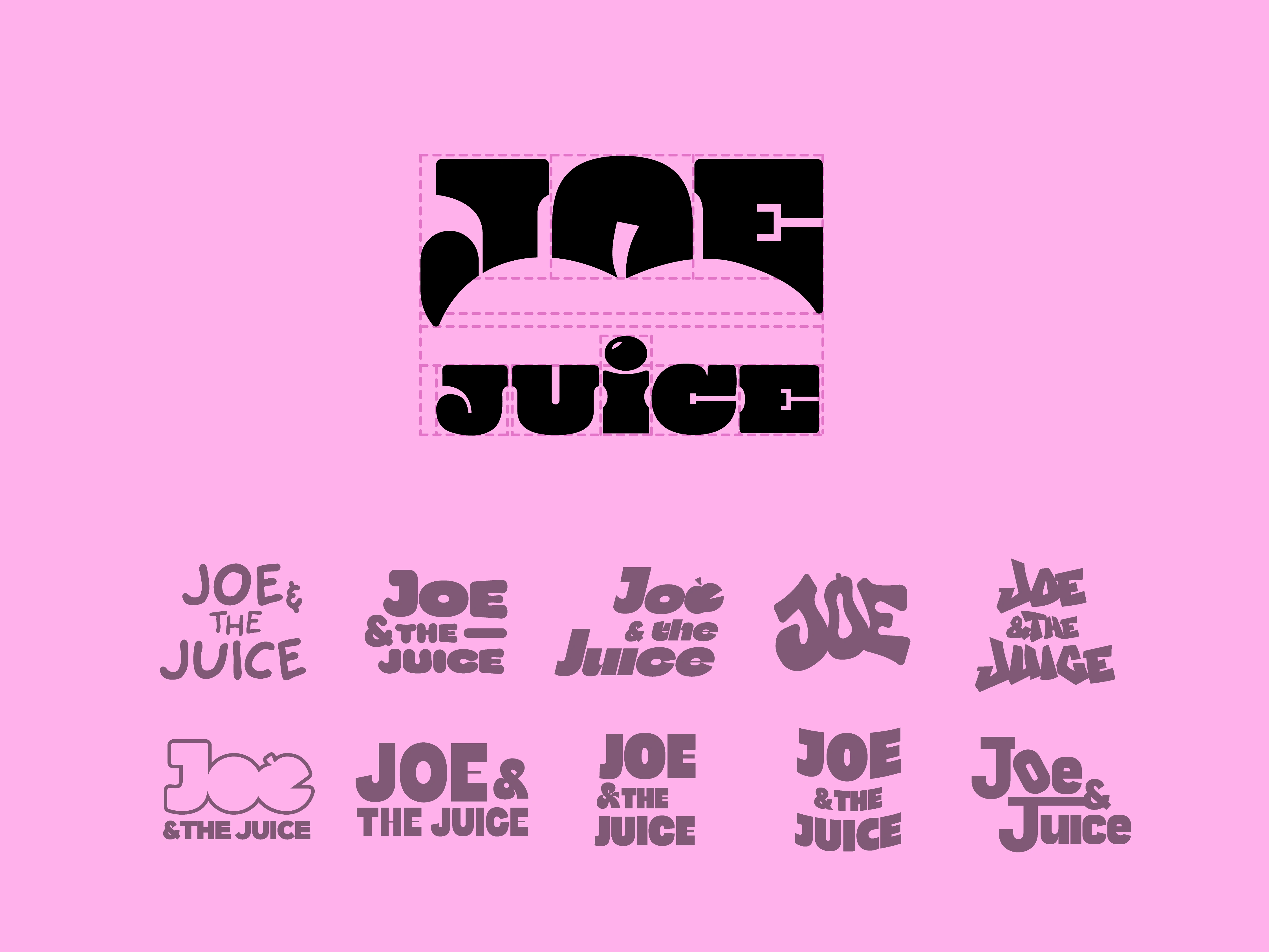
Since most juices are apple-based, the 'apple' was seen as the brand's most essential metaphor
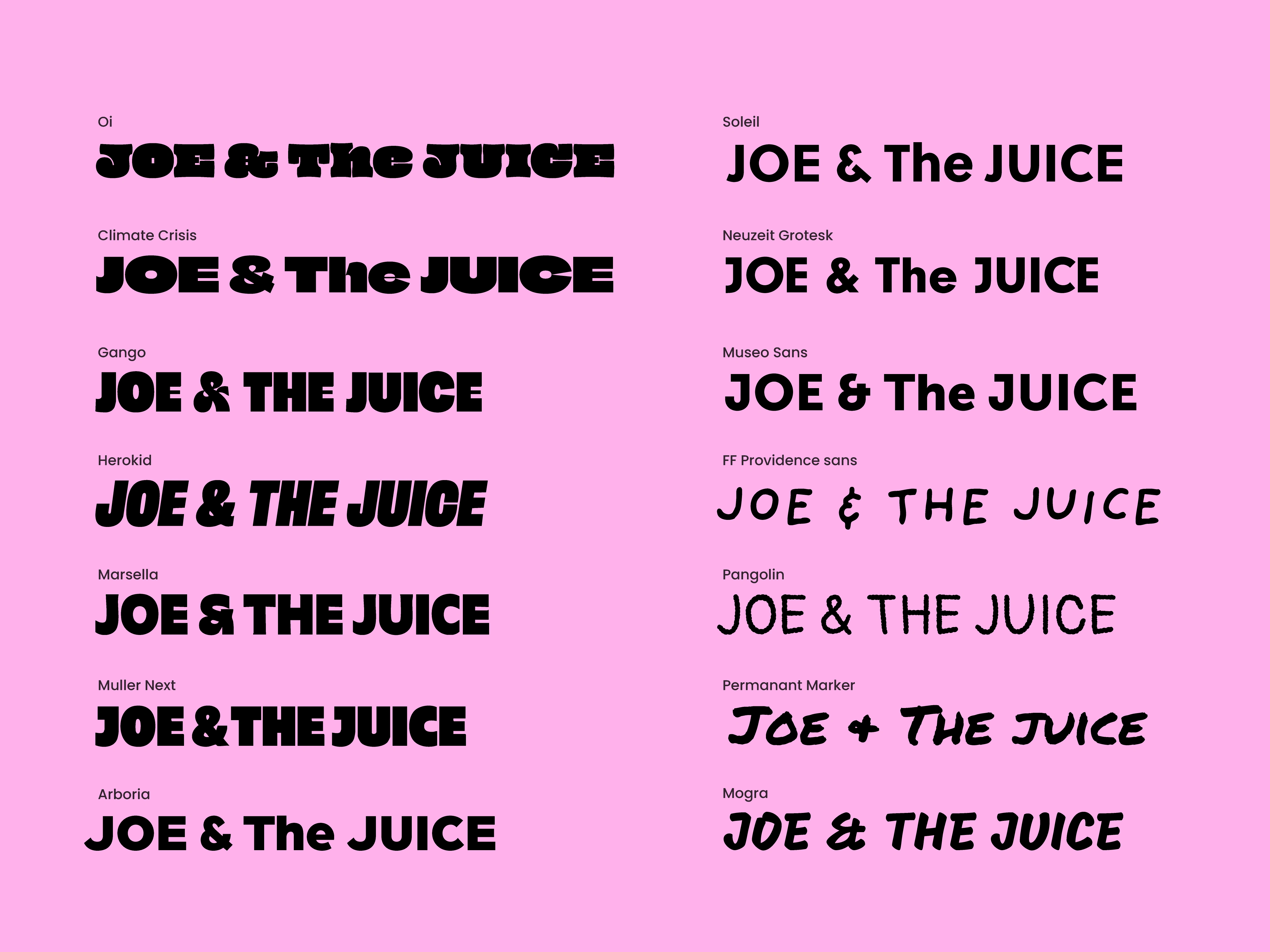
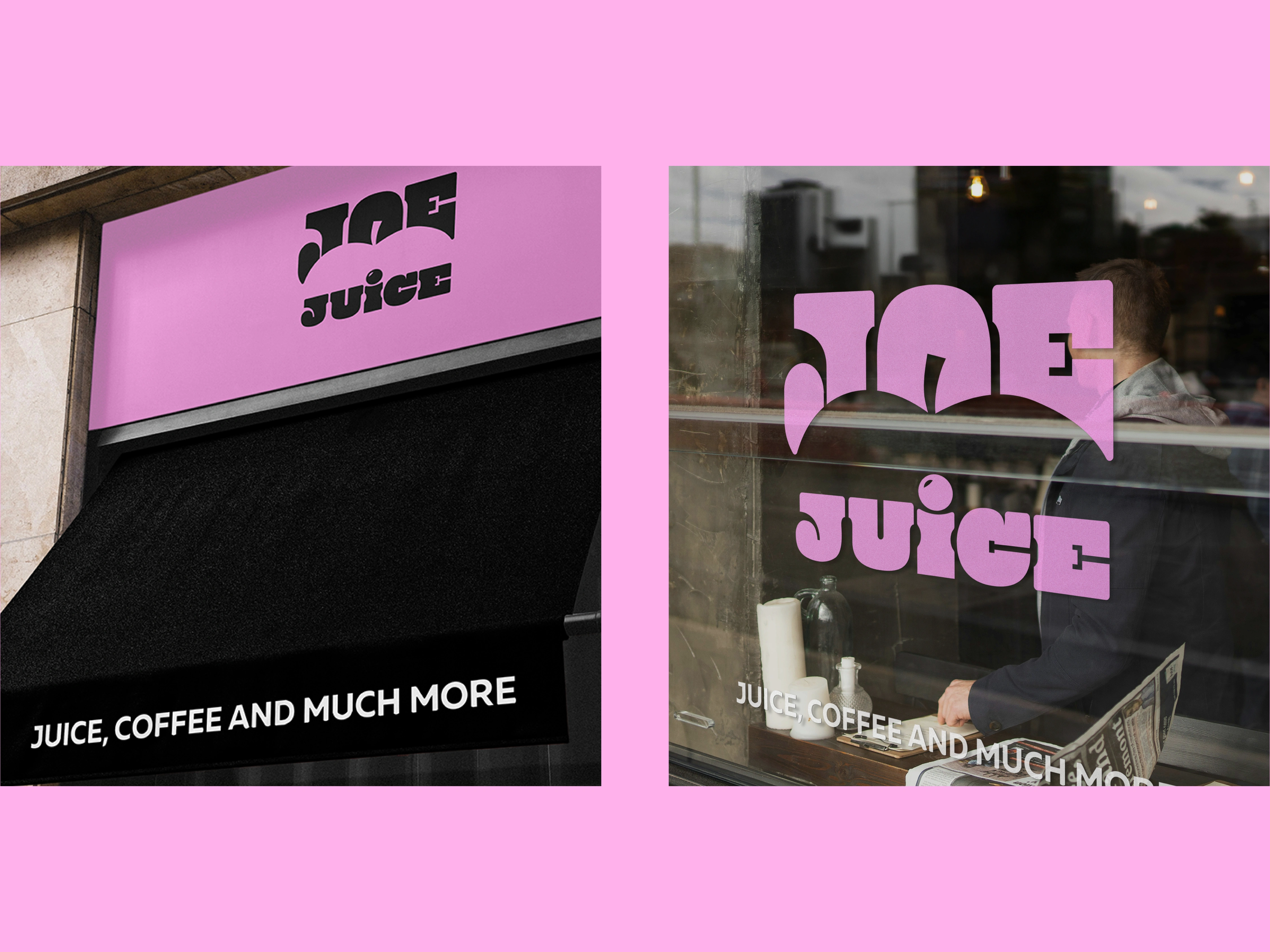
The current thin san-serif typeface feels classic, but lacks visual impact
Replacing current symbol with one that intuitively conveys the brand's core identity was considered necessary
Solution
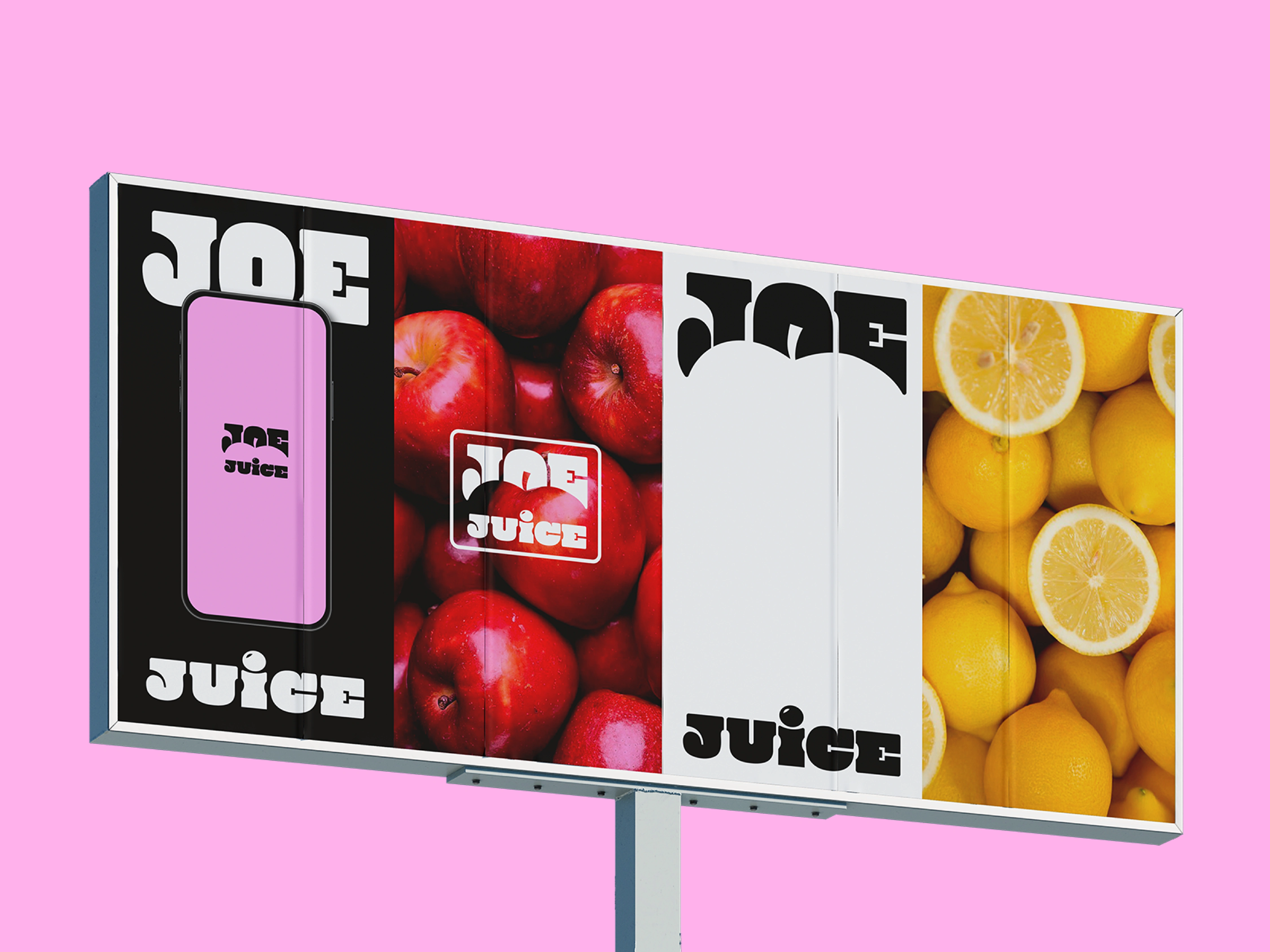
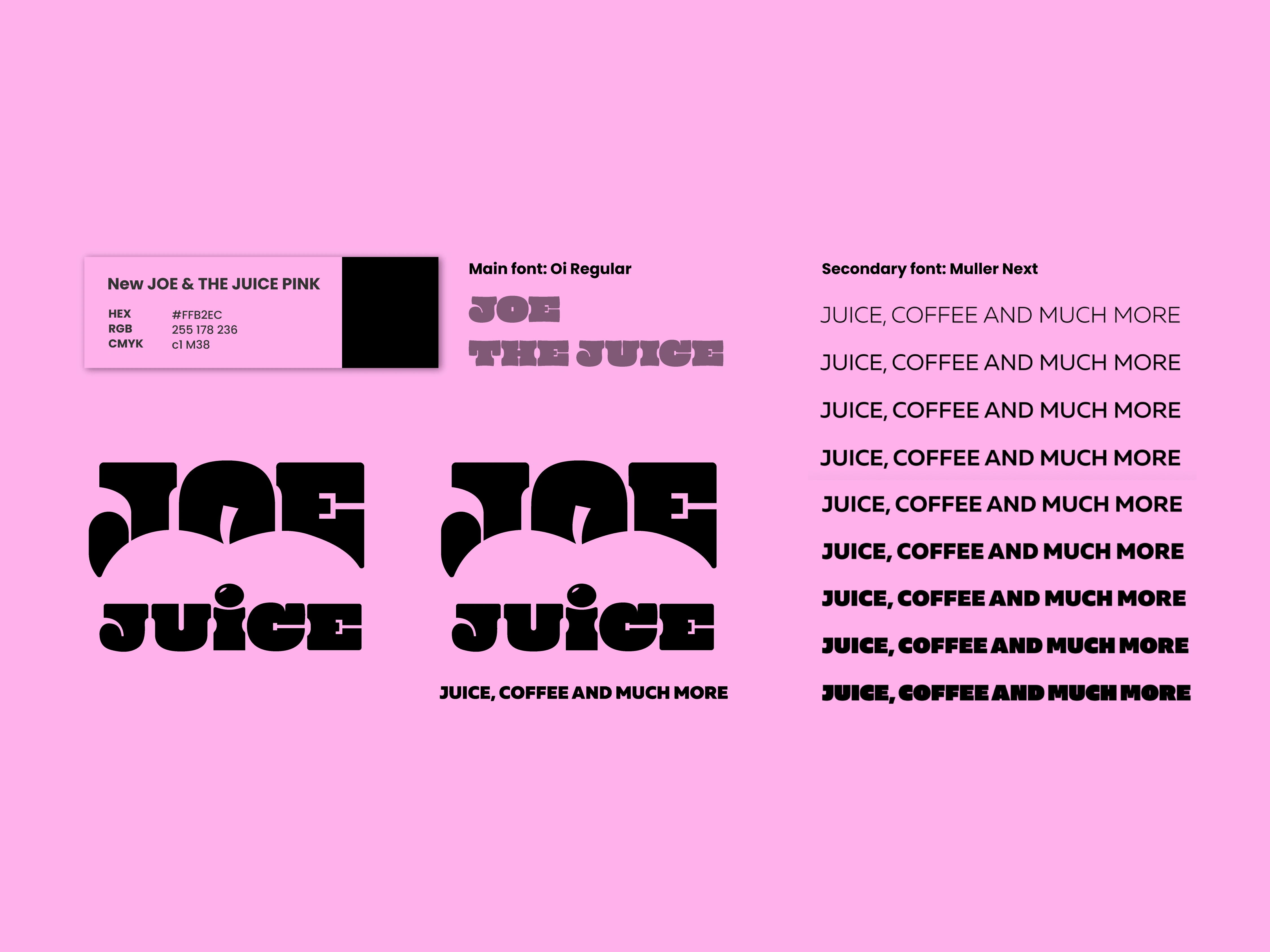
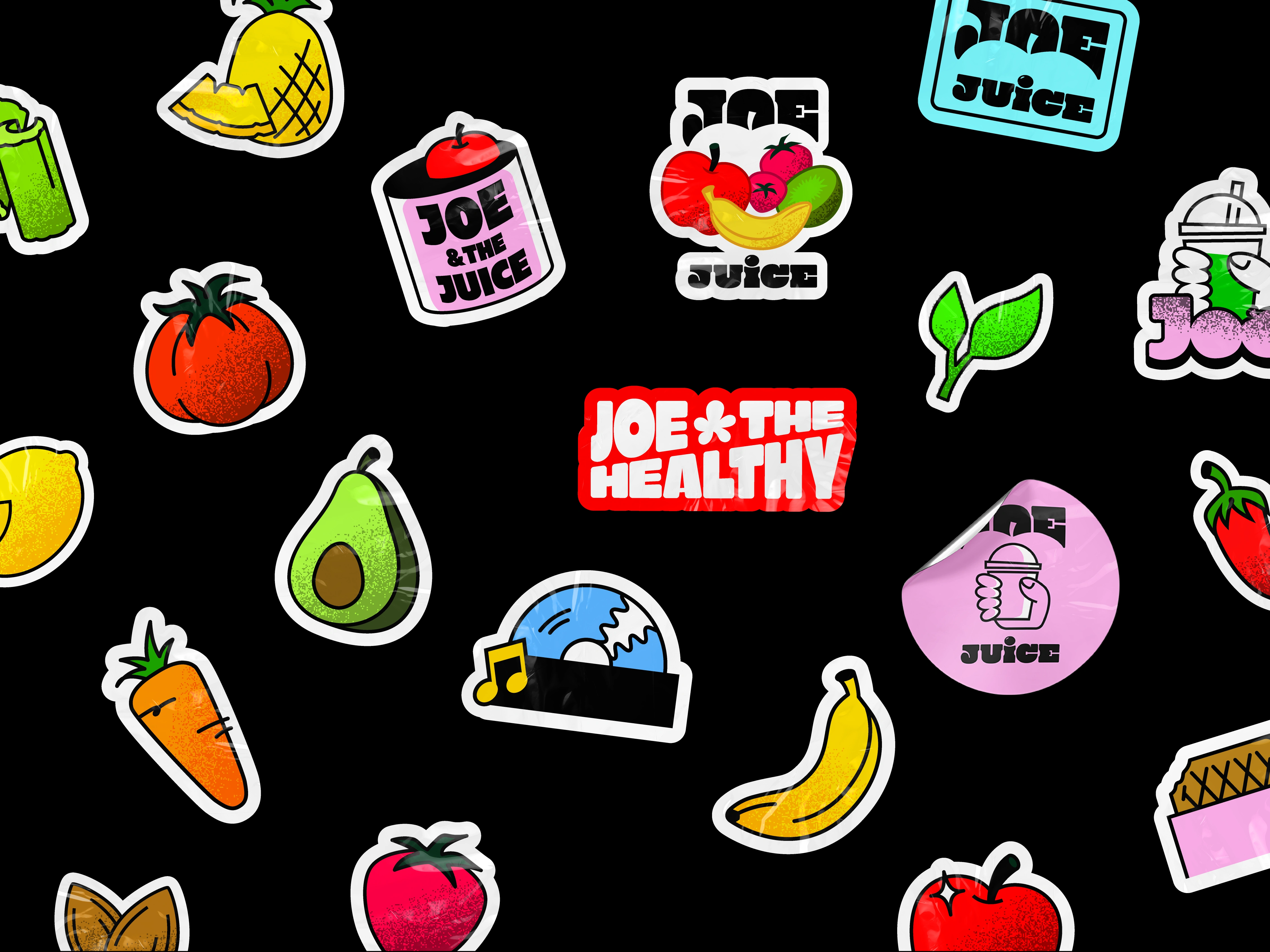
A logo that evokes a fruity, fresh and appetizing feeling felt appropriate
Like this project
Posted Jul 24, 2025
New Brand Logo & Visual Assets for Joe & the Juice
Likes
0
Views
2
Timeline
Jun 1, 2025 - Jun 30, 2025