I stopped designing portfolio projects

Ayesha Kamal

I stopped designing portfolio projects to look like real client projects.
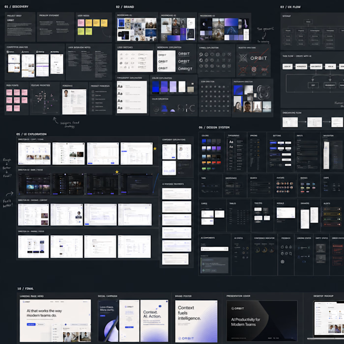
I used to think a strong Product Design case study needed a lot of screens.
Dashboard.
Settings.
Profile.
Notifications.
Every possible state.
The file looked impressive.
But when I looked at it as a hiring manager might, I realized something:
More screens weren’t showing more thinking.
They were mostly showing that I could keep extending the same UI system.
So I changed how I approach portfolio projects.
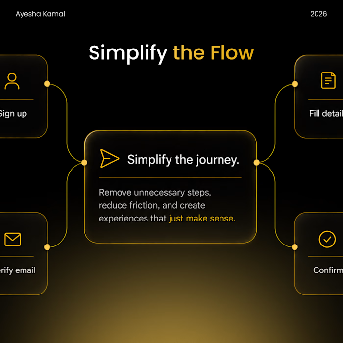
Now I start with one question:
What is the most important problem this product needs to solve?
Then I build one complete journey around it.
For example:
Monitor → Locate → Diagnose → Act → Verify
Five stages can tell me much more about a designer than twenty unrelated dashboard screens.
Because now I can show:
→ why the flow exists
→ what information the user needs at each point
→ what I chose to prioritize
→ what I removed
→ how one decision affects the next screen
I’ll still design additional states when they matter.
But I no longer add screens just to make the Figma canvas look impressive.
A portfolio isn't proof of how many screens you can design.
It’s proof of how you think through a problem.
That shift has made my case studies smaller but much stronger.
Designers: when reviewing a portfolio, would you rather see 20 polished screens or one deeply considered journey?
#ProductDesign #UXDesign #ProductDesigner #UXPortfolio #CaseStudy #UIUX #DesignProcess
Like this project
Posted Sep 4, 2026
I stopped designing portfolio projects to look like real client projects. I used to think a strong Product Design case study needed a lot of screens. Dashb...
Likes
0
Views
2
Tags