A Design System That Goes Beyond
The client
Beyond is a digital product agency that specializes in creating exceptional customer experiences, engineering, design, and product development. They focus on designing for engagement, and enjoyment by getting close to customers and understanding their needs.
Beyond has worked with major brands like Snap Inc., Google, and Artrya, delivering projects that range from website development to integrating cloud services for enhancing inclusivity and security. Their approach combines craftsmanship, empathy, and inclusive technology to create products and platforms poised to make a significant impact in the digital world.
–
The challenge
Build a design system emphasizing scalability
Beyond's Brand & Creative team was facing a huge challenge with their website: lack of cohesive design, odd UX practices, unclear information architecture, and no room for scaling. This posed significant challenges to the overall user experience. Another major drawback of the old design was that it didn't effectively target the right audience. This led to a mismatch between Beyond’s offerings and the expectations of their intended user base, ultimately impacting their overall reach and user engagement.
–
The approach
Implement structure, variables, and define design pricipals
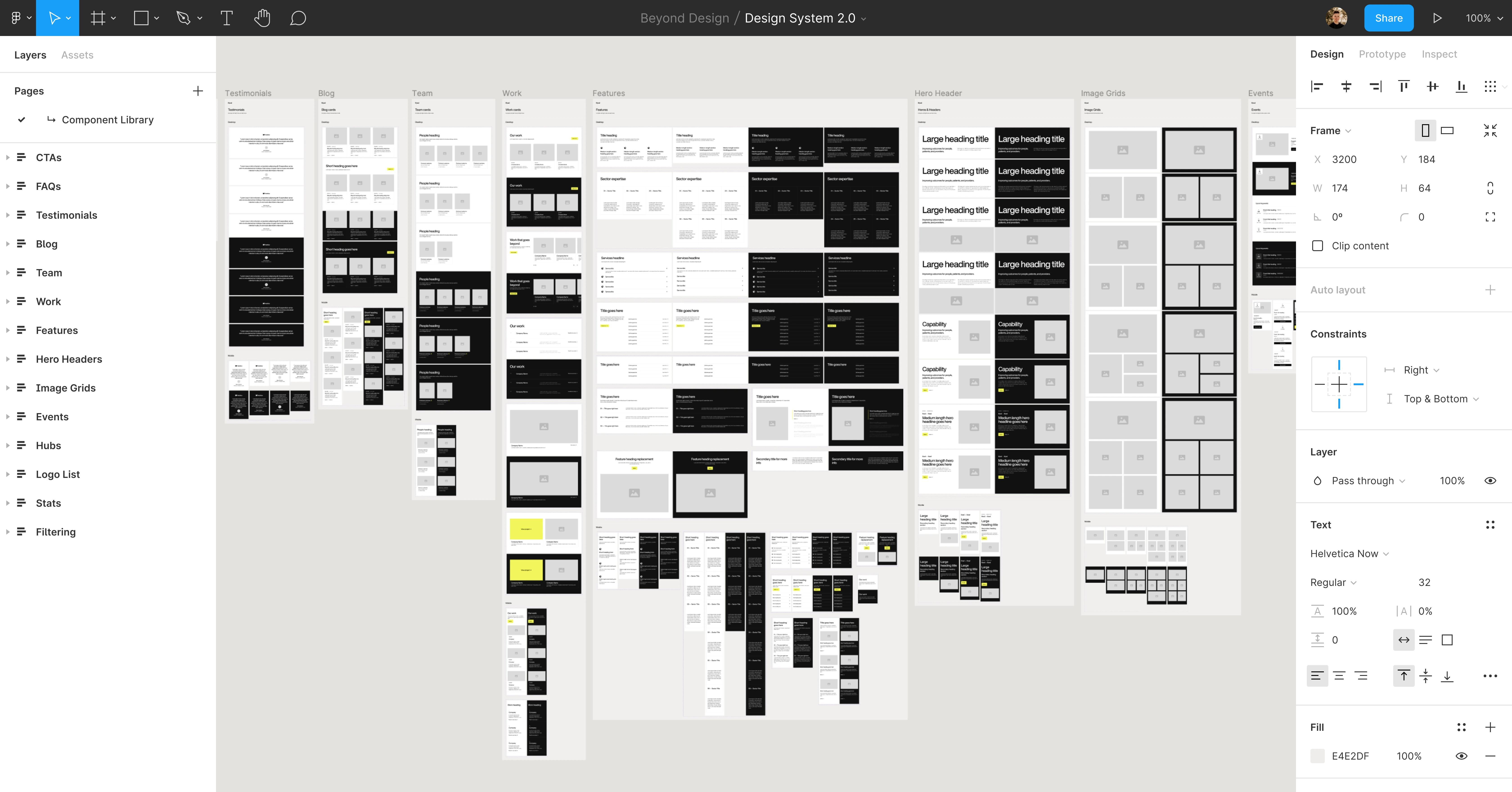
The first task was to audit the current design system and pull out any elements that would carry over into the new one. The main brand colors for light mode, and the patterns were the two main foundational elements that were approved to carry over into the new design.
When I began building the design system for Beyond in Figma, I started by establishing the core design principles that would guide the project. Prioritizing Client-First by Finsweet's development approach was essential, and I also needed to consider both light and dark modes to ensure the design's versatility. Setting up color and font variables was the next crucial step to maintain consistency across all designs.
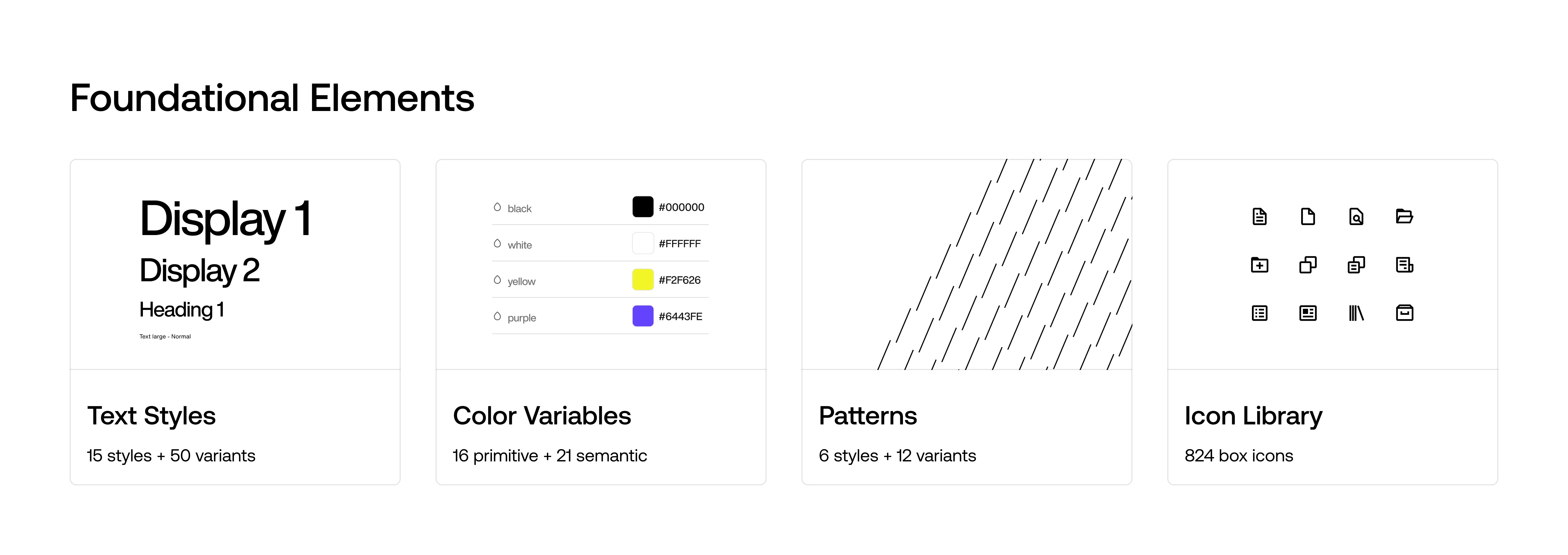
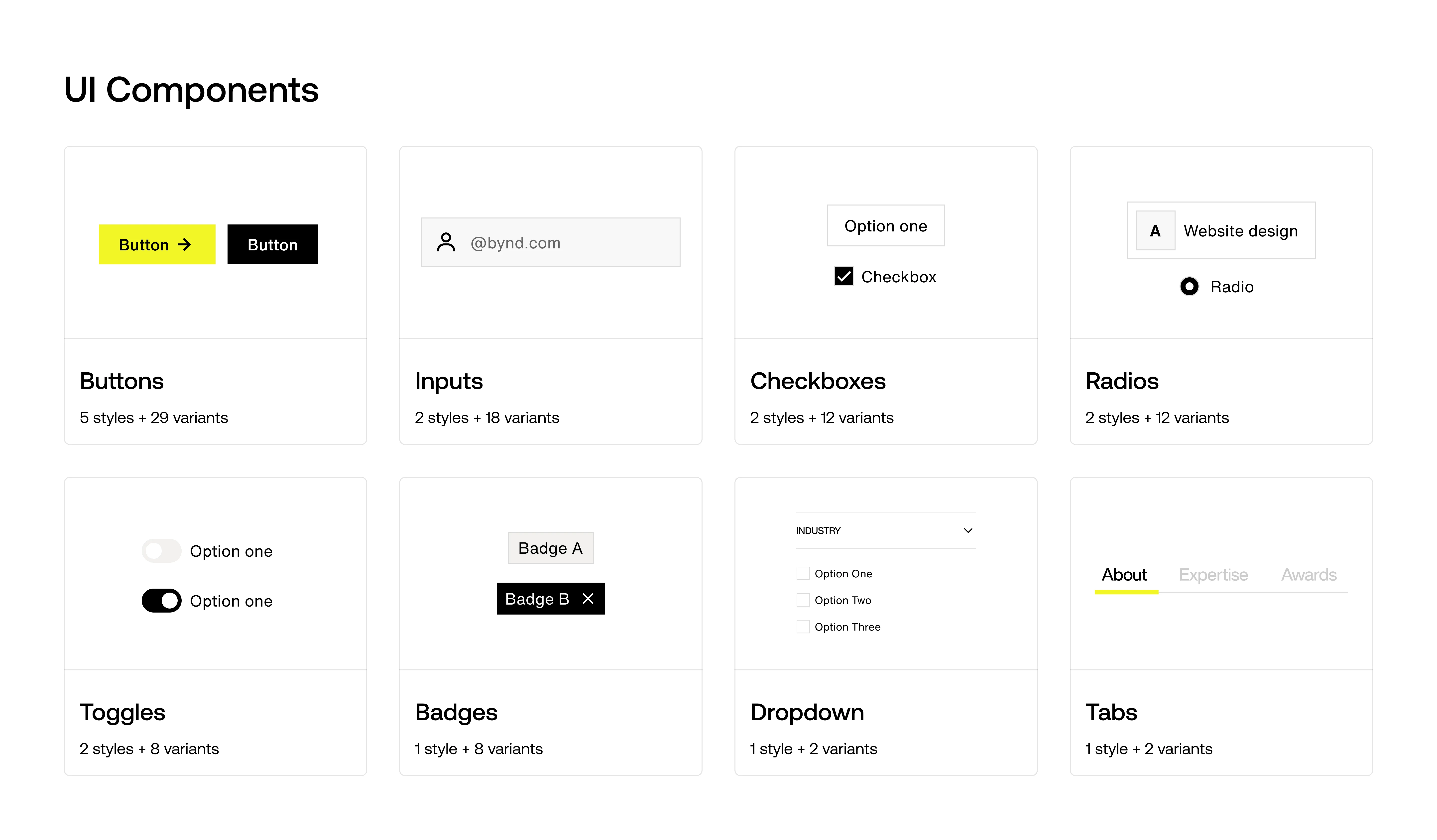
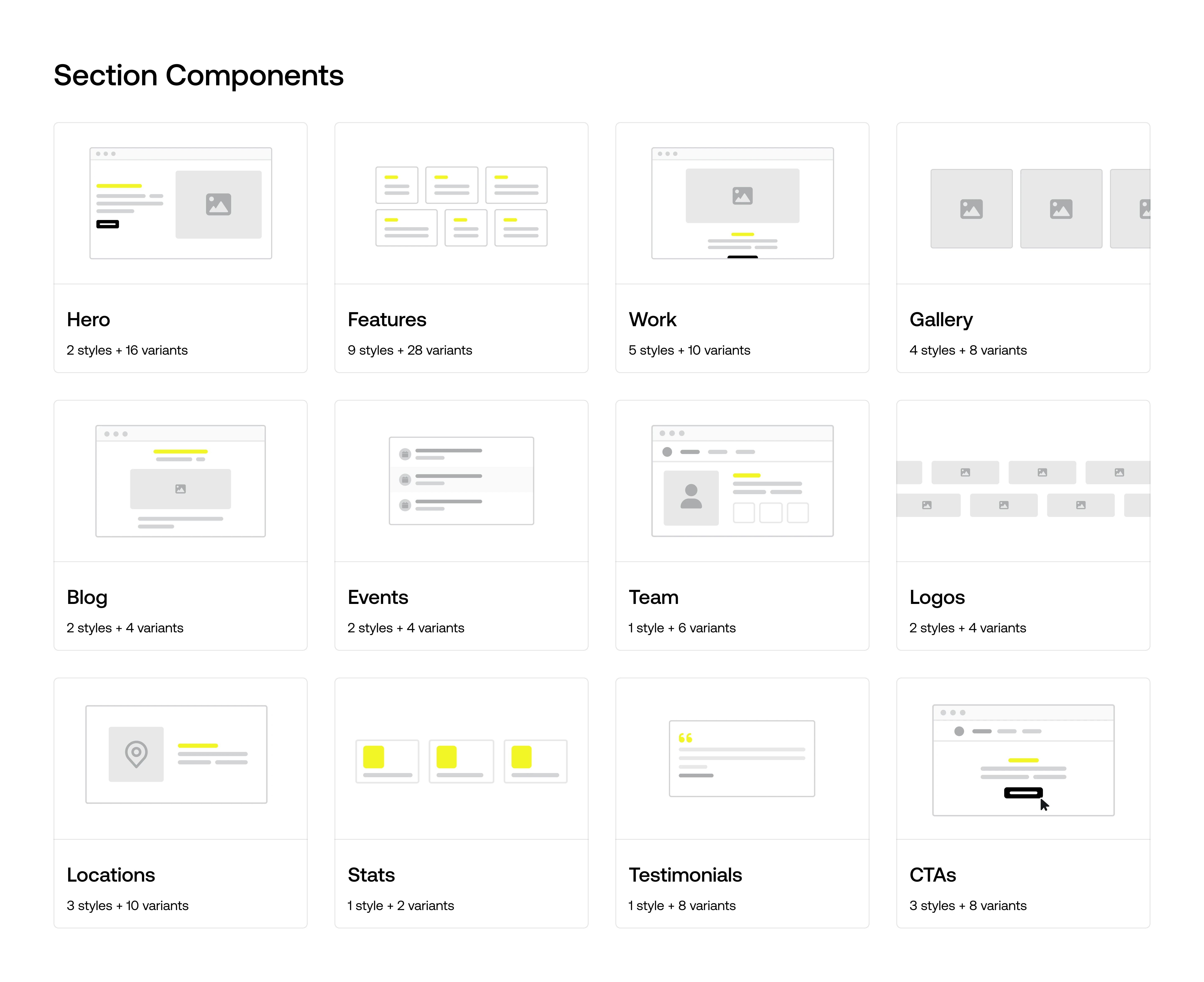
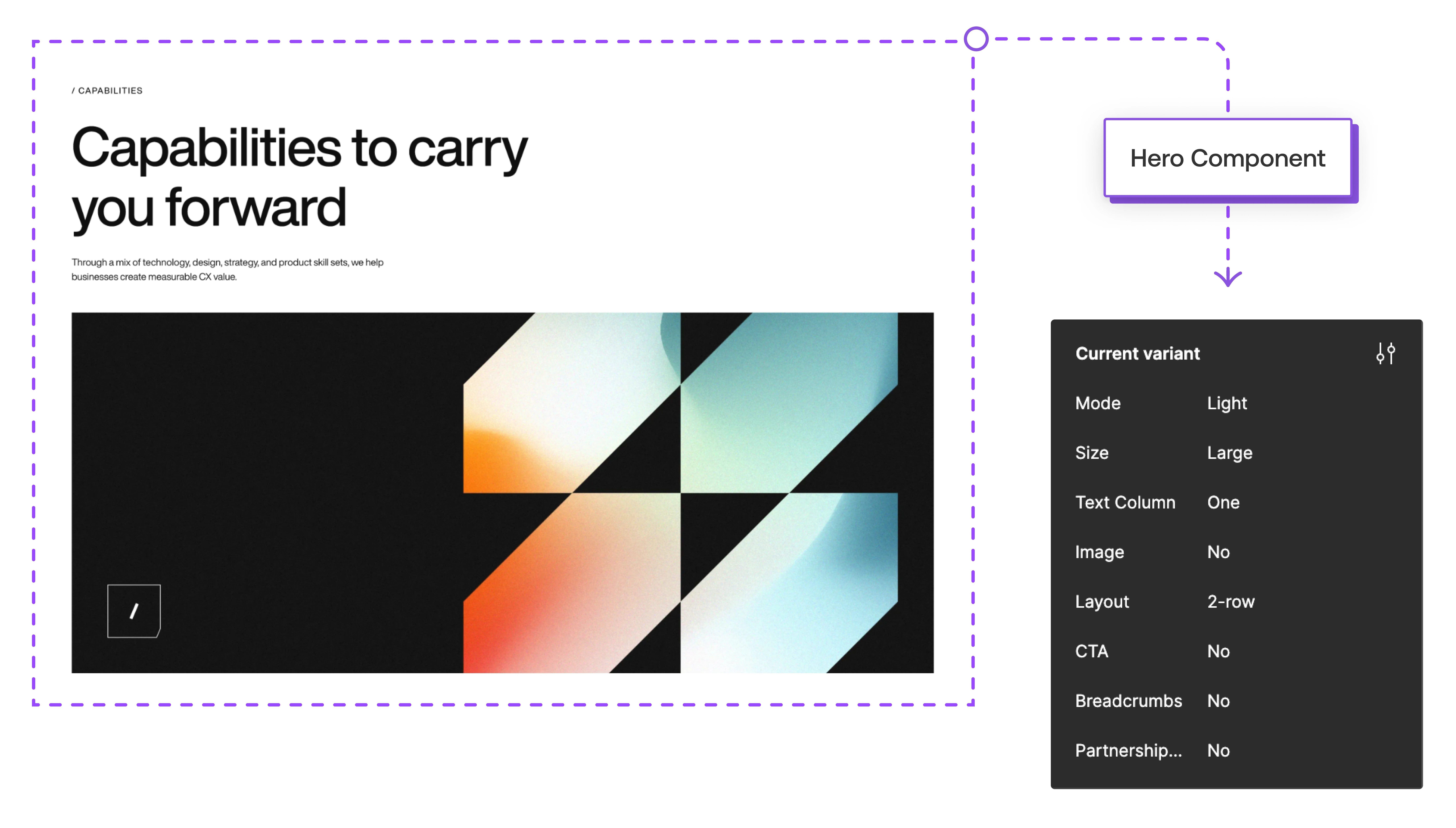
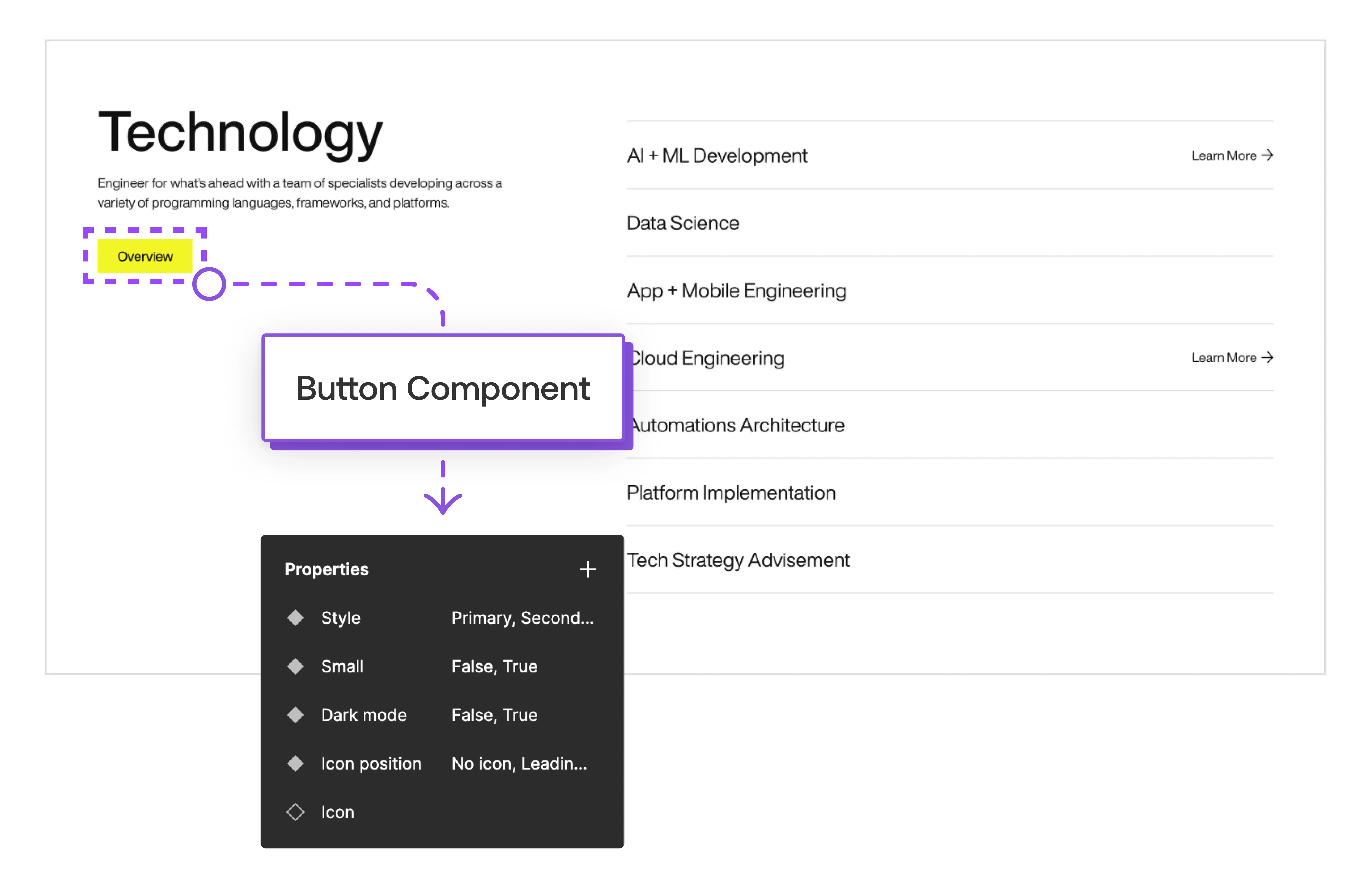
The design system was broken up into three major sections: Foundational Elements (color, type, iconography, etc), UI Components (buttons, inputs, checkboxes, etc) and Section Components (hero, features, stats, etc). Collaboration was key throughout this process. I worked closely with the Director of Brand to ensure alignment with Beyond's brand identity. In parallel, I collaborated with the Webflow Developer to ensure seamless implementation of the designs, while myself and the Director of Brand focused on the user experience and design consistency.
This cohesive approach allowed me to develop a robust and flexible design system that met Beyond's needs and provided a solid foundation for future projects.
The solution
Prioritize the user experience
The new design system being developed necessitated a high level of scalability and emphasizing the users experience. Offering light and dark mode was a key feature designed to cater to Beyond's users' preferences, providing them with the option to choose the mode that best suits their visual comfort and enhancing their overall user experience.
From all of the time spent creating the foundational elements and UI components, we moved straight into creating the section components and designing the new website page templates.
The result
The design system took 2 months to finish and was completed with:
Semantic and primitive color variables
Heading and body font variables
Light and dark mode
800+ icons
100+ UI components
100+ section components
Like this project
Posted Jul 1, 2024
Building a scaleable design system using Figma and Webflow.
Likes
0
Views
11
