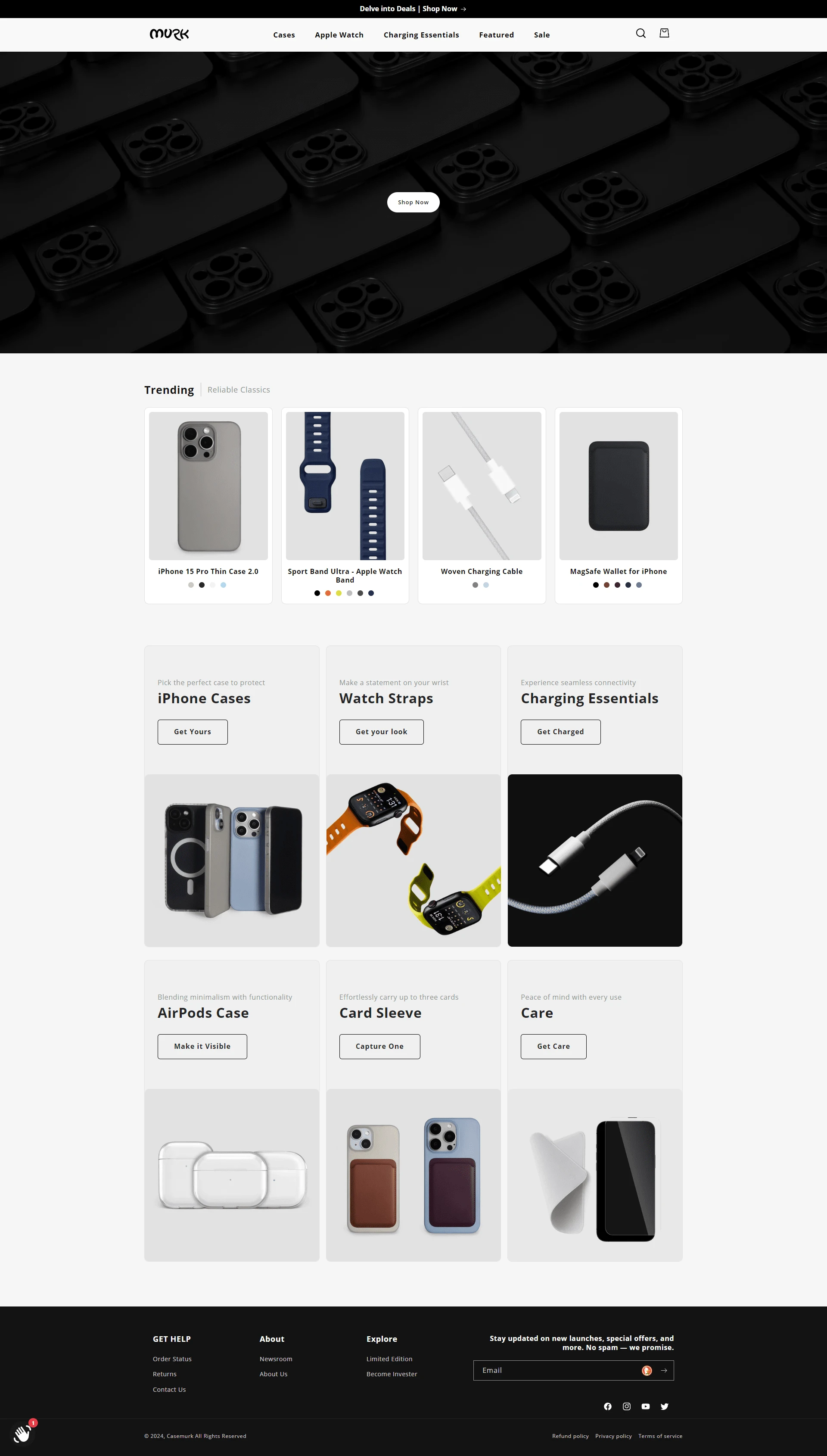
Website Development CaseMurk.com
Enhancing User Experience for CaseMurk.com
Project Goal: Craft a user-centric e-commerce platform for CaseMurk.com, empowering intuitive product exploration and detailed product information.
Challenges:
Seamless Color & Model Switching: Implement functionality to effortlessly switch between color and phone model options on the product page.
Color Visibility on Collections: Ensure color variations are clearly displayed on collection pages, facilitating browsing.
Engaging Product Information: Design a detailed "product blog" section within each product page, delivering comprehensive and optimized product descriptions.
Our Solution:
We addressed each client requirement, resulting in an e-commerce platform that streamlines product exploration and provides in-depth product information.
Interactive Product Display: We implemented a user-friendly interface that allows customers to switch between color and phone model options on the product page with a single click. This eliminates confusion and fosters a smooth browsing experience.
Enhanced Collection Pages: We integrated color swatches or visual representations within collection pages, enabling customers to effortlessly browse products based on preferred colors.
Compelling Product Blog Sections: We designed a dedicated "product blog" section within each product page. This section presents detailed and engaging product information, surpassing the limitations of a traditional product description. Leveraging strategic content organization and optimization techniques, we improved user understanding and search engine ranking.
Results:
CaseMurk.com now boasts an e-commerce platform that empowers a seamless and informative product exploration journey. Customers can effortlessly switch between color and phone model options, navigate collections by color, and delve into rich "product blog" sections to understand product features and benefits. This project highlights our expertise in crafting user-centric e-commerce experiences that drive engagement and sales.

Like this project
Posted Jul 3, 2024
This e-commerce platform is designed to make it easy for users to find the product they need. Easy product browsing: browse by color, by phone model, etc
Likes
2
Views
11

